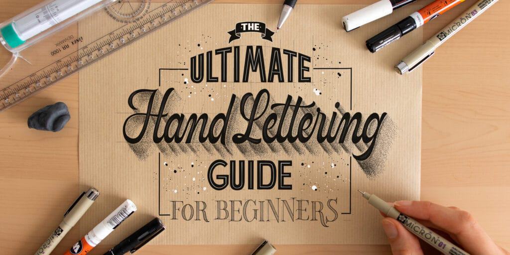
In this post, I will teach you everything you need to know to get started with hand lettering. I’ll show you three essential lettering styles, how to construct them from scratch, and how to stylize your work like a pro.
To top it off, I’ve created a free downloadable—The Lettering Skeleton Cheat Sheet—along with practice worksheets so you can put the theory into practice right away.
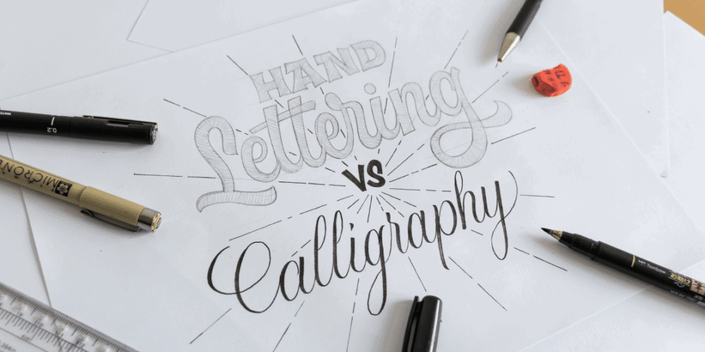
1. Hand Lettering vs. Calligraphy: The Process
Hand lettering is the art of drawing letters. While many people use the terms interchangeably, the key difference lies in the process of creating the art.
- Calligraphy is Writing: It relies on the rhythm, angle, and pressure of a single stroke using specific tools like brush pens or nibs.
- Hand Lettering is Construction: It is the process of drawing and constructing letters through individual shapes. You are essentially an illustrator of words, building the “outlines” and filling them in.
Looking for Calligraphy? If you’re here to master the rhythmic flow of dip pens or brush markers, check out the Calligraphy Hub.
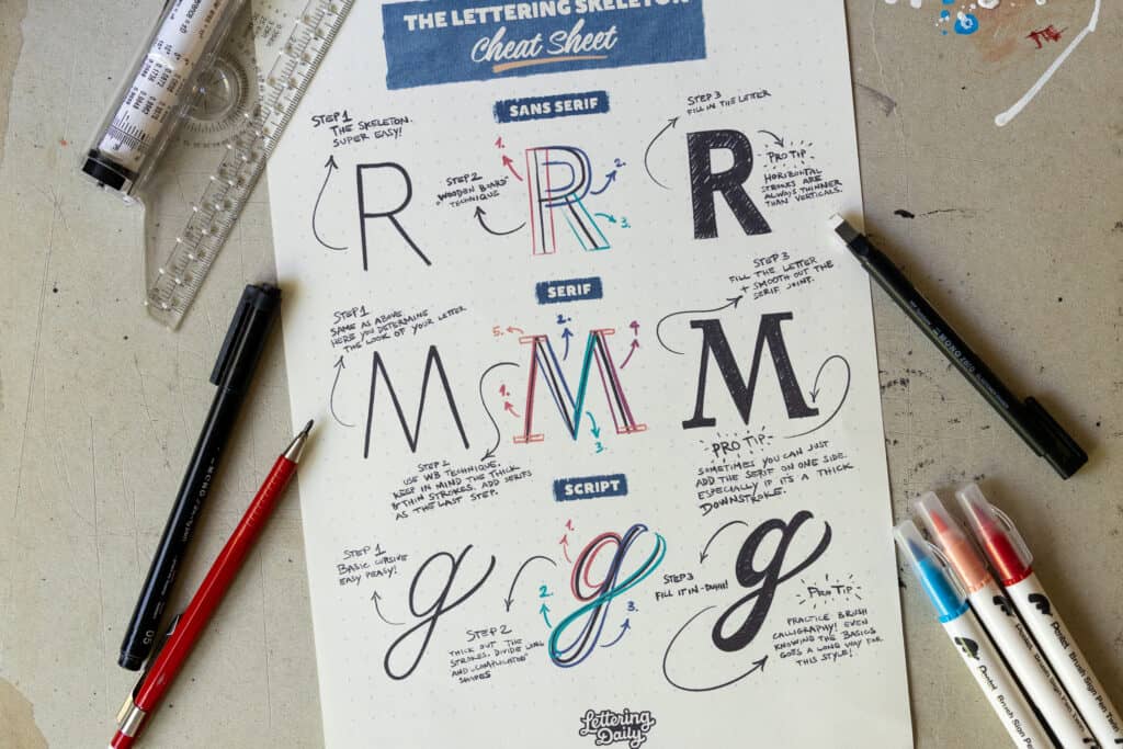
2. How to Construct Letters
The way I create my hand lettering is with the “Wooden Board” technique. It’s a powerful method that allows you to draw even the most complex shapes.
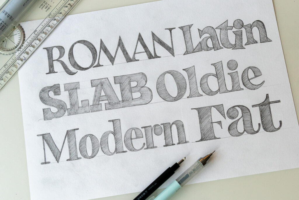
The whole gist is to divide the letter into individual pieces and stack them on top of each other—exactly like you would stack wooden boards. If you’re just getting started with hand lettering, I would advise you to stick with three basic lettering styles:
- Sans serif (aka block letters)
- Serif
- Script
These are the bedrock of hand lettering, and with time you can start exploring other lettering styles. So let’s have a look at how to apply the wooden board technique to all of these.
2.1. Sans serif (aka block letters)
Probably the easiest of the three. No contrast, no decorations—just solid shapes.
Here’s what you do:
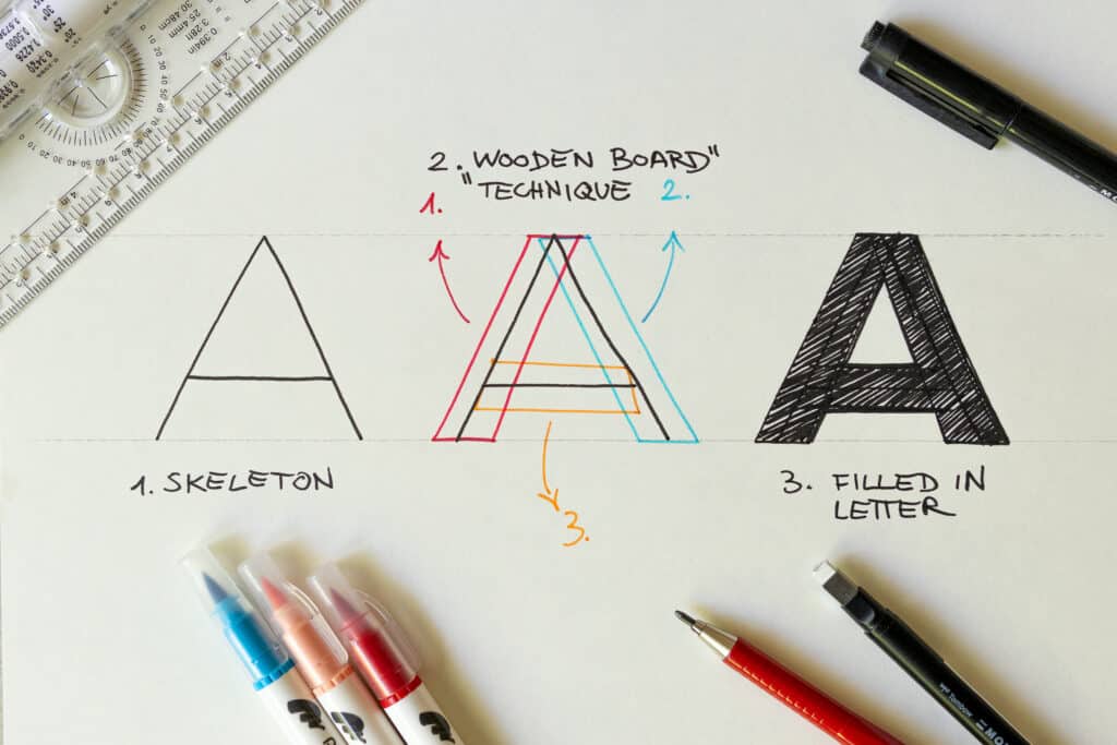
- The Skeleton: Write out the letter in a clean and simple style.
- The Boards: Draw a uniform box (a “board”) around every vertical and curved line. In this example, we can see that the letter “A” can be divided into separate shapes.
- The Result: Fill in the shape and feel free to fix bits and pieces as you do.
For a more in-depth view, check out my tutorial on block lettering.
2.2. Serif Letters
Serifs are the small decorative endings that these letters have. Compared to block letters, there are two key differences:
- The serifs — duuhhh.
- The thick and thins — upstrokes are usually thin, whereas downstrokes are thick.
Don’t feel daunted by this; the process is exactly the same as with block letters, it just requires an extra step.
Here’s what you do:
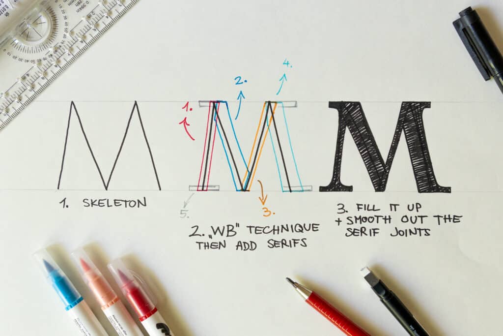
- The Skeleton: Same as above. Keep in mind that in this step, you can also decide the proportions of your letter: taller, shorter, wider, narrower, etc.
- The Boards: Apply the wooden board technique. Just remember: keep in mind the stroke contrast and add the serifs as the last part.
- The Result: Fill it in and smooth out the joints where the serifs meet the main part.
Serif lettering comes in a whole bunch of different styles!
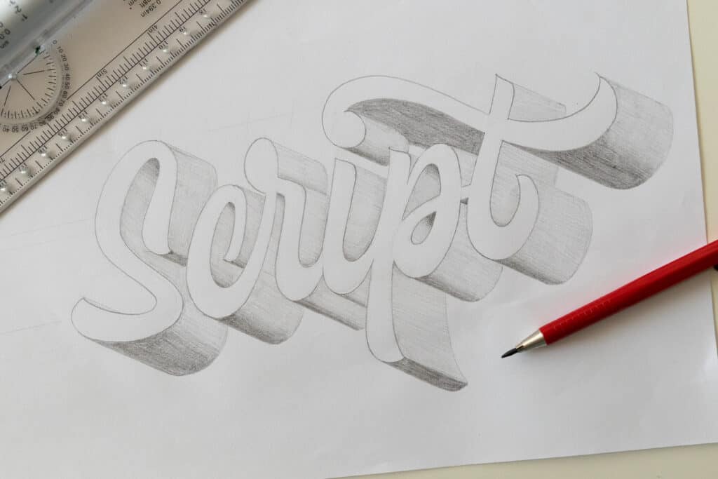
2.3. Script Lettering
Script lettering is a bit more challenging for beginners, but if you remember this one rule, you’ll make your life easier: Upstrokes are thin, Downstrokes are thick.
Due to their rounded nature, the wooden board technique is not super applicable here. Here’s what you do:
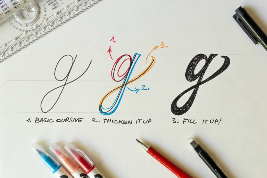
- The Skeleton: Write out a basic cursive letter.
- The Thick Out: I usually make the inside thicker, but I also go around the outside part just to give it some shape. If the shape is complicated (like a “g”), divide it into smaller pieces to keep the weight consistent.
- The Result: Fill it in and smooth out the curves.
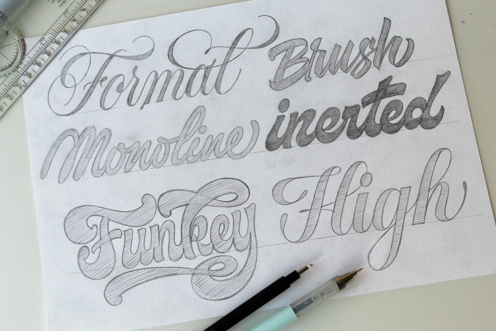
Script lettering can also come in all sorts of awesome-looking styles.
One of the best ways to get better at script lettering is to learn the basics of brush calligraphy.
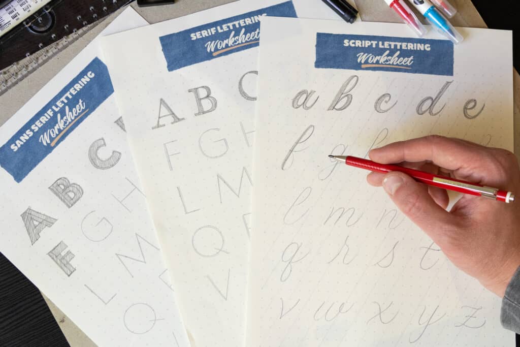
3. Put it into Practice: The Skeleton Worksheets
Now that you understand how to build a letter, you’re ready to practice. To make this as easy as possible, I’ve created A-Z worksheets for each of these three styles.
How to use these worksheets: Print out the worksheets and use the skeleton base to construct the alphabet letters using the “Wooden Board” or “Thick Out” techniques.
Inside your free Starter Kit:
- The Lettering Skeleton Cheatsheet: A visual breakdown showing how to add thickness to your skeletons.
- The Skeleton Alphabets: A-Z guides for all three styles to help you master proportions.
Drop your email below and get the worksheets instantly.

Stay updated with my tutorials and get instant access to the Lettering Crate –
A growing library of free lettering & calligraphy resources that includes –
4. Hand Lettering Tools To Get You Started
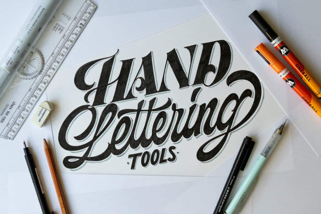
You essentially just need a pencil and some paper. If I had to assemble a hand lettering beginner’s kit, here’s what I would put inside:
- Pencil: I work with [this mechanical pencil], but a regular HB pencil will work just fine.
- Paper: I would invest in some better paper like HP Premium 32 or the Rhodia dot pad—truth be told, you do notice the difference compared to cheap printer paper.
- Ruler: I love my rolling ruler. It’s highly recommended for drawing guidelines to keep your letters nice and consistent.
- Eraser: Come on, we all make mistakes…
- Fineliner: Sketching with a pencil is cool, but inking a lettering piece brings a completely different level of satisfaction.
Want the full breakdown? Check out my guide on the essential lettering tools. A deep dive into my favorite pens, papers, and pencils.
5. Putting it Together: Your First Hand Lettering Project (Process Breakdown)
Once you have a basic understanding of how to construct letters (don’t forget to use the practice worksheets I provided above!), it’s time to move from single characters to a full hand lettering composition.
At this stage, you should already have a phrase in mind. If you’re a beginner, I recommend sticking to one or two words. The more words you add, the more difficult the layout becomes.
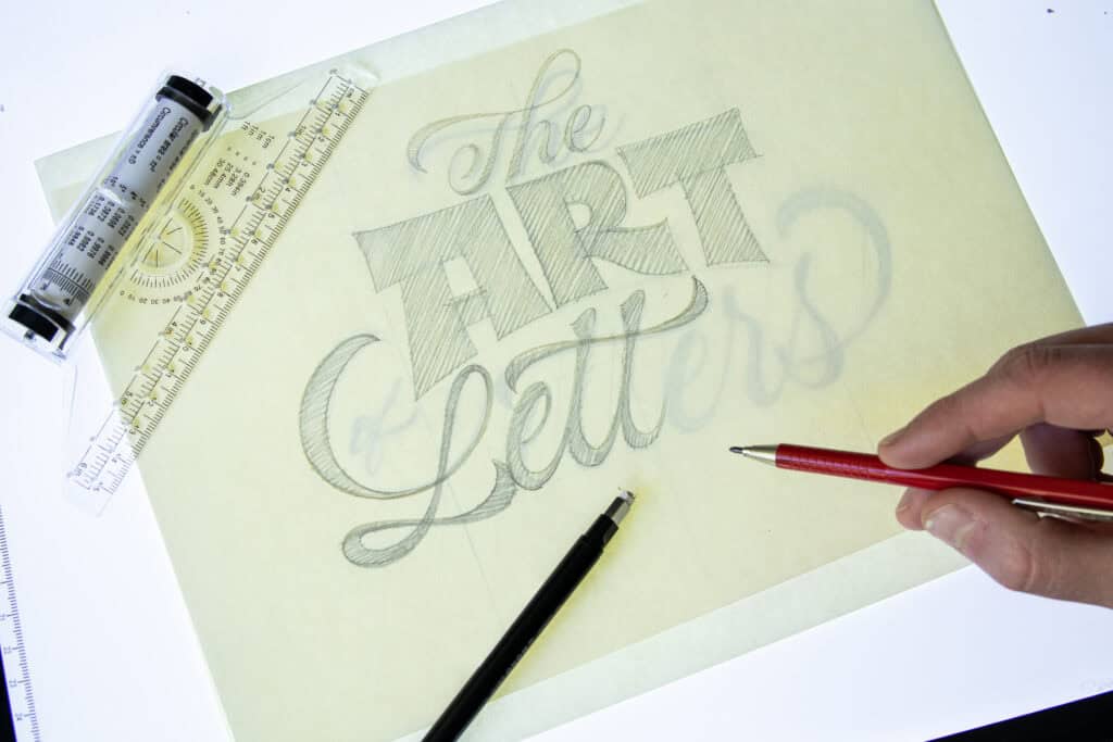
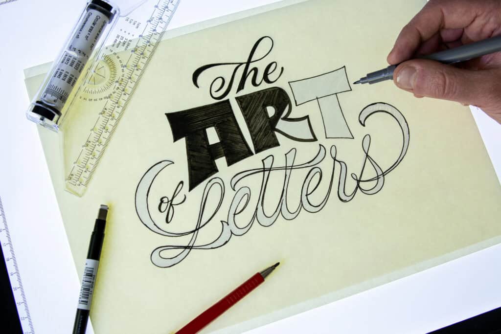
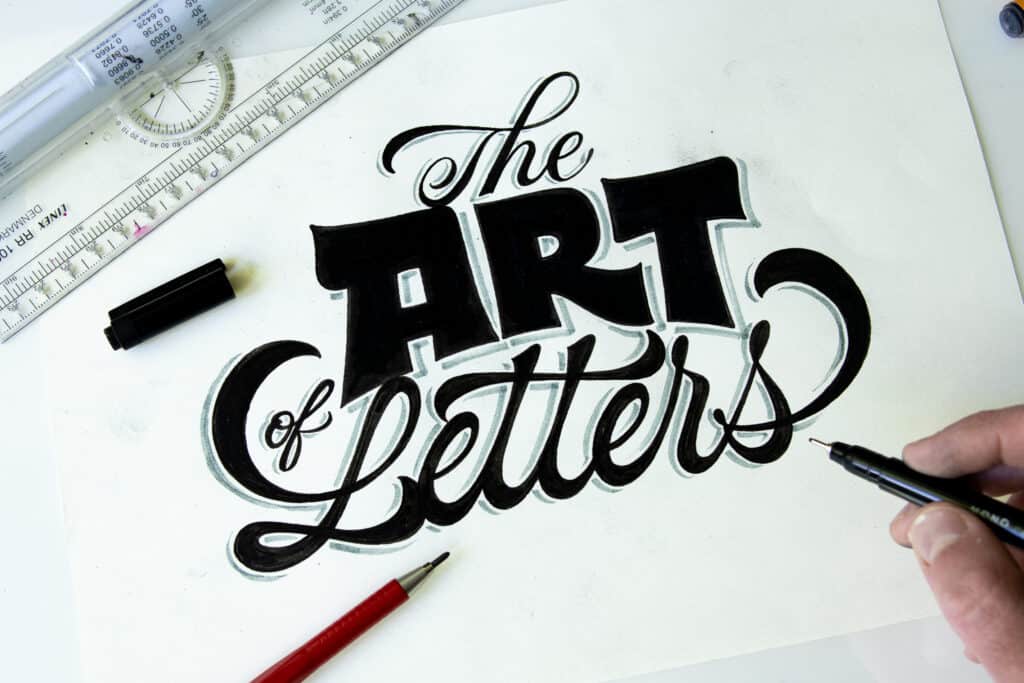
For this tutorial, I’m creating a piece that says: “The Art of Letters”.
Here is my step-by-step approach to taking a lettering project from a rough idea to a finished piece of art.
Step 1: Thumbnail Sketching for Layout
This is a super powerful and totally underrated technique. The goal is simple: quickly lay down every idea you have in a small scale. Start with the most basic layout that comes to mind; as soon as you get that first one out of your system, you’ll notice better, more creative ideas popping into your head.
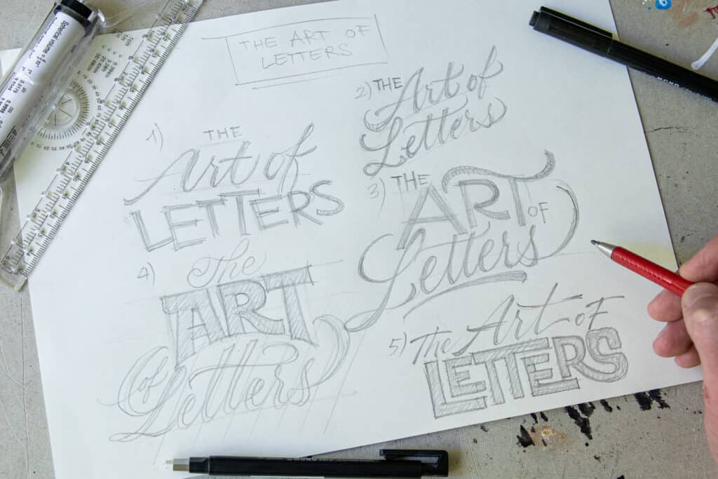
Step 2: Building Your Lettering Sketch
I decided to go with “Thumbnail #4.” In this step, I move to a full-sized sheet of paper and blow the sketch up. You don’t have to be perfect here—we are just building the foundation. My main concern is ensuring everything is nicely aligned and that the lettering styles work together as a whole. No detailing yet!
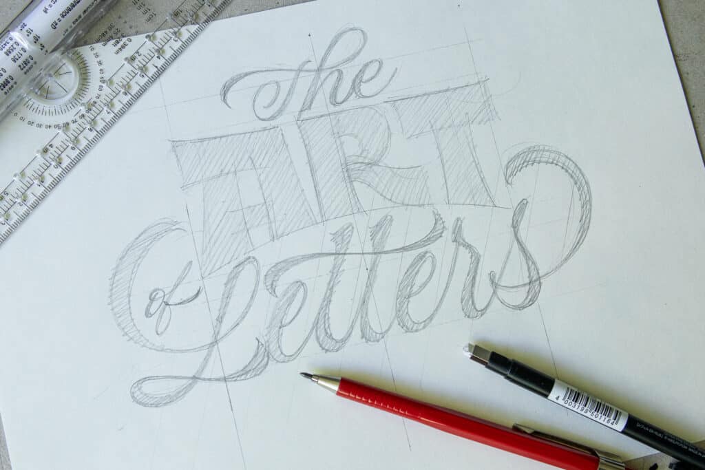
Step 3: The First Refinement Pass
I use a light tablet (or lightbox), which allows me to place a fresh sheet of paper over my rough sketch and refine the letters on a new layer. Some artists prefer tracing paper, but I’m team light tablet. Essentially, I’m doing a second pass to fix letter spacing, proportions, and curves. I’m paying more attention to the details now, but I’m still working in pencil.
Step 4: Inking Your Letters
On a high-stakes project, I might do three or four layers of refinement. However, for this demonstration, I went straight to the inking stage.
- Pro Tip: I like to outline the letters first with a fine-point fineliner and then fill them in with a black brush pen. This is much faster and ensures the edges stay crisp.
Step 5: Adding Lettering Effects and Details
Once your piece is inked, you can add “character” with effects. For this piece, I added a simple offset drop shadow using a light gray marker. I love using gray for shadows because it’s subtle and creates a professional “3D” look without being as aggressive as solid black.
Go Pro: The Masterclass Workflow
If you want to see how this process scales up to high-end professional work, I highly recommend checking out Chandan Mahimkar’s deep dive. He breaks down a 7-step lettering process that masterfully cleans up the “messy middle” we all face. It’s the perfect next step for anyone looking to turn these basics into a professional career.
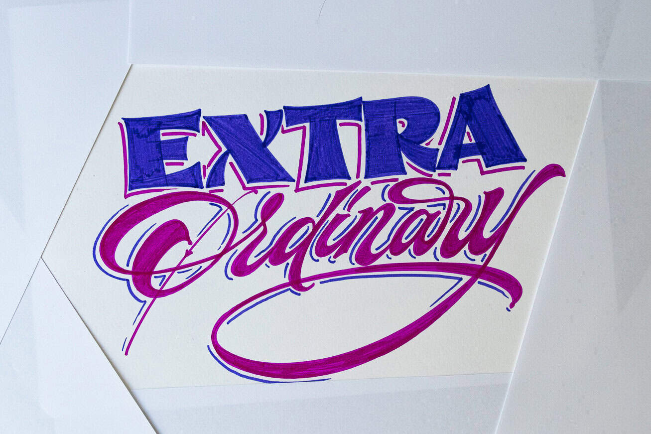
6. Adding Style & Effects: How to Make Your Letters “Pop”
By now, you’ve seen how to construct letters and how the overall process of a composition looks. But style and effects are what really bring a piece to life. They take a flat drawing and turn it into something that stands out.
Here are the quickest and easiest ways to level up your work right now:
- Adding Shadows: A simple drop shadow is the fastest way to make your letters “pop” off the page. It adds instant depth with zero stress. Check out my tutorial on how to add shadows to your lettering.
- Adding 3D Effects: If you want to go beyond a simple shadow, adding a 3D effect gives your letters weight and massive visual impact. I also have a full on tutorial on how to add a 3D effect to your letters.
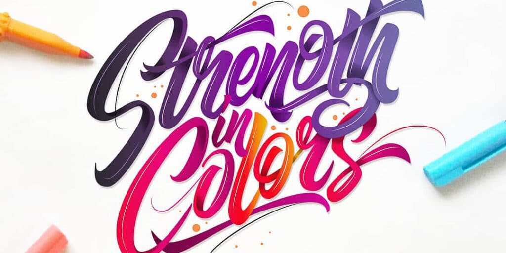
- Adding Color: Choosing the right palette can completely change the mood—vibrant colors feel playful, while muted tones feel sophisticated. Learn more on how to add colors to your lettering.
- Adding an Outline: Drawing a clean border around your finished letter adds a professional “sticker-like” finish that cleans up any messy edges.

Take it to the Next Level (advanced lettering effects)
If you’ve mastered the basics and want to try something more advanced, I’ve written deep-dive guides on some of the coolest effects in the game:
- Flourishing: Learn how to add those elegant swirls and loops to your script lettering.
- 2-Point Perspective: Take 3D to the extreme by making your letters fly toward the viewer.
- 5 Viral Lettering Effects: This is one of my most popular guides ever (it went viral on Pinterest for a reason!). It covers five unique ways to transform your letters.
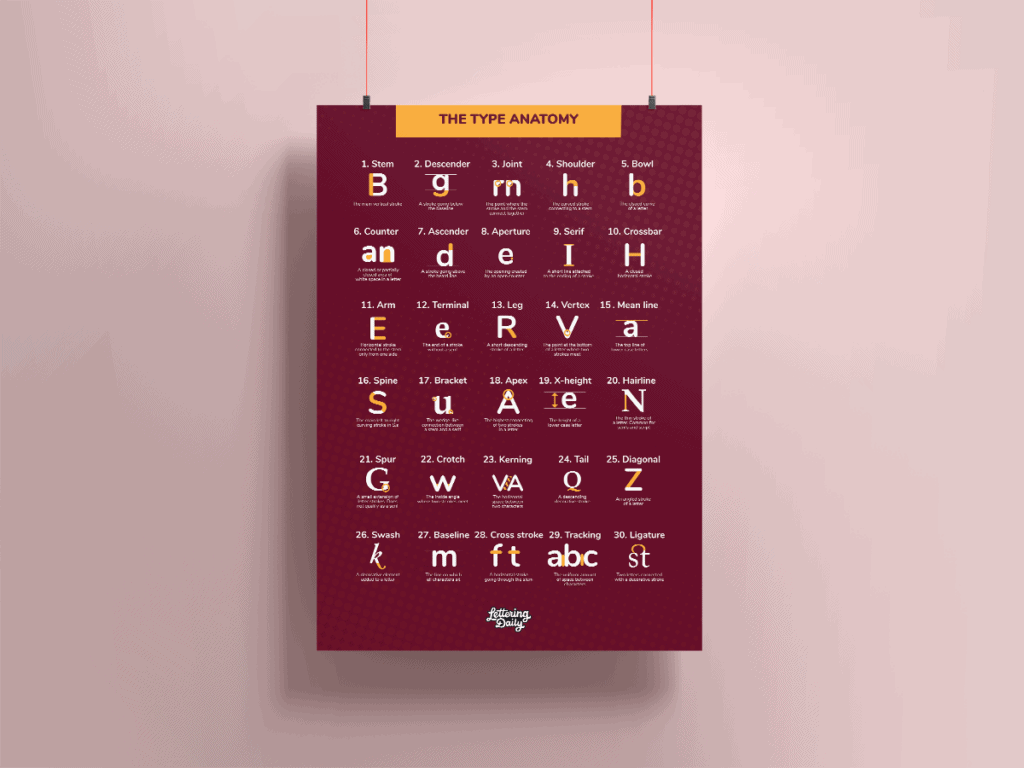
7. Lettering Anatomy: Understanding The Parts Of Letters
Although you don’t need to know any technical terminology to get started, understanding the “bones” of your letters becomes incredibly helpful as you move into more complex work. It helps you troubleshoot why a letter looks “off” and gives you the vocabulary to learn from other professionals.
I’ve written a full breakdown of 30 anatomy terms to help you communicate and critique your work like a professional.
- Printable Poster: I’ve included a high-res Anatomy Poster inside the Lettering Crate for quick reference while you’re at the drawing board.
The best way to learn lettering isn’t by reading about it—it’s by doing it. You have the framework, the techniques, and the steps to build your first piece from the ground up.
Your 3-Step Action Plan:
- Download the Worksheets: Head over to the Lettering Crate and grab the “Skeleton” and “Wooden Board” practice sheets to build your muscle memory.
- Practice One Word: Don’t worry about long quotes yet. Pick a 4 or 5-letter word and focus on getting the structure right before adding effects.
- Experiment with Style: Once your basics are solid, try out different shadows, 3D effects, or flourishing to give your work personality.
Have questions? Lettering is a journey, and I’m here to help. If you get stuck on a specific letter or can’t get your shadows to look right, reach out to me directly—I’m always happy to help you troubleshoot.
Which style are you going to try first? Let me know in the comments below!
About the author

Hey, I’m Max Juric, and I’m deeply passionate about calligraphy and hand lettering.
I’ve spent years honing my skills in the art of lettering, working with hundreds of clients from all over the world on design projects such as logotypes, branding, custom lettering, murals, and more.
But my journey doesn’t end there. I’ve also dedicated myself to sharing my knowledge and expertise with others, creating a wealth of resources including tutorials, articles, and podcasts.
It’s been incredibly rewarding to see thousands of people engaging with my content each month. Knowing that I’m helping fellow enthusiasts grow and develop their skills makes me really happy.
Welcome to Lettering Daily, your hub for all things lettering and calligraphy. Whether you’re a seasoned pro or just starting out, I’m here to inspire and guide you on your lettering journey. Stick around, and let’s explore the world of letters together!

You take me as a beginner as I left calligraphy after my school for higher studies. So being graphic designer I want to make calligraphy a prominent mark in world of graphic designers. AI CANNOT DO
Hi, just joined to group.
Yesterday I was at a calligraphy workshop and I still can’t decide whether I am for calligraphy or lettering. Can I do both? 🙂
It is an absolutely great article for beginners. Thanks a lot for sharing your skills for free. It is so helpful and greatly explained. I just print workshits and start to practice, and I can’t wait to start my 30-day planner.
Hey Ana, absolutely! I do both 🙂 They really complement each other and if you like both i would definitely encourage you to do them 🙂
Oh my god…this article is so amazing…it has explained hand lettering beautifully and I can say it is a blessing for an amateur like me…it has cleared all the doubts that I had relating to hand lettering ..I m going to read other related articles..for sure…all in all l loved it..thank u…😊😊
Thank you! Glad to hear that, if you need any help you can always reach out 🙂
Awesome advice and attention to detail! Thanks so much for the website, have been lettering for years but have learnt much new cool stuff! Like the rolling ruler, what a game changer 🙂
Hey Philippa! Thank you for the awesome comment. I am glad you liked the article 🙂
Hey man you made my day..
I was in search for tutorial like, it was feel like I lost In this search because no one gives this much detail and end up in “Anatomy of type”
But this website is so inspiring, thanks again man
Thank you bro! Im glad you liked it! To be honest, while writing up this post, I felt like I was going too much into detail, and that i would just end up confusing people. At the same time, it felt like something that is essential to the learning process. Thank you for the feedback! 🙂
This is such a fabulous site. Thank you so much. Inspiring!
Thank you, Giselle! 🙂
This website is the best resource for lettering that I have come across. I stumbled upon it when I was trying to get some copperplate calligraphy worksheets. This has opened up a whole new world for me!
It means so much, thank you! I’m just getting started to be honest 😀 Many more tutorials and articles are to be written 🙂
Thank you for making this website ,its excellent ! and I really appreciate your efforts,its really helpful for beginners and I love that kerning game . I have seen the lettering crate and I had a question – what’s a ‘ regular style ‘ hand lettering, its given in the 30 day lettering plan, I didn’t understand . thank you once again ?
Hey, thanks again 😀 Check out the previous response that I gave you 🙂
Hi! This is a pretty awesome post and I’m really looking forward to trying it out. Could you please explain how exactly we’re supposed to draw the guidelines and determine the angles?
Thank you, Emilie! You are free to determine both the size and angle of your guidelines. Let’s say you wanted an upright style of lettering, in that case draw only vertical lines. If you want a tiny slant to your letters then just add a bit of angle to the lines. You can also play with the size of the ascenders and descenders. It all depends on what you want to create and the placement of the letters. There are no strict rules (like with certain traditional calligraphy scripts). The important is that these lines are all consistent since their goal is to keep your letters consistent. Hope this helps, if not, be sure to join the Facebook group I run and I can have a better look at your work 🙂
Hope this helps!
I’m a total beginner and would love to learn the basics. Your information here is to the point and very helpful. Thanks!
Hey Cindy, thank you for the kind comment! 🙂 Glad to hear that.
Looking for a new hobby/skill to try during quarantine. Came across this website and I must say it is really helpful, informative and truly inspiring! Thank you for the sharing your knowledge and appreciate the gesture of the freebies. I am excited to start and have already signed up for the Lettering Crate, however I have yet to receive a confirmation email…
Thank you, Rosalyn! I really appreciate the kind words. Also thank you for reaching out via email, I am glad we were able to resolve the issue quickly! 🙂
This website is truly inspiring and helpful for does who are beginners . I really appreciate your efforts and your hard work . thank you for investing your precious time for us . I saw the 30 day planner and I had a small question : what’s regular style of hand lettering ? Thank you once again ????
Hey Anshika, thank you for the kind comment! When I mention the ”regular” style I mean the most basic form of that letter. Without any details, decorations, distortions, etc. I know it may seem boring, but as I mention in the article, it will help you form a very solid foundation for much faster skill development.
Wow! I’ve followed you on instagram for a long time but I never knew there was a website as nice as this! Thank you this was an amazing read.
I’ve been hobby-lettering every now and then but I truly wanna take it to the next level, do it right.
There is one very VERY consistent issue I always run in when sketching for my letters….
The Ratios… they drive me crazy honestly…. I just don’t know how tall should the ascender line be compared to the x line…. If we say the x line is for example 5 cms should the ascender and descender lines be a fixed ratio derived from that 5? I never got around to adjusting it….
And should those ratios and the sizes of your horizontal grids be related to your letter weights? For example if you’re doing it in a 2 cm x heights you can’t go around using 3 cm thick strokes?
Do these things have rules or am I overthinking it and should just eyeball it?
Sorry for writing this much…. And thank you again for this website ^^
Hey Assem,
Thank you for the kind words and it’s great to hear you want to get into lettering more.
Let me answer to your questions one by one –
1. About the ratios – you are free to determine the heights, angles and proportions of your letters. There isn’t a set rule around this. In fact, that’s what’s so awesome about lettering! You could have thick, bold and low letters or tall thin letters. Short ascenders and descenders or long ones. Straight or slanted – you choose. As i recommend in the article – move gradually! Start by learning the basic form and then with time it will be so much easier to expand towards more complex designs.
2. Should the size ratio correspond to the grid size? Not necessarily – as i mentioned about you are free to make that choice. However, if you decide to create a certain thickness of your strokes, then all of the letters should be consistent. That goes for proportions, angles, spacing, etc.
3. Should i just eyeball it? Definitely not. Use guidelines, guidelines are your friend and they will help you out in the process! No matter if you are a beginner or super experienced, guidelines are always helpful. Determine the sizes and proportions in advance and then make sure all letters follow the same elements.
The best thing now would be that you join our Facebook group and you share some of your work. This way I can give you direct constructive feedback to your work.
Hope this helps!
Cheers man! 🙂
Thank you for this ^^
I already found the facebook group and I can already tell this will be very constructive… Very talented community! <3
Thank you so much for the kind words, Assem! I am really happy you are finding this community to be valuable. If you need any help or if you have any questions, don’t hesitate to shoot 🙂 Always happy to help!
Hi!! from Thailand. I’ve been looking for things to do during quarantine and I found your articles! I’m a beginner and not good at English but somehow I understand all the things that you wrote. I’m really do interesting in calligraphy. I know it’s a bit too late but is it possible to download the 30 day planner too? Thank you so much.
take care. stay healthy 🙂
Hey Nont, the 30-day lettering planner is located in the Lettering Crate and it will stay there all the time. To access it, just sign up for the newsletter and you will gain instant access to it 🙂
Cheers!
I am intersting improve your hand writing
Welcome aboard 😀
Hey! Seems my verification email isn’t comming at all ? help
Hey Liza, sorry to hear that. Can you shoot me an email so I can have a look at it?
Thanks!
A-mazing, and really the ultimate hand lettering guide! So much value here – thank you for sharing your knowledge! <3
Thank you! <3
Hi! You’re site is exactly what I’m looking for to get me started on calligraphy and hand lettering. I’ve actually been gathering inspirations from the net, and copying them, but I would really love to learn how to create my own, not just copy.
I already signed for the Lettering Crate, and received an email for confirmation. But when I click the button, I am receiving an error page. Can you please help me?
Thank you!
Hey Felicity,
Thank you for the kind words and please accept my apologies for the late response here. Have you managed to fix the issue? Can you shoot me an email with your email address that you used to sign up? I will fix it right away for you 🙂
Cheers!
hi dear…
thanks a lot for this amazing information. I m a beginner and this information gives me so much support.
But I didn’t get from where I can have the files to download. please can I
have these?
I love your work.
my email is [email protected]
Thank you for the kind words! Please send me an email and I will be happy to sort this out 🙂
Hi there! I have signed up but I haven’t received the 30 day planner. I already checked my spam folder and it isn’t there. A little help please? Thank you!
Hey Emelyn, sorry to hear that. Can you shoot me an email at – [email protected]
I would be happy to help you with this.
I need never did learn to write properly, and your pages look like the right place to fix this up. I hope you’ll forgive my mistakes.
Hey Valerie, thank you for the kind comment!
Nice piece of information would definitely join the 30 day planner
Thank you, Foram! If you need any help or if you have any question, don’t hesitate to ask 🙂
hi lettering daily Isent an email in order to get the link , And I’ve got it already But when you enter the password it does not work.
I hope get it , thanks.
Please send me an email in regards to this issue.
I don’t receive the email to confirm .
Please send me an email in regards to this issue.
I would like a copy of the 30 day planner if possible. I’m looking forward to making progress with my hand lettering skills 🙂
I can’t believe it! I’ve been trying to get into hand lettering for years and have simply given up for lack of explanation! This site is like the Holy Graal! Thank you sooooooooooooooo much for creating it and share it!
Hahaha! Thank you so much Mariana! Your comment brought me a lot of joy 🙂 I am so happy hearing that you found the content useful.
So glad I came across this article. So helpful and brilliantly explained. Definitely trying the 30-day planner to get started in lettering 🙂
Thank you!
I am truly happy to hear that! If you ever need help or feedback, feel free to join our official Facebook group! 🙂
Hi! I was actually planning to purchase the rolling ruler. However, I really don’t know which one works better and that will last longer. I saw some good reviews at Amazon about the MyLifeUnit rolling ruler likewise to Alvin’s. But it seems that there were more negative reviews too on how they perform. Like the roller isn’t functioning well, the material is cheap, too expensive considering its function, so hard to manipulate/control, etc. I am confused on what to choose though. Can you suggest as your personal preference which one would you choose? thanks!
Hey Melissa, sorry for replying so late to your comment. I use a rolling ruler from Amazon but considering that I’m based in Europe it’s a different brand. I honestly couldn’t be more happy with it! It works flawlessly and it saves me a ton of time for both lettering and calligraphy – definitely a most used tool along with my pencil and pens. Perhaps you can try to find one in your local art & craft shop and test it on the spot? Let me know if there is anything else I can help you with! 🙂
Hi , I have been doing calligraphy for 2 years and just moved on to hand lettering thanks for all these tips keep up the good work???.
Hey Jay, happy to hear that you are expanding your knowledge it will definitely help you on both ends! 🙂
Can I have a link for downloading the 30 day planner? I dropped my email and confirm with password on the website but can’t find the 30 day planner in all the tutorials.
Hello Emily, sorry to hear you are struggling with finding the planner. All of our freebies are located in our resource library which also known as The Lettering Vault. Once you sign up with your email and you confirm your registration, you will receive an automatic welcome email that contains a link and a password to that resource library. On that page, you will be able to find the 30 day planner along with ALL of the other freebies. In case you are not able to find this email, be sure to check your spam folder – sometimes they end up over there. If you are not able to find this email, please send us an email and i will personally make sure to give you a copy of the 30 day planner. 🙂
I can’t wait to start my 30 day planner. This particular blog not only boosted my confidence but excited me as well. It’s an absolute guide for beginners like me. Thank you !!
Hey Julee, this means so much to me! I’m happy to hear that you feel confident about your journey, be sure to find our Facebook group so we can provide you with constructive feedback and help you grow even faster! 🙂
Love this article & blog. It’s an amazing world we live in with blogs and so much information we can find, from blogs and *free* tutorials like this! 😉 Thanks for sharing your skills.
Thank you for the kind words! Im very glad you enjoyed this tutorial! Cheers 🙂
Thank you for the article,But I hope get the link.You have already sent the link but when I enter the password it does not work!I hope to get it as soon as possible.
Hi, just joined and I am an absolute beginner. Can I dowload the Ultimate Hand Lettering Guide? I can’t see a pdf link. I will certainly use your club. After searching the net for hours, you seem to be the best!!! I’ll soon start feebly attempting my Calligraphy efforts.
Regards to all
Mike
Hey Mike! thank you so much for the kind words! You can definitely download it 🙂
All you need to do is drop your email, and we will send you an invitation to our exclusive content area where you can find the 30 day planner along with our other free downloadable content.
Loved the article. It’s simple, concise and up to the point. Learnt a lot.
Thank you Deepak! Really appreciate your kind words 🙂