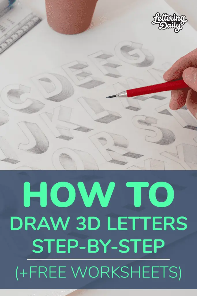
Learning how to draw 3D letters is a fun and creative way to make your lettering pop!
Whether you’re a beginner or looking to refine your technique, this guide will walk you through the process step-by-step — from basic shapes to shading and adding depth. Let’s dive in!
Let’s get started.
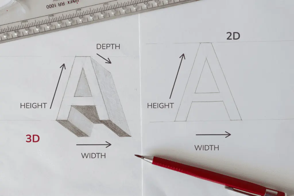
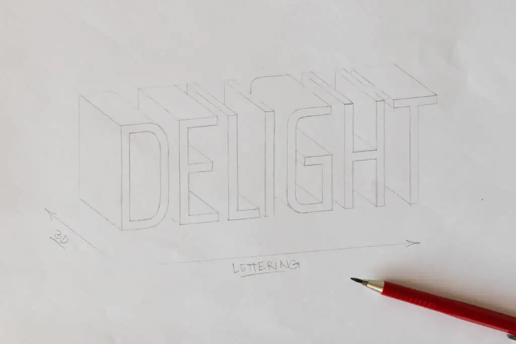
The basics of 3D. What are 3D letters?
Before jumping into templates, it’s important to understand the basics of 3D lettering.
In simple terms, 3D adds depth to flat 2D letterforms by introducing height, width, and depth.
This understanding will make your practice more effective and improve your overall technique.
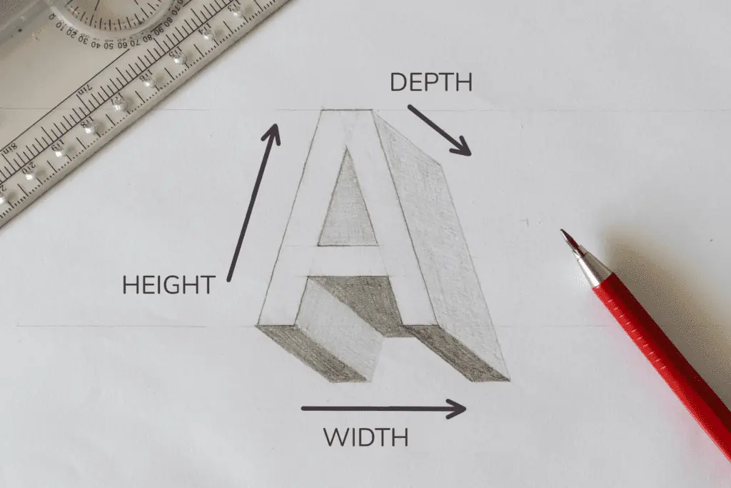
We are basically adding an extra dimension to the flat 2D letterforms we usually create.
How to draw 3D letters – A step by step process
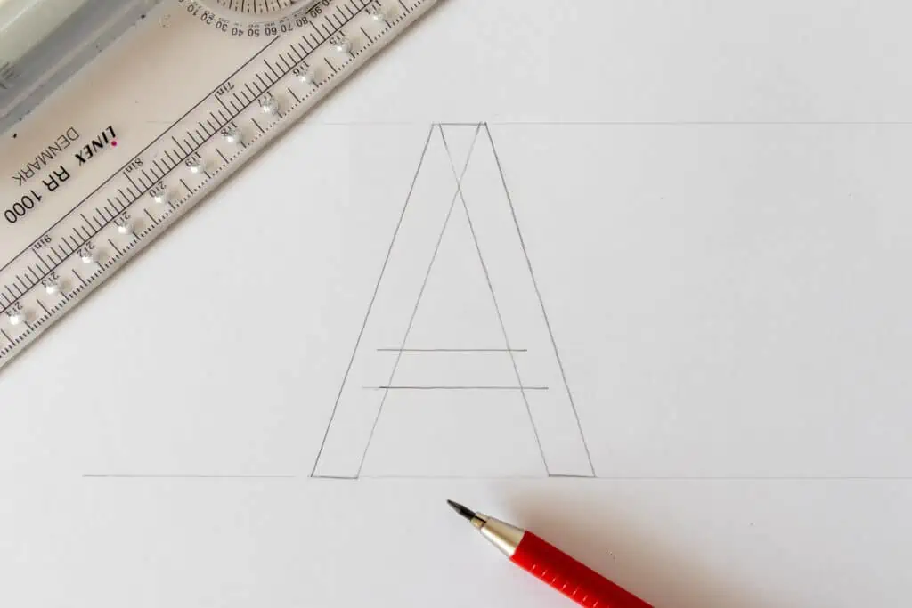
Step 1 – draw the letter
For this example, I’ll go with a basic sans serif block letter A.
I’ll draw it using the wooden board technique.
If you are not familiar with it, I talk more about it in my hand lettering tutorial for beginners.
In short, the wooden board technique teaches you to divide and draw the letter into individual parts.
This method allows you to create better, more consistent, and more balanced letterforms.
Step 2 – determine the direction of the 3D
As I mentioned earlier, the letter’s 3D (or the depth) can extend in multiple directions.
Most commonly, it is either bottom left or bottom right.
You can do it top left and top right as well.
I would just avoid doing the 3D completely vertical or horizontal because then the effect isn’t that noticeable.
This time I went for the bottom right 3D.
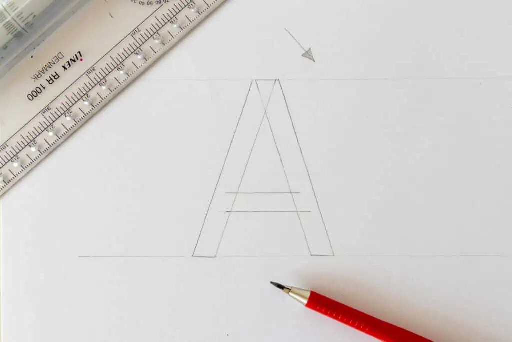
Before you draw your lines, try to identify all of your corners so as not to miss any.
I’ve done this so often that I know where to place my lines, but if you are just getting started and feel overwhelmed, this will help you out.
Notice once again that I haven’t marked the corners where the lines would move “through” the letter.
I did the same thing with the square example.
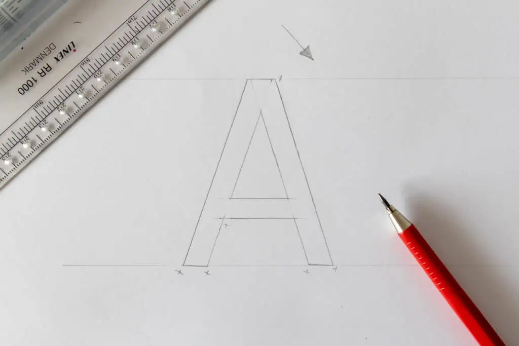
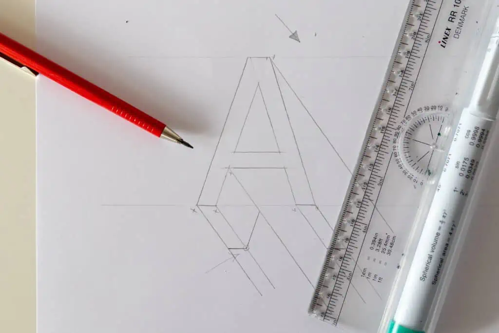
Step 3 – draw the lines
Ok, so I drew my first line from this corner.
Now, every other corner should have a line that extends in the same direction.
You can make these lines a bit bigger, and what doesn’t get used will be deleted later on.
Good, once you’ve drawn all the lines, it should look like this –

As you can see, we work with a lot of parallel lines here, and it’s precisely the reason I love using my rolling ruler for this.
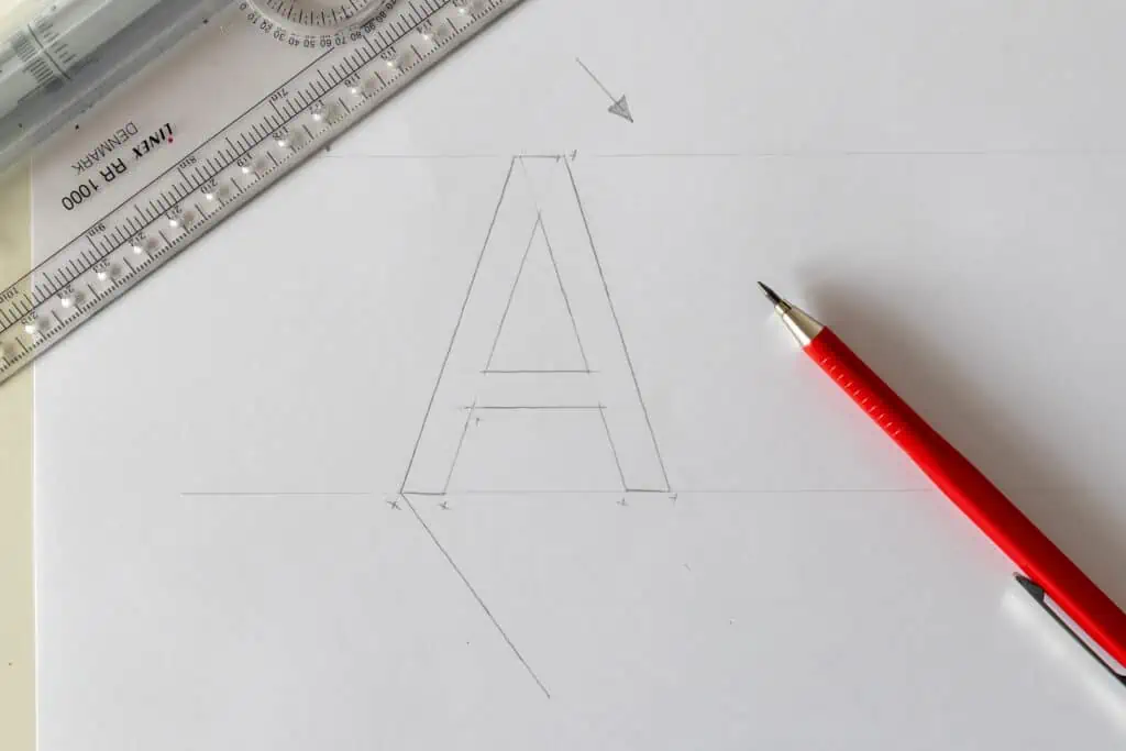
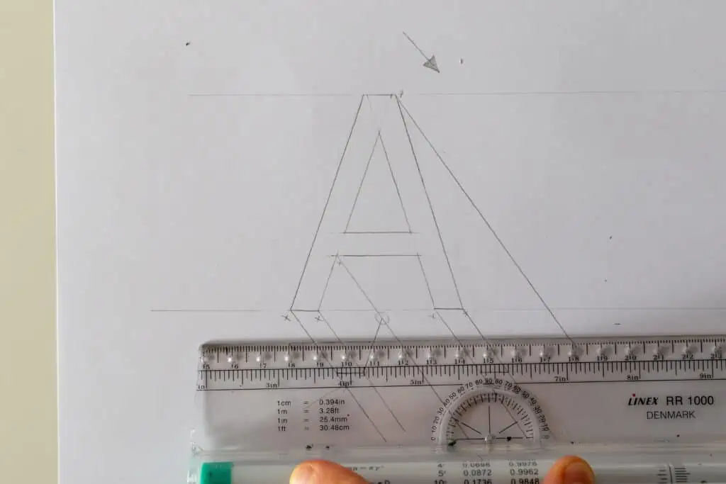
Step 4 – Closing the shape
We have our lines extended from each corner, and now we just need to close the shape to get our 3D letter.
With the first closing line, you determine the length (the depth) of the 3D.
This part is totally up to you.
You can start closing your shape either from the bottom or from the side.
I prefer doing it from the bottom.
I’ll begin by closing up the lowest points of the letter A which are these two lines here.
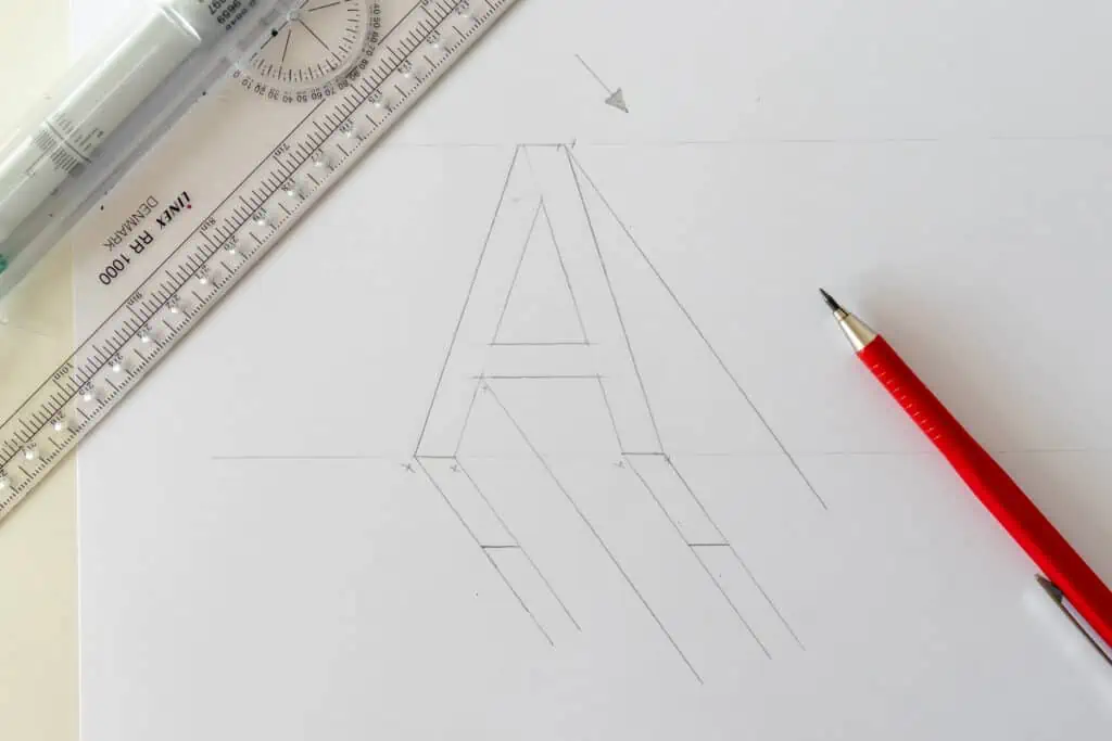
The next thing I have to close is the first (inner) side of the letter.
I grab my ruler, align it to the side of the letter A and slide it to the corner I’ve created in the previous step.

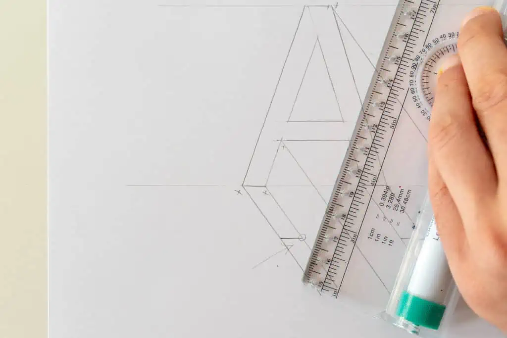
This little corner tells me how far I have to go with my 3D.
In this way, I maintain an equal distance of the 3D from every side.
By closing this side I have yet another point that tells me where to close the crossbar.
So I align my ruler with the crossbar of the A, and I slide it to that corner and close the line.

Finally, I just need to connect the remaining side, and again, I have this little corner at the bottom that tells me how far I have to go.
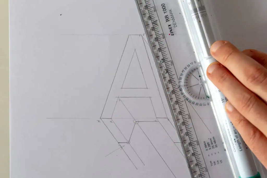
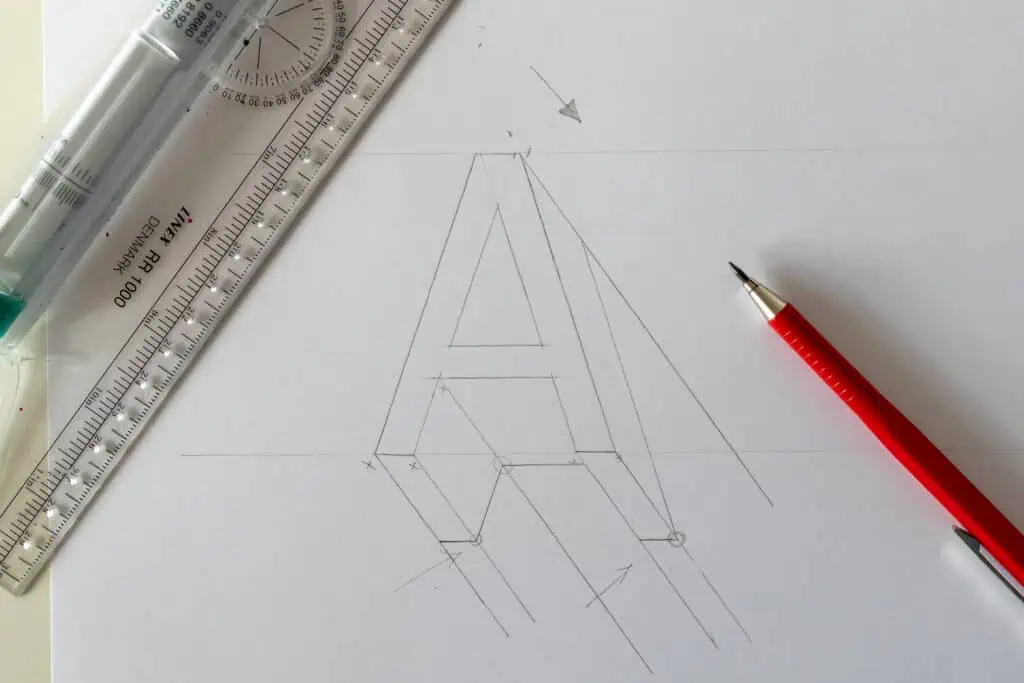
Once I’m done with connecting all the lines, all I have to do is erase all the extras that extend beyond our 3D.
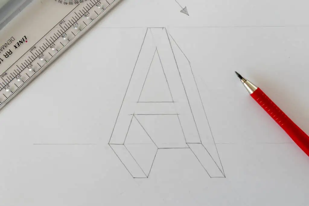
And there you have it, friends.
You’ve successfully created your first 3D letter!
We can, of course, further style our 3D letter, but I’ll cover that in the “Extra Tips” section.
Right now, we are just focusing on understanding the basics of 3D letters.
As always, it’s best to move gradually from easier to more complex elements.
What about rounded 3D shapes and letters?
Applying a 3D effect to rounded shapes can be a bit trickier than straight lines and edges.
Don’t worry. It’s nothing too complicated, but it does take a bit of practice.
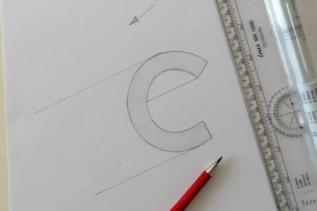
Let’s see an example using the letter C.
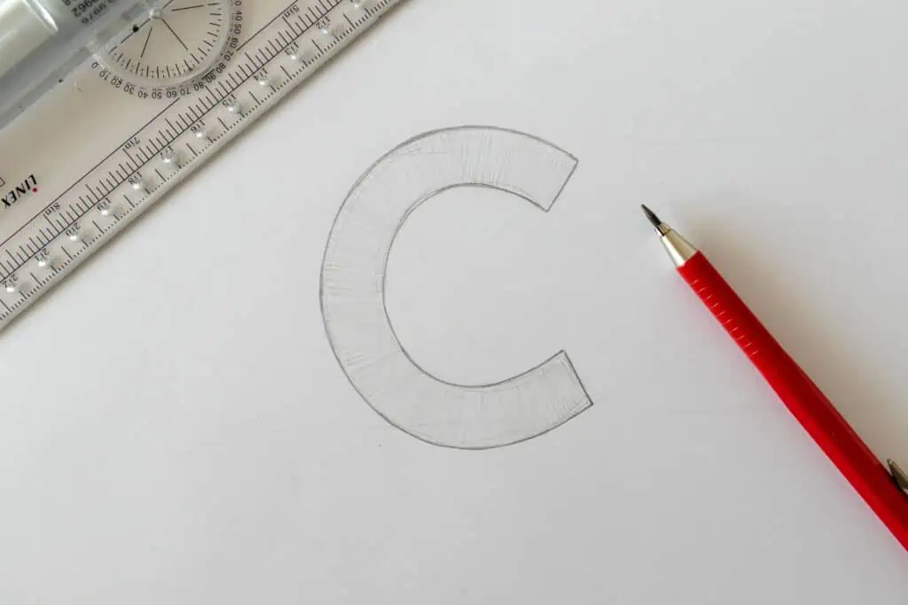
Once you’ve drawn your letter C, determine the direction of the 3D.
Here I’ll go bottom left.
I’ll start with this line inside since it has a corner.
Now, I’ll move down with my ruler to the furthest point of the letter C.

I’ll do the same for the top side.
What matters the most here is that you locate that furthest edge of the rounded letter.
Once you have all the lines it should look like this –
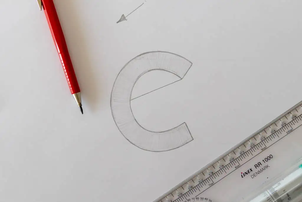
Now i just need to determine how deep my 3D will extend, and then just close the lines.
I need to close the line by following the exact shape of the letter.
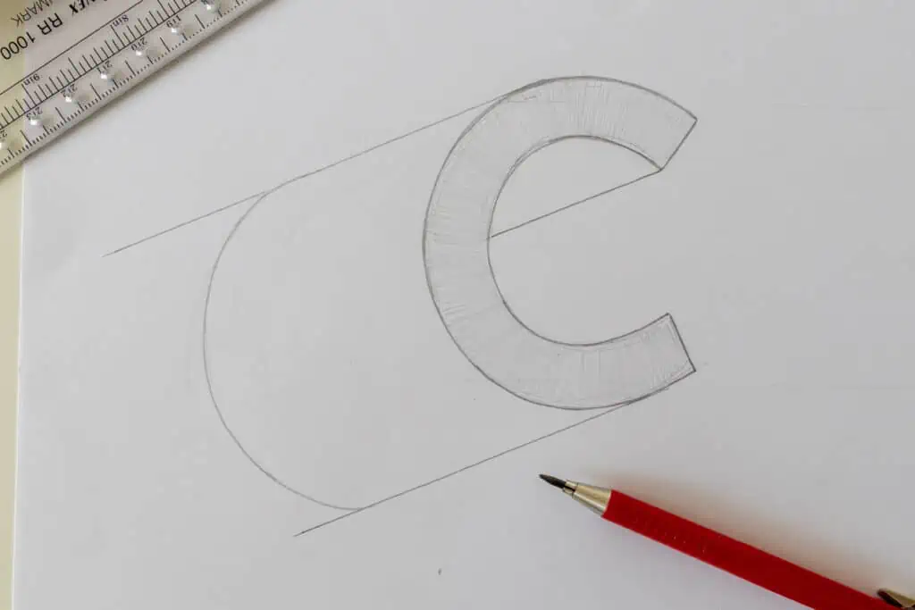
This is the reason why these rounded letters are a bit more challenging.
You have to eyeball these closing shapes, and it’s fine if it’s not 100% the same as the original line of the letter.
Here is how it should look like once you’re done.
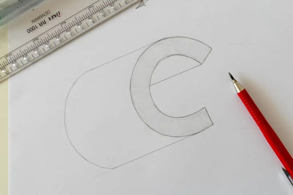
And that’s pretty much it!
Now you know how to create 3D letters using the equal distance method.
Want to see this in action? Watch the full video tutorial here:
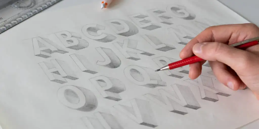
3D letters alphabet template
Following this method, you can add a 3D effect to the whole alphabet as I did here.
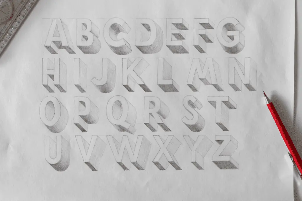
I also made a separate timelapse video where I add a 3D effect to every letter of the alphabet.
You can watch it here –
Although we covered several examples in the step-by-step processes above, you might get stuck on certain letters.
If that happens, just come to this section and look at these references.
After doing the whole alphabet a couple of times, you’ll already start to feel much more confident in creating 3D letters.
Believe me,
It won’t take much for you to start drawing 3D letters without a reference.
3D letters alphabet template worksheets
To help you practice, I created 2 block letter alphabet templates where you can practice adding a 3D effect.

- Page 1 – Is totally empty so you can start applying the 3D effect using a ruler
- Page 2 – Has a barely visible 3D effect already applied to it so you can just trace it over.
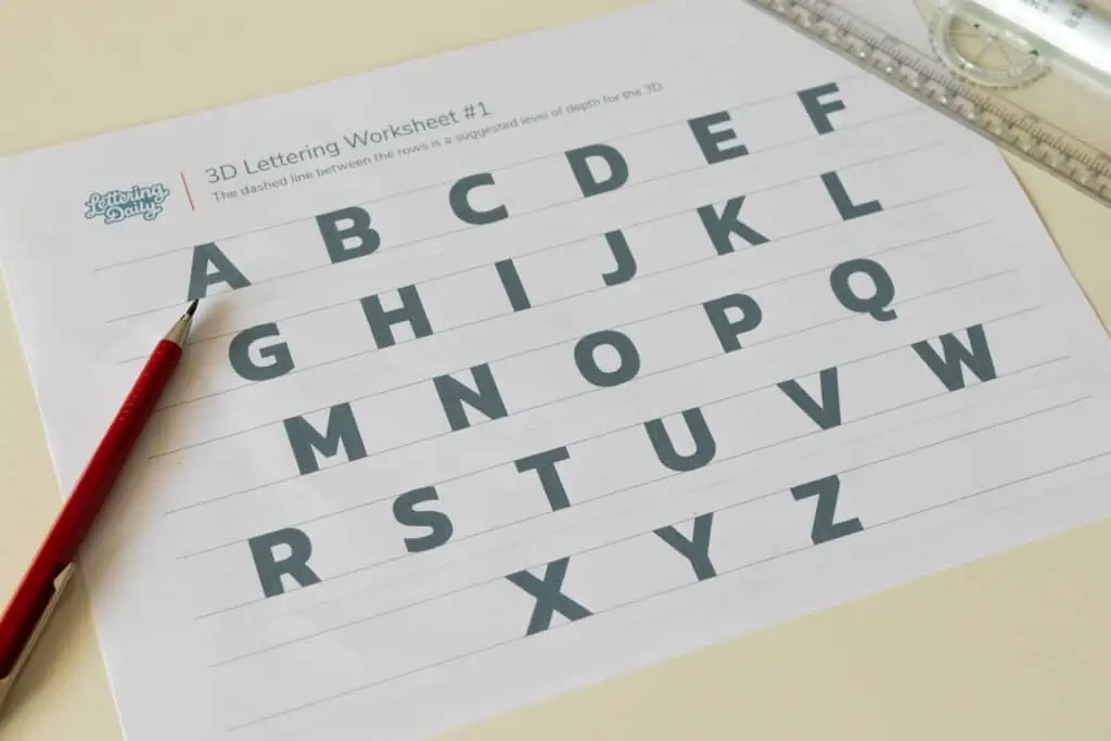
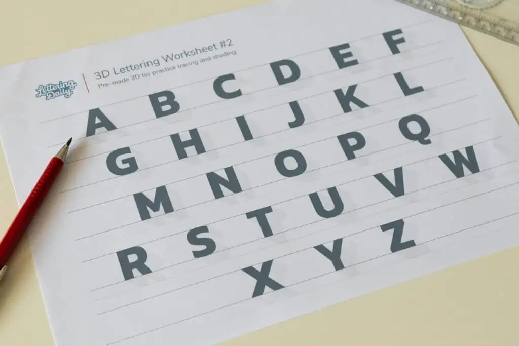
You can download these free worksheets (along with every other freebie) straight from the Lettering Crate.
To get instant access to the Lettering Crate, just drop your email below and follow the instructions.
You’ll receive a welcome email containing a link and a password.

Stay updated with my tutorials and get instant access to the Lettering Crate –
A growing library of free lettering & calligraphy resources that includes –
Tools needed to draw 3D letters
For this tutorial, you’ll need just a few basic lettering tools.
These are the tools that I’m using (links to Amazon) –

If you wish to add colors to your 3D letters you can also use these other tools –
Extra tips for 3D letters
Ok, now that we have the basics covered, we can start looking at different ways to style our 3D letters.
In this section, I’ll mention a couple of different things you can try out.
The first thing we’re starting with is shadows.
Adding shadows to your 3D letters
Shading your 3D letters is probably one of the best and easiest ways you can style your letters.
It gives more depth to the letter, and it just looks so much better with it.
To apply the shades, we just need to determine our light source.
Shades are usually applied on the opposite side of the light source.
If you are just getting started, keep things simple and shade only the lower parts of the 3D.
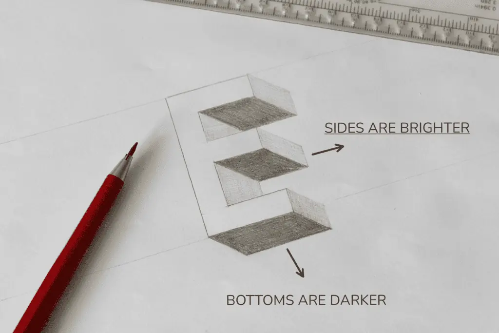
With rounded letters, you can try to create more of a gradient look.
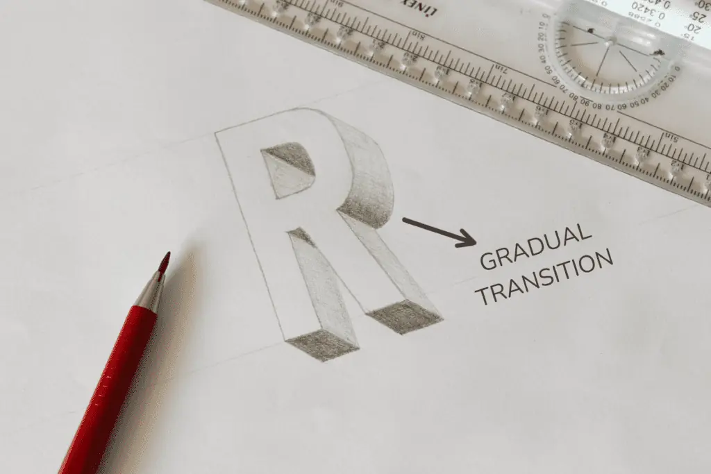
As it goes from the bottom, it’s darker, and as it moves towards the side, it gets brighter.
Once you get comfortable with a basic form of shading, you can start adding more detail to make it look even better.
Keep in mind that understanding shading takes quite some practice.
Playing with the direction of the 3D
Another cool thing you can do when doing 3D letters is playing with the direction of it.
Let’s say that if you have two words, you can point their 3D’s in the opposite direction.
You could also incline your letters and shoot the 3D in the opposite direction.
There are a bunch of different combos you can play with.
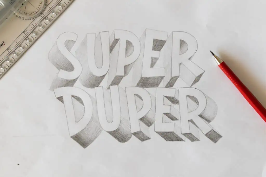
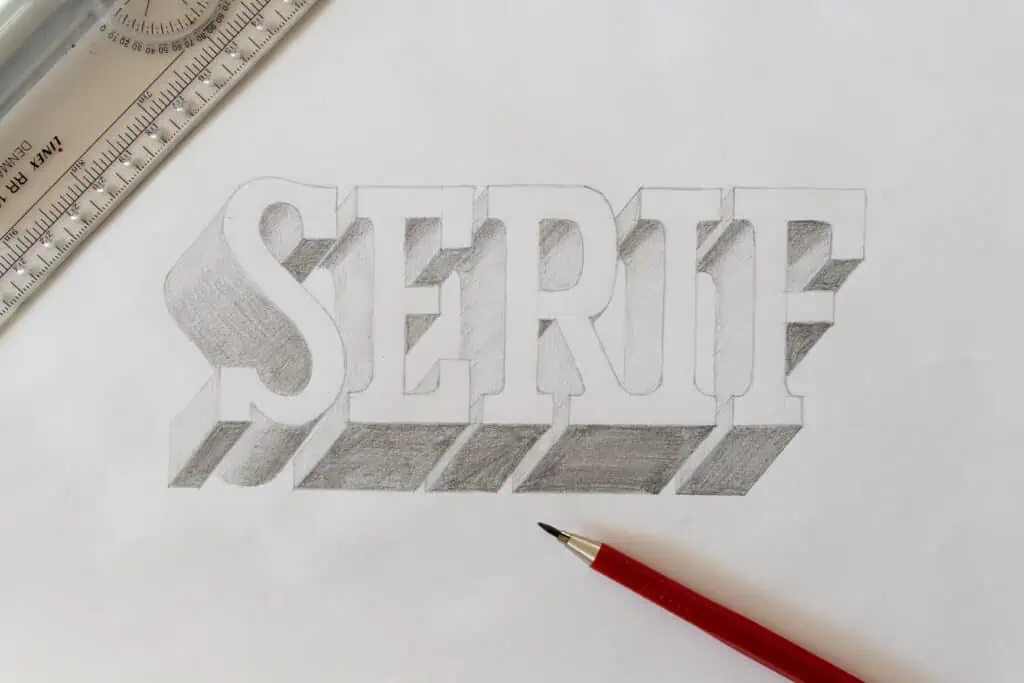
Applying the 3D effect to different lettering styles
As mentioned at the beginning of this tutorial, it’s best to start learning 3D on basic block letters.
Obviously, doing just basic block letters can quickly get boring.
Once you’ve learned how to apply a 3D effect to block letters correctly, you can start experimenting with different lettering styles.
Here is an example of a 3D effect applied on serif lettering –
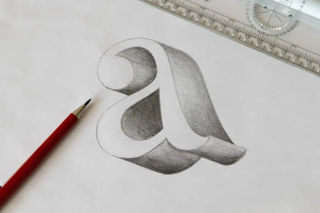
Here you can see another example of a 3D effect applied to script lettering.
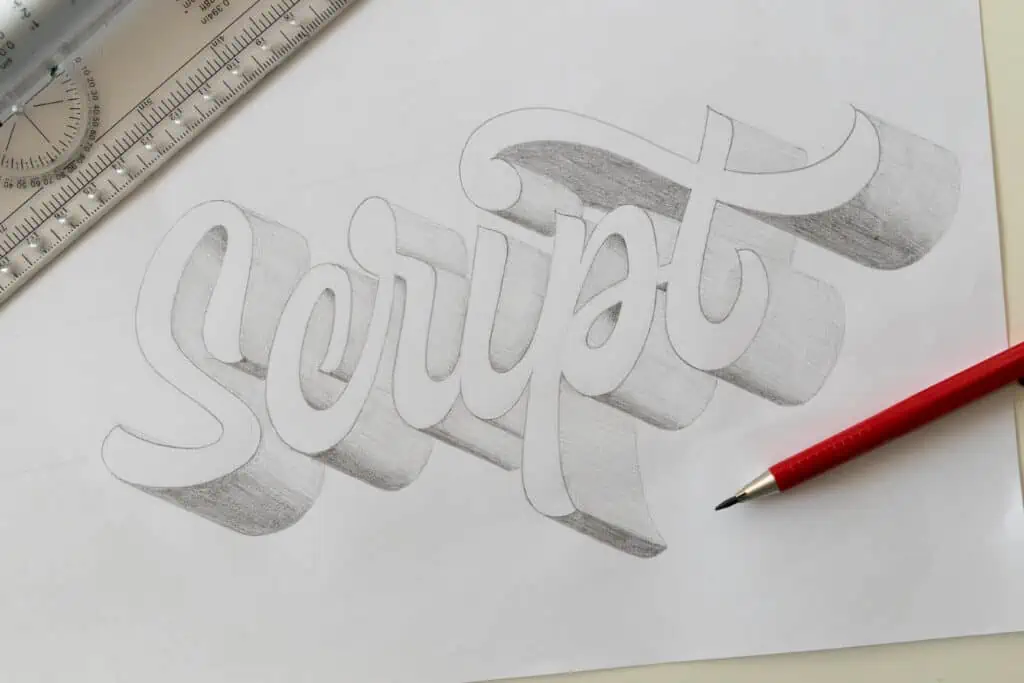
Script lettering is maybe a bit more challenging since most of the shapes are rounded.
However, I’m sure that with a bit of practice you’ll be able to do any style you wish.
Learn how to create a 2 point perspective lettering piece
You thought a 1 point perspective lettering looked cool?
Well then, let me introduce you to 2 point perspective lettering!
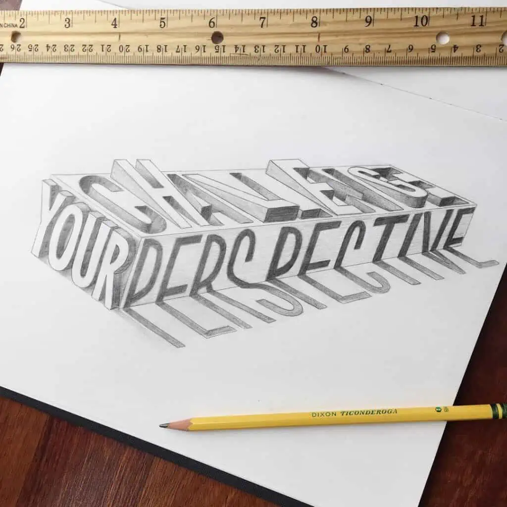
My friend Selina wrote an in-depth, step-by-step tutorial that will teach you how to create exactly that!
Important thing to remember about 3D letters
I often see that people refer to 3D as shadows or shading.
However, it’s not the same thing. In short, shadows are a dark area or shape produced by a body coming between rays of light and a surface.
I think that these two terms get confused and used interchangeably because they seem similar at first.
Here is one good tip on how to recognize a 3D letter from a shaded letter.
We have a shaded letter and a 3D letter next to each other.
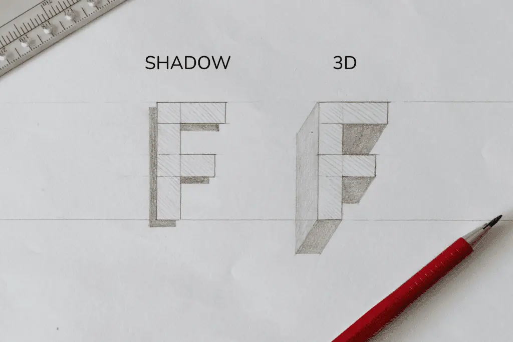
If you look at it closely, you’ll see that all the corners completely connect a 3D letter. On the other hand, the shaded letters are not connected and thus give the impression of them being cast behind the letter.
We can also apply various shading to our 3D letters to make them look even better.
But more on that later on in this tutorial.
Let’s proceed to the next section.
Final words
And there you have it, my friends!
I hope this tutorial will help you start practicing 3D letters.
The more you do it, the better you will get at it.
After a couple of times, you will understand how to draw a 3D effect on any object, and you won’t have to use any references at all.
Take it slow, don’t rush it, and as I always say, move gradually from easy to more challenging elements.
A house is only as strong as its foundations.
What lettering effect or style would you like to learn next?
Let me know by dropping a comment below.
Also, feel free to drop a comment if you have any wishes or suggestions for future tutorials.
Thank you for reading and until the next one,
Stay AWESOME!
Pin me!
About the author

Hey, I’m Max. I’ve been drawing and messing around with letters since 2011. I don’t have a formal art degree—my background is actually in the kitchen as a former chef and on the streets painting graffiti with my friends. Over the last decade, through a ton of trial and error, I somehow turned that obsession into a full-time gig. These days, I design custom logotypes for global brands and paint large-scale murals. I started Lettering Daily just to create the kind of honest, no-BS tutorials I wish I’d had when I was starting out. Stick around, and let’s draw some letters.


i did it at school and my teacher said that it was awsome
I’ve been thinking about doing this for awhile now. I have zero experience, but I think I’ve stumbled across the right person to learn from. 🤙🏼
You did a great job explaining.I have been struggling with the 3d art And now I know why thank you very much
Awesome! Thank you for letting me know, Stacy. Im so glad and i really appreciate your kind comment.
A great video clip taking the artist through the steps. Very encouraging for the beginner or someone who may need to brush up on their technique.
Thank you, Lorraine! Im really glad to hear that you liked it 🙂
Hi, Max; nice tutorial. We need to understand these technicalities before going anywhere with lettering! Thank you muchly!
Awesome! Thank you, Linda. Im glad you liked this tutorial 🙂
Thanks so much for the tutorial!
I really appreciate that you offer both video and written versions. I understand reading and looking at pictures better than watching a video.
Thank you, Patti! Im glad you like that 🙂 That’s exactly why. I realized that for some video is better but others prefer reading.
Ty