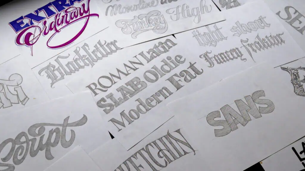
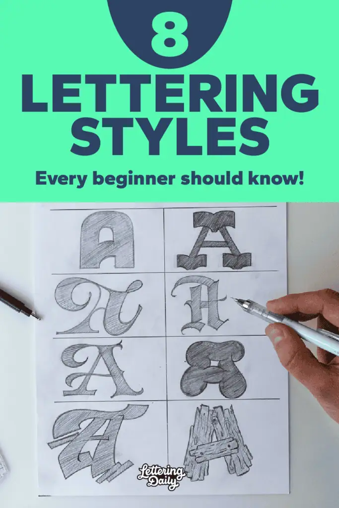
Letters come in all kinds of shapes and styles, and that’s exactly what makes hand lettering so much fun to explore. Different lettering styles give your work completely different vibes — from clean, minimal block letters to bold script, playful bubble letters, or dramatic vintage designs.
In this guide, you’ll find a practical overview of the most common lettering styles artists use today. This isn’t about strict technical classification — it’s simply a clear, beginner-friendly list of the styles you’ll most often see, try, and use in real projects.
For each style, you’ll see an example, common variations, and a quick tip to help you start practicing right away.
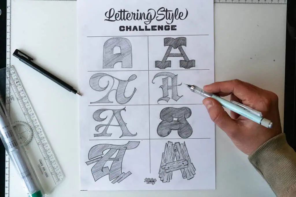
👉 Want to experiment while you read? Download the free Lettering Styles Challenge Sheet — it’s a blank grid that lets you test out each style on your own.
And if you want to go beyond experimenting and deepen your knowledge of different lettering styles, be sure to check out the Hand Lettering Style Database.
In case you prefer watching, I also made a video –

Without any further delays, let’s get to it!
1. Sans Serif (Block Letters)
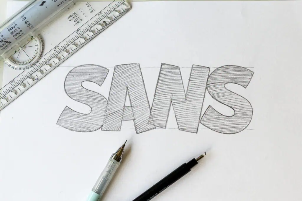
Sans serif letters — often called block letters — are clean, simple, and beginner-friendly. No decorative feet, just straight lines and smooth curves (though not always). The term comes from French, where “sans” means “without” — exactly describing this style of lettering.
Sans serif letters can often be perceived as basic or boring, but it’s their simplicity that makes them so adaptable. By making small adjustments to proportions, weight, or details, you can create a wide variety of looks.
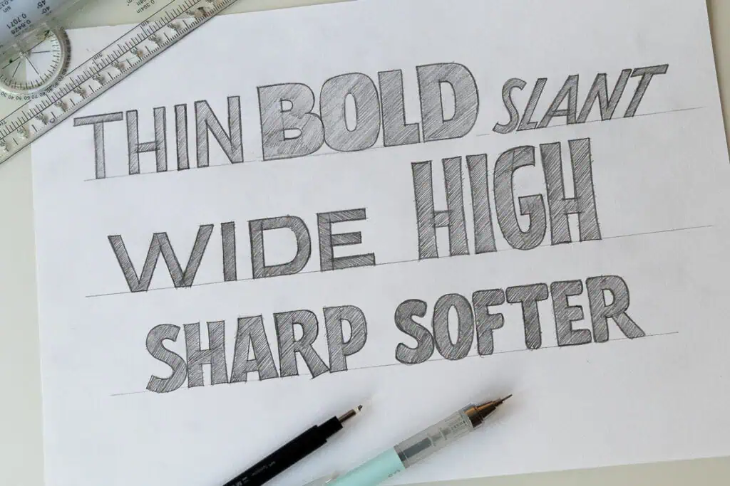
Variations:
- Different weights
- Proportions (tall, condensed, wide)
- Slants
- Rounded vs. sharp corners
- Playing with stroke endings
👉 Tip: The easiest way to practice is by dividing letters into individual parts and stacking them together to create the final form. This improves balance and consistency. (I call this the wooden board technique.)
I made a whole separate tutorial on how to draw block letters (Sans Serif) that you can check out.
2. Serif
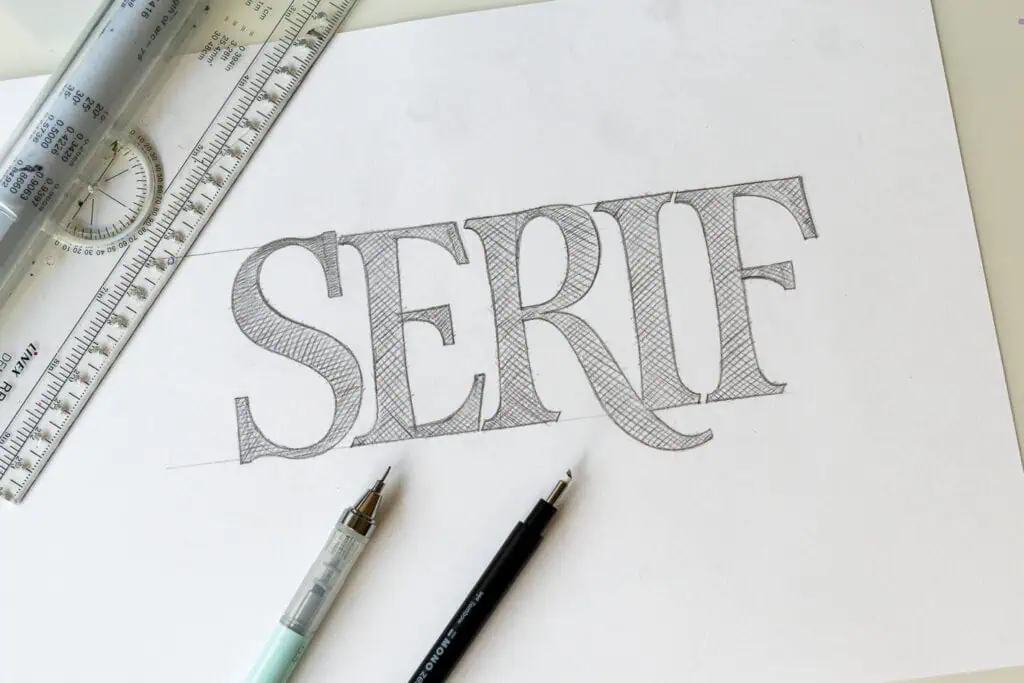
Serifs unlike sans serif letters have little decorative “feet” (extensions) at the ends. They feel more classic, traditional, and elegant.
Serif lettering shares the same skeleton as sans serif, but there are two main differences:
- The serifs — small decorative strokes added at the end of letterforms
- The contrast — not every stroke has the same thickness
With serif letters, you can achieve even more variations by changing both contrast and the style of the serifs. Each approach gives a completely different feel to your lettering.
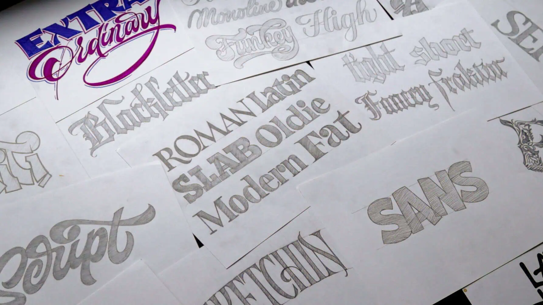
There are sub-categories for serif lettering styles. Some of them are –
- Roman Capitals – A very geometrical and timeless lettering style dating all the ways from the early days of the Latin alphabet
- Latin – A plaful style with medium level of contrast characterized with wedge-like serifs
- Slab serif – thick serifs resembling blocks
- Old style – influenced by Roman capitals these styles originated in the 15th century (check out Garamond). Features a diagonal stress for the thick and thins, a moderate contrast and brackatered serifs
- Modern – clean and elegant. Emerging in the 18th century (Bodoni, Didone). Features a vertical axis high contrast and flat thin serifs
- Fat face – high contrast between thick and thin, and yes, Fat Face is an actual term used in type
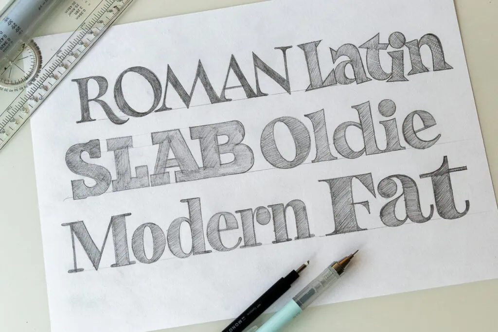
The cool thin is that you can mix and combine these different styles of serif letters with the variations i mentioned in the sans serif section. Suddenly you have a myriad of different looking letterorms.
👉 Tip: Study Roman Capitals (or similar serifed alphabet) to understand where thick and thin strokes go. Use the wooden board technique to construct letters precisely, then add serifs at the end.
For a deeper dive in letters, see my Anatomy of Type guide.
3. Script / Cursive
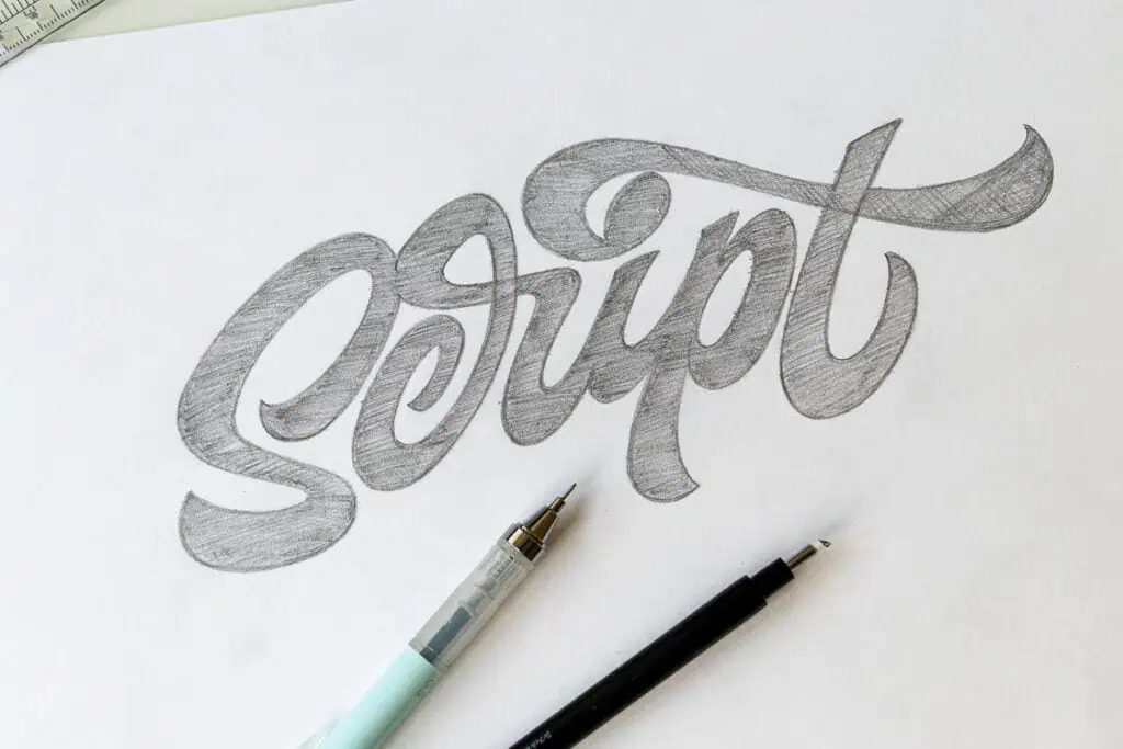
Script lettering mimics cursive handwriting — flowing, connected strokes that feel elegant or casual depending on the style. It’s often mistaken for calligraphy, but as I explain in my guide on the difference between calligraphy and lettering, script lettering is a different thing entirely.
What I love about script lettering is the wide variety of expressivness it offers. There are endless variations — though in my experience it’s trickier to master than serif or sans serif.
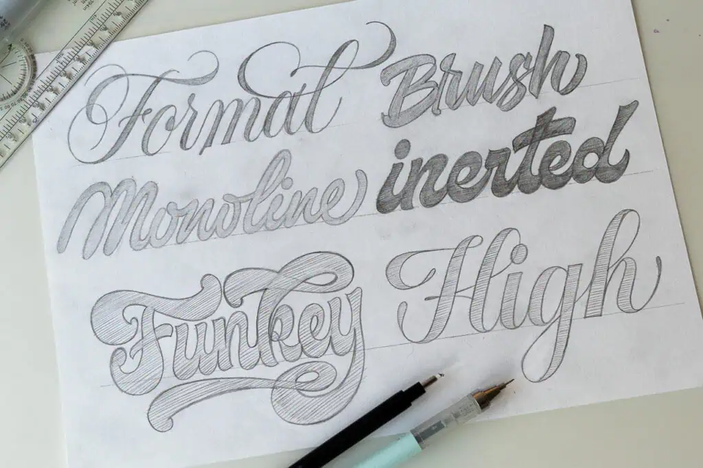
Variations:
- Formal (Roundhand) – a style that has it’s basis in a calligraphy style known as Roundhand or Copperplate
- Brush – a more casual style with the intention to mimic brush calligraphy
- Monoline → same stroke width throughout (simple + clean)
- Inverted weight – One of the golden rules for script lettering is to keep your upstrokes thin and downstrokes thick. Well, here you invert that concept
- Funky – probably a bit ambiguous as a term, this style reffers to script lettering that features bold and luscious strokes. Reminds me often of the script lettering used in the 60’s and 70’s
- High contrast – as the name says, the focus is on the high contrast between the thick and thin lines.
👉 Tip: One of the best lessons for script lettering was learning the basics of brush calligraphy. Understanding thick/thin contrast, rhythm, and balance skyrocketed my script skills.
4. Blackletter / Gothic
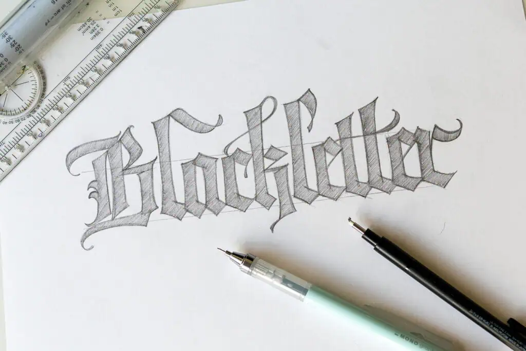
Blackletter (also called Gothic) is dramatic, angular, and instantly recognizable from medieval manuscripts and tattoo art.
Originally a calligraphy script from the Middle Ages, Gothic makes this list because of its strong visual identity. It communicates tradition, strength, and heritage — and it stands out sharply when contrasted with other styles.
Variations:
- Dense, narrow and more angular
- Shorter, wider and with softer curves
- More details and decorations
- Using other blackletter calligraphy scripts as a foundation
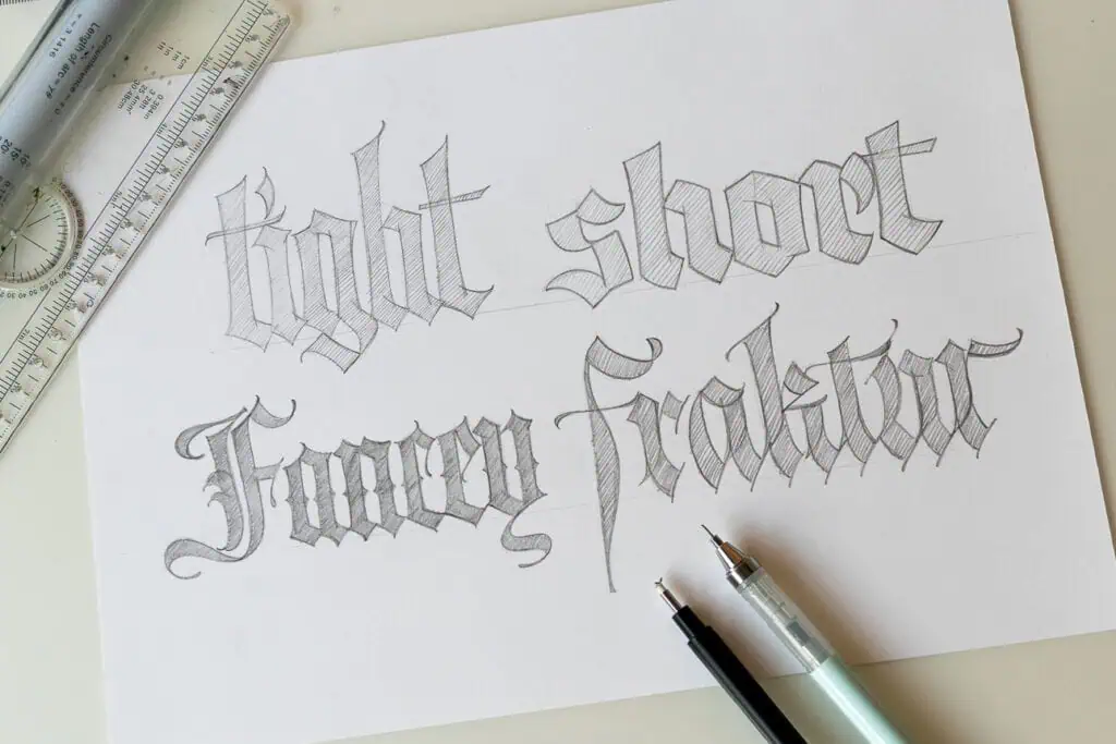
Keep in mind that you can always mix and match different elements with each other to create unique looking letterforms.
👉 Tip: Keep strokes sharp and rhythmic. Repeat angles to create texture. As with other styles, dissect letters into parts instead of drawing them whole.
For a better understanding of blackletter styles, check out the blackletter calligraphy guide.
5. Vintage Lettering
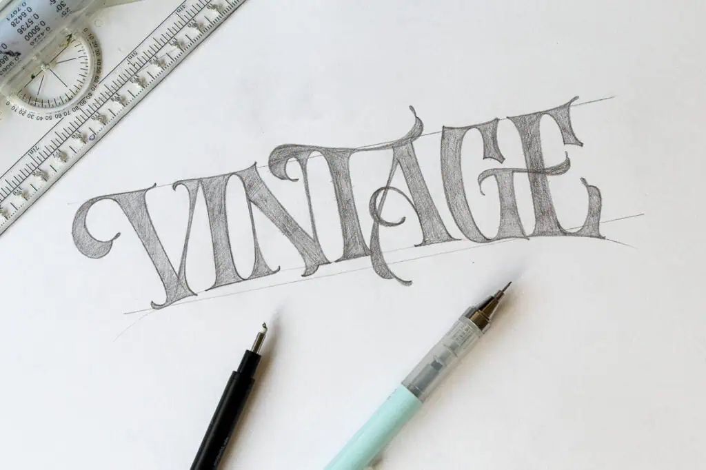
Vintage lettering (aka Victorian style) was popular in the 19th century and is inspired by ornate posters, ads, and signage from the era. Highly detailed and ornamental, it gives lettering a bold, nostalgic look.
Variations:
- Bold slab serifs with drop shadows
- Ornamental flourishes
- Western or circus-style vibes
- Sickle lettering
I highly recommend checking out @victoriantype on Instagram. It’s a dedicated page featuring exclusively vintage style lettering artworks from all sorts of lettering artists worldwide.
👉 Tip: Start with a simple serif styled lettering and gradually add details and ornaments. With vintage styles, less is often more.
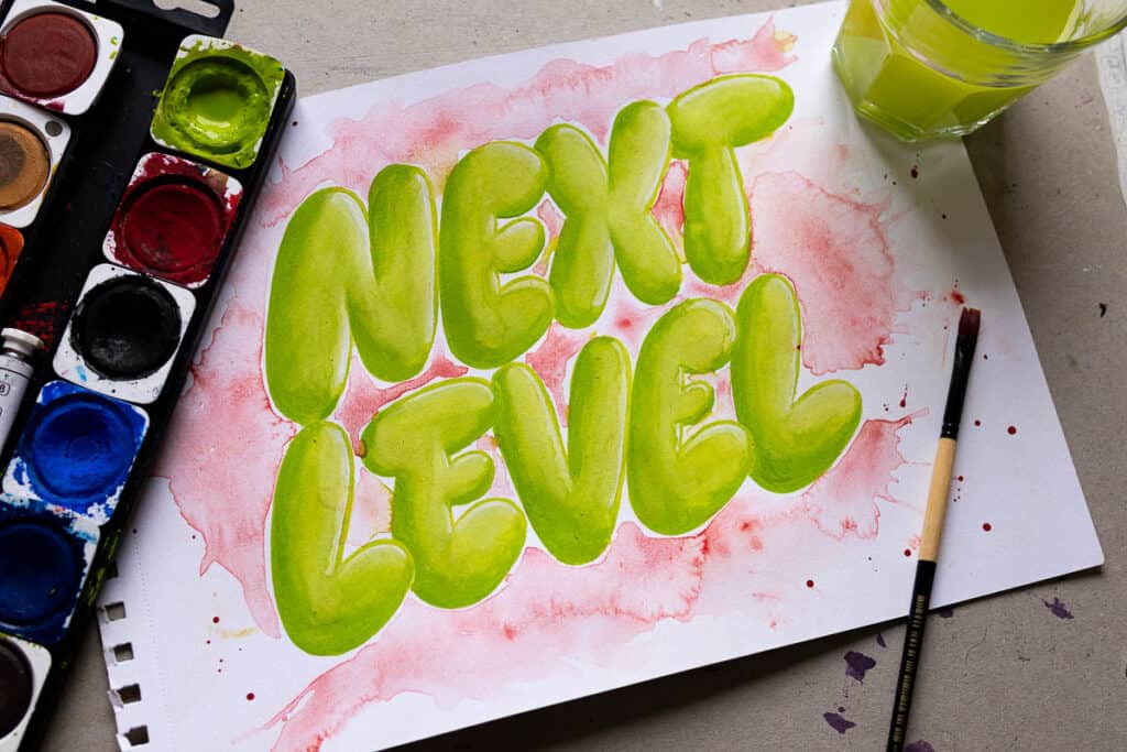
6. Graffiti
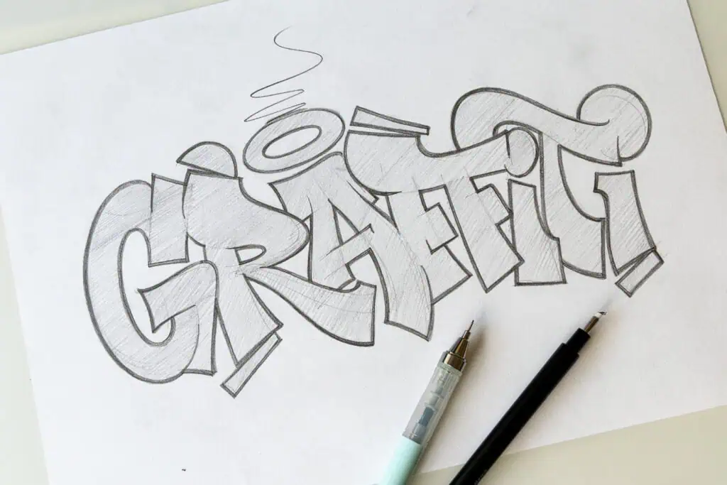
Graffiti lettering is bold, exaggerated, and expressive. Proportions are stretched, shapes are playful, and outlines are heavy.
With roots in the U.S. in the 1970s, graffiti grew into one of the fastest-spreading art movements in the world. What makes graffiti special is that it’s essentially lettering as pure self-expression.
Variations:
- Bubble-like graffiti vs sharp-edged
- Wildstyle (complex, interlocking) vs simple blocky forms
- Flat fill vs layered colors/outlines
👉 Tip: start with simpler shapes and forms and gradually see how much can you twist and bend parts of letters while retaining a level of readability.
7. Bubble Letters
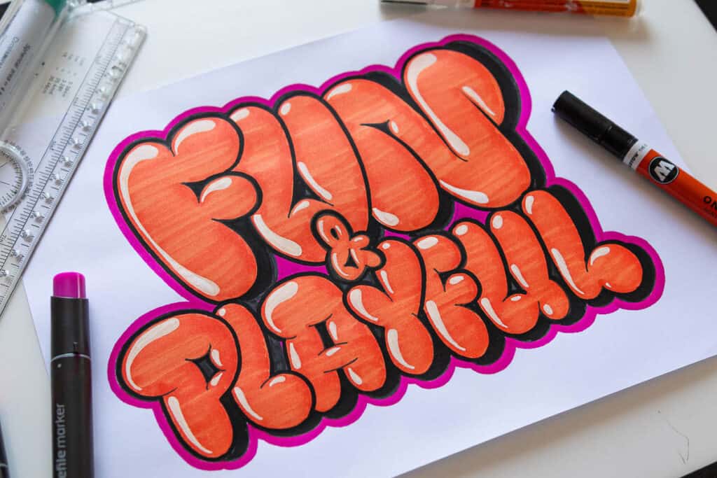
Bubble letters look inflated, soft, and playful. They’re beginner-friendly, instantly recognizable, and often considered a subcategory of graffiti. Recently, bubble letters have made a comeback as a top trend in typography and lettering.
Variations:
- Adding shadows and highlights
- Tall vs short/stubby
- More or less “puffy”
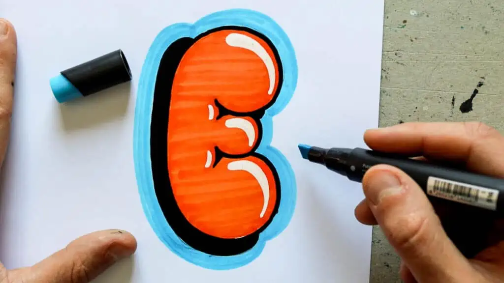
👉 Tip: Start with block letters, then round out every edge until they feel soft and inflated.
For a step-by-step guide, see my bubble lettering tutorial — which also includes free worksheets.
8. Illustrative Lettering
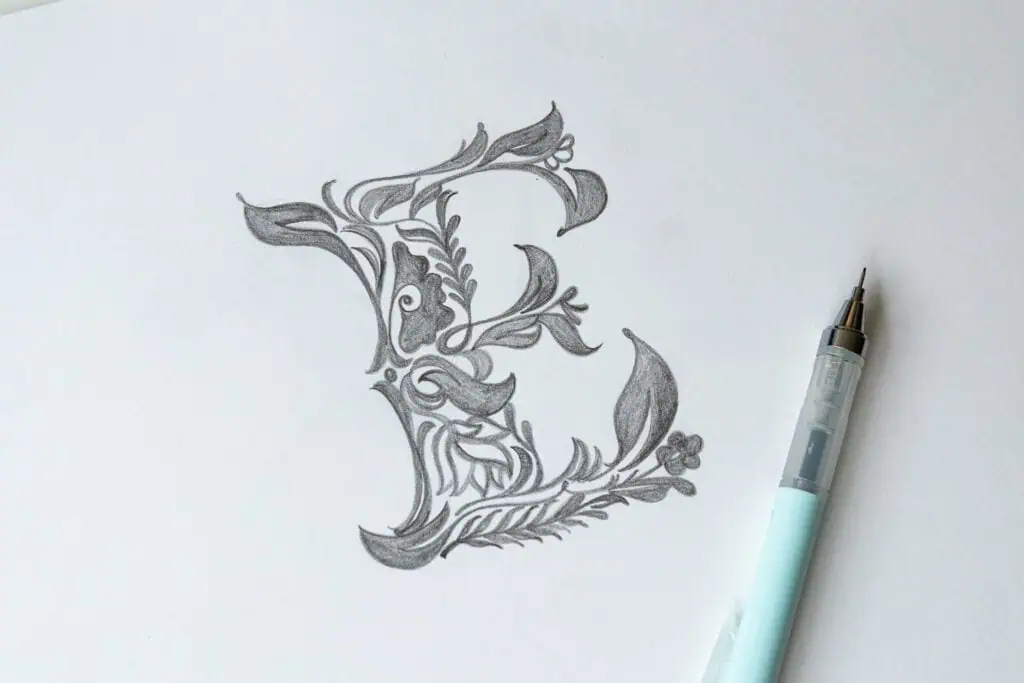
Illustrative lettering is considered any sort of lettering that in one way or another incorporates illustrations.
In illustrative lettering, letters become part of the illustration — turning into flowers, animals, or objects. It’s playful, imaginative, and highly flexible.
A few ideas for illustrative lettering:
- Nature-inspired (flowers, leaves)
- Object-inspired (letters shaped like food, tools, etc.)
- Characters or animals integrated with letters
👉 Tip: Start with a simple outline, then ask: “What could this shape become?”
For inspiration, browse Pinterest with searches like “floral lettering” or “animal lettering.”
Here are some artists that create some amazing illustrative lettering –
- @biksence
- @rylsee
- @Lexwilsontype
- @jimbobernaus
- @joey_bearbower
- @valerie_hugo
- @simonsaysletter
- @belindaskou
Final Thoughts
Lettering styles are simply different ways to shape and express letters — and the only real way to understand them is through practice. Don’t worry about mastering everything at once. Pick one or two styles that speak to you and start experimenting.
If you’d like a simple way to practice all of these styles, you can download the free Lettering Styles Practice Sheet.
And when you’re ready to go deeper and develop your own unique style, the Style Your Alphabet Workbook is designed to guide you step by step through that process.

Master Every Letter A–Z With 260 Creative Styles
The Style Your Alphabet Workbook is your hands-on guide to building confidence, creativity, and control in your lettering.
Inside, you’ll find:
✅ 260 hand-drawn letters to trace and remix
✅ 26 word examples to practice real-world design
✅ Beginner-friendly insights that teach you how to think like a lettering artist
I want to hear it from you, what is your favorite lettering style? Or, what lettering style would you like to learn next?
Be sure to drop a comment below!
Until the next one.

Stay updated with my tutorials and get instant access to the Lettering Crate –
A growing library of free lettering & calligraphy resources that includes –
Pin me!
About the author

Hey, I’m Max. I’ve been drawing and messing around with letters since 2011. I don’t have a formal art degree—my background is actually in the kitchen as a former chef and on the streets painting graffiti with my friends. Over the last decade, through a ton of trial and error, I somehow turned that obsession into a full-time gig. These days, I design custom logotypes for global brands and paint large-scale murals. I started Lettering Daily just to create the kind of honest, no-BS tutorials I wish I’d had when I was starting out. Stick around, and let’s draw some letters.

All these drawling tips are great thank you!
All of this is very helpful for drawling all sorts of fun letters! Thank you!
Thanks for all of the ideas.
I’m trying to figure out a way to write the word BAKER or Baker so it looks like bakery items. Any suggestions?
Wish to paint leather jacket with lettering and images in ‘biker ‘ style.
Have a stencil for one image but applying a stylish name and application is new to me. Any advice on paint choice and method ?
Maybe you could try with some acrylic paint?
i will use these all somtime in my life i guess
its good for grade 4 studying: )?
I dont see why not 😀
Can you do that, but with T?
Can you please elaborate? What do you mean exactly?
Does the Ray Dunn style have a special name?
Who is Ray Dunn? 😀
WAHAHHAHAHA sorry it was funny for me UwU
Do you know who he is? 😀
I think I’m Most interested in between sheriff and I gave. Any examples?
This was really informative and excellent for someone who wants to start hand lettering and doesn’t know how and where to start. Great tips and ideas to look at. Waiting for more of such articles.
Thank you for the kind words! We will make in-depth tutorials on each of the styles mentioned above as well as other step by step tutorials, so stay tuned 🙂
Good information.
What is Roman lettering??
Thank you William! Are you perhaps talking about Roman Capitals?
Check out this link here – https://en.wikipedia.org/wiki/Roman_square_capitals
Tq for the valuable information….
You are welcome!