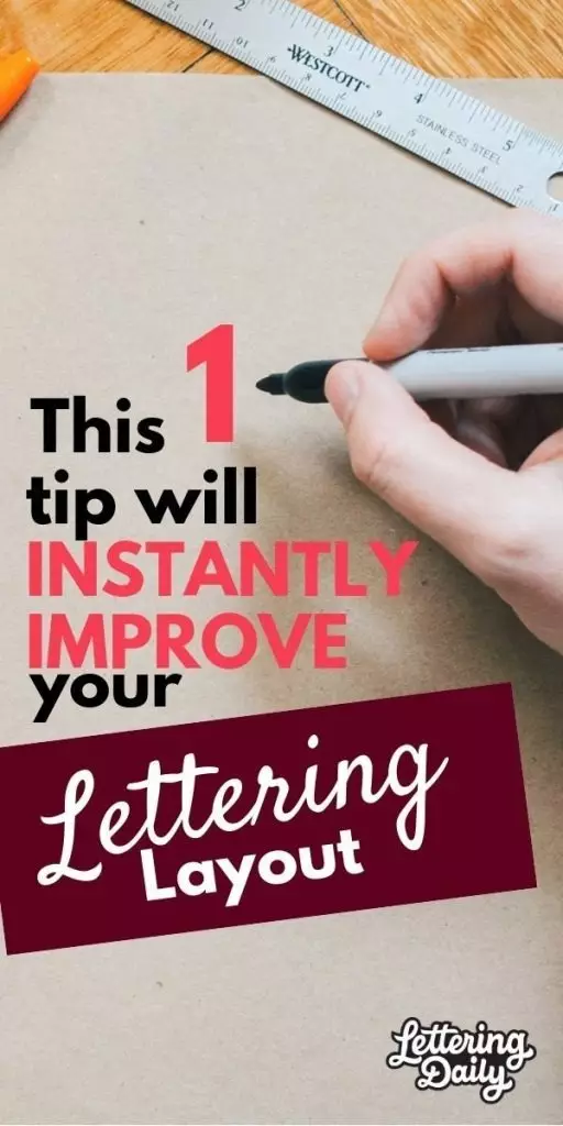
Are you looking for that one quick and easy trick to step up your hand lettering layouts?
Well,
This might in fact be something you are looking for!
This small and simple trick will help your hand lettering composition in no time, and on top of that, I will guide you throughout the process step-by-step.
Here is a quick overview of what we are going to talk about today-
- Tools needed
- 2 Fundamental rules for a good layout
- The easy tip that will elevate your hand lettering – step by step
Without any further delays, get your tools out and join us for another tutorial.
What tools do i need for this tutorial?

This time we keep it very simple, you will need –
In case you wish to roll with an iPad, that’s totally cool 🙂
A few compositional fundamentals to note!
I know,
You are eager to find out what is this tip, and you are wondering why is this so important.
Believe me, it will help you a lot!
Before we jump right in with the tip, i wanted to bring to your attention a few fundamentals to keep an eye on every single time you will try to create a hand lettering layout.
Composition in general is much more complex and includes other aspects that we won’t mention simply because those are elements that you won’t be needing at the moment.
The two things i want you to keep an eye every time you work on your lettering composition are – balance and structure.
Understanding balance and how to use it in your lettering?
Ok, i will try to keep this as simple as possible!
Let’s take a simple geometrical shape in order to explain the concept of balance – a square in this case.

We draw a square on a piece of paper and we split it in half. Now we have to equal shapes on each side, the weight is distributed equally on each side.

Now let’s imagine the following shape (not sure how to call it :D)

If we try to split this shape in two pieces we can immediately notice that there is a lack of balance, and that there is more weight on the right side than the left one

Now, when you are creating a hand lettering piece you shouldn’t try to achieve 100% perfect balance and go crazy over it, but you should definitely try to come as close as possible.
QUICK TIP- an old school quick tip for determining good balance in your lettering is to squinch your eyes when you look at it until the point your vision gets blurred. By doing this your mind will focus only on solid shapes rather than the details, which will help you determine whether the piece is balanced or not. For those using an iPad or Photoshop it gets even easier – simply add some gaussian blur to it.

Just keep in mind the left and the right side when working on a piece, that alone will already help you a lot. Then again, with time and practice this will just become a part of your routine till the point you won’t be even thinking about it 🙂
The compositional structure for lettering
When we talk about hand lettering layout we usually refer to pieces with at least 2 + words. This could be a quote, shower thought, song lyric or whatever comes to your mind.
The lettered words sit next to each other but also on top of one another.
We always want to maintain the readability level, as that is an essential aspect – so you don’t want to squash the words too much together
However,
on the other hand you don’t want to increase the space too much, because by doing that you lose the cohesion of the composition.
Always considers your ascenders and descenders, and use flourishing to your advantage to fill in those white spaces.
As always, with more time and practice you will quickly start to develop a feeling for a good structure. Have a look at some examples below
And now, the moment you all have been waiting…
THE SUPER DUPER MEGA AWESOME LETTERING LAYOUT TIP!
This tip is based solely on personal experiences, and it could be that there are other more efficient ways of creating a hand lettering layout.
Nonetheless, this method has been proven to be quite efficient especially with beginners who are struggling with getting the final layout.
The technique is quite simple and everyone should be able to do it.
Get your quote ready or whatever it is that you wish to letter, and let’s start with it step-by-step
Step 1 – getting ready
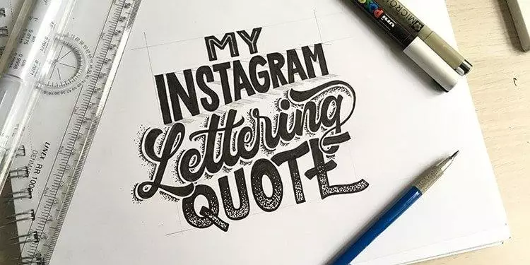
So for this occasion i’ve decided to pick a shorter quote in order to keep it simple.
Due to the lack of current creativity the quote will be –
My Instagram Lettering Quote – pretty original right? 😀
Step 2 –
Write it down with your normal handwriting

Simple as that, just write it down with your normal handwriting (avoid cursive)
Step 3 – Box them!
Now things start to get interesting, roughly draw a box around each of the words. This will help you visualize the needed sizes which will come in handy for the next steps.

Now, in my case i can see that i have 2 smaller and 2 larger boxes, so let’s move on to the next step.
Step 4 – time to play with the boxes!
As you probably know by now, hand lettering has its essence within sketching – exactly why the pencil is one of your most powerful tools.
However, now instead of sketching out the quote itself, we are just going to play around with the previously drawn boxes.
We are starting with a few simple layouts and tweaking them one by one.

Im roughly recreating the same sizes that i’ve outlined in the previous step, and placing them in various positions
– while still keeping an eye on both my left and right side (remember what we’ve talked earlier)
Step 5 – tweak the boxes
Basically each of these boxes can be tweaked in countless ways. You can arch it, flag it you name it.
Here are a few rough examples of common ways you can tweak these boxes.

Now its time to assemble the boxes so its balanced both from the left and right side.
You can up with several variations until you don’t find the one that you like the most.
We are still working with just a pencil at this point, brainstorming and planning our work ahead.
If you lack experience i would suggest you to start simple, perhaps just tweak one box and keep the others straight one under the other, and gradually start adding tweaks in different places.

As you can see,
i went ahead and created 3 different potential layouts after i tweaked some of the boxes. As im uploading this article i realized that the photo above is a bit crappy, and you can’t really see the 3rd layout that good but that’s the one i’ve decided to continue with 😀
QUICK TIP – when you hand letter quotes, lyrics etc. you always have connecting words such – the, an, a, of, etc. those words, being they are shorter and less important, they usually get less attention while the main words are bigger and more prominent in the final piece. (Something Kristin referred in her article)

Step 6 – Start filling the words
At this point you have your hand lettering layout ready and its start to create the actual hand lettering.
I would suggest to re-draw the selected layout on a clean sheet ver very lightly – this will allow you to easily delete the boxes.
Another way would be by using tracing paper, which is a great tool for this kind of work.
In case you don’t have any tracing paper, baking paper is an awesome home hack that could replace that 😀

I continued with the rough sketching and with the inking (using the Sakura microns, they are just so awesome!)
After we have our piece laid out and filled in, we can proceed with some details, such as shadows or some perspective – yup, we cover those tutorials as well 🙂

And that is basically it ladies and gentleman’s!
Start simple, explore the field and raise your bar bit by bit. Lettering and calligraphy are a beautiful form of art that require time and practice.
Hopefully this simple layout trick will help you visualize and plan better your artwork.
REMEMBER – it’s better to spend more time planning out your work than just rushing in and hoping for the best 😀
Until the next time,
Stay AWESOME!

Stay updated with my tutorials and get instant access to the Lettering Crate –
A growing library of free lettering & calligraphy resources that includes –
Pin me!
About the author

Hey, I’m Max. I’ve been drawing and messing around with letters since 2011. I don’t have a formal art degree—my background is actually in the kitchen as a former chef and on the streets painting graffiti with my friends. Over the last decade, through a ton of trial and error, I somehow turned that obsession into a full-time gig. These days, I design custom logotypes for global brands and paint large-scale murals. I started Lettering Daily just to create the kind of honest, no-BS tutorials I wish I’d had when I was starting out. Stick around, and let’s draw some letters.

Muito útil esse tutorial com essas dicas das caixas!
Gracias! 🙂
I’m confused how tracing/baking paper helps if where you want your final product is NOT transparent. If I put my card stock of the tracing/baking paper, I can’t see any lines??? What am I missing?
Tracing paper helps to refine the sketches. It’s not made for creating a final product of the design.
Super super good! Loved it! Congrats.
Thank you! Glad you like it 🙂
Thank you for this great tutorial. Helped a lot! But I’m missing a step between 5 and 6 where we could see how you fill the single letters into the grid of a box because at this point i can’t really see that the words have the size of the boxes. The word “lettering” for example has a grid of 8 little boxes but it’s a word with 9 letters. How do you know how much space you need for every letter?
Hey Natasha, I’m sorry for not addressing that in the tutorial – and the reason for that is that it will always be different depending on which word you are trying to letter. Spacing between the letters depends on the individual letter pair – some letters sit closer together while others are further apart. I will create a separate tutorial that will cover the topic of spacing and kerning more in-depth. I would recommend sketching lightly and gently and add more layers each time you go over it – this way if you mess up (for example, not enough space) you can easily delete it and fix it quickly. Let me know if you have any other questions, I’m always happy to help! 🙂
This amazing tip turns lettering from writing into design – the perfect missing ingredient and simple too. I tried it straight away and was very happy with the result – my quote – ‘Don’t forget practise makes perfect – of course!
Thank you, Joanna! Really happy to hear that you found this tutorial useful. It’s all about planning your work ahead instead of just rushing straight into it. The more you plan it out the better it will look 🙂
I am glad i ran across your site. I too like how you present the learning. It seems natural to you but for us beginners??? Its all foreign haha. Thank you for your time and teachings.
Thank you, Victoria! It’s all about time and effort, the more you do it the easier it will become 🙂
Thank you very much..
I’ve been practicing lettering for some time,
I’ve found here fantastic tips to put it into practice.
You are super welcome!
Thank you very much.
I’ve been practicing lettering for some time, I’ve found here fantastic tips to put it into practice.
Thanks for a great tip to share with my students.
You are most welcome! 🙂
Také velice děkuji, supr článek!
Loved it… As usual you have very easily explained the entire process… And the examples that you gave for balancing were the ones that popped up in mind…coz those artists have awesome work… Thank you so much for this tip tutorial. I really really appreciate your efforts 🙂
Thank you Ekta! Glad you found this tutorial helpful 🙂
You have really kept it so simple for easy comprehension. Loved it.
Thank you! I really try to do this in every tutorial 🙂 cheers!
This is SO helpful! Thank you for this post!
You are welcome Alexandra! 🙂
Man oh man I just love the design and have great respect for the font guys and lettering seems to unite those two trades in such an enticing and unique way… I wish people would start paying more for this form of art so I could abandon my graphic design career to pursue one of the lettering artists! Well, kind of!
Thank you Simon! i really appreciate the kind words. Lettering is making a big comeback! it’s getting more and more popular, and if you wish to pursue your career as a lettering artist i think its definitely doable.
It requires A LOT of time and effort, but if you are dedicated there is no reason you couldn’t make it 🙂