
When you see a stunning piece of lettering on Instagram or Pinterest, it’s easy to assume the artist just sat down and drew it perfectly in one go. After years of working as a professional graphic designer and lettering artist, I can tell you the truth: it’s never that simple.
Great lettering isn’t a result of luck; it’s the result of a disciplined process.
In this tutorial, I’m taking you behind the scenes of my personal workflow. I’ll show you how I move from a messy pencil scribble to a polished, professional composition. We aren’t just “writing” here—we are building, refining, and “pimping” our letters using layers of tracing paper and technical logic
Hand Lettering Tools I’ll Be Using For This Piece
Here’s a quick list of the lettering tools i’ll be working with for this project. If you’re just starting out, check out the essential hand lettering tools guide.
- H, HB & 2B Lead pencils
- Ruler, Eraser
- 0.5 Tip black pen
- 0.5 Gold Gel pen
- A4 sheets of sketching paper (or your sketchbook),
- A4 sheets of tracing paper,
- A4 sheets of 180gsm white paper (artist quality used for watercolor)
Step 1: Concept, Style & The “Scribble”
The process doesn’t start with a pen; it starts with a vision. First, choose a word or phrase that inspires you. But don’t just write it down—think about the vibe you want to project.
Is the quote aggressive and bold? Or is it elegant and flowing? This is where you decide your direction. I usually start by “Scribbling” with a light hand (HB pencil). I’m not worried about perfection here; I’m looking for the “shape” of the composition.
Pro Tip: Choose Your DNA Before you get too deep into the sketch, you need to decide on a style. I typically choose between a clean Sans-Serif, a classic Serif, or a fluid Script. If you aren’t sure which one fits your quote, check out our Hand Lettering Styles Guide to see the technical differences.
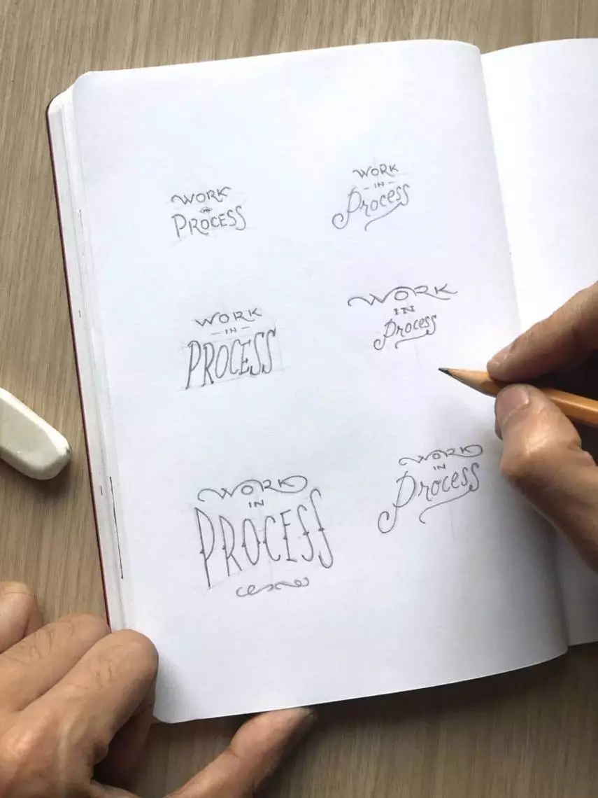
During this “Scribble” phase, I’m looking for two things:
Ligatures: I look for “natural connections” between letters where I can create a unique rhythm. Ligatures make a simple composition look extraordinary, but only if they feel effortless.
Hierarchy: Which words are the most important? I make those bigger or bolder.
Step 2: Structuring Your Composition
Now that you have your “hero” word or phrase, you need to decide on the structure. This is where you choose between consistency and contrast.
The Style Choice There are two ways to approach this:
- Uniformity: You can use a single style (like all Bold Block or all Script) for the entire piece. This creates a clean, cohesive look that is often more powerful than a busy layout.
- Pairing: You can mix styles to create “hierarchy”—using a bold style for the important words and a simpler style for the rest.
Breaking the Lines Regardless of whether you use one style or three, if your quote is more than two words, you should experiment with breaking it into multiple lines. This helps create a “compact” structure that feels intentional rather than accidental.
The “Skeleton” Guidelines Even at this messy stage, I use light guidelines and basic boxes. These aren’t for the final shapes yet; they are just to ensure that my lines are straight and my letter heights are consistent.
Step 3: The Detailed Sketch (Scaling Up)
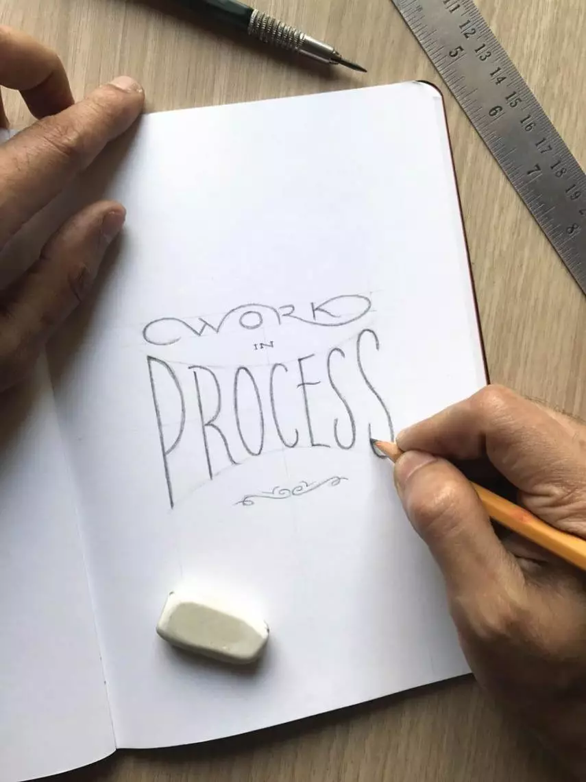
Once you’ve picked your favorite scribble, it’s time to bring it to life. I never stay at the “scribble” size—I scale up to at least 8–10 cm in width. For complex pieces with shadows or deep textures, I’ll even go as large as 15–20 cm.
Working larger gives you the “breathing room” to see if your letter spacing (kerning) actually works.
The Technical Build
Explore & Decorate: This is the phase to play. If the composition feels empty, I might add flourishes or decorative ligatures to fill the gaps. Use your eraser freely—think of this as “sculpting” the letters until they feel right.
Set Your Foundations: Use a ruler to draw precise guidelines. These aren’t suggestions; they are the boundaries that keep your letter heights and slant consistent.
The Skeleton First: Even at this size, I start with light pencil lines. I’m looking for the “bones” of the letters before I add any weight.
Step 4: The First Tracing (Refining the Details)
Many beginners make the mistake of inking their first sketch directly. If you do that, you lose the chance to fix the small errors that kill a composition. Tracing paper is my secret weapon. It allows you to “level up” your sketch without losing the energy of your original idea.
How to Refine Your Work:
- Set Your Center: If your layout is symmetrical, use a ruler to draw a vertical and horizontal center line on your tracing paper. Align these with your sketch.
- Focus on the “Meat”: Place the tracing paper over your Step 3 sketch. Using an HB pencil, start refining the weight of every letter. This is where you ensure your stems are consistent and your curves are smooth.
- Fix the Spacing (Kerning): Look at the white space between your letters. Is it balanced? If a word looks too cramped, simply shift your tracing paper a few millimeters and redraw the letter in its new, better position.
- Fill the Forms: Once the outlines are perfect, lighty shade in the letters. This is crucial—you need to see the “black and white” balance of the page to know if the weight is truly correct before you commit to ink.
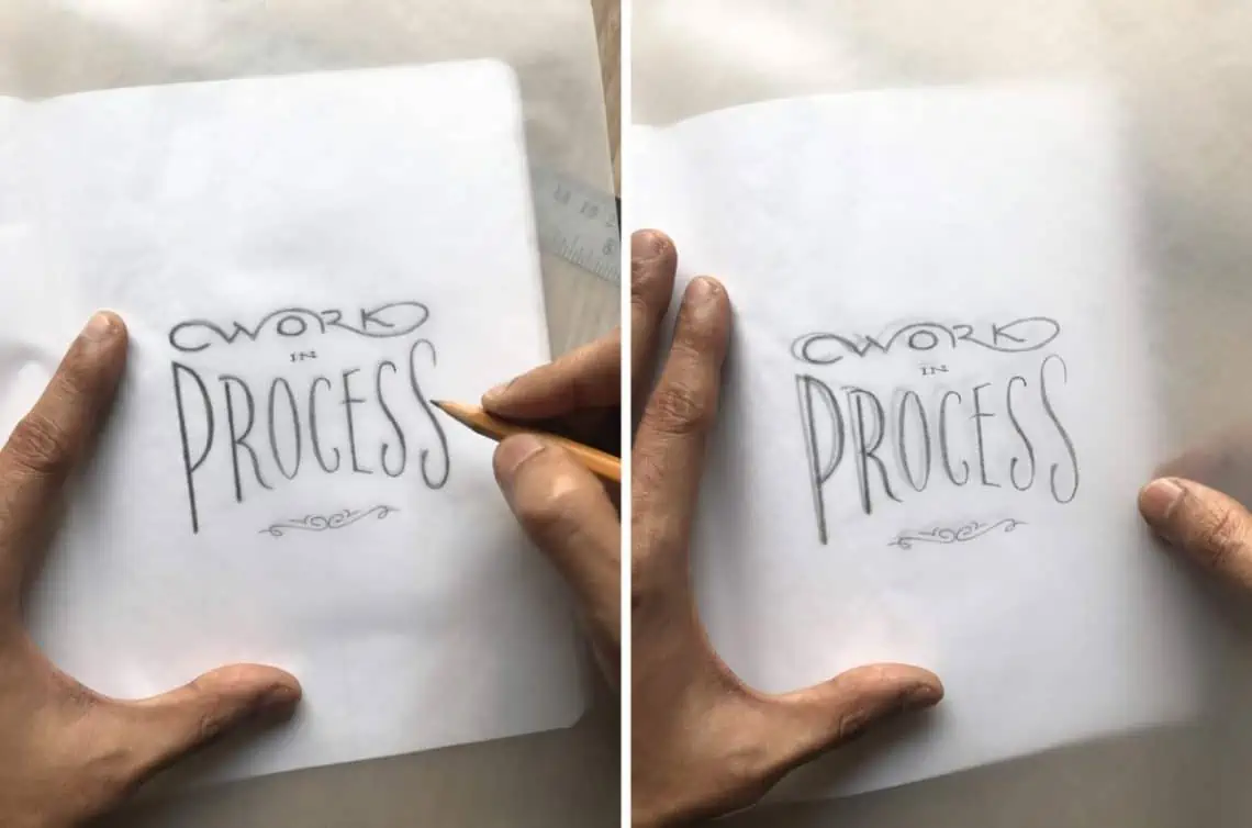
Pro Tip: Don’t be afraid of the ruler here. I often measure the width of my main words to ensure they are perfectly centered. Precision at this stage makes the final inking effortless.
Step 5: The Final Tracing & The “Reverse” Trick
This is the final checkpoint. We are going to create a perfect master copy and prepare it for transfer. This step is divided into two parts: the “Front” for perfection and the “Back” for the transfer.
Side A: The Master Polish
Lay a fresh sheet of tracing paper over your first tracing. Again, use your center lines to keep everything aligned.
Precision Lines: Use a sharp HB pencil to create the cleanest possible outlines. If a curve isn’t smooth or a stroke looks wobbly, fix it now.
Correction on the Fly: This is your last chance to fix kerning (spacing). If a letter feels slightly off, don’t erase it—just slide your top tracing paper a few millimeters left or right until the spacing looks perfect, then draw it.
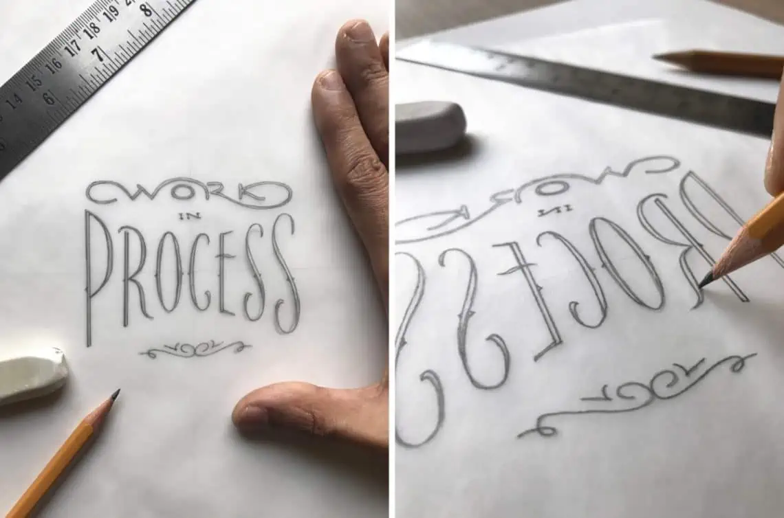
Side B: The Graphite “Carbon”
Now, flip your tracing paper over. You’re looking at the back of your work.
- Coating the Back: Using a softer 2B pencil, draw precisely over all your lines again on this reverse side.
- The Goal: You are essentially creating your own “carbon paper.” The soft 2B lead on the back will eventually be pressed onto your final paper, transferring your design perfectly.
Don’t Panic: When you look at the back, your lettering will be reversed and might look “wrong” or poorly spaced. Ignore that—just focus on covering every single line with that soft 2B graphite.
Why this is a “Pro” Move:
Using this method keeps your final paper (the expensive stuff) completely clean. You won’t have to erase a single line on your final artwork because the only thing hitting that paper is the perfect, refined design you’ve built through these layers.
Step 6: The Transfer (The “Clean” Reveal)
For the final piece, I’ve chosen a thick, 180gsm artist-quality paper. I love using watercolor paper because the subtle texture adds a professional depth that you just can’t get from standard printer paper.
Now, we transfer the design. This method is brilliant because it leaves your final paper pristine—no eraser marks, no smudge ghosts, just a perfect guide for your ink.
How to Transfer:
- Alignment & Security: Place your final tracing (Side A/the “clean” side facing up) onto your white art paper. Once it’s perfectly centered, tape the top two corners with tiny pieces of masking tape. You need it to be secure—if the tracing paper shifts mid-transfer, your lines will double up.
- The Burnish: Take a hard H lead pencil and draw over your lettering outlines with firm, consistent pressure. As you press down, the 2B lead you applied to the back in Step 5 is pushed onto the art paper.
- The Peep Test: Before you remove the tape entirely, lift the bottom of the tracing paper to check your progress. If any strokes didn’t transfer clearly, lay it back down and go over them again.
The Result: When you peel back the tracing paper, you’ll see a light, perfect graphite “ghost” of your design on your expensive paper.
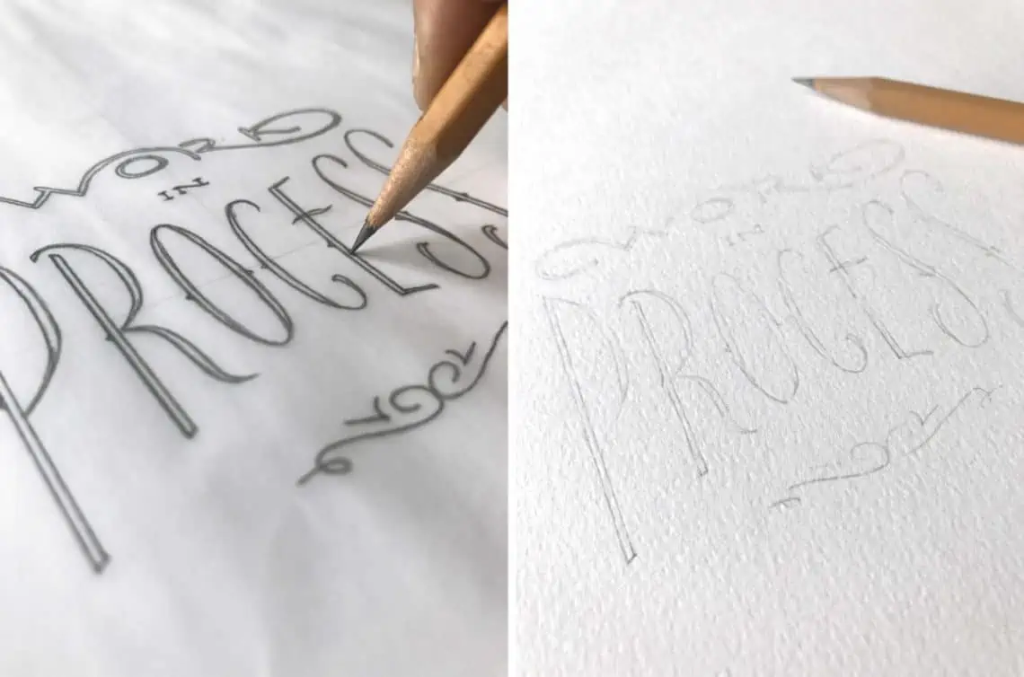
Pro Tip: Don’t press too hard with the H pencil. You want to transfer the lead, not deboss a permanent groove into your art paper. Keep it firm but controlled.
Step 7: Final Inking (The Reveal)
If you’ve made it to this stage, you’ve already done the hardest part. You have a perfect, light graphite guide on your final paper. Now, it’s just about the execution.
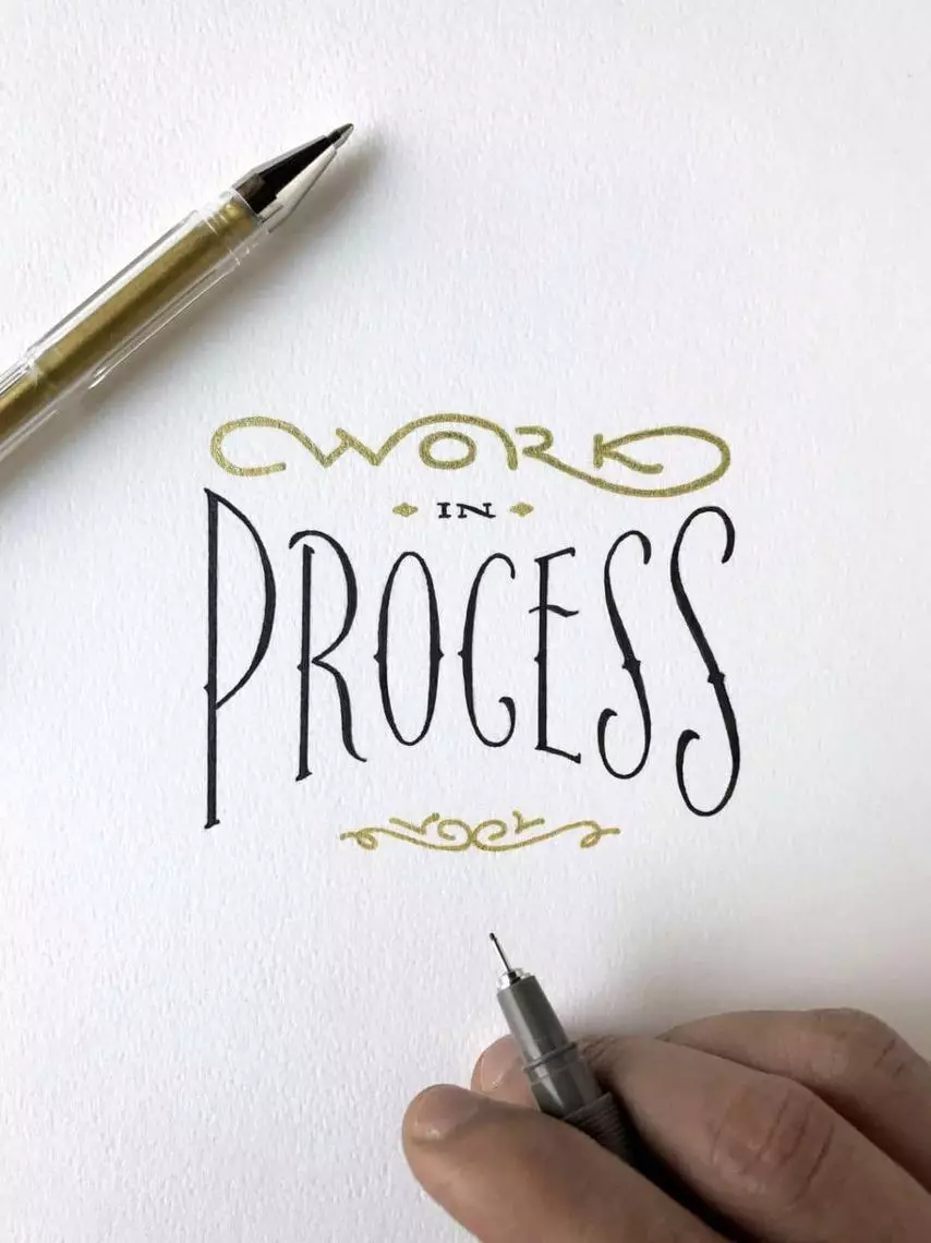
I love using a Black and Gold combination. It’s timeless. I typically use the gold for the smaller, supporting words and black for the “hero” lettering, but the choice is yours. If you don’t have a gold metallic pen, any vibrant color like red or deep blue will work beautifully against the black.
The Inker’s Protocol:
Chase the Light: I always do my final inking during the day near a window. Natural light helps you see the true saturation of the colors and ensures you don’t miss any tiny gaps in the ink.
The “Bridge” Technique: Never rest your palm directly on the paper. Even the light graphite from your transfer can smudge. I always keep a clean, blank sheet of paper under my hand to act as a bridge.
Outline First: Don’t try to “paint” the letters. Use a fine-tip pen to draw the crisp outlines of your forms first. This locks in the shape.
The Fill: Once the outlines are set, switch to a slightly broader pen to fill in the “meat.” Work slowly and in one direction to keep the ink coverage even.
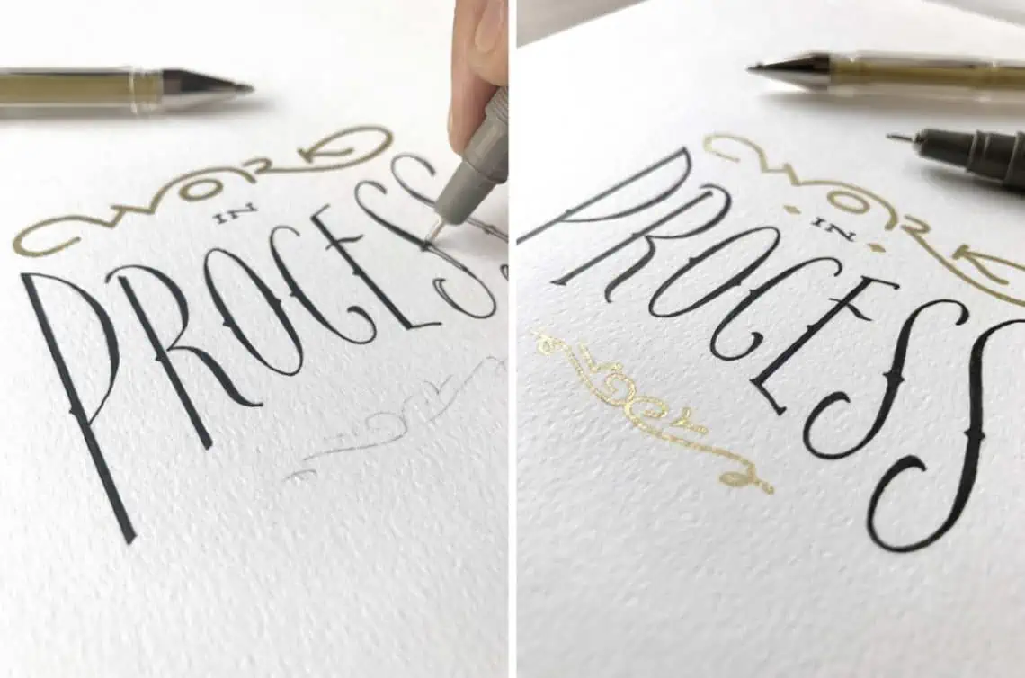
The Result of the Process
By following these steps, you haven’t just “written” a word — you’ve engineered a piece of art.
The beauty of hand lettering is that it’s organic and unique. Those slight imperfections are what give it character. Now that you understand the workflow, you can apply this to any style, from a simple block letter to a complex script.
Keep practicing, and remember: Process over perfection.
What’s Next? (Beyond the Paper)
Now that you’ve mastered the physical process, there are three ways to take your work to the next level:
1. Presentation is Everything
Don’t just take a quick, blurry photo. Your artwork deserves to be showcased with the same passion you used to create it.
- The Quick Tip: Use natural light near a window and place your tools around the piece as props to tell a story.
- The Deep Dive: Learn how to get high social media engagement with our [Guide to Photographing Lettering].
2. Digital & Vector Lettering
Turning your hand-drawn piece into a digital file (Vectorizing) is the bridge to professional design work. It allows you to create logos, merchandise, or even your own typefaces.
- The Next Step: Check out this step-by-step tutorial on [How to Vectorize and Digitize your Lettering].
3. Professional Application
Hand lettering isn’t just a hobby; it’s a high-demand skill in the design world. From logo design and packaging to large-scale murals for brands like Jack Daniels or Levi’s, the organic “imperfection” of hand-drawn work is what makes it exclusive and valuable.
4. Explore more lettering styles
Letters come in all sorts of shapes and forms. One of the best ways to improve your skills is by practicing, and by practicing new styles you gain a deeper knowledge that you can’t get by repeating the same thing over and over again. That’s why I created the hand lettering style database. You’ll find a pretty big library of various styles you can try out.
The Process in Action
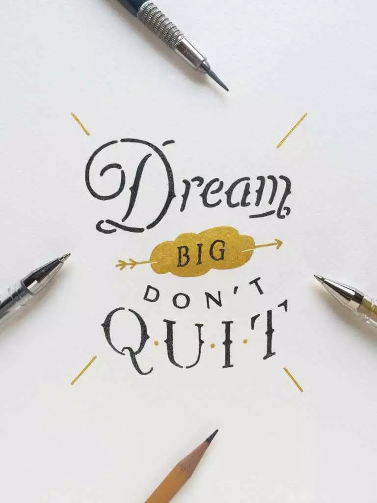
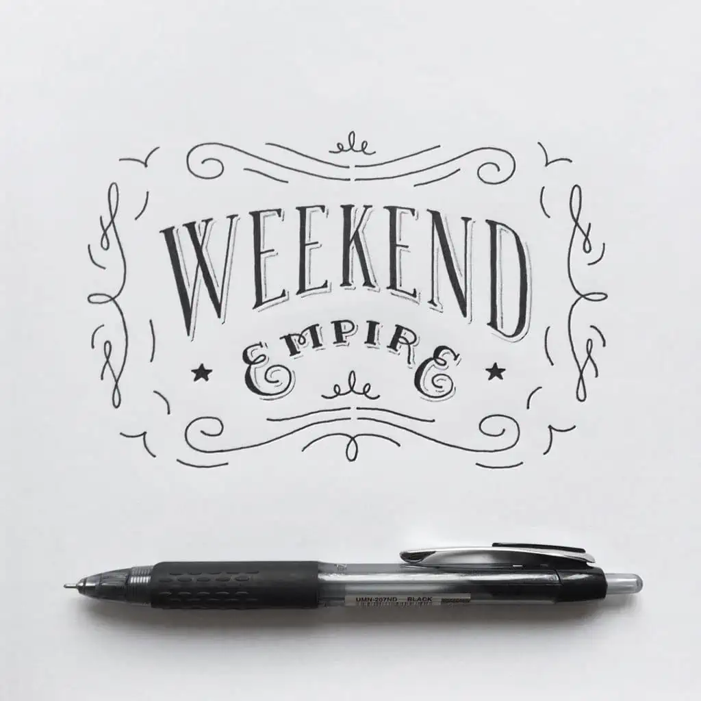
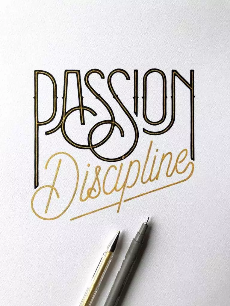
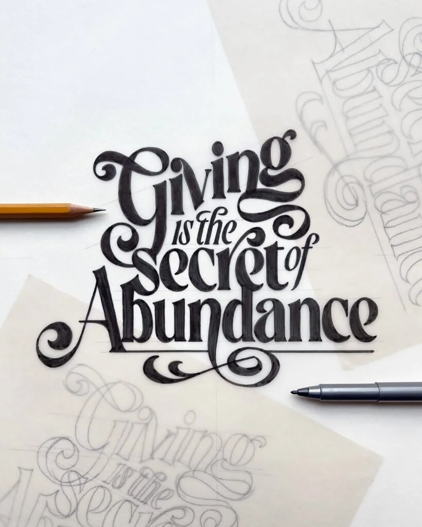
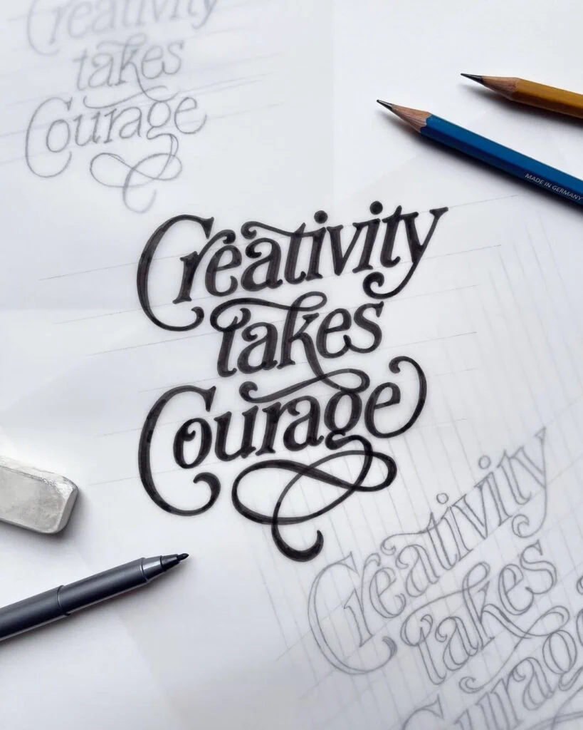
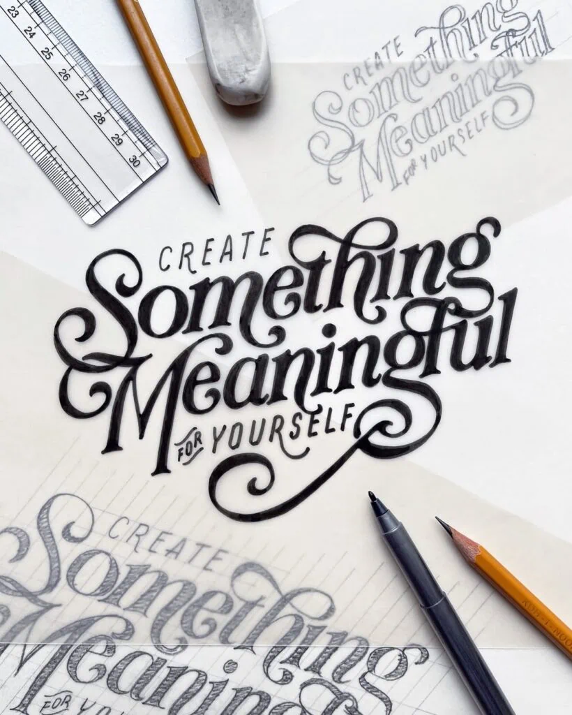
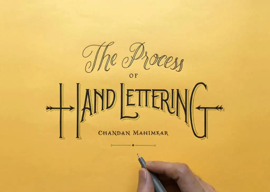
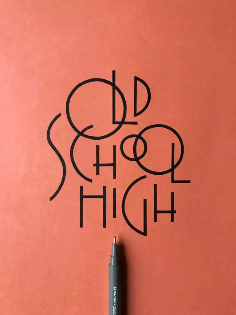
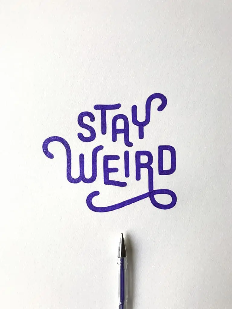
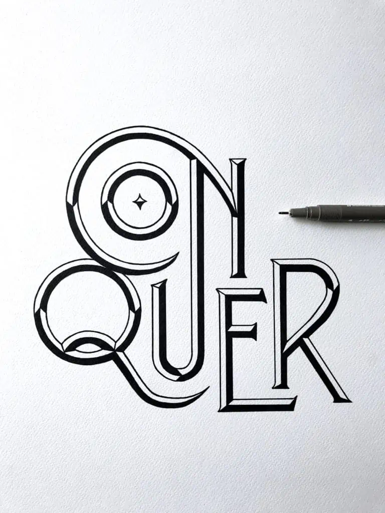
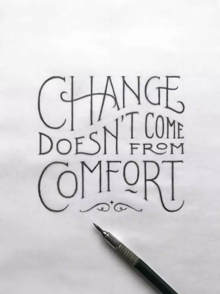
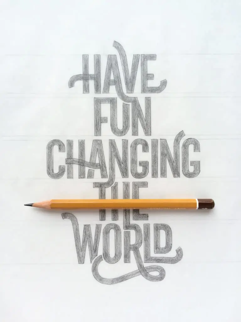
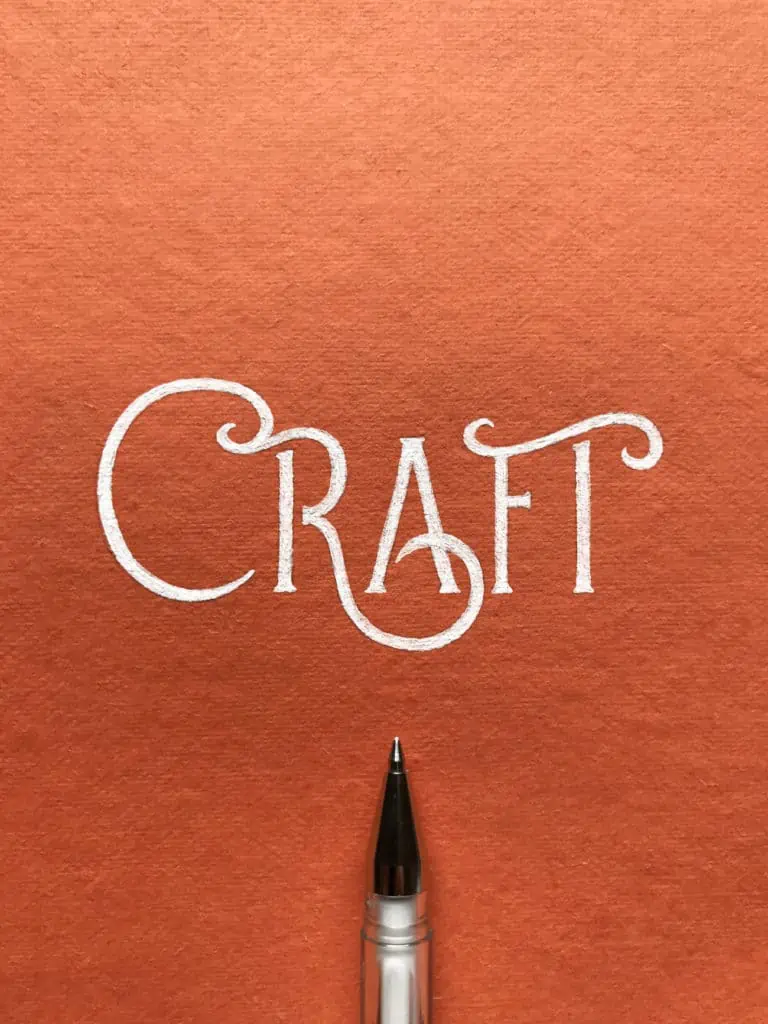
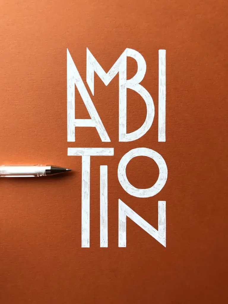
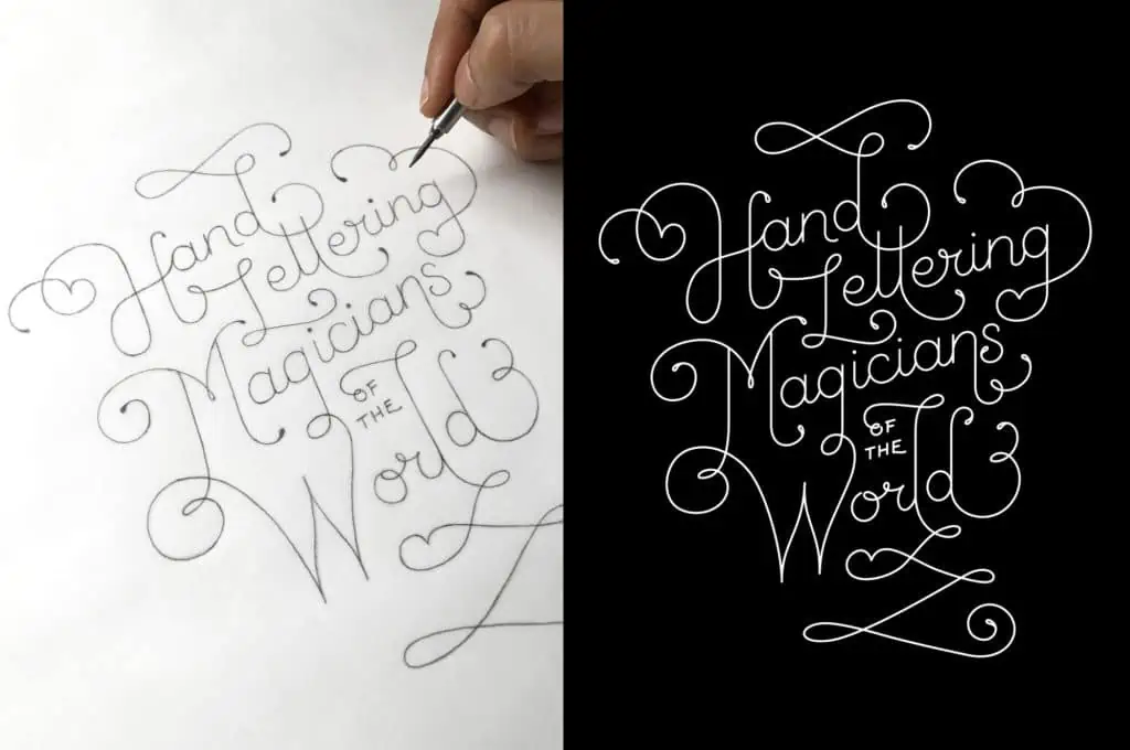
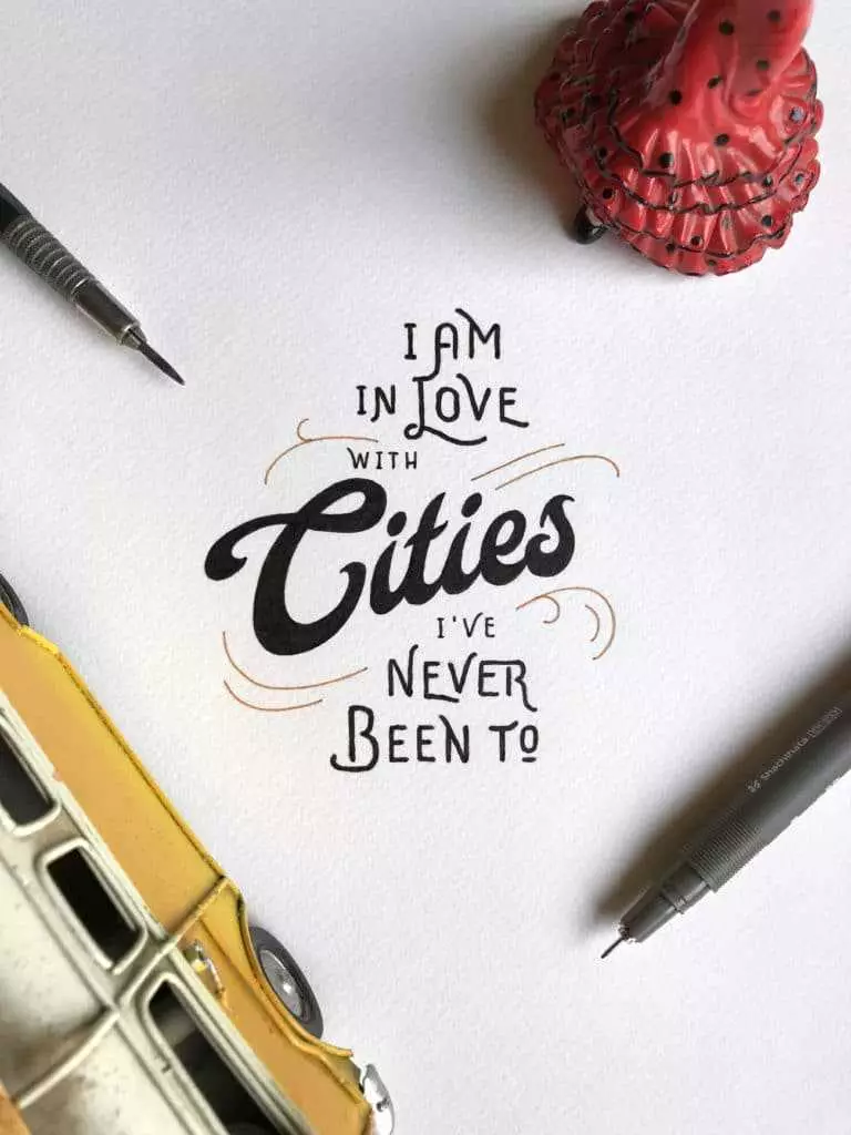
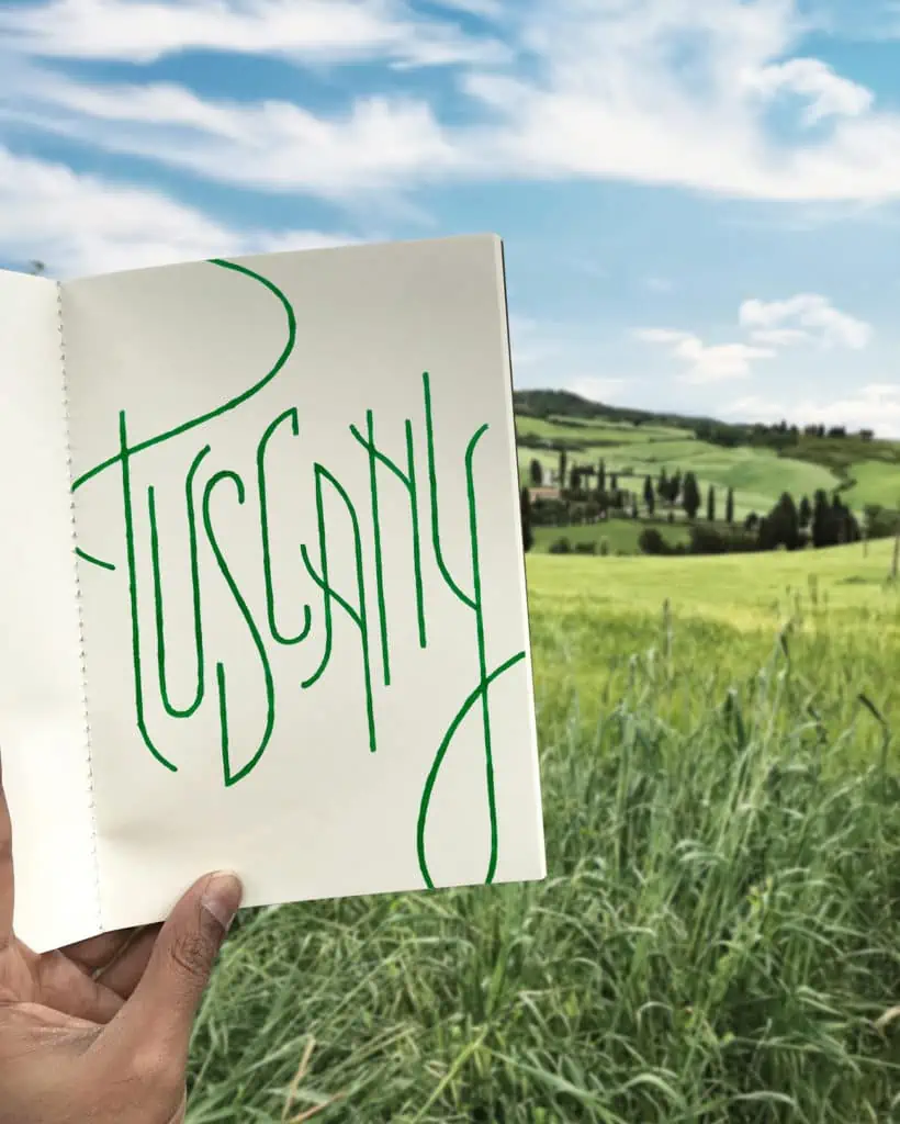
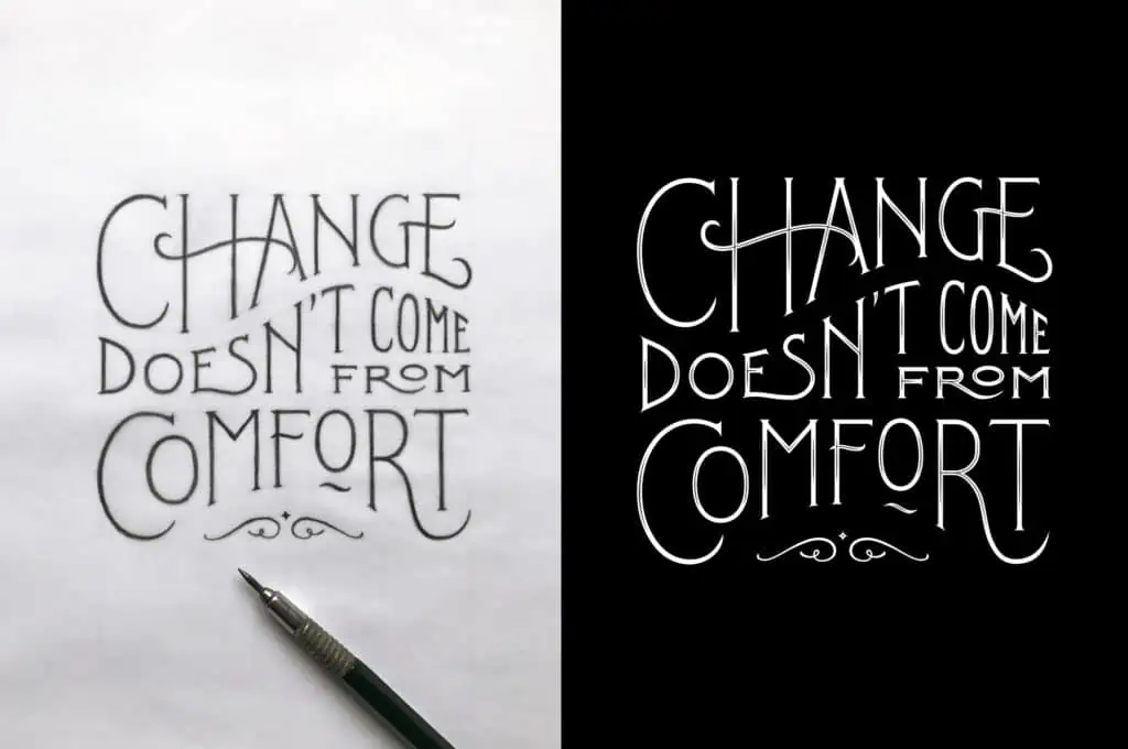
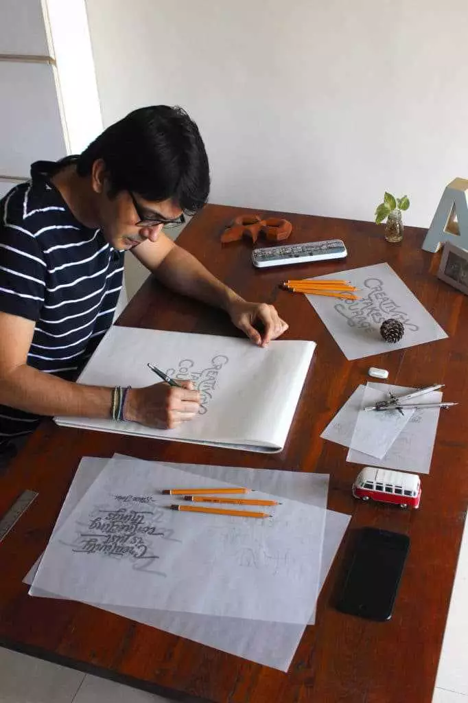
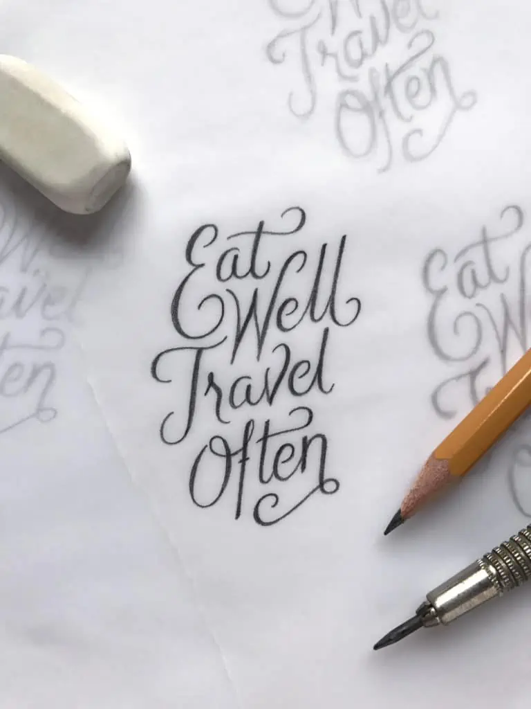
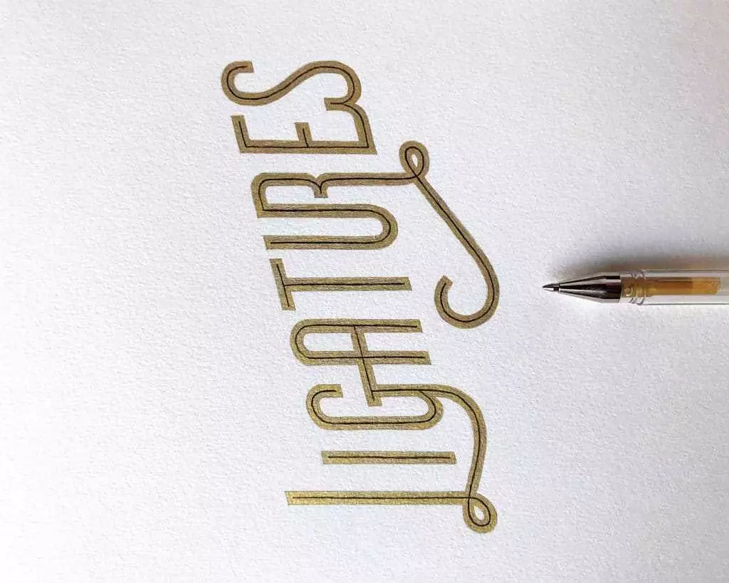
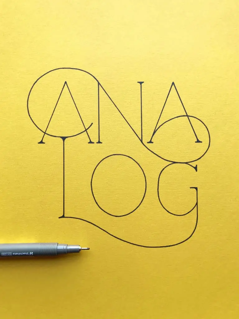
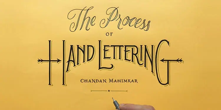
Here are a few more examples of my finished work. Every one of these started as a messy scribble, went through layers of tracing paper, and was refined using the exact steps I shared with you today. For more of my work, find me on Instagram – @see_mahimkar.



Sign up and get FREE instant access to the Lettering Crate –
A growing library of free lettering & calligraphy resources that includes –
Pin me!
About the author

Chandan Mahimkar
Designer, Creative Director & Lettering Artist
Chandan is a multi-disciplinary designer & creative director based out of Mumbai. He is former CCO of L&K Saatchi & Saatchi’s design division in India. He now runs his own design studio and works on branding & design projects for reputed clientele in India & internationally. He effectively uses his style of hand lettering in many of his graphic design & space design projects. Chandan is a well known graphic designer in India and one of the top lettering artists. His work has appeared in some of the top lettering books published in the US and Australia. He shares his knowledge of design & lettering through talks/workshops for design institutes & design agencies in India & internationally.

Awesome
Always knew I had a passion for lettering
Now…you’ve made me more intrigued into the art😌
Thanks…😁
Great to read your comment…I am so glad that my tutorial has intrigued you. Keep practising and enjoying the art of lettering.
Muchas gracias por compartir.
Glad that you found it helpful. Cheers!
I love your tutorial. Very easy to follow
I am a beginner and it’s amazin to see that I can draw words in beautiful way. Thanks for sharing your knowledge
Delighted to get your feedback.
I loved the processes.. But as a core beginner, I don’t have an idea on drawing or drawing letters with an angle of rotation.. Any article to recommend?
Excellent! Great article with lots of important information. I just have one question, is there a prerequisite to starting the process you have mentioned. I mean do you have to be amazing at drawing or anything like that.
Cheers,
Raffay.
Thank you for your comment! Really happy to hear that you liked the tutorial. Well having some previous experience can definitely help, however by practicing consistently you will learn the most!
Hi, glad that you liked the tutorial. If you love letterforms then just go for it to learn this process. Start to observe letters and the style references I have put in the tutorial, it will guide you. Keep practising & enjoy the process!!
Appreciating the dedication you put into your blog and detailed information you offer.
It’s great to come across a blog every once in a while
that isn’t the same old rehashed information. Excellent read!
I’ve saved your site and I’m adding your RSS feeds to my Google
account.
All the efforts are worth it when such feedback comes. Thanks so much!!
Mohave always enjoyed Mr. Chandan’s work. Great article. Picked up tips around tracing.. extremely helpful. Can’t wait to get started.
Awesome! That’s great to hear 🙂 be sure to share some of your work on the website forum!
Hey Prathana…so happy that you liked my tutorial. Keep practicing and contributing to the Lettering Daily website forum!!