James Lewis is here today to teach you how to transform your brush lettering into vector!
Before we jump right in let us introduce you with Ligature Collective.
The Ligature Collective was born in 2013 when Jorgen Grotdal reached out to some of the most successful lettering artists & designers around the world with the goal of forming an international group of like-minded individuals to collaborate with and share ideas.
The name Ligature Collective was coined by James Lewis, one of the founding members, as it represented the coming together of typographic skill and knowledge.
After successfully growing the ligature collective Instagram to over 250,000 followers James Lewis took over as director of the group with a vision to recruit new members, build a website, and become the number one destination for creatives looking to learn hand lettering, and clients looking to hire the eclectic talent within the group.

Without further ado, let’s turn it over to James and learn how to vectorize your hand lettering!
Hello creative people!
James here, during the six years I’ve been drawing hand lettering, and designing typography the most common question I’ve received is ‘’how are your single letter artworks so precise?’’.
It’s a question we at Ligature collective get almost everyday!
Lucky for you, with this tutorial you will learn how to transform your hand lettering into a vector format which you can afterwards utilize in many different ways!
This is something that all professional lettering artists do, once you learn this process, a whole new world of possibilities will open up for you as a hand letterer.

UNDERSTANDING THE BENEFITS OF VECTORIZED HAND LETTERING
Firstly,
it is important to understand that vector based objects have the capability to change their size without losing any quality while on the other hand if you grab a pixel based image, and you try to increase the size of it, you will notice immediately that it will lose the quality.
Besides that you can completely manipulate your lettering with the help of the pen tool (which I will elaborate later on) in order to get those razor sharp lines!
By learning this process you will be able to create logotypes for clients, or create lettering that you will be able to print on various merchandise as we do at Ligature Collective.
Once you start to get a hang of Adobe Illustrator you will realize that your imagination is your only limit!

For too long I hoarded the ancient lettering secrets, and I’ve definitely learned A LOT through experimentation and studying books like:
Karen Cheng’s ‘’Designing Type”
and
Ivan Castro’s ‘’The ABC of custom lettering’’.
Secrets that allowed me to design logos and custom lettering for brands all around the world!
Finally, after Lettering Daily pleaded with me to give up the secrets, I gave in, and wrote this 4 steps to precision lettering tutorial.
But wait there’s more, not only am I telling you how to create precise lettering but I’ll be showing you an example of a letter I designed using this exact method!

Before we get into the process I warn you, custom lettering is addictive, (and time consuming).
It is highly probable that you will end up pulling bezier handles in Adobe Illustrator to the point you can no longer recognize the letters you’re designing.
There are a few tools that you will be needing for this:
- A brush pen
- A pencil (i would recommend a mechanical pencil for better precision)
- Tracing paper (a super useful tool for hand lettering!)
- Scanner/ (phone)camera
- Adobe illustrator
- Serious patience

STEP 1 – BRUSH LETTERING
Now, this may look daunting to you beginners, but do not be discouraged!
All calligraphy takes time to perfect and I have huge admiration for calligraphy artists like Paul Antonio Attong who clearly practice as often as they possibly can.
Now this technique can be used to create vector lettering from any style of calligraphy, but for the purpose of this tutorial I want you to draw out some guidelines and write out the letter ‘M’.
As a rule, down strokes are thick and upstrokes are thin, good luck!
Do not be discouraged if your M doesn’t look perfect first time
– it took me 20 attempts to get this M- keep trying until you are satisfied as we will be refining the letter form as we go.
QUICK TIP – Create some guidelines!

STEP 2 – TRACING
Tracing the letter form allows you to refine your letter.
It’s pretty self explanatory: trace the letter, make it cleaner and more precise, then do it again (and again, and again, and again).
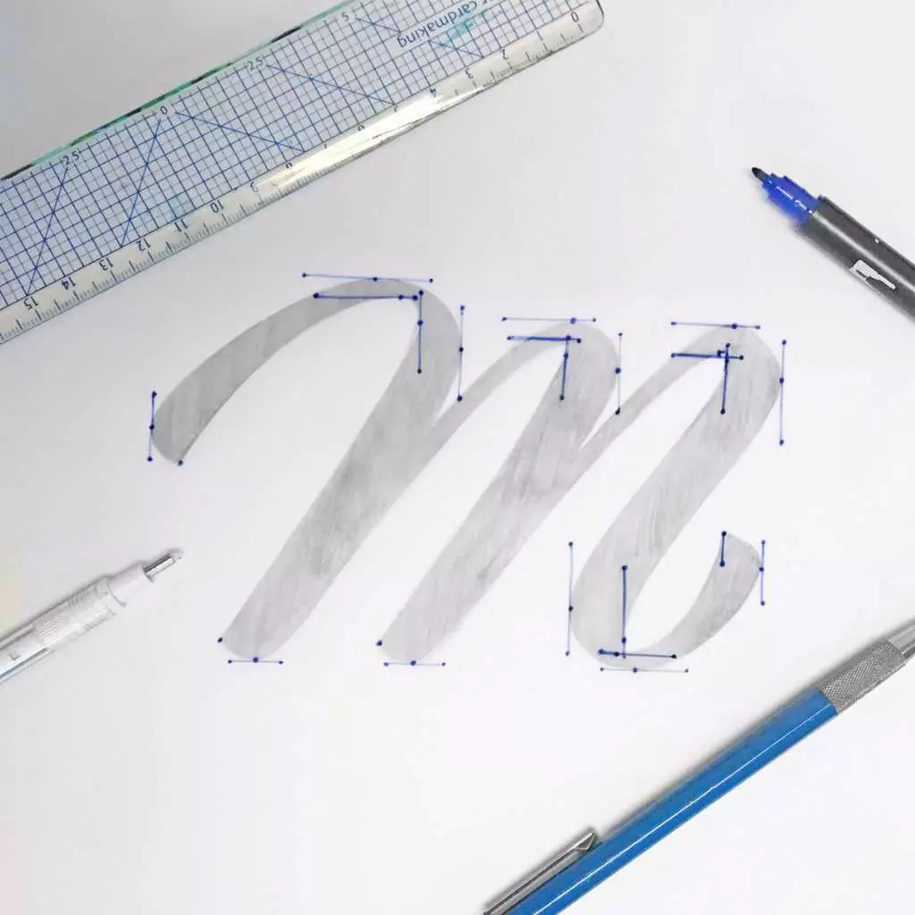
When you’re finally satisfied with your letter we’re going to plot out where to place the vector points to create the most precise letterform.
Take a look at the points I’ve drawn on my letter.
The edges of the letter will always have a point. Curved edges will always have a combination of 2 points positioned at the outermost point of each side of the curve. The bezier handles with then be perpendicular (positioned at right angles)
Technical jargon out of the way, what is the point of all this?
Well, the less vector points you have, the smoother the letter form, it’s that simple. And drawing out these points now will save you hours of guesswork in illustrator, trust me.

STEP 3 – VECTORIZING
Now that we’ve got the vector points drawn up on our letter form, scan it in or take a photo of it and open the photo in illustrator.
We’re going to use the vector points we’ve drawn to simplify the vectorization process and I’m going to share with you another tip I use when vectorizing lettering.
As you can see from the image I split the letter form into down strokes (thick strokes) and upstrokes (thin strokes) and use the points we’ve drawn and guides for each form.
You want the down strokes to all be a consistent thickness as well as the upstrokes.
This can be experimented with when you’ve got the hang of it but you should always learn the rules before you try and break them.
In my experience this helps you further down the line if you have to back up and make adjustments because the client (or your own inner critic) lambaste your letter form.

STEP 4 – FINALIZING
Now that you’ve got each stroke vectorized we’re going to combine all of the forms using the ‘unite’ tool in Illustrator.
This final step separates the (wo)men from the children, we have to clean up the vectors.
Keep duplicates of your letter forms as you refine to refer back to and keep going until every bezier handle is perpendicular.
A pro tip which I’ve used countless times is to flip the letter upside down and refine it like that for a while, you’ll often see inconsistencies and incorrect weight distribution you missed previously.
The perfectionist in me doesn’t stop until every point is perfectly positioned and every curve is silky smooth, which can take hours when designing a full hand lettered logo.
Luckily for you you have only one letter to design so I expect my inbox to be blowing up with squeaky clean letter forms showcasing your new found talent!


Stay updated with my tutorials and get instant access to the Lettering Crate –
A growing library of free lettering & calligraphy resources that includes –
Pin me!
About the author

With over 6 years of experience in hand lettering, plus a degree in graphic design, James is perfectly suited for all projects requiring unique typography. He currently works closely with businesses and creative agencies to produce typographic artworks, viral art videos, hand lettered logos, and full fonts for a range of commercial applications and artistic exhibitions.
James’ hand lettered artworks have been featured on numerous occasions by the likes of: Creative review, The Guardian, Made in Cardiff TV, Creative Bloq, Expressive type (book), Good type (book), Behance, design&paper, as well as many other smaller art & design sharing platforms.

Surely it’s easier to scan the letter then use’simple trace’ in illustrator to create the vector image? Then you can clean up by adjusting the beziers. You don’t need to create all the vector points yourself – what an over laborious process you’ve suggested!!
Hey Kate, thank you for your comment. You are 100% correct! Using image trace in illustrator is much faster and easier. However, it cannot compare with the manual process. When you manually vectorize a piece (creating each point individually) it allows you to achieve a much more refined and cleaner end result. The question about which one to use depends entirely on your intentions. Are you trying to vectorize a quick design for personal purposes? In that case, image trace could do the trick – if you don’t want to spend hours on it. Are you working on a custom logotype for a paying client? No serious designer will use image trace to vectorize a sketch. Manual vectorization is a particular skill that requires a lot of time as well as practice. I’ve worked with many clients over the years and believe me, in the beginning, I tried using image trace so I wouldn’t have to spend so much time on it. Only once I saw that by image tracing and then fixing, I wasn’t really saving too much time and the end result was nowhere near as good as the manual version. Perhaps there are professionals out there who rely on image tracing as their main method, however, I still haven’t meet a designer who does it that way. Also, once you’ve manually vectorized quite a few pieces you actually get very quick at it. I could vectorize something in an hour or two that would initially take me perhaps 2 days. At the end of the day, it’s all about personal preferences, there is no vector police who will arrest you if you don’t use a specific method 😀
You took the words right out of my mouth. very well said 🙂
Thanks, man! If you want to do it right, you simply can’t cut any corners 😀
To vectorize the handmade images easily you can take the help of adobe illustrator by this software everything works perfectly and smoothly just add image which you want to vectorize and your image is ready just you can vectorize the image in easy steps.
This style of lettering is really effective and easy if one understands what one’s doing. However for a newcomer to the calligraphy addiction it would seem just for the first starter course of equipment it’s going to break the bank.
Funnily enough there were no mobile phones when I was at art school, no one had heard of “Adobe” and *tracing paper *was considered an obscenity.
Still, there’s nothing like progress.