
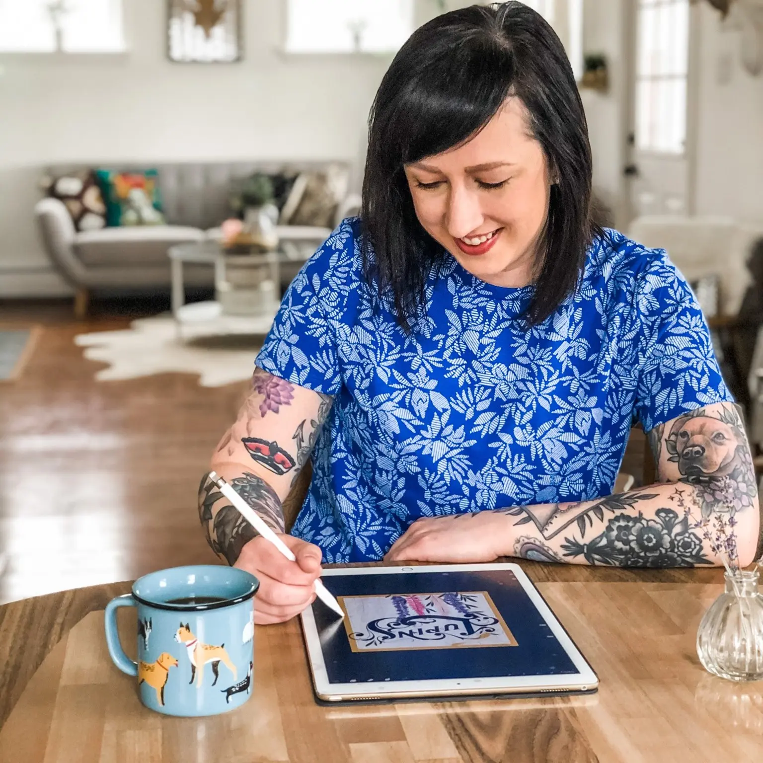
MEET KRISTEN FROM KDP LETTERS!
Kristen here from KDP Letters. I’m a hand lettering artist based in Halifax, Nova Scotia, Canada.
I started hand lettering for fun back in 2016, and ever since, it’s become a passion that I now practice daily.
I have a background rooted in graphic design and marketing, which helped significantly in approaching layout and design for my hand lettering pieces.
I share all of my work regularly on my Instagram account at @kdpletters. But enough about me, let’s talk lettering layout!

The fundamental rule
All of the info below is hopefully going to be helpful to you in your lettering process, but I want to start by saying that THE single most important thing to improve your lettering is also one of the most basic things – PRACTICE! It’s all about the pencil mileage. You’ll continue to improve the more you keep practicing your lettering.

WHY ARE LETTERING LAYOUTS IMPORTANT?
My favorite part of hand lettering is figuring out the best way to arrange the letters I’m about to draw.
You can add so much interest to a piece by the way you construct your layout, and mixing styles and sizes is a great way to create impact in a quote.
Sometimes, it can be really challenging to figure out how to lay out your lettering piece. There are endless possibilities for laying out a design, and your only limit is your imagination – and well, time. If you ever feel stuck on a layout design, try drawing a shape and lettering inside that to inspire a new approach.
Or, I also love to look at product labels or magazine covers for inspiration!
Here are the steps I take when developing a sketch through to final inking – hopefully, you’ll find them helpful in your own artistic process this year!

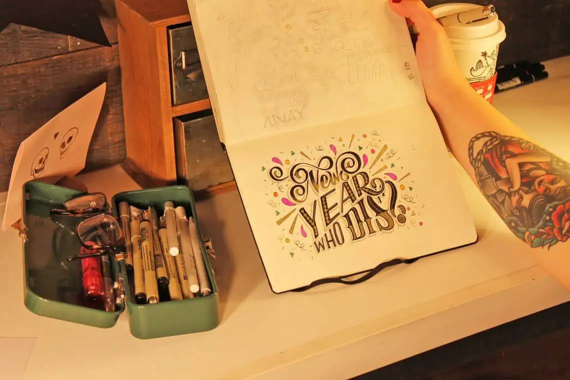
STEP 1 – CREATE A THUMBNAIL SKETCH
Thumbnail sketches are my go-to before I draw any larger lettering piece. I draw the quote out a few different ways, on a small scale, and once I’m happy with how it looks I will then begin sketching out the actual size I want to draw it at.
Note that this step might take many different iterations – layout for some quotes come to me quickly, while others can take more than a dozen sketches to get just right.
Tools used:
- Sketchbook: Leuchtturm 1917 (medium)
- Pencil: Staedler 4H
- Pens: Micron 01 and Graphic 1, Gelly Roll white gel pen, Gel Xtreme 0.7 gold gel pen
- Eraser: Staedler white eraser, Tombow Mono Zero eraser

When creating the layout for your design, you’ll want to think about:
- Is there a particular word in your layout that you want to stand out more than the others? It’s important to have the right hierarchy in your design so that the impact is where you want it to be. The important words that you want to be the focus of your piece should be larger and/or bolder than the others.
“Link words”, meaning words such as “the”, “with”, “for”, “or”, “and”, etc, can be much smaller and done creatively like inside of a circle or written as an ampersand.
Pay attention to legibility and reading direction (left to right, top to bottom) as you consider your layout.
Are there ascenders or descenders you can use to make your design more interesting? For example, if you have the letter “y” in your quote, try using the letter’s descender to add an extra swoop or swirl.

STEP 2 – SKETCH YOUR GUIDELINES
I usually begin my sketches by drawing lines out on the page for me to place the letters into.
This really helps with planning out proper placement, so you don’t end up running out of space as you finish the quote. It also helps to guide your letters inside different shapes and keeps your words all straight and properly spaced from one another.
If it’s just a piece for my sketchbook, I’ll usually freehand the lines because it doesn’t need to be perfect – but I’ll use a ruler for any commissions.
Tip: You can create more interest in your layout by putting some words on an angle, inside an arc, or having some of the words interact with each other through swirl details.

STEP 3 – SKETCH YOUR LETTERS
Next, I’ll fill the letters into the guidelines I’ve sketched out.
I always sketch with pencil first, so that I can erase and fix any mistakes as I go. I also use a 4H pencil, because it’s very light and forgiving as I’m drawing.
I usually look at my sketch quite a bit before transitioning into the next step of inking – and it’s important to look at your drawings from a little bit of a distance, especially if it’s for a commission that someone will hang in their house.
Most people don’t admire artwork on their walls from 2 inches away, unless that’s something you’re into.
Tip: Mix lettering styles to add to your design, and consider sketching in additional details like swirls or serifs. Before moving on to the next step, double-check the spacing in between each letter (also known as kerning) to make sure there’s enough room for you to add any shadows or extra detail you might want in your final piece.

STEP 4 – INK YOUR LETTERS
Once I’m happy with my sketch, I’ll bring out my pens and begin tracing in black pen.
I stay loose when doing this part, as I plan on filling the letters in with black and colours anyway – so it’s OK to mess up a little bit along the way.
Plus, whiteout or a white gel pen is amazing for covering up those times that you might accidently colour outside the lines.
Tip: You can add depth in your design by using a white gel pen to draw in separation lines wherever letters or ascenders/descenders overlap in your layout. This adds helpful contrast to your piece.

STEP 5 – ADD SOME DEPTH AND DETAILS!
I am a huge fan of adding interest to my hand lettered pieces by incorporating various details inside and around my letters, and adding depth with drop shadows.
If you’re comfortable with illustration, you can enhance your work with flowers, leaves, or flourishes.
But you don’t need to be an advanced artist to add detail – you can also leverage simple shapes like circles, lines, or stars to build out your pieces.
Tip: Don’t over-do the details so that the piece becomes illegible (admittedly, I can be guilty of this at times!). After each new detail you add, step back and look at your piece from a few feet away to see how it’s all coming together.

IN CONCLUSION
Thanks so much for reading, and I hope you found this article useful in your lettering practice!
Remember, there are no shortcuts to improving your hand lettering – these are simply some helpful steps to guide your process.
The more you practice, the more improvements you’ll begin to see in your lettering.
A great way to hone your skills is to join in a daily lettering challenge where you’re forced to design layouts for various sizes of quotes that you might not normally come up with – there are a ton out there, and there’s an Instagram account that rounds them all up for you (@letteringchallenges).
Lastly, I encourage anyone getting started with hand lettering to share your work on a regular basis – gathering feedback and support from the amazing online community of artists on Instagram is a great way to build an audience and continuously improve.
I am more than happy to chat with you about your lettering practice anytime, just reach out to me via Instagram or email! I look forward to seeing your awesome lettering layouts!


Stay updated with my tutorials and get instant access to the Lettering Crate –
A growing library of free lettering & calligraphy resources that includes –
Pin me!

About the author
Hi! I’m Kristen, and I’m a hand letterer and graphic designer in Halifax, Nova Scotia. I started hand lettering just a couple of years ago, and since then, it’s become a passion that I now practice daily. I have a background rooted in graphic design and marketing, and have spent the past 10 years as a freelance designer for various clients in addition to my current role as a Marketing Manager.

This is a well-written and very useful article. Thank you for sharing!
Thank you! 🙂
I love this site!
All content is very good and relevant!
I feel that you have a lot of love in sharing this knowledge …
Thank you very much for existing!
You have a fan in Brazil! : D
Thank you, Sarah! Yes i do! I really enjoy sharing my knowledge and experiences! I am not the best out there but I enjoy the process, it doesn’t just help others but also myself to learn and grow 🙂
Nice
Thank you!
Lovely swirls!
I will surely give it a try.
I’m a new fan of “lettering daily” by the way.
I’m in IG as @bishal.creator
Always learning…found today this article with a lovely teaching method…really 5 easy steps…i’m from northeast in Brasil, here in Pernambuco, my state. Started last year to find my place in this new area, lettering. Graduated in Graphic Design since 1986…but coming back now…tks for sharing acknowledgment.?? Ah, my ig is @tracosecurvascarpina
Thank you, Mary! I really appreciate your kind words 🙂
Absolutely stunning! I love the overlap of the R and the swirl on the N.
Happy to hear that you liked it! 🙂
Excellent Very helpful
Thank you, Gilbert! I appreciate the kind words 🙂