
Adding a shadow on letters is one of the easiest ways to make your lettering pop.
Whether you’re drawing by hand or using Procreate, learning how to add shadows to your letters properly gives them depth, dimension, and a polished look — even with simple tools.
In this guide, I’ll walk you through 8 different shadow styles you can apply to any lettering piece. It’s beginner-friendly, straight to the point, and includes free lettering shadow worksheets to help you get started.
I’ve organized all my core tutorials, tips, and tools into this main calligraphy resource if you’re looking for a structured way to learn.
Let’s get into it.
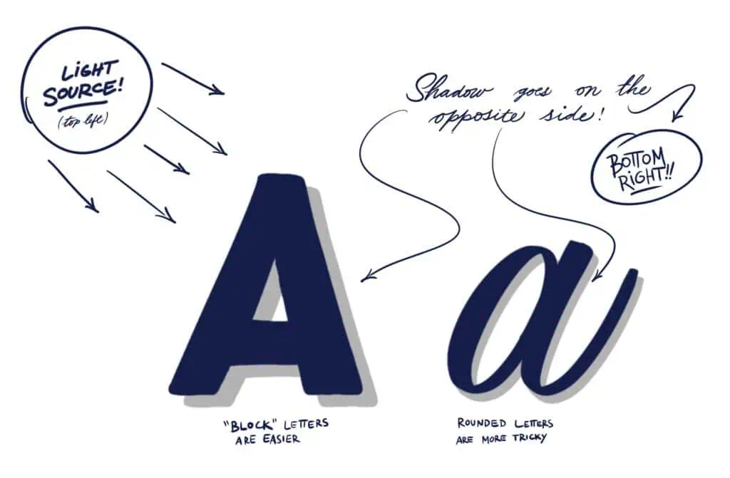
Before we dive into styles, let’s quickly cover how shadows work.
A shadow is simply a shape cast opposite the direction of your light source. Imagine placing a flashlight at the top-left of your letter — your shadow will fall to the bottom-right.
Keep these rules in mind:
- Pick one light direction and stick to it
- The shadow shape should mirror the contours of the letter (rounded letters = curved shadows)
- Maintain consistent spacing between the letter and shadow
This principle works for any shadow style for your lettering or calligraphy.
Now let’s explore some styles you can try.
📚 What You’ll Need
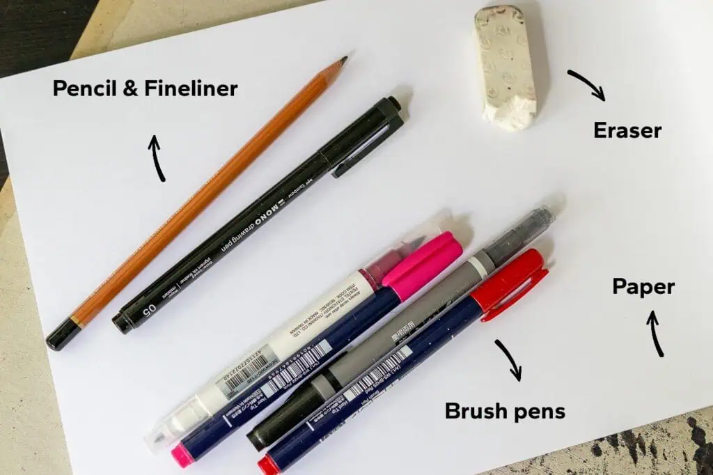
- ✏️ Pencil, brush pens or even color markers and fineliners
- 📱 iPad + Procreate (if you’re working digitally)
- 📄 Paper for calligraphy and/or lettering
- 📏 Ruler (for guidelines, optional)
- Eraser to delete your pencil marks
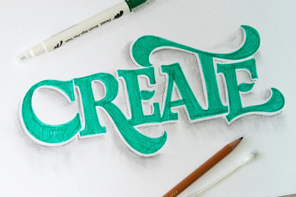
1. Basic Drop Shadow
Place your shadow directly behind and slightly offset from the letter. This is the easiest style of shadows and what I recommend if you’re just getting started.
👉 Great for: Clear visibility, clean look
✅ Tip: Keep shadows lighter/darker or gray so they don’t overpower your letterforms.
2. Offset Shadow
The shadow is placed further away from the letter (same angle). Think of it like drop shadow’s more dramatic cousin.
👉 Great for: Clear visibility, clean look and works on a variety of lettering/calligraphy styles.
✅ Tip: Best to first lightly mark the position and distance of the shadow using a pencil.
3. Cast (floating) Shadow
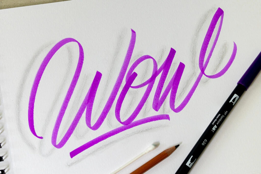
Also referred to as blurred or soft shadow. Mimics natural light casting longer, angled shadows. Best done using a pencil or a soft airbrush tool if working in Procreate. The trick is to place the shadow further from the letters.
Make sure to use a softer pencil such as a B6.
👉 Great for: Thinner looking letterforms such as brush calligraphy.
✅ Pro tip: Use a Q-tip or even your finger to smudge the pencil marks to create a blurred effect.
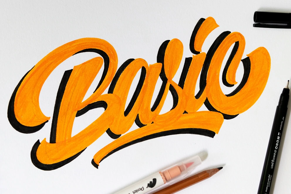
4. Double Color Shadow
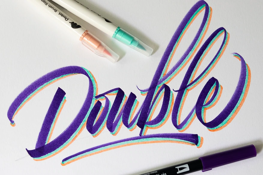
Take two colors (markers or pencils) that go well together (if in doubt, go monochrome) and add one shade after the other.
👉 Great for: To add a more vibrant look to various lettering/calligraphy styles.
✅ Pro tip: The second shadow follows the shape of the first shadow rather than the shape of the letter. And if you feel confident enough, go even for a third layer!
5. Stippling Shadow
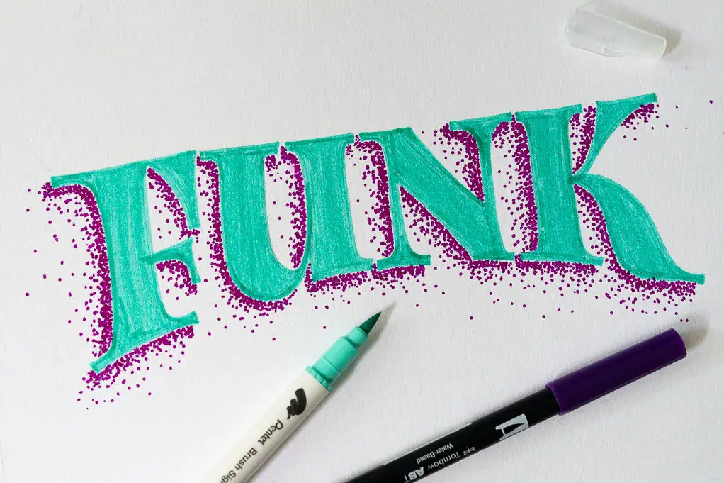
This one gives a super cool effect to your letters. Best done using a marker or fineliner. You create it by scattering little dots where the shadows should go.
It is more time consuming but it’s definitely worth it considering how cool it looks once you’re done!
👉 Great for: Eye catching words and works with a wide variety of styles.
✅ Pro tip: As you move further away from the letter, just add fewer dots to create a more dramatic effect — think of it as a gradient.
6. Pencil Smudge Shadow
The pencil smudge shadow gives you a very dramatic yet impacting look to your letterforms. Grab a softer lead pencil (such as a B6) and gently apply an offset shadow to your lettering/calligraphy.
Then using a Q-tip pull the pencil marks in the direction of your shadow. Then simply smudge those strokes so it looks more unified.
👉 Great for: Old school looking designs and it works well on a lot of different styles.
✅ Pro tip: Avoid pressing the pencil too hard. It will make it more difficult to smudge and to blend nicely the edges.
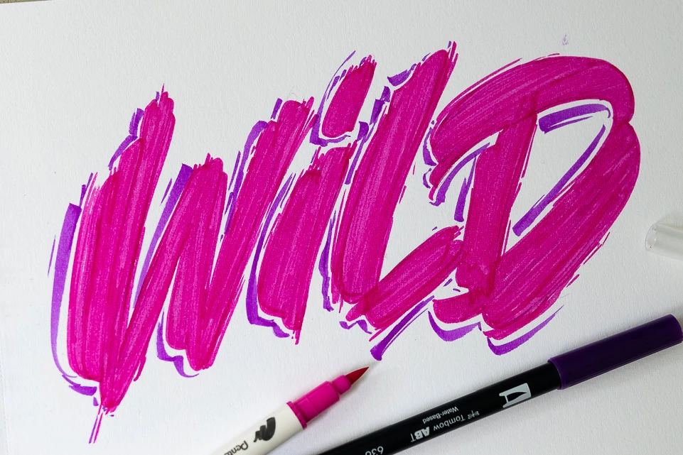
7. Tapered (Messy) Shadow
The tapered shadow is more expressive, perhaps better suited for letterforms that are a bit more wild in their shape. They start thick and end up thin — or vice versa.
There isn’t a strict rule for where to start thick or thin — that’s totally up to you. You can even combine a bit of both.
👉 Great for: Expressive looking letterforms.
✅ Pro tip: For more control, use a fineliner. But if you feel confident with thick/thin transitions, a brush pen is even more fun.
8. “Invisible” Letter Shadow
As the name says, this is an effect where you only add the shadows. By adding only the shadows, you allow the viewer to “imagine” the letters.
First, lightly draw your letter. Then using either a fineliner or a brush pen, add the shadow. Finally, erase the pencil sketch.
👉 Great for: Capital and sans serif letters. Script and serif lettering are a not as recognizible.
✅ Pro tip: I’ve noticed that this shadow style works best if you keep the shadow on the right side of the letters.
🎁 Bonus: Shadows on Your Lettering
Here are two bonus shadowing effects. These don’t follow the light source rule mentioned earlier but still look great when done well. Both of these bonus shadowing styles are included in the more extensive guide on how to shade letters using Procreate.
Bonus #1 – Overlapping Shadow
Works best with thicker lettering. The idea is to add shading on strokes that overlap each other.
Draw a thin line with a pencil where two strokes cross each other. Start from closer to the intersection by adding a darker shade. As you move further away, go lighter to create a gradient effect.
👉 Great for: Thicker looking script lettering styles.
✅ Tip: You can add it to the other side too, but avoid using the same intensity as on the primary side.

Bonus #2 – Cut-in Shadow
The cut-in shadow effect is a more subtle effect. As with the overlapping shadow, try to identify where letters overlap. Then erase part of the letter on one side to create the cut-in effect.
✅ Tip: If you’re doing this with pen and paper, mark the cut-in area before inking or use the same color as your background.
📥 Grab your free shadow letters worksheet
I created a free downloadable worksheet to help you practice placing shadows on letters.
You can either do the worksheet with a small brush pen (Tombow Fudenosuke or similar) or a pencil/marker.
The FREE worksheet includes two levels of guided shading for brush script lettering.
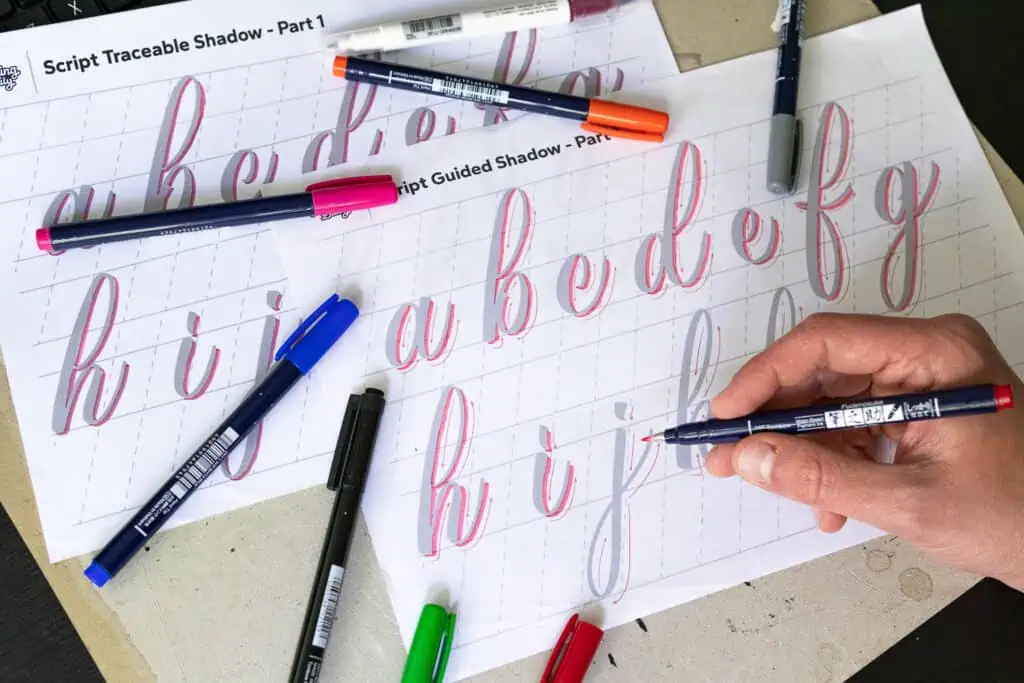
Drop your email below and download the worksheets straight from the Lettering Crate.

Stay updated with my tutorials and get instant access to the Lettering Crate –
A growing library of free lettering & calligraphy resources that includes –
🚀 Ready to Master Letter Shadows?
Dive deeper with my comprehensive workbook – Letter Shadow Mastery.
Featuring step by step guided exercises and pro tips.
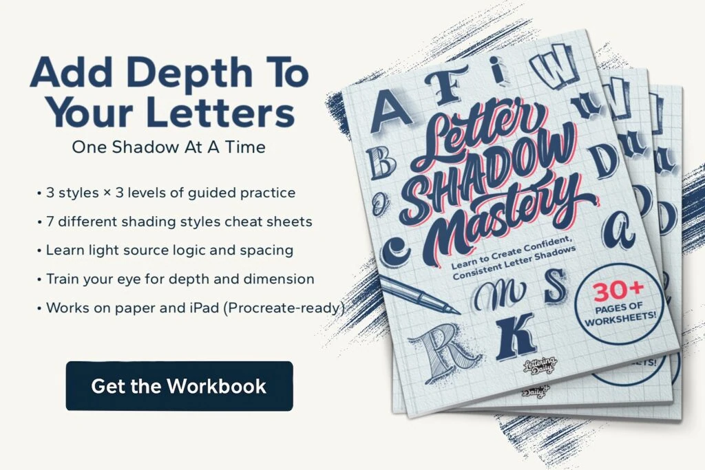
Get the full Shadow Mastery Workbook to take your skills further. It includes:
- 3 lettering styles (script, serif, sans)
- Upper + lowercase A–Z
- 3 skill levels: traceable, guided, and blank
- 28 Shadow reference cheat sheets
🎯 Start mastering shadows → [Click here to check it out!]
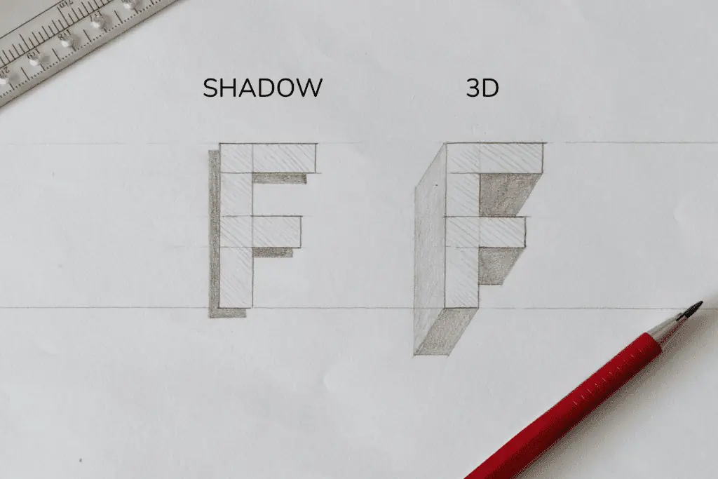
⚠️ Shadows vs. 3D Letters — What’s the Difference?
It’s important to understand that shadows are not the same as 3D lettering.
- Shadows are added to suggest depth and light source — they’re external to the letterform.
- 3D letters are constructed with visible sides (like cubes or extrusions) and involve more complex shaping.
Shadows = light and contrast
3D letters = form and structure
👉 Want to dive deeper into 3D styles? Check out my full tutorial on how to draw 3D letters!
🎯 Common Shadowing Mistakes
- Shadows going in different directions
- Inconsistent spacing
- Poor color choice between letters and shadows
- Adding 3D effects when intending just a shadow
🧠 Final Thoughts
Shadowing letters isn’t hard — it just takes a little direction and practice. Stick to one style, master it, and build from there.
The best part? You don’t need fancy tools to get great results.
What is your favorite shadowing style?
Let me know by dropping a comment below.
About the author

Hey, I’m Max. I’ve been drawing and messing around with letters since 2011. I don’t have a formal art degree—my background is actually in the kitchen as a former chef and on the streets painting graffiti with my friends. Over the last decade, through a ton of trial and error, I somehow turned that obsession into a full-time gig. These days, I design custom logotypes for global brands and paint large-scale murals. I started Lettering Daily just to create the kind of honest, no-BS tutorials I wish I’d had when I was starting out. Stick around, and let’s draw some letters.


Thank you for making this tutorial. It was clear and easy to understand and very helpful
Thank you! 🙂
It’s 2021, and this post is still helping people like me!
My shadowing looks great in my head, but when it gets to my hands is when the chaos starts.
But, now I finally have a beautiful brush stroke letter ‘B’, with a gorgeous shadow, (and one with a ‘eeehhhh’ shadow). None of the hand lettering tutorials ever worked as much as seeing your word ‘Basic’ – something just clicked! The rest of my name needs a little work, but I have a page full of beautiful, red Bs with light grey shadows.
I’m going to go look at everything else here now! Thank you for all the time and effort you’ve put into this. You’re making the world a prettier place.
Super happy to read your comment, Becky!
If you are still struggling feel free to join the Facebook support group I run. Over there you can get constructive feedback and other helpful tips to help you learn and further improve your skills.
I have just come across this post. Thank you for taking the time to explain this shadow technique in so much detail. I have saved it and am going to use it a lot! Once again, top post!
Super happy to hear that 🙂
This was great! Easy to follow and understand 🙂 thank you
Thank you! Glad to hear that 🙂
Thank you so much. I will join Facebook group
You are welcome, Bridget. Please do 🙂
Best shadow tutorial so far. It has so many techniques with so much details. But at the end of the day, it’s all about the talent. Calligraphy has been my hobby for quite a while but I can say it isn’t a thing I can excel. I can make “ok” pieces but I lack creativity. Nevertheless, thank you for this, I will try this when I have time.
Thank you for your comment Rodyard! I really appreciate it 🙂 I think that talent isn’t something you are born with, but rather something you develop through life with proper and consistent practice. Creativity can sometimes be tricky and not consistent, however, i would be happy to help you out. Are you on Facebook? You should consider joining our official Facebook group where we constantly give feedback and help out people to learn, improve and push their skills to the next level.
The article is described with so much details and to the point content..
I love the way how shadow makes lettering so attractive…?
Makes me really happy to hear that you liked it!
Haven’t read an article / tutorial in such detail in along time. Thanks for making it interesting
You are very welcome! Im really happy to hear that you found this tutorial to be valuable 🙂
thank you very much now am on line
Hello, I want to thank you, RK Sanchez, for your interesting content, That’s it Thanks.
Amazing to learn this from the step-by-step tutorials. Thanks for sharing.??♀️from Holland.
You are very welcome! 🙂
I’m from the same countryyy, this is very helpful!!!! Can you please teach that kind of style of the letters, it’s so cool!!! Please reply:>
Wow, you really go above and beyond with your information! This is not just a simple experience but you took the time to give so many examples and in depth. You are a true find. Thank you ! I can’t wait to put these to paper.
Thank Lisa! RK really did an amazing job. We wanted to create a tutorial that anyone could easily follow, and im glad we managed to achieve that 😀
Thank you For sharing this techniques RK and Lettering Daily ???
Hey Sally!
You are so welcome! Be sure to share some of your work on the forum or on Instagram 🙂
Hiii Lettering Daily! I’m so glad you post this up. This is very beneficial and encouraging for beginners especially! I love your positive vibes and care to share information and knowledge! Thank you for your dedication and effort! Followed your instagram indeed!! Your works are very much appreciated. I look forward to more lessons and tips hehe!❤❤❤?
Hey Natilya!
Thank you, im really glad you are enjoying the content. Definitely check out RK’s profile for more inspiration as she is the one responsible for this awesome tutorial 🙂
Cheers!
This was really informative. I would have loved to watch you blend with the overlapping shadow.
Thank you! be sure to give it a try and tag us on social media posts, we would love to follow people’s progress 🙂
WOW!
thankyou for this super “how to”
can’t wait to start trying all the different styles you have in this demo
what a great email to open up the first thing in the am
Hey Linda! Thank you for the kind words 🙂
Glad you enjoyed the tutorial 😀
This is fantastic. I love your work. Thank you for the time and effort you taken to write this lesson. I haven’t read it all yet, but I will and I can see it’s going to be really helpful for me. Nicky from @nickys_ink
You are welcome Nicky! Take your time, the article will always be here 🙂
Great examples! Shadows make all the difference. Keep up the great work!
Kristin
Thank you Kristin!! We are so happy that you liked this tutorial! Cheers 🙂