
Hey, my name is Edgar (@made.by.edgar) and in this tutorial, I’ll show you exactly how to get started with blackletter (aka gothic) calligraphy.
Blackletter is a bold, historical style defined by sharp angles and dramatic contrast. Because it is highly geometric and rule-based, it is actually one of the easiest styles for beginners to learn—provided you follow the right steps. In this guide, you’ll learn the core spacing rules, the basic strokes, and how to write your first words with a broad-edge pen.
New to the craft? Start with our comprehensive Calligraphy Hub for foundational techniques and tool recommendations.
Grab Your Free Practice Sheets
Don’t practice on blank paper. Get our free Blackletter Alphabet Worksheets inside the Lettering Crate to trace the strokes as you follow this tutorial.
Download Your Free Worksheets below 👇
Sign up and get FREE instant access to the Lettering Crate –
A growing library of free lettering & calligraphy resources that includes –
What is Blackletter Calligraphy?
Blackletter is an umbrella term for a family of historical scripts used across Europe from the 11th to the 20th century. It evolved from Carolingian minuscule when a demand for books required a denser, faster-to-write script. To save expensive parchment, scribes began flattening the curves of letters into tight, compressed columns—giving birth to the “Gothic” look.
While there are four main historic styles of Blackletter (Textura, Rotunda, Schwabacher, and Fraktur), this tutorial focuses strictly on Textura Quadrata.
Textura is the most rigid, geometric, and organized variation of Blackletter. Because it relies almost entirely on straight lines, repeatable diamond shapes, and strict spacing, it is by far the best and easiest style for beginners to master first.
Tools Needed For Blackletter Calligraphy
Blackletter calligraphy requires a broad-edged writing tool. One of the best starting points for a beginner is the Pilot Parallel Pen (I recommend the 3.8mm green version).

With time, you can start experimenting with traditional dip pens, but for now, trust me—stick to the Parallel Pen.
Want to learn more about calligraphy pens? Check out my dedicated Calligraphy Pens Guide.
Additionally, you will need:
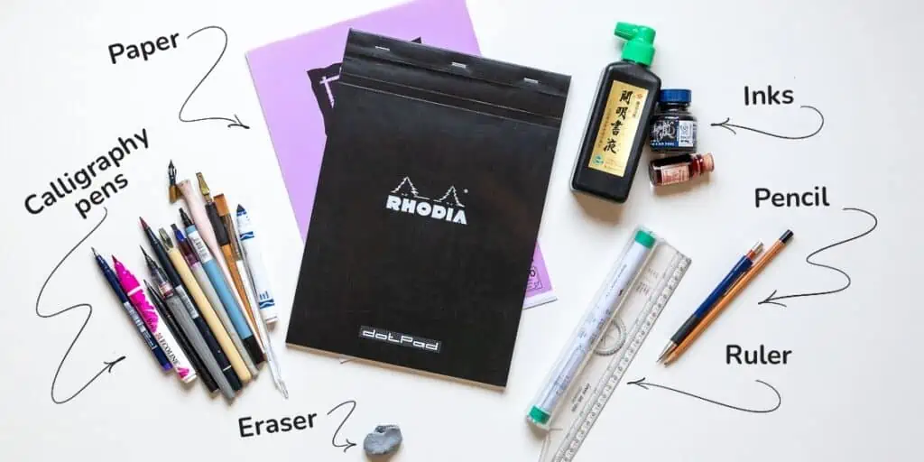
Want to learn more about essential calligraphy gear? Check out this guide on Calligraphy Tools.
No Pen? No Problem!
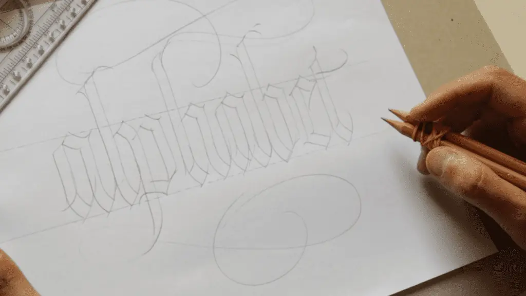
If you don’t have a broad-edged pen for calligraphy yet, there’s a cool trick you can do: grab two pencils and a rubber band, and tie them together tightly to quickly craft a makeshift broad-edged pen!
The 3 Core Rules for Blackletter Calligraphy
Before you ink your pen, you need to understand the structural laws of Textura Quadrata. Unlike modern cursive or brush lettering where shapes are fluid, Blackletter is a highly rigid, grid-based art form.
If you master these three fundamental rules, your work will instantly look consistent and authentic.

Rule 1: Keep Your Pen Angle Locked at 45°
The signature contrast of Blackletter—thick vertical downstrokes and razor-thin hairline diagonals—is created completely by the angle of your pen.
To get that look, it’s crucial that you keep your angle consistently between a 35 to 45-degree angle relative to your horizontal baseline. The reason I mention the range between 35 and 45 degrees is because you won’t always be able to keep it 100% mathematically the same, and it’s totally fine if it’s in that range.
The whole idea of focusing on a strict 45° angle is nonsense. Calligraphy is not that rigid. It has to be consistent, but having a slight oscillation creates a more organic and dynamic look.
Rule 2: Focus on Consistent Spacing
Textura Quadrata translates to “woven grid,” and your writing should look like a tightly knit fence. The secret to getting that historic look isn’t about being mathematically perfect—it is all about consistency.
Developing a consistent rhythm of spacing is what creates the beautiful, woven texture of this calligraphy style. To get this rhythm down, use the width of your pen’s nib as a general guide:
- Inside the letters: The space inside a letter (like the middle of an ‘n’ or an ‘o’) should be about one nib-width wide.
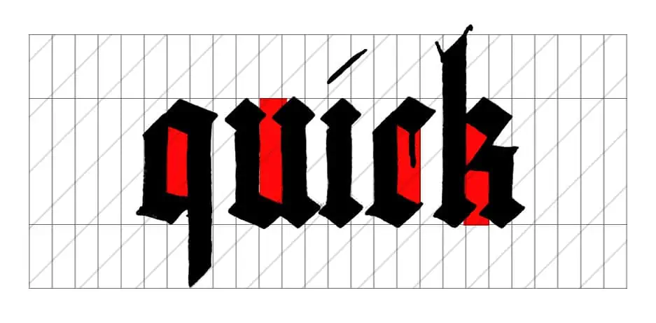
- Between the letters: The space between two separate letters should also be about one nib-width wide.
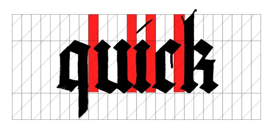
- Word space should have 2 nib widths between.
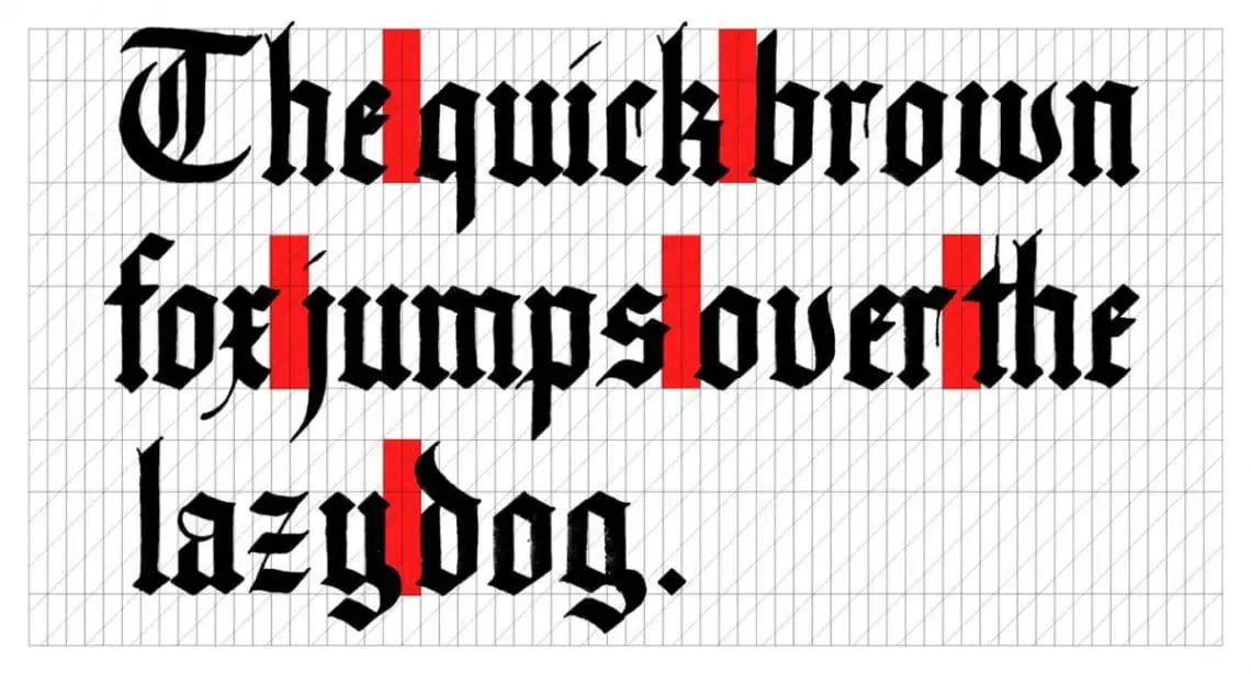
Basically, Blackletter is all about an even, repeating rhythm: a vertical downstroke, a space, a vertical downstroke, a space. If your spacing stays consistent with the thickness of your strokes, your letters will lock together beautifully.
Rule 3: Use Nib Widths for Your Guidelines
In Blackletter, you don’t use a standard ruler to decide how tall your letters should be. Instead, you use your pen’s nib as your unit of measurement to keep your proportions consistent.
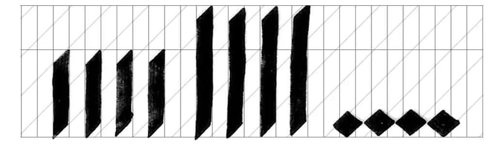
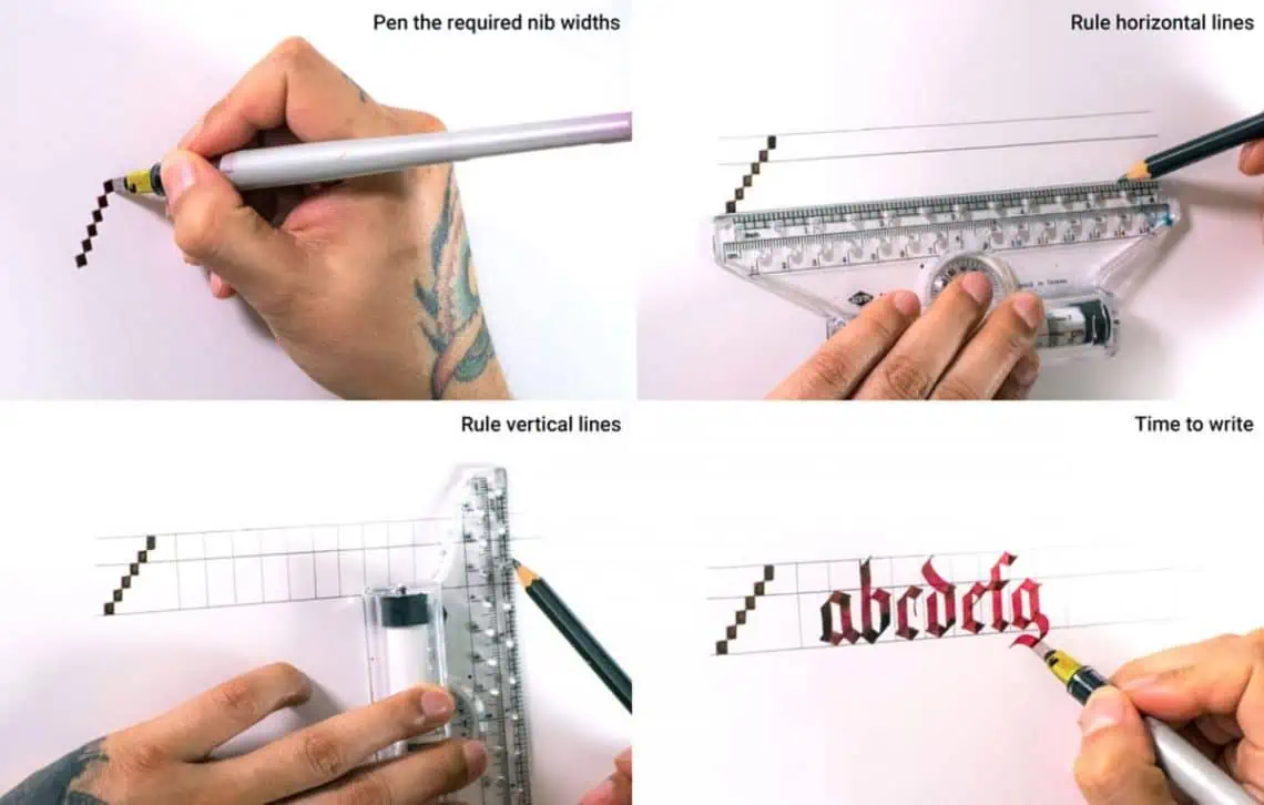
To create your guidelines, turn your pen sideways and turn it 90 degrees to stamp a vertical stack of little ink squares on the edge of your page. For this style, we use these general proportions:
- x-Height (The body of your lowercase letters): 5 nib widths high.
- Ascenders (The tops of letters like b, d, h): 2 nib widths above the body.
- Descenders (The bottoms of letters like p, q, g): 2 nib widths below the body.
Once you have your stack of squares, use your ruler and pencil to draw horizontal lines across your page using those marks. Having these guidelines drawn out gives you a clear visual boundary so your letters stay uniform across the entire page.
The Step-by-Step Blackletter Practice Plan
The absolute biggest mistake beginners make is trying to write full words right out of the gate. Blackletter (or any other calligraphy style for that matter) is a skill that you need to build up gradually, moving from the easiest shapes to more difficult compositions.
If you want to save yourself a ton of frustration, follow this step-by-step practice roadmap.
Step 1: Master the Basic Strokes (The Diamond and the Verticals)
Before you try to write a single letter, you need to train your hand to do two things: pull straight vertical lines down, and create clean diamond shapes.
Set your pen between a 35° and 45° angle, pull a straight downstroke, and stop. Then, use the flat edge of your nib to create the iconic diamond serifs that sit at the top and bottom of Gothic letters. Sit on this step until your hand feels relaxed and your lines look parallel.
Crucial Rule: Always, always practice using guidelines! Don’t try to freehand this. Whether you draw them yourself using the nib-width rule or use pre-printed grids, guidelines are non-negotiable for building muscle memory.
Step 2: Grab the Worksheets and Follow the Ductus
Once your basic strokes are looking consistent, it’s time to move toward letters. To do this properly, you need to learn the anatomy and construction of the alphabet.
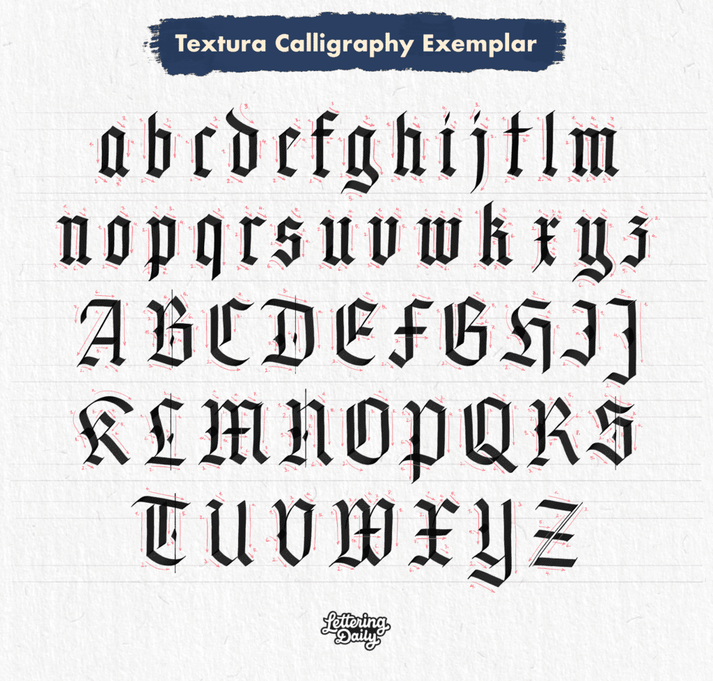
This is where following an exemplar with a ductus is crucial. A ductus refers to the little directional arrows and numbers you see alongside the letterforms. They show you exactly how the letters are constructed, which direction your pen should move, and the precise sequence of individual strokes needed to build each character.
Instead of guessing how a letter is made, use our free practice sheets to trace along with the ductus order shown above. Master the lowercase alphabet first before challenging yourself with the more ornamental uppercase capitals.
Grab Your Free Practice Sheets Here!
Don’t practice on blank paper. Download the free Blackletter Alphabet Worksheets inside the Lettering Crate to practice these exact stroke sequences on a properly sized grid.
Sign up and get FREE instant access to the Lettering Crate –
A growing library of free lettering & calligraphy resources that includes –
Step 3: Combine Letters into Short Words
Now that you can write individual letters, start combining them to form words. The goal here is to focus completely on Rule 2: Consistent Spacing.
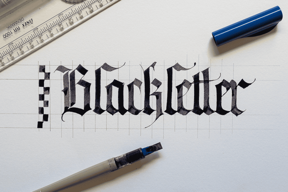
Start with shorter, single words that use simple letters (like “minimum” or “tilt”). This will help you lock in that rhythm of downstroke, space, downstroke, space without getting tripped up by complex letterforms.
Step 4: Move to Short Sentences and Simple Compositions
Once you can write single words with beautiful, consistent spacing, you are ready for the final stage. Move on to short quotes, sentences, and simple layouts.

Keep This in Mind When Practicing:
Calligraphy can be challenging, especially if you’ve never done it before. You will mess up, you will get frustrated, but if you practice consistently, I promise you will see progress. Drop your expectations and allow yourself to be a complete beginner. Embrace the play, embrace the mistakes, and enjoy the ups and downs of learning. This way you’ll have fun and you’ll make the most progress in the least amount of time. As I like to put it—Try, fail & try again.
Ready to Explore More Calligraphy Styles?
Now that you have a solid grasp on Blackletter, why stop there? The world of calligraphy is massive. Check out the ultimate guide on 10 Calligraphy Styles Every Beginner Should Learn to discover your next favorite script!
About the author

My name is Edgar Villa. A few of you may know me by my social media handle ‘Made by Edgar’ and I am a Mexican calligrapher/artist from Jersey City. I composed this article to help any beginners interested in learning ‘Blackletter’ calligraphy

Thank you so much for making my dream into a reality! Forever will be grateful.
excellent tutorial young sir!
Hello! Are these recipes for 6.0mm or 3.8mm? If for 3.8 mm, then where can I find prescriptions for 6.0 mm?
Hi! Where could I get those practice sheets?
In the Lettering Crate, instructions are written above in the article.
I think the problem is that there is no blank practice sheet with just your slanted grid in the Blackletter set. Could you add one please?
For sure I’ll add it in the next update. Thanks for the feedback!
Thank you for your information !
Please can i get some practice sheets. i am interested in learning.
All the worksheets and freebies are located inside the Lettering Crate. Sign up to the newsletter with your email and you’ll get instant access to the freebie page a.k.a – The Lettering Crate.
I wanna know the order of writing!
Can you show me?
It is so difficult…
I will soon update this article with a clear ductus of the whole alphabet! Sorry for the inconvenience.
Please , send me the worksheets. Thanks
I can’t send you the worksheets. They are all located inside the Lettering Crate. Just read the part in the article where the worksheets are being mentioned.
Heya!!!
First of all your tutorial & free downloadable worksheets are just amazing. I just wanted to know what’s the spacing between the vertical lines drawn or the width of it.
that she has used while making guidelines in the ratio 2:4:2.
Thank you
Thank you for your feedback! 🙂
I am interested in calligraphy and try to improve my skills in Black-Letter. Your practice guide sheets will be very helpful.
Thank you,
Vasfi
Hey Vasfi,
Glad to hear that, thank you for the kind words 🙂
Found everything, thank you. This tutorial article is great and the lettering gorgeous. Kudos!
Awesome! 🙂
I think many of your commenters are experiencing what I’m also encountering. I got the passcode and link. Perused your tutorials. I’m currently trying to find the Blackletter worksheets and any printed materials for download. There is a lot of great info here. But I have gotten to the comments section and still am unsure how to navigate to the downloads. I will take a closer look, as I’m sure it is there somewhere. But might I suggest that if so many ppl are finding it difficult to download your practice sheets, perhaps it’s not highlighted in a prominent enough way. I’ll begin looking again … thanks for all the learning materials!
Hello Violet. Thank you for your comment, and i completely agree with you. I will most definitely update the article and improve the structure so it’s easier for people to navigate. Constructive feedback is always super appreciated so feel free to drop your thoughts at any time 🙂
Wow! Thank you! I’m lookin forward to mastering this style
Hey Mary, thank you for your comment 🙂 Love the energy in your words, and if you need any help just let me know 🙂
Hi my email is
kulpreetk2304@gmail.com
Hello, Kulpreet. This does not work like this. I can’t use your email address. If you scroll above, you will see a sign up form. Drop your email there and you will get access to the Lettering Crate.
Please send free practice sheets. I am just starting out and found tutorial very helpful.
You got to sign up to the newsletter in order to get access to the Lettering Crate – once you do that you will have full access to all the freebies that we offer on the website 🙂
hi! i found this extremely helpful but where can i download the free practice sheets? thanks!
Hello Sam, thank you very much. Right before the end of the post there is a subtitle that says – Drop your email below so we can send you the FREE downloadable practice sheets. After that you just drop your email and we send you the access to the Lettering Crate where you can download all of the practice sheets and other freebies as well (it’s a resource library)
What about numbers and punctuation on blackletter?
Good question 😀 Im pretty sure you can find some inspiration on Pinterest
Can’t able to understand how I download the practice sheets!!!
Halo me for the same
Where exactly do you face the issue? How can i help?
Not sure if this is the same issues, but the confirmation email sends us to https://www.mailerlite.com/
Hey Aaron, we just tested the whole thing and it works without any issues on our side. Once you receive the confirmation email you just need to click on the big red button that says – ”confirm your email” after that you will get a second welcome email that will give you access to all of the practice sheets. In case you are struggling with it, please feel free to reach out via email and we can have a closer look at it.
I can believe it!! Just what I needed. I already have all the tools so I will start right away!! Thanks so much for sharing!!
Awesome! Great to hear that 🙂
hi! recently bought some parallel pens and it’s such great fun using them. learning blackletter and came across your site. it’s so useful! thanks~ been practising the letters, would you be uploading any symbols or numbers of the script? thanks!
Thanks for the kind words! Happy to hear that got started with the parallel pen – excellent choice!
As for your question i can suggest two things – 1. Send a message to Edgar on Instagram – he is really cool and always replies to the DM’s 2. Try to search on Pinterest for some inspiration.
Let me know if you have any more questions!
Such a well written and amazing article…each and every step was so amazingly explained…
Thank you! happy to hear that you found it useful 🙂
Thank you so much for sharing your work.really greatful to you guys?
Glad you enjoyed it! keep practicing and be sure to share your artwork 🙂
Thank you! this is so helpful.
You are welcome! 🙂
Thank you for sharing. This is awesome.
You are welcome! 🙂
Can’t wait to try this script…..thanks for sharing
Awesome! be sure to share your work on the forum, or use the #learning2gether to get some additional feedback on your work 🙂
Cheers!
Such a helpful post but not able to download the sheets..
Hey Saloni,
Glad you enjoyed the tutorial and im really sorry you couldn’t reach the practice sheets.
Would you mind describing where are you facing the issue? Perhaps you can take a screenshot and submit it to the forum under the ”other” section
or send us an email directly to letteringdaily@gmail.com
Looking forward to helping you out!
Thank You so much for generously sharing your knowledge with us newbies. ??
Super glad you found it useful! 🙂 Cheers!
This is very helpful. I have been looking for an easy to understand Blackletter guide. I appreciate the time and effort taken to make this and thanks for sharing it to the world ??
Thank you very much for sharing!!
You are welcome! glad you found it useful 🙂
WOW!! Thank you so much for sharing this! 😀 It was very helpful, and i can’t wait to start using these practice sheets 🙂