
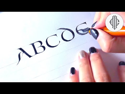
Do you want to start practicing calligraphy, but you’re not sure which calligraphy style to choose from?
You’ve come to the right place!
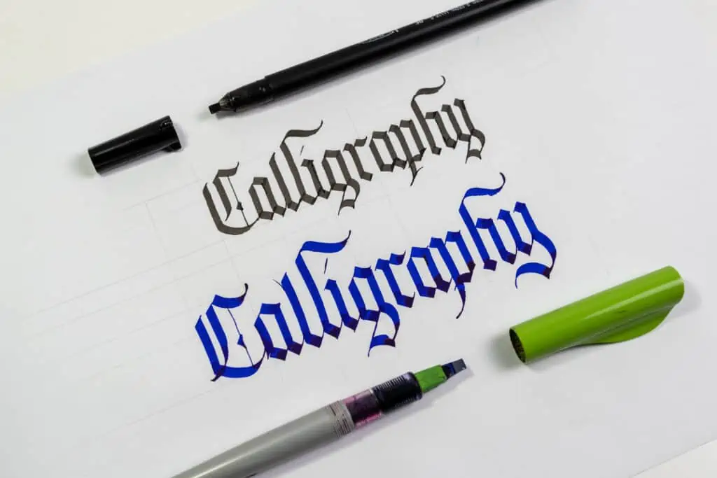
Calligraphy is an umbrella term encompassing a wide variety of calligraphy scripts that have evolved for nearly two thousand years.
In this article, I will go over the most popular calligraphy styles.
This article is part of my Calligraphy Hub, where I’ve gathered foundational guides, tools, and creative inspiration to help you grow your skills.
For each style (a.k.a. script), I will provide the following –
- Origins of the style
- Characteristics of the styles
- Exemplars
- Resources
- Instagram accounts for inspiration
This article will help you better understand the names of the various calligraphy scripts (aka styles) and help you choose one to start.
Here is a quick look at the styles covered in this article –
- Copperplate
- Blackletter (Textura, Fraktur, Rotunda, Batarde)
- Italic
- Uncial (Half-Uncial, Artificial Uncial)
- Roman Capitals (Rustic & Square Capitals)
- Foundational Hand
- Spencerian
- Gothicized Italic
- Neuland
- Modern calligraphy
Quick note: If you are just starting, I recommend picking one of these styles first and then purchasing the needed calligraphy pen and other basic calligraphy tools according to that style. I talk about this in my ultimate guide for calligraphy beginners.
I wrote an in-depth guide on choosing the right calligraphy pen that you can check out later.
Alright, let’s begin!
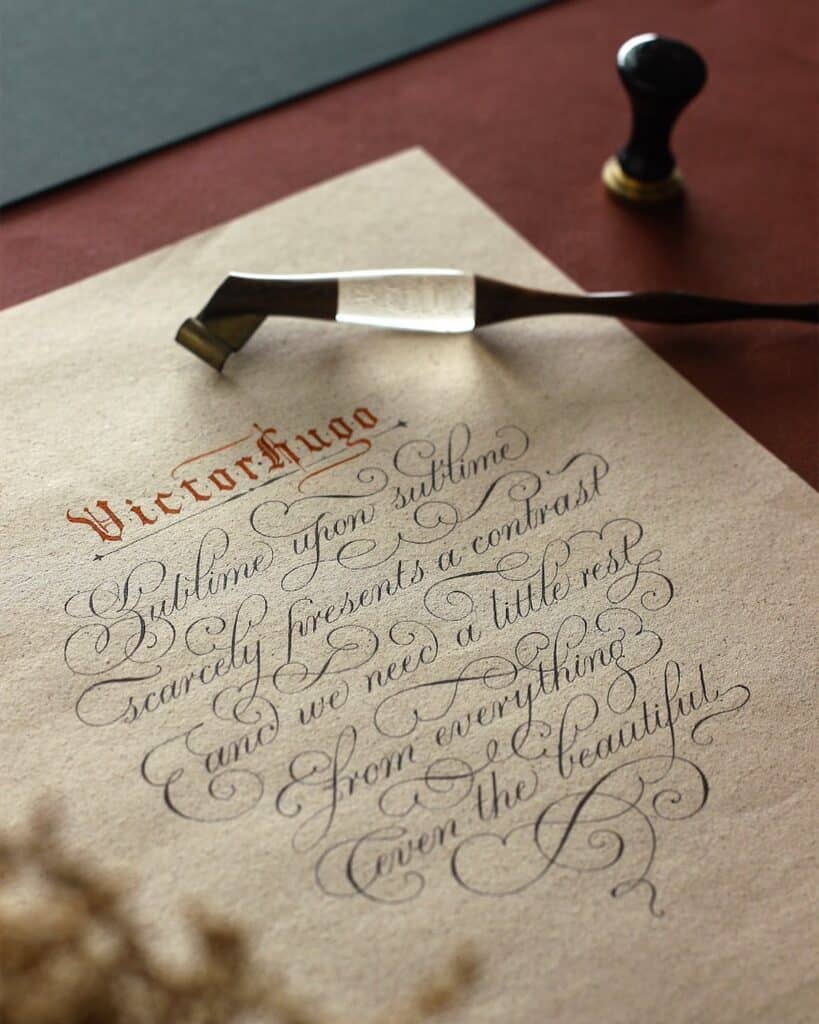
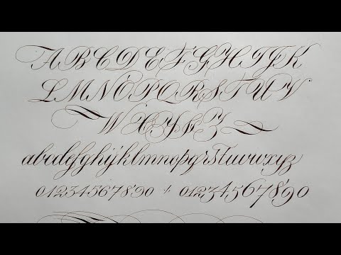
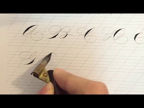
1. Copperplate calligraphy
Origins of the script
The Copperplate script can be traced back to the late 17th century. Back then, known under a different name – the English Round Hand.
Without going too deep into the whole history of the Copperplate script, the name was adopted later on as calligraphers tried to copy the beautiful letters engraved on copper plates created by the penmanship masters of that time.
I talk more about this in my article about the history of calligraphy.
However, for a more in-depth explanation of the origins of the Copperplate script, I highly
recommend checking out this fantastic article by Sybille.

Script characteristics
The Copperplate script is undoubtedly one of the most popular calligraphy styles worldwide. Highly slanted, elegant, flowy, delicate, and precise strokes are just some elements that make Copperplate such an attractive style.
The Copperplate script is mainly created with a pointed nib and ink.
However, you can also practice it using a brush, pen, or pencil.
As mentioned, it is a highly slanted style angled at 55 degrees.
The x-height of letters isn’t fixed, meaning you can determine how big you want your minuscule to be.
However, when practicing, it’s not practical to have a large x-height (especially when working with a dip pen and ink).
The ascenders and descenders are one and a half times the x-height, making them proportional regardless of the size you choose to write your letters.

The best way to begin practicing the Copperplate script is by learning the basic strokes and understanding the proper sizing and proportions of the letters.
The key is forming strong foundations that will allow you to create letters, words, and even intricate flourishing compositions.
Exemplar
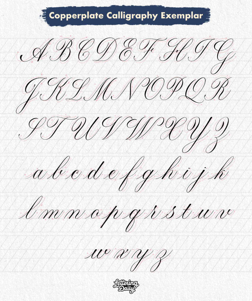
Note – In calligraphy, exemplars are fully written alphabets that include the ductus. The ductus is the direction that indicates the order of each stroke needed to form the letter.
Resources
My friend Paul Antonio also has fantastic resources on his website and YouTube channel regarding Copperplate calligraphy.
Check out his video demonstration on the whole alphabet done with the Copperplate script –
You can check out my website’s beginner’s guide on Copperplate calligraphy.
Additionally, you’ll find some great resources on the IAMPETH website.
An excellent book for you to check out is – Mastering Copperplate by Eleanor Winters
Instagram accounts for inspiration
@pascribe
@logos_calligraphy
@suzcunningham
@benjawan_calligraphy
@bad_calligraphy
@caligrafiabilbao
@masgrimes
@trishiba
@sarahscript
@inkmethis
@anintran
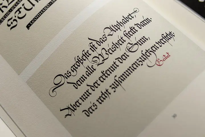
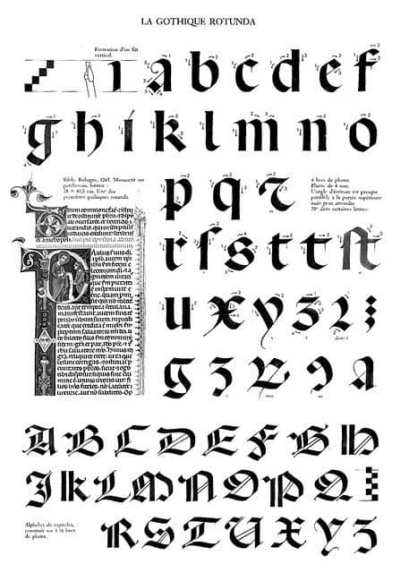
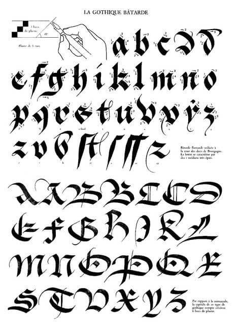
2. Blackletter calligraphy
Origins of the script
Think of Blackletter (gothic) calligraphy as a family of different scripts.
There are so many different blackletter calligraphy styles that you can practice.
They all have their own names, history, and little nuances.
It would be quite impractical to try and cover all of them in a single article, so I decided to go over the most popular ones –
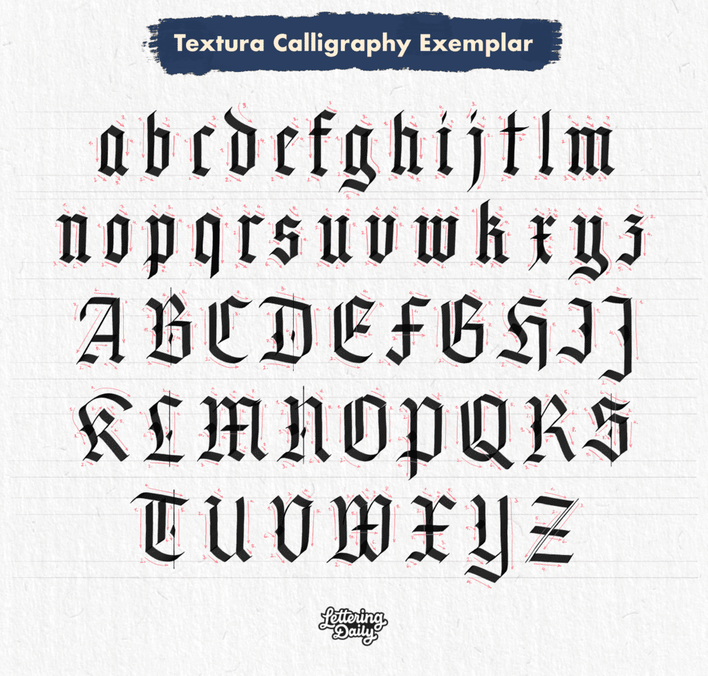
- Textura Quadrata
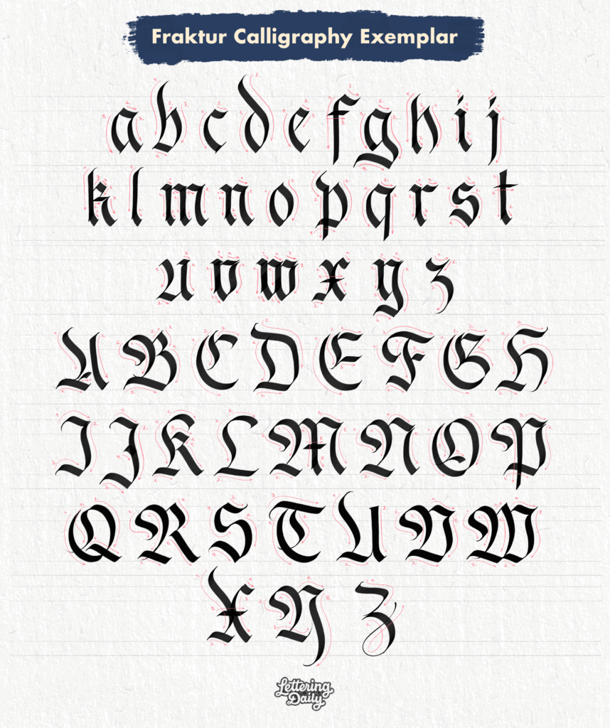
- Fraktur
- Rotunda
- Batarde
Each of these styles emerged in different time periods and locations across Europe.
However, to generalize, blackletter calligraphy emerged in Northern Europe around the 11th century.
Script characteristics
Thick, black, dense, vertical strokes with sharp edges characterize black letter calligraphy.
Blackletter calligraphy is a very expressive calligraphy style (regardless of the specific script), and today, there are so many variations out there that you can practice.
Blackletter calligraphy is practiced using a broad-edged nib, marker, or fountain pen.
The minuscules are usually sized at 5 nib widths, while the ascenders, descenders, and capitals are at 7 nib widths.
However, some blackletter calligraphy scripts use different sizing proportions (i.e., the Batarde script).
Unlike Copperplate calligraphy, where the thickness difference is created by adding/releasing pressure from the pen, the broad-edged nib creates variations in thickness by holding the nib at a consistent angle.
Exemplars
Unfortunately, I still need tutorials for the Rotunda and Batarde calligraphy scripts, and I couldn’t find any good resources online. However, I did find these two exemplars on Pinterest that you can see below.
Resources
Artist Tri Le created this YouTube video demonstrating a blackletter alphabet –

If you’re interested in the Textura script, you can check out this tutorial here written by Edgar Villa.
There is also a beginner’s guide on Fraktur calligraphy written by Jake Rainis.
Jake’s website is also a great resource for blackletter calligraphy.
I also highly recommend getting a calligraphy book.
Calligraphy books are a great alternative for people who are unable to attend any calligraphy workshops.
In this article, I share my top 10 calligraphy books for beginners.
Instagram accounts for inspiration
@theosone
@frak_one
@sachinspiration
@filipcislak
@emmanuel_buron
@lucabarcellona
@slo.leecalli
@signum_et_imago
@chaanes
@tolgagirgin99
@hwangraphy
@misterkams
@_ch_is_art_o_
@jakerainis
@remrk
@lalit.mourya207
@calligraphile
@kikovalente
@yukimi_annand
@uri.miro
@letterjack
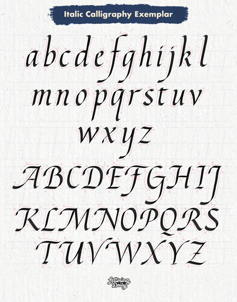
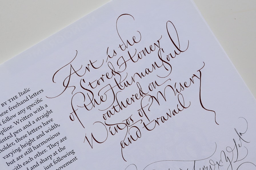
3. Italic calligraphy

Origins of the script
Also known as the Cancelleresca script, Italic calligraphy is a beautiful script that evolved from the Humanist minuscule and originated in Italy during the Renaissance.
If you’re interested in historical examples of this beautiful script in action, I highly recommend checking out La Operina by Ludovico Vicentino degli Arrighi.
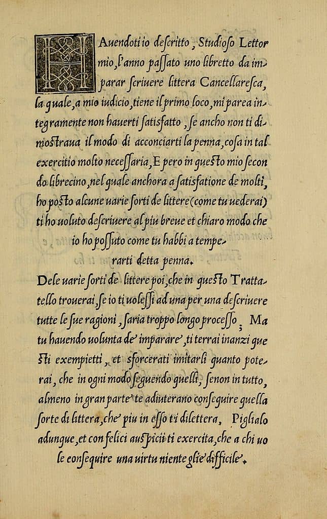
Note – It is incorrect to call calligraphy styles or scripts – calligraphy fonts. Fonts are what computers and other devices use to display text. Calligraphy styles are either called styles or scripts.
Script characteristics
Best recognized for its smooth and elegant strokes with a slight forward slant.
It’s a very rhythmic and dynamic calligraphy style that retains a high level of readability.
The Italic script is practiced with a broad-edged tool. That can be a broad-edged marker, nib + ink, or a fountain pen (Pilot Parallel Pen).
Written at a slant between 5 and 10 degrees, the letters are usually taller than wide.
Minuscules are usually sized at 5 nib widths while ascending and descending letters are extended equal to the x-height but can be shorter or longer if needed.
The capitals (or majuscules) are slightly lower at 7 nib widths.
Exemplar
Resources
I wrote a beginner’s guide on how to get started with Italic calligraphy.
As a beginner’s resource, this YouTube video by Joanne Fink is also very useful –
I also highly recommend the book – Foundations of Calligraphy by Sheila Waters.
Instagram accounts for inspiration
@cencelleresca
@mattiabonora
@slter8
@chiar.riva
@tolgagirgin99
@hwangraphy
@filipcislak
@donavonmatthews
@huiskong
@andrearusso_90
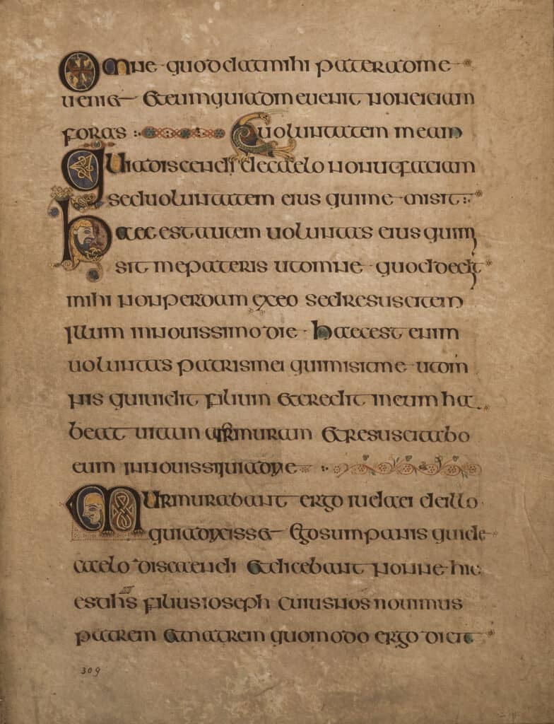
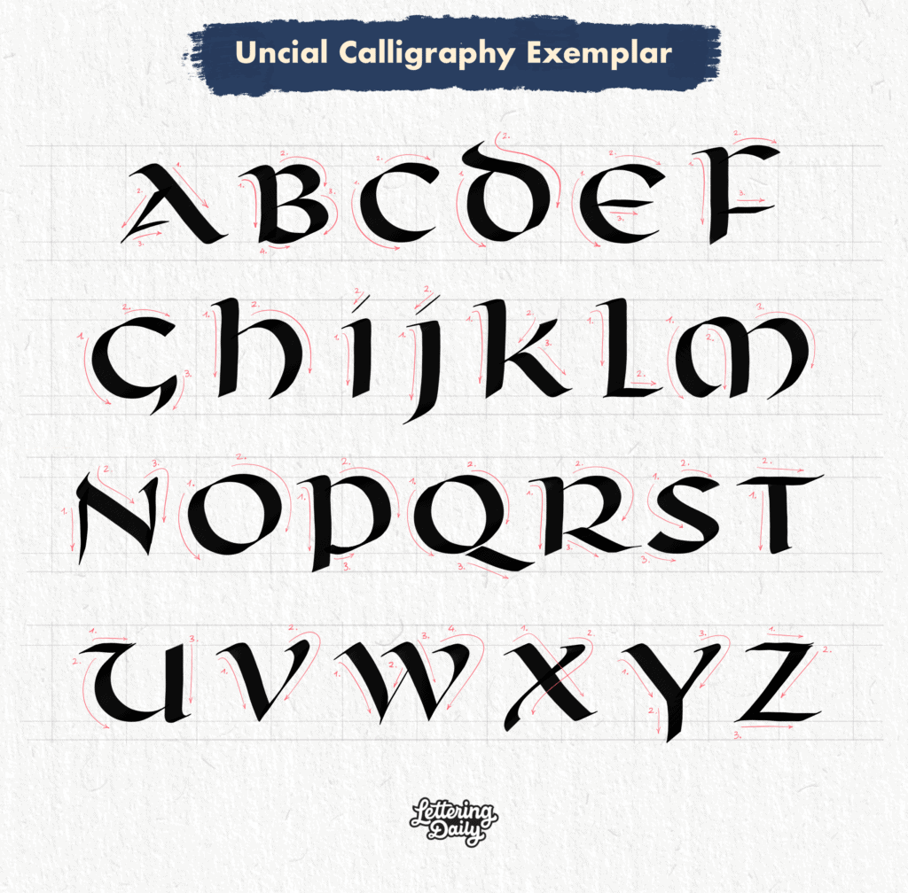
4. Uncial Calligraphy
Origins of the script
Uncial calligraphy evolved from the Roman capitals around the third century, with even some earlier historical records.
As Christianity was gaining popularity, the Uncial letters served as the official script for their manuscript, which quickly found its way across Europe.
Here is an absolutely gorgeous historical sample of the Half-Uncial script from the Book Of Kells (9th century) –
Script characteristics
As with other traditional scripts, the Uncial comes in many variations.
The three most notable variations of Uncial calligraphy are –
- Uncial
- Half-Uncial
- Artificial Uncial
Another distinct feature of the Uncial script was that although it was a pure capital letter script (majuscules), it was the script that first introduced some of the lowercase letters we know and use today.
The Half-Uncial lowercase letters were even more prominent than the Uncial script.
It also differed from its predecessor (Roman capitals) by an absence of serifs.
The Uncial style is usually created using a broad-edge calligraphy tool (nib, marker, fountain pen, brush).
It is commonly sized with 4 nib widths and an extra nib width for the slight extensions of specific letters.
Fun Fact: Calligrapher Daniel Reeve used the Uncial script to develop one of the fonts used in the Lord Of The Rings movies.
A subsequent form of the Uncial is the Artificial Uncial, a more elaborate form characterized by serifs resembling the Roman Capitals.
You could say it’s a more elegant-looking Uncial that requires a higher level of skill with the pen.
If Uncial calligraphy is something you would like to learn, I suggest starting with the classic form of Uncial before attempting the Artificial Uncial.
Exemplar
As for the Artificial Uncial, here you can see a demonstration video by @andrea_ho_calli –
Resources
I also recommend checking out this Uncial calligraphy beginner’s YouTube tutorial by Janet Takahashi –
The calligraphy books for beginners article has many books where you can find all the information needed to start with Uncial calligraphy.
Instagram accounts for inspiration.
@reevedf
@andrea_ho_calli
@andrearusso_90
@oliveleafcalli
@cool.hand.James
@evandrocaligrafia
@lililettering
@nutsabtcallig
@yancy.p.sura
@sue.tangomango
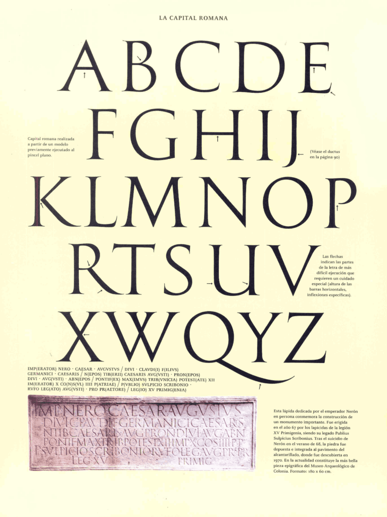
5. Roman Capitals
Origins of the script
Roman Capitals date all the way back to the first century.
They originated in Rome hence the name, and it is with this script that the journey of the Latin alphabet began.
I find it absolutely fascinating the fact that these letterforms were developed by people nearly 2000 years ago and that they remained virtually unchanged until today.
That such beauty, precision, and attention to detail existed back then.
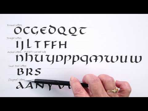
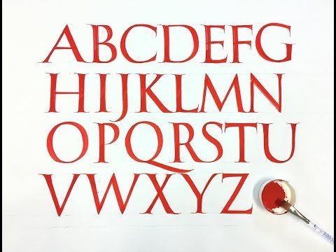
Script characteristics
With Roman Capitals, we can make two clear distinctions –
- Roman Square Capitals
- Rustic Capitals
The Roman Square Capitals is a geometrically based script where the widest letters (such as the O) fit in a perfect square, which gives it its distinctive name.
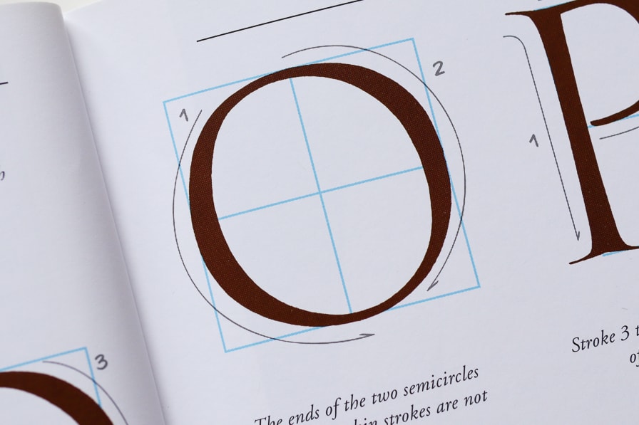
However, not all letters share the same proportions.
Some of them fit in only half of the square shape, and the proportions of each letter are exactly predetermined.
These letterforms are strong, wide, and precise, and I think they perfectly represent the Roman Empire.
You will need a broad-edged tool to start practicing the Roman Square Capitals.
It could be a nib, marker, or fountain pen.
A flat brush is also an excellent tool for this script, considering the complex manipulations required to create the serifs.
However, the best way to begin learning the Roman Square Capitals is by properly understanding the correct proportions of the letters using a pencil.
Practicing the monoline skeleton of this calligraphy style will immensely improve your understanding and thus allow you to improve once you start using a broad-edged tool.
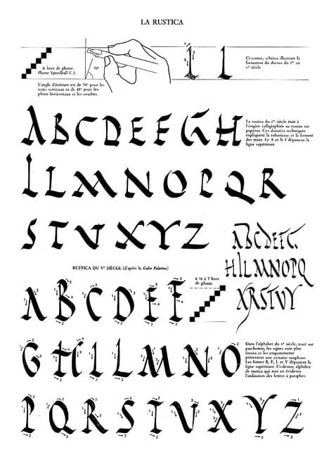
Rustic capitals
Although the Roman Square Capitals were a great representation of the might of the Roman Empire, it was a rather impractical script when it came to execution.
Creating such beautiful letterforms takes time and effort, not to mention the ample space it takes.
The Rustic Capitals was a script that solved this issue and had a more colloquial use.
The Rustic Capitals are characterized by a narrower form achieved by a more narrow pen angle and a more relaxed hand movement.
Exemplars
Resources
I highly recommend checking out these books as they have great resources for the Roman Square Capitals –
- Edward Catich – The Origin of the Serif: Brush Writing and Roman Letters
- Sheila Water – Foundations Of Calligraphy
- David Harris – The Art Of Calligraphy
Demonstration video by Sunny Law –
Demonstrations video for Rustic capitals –
Unfortunately, the video shows only a couple of the letters.
Instagram accounts for inspiration
@calligraphile
@kikovalente
@claudiogil_lagrafia
@slter8
@yukimi_annand
@bocchigiuliano
@lettertetter
@huyhoangdao
@suyoun_calli
@yves_leterme
@andrearusso_90
@studioindigo
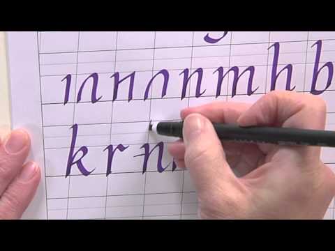
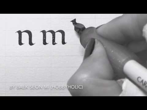
6. Foundational Hand
Origins of the script
The Foundational Hand was created in the 20th century by the famous calligrapher Edward Johnston.
The Foundational Hand is a script based on the historical Carolingian minuscule from the 10th century.
According to Johnston, the Foundational Hand is the best script for beginners to start practicing calligraphy.
Script characteristics
The Foundational Hand is a clean upright calligraphy script written with a broad-edge pen.
A key focus letter of this style is the letter o since nearly all letters fit into that rounded shape.
Like the Roman Square Capitals, the letter o of the Foundational Hand also fits proportionally into a square.
The pen angle is mainly kept at 30 degrees, except for diagonal letters, where it’s turned to 45 degrees to balance the weight of the stroke.
Such a pen angle gives us a very well-balanced look of thick and thin strokes across the letterforms.
The Foundational calligraphy is sized with 4 nib widths and 2 additional nib widths for ascenders and descenders.
Exemplar

Resources
On the Lettering Daily website, you will find a beginner’s guide on the Foundational Hand, which also includes FREE printable worksheets.
Additionally, I HIGHLY recommend getting this book –
Sheila Waters – The Foundations Of Calligraphy
It contains the best breakdown of the Foundational hand I’ve seen from any book.
Demonstration video by Seonmi Baek –
Instagram accounts for inspiration
@calligranir
@dashaen_09
@kanako.arata
@lettertetter
@joostnijssen
@suyoun_calli
@seonmi_calli
@zhoutong0810
@cancelleresca
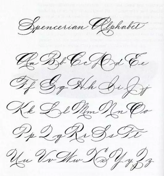
7. Spencerian Calligraphy
Origins of the script
The Spencerian script is a calligraphy style dating from the 19th century in the United States.
Developed by Platt Rogers Spencer, hence the name, Spencerian was so popular and widespread across the country that it became the official writing style in both personal correspondence as well as at a government level.
Script characteristics
Unlike Copperplate, Spencerian is written at a slightly softer angle.
Instead of a 55-degree, it’s a 52-degree slant.
It’s also less shaded than Copperplate, giving it a more delicate look.
The shade means the thicker downstroke.
Another notable difference between the two scripts is that Copperplate is more oval-based, whereas Spencerian has a bit more of an angular look between the downstrokes and upstrokes.
It also requires fewer pen lifts than Copperplate, which allows it to be more free-flowing.
To start learning Spenceian, like with Copperplate, you will need a pointed nib + ink, a brush pen, or even a pencil.
Exemplar
Resources
IAMPETH Website
Video demonstration by Dao Huy Hoang –
Instagram accounts for inspiration
@mrmgward
@huyhoangdao
@logoscalligraphy
@james_fazz_farrell
@zelym.calligraphywork
@anintran
@nqnghia.calligraphy
@peachiecalligraphy
@calligraphybyfiza
@calligrapher_gaganpreet
@olyisolivia2calligraphy
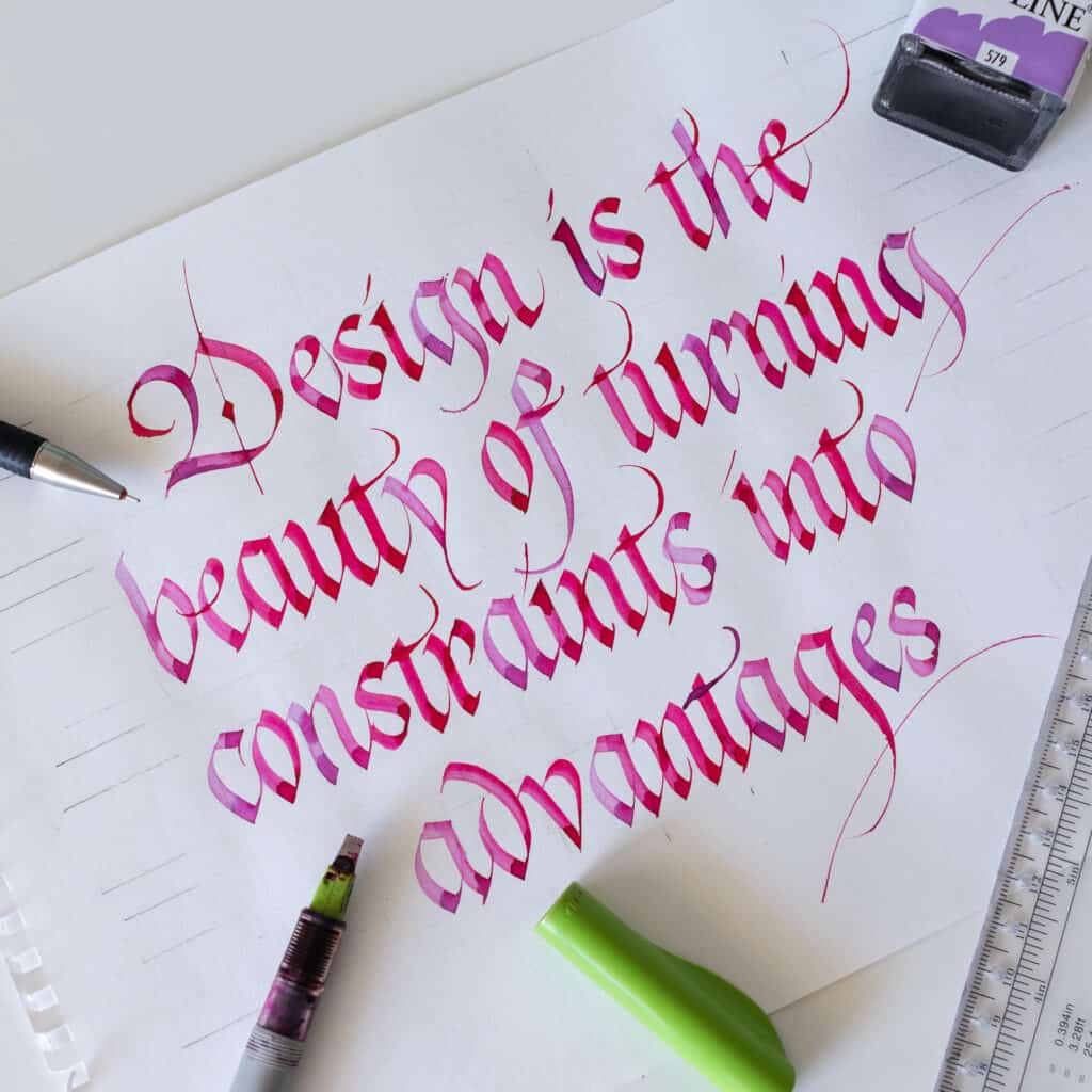
8. Gothicized Italic
Origins of the script
This is probably one of my favorites from this list.
It combines two of my very dear calligraphy styles – blackletter (gothic) and italic.
Gothicized Italic as a script was developed by famous calligrapher Edward Johnston.
Yup, the same guy I mentioned earlier regarding the Foundational Hand.
Script characteristics
This style is so particular because it retains the strength and rigidity of blackletter calligraphy. Still, simultaneously, the curves taken from the italic script add more rhythm, which also improves the legibility.
It’s like mixing PB & J. It’s a fantastic combination that everyone loves!
Gothicized Italic is created with a broad-edged pen. Again, that could be a nib, marker, or the popular Parallel pen.
The proportions of Gothicized Italic are the same as for blackletter calligraphy.
An upright slant, an x-height of 5 nib-widths, and 2 extra nib widths for the ascending and descending letters.
Exemplar

Resources
This is a fantastic one-hour lecture on Gothicized Italic calligraphy by Eleanor Winters –
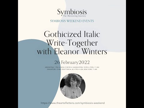
This is a great starting point to understand the basics of the script.
Additionally, I also recommend this book – Foundations Of Calligraphy by Sheila Waters.
Instagram accounts for inspiration
@aninatran
@barrymorentz
@oliveleafcalli
@pattinola
@tico.calligramotion
@georgia.angelopoulos
@sachinspiration
@micaelacalligraphy
@tortoise_calligraphy
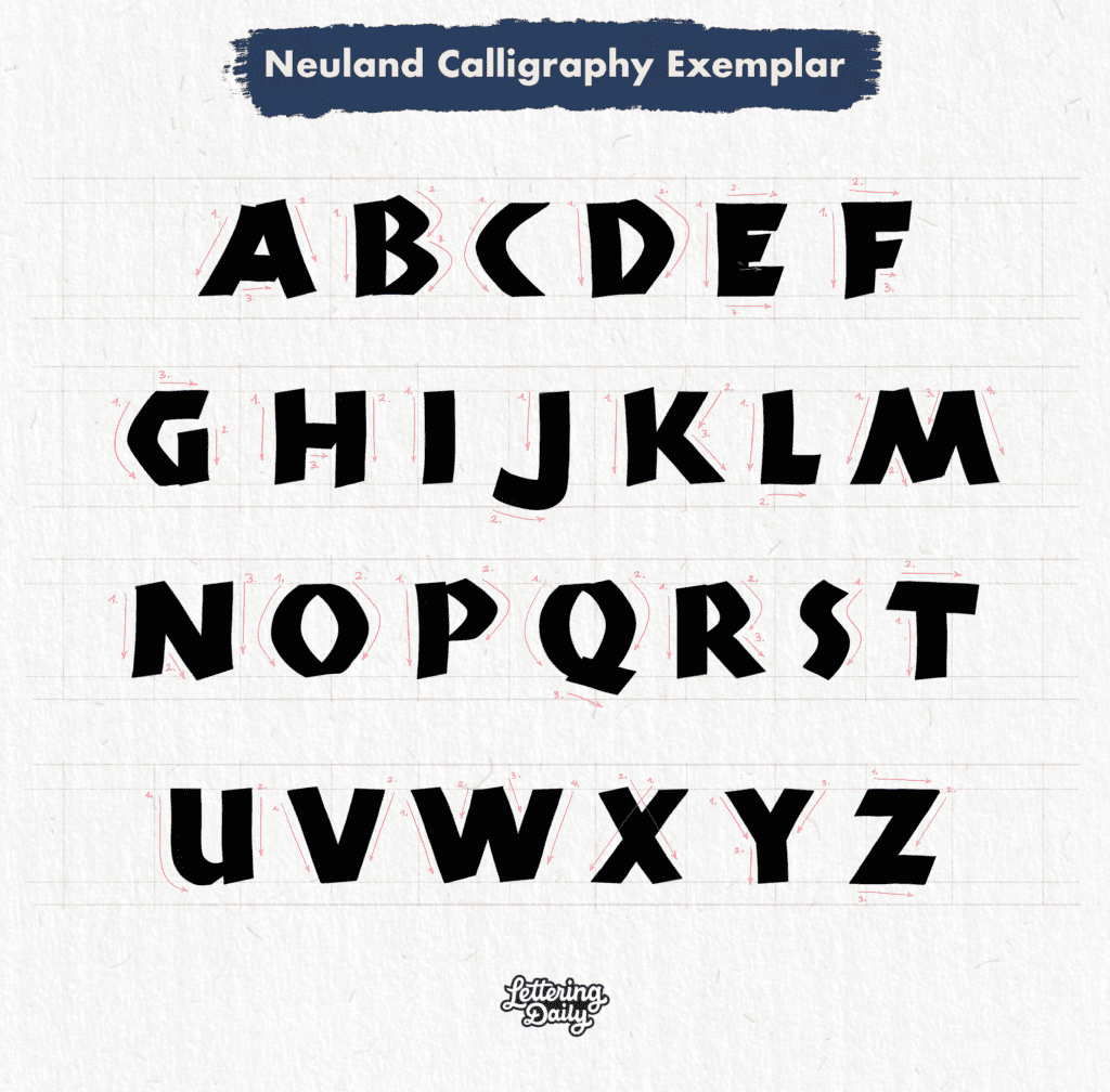
9. Neuland Calligraphy
Origins of the script
The Neuland script was created in the 20th century by German type designer and calligraphy Rudolf Koch.
Neuland was initially created as a typeface and, in later years, adopted by calligraphers as a writing alphabet.
Along with Edward Johnston, Rudolf Koch was also considered to be at the forefront of the revival of calligraphy as an art form during the 20th century.
Script characteristics
What makes this calligraphy style so unique is its simplicity and boldness. In other words, it’s funky and chunky.
It’s a complete majuscule script (only capitals), and it has a distinctive playfulness.
You will also notice that there is a lack of contrast between the thick and thin parts, as you can see with other broad-edged scripts.
The Neuland script is more uniform in that regard.
Neuland calligraphy is created with a broad-edged tool. It could be a marker, broad-edged nib, dip pen, Parallel pen, and more.
It is usually sized at 4 nib widths but I’ve seen also people sizing Neuland at 3 nib widths.
Fun fact – The logo for the movie Jurrasic Park uses a font inspired by the Neuland script.
Exemplar
Resources
A good starting point is this YouTube video by Maria Montes –
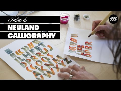
She covers the very basics of the Neuland script, such as sizing, proportions, basic strokes, etc.
Additionally, I recommend the following books –
Calligraphy Bible by David Harris
Speedball Textbook 25th Edition
Instagram accounts for inspiration
@iamariamontes
@lesencresfolles
@studioindigo
@luthienpetrucci
@lettersbydryogi
@sue.tangomango
@joanquiros
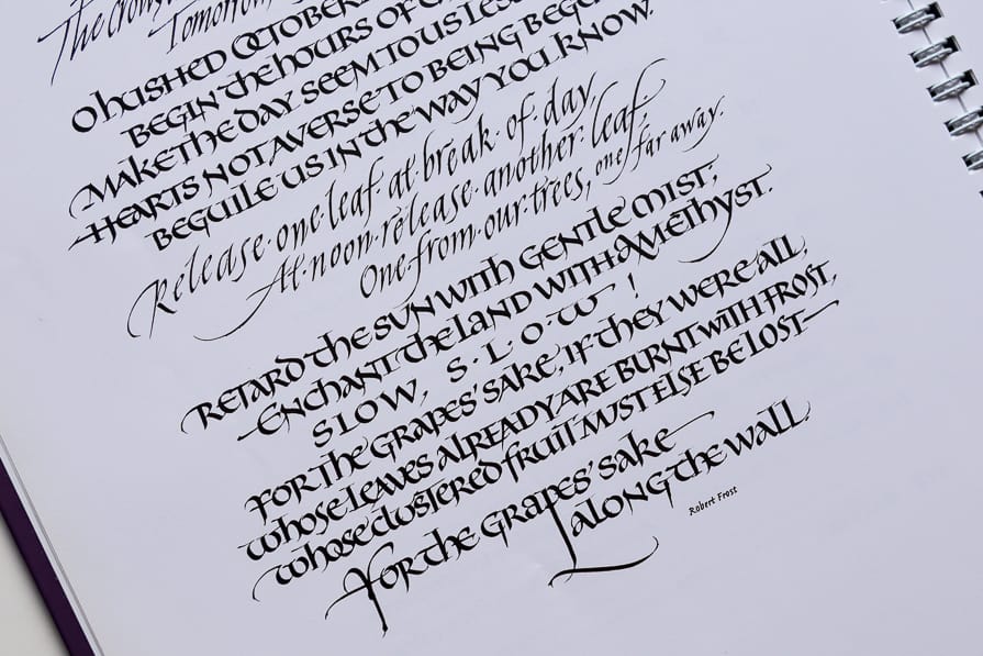
10. Modern Calligraphy
I left modern calligraphy as the last item on this list since it’s something that stands out from this list.
Modern calligraphy is more of a concept than a particular script.
Thus, including the script’s origins, characteristics, etc., doesn’t really apply here.
Today the word modern calligraphy triggers a specific image to calligraphers.
Bouncy and swirly letters were created with a brush pen.
Although that’s not technically incorrect, it is a very limiting way of thinking about modern calligraphy.
I see and think about modern calligraphy as a much broader term.
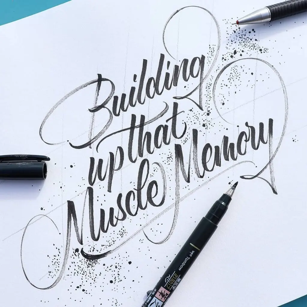
In short, modern calligraphy is any type of calligraphy that doesn’t strictly adhere to the rules of traditional scripts.
This is a more suitable definition since modern calligraphy isn’t just bouncy brush calligraphy. It’s much more than that.
Modern calligraphy can be created with virtually any writing tool you can think of.
So, for example, you can create a modern alternation of a blackletter script or perhaps of italic letters.
You can create modern alternations from the Copperplate script, Spencerian, and Roman capitals and minuscules.
The brush pen is a fantastic tool that allows you to create all sorts of marks on the paper.
Of course, scribbling something on a piece of paper and calling it modern calligraphy isn’t the best practice.
Even with modern calligraphy, you can quickly notice the difference between a skilled hand and a beginner.
I’ve written an extensive guide on how to start modern calligraphy using a brush pen.
It also includes free downloadable worksheets.
I also highly recommend you check out my brush calligraphy workbook – From Strokes To Style
Master Brush Calligraphy
One Stroke at a Time
This 100+ page workbook walks
you step-by-step through brush
calligraphy basics to full style
development – no experience needed.

This is precisely the beauty of modern calligraphy, the fact that you can let loose and try out new things.
And who knows, you might create an entirely new calligraphy style that will be practiced by calligraphers worldwide for centuries.
What do you think about how we came to have so many different styles to practice today 🙂 ?
Instagram accounts for inspiration
@rachelyallop
@snooze.one
@chiar.riva
@lucabarcellona
@tolgagirgin99
@hwangraphy
@claudiogil_lagrafia
@meximuss (me)
@lettersbydryogi
@michael_moodie
@stephanelopes
@rodriguez_carmas
@jexpo76
@dilbag.insta
@angeliqueink
@black3angle
@philippstehli
@jelvin
@abhaycalligraphy
@omelartjewelry
@myletterlove.art
@calligraphy.by. Manoj
@bugitype
@danielhosoya
@mdemilan
@calligraphy_dk
@tierneystudio
@loveleighloops
@sue.tangomango
@marscalligraphie
Final words about calligraphy styles
So to recap the whole story.
If you’re just starting, pick one style, get the needed supplies for that style, and start practicing the calligraphy style you chose.
Spend a few months with it, study it properly, and be sure to practice consistently.
With time you can start learning more styles and gradually build up your skill level.
Now let me ask you a question –
What calligraphy style are you practicing, or would you like to start practicing?
Be sure to let me know in the comments below.
If you have any questions or feedback, feel free to reach out.
Until the next time,
Cheers!
Pin me!

Stay updated with my tutorials and get instant access to the Lettering Crate –
A growing library of free lettering & calligraphy resources that includes –
About the author

Hey, I’m Max. I’ve been drawing and messing around with letters since 2011. I don’t have a formal art degree—my background is actually in the kitchen as a former chef and on the streets painting graffiti with my friends. Over the last decade, through a ton of trial and error, I somehow turned that obsession into a full-time gig. These days, I design custom logotypes for global brands and paint large-scale murals. I started Lettering Daily just to create the kind of honest, no-BS tutorials I wish I’d had when I was starting out. Stick around, and let’s draw some letters.

Hello, Max! Thanks for this awesome info and tutorials. I really appreciate it. I wanted to ask about where to find practice worksheets for Textura Calligraphy. I wanna do so wonderful type of calligraphy.
Thanks again!
Hey Eva,
Thanks for the comment. The worksheets are all in the Lettering Crate.
I am interested in learning and practicing the Italic script. I am new to calligraphy and I would love to receive printables and such from the Lettering Crate that relate to the Italic script and calligraphy in general.
Thank you for all the Script styles, tutorials, etc I have seen on your site!
Miranda
Hi Max I absolutely love all of these,
Hi max Loved every part of this, I cannot say I have a favourite because all of them are appealing. Since I began my love of Calligraphy over 54 years ago, and it began with an interest in history of hand writing, coupled with story writing in school , then my love of art drew me to trying Sign Writing, unfortunately it was not to be, but I found joy in ticket or showcard writing as it is alternatively called and with the aid of speedball nibs dip pens and my trusty speedball book which I still have..a bit tatty now, I have continued to gain interest in modern brush calligraphy and enjoy experimenting, but oh how I need to put in time to practice. I have really enjoyed learning from and being inspired by all you share. Thankyou so much
I’m looking at both Italic Calligraphy and Foundational Hand, want to study up a bit more on both. Which one would you think would be the best / easiest to begin with? I’ve always hated signing cards & such because I did not like my writing. I want to begin working on learning one of the above.
Thanks for all the wonderful information!!
I appreciate all the information you have provided. Right now, as a beginner, I feel a little intimidated by Calligraphy. So thank you for all the information you have provided on your site. Today, I had brought some Calligraphy markers. Once I get the hang of it and decide whether or not to get into Calligraphy more seriously, I’ll buy some nice pens that are recommended on this site.
There is so much needed information for anyone who really wants to learn Calligraphy. Love reading your articles and background work. Looking forward for more. Thank you very much for this!
Thank you so much for this wonderful article! Your website is such a precious resource for someone like me who’s just approaching this beautiful art.
The one I’m thinking to start with is the Spencerian, because of the fewer pen lifts and the high legibility, but I would love your advice!
I want to learn to write beautifully because… I love words!
I am actually an amateur poet (in a romance language) and I almost always start my poems on my notebook, so it goes without saying that I would love my words and verses to look as beautiful as I feel they are 😉
My dream Calligraphy style would have a minimum amount of pen lifts, it would be simple, maybe a little less slanted than Spencerian, and highly legible, it would just allow me to write with an “uninterrupted flow” with a flexible nib fountain pen (I do love the variable width of the line).
Does such a dream script exist? Or should I start learning something close to it like Spencerian and then try to adapt it to my wishes?
I know, very long and complicated question, but I figured if there is someone who could help me it’s probably you!
Thank you again so very much for your ability and willingness to share your knowledge! Teaching is also a fine art form in which the medium is the human mind ❤️
Have you ever heard of business penmanship? 😀 I think this is exactly what you need – https://www.lettering-daily.com/improve-handwriting/
Let me know if it is. And thank you so much for the kind words! 🙂
Super interesting article and great description for each script. 🙏
My favorite is probably the Gothicized Italic (pb & j)
Thank you 🙂 Hmmm, I never thought you were a Gothicized Italic type of person 😀 Interesting!
This is great work, Max, a very comprehensive introduction to a wide range of scripts–something for everyone. I wrote a short letter in copperplate for friends last Christmas, my first serious attempt–but I need a lot more practice. Thanks again for your hard work.
Drew
Hey Drew,
Thank you so much for the kind words. I really appreciate it. What would you like to learn aside from Copperplate?
Brilliant, thank you. I am presently working on Foundational which I love.
Foundational is such an awesome script but very tricky. At least it was for me 😀 Spacing was something I was struggling a lot with. What style do you want to learn aside from that one?
Wow….what a wonderful email !!! As a calligrapher, I appreciate all the work and information you have gathered, Congratulations to a job more than well done !!!!!!
Thank you so much, Abbey! 🙂
Thanks for a comprehensive introduction to calligraphy.
I especially appreciate the resources. I haven’t been doing any calligraphy lately, but I’m inspired to start again.
YES!! Im so happy to hear that 🙂
This is such a useful explanation, and I love that you have signposted on to so many other resources. Great job!
Thank you so much, Ros! Im so happy to hear that 🙂
Really good information. Thank you so much
Thank you so much Jose 🙂 Im glad you like it.
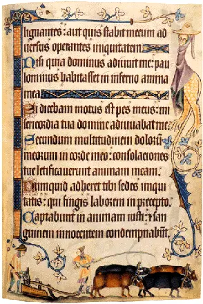
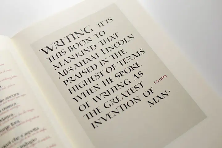
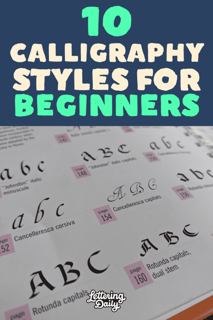
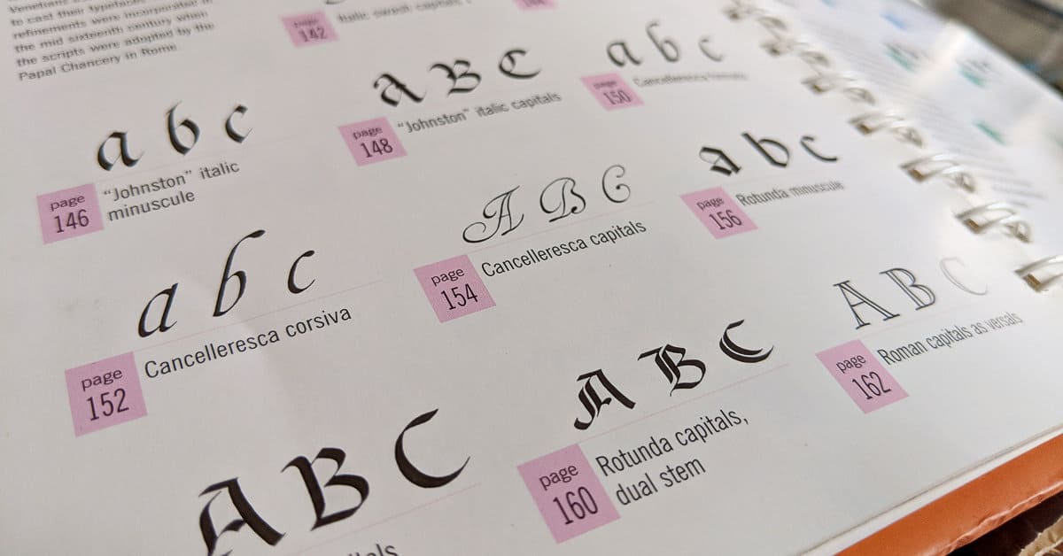
Thanks for such a great article! What book is that first photo from showing the different styles and page number?
It’s the Calligrapher’s Bible. Check out this article here – https://www.lettering-daily.com/calligraphy-books/
Bonjour, vous publiez des planches de : Gothique Rotunda – Gothique Bâtarde – Capitale Romaine – Rustica in « Calligraphie, du signe calligraphié à la peinture abstraite de Claude Mediavilla » 1996 Editions Imprimerie Nationale Paris
Pour la Capitalis Monumentalis, le nom du livre de Julien Chazal est « Calligraphie, le guide complet » 2012 Editions Eyrolles
Thank you, I will add the info under the two images 🙂 As for the third one, I already mentioned it’s from Julien’s book.
Such amazing information put together for anyone who wants to do Calligraphy!
Thank you so much
Wow! Thank you so much for the kind words, Shreya 🙂 What’s your favorite calligraphy style to practice?
Wow, what a wonderful, informative article! I love reading your articles, but this has so much info as well as resources and backgrounds- it makes me want to learn each one of these! I’m still, after a long while, working on Copperplate, which I love so much. My next one will be italic calligraphy. Thanks so much for this!
Awesome! Those two styles really complement each other nicely 🙂 Thank you so much for the kind words, Sue! 🙂 I really appreciate it.