Hello everybody!
I’m Nirjhar Mondal, a doctor by profession and calligrapher by passion!
Some of you may know me by my social media handle @calligranir. I’m an Indian calligrapher from Kolkata.
In this post, I will share my knowledge and experiences with the Foundational Hand.
This tutorial connects with my larger Calligraphy Hub — your central resource for everything calligraphy, from tools to styles and techniques.
This Foundational hand tutorial will teach you these things-
- A brief history of the Foundational Hand
- Tools needed
- Structure of letters
- Spacing
- Understanding letter groups
- Composition tips
- Tips to improve your writing
- FREE downloadable practice sheets
Before jumping on the details, let’s get back in time for a better understanding of the Foundational Hand.
History of the Foundational hand
The British scribe Edward Johnston developed the Foundational as a calligraphy script.
The origin of the modern Foundational hand is based upon 9th and 10th-century manuscripts written in Carolingian script.
It was a fluent, cursive hand with fewer pen lifts than most historical scripts.

These letterforms have been the basis of many scripts, including the modern Foundational hand.
Why is learning the Foundational Hand crucial for every calligrapher?
Because of their clean geometric structure, these letterforms provide an excellent basis for understanding the formation of (other) minuscule alphabets.
That’s why a proper understanding of the Foundational hand’s letterforms will help you write many other related scripts.
As Edward Johnston said in his book – Writing & Illuminating & Lettering (1906) –
The best training is found in the practice of an upright round-hand. Having mastered such a writing, the penman can acquire any other hands -sloping or angular- with comparative ease.
If you want to learn more about the history of the Foundational hand, be sure to check out this article from theshapeofletters.com

Tools needed for the Foundational hand –
1. Nibs
For the Foundational hand, you need the basic calligraphy tools.
My favorite for this particular script is round hand dip nibs from William Mitchell.
There are various sizes available; however, my picks are –
- no 3 (1.2mm)
- no 3.5 ( 1 mm)
These are my favorite nibs for practicing the Foundational hand.
2. Straight holder
A short round-bodied straight nib holder works just fine.
I use an inexpensive Brause straight nib holder.
You can also check out this set from Mitchell – it offers both the holder and multiple nibs.
If you are just getting started, a simpler alternative would be to use the Pilot Parallel pen.
3. Paper
A good calligraphy paper should resist bleeding & feathering and reproduce colors well.
I prefer watercolor papers ( 200 gsm and higher) for most of my work.
These papers can be-
You can use any of the above depending on the effect you’re looking for.
As for regular calligraphy practice, you can also use any sort of paper as long as it doesn’t bleed – always aim for sharp hairlines.
4. Ink
- Gouache
- Watercolors
- Sumi ink
- Any other calligraphy inks
Fountain pen inks from brands like –
Diamine or J Herbin also works very well.
5. Ruler
A simple regular ruler works just fine.
However, I recommend getting a rolling ruler as it’s much quicker and easier to create your calligraphy guidelines.
6. Pencil
HB pencils should be used for ruling because it’s easier to erase.
7. Eraser
Kneaded eraser – works great for light pencil marks and doesn’t leave any pieces like a regular eraser.
And most importantly- your hand.

Quick note: Dip nibs have a protective coating that prevents them from rusting.
You must remove the covering before use as it repels ink while writing.
In this post, Sarah mentions several ways to prep your calligraphy nibs.
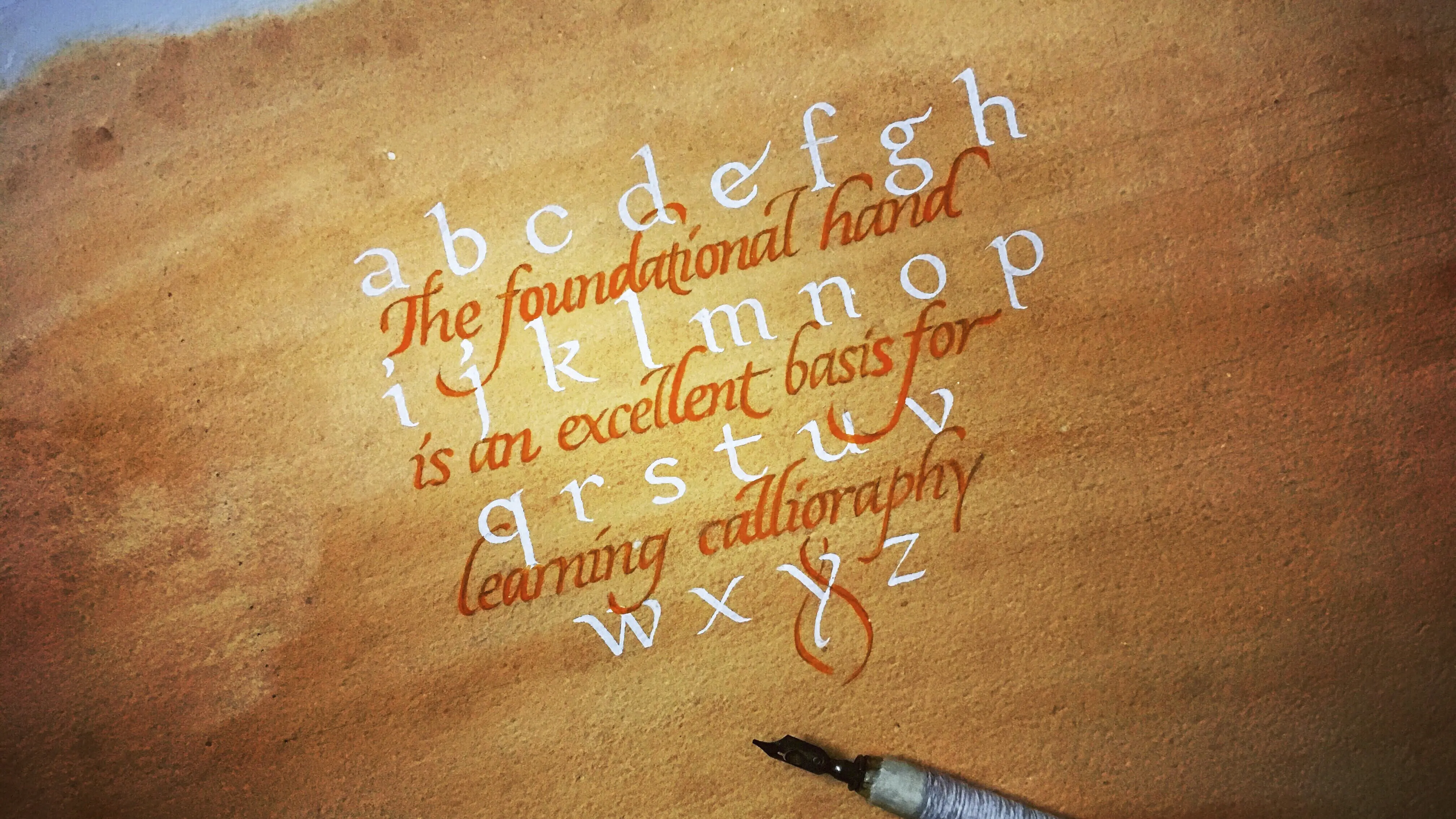
Structure of the letters in the Foundational hand
The letters can be divided into several parts by horizontal lines representing letter proportions.
Consider the following diagram-

- Most of the letters fall between x-height and baseline.
- However, some letters (e.g., h,k) extend beyond x-height to the ascender guideline.
- Likewise, some letters (e.g., p,q,y) descend beyond the baseline up to the descender guideline.
The letter ratio
Letter ratio means the distance between the guidelines that determine the overall aesthetic appearance of the letters.
Traditionally, this ratio is measured in units where one unit represents the nib width of the pen you’re using.
For example, if you’re using a 2mm nib, each unit will be 2mm.
For the Foundational hand, usually, a 2:4:2 ratio is used.
Which means –
- The space between ascender and x-height is 2 units
- The area between x-height and baseline is 4 units
- The space between baseline and descender is 2 units

Once you feel comfortable with this ratio, you should start experimenting with the spacing to add versatility to your writing.
The pen angle
As you can see in the image above, the pen angle stays consistently at 30 degrees.
There are just a few letters, like w, v, and x, that may be written with a steeper 45-degree angle.
Spacing between words
For consistent and proper spacing between the words, leave a space of the same width as the small letter ‘o’ of the script you’re writing.
In the beginning, you can mark the space with a pencil to get an idea.

Spacing between letters
The space between words is the same (the size of the letter ‘o’). But space between letters isn’t equal –
- Space between two straight-sided letters (e.g., db, ll, ii) is maximum
- Space between two curved letters (e.g., oo, bo, pd) is minimum
- Space between one straight-sided and one curved letter (e.g., lc, no, pt) lies in between.

This may seem a little difficult to understand at first but becomes quite easy with practice.
Keeping the proper spacing between the letters is very important in the foundational hand to maintain harmony.
Spacing between lines
Spacing between two consecutive lines should be such that the descenders of the upper line do not clash with the ascenders of the lower edge.
Consider the following diagram –


So, until now, we have learned the letter structure, ratio, and different kinds of spacing.
Now, let’s see how a draft ruling looks like –

Letterform analysis
Almost half of the total letters of the Foundational hand are based on the letter ‘o’.
It’s the key letter in this script.

Consider the following diagrams to understand how the letters are related to the letter ‘o’.
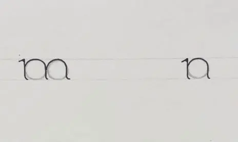
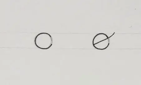
These are the letters based on the letter ‘o’.
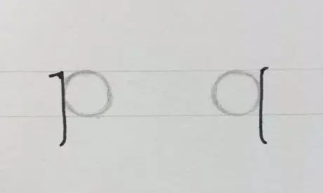
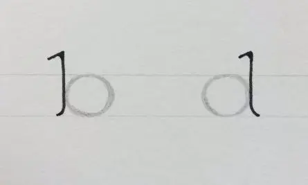
Now let’s look at the stem’s construction and the serif that will be frequently needed in the Foundational hand.

The stem can be added with part of the letter ‘o’ to create a variety of letters.
Here is an example –

Starting to write
We will divide the letters into some groups so that it’ll be easier to learn their shapes.
All the letters in a particular group share some common features.
Here is how I would advise dividing the letters in groups.
Group 1 –
- Letters o, c and e

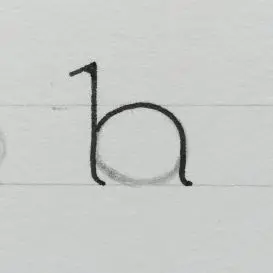
Group 2 –
Letters d, b, p and q

Group 3 –
- Letters h, m, n, and r

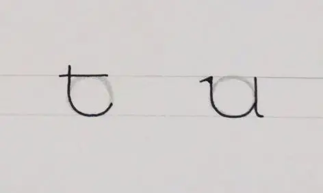
Group 4 –
- Letters t and u

Group 5 –
- Letters l, i and j

Group 6 –
- Diagonal letters k, v, w, x, y and z

Miscellaneous letters –
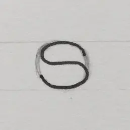
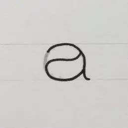
- a, s, f and g

Let’s arrange all of them in alphabetical order.

Layout and composition
Layout and composition denote how you arrange the letters to create a strong visual impact on the viewer.
There are innumerable ways of arranging the letters, and each calligrapher has his/her unique way of composition that distinguishes them from the rest.
It’s impossible to get an insight into the elusive art of composition first. Still, with sustained practice and evolving experience, you’ll be able to compose in a better way.
Here are some easy ways of composition that you may try –
1. Reduce negative spaces around your writing
Suppose we’re going to write the following quote-
‘It’s easy to look sharp when you have not done any work.’
Now, we can arrange the words in many ways like-
It’s easy to look sharp – 18 letters
when you – 7 letters
have not done any work – 18 letters

Or, it can be-
It’s easy to look – 13 letters
sharp when you have – 16 letters
not done any work – 14 letters

In the first example, the words are not adequately arranged, which creates unwanted empty spaces in the middle.
2. Using colors and gradient
With watercolors and gouache, you can create many colors by mixing and making color gradients by dilution, depending on the theme.

3. Alternating scripts
The Foundational hand has an elegant, delicate appearance, and you can alternate it with a bold script like Fraktur or Neuland for contrast.

How to improve my writing?
- Always make proper ruling first before writing. Whether you’re doing casual practice or serious work, remember to draw the guidelines first.
- Practice the letters as groups ( as shared previously) rather than in alphabetical order. This way, you can easily replicate the strokes from memory without looking at the guide sheet.
- Work on a big scale so that you can understand the errors in letterforms and spacing
- Commonly, you may get stuck in one or two letters as you’re learning something new. In that case, better not to repeat the same letters repeatedly. Try to correct them while writing with other letters.
- Gradually start experimenting with the letter ratio and try different
compositions and colors. Experimentation with new ideas is very crucial in your calligraphy journey. But learn the basic rules first before deciding on something new, as it says- ‘Learn the rules like a pro, so you can bend them like an artist.’

FREE downloadable Foundational Hand worksheet
With the help of Lettering Daily, I’ve also created some free downloadable practice sheets to help you get started.
The practice sheets contain the whole minuscule (lowercase) alphabet, and it’s divided into letter groups (like mentioned above) to make it easier for you to practice.
A few notes about the practice sheets –
- The nib size you need is 2.4 mm – for example, an orange Parallel Pen or a Mitchell 1.5 size.
- Use proper paper – one that will not cause bleeding.
Simply drop your email below, and you will get instant access to the Lettering Crate. You can download these along with all the other practice sheets currently available.

Stay updated with my tutorials and get instant access to the Lettering Crate –
A growing library of free lettering & calligraphy resources that includes –
Final words
Thank you for stopping by and reading this tutorial.
I hope this resource is going to be helpful on your creative journey.
Remember – the Foundational Hand will provide a strong basis for further learning other calligraphy styles (aka scripts).
If you want to get more constructive feedback on this challenge and generally on your lettering and calligraphy, be sure to join our Facebook group!
The official Lettering Daily Facebook group is a place where you can –
- Share your work
- Get constructive feedback
- Network with fellow lettering & calligraphy artists
- Ask specific questions about lettering & calligraphy
- Much more!
Thank you for joining for another tutorial, and until the next time –
Stay AWESOME!!
Pin me!
About the author

Hi! I’m Nirjhar Mondal, a Doctor by profession and a calligrapher by passion. I started calligraphy since my high school days as a recreation in my leisure time. Later when I entered my profession as a doctor, calligraphy became my only stress buster, a medium where I can express my imagination. I am entirely a self-taught calligrapher. I never had any formal training; I learned mainly by studying the work of the masters on social media. I practice a variety of broad edge and pointed pen scripts like italics, foundational hand, Neuland, Roman capitals, copperplate, etc.

Hello again.
Just a out-of-the – syllabus question 🙂.
Can Spencerian or Copperplate be done or learnt using any other than Dip nibs/pens.?
Hello.
It sure looks clear and precise.
I learnt Calligraphy some 15 yrs ago and the Speedball text books were sacred and now I wanted to refresh and bumped into Lettering Crate for good.
I have a question, does this script has only Miniscules ? And how abt numericals and punctuations ?🙂
Do you have uppercase worksheets for this style?
Do you have a similar (excellent) tutorial for the upper case alphabet?
I am also a physician that taught myself calligraphy in high school from Johnston’s Writing & Illuminating & Lettering and began with the Foundational hand as he suggested. I am very impressed with this tutorial you have created and shared. It is clear and concise, covering the important points. I believe Mr. Johnston would be proud of you.
Wow! Thank you so much for kind words, Carol. That would be pretty cool, can’t lie 😀
So kind of you to share this with all.. Thank you
Thank you, Yasmin! 🙂
I’m having trouble finding the downloadable practice sheets for the basic alphabet letters you talk about here. Is there a link to where I can find those?
Have you looked inside the Lettering Crate?
Me too! Where are they?!
Dear Brian and Tess, as it’s written in the article, all the worksheets (along with every other freebie) are located in the Lettering Crate. To access the Lettering Crate you sign up to the newsletter in the sign-up form placed exactly in the section in the article where i mention the worksheets. Once you drop your email, you just follow the 2 easy steps. You’ll get instantly a welcome email that contains the link and the password to the Lettering Crate and then you can enjoy all the freebies. I hope this helps, and if you have any technical difficulties be sure to send me an email as i check them more often than these comments on articles.
Hi!
This tutorial is great. which is the space between the vertical lines for consistency?
please, I would like to know.
Thank you so much for the kind words, im glad to hear that this was helpful for you. The space between the vertical lines is decided by you. These lines do not determine the spacing between the letters, the purpose of these lines is to help you keep the angle of the letters nice and consistent. I hope this helps, let me know if you have any other questions! 🙂
this is amazing. i learned here more than what i learned in a three day long workshop!
WOW! Really? 😀 Im glad to hear that. I mean that you liked the article, not that the workshop wasn’t as good as expected 🙁
Please send me the link to the Lettering Crate, thank you!
Hey Bridgette, you can find the link to the Lettering Crate in the footer of the website as well as inside the welcome email. Send me an email in case you need further assistance.
I’m a left hander , I found your website, reading your explanation. Initially, I was looking for group of letters somehow, I found this very clear, precisely information. Look forward to work on my new skills on it.
Thank you for explaining the foundational hand.
Ciao Maria
Thank you Maria, I am glad to hear that. I am right-handed so i can’t really provide any useful information for left-handed calligraphers 🙁 I will try to reach out to some left-handed calligraphers and see if they could perhaps contribute to this 🙂
I’m having problems ending the stem with the corner of the nib… any suggestions?
Thanks!
You shouldn’t really use the corner of your nib to do the ending stem. Try to keep it straight all over the letterforms. If you still struggle, feel free to reach out directly 🙂
Thanks for your answer.. I mean, under the title “Letterform analysis” there is a picture in which its showed how to finish the lower part of the stems… and it says that it should be finished with the corner of the nib… is that part of the letter that I can’t achieve…
Hey Sebastian, why don’t you shoot me an email with an image of your work? This would be the best way for me to provide helpful information 🙂
Good day!
Like this calligraphy very much!
Unfortunately, I have difficulties making the end part of the stem with the courner of the nib…
Any advice??
Thanks!
Great tutorial. I have only done pointed pen work before; I confess to being a little afraid of a broad nib. I do have a couple, and you’ve given me enough encouragement to try them out.
Thank you very much!
Thank you Carol, getting started is the hardest part. You will see that with time you will just get better. If you have any questions, or if you need any help – don’t hesitate to ask! 🙂
Thank you – a great tutorial for a beautiful script!
many ♡ ly greetings sent by
Sabine from WO(rms) in Germany
Thank you Sabine, your comment means a lot!
It’s really very very very useful to beginners,It shows your TRUE LOVE WITH ALPHABETS .THE COMING Generation Will definitely Delited after getting this forever.Thank you.Regards!!
Thank you, Anant! I hope more people will perceive it the same way you do it as well 🙂
Can I download the information of the tutorial ?
What do you mean exactly? Can you perhaps elaborate on your question?