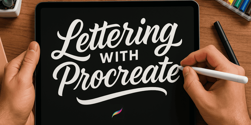
In this tutorial, I’ll walk you through how I create lettering on my iPad using the Procreate app.
We’ll go step by step through the process of building a simple but polished lettering piece. Along the way, I’ll show you the specific tools, settings, and features I use in Procreate to get the results I want.
Now, Procreate is packed with features, and while I won’t cover every single one, that’s okay — I don’t use all of them myself. The goal here is to give you exactly what you need to create clean, creative, and fun lettering artwork, even if you’re just starting out.
By the end of this tutorial, you’ll feel confident opening Procreate and making your own custom lettering from scratch. 🙌
2. What You’ll Need
Before we jump in, here’s a simple checklist of what you need to follow along:
🖥️ iPad
I use the iPad Pro (4th gen), but you can totally use older or more budget-friendly models too. The key thing is making sure your iPad supports the Apple Pencil — that’s non-negotiable for this kind of work.
Different iPads vary in size, storage, and power, but as long as it runs Procreate smoothly and works with a stylus, you’re good to go.
✏️ Apple Pencil
This is what makes the whole lettering experience feel magical on the iPad. Unlike a basic stylus, the Apple Pencil is pressure-sensitive — which means you can control your line weight by simply adjusting your pressure as you draw.
I personally use the 2nd generation Apple Pencil, which charges magnetically on the side of my iPad. Super sleek and efficient.
I’m not a fan of the 1st generation — the charging method (you know what I’m talking about 😬) is… let’s just say, one of Apple’s rare design flops.
🎨 Procreate App
Hands down the best app for drawing, illustrating, and yes — lettering. It’s a one-time purchase, no subscriptions, and it’s worth every penny.
Whether you’re into calligraphy, design, or casual doodles, Procreate is the go-to app for creatives on the iPad.
Optional Accessories
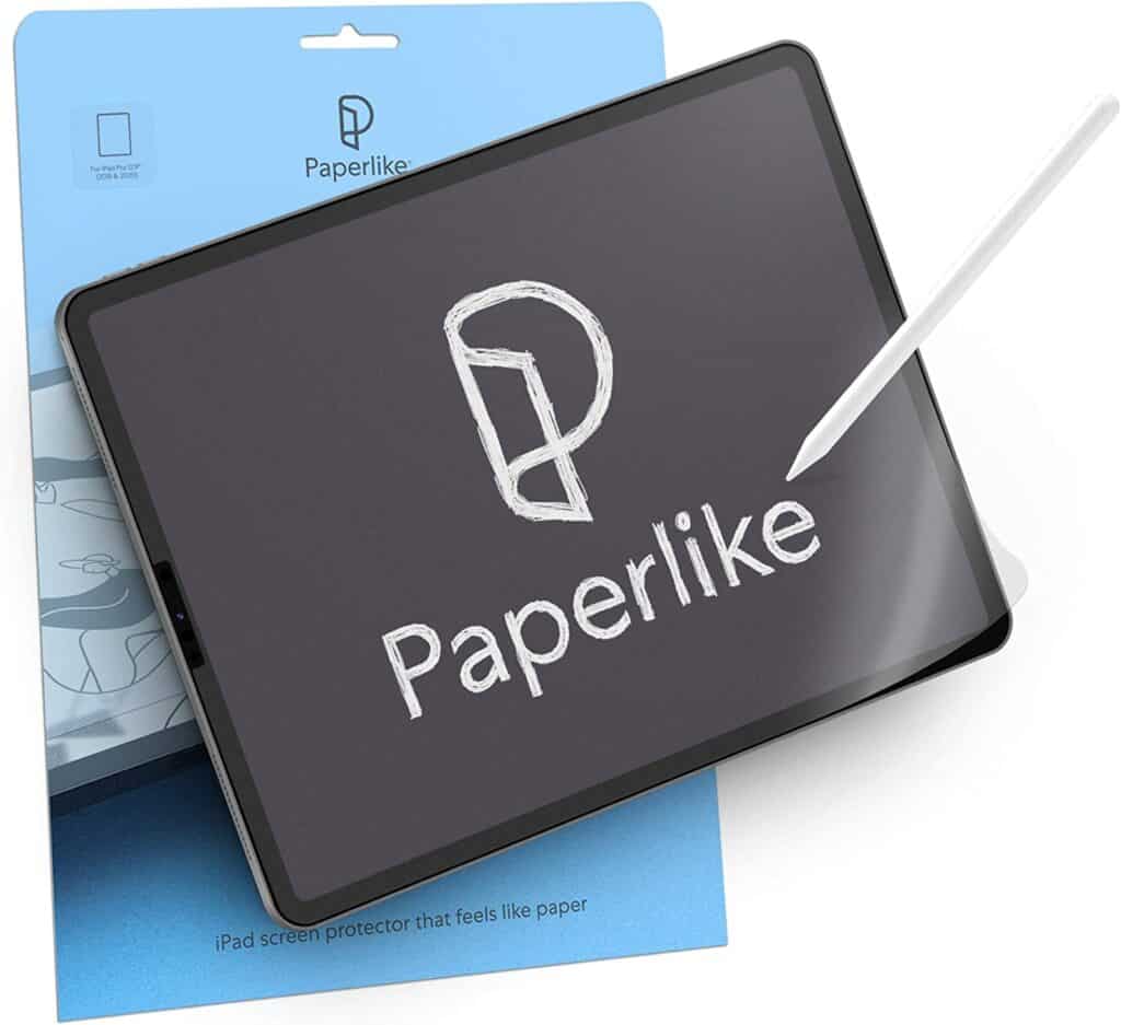
- 🛡️ Matte Screen Protector – For a paper-like feel. Adds a bit of friction that helps with stroke control. I recommend Paperlike if you want a solid one.
- 🪑 iPad Stand – I personally don’t use one, but some artists swear by it for comfort during long sessions.
3. Setting Up Procreate
Before we start drawing, let’s get your Procreate workspace set up correctly. A well-prepared canvas makes a huge difference in your workflow and final results.
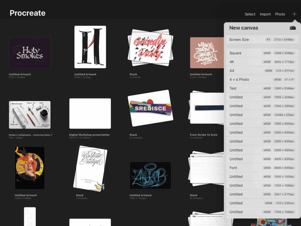
🆕 Create a New Canvas
Open Procreate and tap the “+” icon in the top-right corner of the gallery.
You’ll see a bunch of preset canvas sizes. For most lettering projects, I like to use Screen Size, but if you want more control, you can create your own custom canvas (which we’ll do here).
🛠 Custom Canvas Settings
Tap the icon in the upper-right of the canvas panel to open the Custom Canvas settings.
For this project i’ll use –
- Canvas Size: 3000px × 2000px
- Resolution: 300 DPI (perfect for high-quality exports or printing)
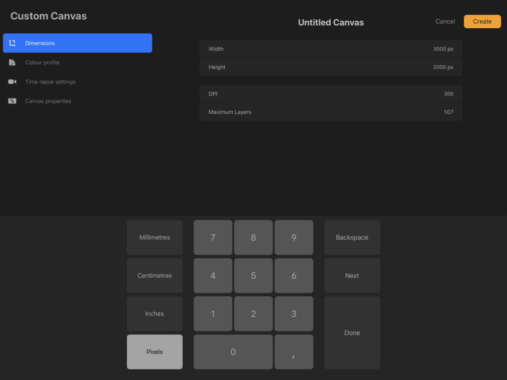
Procreate will automatically show you the maximum number of layers based on your canvas size and device. Just a heads-up: the larger the canvas, the fewer layers you’ll be able to use.
🎨 Choose the Right Color Profile
Scroll down to the Color Profile section. This is important depending on whether your piece will live on a screen or in print.
- RGB – For digital and web use
- CMYK – For print projects
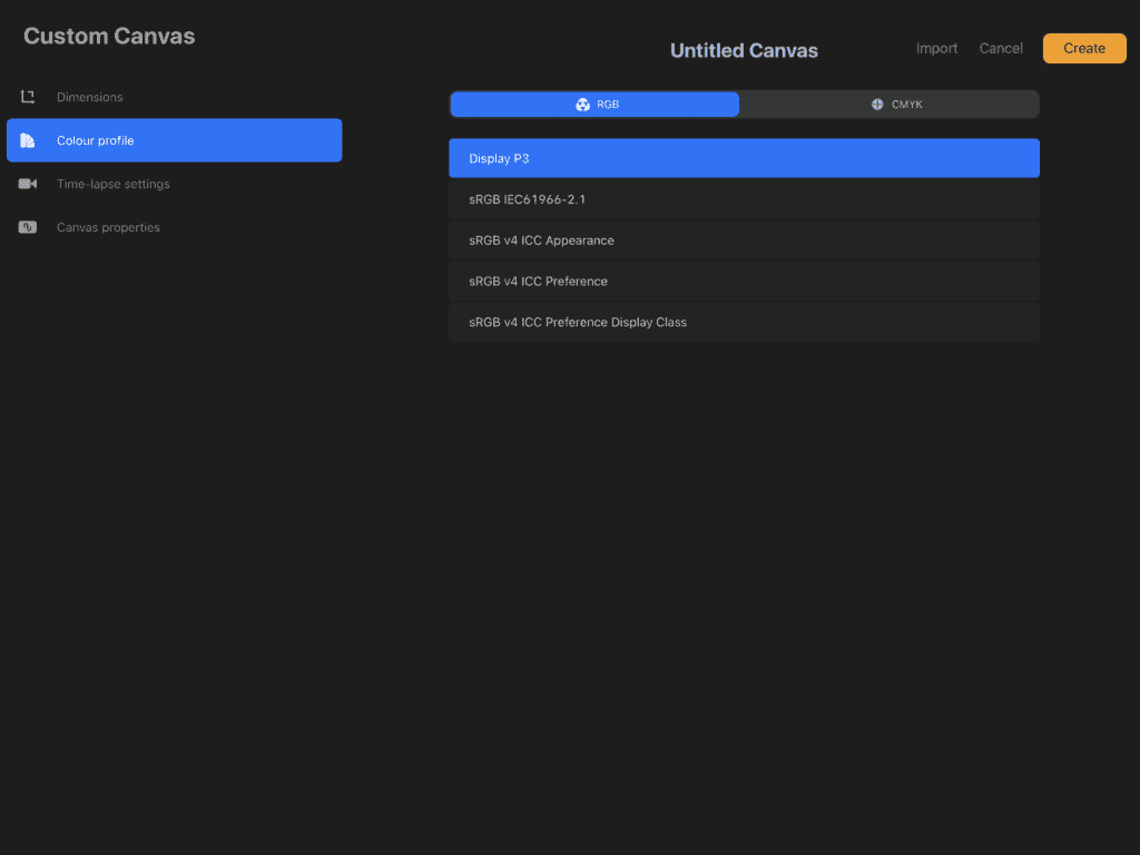
For this tutorial, go with RGB.
Once that’s done, tap Create — and your canvas is ready! 🥳
💡 Pro Tip: If you like your custom settings, swipe left on your new canvas preset in the gallery and tap Set Default. That way, you won’t need to recreate it each time.
4. Creating Your First Lettering Piece
✨ Let’s Clear Something Up — Lettering vs. Calligraphy
Before we get into the fun stuff, let’s talk terminology real quick — because lettering and calligraphy are not the same thing.
- Lettering is about drawing letterforms — it’s more like illustration. You shape and tweak each letter as a design element.
- Calligraphy is about writing with rhythm and pressure — more about consistent strokes and muscle memory.
👉 This tutorial is all about lettering — using Procreate to build and refine letter shapes — not traditional calligraphy.
Want to dive deeper into the difference? Check out my guide on lettering vs. calligraphy
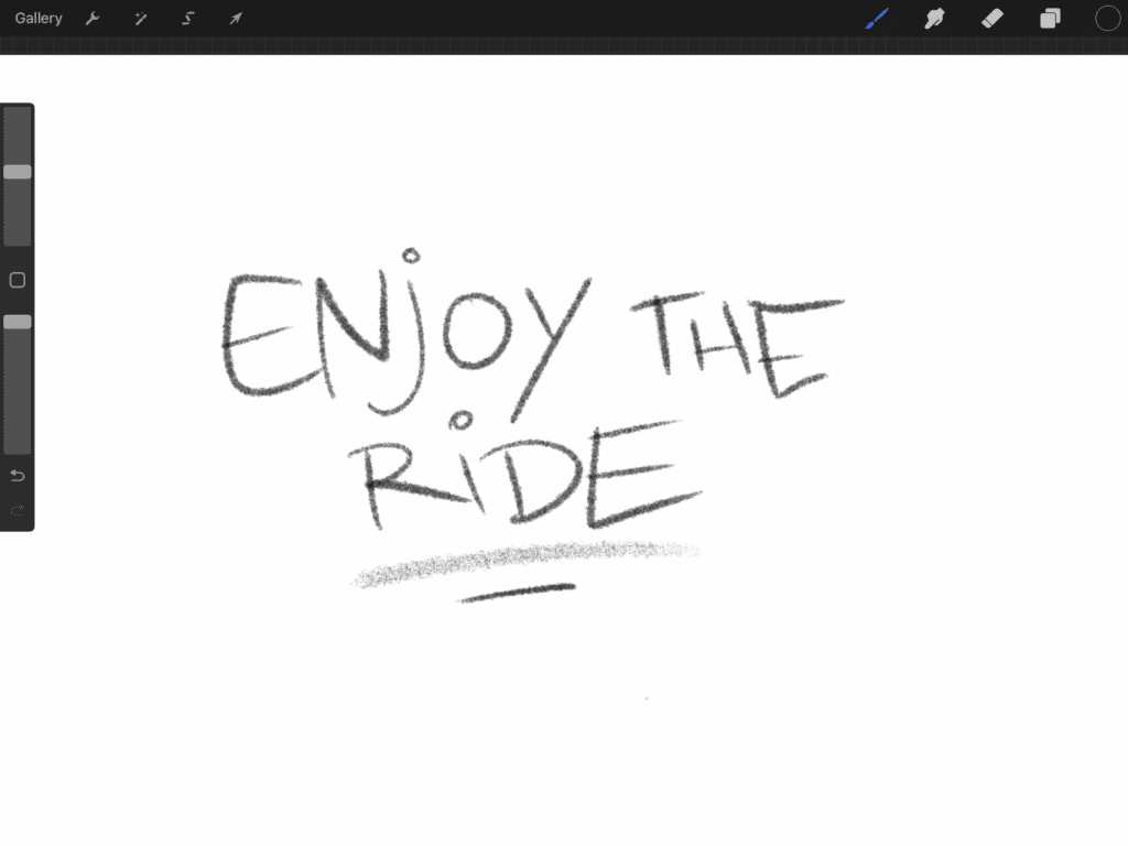
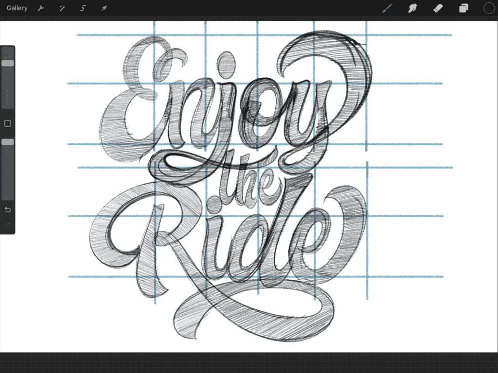
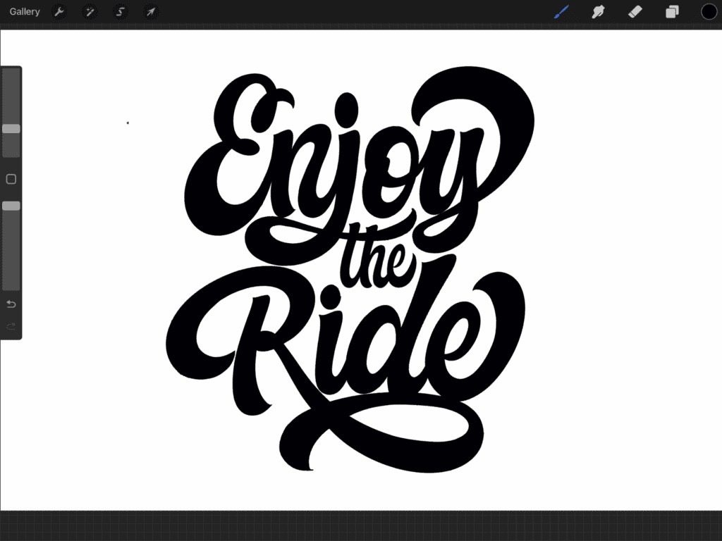
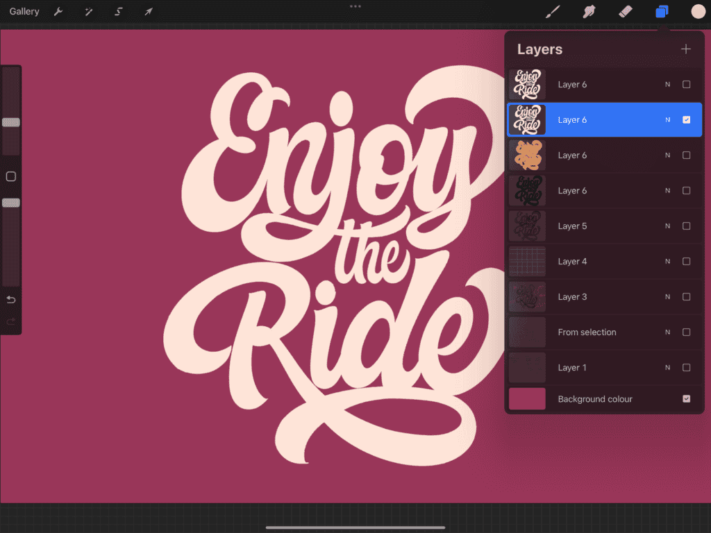
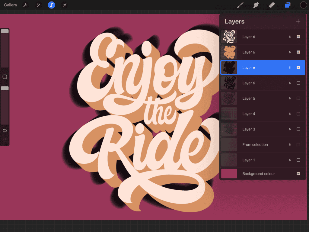
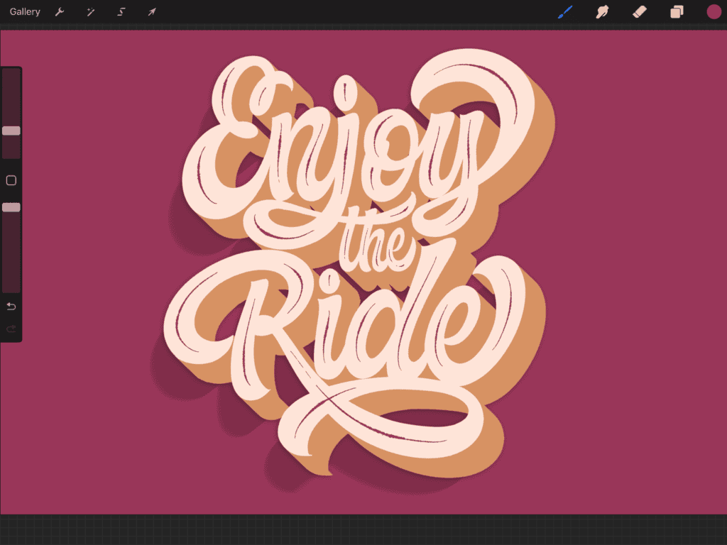
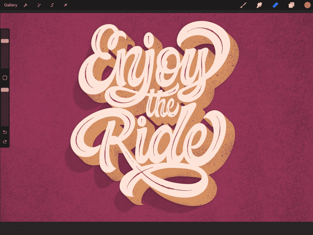
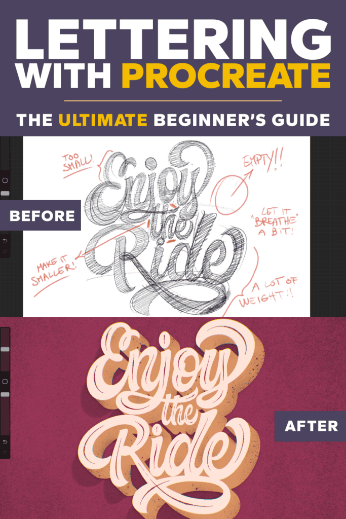
🖋 For This Project: “Enjoy The Ride”
That’s the phrase I chose for this example.
You can pick any word or short phrase you like — just keep in mind: the more words you add, the more complex the layout becomes. So if you’re just starting out, keep it simple!
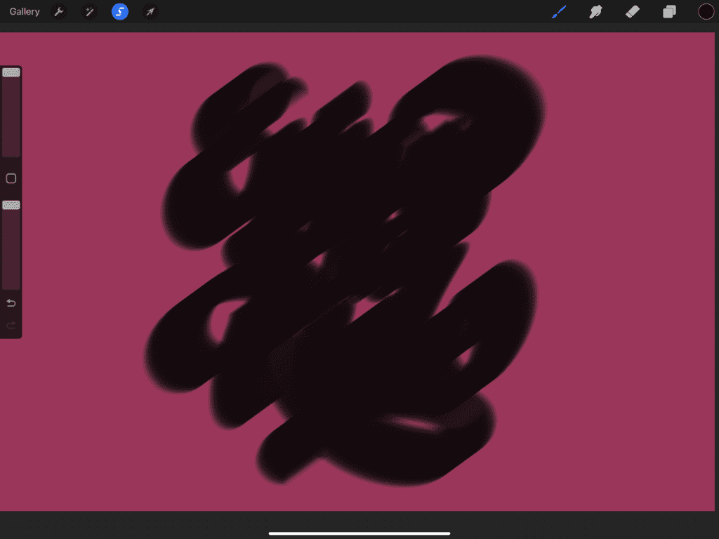
Step 1: Thumbnail Sketches
This is how every lettering piece should start — with small, fast, loose sketches. I call this the “throw-up-on-the-page” phase 😂 — just let your ideas flow!
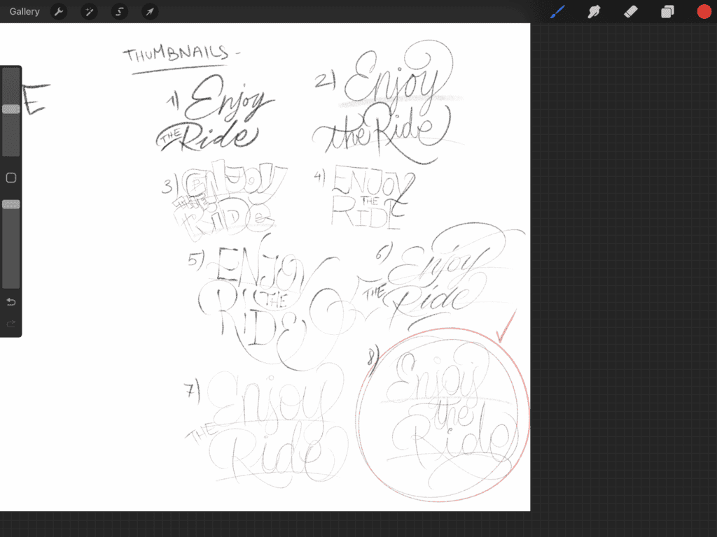
- Select a pencil brush in your Brushes panel.
- Do at least 5 quick thumbnails — don’t worry about perfection. Explore layout ideas.
- Pick the one that feels the most balanced and interesting.
Step 2: Refining Your Sketch
Once you’ve found your favorite thumbnail:
Tap the Selection tool (top-left), and loosely draw around your sketch.
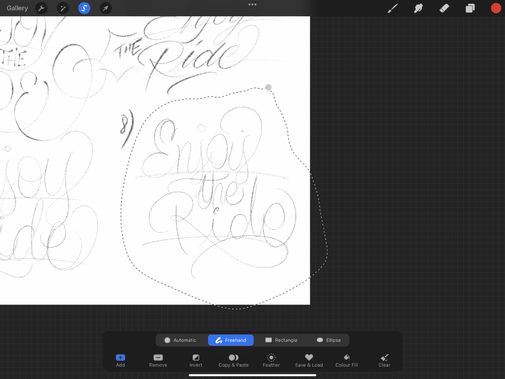
Tap the Transform tool, then swipe down with three fingers to open the Quick Menu.
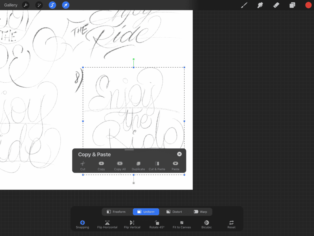
Select Cut and Paste — this moves your sketch to a new layer.
Center and enlarge the sketch using the transform handles.
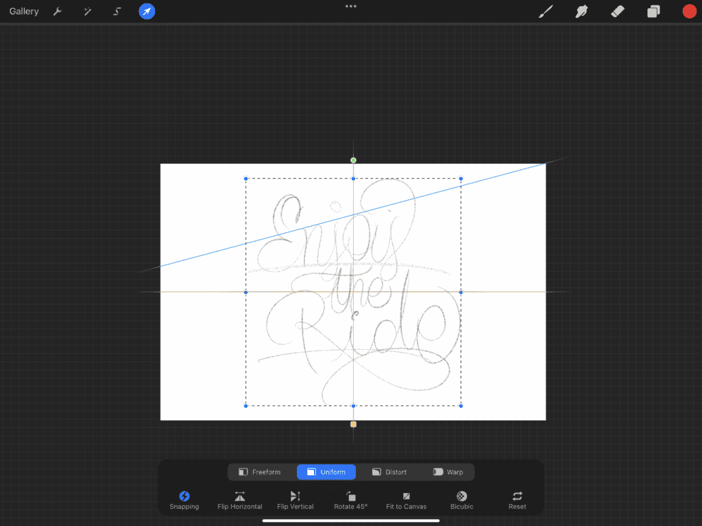
Now use your pencil brush to start refining it — thicken strokes, smooth out curves, and give it some structure.
You’re still working loosely here — think of this as shaping a block of clay before you carve the details.
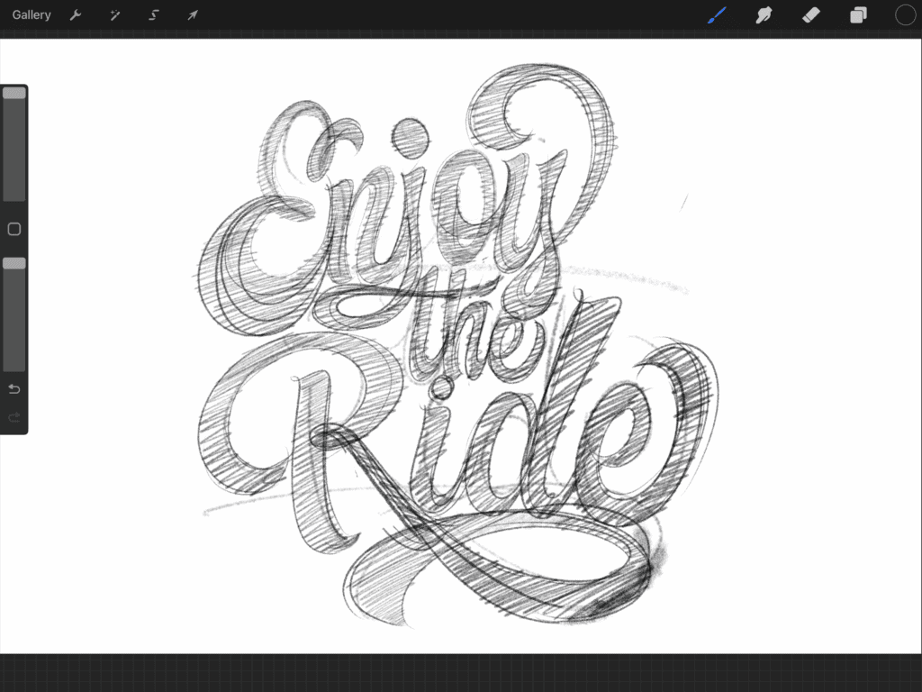
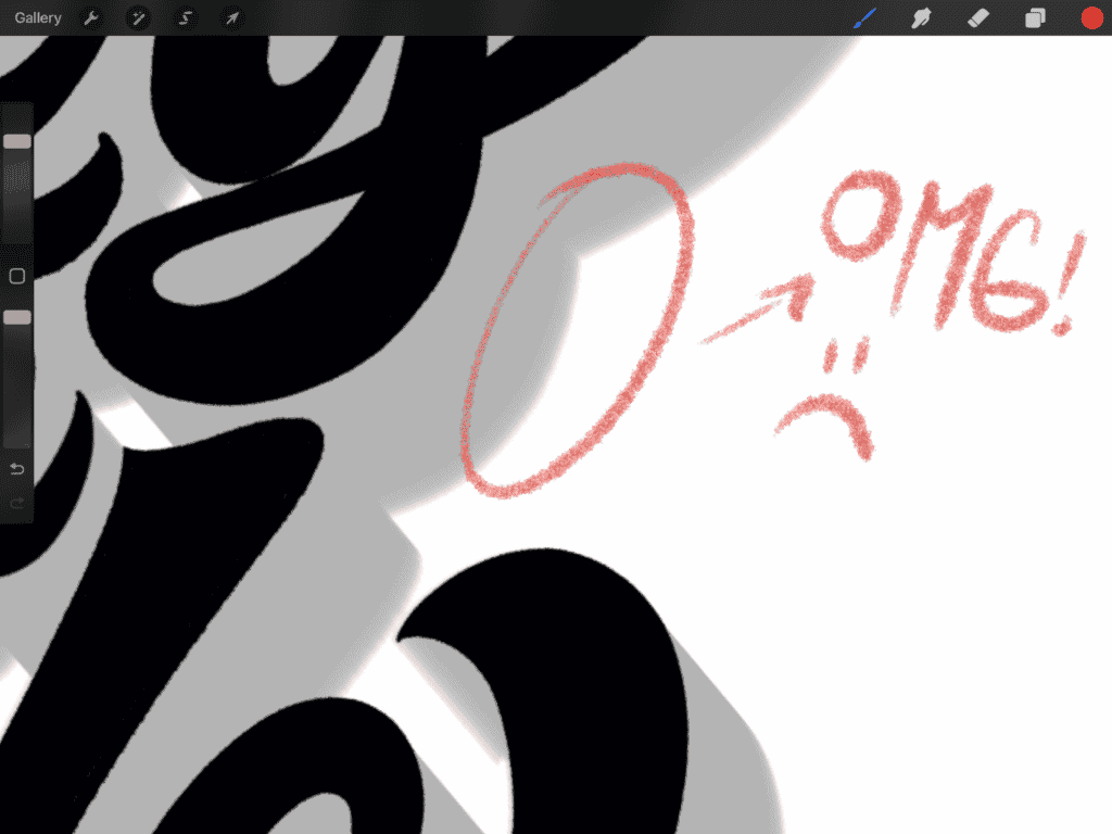
📝 Give Yourself Some Feedback:
Before moving on, take a minute or two to analyze your piece. Grab a different colored pencil and jot down notes directly on your sketch — highlight areas that feel off, spacing that could be tighter, or shapes that might need adjusting.
This simple step helps you visualize what to improve in your next refinement.
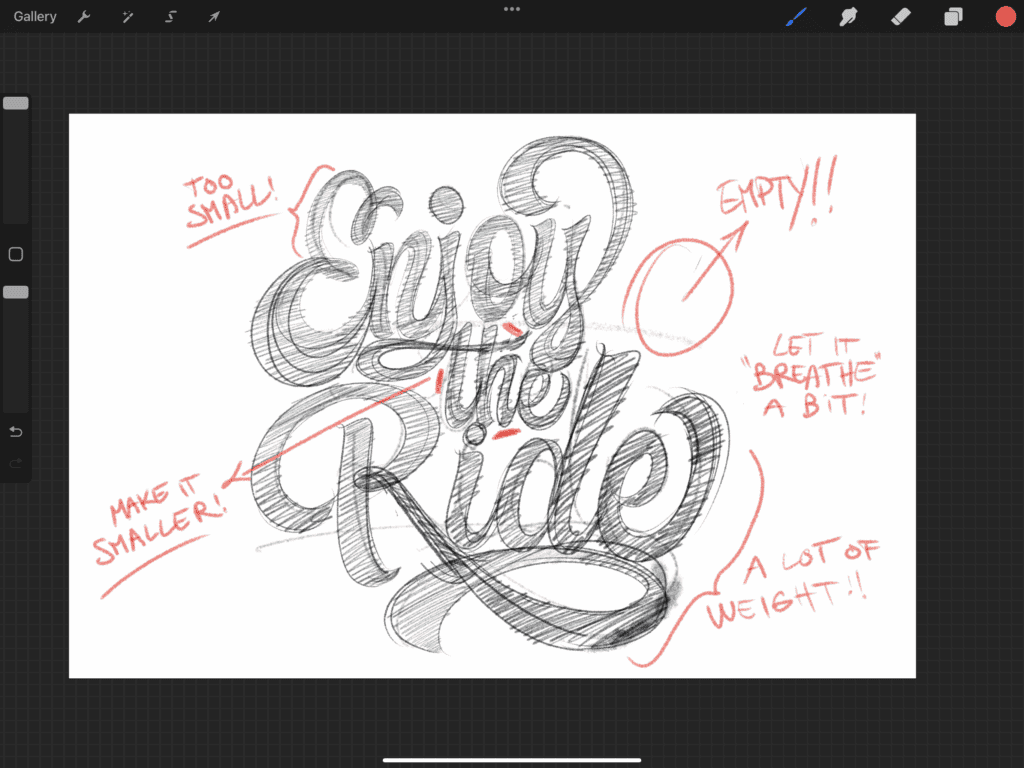
💡 Pro Tip: Want to improve your composition? Try looking at your sketch from a distance. Zooming out helps you focus on the overall layout and balance of your piece, rather than getting caught up in the small details. Luckily in Procreate, it’s super easy — just pinch the screen to zoom out!
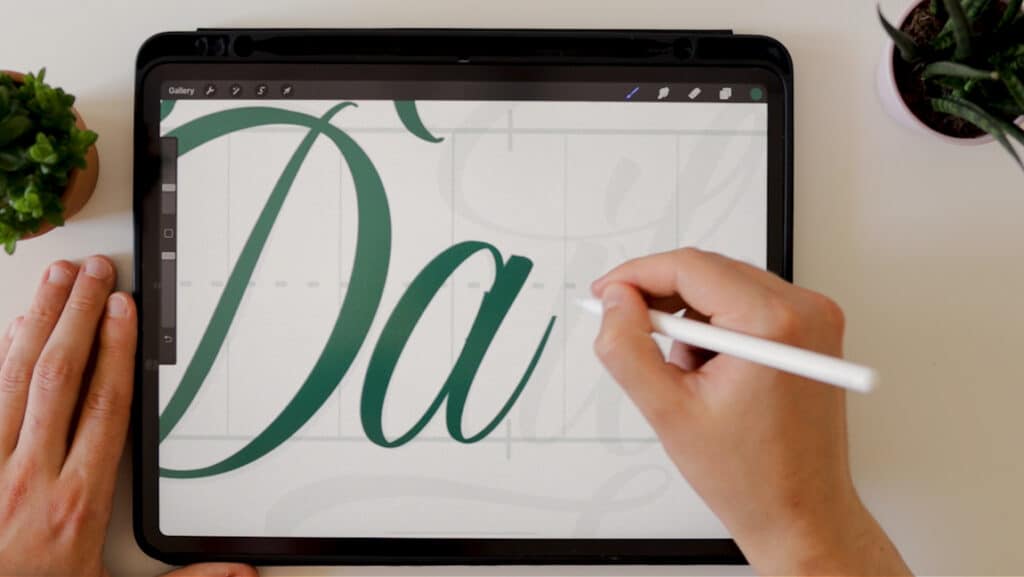
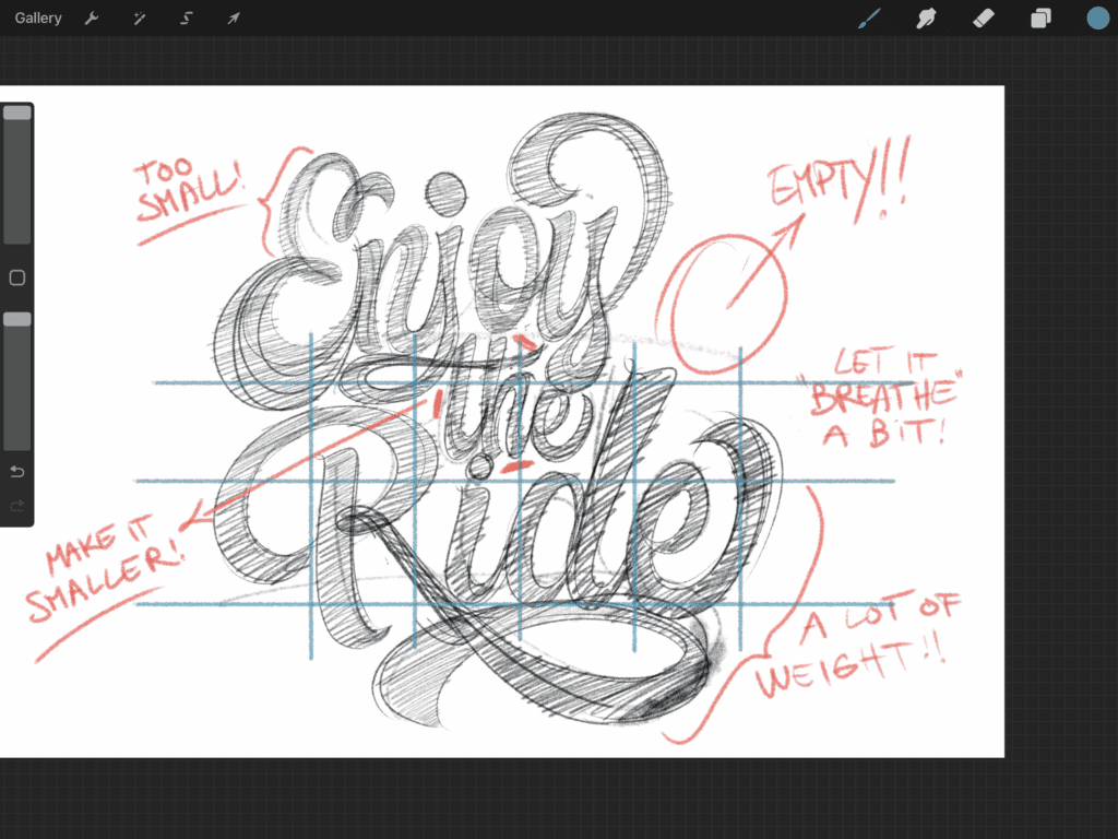
Step 3: Add Guidelines
Now it’s time to bring in some structure and boost your consistency.
Create a new layer above your sketch.
Pick a different color for visibility.
Add your:
- Baseline
- Waistline
- Ascender line
- Descender line
- Slant guides (if needed)
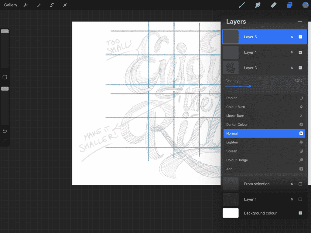
If your design has multiple rows (like mine), just duplicate your guide layer:
- In the Layers panel, swipe left on the guide layer → tap Duplicate
- Tap Transform, and move the duplicated guides to line up with the second row.
- Make sure to lower the opacity of your guidelines as well as the previous sketch to about 30%
Step 4: Second Refinement
With guides in place, you’re ready to refine your sketch again — this time with more precision.
- Create a new layer.
- Use the pencil brush to redraw your sketch, aligning with your guides.
- Take your time — slow down, focus on letter proportions, stroke weight, and balance.
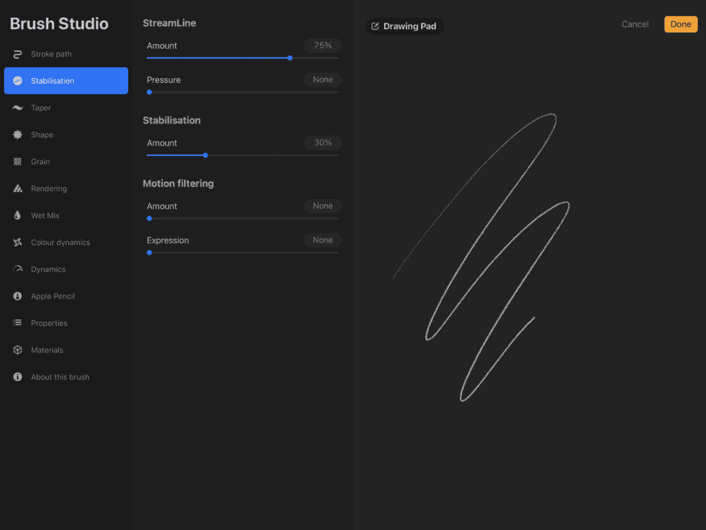
💡 Pro Tip: Struggling with shaky lines?
Open the Brush Studio, go to the Stabilization panel, and adjust the StreamLine and Stabilization sliders.
Start small — even 15–30% can make a big difference!
Step 5: Inking Your Sketch
Now we ink! This is where your lettering starts to pop. 🎉
Choose an inking brush (I use one from Jimbo’s Rough & Raw set, but Procreate’s native inking brushes work great too).
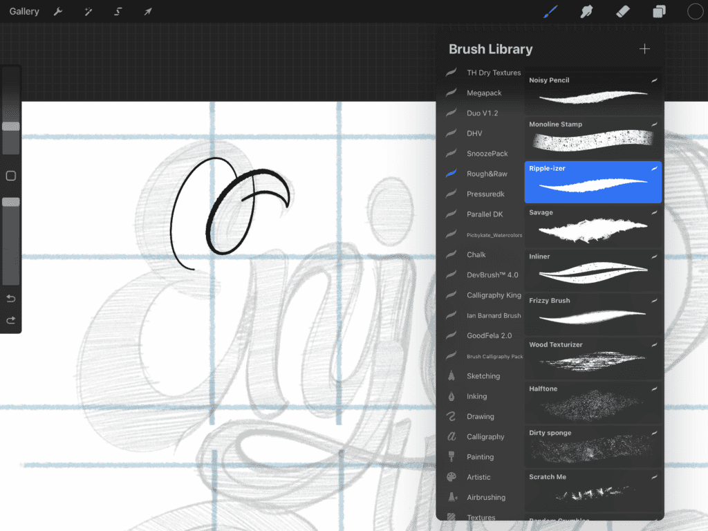
Make sure your stabilization settings are still on for clean strokes.
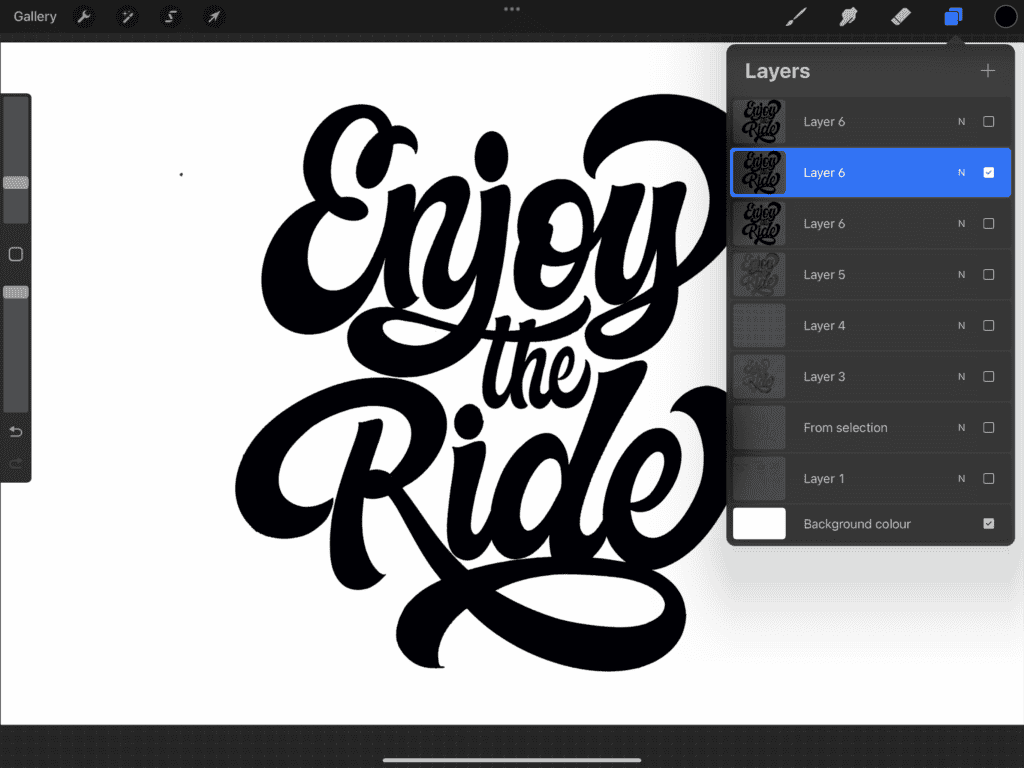
Ink each word on a separate layer — this makes repositioning easier later on.
Outline your letters, then use Color Drop to fill them:
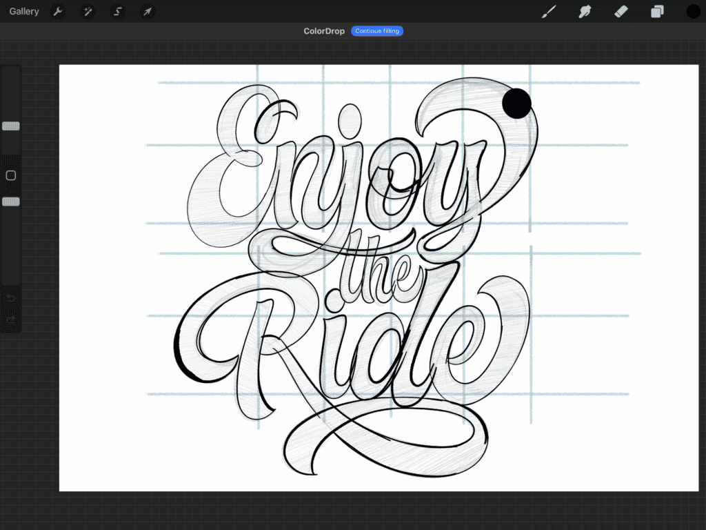
Drag your color from the top-right into a closed shape.
If it fills the whole canvas, your shape might not be fully closed.
💡 Pro Tip: If you see a weird gap near the edge after color dropping, don’t panic: Drag the color again, but before releasing, slide your pen to the right to increase the Color Drop Threshold. This will close that gap like magic.
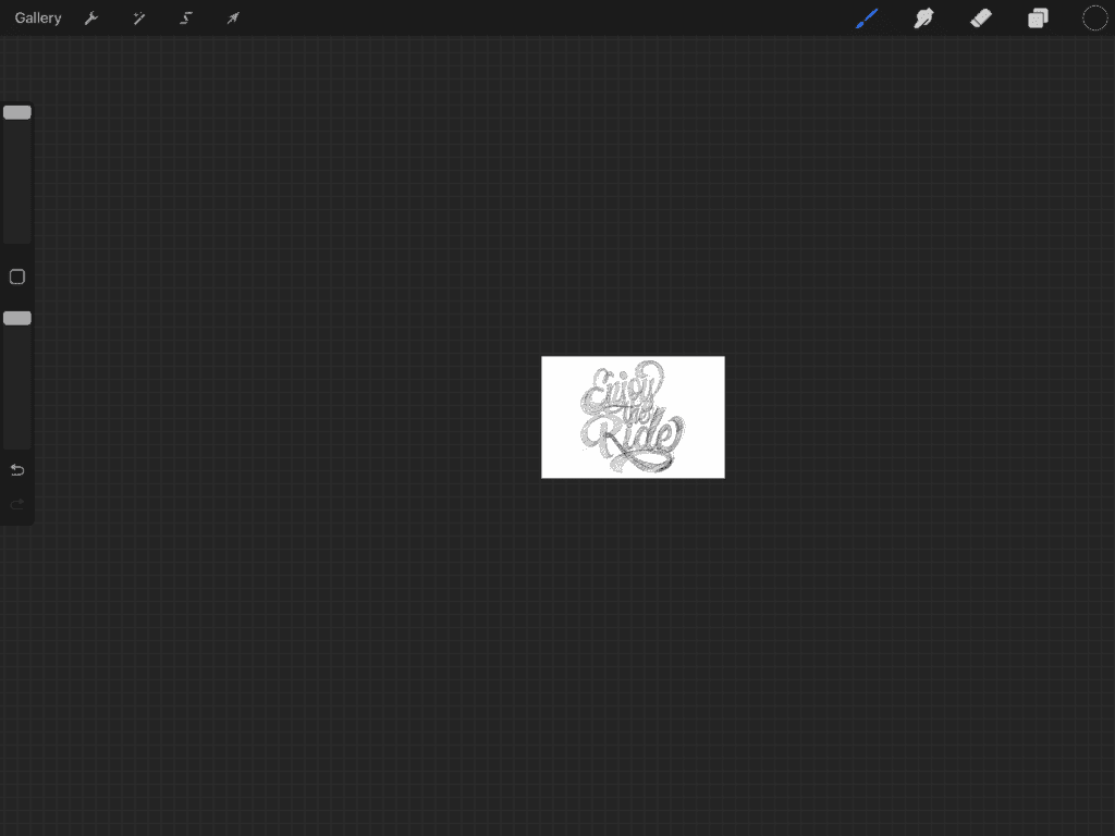
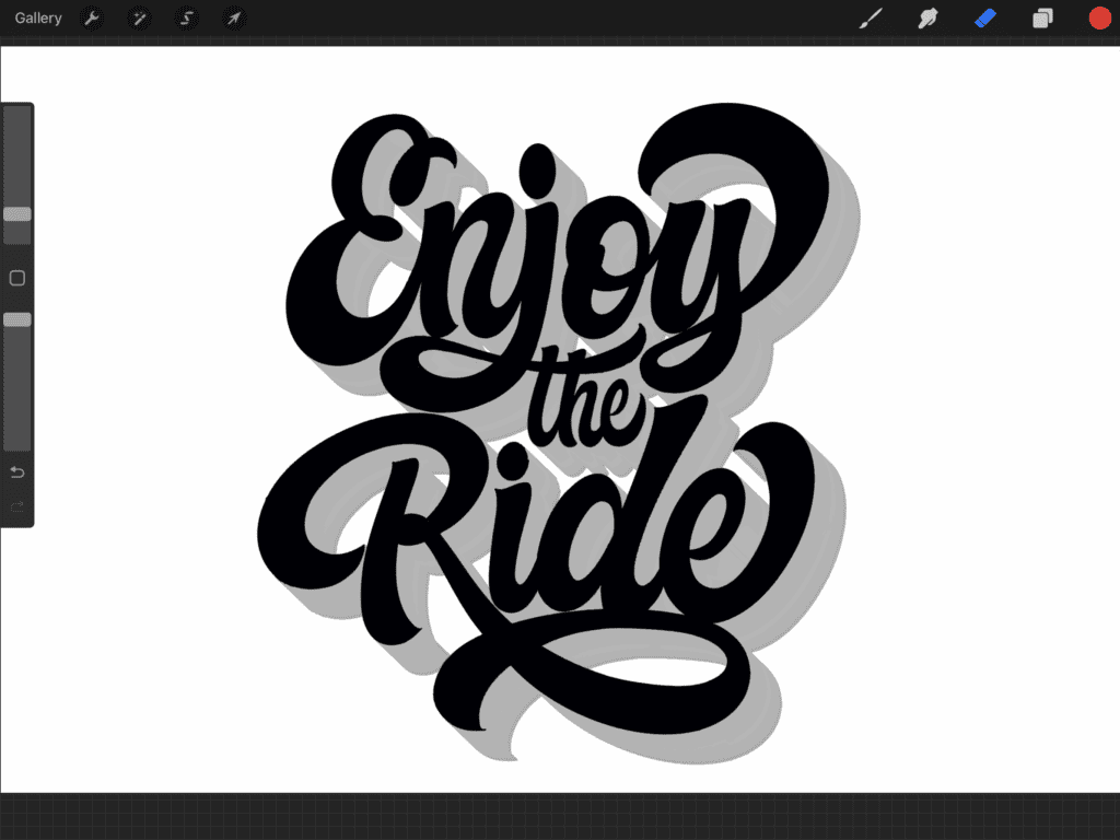
Once your inking is done, turn off the sketch layers below — and boom! You’ve got a solid lettering base.
5. Adding Color, Style, and Texture
So far, you’ve built a solid lettering piece — but we’re not done yet. This is where we elevate your artwork with depth, personality, and some cool effects.
You can add shadows, highlights, textures, 3D effects, color palettes, and more. Your creativity is the only limit here!
For this tutorial, I’ll keep it simple and show you how to apply a 3D effect, a drop shadow, and a touch of texture to bring everything together.
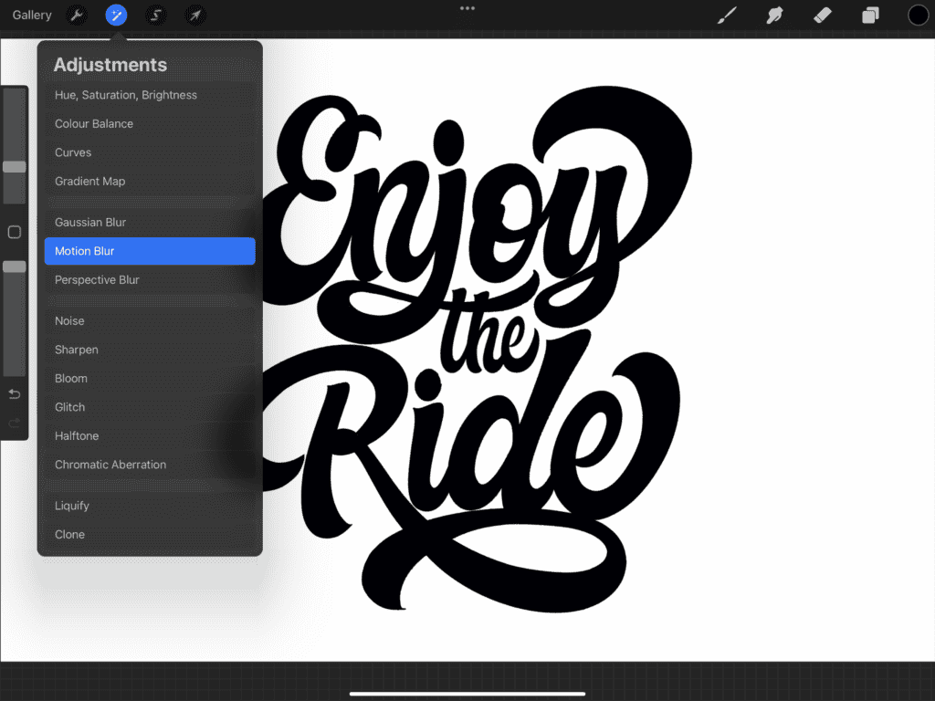
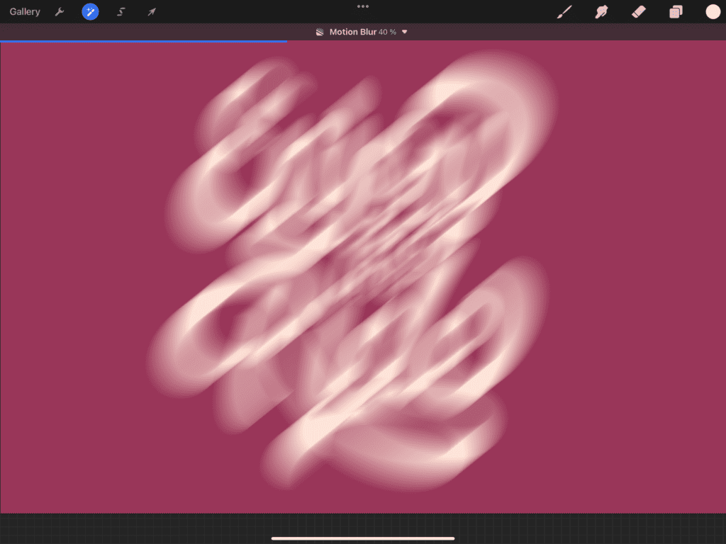
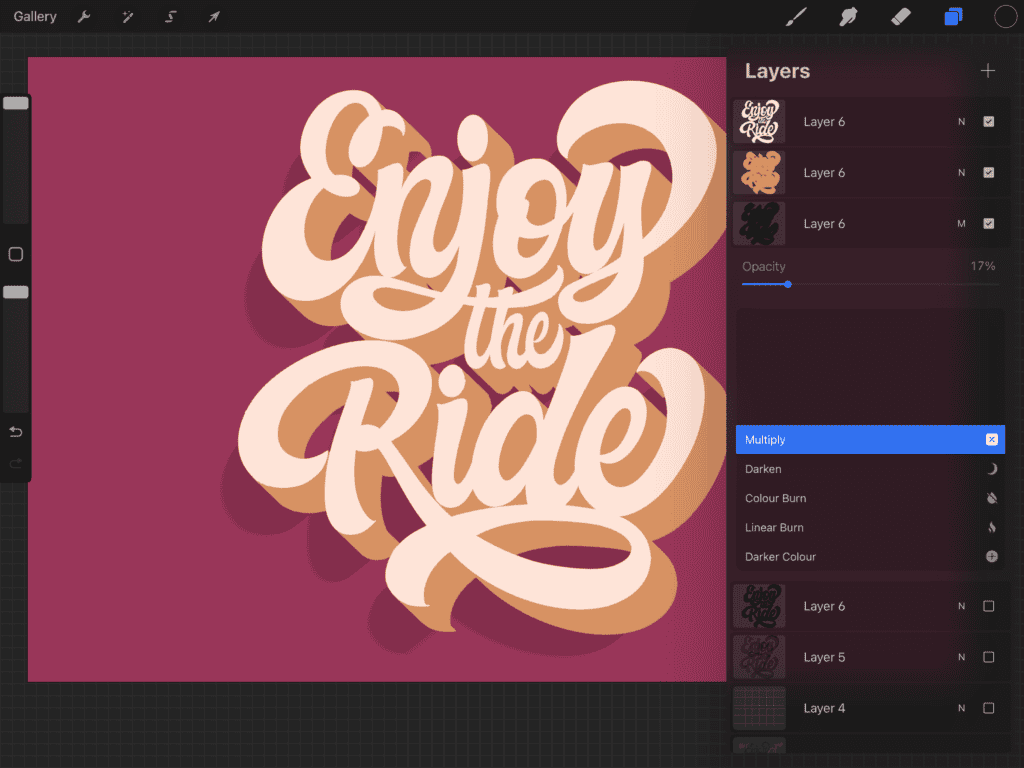
🎬 Step 1: Add a 3D Effect
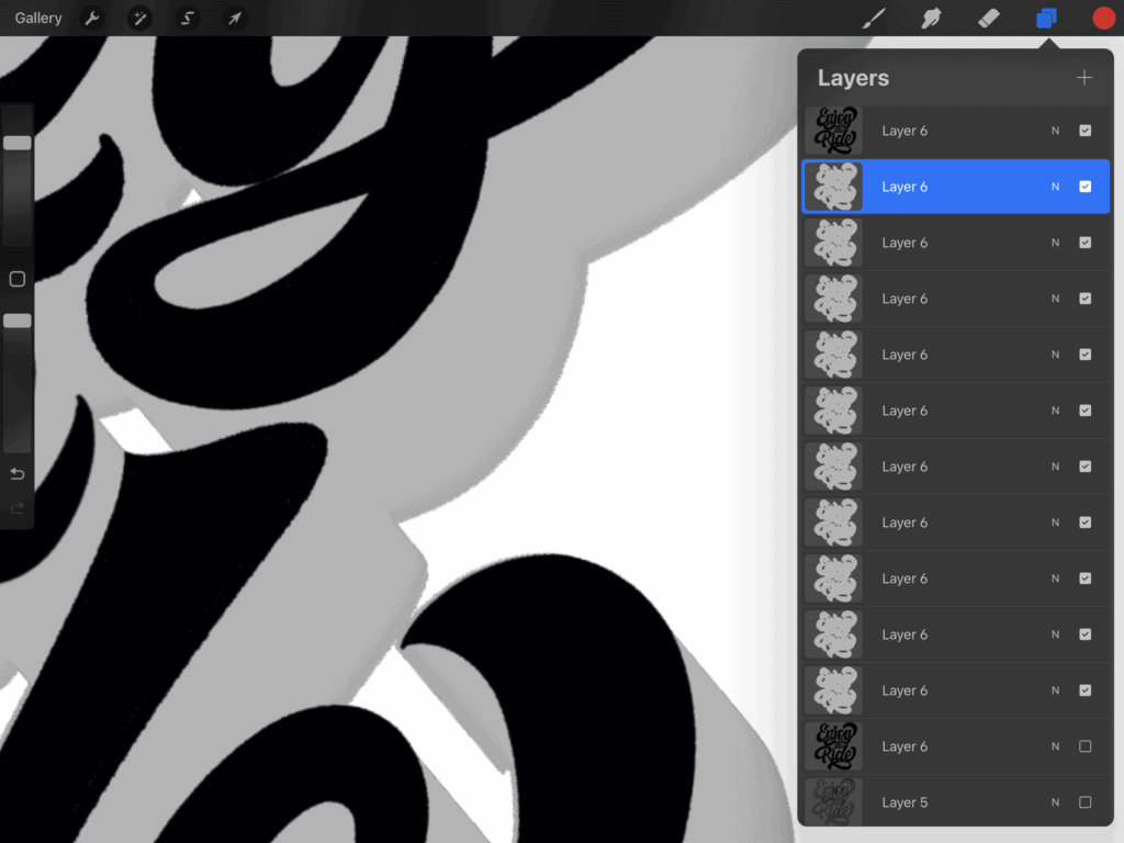
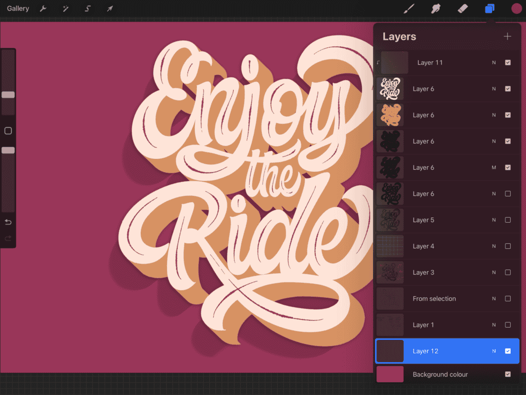
If your lettering is on multiple layers, start by merging them:
- In the Layers panel, swipe right to select each lettering layer.
- Tap one and choose Merge Down.
Then:
Duplicate the merged layer three times.
Hide the top and bottom layers, and select the middle one.
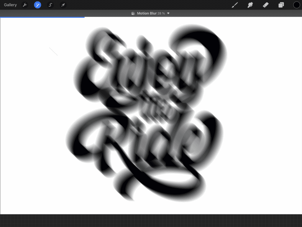
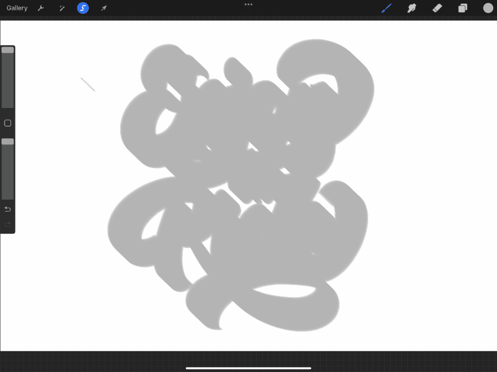
Tap the Magic Wand (Adjustments) icon → choose Motion Blur.
Drag your pen slightly down and to the right — that’s where we want the shadow to fall.
I went to about 30% blur.
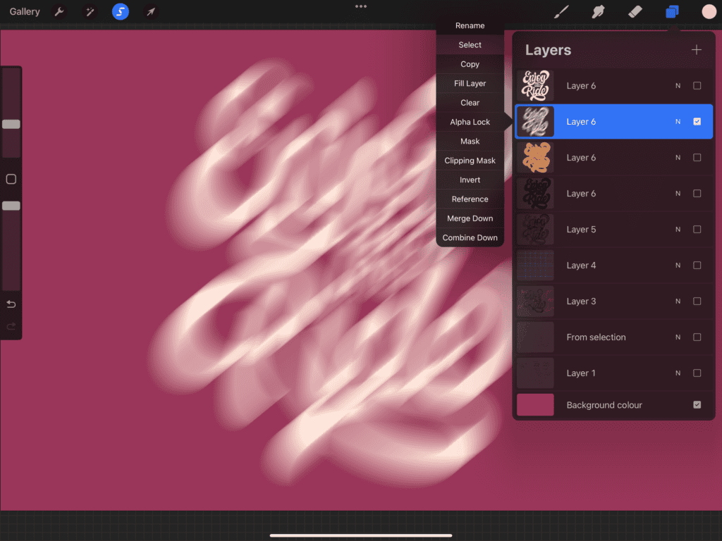
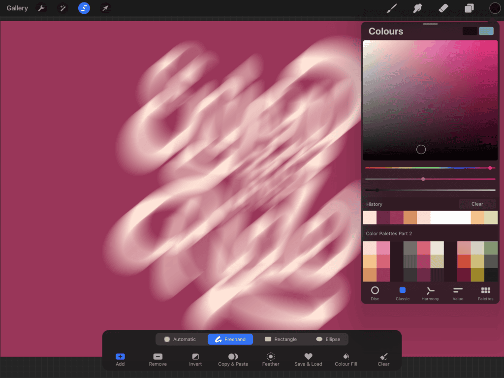
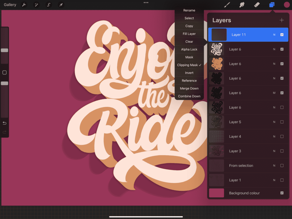
Open the Layers panel, tap the layer’s thumbnail → tap Select.
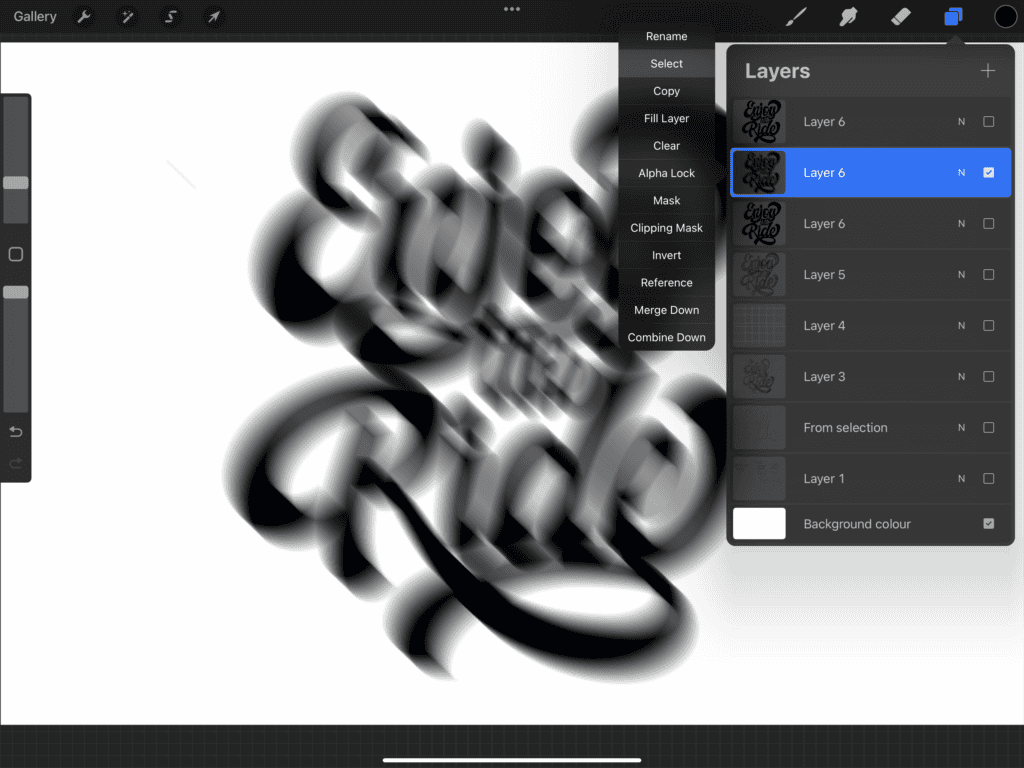
Grab the big hard airbrush, pick a color that contrasts your lettering, and brush over the blurred shape.
💡 Pro Tip: I always work in grayscale first, then add color at the end. It helps you focus on form and contrast before worrying about hues.
Deselect by tapping the Selection tool again.
Turn the top lettering layer back on.
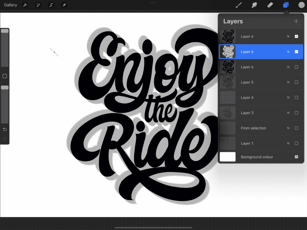
With the middle layer still selected, use the Transform tool to nudge it slightly — aligning the blurred shape with the bottom-right of your top layer.
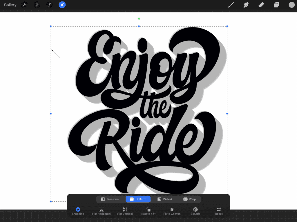
🔧 Need more precision? Tap the edge of your canvas in the direction you want the layer to move. Each tap shifts it pixel by pixel.
If your 3D layer looks soft or fuzzy, here’s a trick:
Duplicate it 10 times, then merge all duplicates together to boost contrast.
Boom — 3D effect complete! 💥
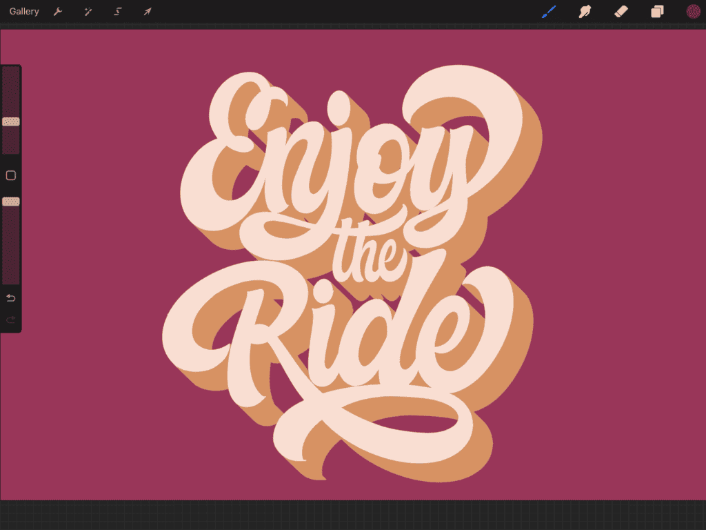
🎨 Step 2: Add Color
Color can make or break your piece, so keep these quick tips in mind:
- Less is more — too many colors can get messy.
- Avoid ultra-bright, oversaturated shades.
- Watch your contrast — too much or too little can flatten the design.
I’ve already got some saved palettes on my iPad. For this one, I’m using a peachy-pink combo — soft but punchy.
Once applied, the whole piece already feels more alive — but we’re not stopping there.
🌑 Step 3: Add a Drop Shadow
Time to add some depth and realism.
In the Layers panel, hide the 3D layer and duplicate the lettering layer.
Select the bottom duplicate.
Apply Motion Blur in the opposite direction (e.g. bottom-left if your 3D is bottom-right).
I went with about 40%.
Tap the layer’s thumbnail → tap Select.
Choose a darker tone of your background color.
Use the big hard airbrush to fill the blurred shadow.
Turn the top lettering and 3D layers back on.
Lower the opacity of the shadow layer to around 20% — just enough to make it pop.
Looking good? Let’s add one last bit of flair.
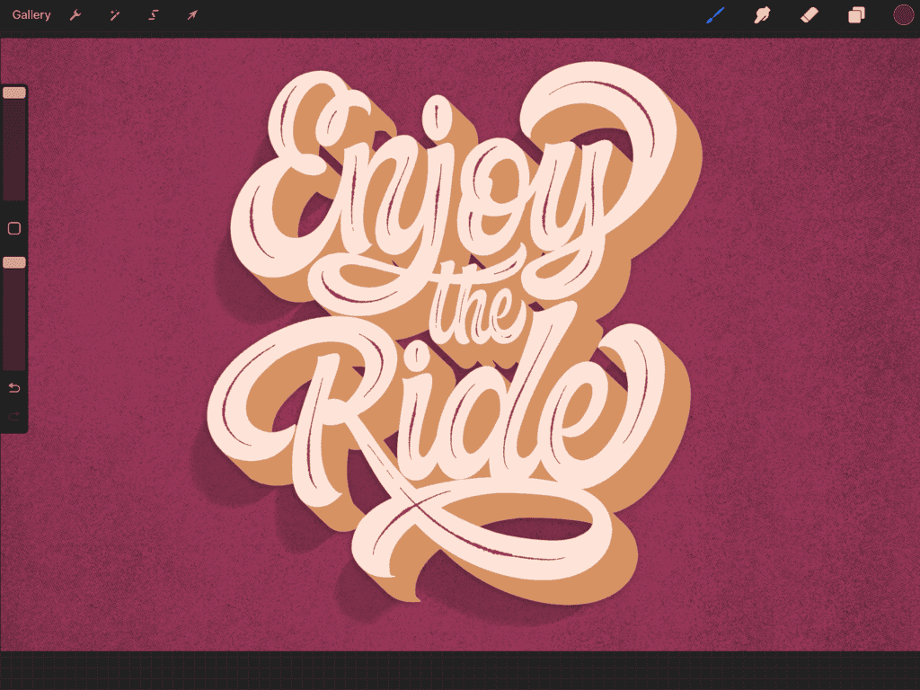
🖌️ Step 4: Inline Stroke & Texture
To create more contrast in thick areas of your letters:
Create a new layer above your lettering layer.
Tap it and choose Clipping Mask — this locks your strokes to the lettering shape.
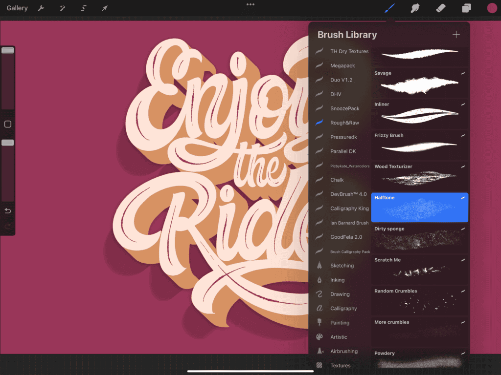
Grab the “Savage” brush from the Rough & Raw set (or any detail brush).
Using a dark purple (or contrast color), draw thin lines through the middle of your downstrokes.
Now for texture:
Add a new layer above your background.
Use a halftone texture brush with a darker background shade.
Lightly apply texture toward the edges to create a subtle vignette effect.
Want to roughen the 3D effect too?
- Use a dry texture brush with the eraser tool.
- Lightly tap away parts of the 3D layer for a distressed look.
(There’s no wrong way — just have fun with it. Two-finger tap to undo if needed.)
🌈 Bonus: Chromatic Aberration
For that edgy, distorted finish:
- Duplicate your lettering and 3D layers and merge the duplicates.
- Tap Adjustments → Chromatic Aberration.
- Slide to around 6–7%.
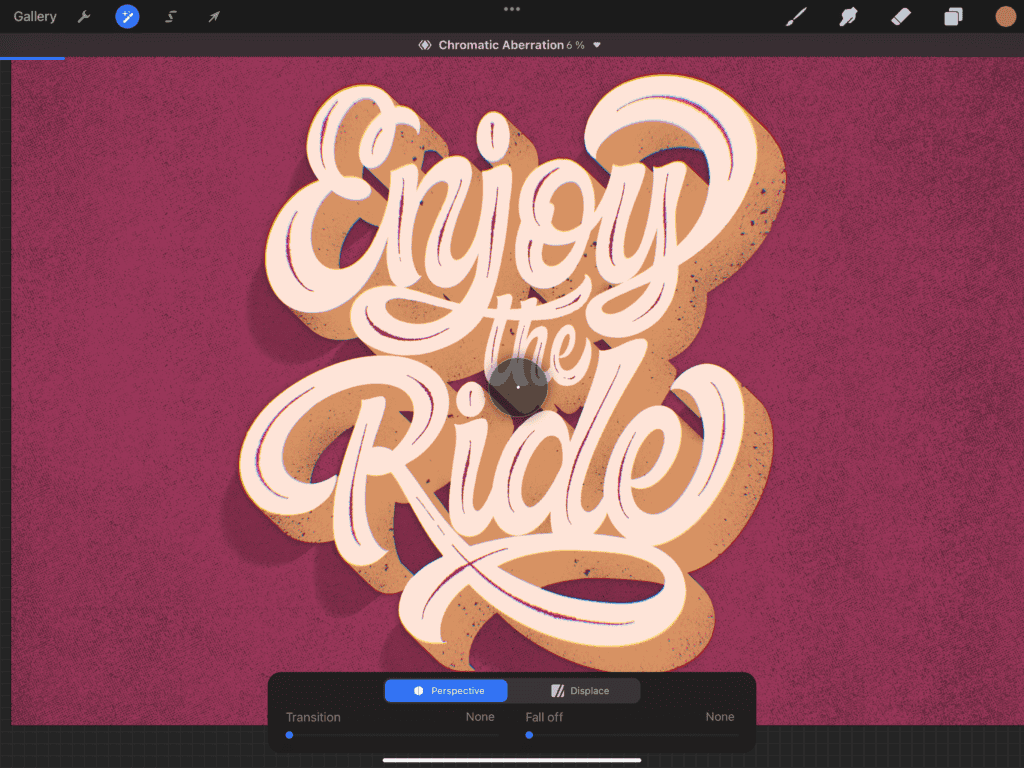
It adds just the right touch of controlled chaos to wrap things up.
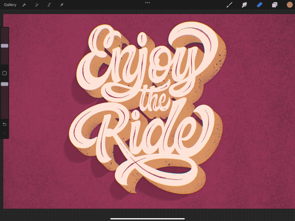
Aaaand you’re done!!
6. Exporting and Sharing
Once your lettering piece is complete, it’s time to share your masterpiece — whether that’s online, with clients, or printing it for display.
You can either crop and export, or just export it as-is depending on your goals. Personally, I usually set up my canvas with export in mind from the start — but if not, you can still do some cropping at the end.
Here’s a quick breakdown of your export options in Procreate:
🔄 Export Settings
| Format | Best For |
| PNG | High-resolution images, transparent backgrounds |
| JPEG | Optimized for web and social sharing |
| PSD | Further editing in Photoshop |
| Print-ready vector-style exports | |
| TIFF | High-quality, print-ready files with full data |
To export:
- Tap the wrench icon (Actions menu) → go to the Share tab.
- Choose your preferred format.
- Save to Files, Photos, or share directly to your social channels or cloud storage.
7. Best Procreate Brushes for Lettering
Procreate comes with a solid library of default brushes, but if you want to take your lettering to the next level, investing in some premium brushes can make a huge difference. These brushes are often hand-crafted by professional artists and tailored specifically for lettering and calligraphy.
Over the years, I’ve collected a few that I keep coming back to — and trust me, they level up your work instantly.
✨ My Go-To Lettering Brush Packs:
- Rough & Raw – Great for expressive, textured strokes. I use this one a lot.
- Dry Textures – Perfect for adding grit and grain to your work.
- Grid Builder – Super helpful for creating consistent layouts and structure.
- Rough Pack 2 – A follow-up to the OG Rough & Raw — more variety, same great feel.
Whether you’re aiming for a clean digital look or a gritty handmade vibe, the right brush can totally shift the tone of your piece.
Want to try before you buy?
You can grab free sample brushes inside the Lettering Crate, or even better — learn how to make your own brushes from scratch!

Stay updated with my tutorials and get instant access to the Lettering Crate –
A growing library of free lettering & calligraphy resources that includes –
For a full breakdown, check out my article:
👉 The 21 Best Procreate Brushes for Lettering and Calligraphy
8. Adding Lettering Effects
Once you’ve nailed the basics, it’s time to kick things up a notch with lettering effects. These extras help you add dimension, personality, and that “wow” factor to your work.
You don’t have to go all-out every time — but even one simple effect can make your lettering stand out.
Below are some of my favorite tutorials you can dive into when you’re ready to experiment:
✏️ Beginner-Friendly Lettering Effects in Procreate
How to Add an Outline to Your Lettering
A simple border can dramatically change your design — great for contrast or layering effects.

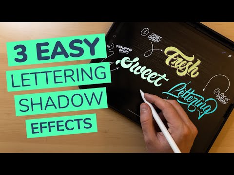
3 Easy Shadow Lettering Effects in Procreate
Drop shadows, cast shadows, and inner shadows — all easy, all impactful.
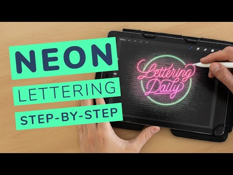
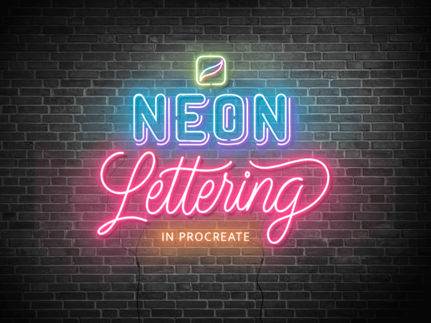
How to Create a Neon Lettering Effect
This one’s super fun — glowing edges, bright colors, and retro vibes.
How to Create an Embossed Effect in Procreate
Subtle but classy. Gives your lettering a raised, tactile look.

As I keep making new tutorials, I’ll be updating this list — so be sure to check back often or bookmark the page!
9. Lettering Inspiration Gallery
Feeling stuck or need a little boost of creative energy? I’ve got you covered. Sometimes, just seeing how others play with shapes, color, and style can reignite your own ideas.
Here’s a mini gallery featuring some of my favorite lettering pieces I’ve created in Procreate. These range from bold block styles to textured script and playful retro vibes.
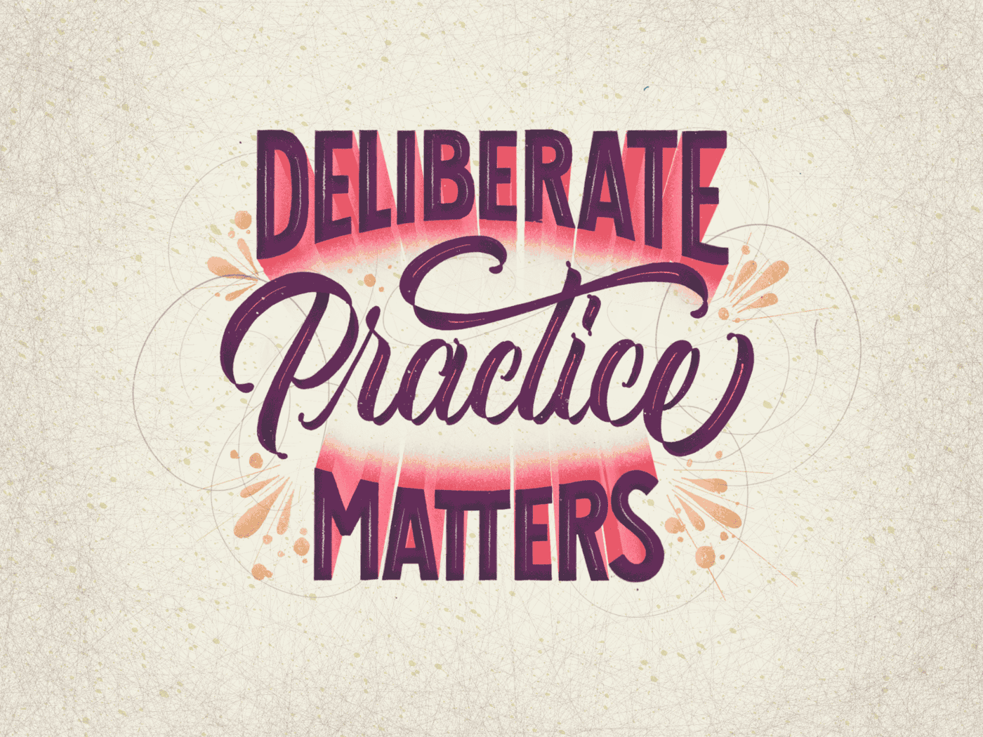
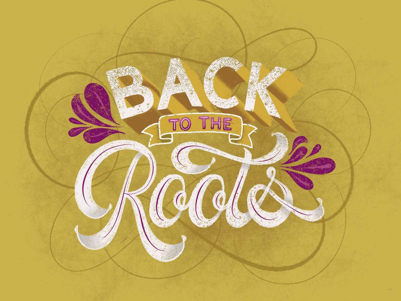
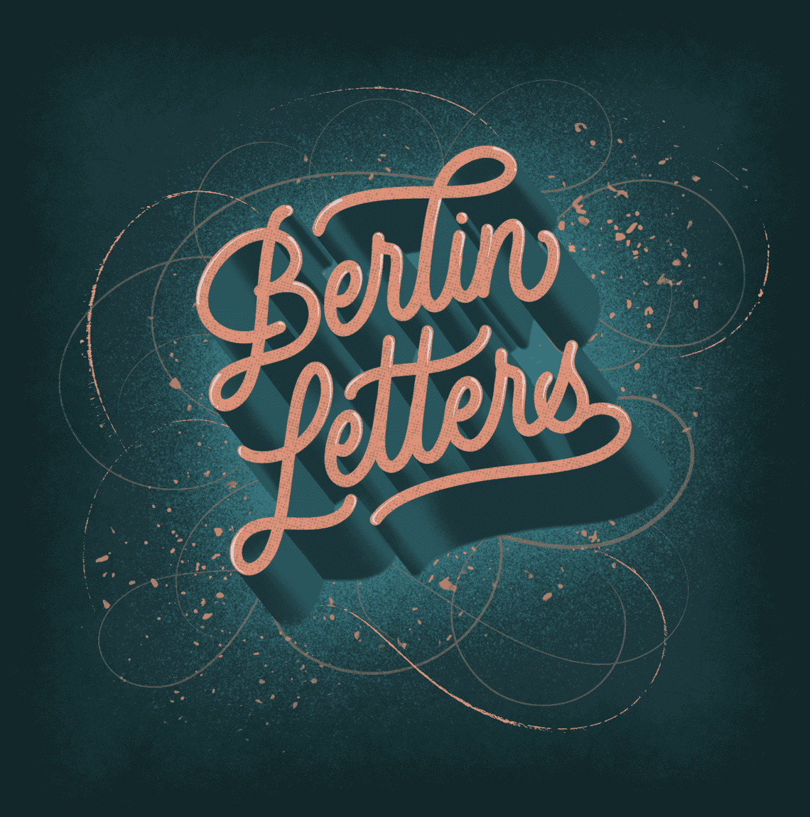
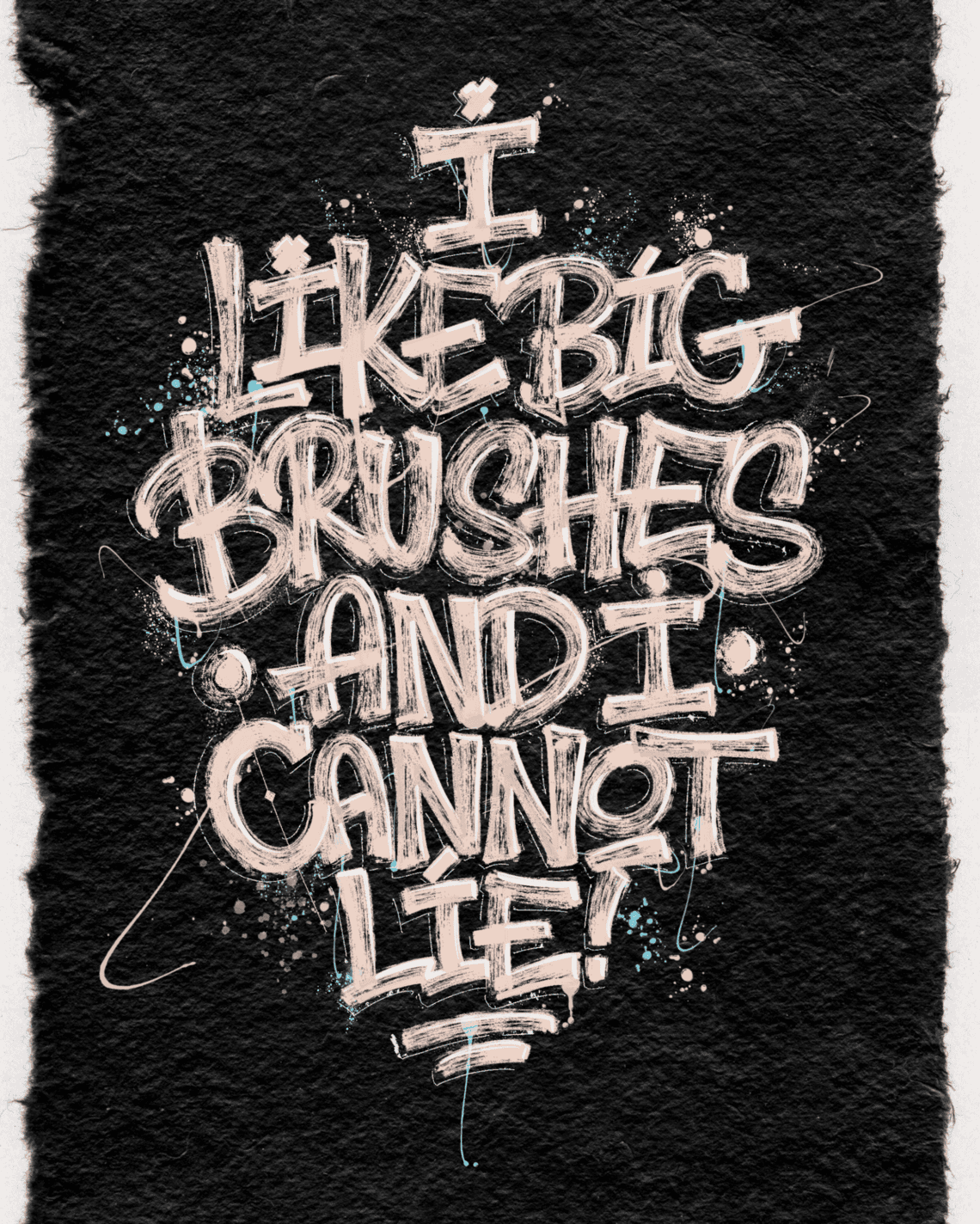
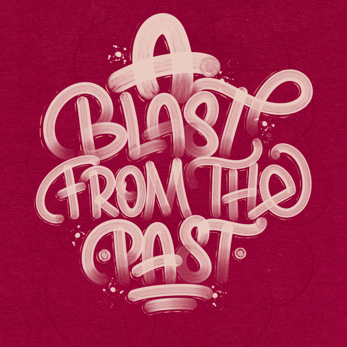
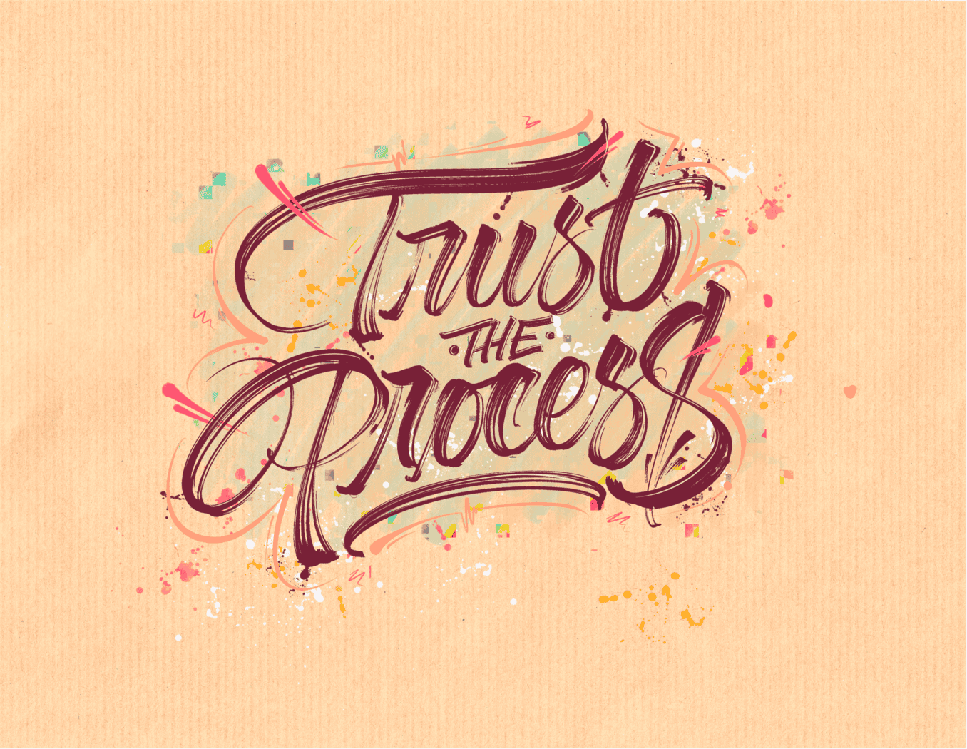
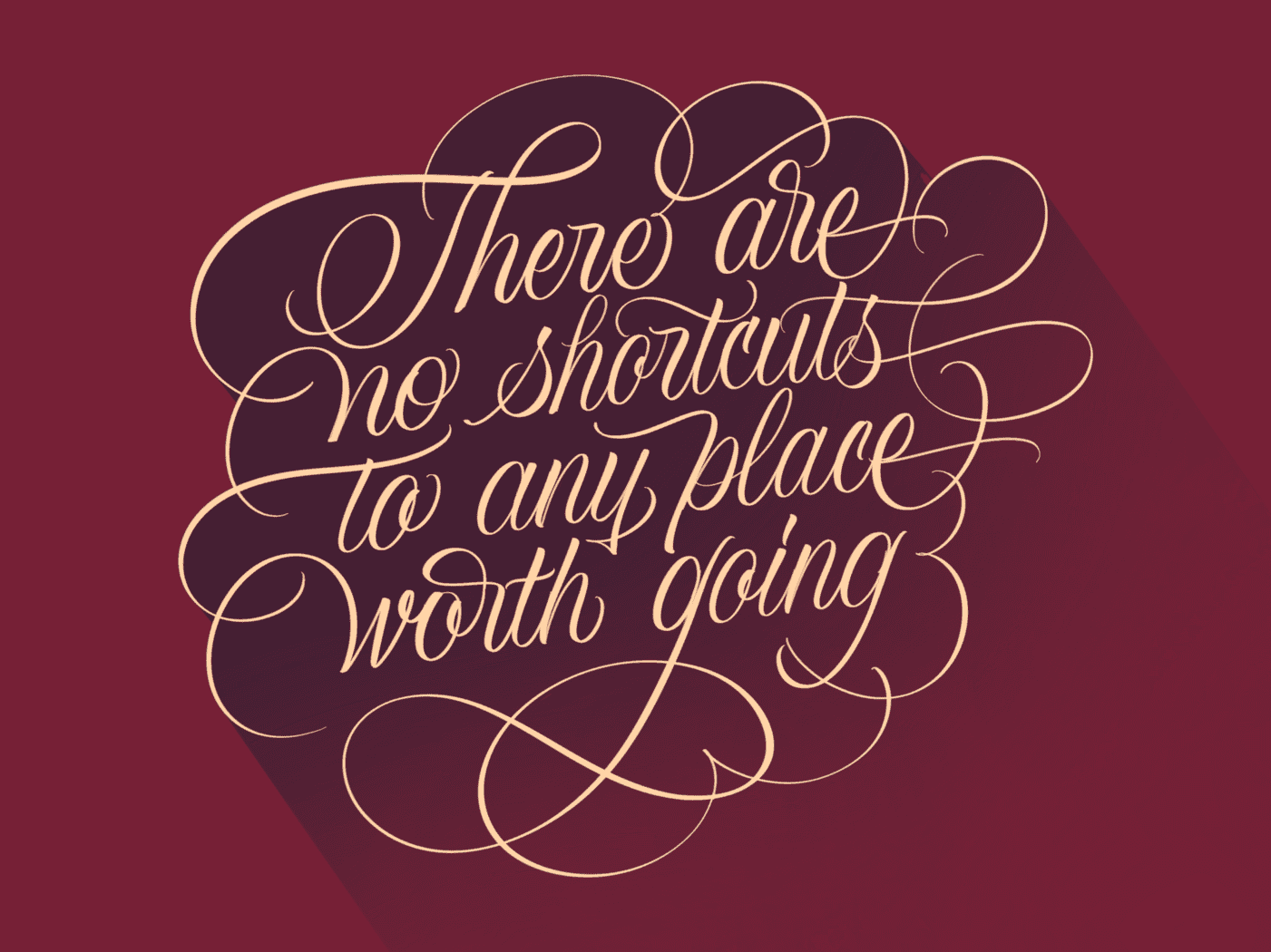
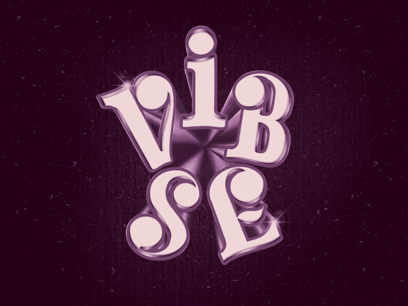
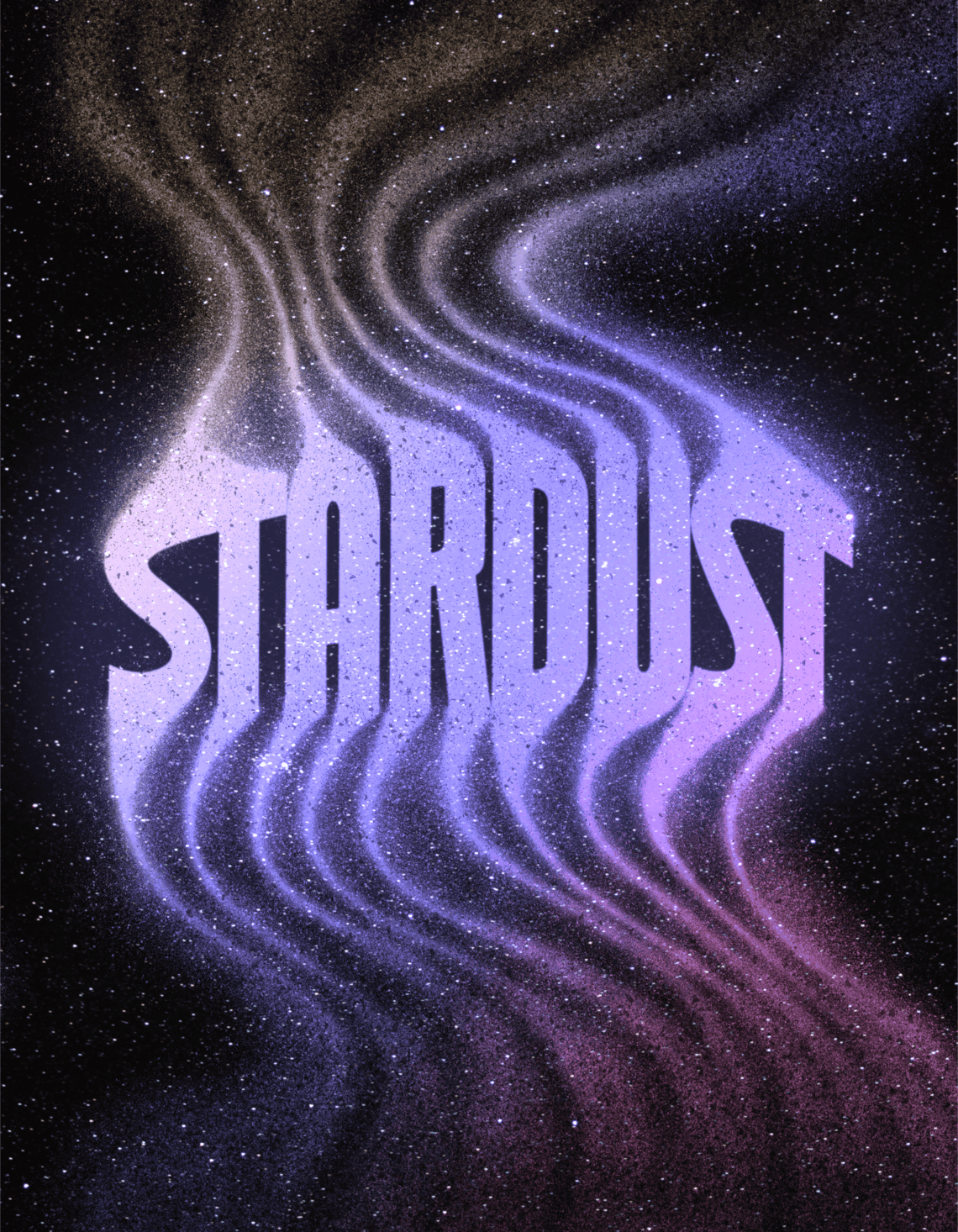
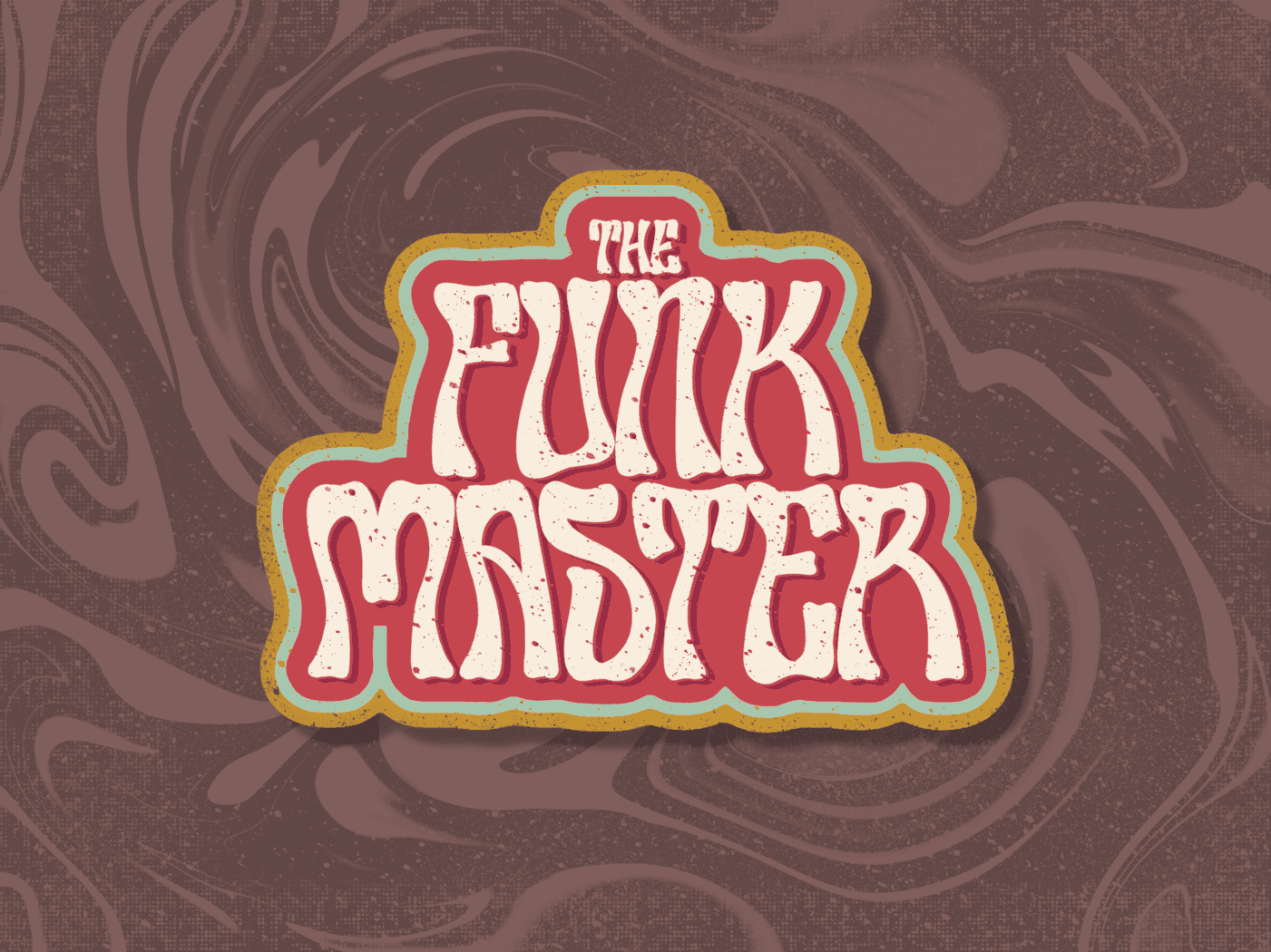
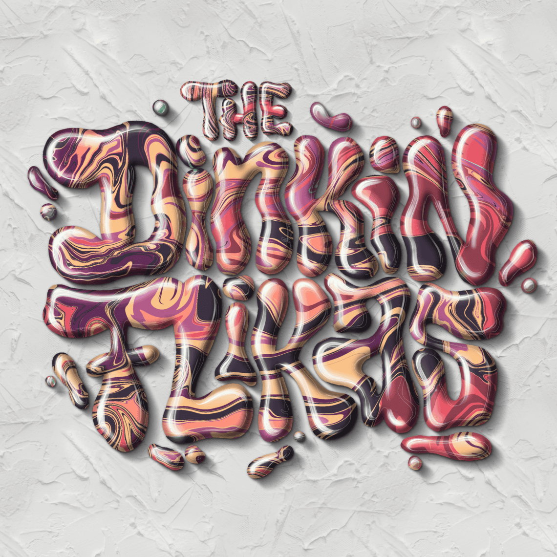
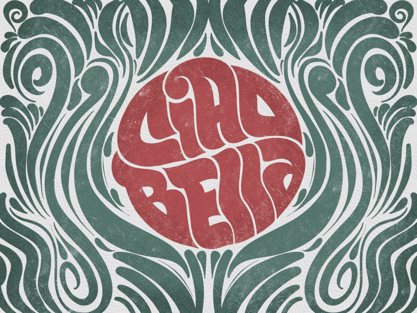
Use these as inspiration, not imitation. Notice the variety in:
- Layouts – Centered, stacked, angled, or flowing across the page
- Textures – From crisp vector-like finishes to gritty vintage vibes
- Color Palettes – Bold pops, muted tones, or simple monochrome
- Lettering Styles – Serif, sans-serif, brush script, and more
I encourage you to try breaking down what you like about each piece. Is it the texture? The spacing? The letter shapes? This kind of observation is a great way to grow your own style.
10. Final Words
And that’s a wrap! 🎉
You’ve just learned how to create a full lettering piece using Procreate on your iPad — from sketch to inking, color, effects, and exporting. Whether this was your very first time trying digital lettering or you’re building on existing skills, give yourself props. 🙌
You don’t need to master every Procreate feature right away — in fact, most of the magic happens just by practicing, experimenting, and getting more comfortable with your tools.
Here’s the deal: the more you create, the better you get.
Keep sketching. Keep tweaking. Keep exploring new brushes and effects. And most importantly, have fun with it.
Got questions? Want to share your progress? Drop a comment below or tag me on Instagram — I’d love to see what you’re working on.
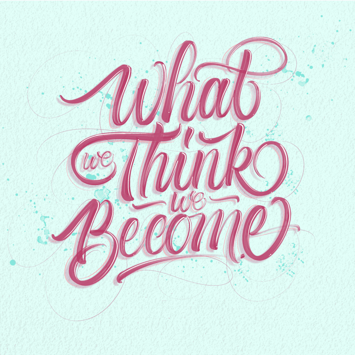
Until next time — keep creating, and enjoy the ride. 🚴♀️✨
Pin me!
About the author

Hey, I’m Max. I’ve been drawing and messing around with letters since 2011. I don’t have a formal art degree—my background is actually in the kitchen as a former chef and on the streets painting graffiti with my friends. Over the last decade, through a ton of trial and error, I somehow turned that obsession into a full-time gig. These days, I design custom logotypes for global brands and paint large-scale murals. I started Lettering Daily just to create the kind of honest, no-BS tutorials I wish I’d had when I was starting out. Stick around, and let’s draw some letters.

For employees of the United States Postal Service (USPS), Liteblue ePayroll is your one-stop shop for all things related to your paycheck. This secure online portal allows you to conveniently access your paystubs and keep track of your earnings anytime, anywhere.
You can find the Swertres Result summary and complete history of 3D (Swertres) lotto results for all time on this dedicated Website. The 3D Lotto game is drawn every day by the Philippine Charity Sweepstakes Office (PCSO) at 2 PM, 5 PM, and 9 PM in all areas nationwide.
NLCB Play Whe is the famous and Popular lottery of Trinidad and Tobago. You can check the latest Play whe predictions for the Next Play Whe Draw.
You can find the Swertres Result summary and complete history of 3D (Swertres) lotto results for all time on this dedicated Website. The 3D Lotto game is drawn every day by the Philippine Charity Sweepstakes Office (PCSO) at 2 PM, 5 PM, and 9 PM in all areas nationwide.
Thank you! Very informative, can’t wait to get started!
Sweet! So glad to hear that 🙂
Thanks!
Thank you so much 😊
Thank you! 😉
This website is so helpful as i just got my ipad that i waited so long for.
Wooohoo! Welcome to the #ipadletteringgang 😀 You’ll love it! If you need any help, don’t hesitate to reach out! 🙂
Thank you for such detailed explanation. How can i get calligraphy guidelines in my procreate? I’m new to this and have only recently started. Thank you.
You can either use Dropbox or Airdrop, depending on what you are using.
This article was so useful, thank you! I got my new iPad and Apple Pencil yesterday and you helped me understand exactly why I was frustrated with my attempts and fix it! Lots more practice needed with pressures and calligraphy, but now I have some firm foundations to build upon 🙂
Article step by step easy to understand thankyou Dong
Thank you!! Really appreciate it. Keep up the good work ??
Thank you! 🙂
Super useful, it helps a lot
Thanks Isabella, appreciate it 🙂
Hey – Would I need to get the Ipad Pro or can I just get an ipad to begin?
Get an iPad Pro right away. It really makes no sense buying a regular iPad. it’s better to spend a bit more and get the real thing. The iPad pro is the best model for Procreate as the screen has a different technology compared with the other ones.
Hey Teeka, I have the iPad Air 3rd Gen which supports the 1st Gen Apple Pencil. I was previously using an older model (1st Gen Air) with a 3rd Party bluetooth stylus and the Pocket version of Procreate, but I “outgrew” that and need more accuracy, control and access to features.
The Pro is prohibitively expensive for me, but as a “new” beginner with this setup I’ve got more than enough to learn before I envisage the specific features of the Pro being something I’d miss or even understand as compared to the 3rd Gen Air. If you’re not planning to use it for your career, I’d personally say you don’t need the Pro, and you can save yourself a few hundred bucks!
There is one version of the Pro (the 10.5 inch which isn’t made anymore) that is about the same price refurbished as the Air 3. However, I did some research and there wasn’t much difference, except the Air 3 is newer (2019) and still produced so is likely to be supported by Apple for longer. Hope that helps!
Thanks for sharing, I really appreciate it. You the man!
Thanks for sharing, I really appreciate it.
Thank you so much for all this helpful information, I had no idea there was!
You are welcome Melanie 🙂
After step 3–Layer Settings–you move to step 4–Blend Modes. But you never say how you got to Blend Modes. Where do I find these blend modes?
To access the blend modes you need to tick the downwards arrow next to the (each) layer.
Can’t wait to practice with the free brush
Can’t wait to see your works!?
Thanks
My pleasure!
Just wanted to say thank you so much! I’ve had the iPad pro (& apple pencil) for a few months now & despite my thinking that i was going to jump right into learning about lettering.. I’ve actually been completely overwhelmed & haven’t started at all.?There are just so many videos about so many different steps/products, and I’m such a BEGINNER- i just didn’t know where to start. Until now!? Reading this article (& having access to it while i learn the process step by step) is the first time that i genuinely believe that I’m gonna be able to this! & I’m SOOO excited!! So i just wanted to stop & say thank you so much for all the work you put into this- it’s definitely appreciated! Sending love & health to you & yours, Erin
I definitely feel you on the part of feeling overwhelmed Erin! I ended up procrastinating on it, just thinking about all the resources made me not want to start at all. I am super glad to hear that the article/video was helpful and I really appreciate the kind words! Much love & Stay safe! -DK
whoah this blog is excellent i love reading your articles. Keep up the great work! You know, a lot of people are searching around for this info, you could help them greatly.
Max/Lettering Daily is indeed doing an amazing job! Really happy that I could contribute to the community this time as well! Thanks so much for the comment!? -DK
Hi Brian, I just watched your video on lettering on the iPad. I liked it very much. I clicked on the link for the free brush to just try it out. I read the the page it took me to and found the freebie box at the bottom. I filled out the email section and received the confirmation email. The email said…thanks for the subscription. Maybe I didn’t read all the page correctly but, I didn’t see anything about a subscription or what that might cost. If there is a cost and I need to subscribe to something to receive the freebies I would like to know.
Hey there Terry, sorry for the confusion. The subscription doesn’t cost anything. You are just subscribing to the newsletter with your email address. Once you do that you receive a welcome email with the link and password to the Lettering Crate. That’s a resource library with all the freebies I am currently offering 🙂
Let me know if you have any questions. You are also welcome to reach out via email!
Cheers
Amazing!
Thank you!!
Thank you, very Good.
I really appreciate it!
Thanks
Thank you Brian, means a lot!
How do I change the color of the stroke from one color to the next in one stroke?
That’s a feature that was recently made available with Procreate 5. To be honest I am still catching up with it so im not really sure how you can achieve that. Luckily, my friends Jillian & Jordan of Loveleigh Loops have created this video that explains it! 🙂