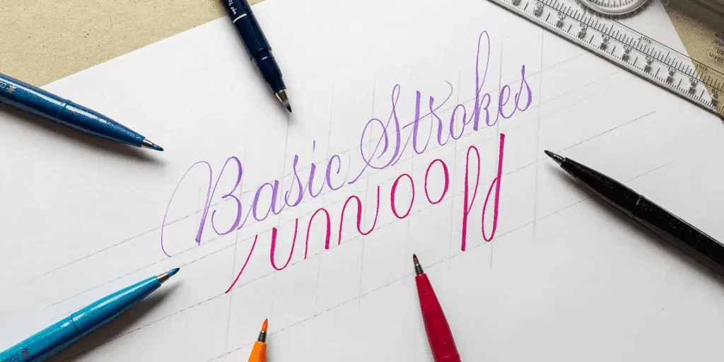
The basic calligraphy strokes are the best way to learn calligraphy as a beginner.
In fact, the number one struggle for beginners I most commonly see is not learning and practicing the basic calligraphy strokes.
This tutorial will teach you everything you need to know about basic calligraphy strokes.
I’ve included some free basic calligraphy strokes worksheets, so be sure to stick around until the end of this tutorial.
Looking for more calligraphy tutorials like this? I’ve collected them all in one place — visit the Calligraphy Hub to dive in.
Here is a quick overview of the article –
- Tools needed to practice the basic calligraphy strokes
- What are basic strokes in calligraphy? How many basic strokes does calligraphy have?
- Basic calligraphy strokes breakdown
- Basic calligraphy strokes alphabet demonstration
- Basic calligraphy strokes worksheet
- Quick recap + final words
Without any further delays, let’s jump straight into this tutorial.
If you’re a complete beginner, I highly recommend you check out my ultimate guide for calligraphy beginners.
Tools needed to practice the basic calligraphy strokes.
To practice the basic calligraphy strokes, you’ll need a very basic calligraphy tool setup (links to Amazon) –
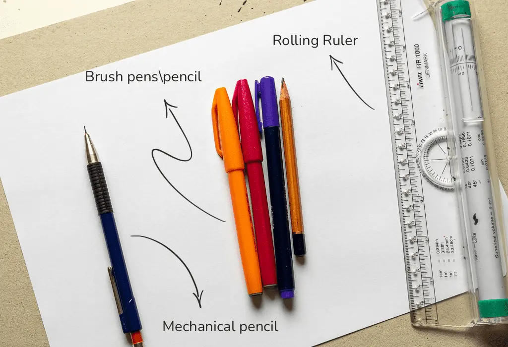
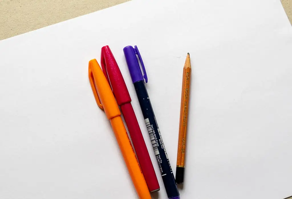
Pens
You can practice the basic calligraphy strokes using a brush pen, pointed nib, or even a regular pencil.
If you’re just getting started, I recommend (links to Amazon) –
- Small brush pen – Tombow Fudenosuke or Pentel Touch Brush Pen
- 2B Pencil
You might also be interested in reading my review on the best brush pens for calligraphy beginners.
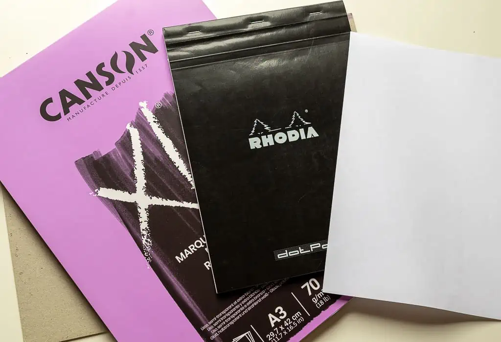
Paper
Aside from your writing tool, you’ll need some paper.
If you use a brush pen or a dip pen + pointed nib, you will need specific papers; otherwise, you risk ruining the tips of your brush pens or ink bleeds.
I recommend the following papers (links to Amazon) –
- HP Premium 32 (cheapest and ok quality)
- Canson marker paper
- Rhodia paper
- Any other bleed-proof marker paper.
I also wrote a separate guide on the best calligraphy papers.
Ruler
You’ll need the ruler to create calligraphy guidelines to keep your basic strokes accurate and consistent.
I have a whole separate tutorial on how to create calligraphy guidelines that you can read here.
I highly recommend that you do.
For guidelines, I always use and recommend the rolling ruler.
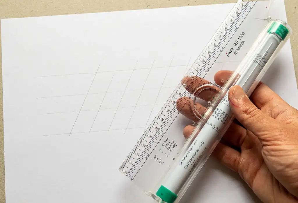
Pencil
We need the pencil to create our guidelines.
I work with an HB mechanical pencil, but you can use whatever you have at hand.
What are basic strokes in calligraphy?
The basic calligraphy strokes are the building blocks of calligraphy letters. These are individual strokes that, when put together, form different letters of the lowercase alphabet.
")
We use basic strokes in both modern and traditional calligraphy.
In fact, I talk about the basic calligraphy strokes in my modern calligraphy tutorial for beginners.
Any style created with a pointed nib or a brush pen.
Let me give you a bit of context as to why these basic strokes are so important.
To the untrained eye, a word in calligraphy may seem that has been created in one take without lifting the pen.
Similar to cursive writing.
However, calligraphy and cursive writing are two very different things.
- Calligraphy is done slowly, the pen is lifted often, and each stroke is created with focus and precision. The strokes also vary in thickness.
- Cursive writing, on the other hand, is more fluid, done quickly, and the pen is lifted less frequently.
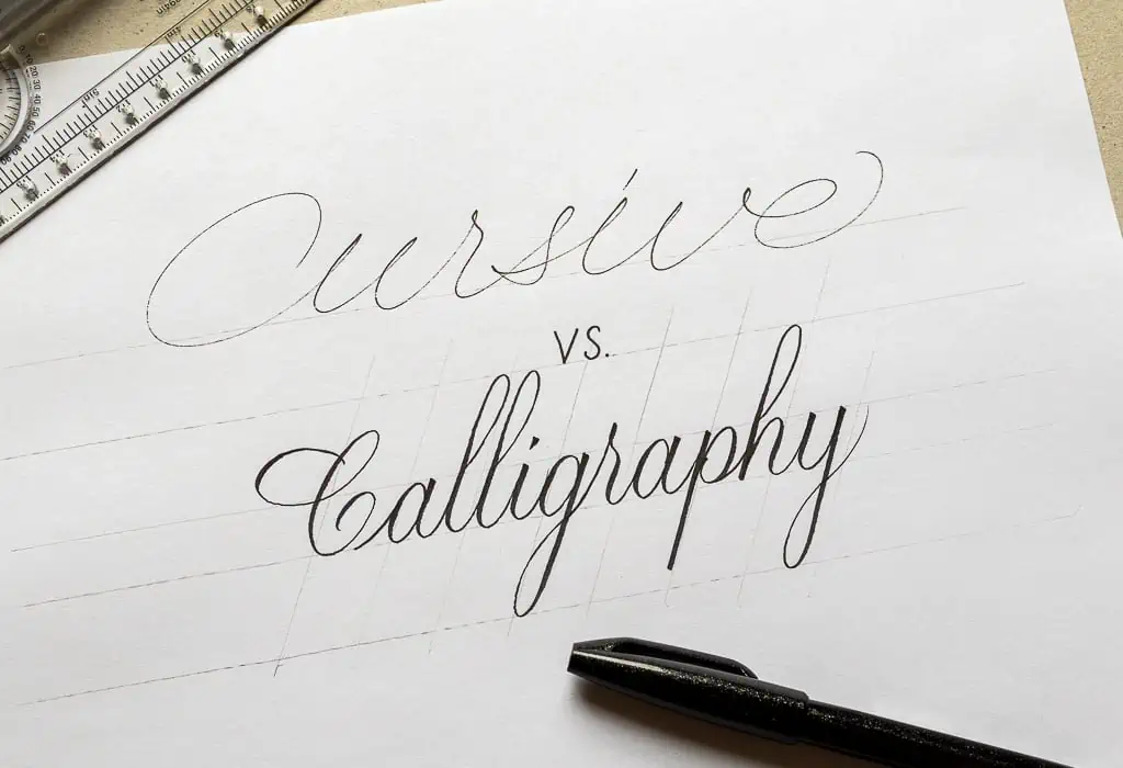
It’s essential to understand this difference because the basic calligraphy strokes allow you to drastically improve the precision and consistency of your calligraphy.
The basic calligraphy strokes also help us learn how to write the whole alphabet and to identify when we should lift the pen after each stroke.
In this way, you dont have to memorize the letters individually and guess when to lift the pen.
How many basic strokes does calligraphy have?
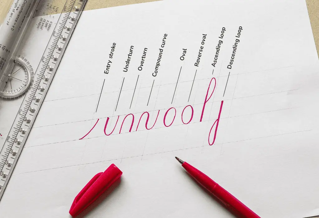
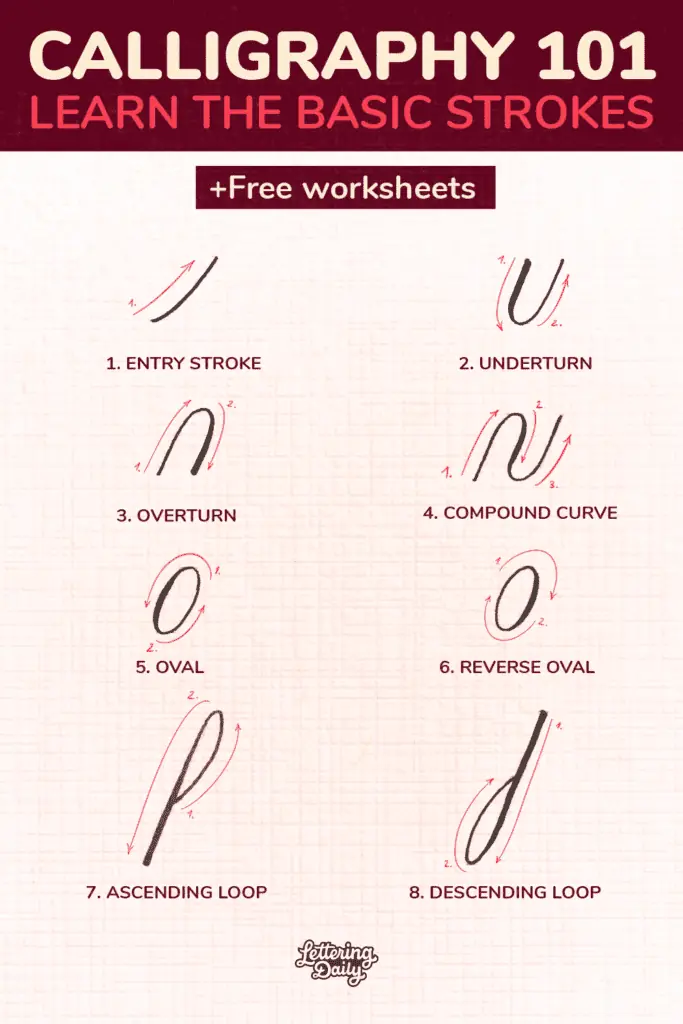
There are 8 basic calligraphy strokes, and they are –
- The entry stroke
- The underturn
- The overturn
- The compound curve
- The oval
- The reverse oval
- The ascending loop
- The descending loop
Some letters of the alphabet are an exception to these basic strokes.
I’ll get to them later in the article.
Here are a few quick examples of how we use these basic strokes to combine different letters.
- The letter a is created with an entry stroke, an oval, and an underturn.
- The letter n is made with an underturn and a compound curve.
- The letter b combines an entry stroke, an ascending loop, and a reverse oval.

Now let’s take a closer look at the basic calligraphy strokes.
Basic calligraphy strokes breakdown
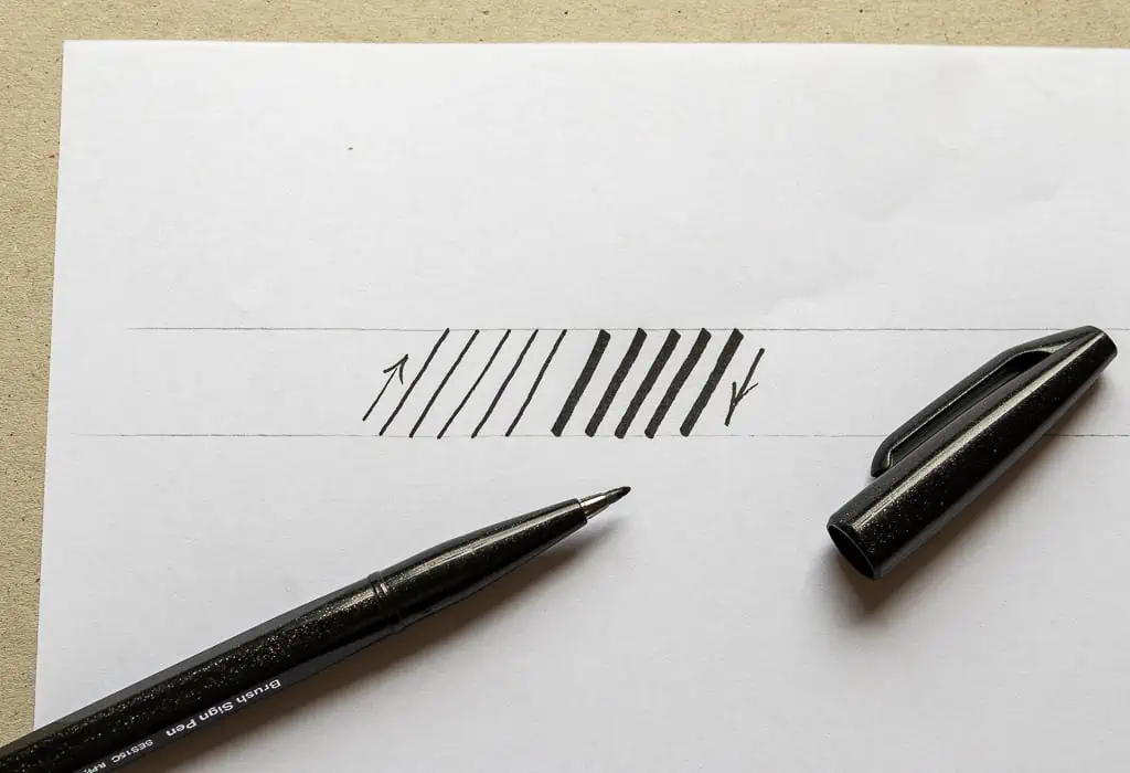
If you’re entirely new to calligraphy, it’s essential to understand the two basic motions.
- When you move upwards with your pen, your strokes should be thin (low pressure)
- And when you move downwards, your strokes should be thick (more pressure).
Ok, now I’m going to go over each stroke to give you a better overview of how to write them out.
Once again, it is absolutely crucial to do this using calligraphy guidelines.
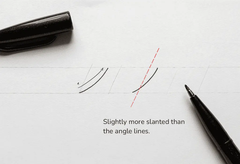
1. The Entry Stroke
The entry stroke is a thin upstroke that starts from the baseline and slightly curves following the slant lines to the waistline.
In most instances, you won’t have to take it up to the waistline but rather to the middle or slightly above.
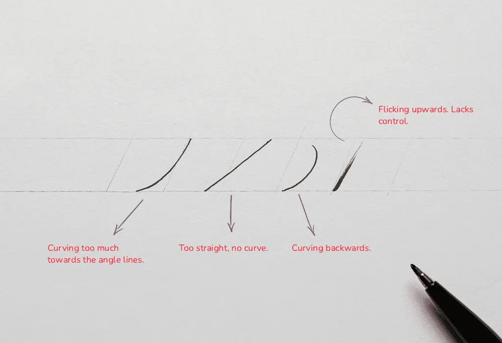
Here are a few examples of what you should try to avoid –
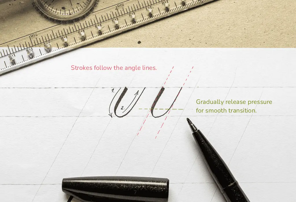
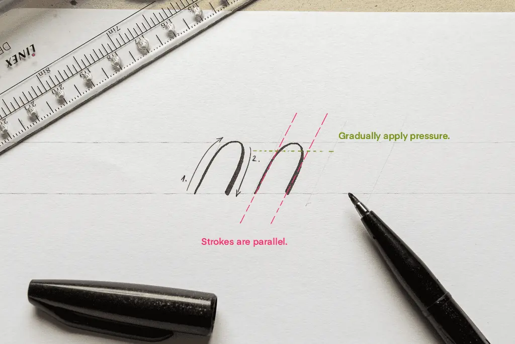
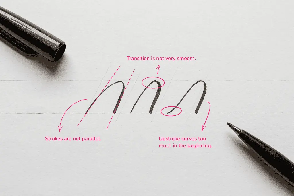
2. The Underturn
Begins at the top of the waistline as a thick stroke.
Then, it curves on the baseline and comes back up as a thin upstroke to the waistline.
Two important things to mention here.
- The downstroke and upstroke are parallel to each other and follow the slant lines of our guidelines.
- You begin to release the pressure slightly above the baseline to get a smooth, gradual transition.
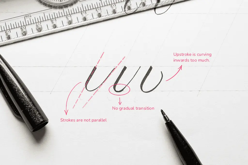
Here you can see a few examples of what you should try to avoid doing –
3. The Overturn
It is absolutely the same as the underturn, just in reverse.
You begin from the baseline with a thin upstroke, curve on the waistline, and come back down with a thicker downstroke to the baseline.
Again, both strokes are parallel and follow the slant lines.
Start applying the pressure gradually right after the curve.
Here are a few examples of what you should try to avoid –
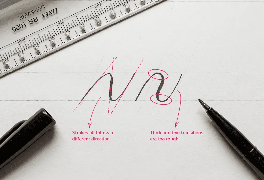
4. The Compound Curve
A combination of the two previous strokes.
Slightly more challenging.
Begin with a thin upstroke, curve at the waistline, come down with a thicker downstroke, curve on the baseline, and back up with a thin upstroke.
All three lines are parallel, following the slant lines.
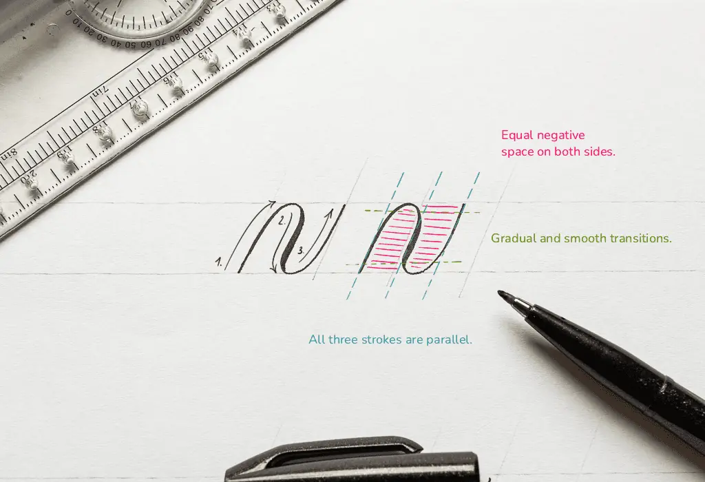
Try to avoid these mistakes –
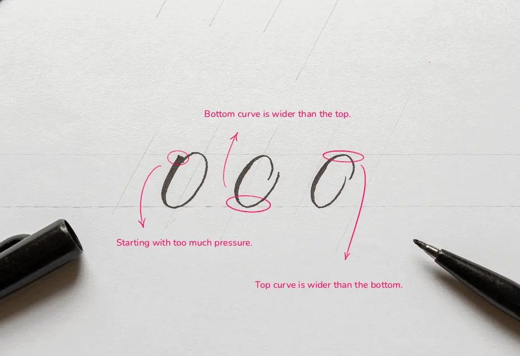
5. The Oval
Probably the trickiest basic calligraphy strokes.
Start slightly from the right side (2-3 o’clock) with a thin upstroke. Curve upwards (counterclockwise) into a thick downstroke which is also curved. Gradually transition on the baseline into a thin upstroke to join the oval.
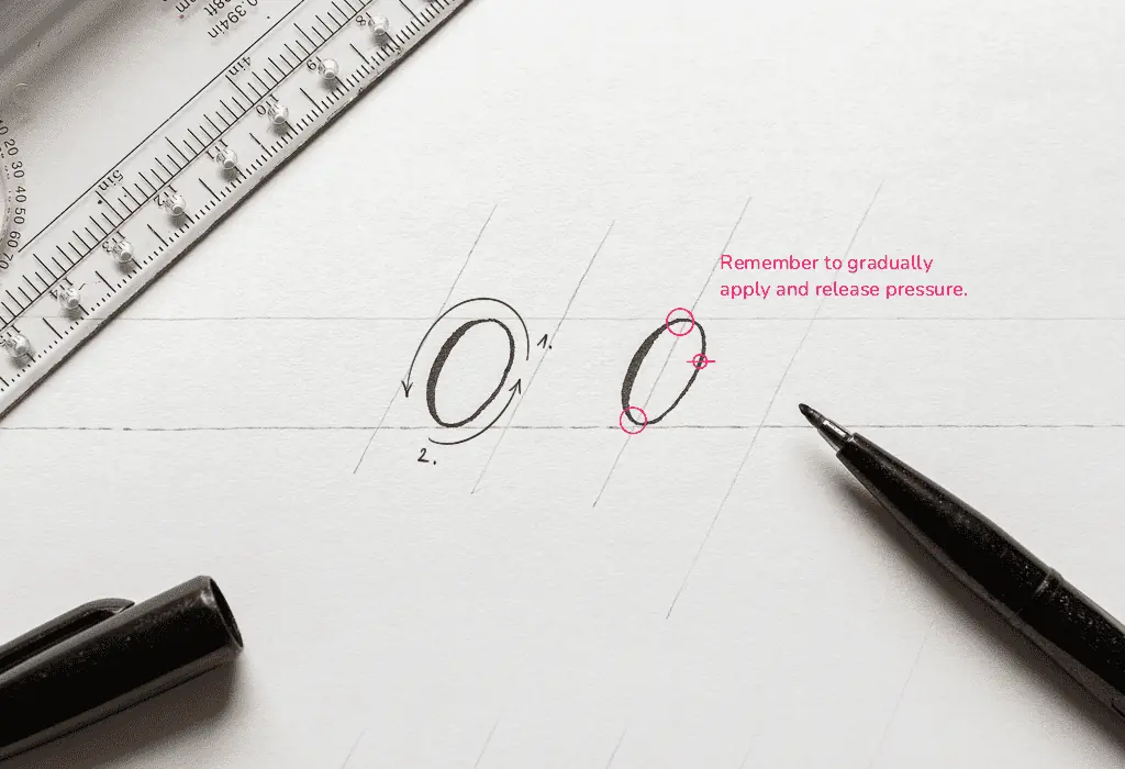
Avoid these common mistakes with the oval shape-
Important note –
Another important mention about the slant of the oval stroke.
I often see people confused about how to angle the oval correctly.
The best way to direct the oval is by using an axis line.
The axis line is basically a line that goes through the middle of an oval and splits it into two equal parts.
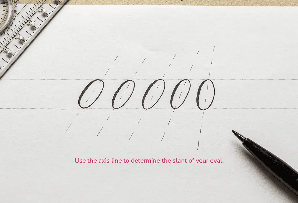
Obviously, you can’t always stop mid-practice just to draw an axis line for your oval.
However, what you can do is imagine one and use that as a guide for the slant of your oval.
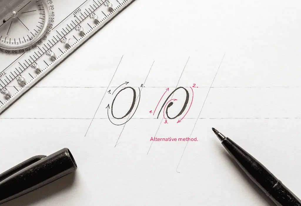
6. The Reverse Oval
Pretty much the same thing as the oval, just in reverse.
Here you can also slightly modify it, and instead of joining the two strokes, the reverse oval can and in a half loop inside like this.
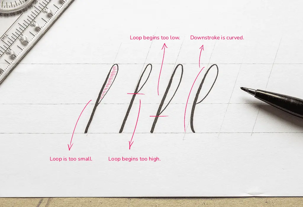
7. The Ascending Loop
The ascending loop begins at the waistline and extends in a curved thin upstroke to the ascending line.
At the ascending line, it curves back down towards the baseline following the slant angle.
As it curves, you gradually apply pressure to create a thick downstroke.
Alternatively, you could start slightly above the waistline with light pressure that gradually becomes a thicker stroke all the way to the baseline and add the loop as a second stroke.
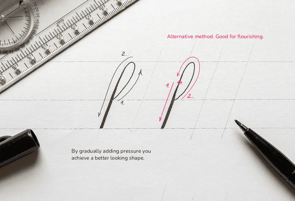
This second method is often used for adding flourishes at the end.
Because with a closed-loop, your flourishing options are limited.
Both ways are good for closed loops, so use the one that suits you best.
Here are a few examples of common mistakes you should try to avoid –
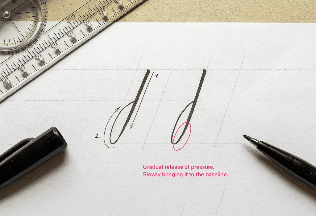
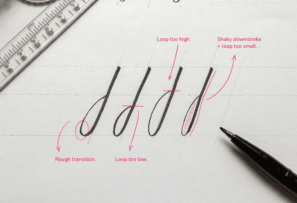
8. The Descending Loop
Pretty much the opposite of the ascending loop.
Start from the waistline with a thick stroke.
Then, take it down to the descending line, and right before it, start releasing the pressure for a smooth thick, and thin transition.
Then, you curve it on the descending line and right back up in a curved, thin upstroke to the baseline.
Here are a few examples of what you should try to avoid –
A note about counter spaces (important!)
If you don’t know what counters are, it’s basically the white space inside of the letters.
We differ two types of counters – opened and closed.
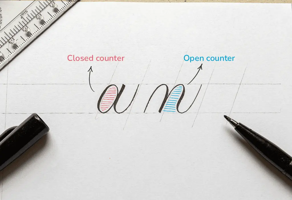
To make your basic calligraphy strokes and your calligraphy, in general, more consistent, it’s important to keep an eye on your counter spaces.
By maintaining an equal counter space (both open and closed), we get a much more consistent and balanced look.
The example below shows that counters with equal space look much better than those without.
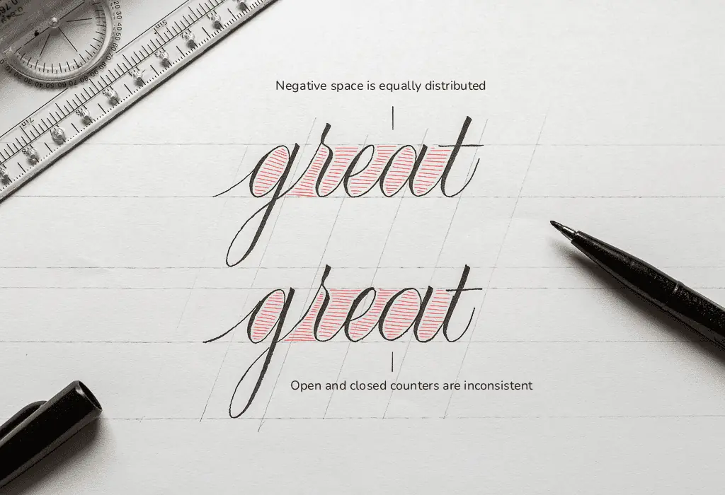
Obviously, it’s impossible to measure this perfectly, but it’s just something I wanted to point out.
Want to build strong brush lettering skills from the ground up?
This workbook walks you through every stroke, with 100+ pages of guided practice.
Master Brush Calligraphy
One Stroke at a Time
This 100+ page workbook walks
you step-by-step through brush
calligraphy basics to full style
development – no experience needed.

Basic calligraphy strokes alphabet demonstration
In the video below, I demonstrate how I use the basic calligraphy strokes to write out the whole lowercase (minuscules) alphabet.
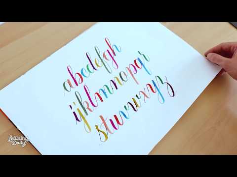
I also created a tutorial on how to write a brush calligraphy alphabet from a to z.
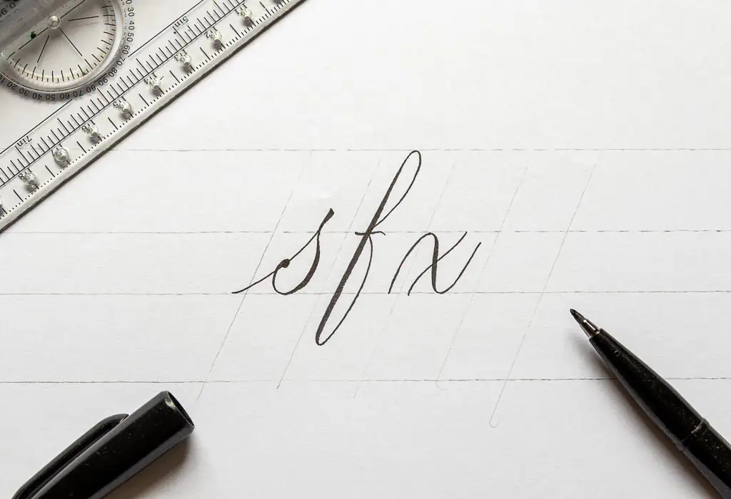
Exception letters
As I mentioned earlier, some letters are an exception to these basic strokes.
Their shape is simply different and unique, and therefore you memorize them.
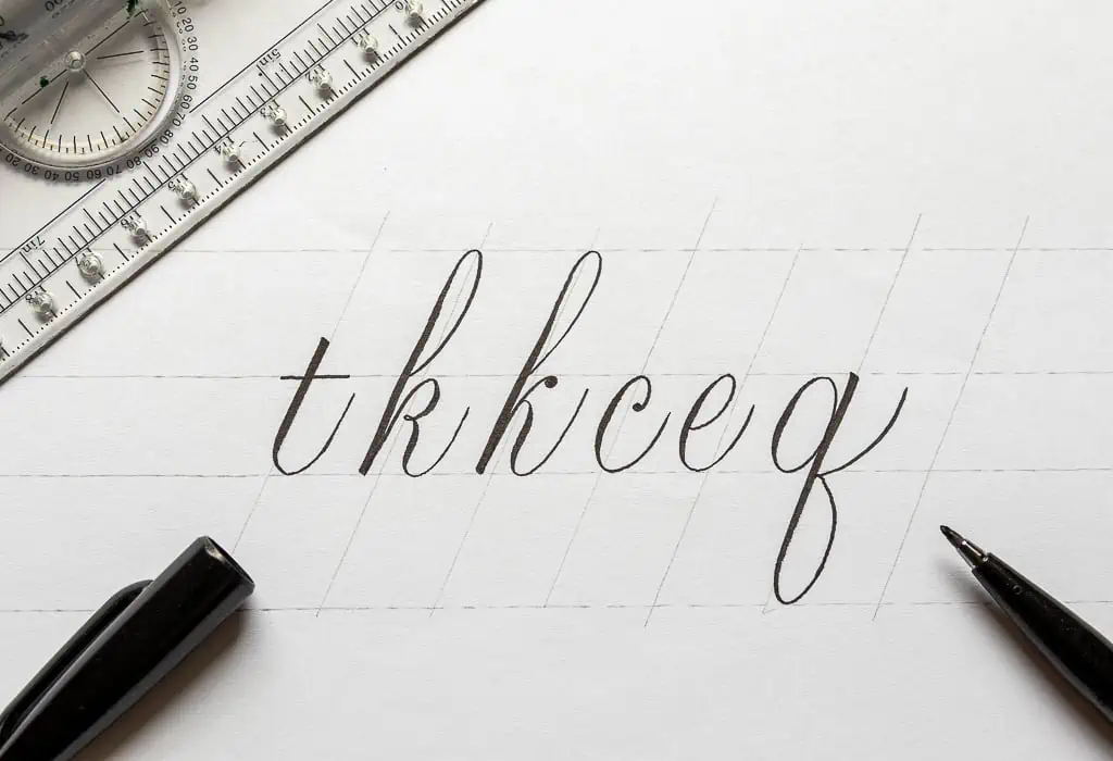
Some of these letters are – s, f, x,
However, some letters have a certain element of these basic strokes, with a slight variation or addition.
Here are a few examples –
- The letter t is an extended underturn (variation) with a horizontal/wavy crossbar (addition).
- The letter k is an ascending loop with a small R shape below.
- The letters c, e, and o are variated ovals with a small addition.
- The letter q is composed of an oval and a reversed descending loop.
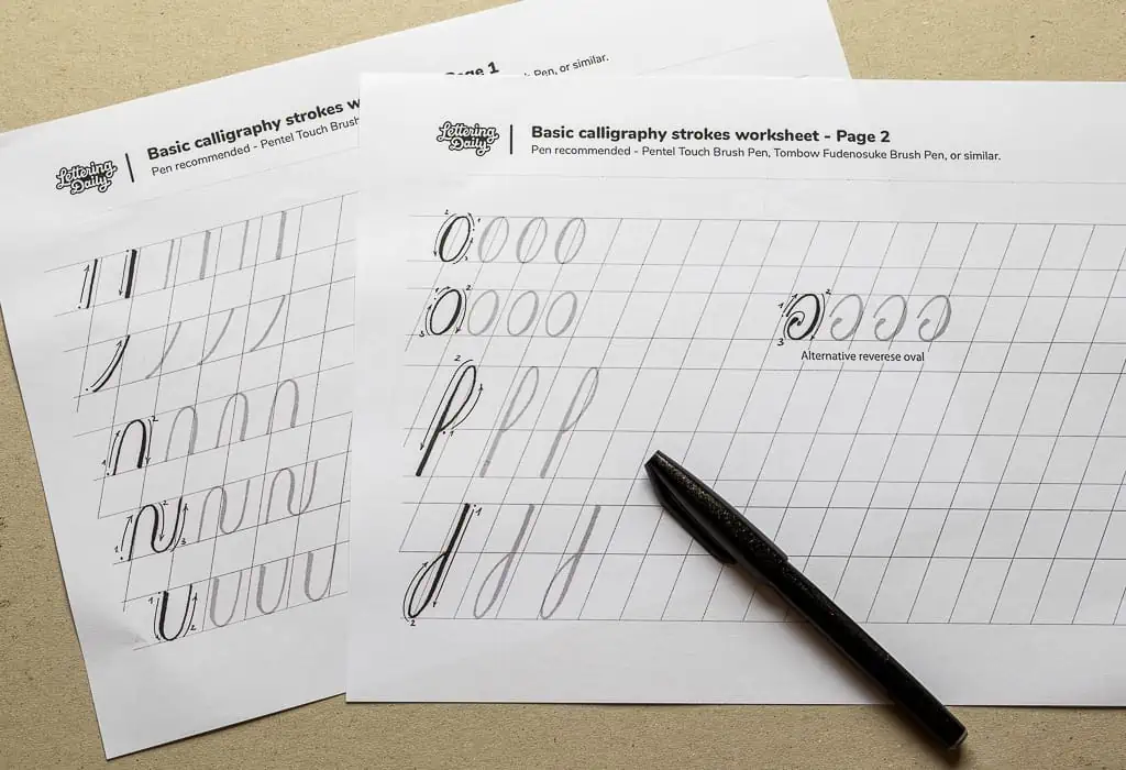
Basic calligraphy strokes worksheets
I’ve created free printable worksheets to help you put the theory into practice.
I highly recommend you practice these basic strokes before attempting to write letters, words, sentences, etc.
I promise that if you practice for just 15 minutes a day for 30 days (consistently), you will significantly improve your skills.
In these worksheets, you’ll find –
- The two fundamental strokes (up thin, down thick)
- The 8 basic calligraphy strokes
The worksheets, along with all the other freebies, are located inside the Lettering Crate.
If you’re new here, just sign up for the newsletter, follow the super easy instructions, and get instant access to the Lettering Crate.

Stay updated with my tutorials and get instant access to the Lettering Crate –
A growing library of free lettering & calligraphy resources that includes –
The Lettering Crate is an exclusive member area where I upload ALL free worksheets (and other freebies) to help you learn and improve your skills.
Note – if you struggle to access the worksheets, email me rather than leave a comment below.
Quick recap + final words
Let’s have a quick recap of everything we talked about in this tutorial –
- The basic calligraphy strokes are the building blocks of letters
- There are 8 basic calligraphy strokes
- Basic calligraphy strokes allow us to learn the whole alphabet and drastically improve our consistency
- Calligraphy and cursive writing are not the same thing and should be approached differently
- Some letters are an exception to these basic strokes
- Some letters are slightly modified, and some have small additions to them
- Always work with guidelines!
- Keep an eye on your opened and closed counters
- 15 minutes a day for 30 days (consistently) will do wonders for your calligraphy skills
If you are interested in other styles, check out my article on the 10 calligraphy styles for beginners.
And once you feel confident with your basic strokes, you can read about other helpful calligraphy practice tips.
And there you have it, friends.
I hope this tutorial helped shed some light on the basic calligraphy strokes and how to use them to learn calligraphy.
If you have any questions or comments, feel free to drop a comment below or reach out via email.
Until the next one!
Pin me!
About the author

Hey, I’m Max Juric, and I’m deeply passionate about calligraphy and hand lettering.
I’ve spent years honing my skills in the art of lettering, working with hundreds of clients from all over the world on design projects such as logotypes, branding, custom lettering, murals, and more.
But my journey doesn’t end there. I’ve also dedicated myself to sharing my knowledge and expertise with others, creating a wealth of resources including tutorials, articles, and podcasts.
It’s been incredibly rewarding to see thousands of people engaging with my content each month. Knowing that I’m helping fellow enthusiasts grow and develop their skills makes me really happy.
Welcome to Lettering Daily, your hub for all things lettering and calligraphy. Whether you’re a seasoned pro or just starting out, I’m here to inspire and guide you on your lettering journey. Stick around, and let’s explore the world of letters together!


Hi Max,
Thankyou for all the resources and clear detailed explanation.
God Bless You
Thank you!!!!!
Please email the free worksheets! I’m excited to begin ✒️
Please email the free worksheets, great tutorial
[email protected]
Bonjour,
Merci beaucoup pour cet article, je suis débutante et comprendre et visualiser les erreurs à ne pas commettre va beaucoup m’aider,
je continue ma lecture de votre site qui est extrêmement enrichissant pour moi qui débute.
Amicalement
What a fantastic find! Clear and step by step for a beginner like me. Thank you so much for sharing 🙂
By far THE BEST website on teaching calligraphy in all forms! With video tutorials to written out instructions, there is no room for guessing which is GREAT. Thank you, Lettering Daily aka Max. You have helped me every step of the way on my calligraphy journey and I am so much better for it. My appreciation and gratitude is endless and no words can quite suffice.
I have been interested in the beautiful art of Calligraphy for years but have only recently started looking at the ‘how to’ pages on Pinterest. Your site offers the most concise and understandable tutorial I’ve come across. So much so, I’ve actually left my email in your Lettering Crate! I bought a starter set of Calligraphy pens at the weekend… I can’t wait to get started 🙂
First of all thank you so much for a wonderful explanation. Your teaching method was too amazing and very clear. I can understand easily. I love calligraphy. But I don’t know how to write it. After seeing your tutorial I have confidence that I will be able to write beautifully. 👍Good job…
Thankyou for your clear instructions. The description is so detail. I do really understand what to do.
Awesome! Glad to hear that 🙂
Thank you for this guide. I struggle with how to hold the pens so my hand doesn’t have to do all the weird movements to get the up and down strokes.
The pen hold should be constant. You shouldn’t have too much movement of the tool in your hand. Im going to make an article about that as well, but if you want, in the meantime, feel free to send me an email and I’ll do my best to help you out.
Thank You very much, is a very good tutorial to follow.
Thank you, Jose! It means a lot. Im glad to hear that 🙂
Thank you Max for this very detailed tutorial. Now I know why my work looks bad. I will follow your advise.
Thank you, Melissa. Im glad you found this tutorial helpful. If you need further assistance with your work, consider joining the Facebook group 🙂
Oh wow, my goodness, what a gem of a post! So thorough and at the same time such a pleasure to read. Thank you so much for this!!!
Thank you, Agata! Im really glad you liked the article. Let me know if you have any questions 🙂
Thank you. Your instructions are wonderfully clear and the examples are a joy to behold. As well as inspiring!
Thank you, Diane. Im glad that this article was helpful for you! 🙂