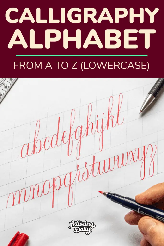
In this tutorial, I will teach you how to write a whole (lowercase) calligraphy alphabet.
I will create this calligraphy alphabet from a to z using a brush pen.
By the time you end reading this tutorial, you will see that writing calligraphy letters is much easier than it seems initially.
I’ve gathered all my foundational articles, style guides, and practice tips in the Calligraphy Hub so you can easily navigate what you need.
Here is a quick overview of what I’ll be going through –
- Needed tools for creating a brush calligraphy alphabet
- The “secret” behind brush calligraphy alphabet letters
- Brush calligraphy alphabet step by step from a to z (+ video)
- Brush calligraphy alphabet variations
- Recap and final words
If you prefer to watch, I also created a YouTube video –

Note – If you’re just getting started with calligraphy, I highly recommend you check out my ultimate guide for calligraphy beginners.
Needed tools to create a brush calligraphy alphabet
You’ll need basic calligraphy tools to create a brush calligraphy alphabet.
The tools I’ll use for this tutorial are (links to Amazon)-
- Paper – Canson Marker paper (great for brush pens)
- Tombow Fudenosuke (hard tip)
- Rolling Ruler
- Mechanical pencil
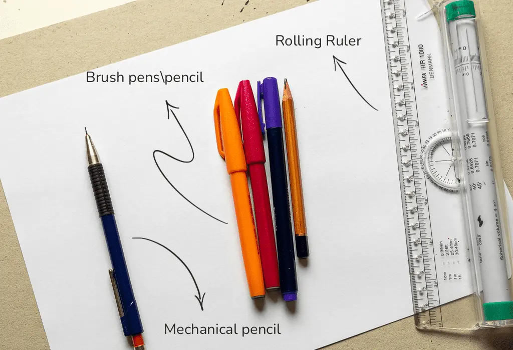
As I mentioned in the beginning, I’ll create this alphabet using a brush pen for this alphabet.
However, you can also work with a pencil or a dip pen + nib.
I create a whole tutorial on how to do calligraphy using a pencil.
Basically, writing tools can change the size of their mark based on the amount of pressure you add as you write.
The rolling ruler and the mechanical pencil are for creating guidelines.
Calligraphy guidelines are an absolutely vital part of calligraphy in general.
Therefore, I made a separate tutorial about calligraphy guidelines and how to use them.
The “secret” behind calligraphy alphabet letters
Brush calligraphy letters may seem tricky and challenging at first, but if you learn and practice the “secret” behind it, you’ll see that’s not the case at all.
The secret is – The basic calligraphy strokes.
In short, the basic calligraphy strokes are the building blocks for our calligraphy letters.
It’s a set of 8 basic strokes that individually look like just some random lines.
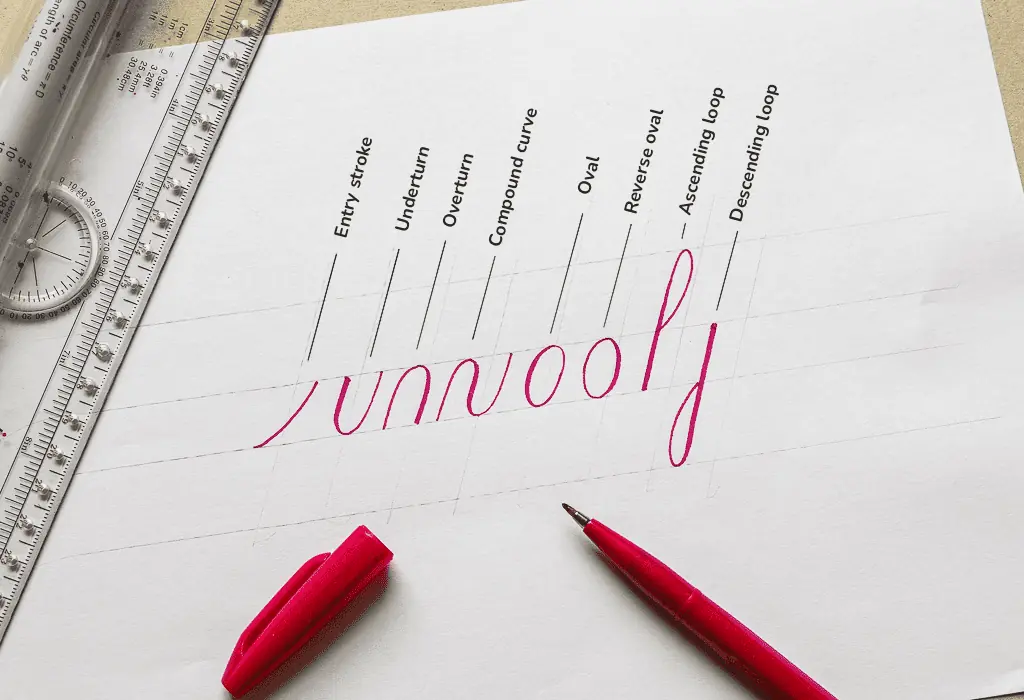
However, when they are placed together in a different order, they form (almost) all of the letters of the lowercase alphabet.
Here is a quick example –

Note: Another term used in calligraphy for lowercase letters is minuscules.
So if you are entirely new to calligraphy, I highly recommend you check out the basic calligraphy strokes tutorial before attempting to create letters, words, and sentences in calligraphy.
By implementing the basic strokes into your calligraphy practice routine, you will develop a strong foundation that will help you improve much faster.
A quick note about the calligraphy style I’ll be demonstrating here.
This specific brush calligraphy style is a modern alternation that has its basis in the copperplate script.
This style is very basic, and its scope is to introduce you to the world of calligraphy letters.
With time and practice, you can develop your own style and variations from it.
As you can see in this example, this style is very simple that follows the basic calligraphy strokes.
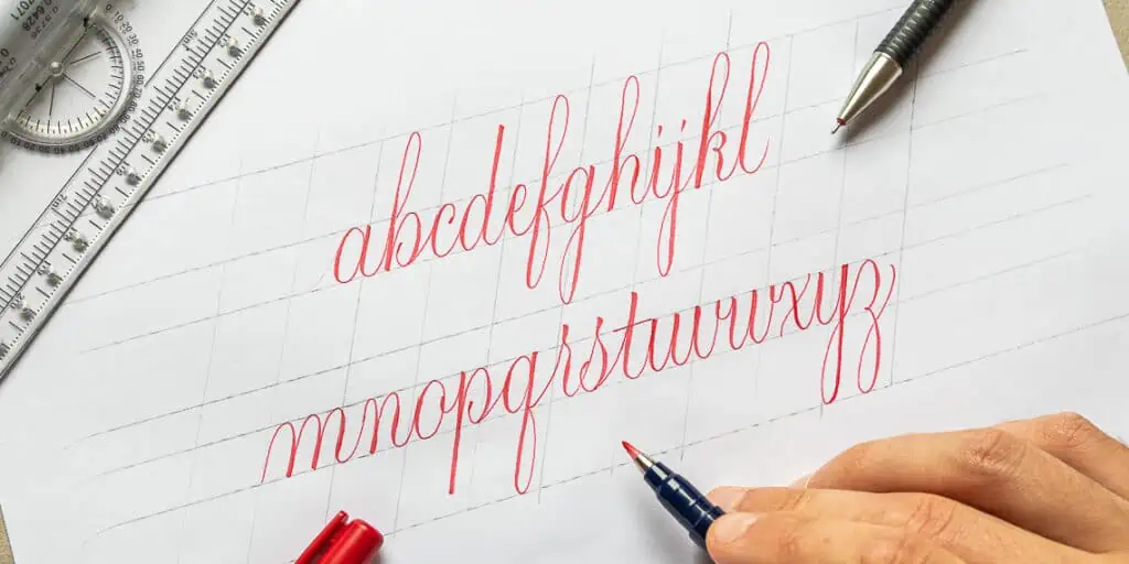
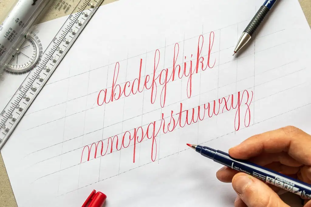
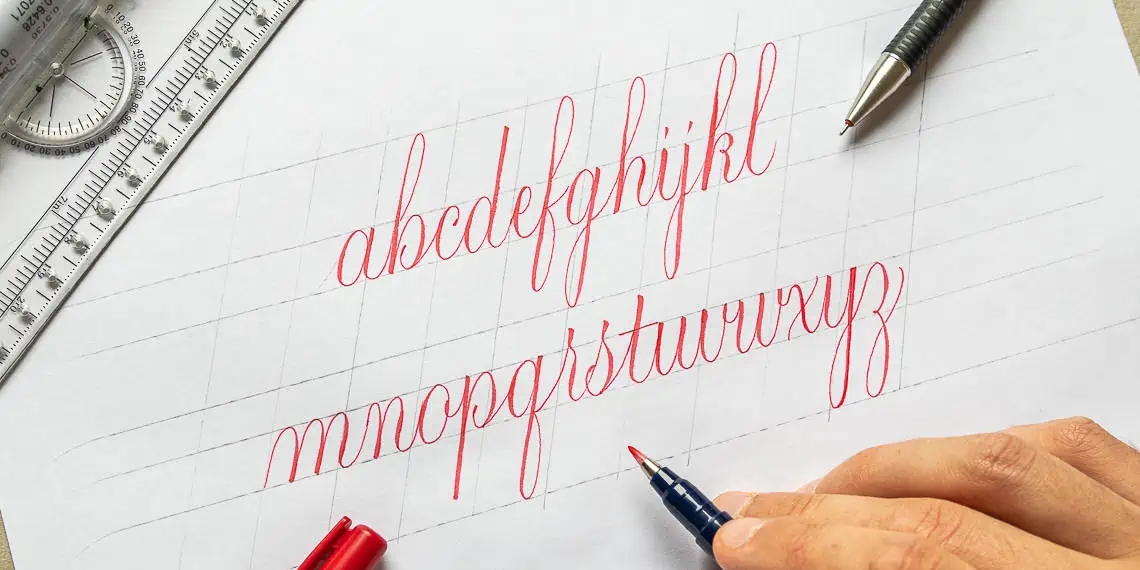
Brush calligraphy alphabet step by step from a to z (+ video)
If you look at the minuscule letters of the alphabet, you will notice that many letters are similar.
That’s precisely why we divide letters into separate pieces and call them basic calligraphy strokes.
Another important thing is that when practicing calligraphy, we dont write out the letters in the order they appear (a,b,c,d, etc.).
Instead, we divide the minuscule letters into groups based on their similarities.
By doing this group division, we can practice the alphabet more effectively.
Therefore, I have separated this alphabet into four groups.
Aside from individual images with a ductus (the little red direction arrows), I also created a demonstration video for each group.
Brush calligraphy alphabet group 1 – i, u, t, j, y, v, w, r, n, m
This is the easiest group of letters.
These letters are based predominantly on the underturn basic calligraphy stroke.
Again, if you are unfamiliar with the basic calligraphy strokes, I highly recommend you check out that tutorial first.
Let’s take a close look at each letter.
You can also check out the demonstration video –

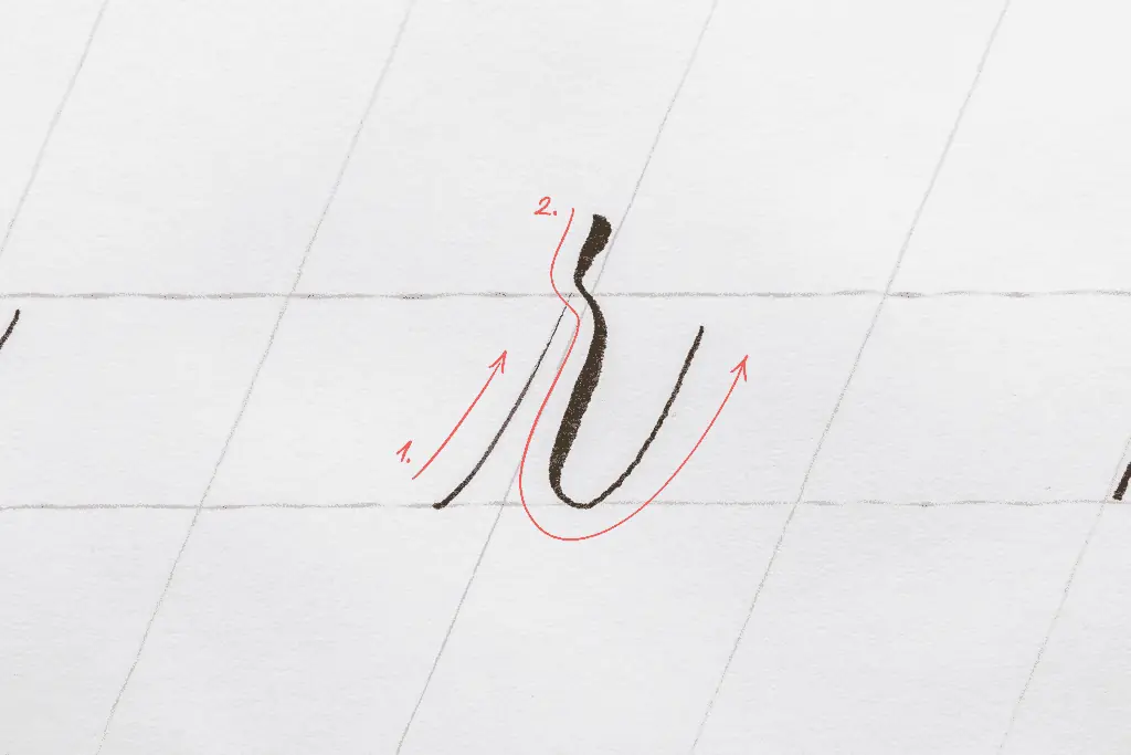
The letter i
The letter i begins with an entry stroke and then with an underturn.
I like to make a little flick on top, but you can also make a little dot.
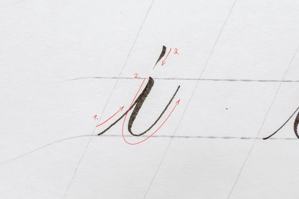
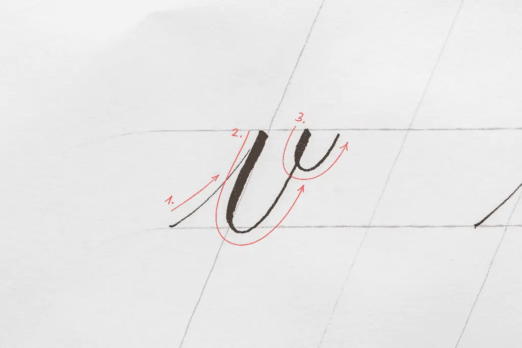
The letter u
Very similar to the letter i.
We just need to add a second underturn next to it.
Try to maintain an equal amount of space in your counters for more consistency.
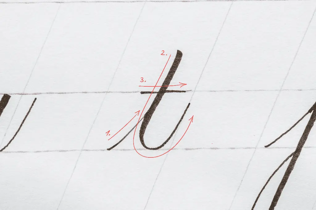
The letter t
The letter t starts with an entry stroke.
After that, you just add an extended underturn.
Although the letter t is an ascending letter, it doesn’t extend to the ascending line but rather halfway to it.
Finish it off with either a straight or curvy crossbar.
The crossbar is usually placed on the waistline or slightly above it. You can place it higher up if you’re doing some calligraphy flourishing.
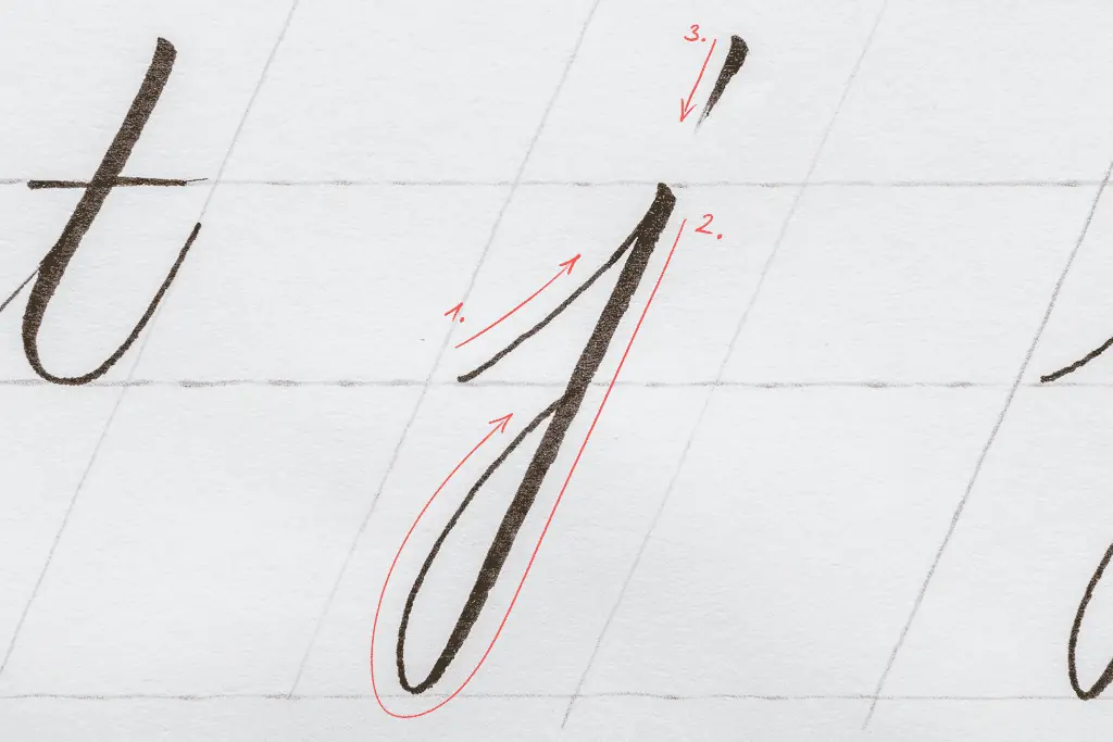
The letter j
With the j, you also start with an entry stroke.
However, instead of an underturn it has a descending loop.
Finish it off with either the flick or a dot.
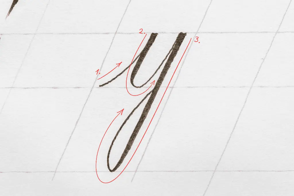
The letter y
The y is a combination of the letter i and j.
So, an entry stroke, an underturn, and a descending loop.
The letter v
Begin with an entry stroke and add an underturn that goes up to the waistline.
Finish it off by adding a little stroke known as the comma dot.
It’s basically like a smaller version of an underturn, which should fit inside the letter.
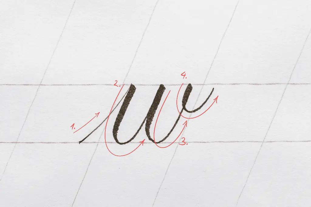
The letter w
It’s similar to the letter u.
So, an entry stroke, two underturns, and a comma dot at the end.
A tip to make the w more balanced is to make the second underturn slightly larger than the first one.
This way, when you put the comma dot, the two underturns are optically adjusted and appear to have the same negative space.
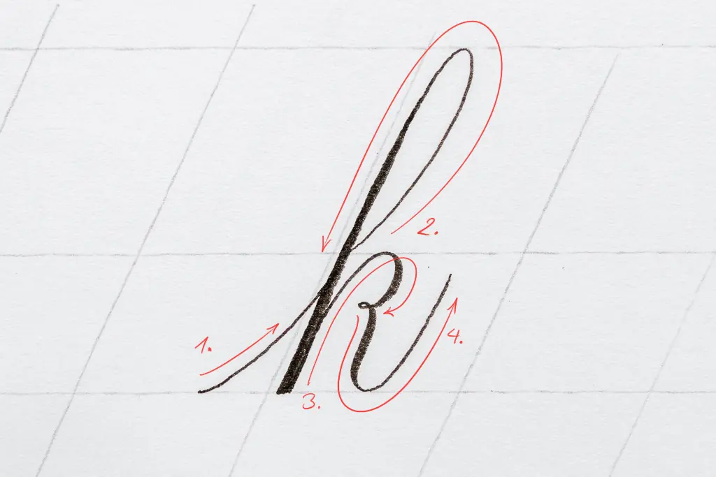
The letter r
The r is a bit unique.
Begin with an entry stroke that is not slanted as much as usual.
Then for the thicker downstroke, begin slightly above the waistline.
Apply pressure briefly, release it right at the waistline and add pressure again to form an underturn stroke.
At first, it might be tricky to get this pressure, release, and pressure combination all in one take, but it’s easier than it looks.
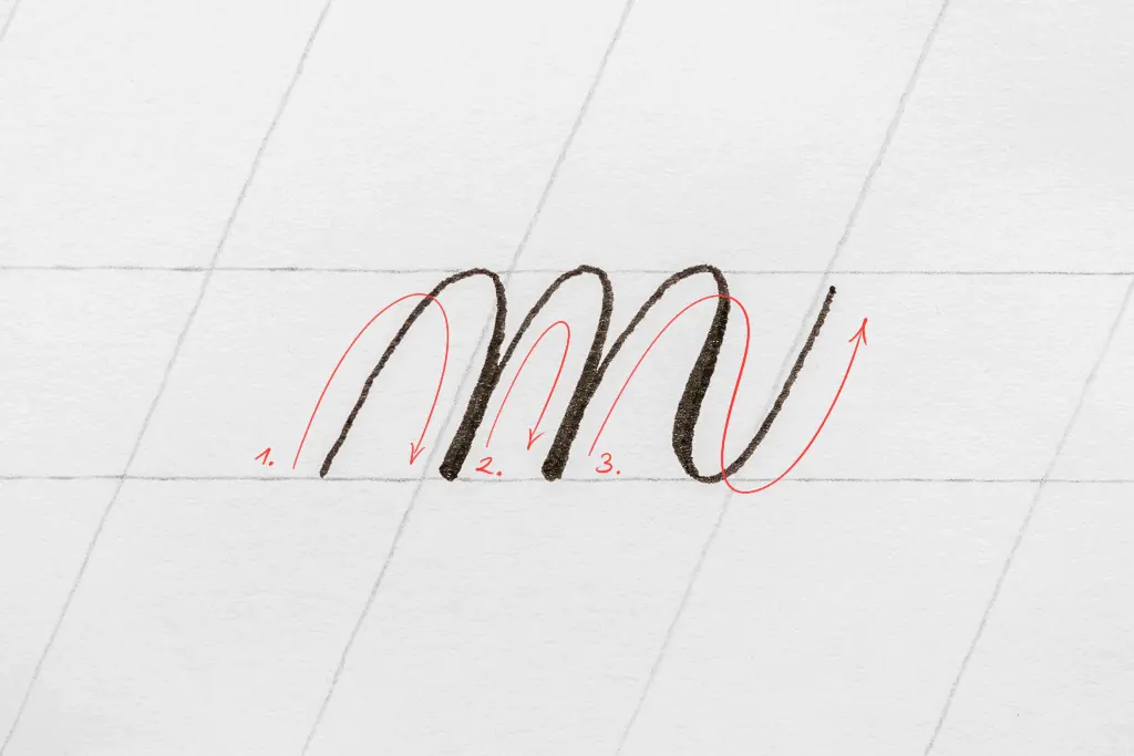
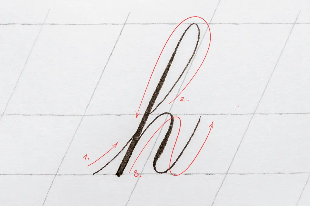
The letter n
Instead of an underturn, with the n, you’ll start with an overturn stroke.
Then, you’ll finish it with a compound curve right after that.
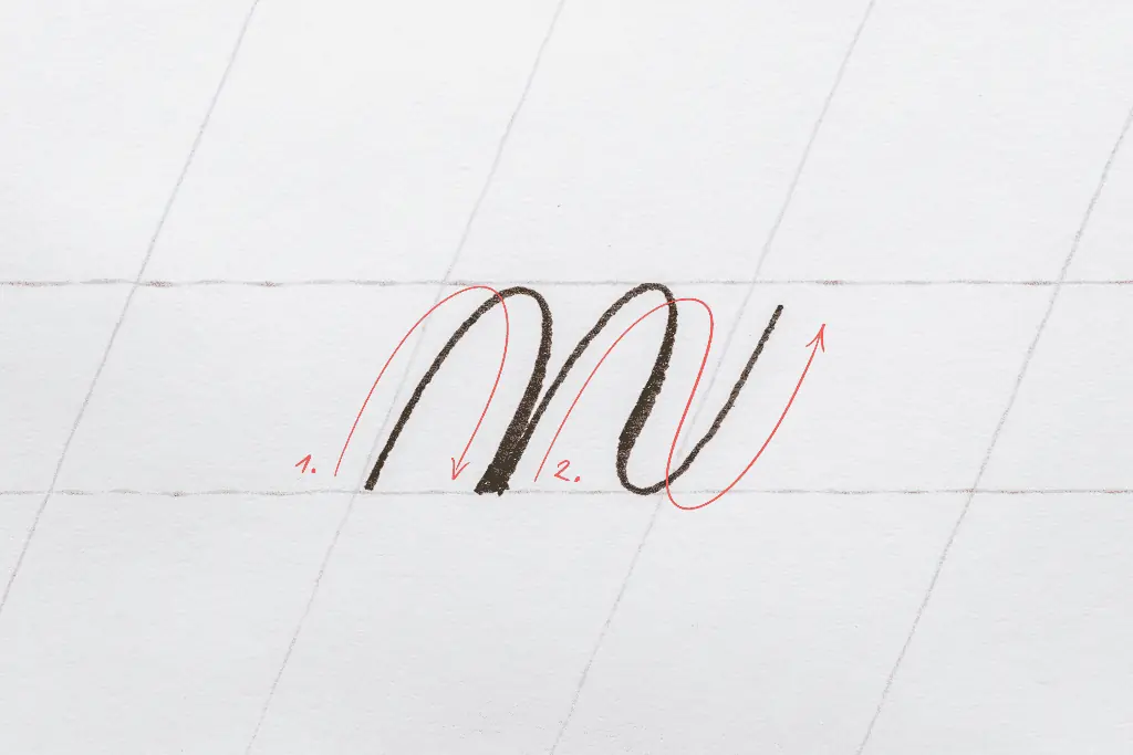
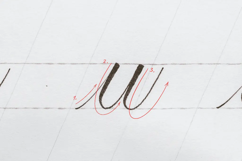
The letter m
Similar to the n, but with two underturns at the beginning followed by a compound curve at the end.
Again, maintain a similar amount of negative space (aka open counters) for better consistency.
Quick note – the entry stroke comes only at the first letters of words. So when we connect letters, we lose that entry stroke. However, it’s good to keep it when you practice single letters like this.
Looking to go deeper with brush calligraphy?
Grab my workbook From Strokes to Style for a full step-by-step learning experience.
Master Brush Calligraphy
One Stroke at a Time
This 100+ page workbook walks
you step-by-step through brush
calligraphy basics to full style
development – no experience needed.

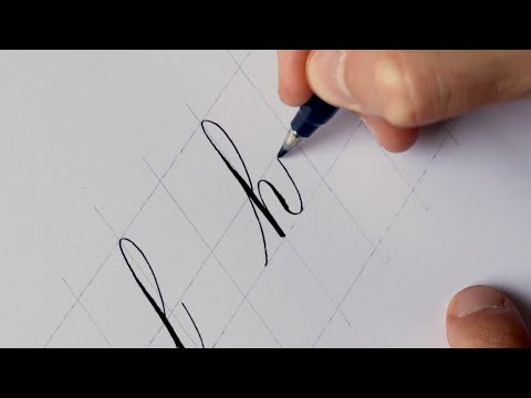
Brush calligraphy alphabet group 2 – l, h, b, k, f
The second group focuses on the basic calligraphy stroke known as the ascending loop.
You can also check out the demonstration video –
The letter l
Begin with a thin upstroke from the waistline up to the ascending line.
Remember that this upstroke should be curved and more slanted than the angle lines.
Curve it at the ascending line and gradually apply pressure as you reach the baseline.
Before the baseline, slowly release the pressure and come back up with a thin upstroke. Similar to the underturn stroke.
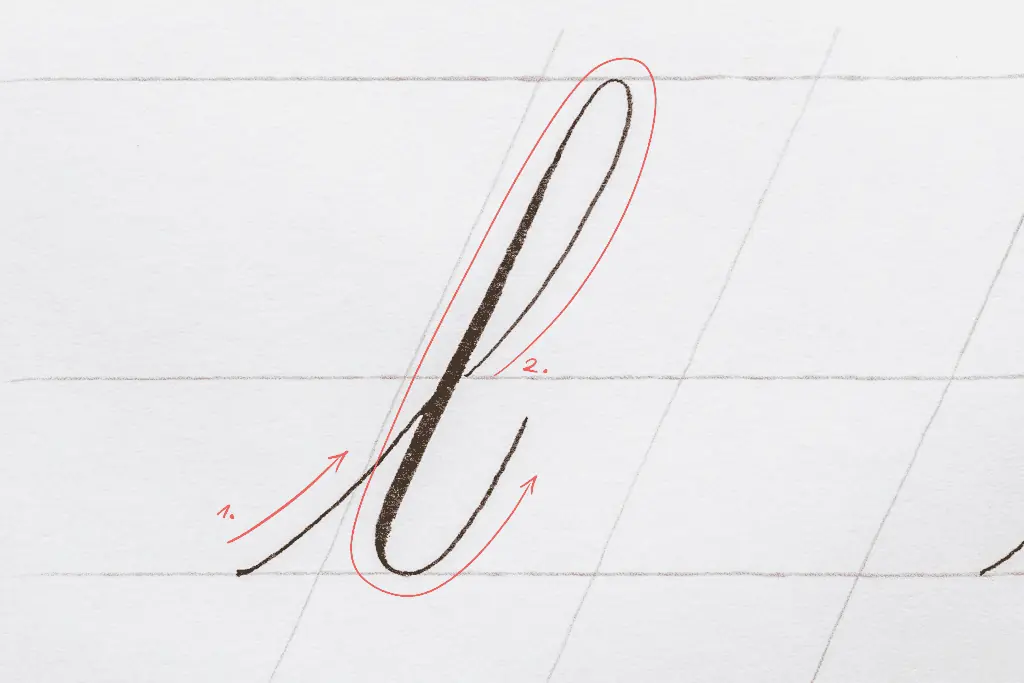
The letter h
The letter begins with an entry stroke, followed by an ascending loop.
Then finally, add a compound curve.
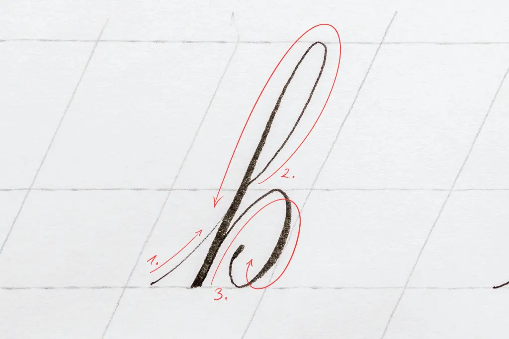
The letter b
Begin with an entry stroke, add an ascending loop, and finish with a reversed oval stroke.
I like to do my reverse ovals with a small terminal, but you can also do a closed oval shape.
The letter k
Like the previous letters, begin with an entry stroke and add an ascending loop.
However, with the letter k, we add a unique shape that resembles a small-sized capital letter, R.
The loop is smaller than the leg.
The letter f
It’s a unique letter of the alphabet as it has both an ascending and descending loop (almost).
I usually dont extend the descending loop to the descending line because otherwise, the letter becomes too big and dominant in a word/sentence. Instead, I lower it ¾ of the way.
The thin upstroke comes back to the middle of the x-height.
Brush calligraphy alphabet group 3 – a, d, g, o, c, e, q
The third alphabet group focuses on the oval shape.
The oval shape is one of the most challenging basic strokes in calligraphy.
However, with proper practice, you’ll get it in no time.
You can also check out the demonstration video –

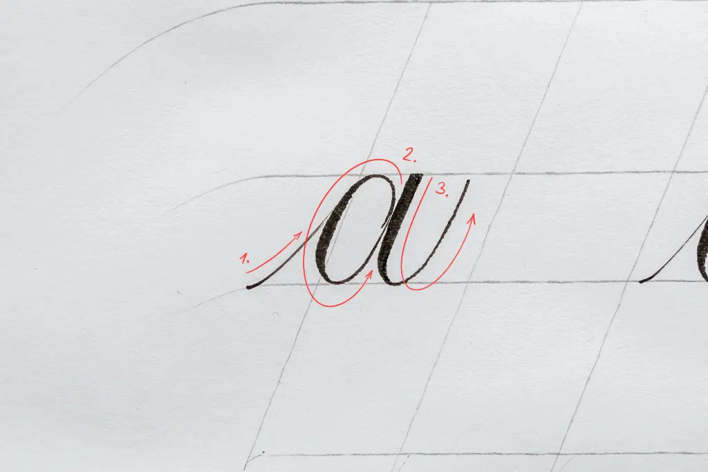
The letter a
The letter a is pretty simple.
Start with an entry stroke, add an oval, and finish with an underturn.
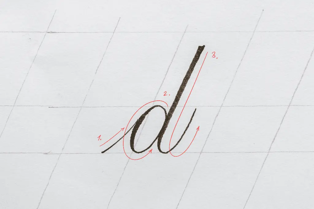
The letter d
The letter d starts with a thin upstroke, an oval, and an extended underturn.
Slightly higher than the extended underturn we had for the letter t.
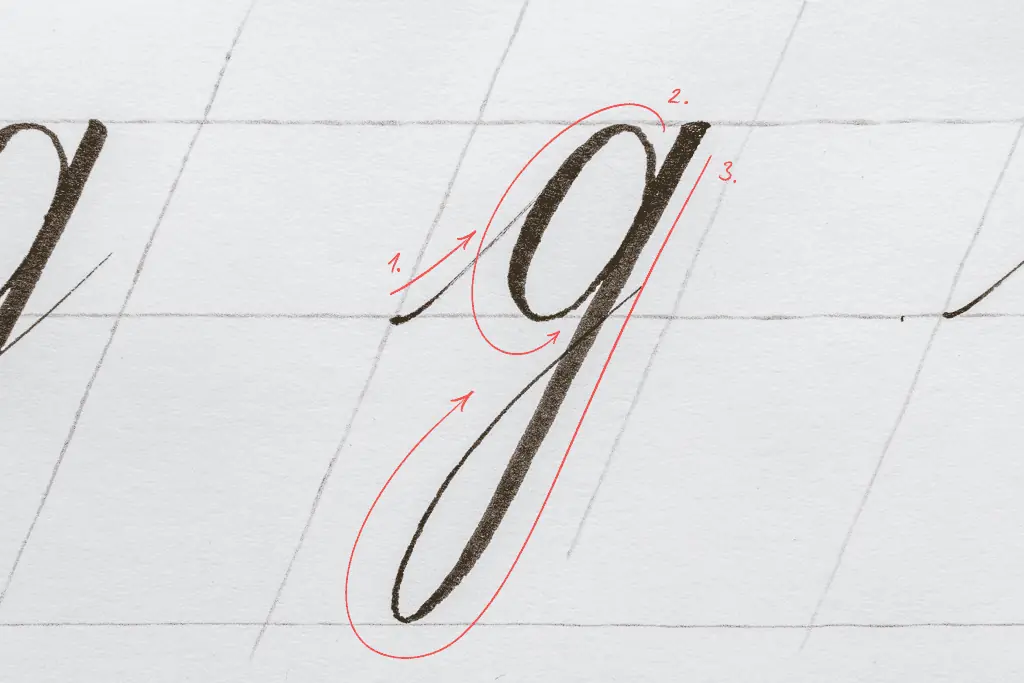
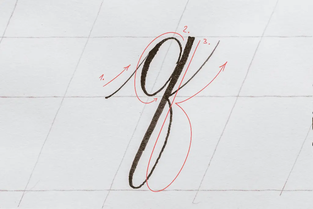
The letter g
Begins with an entry stroke, an oval, and a simple descending loop.
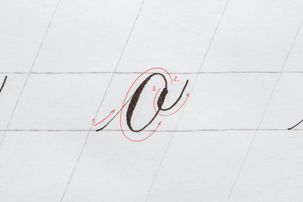
The letter o
The o is an oval shape with a comma dot on the upper right.
As with the v and the w, the comma dot should be placed inside the letter.
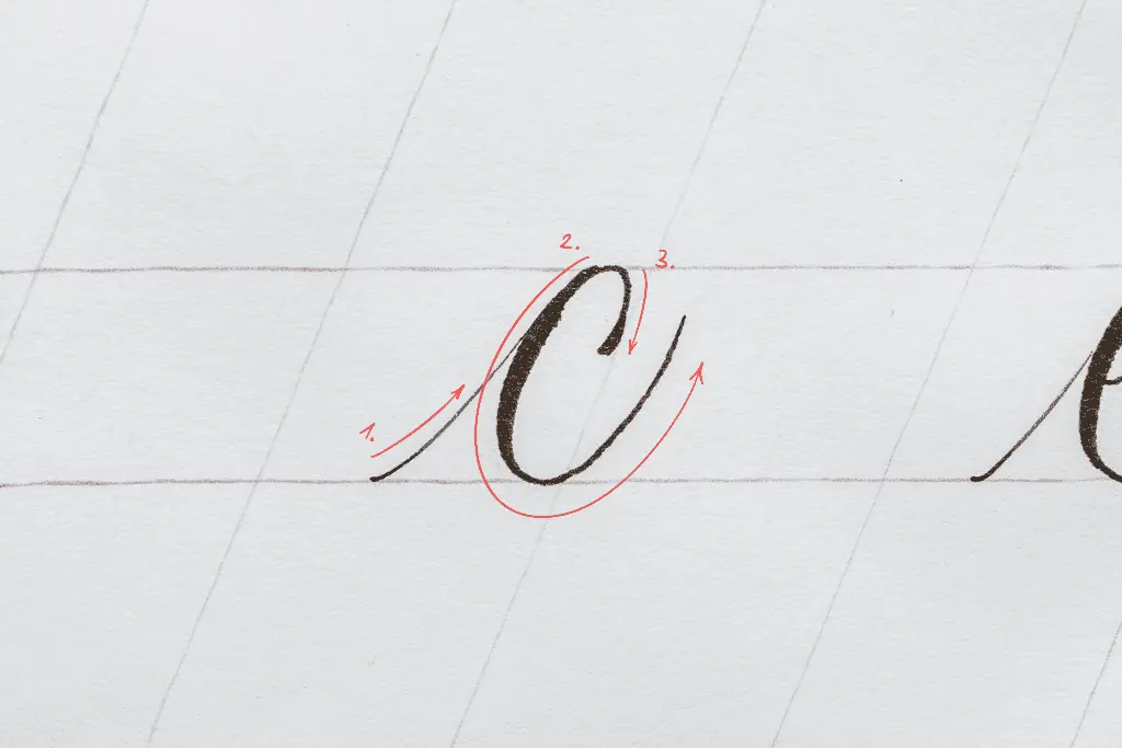
The letter c
The c begins with an entry stroke.
Then place your pen on the waistline and gradually start applying pressure to form a gradual curve.
Remember to reduce the pressure gradually before the baseline as you curve back up in a thin upstroke.
The thickest part of the curve should be somewhere in the middle of the x-height.
Finish with a thin line that comes down from the top. You can add a little terminal here, as I like to do it.
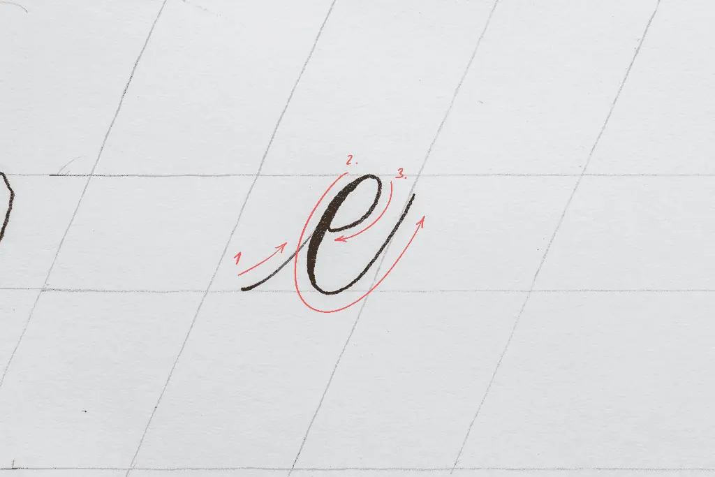
The letter e
The same as the c.
Just extend the thin upstroke to the thick downstroke to close the loop.
I like to close it slightly higher than the middle.
The letter q
Start with a thin upstroke, add a curve, and finally, a reversed descending loop.
The reversed descending loop returns to the baseline and bounces off as a connecting thin upstroke.
Brush calligraphy alphabet group 4 – p, s, x, z
This last group is made of exception letters.
Letters that dont fully share or have the basic calligraphy strokes in them.
You can also check out the demonstration video –
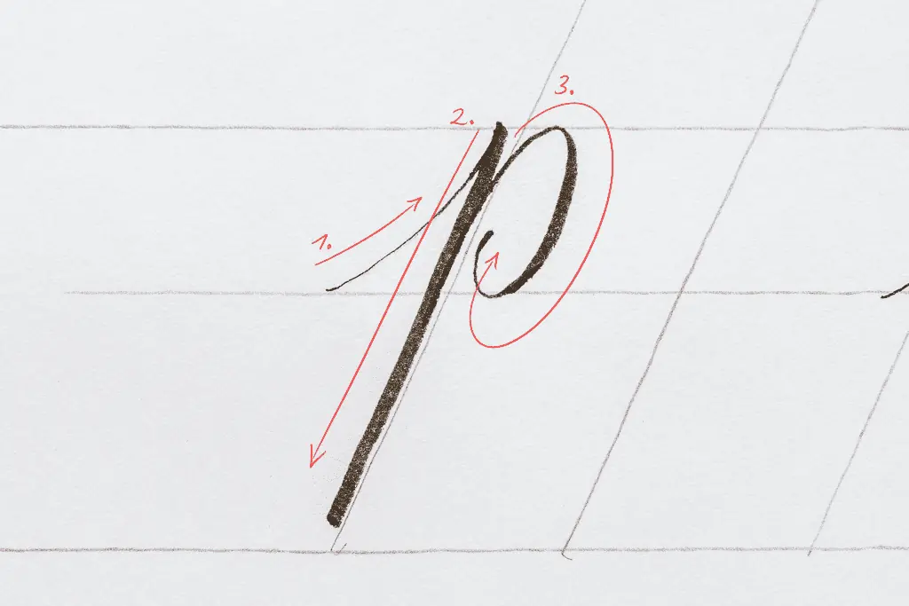
The letter p
The p starts with an entry stroke followed by a long thick downstroke.
I usually don’t extend the downstroke to the descender line, but if you want, you can do so.
Finish it off with a reverse oval.
As with the b, you can either add a terminal in the middle or completely close it off.
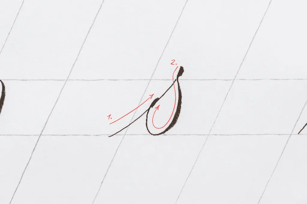
The letter s
The letter s is one of the most tricky letters of the alphabet.
A common struggle for beginners. Begin with an entry stroke.
Then, like with the letter r, apply pressure slightly above the waistline.
Next, release it on the waistline, and in a similar motion as the reverse curve, start applying pressure to form the bowl of the s.
I like to end the s with a little terminal at the end, but you can leave it as a thin upstroke.
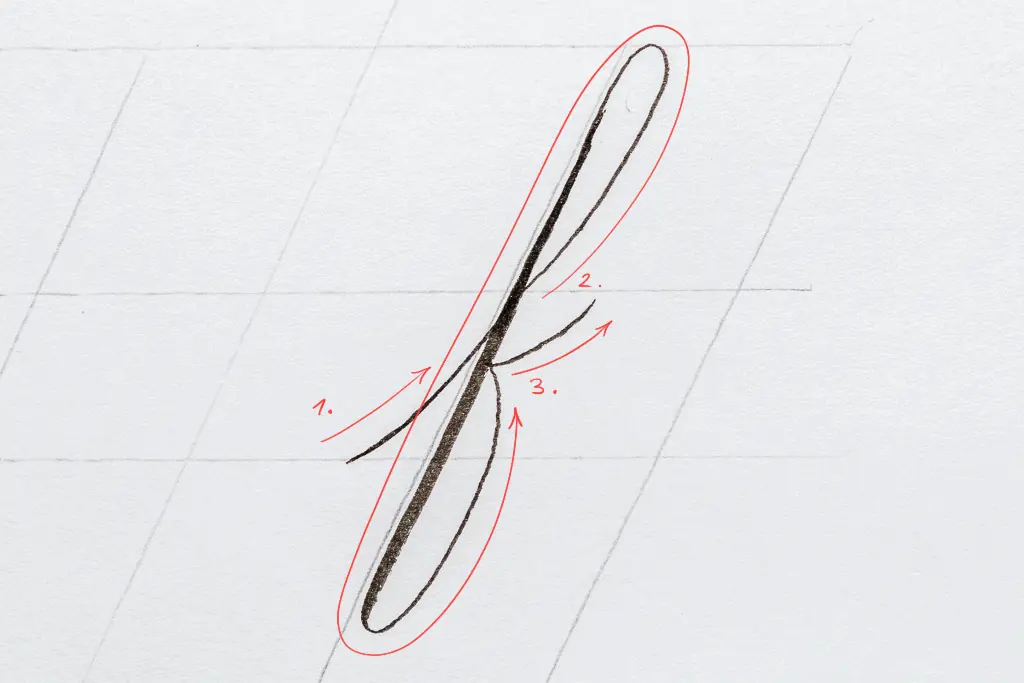
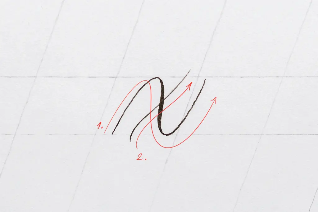
The letter x
Begin with a similar shape as the compound curve.
The difference is that the swelled down stroke (in the middle) is slightly flattened.
Finish it with a thin upstroke in the middle of the downstroke.
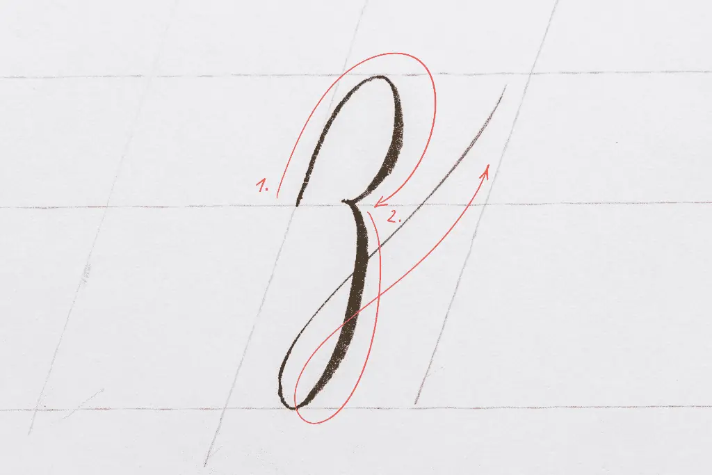
The letter z
The z seems like it’s made of an overturn and a descending loop.
However, it’s slightly different.
The overturn twists at the end, and you extend a descending loop that is more curved than straight.
Brush calligraphy alphabet variations
Once you grasp the basic style of letters, you can start tweaking and changing the shapes of the basic strokes and letters.
You can create a wide variety of looks with your calligraphy and even explore and develop your calligraphy style.
However, having a strong foundation is crucial to developing something of your own.
Here you can see a few alphabets in different styles I have created.
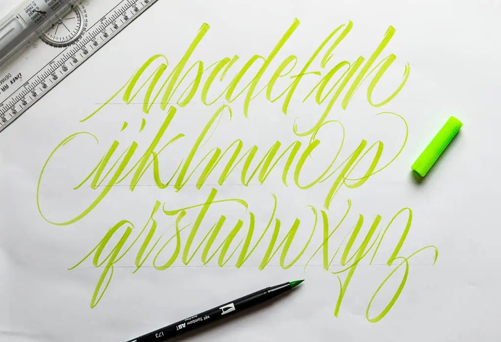
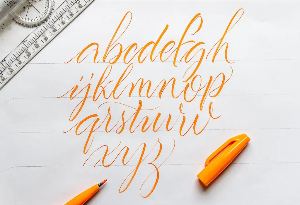
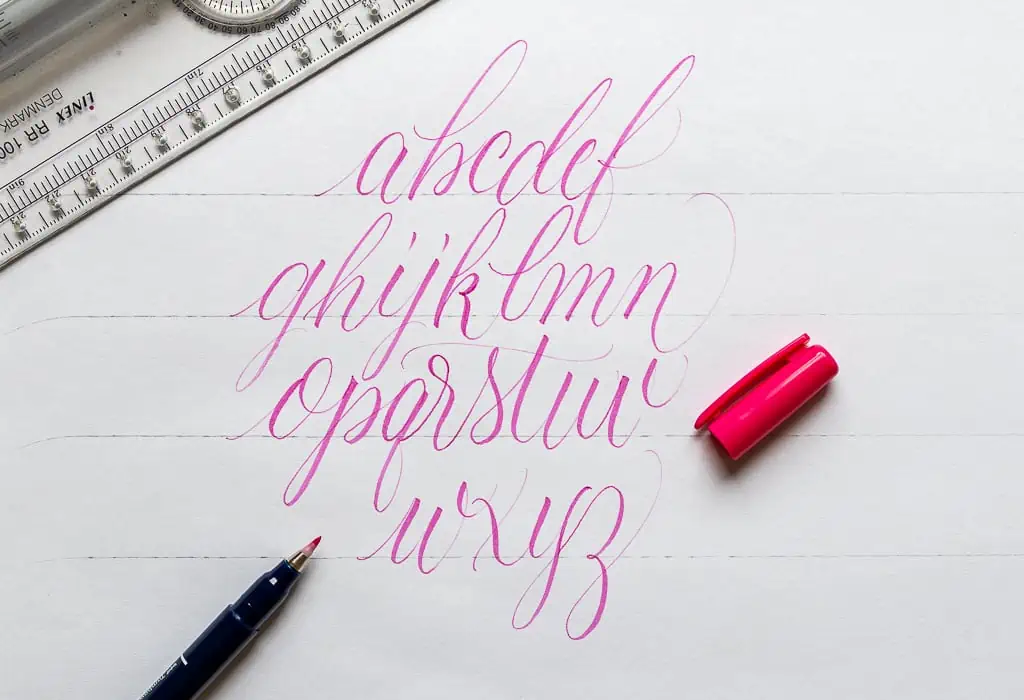
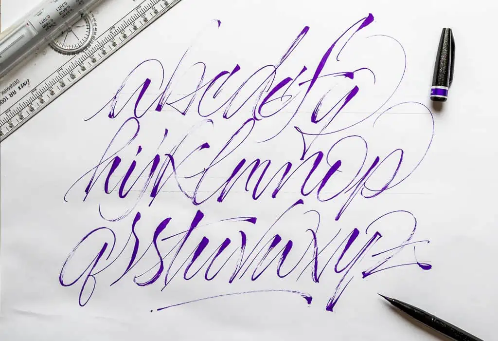
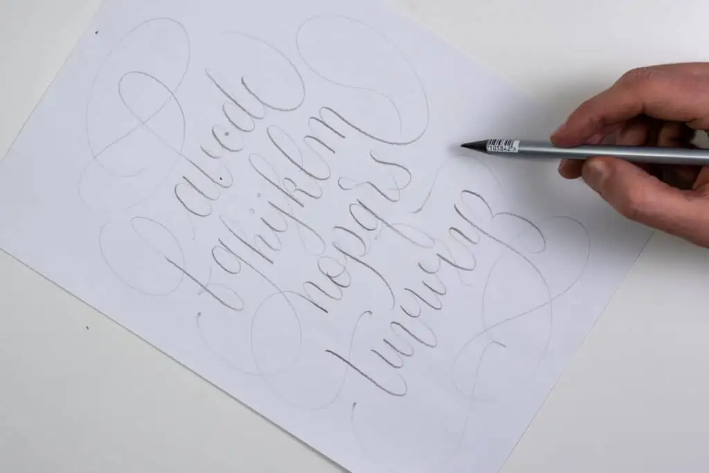
Start practicing and see what can come out of it!
Btw. If you’re interested in brush pens, check out my review on the 10 best brush pens for brush calligraphy.
A quick recap and final words
There you have it, friends.
I hope this article has helped you better understand how to create a calligraphy alphabet.
Here is a quick recap of the whole article –
- The “secret” behind brush calligraphy alphabet letters are the basic calligraphy strokes.
- I highly recommend checking my basic calligraphy strokes tutorial if you haven’t heard of them.
- The basic calligraphy strokes are the building blocks for the letters.
- The alphabet is best practiced when the letters are divided into individual groups based on their shape similarity. There are four groups in total
- Once you’ve practiced the basic style, you can start creating and developing your brush calligraphy styles.
Be sure also to check out my article on the 10 calligraphy styles for beginners.
Now I want to hear it from you – which alphabet letters are the ones you struggle with the most?
Let me know by dropping a comment below 👇.
Thank you for reading,
Until the next one,
Cheers.

Stay updated with my tutorials and get instant access to the Lettering Crate –
A growing library of free lettering & calligraphy resources that includes –
Pin me!
About the author

Hey, I’m Max. I’ve been drawing and messing around with letters since 2011. I don’t have a formal art degree—my background is actually in the kitchen as a former chef and on the streets painting graffiti with my friends. Over the last decade, through a ton of trial and error, I somehow turned that obsession into a full-time gig. These days, I design custom logotypes for global brands and paint large-scale murals. I started Lettering Daily just to create the kind of honest, no-BS tutorials I wish I’d had when I was starting out. Stick around, and let’s draw some letters.

Wonderful resource to quickly and easily learn lowercase brush calligraphy alphabet. Thank you! Is there an uppercase practice sheet to go with this lower case style?
Hey Julia,
Im working on the Capitals as we speak. It’s coming! 🙂
Great tutorials. Given it has been a year since this question was asked. Will you have a uppercase tutorial soon? Or am I missing it on your site somehow? Cheers.
Unfortunatelly i didn’t had the time to write up that article just yet. However, I did publish my workbook that covers that and so much more – https://www.lettering-daily.com/product/from-strokes-to-style/
If you’re interested in learning brush calligraphy, here you’ll find everything you need. As for the tutorial, i’ll do my best to publish it ASAP 🙂
Thank you so much for explaining, in detail, each lowercase letter. I have searched high and low for this information. And then, one day -like magic- there you were! You’re wonderful for blessing us learners like this!
Super glad to hear that 🙂 Thank you for the kind words.
Thank you so much! I’ve tried several times before, even taking an in-person class, but I’m left-handed and get overlooked or lost. I’m just about ready to try again, so thanks for the encouragement!!
Don’t give up! Keep practicing, and you will make progress for sure. If you have any questions, feel free to shoot!
Las letras que más me cuestan son la r y la s
Does the tutorial help out to overcome your struggles?
This is amazing. Thank ypu so much for this detailed instructions ❤️
Thank you so much, Sara! 🙂
Could you recommend an alternative cheaper paper to use for practising with the brush pen you’re using please?
Thanks
Frances Dupuy
The cheapest you could go with is the Premium HP 32. However, that’s not my best recommendation for brush pens.
Amazing calligrapher, wonderful person. I have the privilege of knowing him.
I really liked that every letter was well explained and it helped me get the point for it!
Wow! I love how you explained in detail exactly how to do each single letter, and how you divided them in groups. Once again, fantastic tutorial!
Super useful tutorial!!
Super useful and well-explained tutorial! I really enjoyed it.