
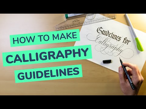
One of the best things you can do to improve your calligraphy right away is by using guidelines, and in this article, that’s exactly what I’ll be showing you how to do.
This tutorial connects with my larger Calligraphy Hub — your central resource for everything calligraphy, from tools to styles and techniques.
Before we jump straight into it, let’s have a quick overview of the contents of this article –
- What are calligraphy guidelines, and why do you need them?
- What tools do you need to draw calligraphy guidelines?
- The anatomy (terminology) of calligraphy guidelines
- How to draw calligraphy guidelines – step by step
- How to size guidelines (traditional and modern calligraphy)
- A few extra tips to streamline the process
- Final words
Without any further delays, let’s jump straight into it.
In case you’re a complete beginner, I highly recommend you check out my ultimate guide for calligraphy beginners.
I also made a YouTube video if you prefer to watch –
What are calligraphy guidelines, and why do you need them?
Calligraphy guidelines are lines to help you determine the size and proportions of your letterforms, and at the same time, they are here to assist you and keep your calligraphy nice and consistent. Calligraphy guidelines may vary in size depending on the style of writing you’ve chosen to do.
")
I’ll talk more about the different calligraphy styles and guideline sizes later on in this article.
So why do you even need calligraphy guidelines?
Calligraphy guidelines are essential for your calligraphy practice.
One of the key elements of calligraphy is consistency.
Consistency in proportions, heights, angles, etc.
")
Guidelines are extremely helpful in maintaining a higher level of consistency for your calligraphy.
You see, while you write, you have to focus on a bunch of different things.
- How you sit
- Hold the pen
- How much pressure to add
- How to move your arm
- How to form the letters’ shapes, etc.
Without guidelines, you must also consider maintaining a consistent rhythm in letter proportions, heights, angles, etc.
You can still write without guidelines, but you will struggle without them, especially if you plan to write more than two words.
Here is an example where I wrote the same word.
One is with, and the other one is without guidelines, and I think it clearly demonstrates the difference.
")
I continuously recommend using guidelines, especially considering how quickly and easily you can create them from scratch.
In fact, in my experience, not using guidelines is one of the most frequent reasons why beginners struggle to improve.
With that in mind, let’s proceed to the next section.
Check out my workbook, From Strokes to Style — it’s packed with everything you need to go from basic strokes to your own lettering style.
Master Brush Calligraphy
One Stroke at a Time
This 100+ page workbook walks
you step-by-step through brush
calligraphy basics to full style
development – no experience needed.

What tools do you need to create calligraphy guidelines?
To create calligraphy guidelines, you will need just a few essential calligraphy tools.
In short the tools, you will need are (links to Amazon) –
")
I’ll provide a few recommendations for those looking to stock up on some of these items.
Paper recommendation
The paper depends on the writing tool you are using.
To not go too deep into this topic (i already did here), here is a quick recommendation for the paper selection –
For brush and other felt tip pens –
- HP Premium 32 – best bang for your buck
- Canson Marker Pad – better quality
- Rhodia pads – also better quality
For broad-edge nibs, fountain pens (e.g., Pilot Parallel Pen), and pointed nibs –
I wrote a separate in-depth guide on the best calligraphy papers you can check out.
")
The Rolling Ruler
As for the ruler, you can use any ruler you have at hand.
However, when we talk about calligraphy, I recommend either a T-square ruler or my personal favorite – The Rolling Ruler.
It’s like a regular ruler but with a cylinder on the backside that allows you to draw straight parallel lines quickly and efficiently.
It is extremely helpful when it comes to creating calligraphy and lettering guidelines.
")
I love it, and I use it all the time. I think it’s an excellent investment for any calligrapher’s toolbox.
The Pencil
The pencil can also be whatever you have at hand.
Just make sure to draw the guidelines lightly so you can easily erase them once you are done.
I personally use a Staedtler mechanical pencil with 0.5 HB lead.
It always gives me nice sharp and light lines, which are then super easily removed.
Did you know that the pencil is so awesome that you can actually use it to do calligraphy?
")
The anatomy (terminology) of calligraphy guidelines
Before I show you how to draw calligraphy guidelines, I think it’s important to understand each line’s purpose and name.
Don’t worry. It’s nothing too complicated.
In the image below, you can see the reference image with the guidelines.
")
Each of the lines has it’s own number, and here you can see their names –
- Baseline – The line where all the letters sit (both minuscule and majuscule)
- Waistline – The top line for all lowercase (minuscules) letters.
- X-height – is not the name of a line but rather the height between the baseline and the waistline.
- Cap line – The top line for all capital (majuscules) letters.
- Ascender line – The top line for all ascending letters (h, b, k, l, d, f)
- Descender line – The bottom line for all descending letters (g, j, p, q, y)
- Slant/angle lines – These are the lines to help you maintain your letters’ consistent slant.
As you can see, we are working with many parallel lines, which is precisely why the rolling ruler is a useful tool for drawing calligraphy guidelines.
Quick side note – the distance between the slant/angle lines is determined by you, and it doesn’t determine the spacing between the letters. I tend to keep them evenly spaced so it doesn’t distract me while I write the letters.
If you’re interested in learning more about what the different parts of letters are called, check out this article on type anatomy.
Ok, now that we know what lines we have to draw (and how we call them), we can proceed to the next section.
The one you’ve been patiently waiting for.
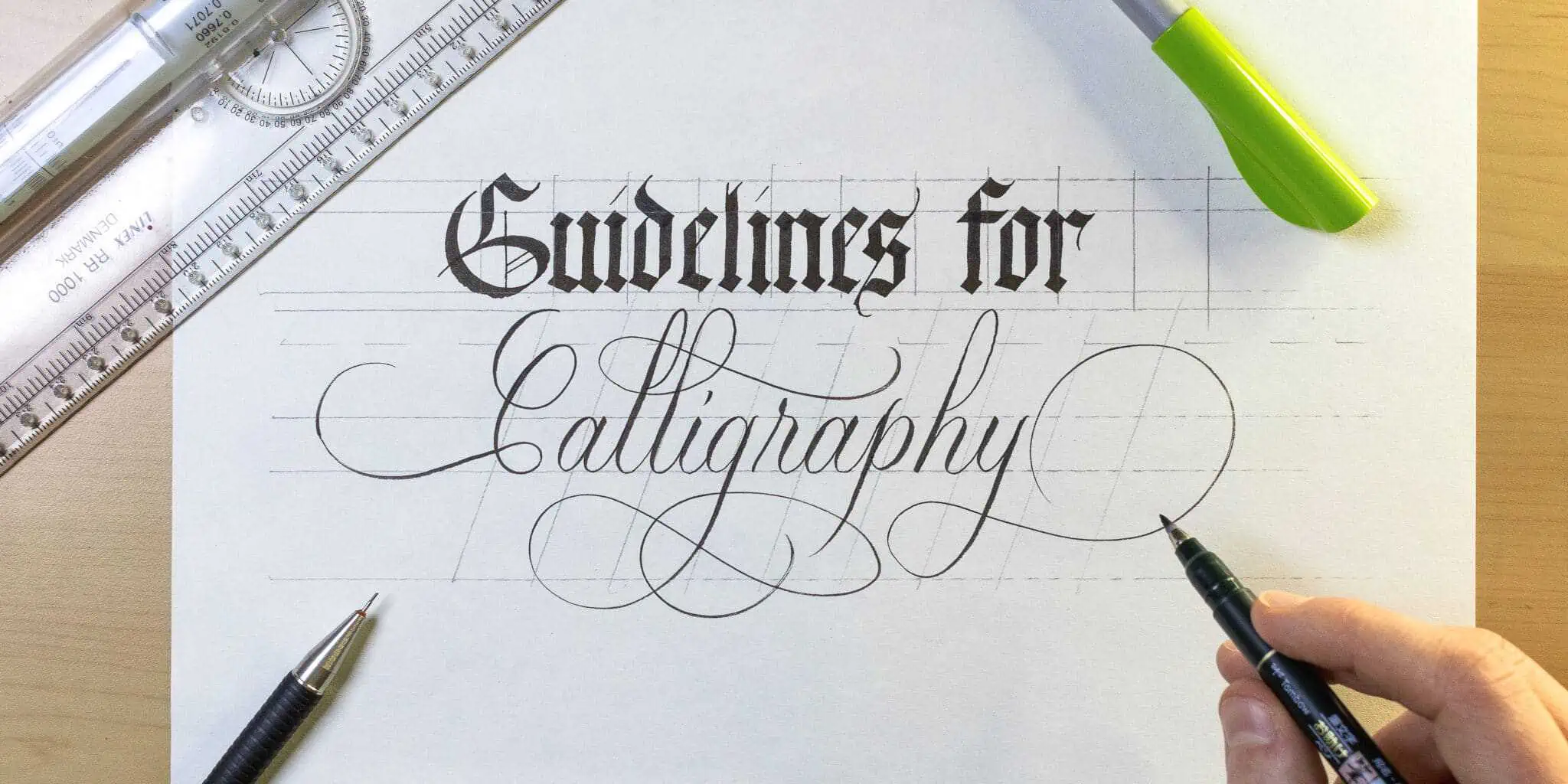
How to make calligraphy guidelines – step by step
Drawing guidelines is quite simple.
The thing that I noticed people tend to struggle with is how to size them correctly.
I’ll get to that in a second, but first, let me quickly demonstrate how I create my guidelines.
Step 1 –
Align the ruler to the top of the page, and slide it down to below half of the page.
")
")
Step 2 –
Start by drawing straight horizontal lines from bottom to top. It is important that you draw all of the lines I mentioned in the anatomy section.
You will need (in order from bottom to top) –
- A descending line
- A baseline
- A waistline
- A capline
- An ascending line
")
Note – make sure your ascending and descending space is the same size.
Step 3 –
Flip the ruler vertically and create the angle lines.
I would suggest maintaining an equal distance between them so you don’t get distracted while writing.
")
Step 4 –
Write out your letters.
Now that you have your guidelines, you know exactly how big and slanted your letters should be.
Don’t rush and write out your word by following the guidelines.
")
Step 5 –
Give it a couple of minutes for the ink to dry, and then gently erase the guidelines.
")
How to size guidelines (traditional & modern calligraphy)
As you can see, creating guidelines isn’t difficult.
The key to guidelines is knowing how to size them correctly, which is what I want to cover in this part.
The main distinction when it comes to sizing guidelines is between traditional and modern calligraphy.
- Traditional calligraphy scripts have well-defined rules when it comes to sizing and structuring your letterforms.
- Modern calligraphy, on the other hand, is more open to personal interpretation.
Let’s briefly touch base with traditional scripts through a few examples, and then we can proceed with modern and brush calligraphy.
")
Guidelines for traditional calligraphy scripts
For traditional scripts, we use guidelines not only for achieving higher consistency but also to get the correct letter proportions.
Broad-edged scripts have a clever way of proportionally sizing the letters based on the size of the tool you are using.
Instead of having a fixed size in centimeters/inches, the size of the letters is determined by nib widths.
Here are a few examples –
- Blackletter calligraphy (Textura) letters (minuscules) have an x-height of 5 nib widths. The cap line is usually at seven nib widths as well as the ascending and descending letters.
")
- Italic calligraphy is also at a five nib width for the minuscule letters and a seven nib width for the capitals. However, the ascenders and descenders extend for a total of 10 nib widths.
")
- Copperplate calligraphy is performed with a pointed nib. Therefore we cannot use the same approach as we do with broad-edged scripts. Instead, a general rule of thumb is the use of a 3:2:3 ratio. The letters are also slanted at a 55 degree angle.

Calligraphy guidelines for modern/brush calligraphy
One of the things I like about modern calligraphy is the creative freedom you have.
We still want to follow esthetical principles such as balance, contrast, consistency, etc.
It’s precisely the reason why even with modern calligraphy, you still want to use guidelines.
So, how do you size guidelines for modern calligraphy without any predetermined rules?
The answer is – you determine the sizes and angles that you want to use.
What matters is that you remember to draw out all of the lines I mentioned in the previous section (the anatomy).
Here are a few examples to better demonstrate this.
Example #1 – evenly balanced
Here I decided to have an equal size for the x-height and the ascenders and descenders, a 1:1:1 ratio.
As for the angle, I went for a 20-degree slant.
")
Example #2 – High descenders and descenders
Here I used a 3:1:3 ratio, meaning that the ascenders and descenders are three times bigger than the space between the baseline and the waistline (a.k.a. The x-height).
I’ve also increased the slant to 35 degrees. Higher descenders and descenders are helpful when you wish to implement calligraphy flourishes.
")
Example #3 – a prominent x-height.
Here I’ve decided to make the ascenders and descenders smaller and actually reverse the ratio from the previous example – 1:3:1
Additionally, I also reduced the angle to 15 degrees, giving it a very soft slant.
")
As you can see, once you know the needed lines, you can easily switch them up and get totally different looks for your calligraphy.
If you’re interested in learning how to write the whole alphabet in calligraphy, check out this tutorial.
")
A few extra tips to streamline the process
Personally, I always draw my guidelines from scratch using a pencil and my rolling ruler.
I’ve done this for a very long time, and it’s just the method I prefer to use.
That being said, I know that others might prefer something more streamlined.
Here are a few methods to achieve that.
1. Try using a calligraphy guideline generator
Over the years, I’ve stumbled upon several calligraphy guidelines generators.
The idea is simple, you create your guide sheet, and then you print it out.
These two are my favorites as they provide a live preview and a high level of customization –
")
")
Additionally, you can also try these –
- https://kylev.github.io/pen/
- http://calligraffiti.in/rulings
- https://cd.kaligrafia.info/
- http://liniuszek.prv.pl/
These guideline generators are also great if you want to improve your handwriting.
2. Create your own guide sheet template
The marker paper I mentioned earlier (in the tool section) is excellent for both brush pen and broad-edged tools.
On top of that is relatively thin (only 70 gsm/18 lbs).
We can take advantage of the thin paper by making our own guide sheet template.
Grab a blank piece of paper, a ruler, and a black fineliner.
You can then use the guide sheet template over and over again
")
If you don’t have a thinner paper you can use a light tablet instead.
The bright light from the tablet will shine through the paper without any problems.
With the light tablet you can even use regular (thicker) paper.
The benefit of using these methods is that you don’t have to use an eraser to remove the guidelines.
It’s especially beneficial if you are working on an important project.
3. Use a laser liner
I personally never tried it, but I’ve seen many calligraphers using it, and that’s why I included it on the list.
The laser line level seems like a good alternative if you are working on an important project where you can’t draw pencil guidelines.
The only downside is that you are only working with a baseline, so I think this could only be suitable for more experienced calligraphers.
Here is a quick example by @suzcunningham –
Additionally, you can sign up for the Lettering Crate and get instant access to all the free worksheets currently available. There are worksheets including full alphabets, drills, different calligraphy and lettering styles, and much more.
Simply drop your email below and follow the instructions (two easy steps).

Stay updated with my tutorials and get instant access to the Lettering Crate –
A growing library of free lettering & calligraphy resources that includes –
Summing it all up – final words.
And there you have it, friends.
That’s pretty much everything you need to know about calligraphy guidelines.
Here is a quick recap of the article –
- Guidelines are super helpful to keep your letters nice and consistent
- The rolling ruler is the best tool (IMO) to draw guidelines
- Understanding the anatomy and terminology is a crucial part of knowing how to make guidelines
- Traditional calligraphy scripts have well-defined sizes when it comes to drawing guidelines
- Modern/brush calligraphy is more open to personal interpretation. You decide the sizing and angles of your letterforms
- You can either draw your guidelines or print some templates using one of the generators I mentioned above.
I hope this post was helpful to you. If you have any questions about this topic or even suggestions for future tutorials – feel free to drop a comment below or even shoot me an email.
Until the next one,
Stay AWESOME!
Pin me!

About the author

Hey, I’m Max. I’ve been drawing and messing around with letters since 2011. I don’t have a formal art degree—my background is actually in the kitchen as a former chef and on the streets painting graffiti with my friends. Over the last decade, through a ton of trial and error, I somehow turned that obsession into a full-time gig. These days, I design custom logotypes for global brands and paint large-scale murals. I started Lettering Daily just to create the kind of honest, no-BS tutorials I wish I’d had when I was starting out. Stick around, and let’s draw some letters.

Max: like another request from several years ago, did you ever publish more technical details or video on “how” to use the rolling ruler? yes basics on using the measurements to measure spaces between lines and to select the slant angle. I’ve hunted myself and can’t find anything. Would be so helpful – you’re so experienced and talented, you breeze right along with your lines.
Unfortunatelly it’s still on “the list” of tutorials i want to make. But to give you a quick answer to your question – it depends on the style. If you’re working with traditional scripts, usually the sizes and proportions are pre-determined. With modern scripts and variations you’re much more flexible (as i explain in this tutorial). You are esentially free to determine your heights and angles. Different heights and angles will give you different looks. Essentially there is no “correct” way to do it. Pick a size that you like and use that to practice. When you get tired of that particular size, find another one and try it. Let me know if you have any other questions 🙂
Thank you so much! Very thorough and informative! You’ve helped me a lot!!!! Thank you again!
Great, in-depth post! I took a class way back in grade school, for fun…38 years later(!) I’m re-discovering all the beautiful variations! Thank you for all the technical info.
Glad to hear you’re getting back at it! 🙂
My son’s favorite is a ‘clutch point’ that he picked up in Japan. Uses the lead down till there’s almost nothing left.
very good article and love the guideline generators – easier and quick when practicing. Could you do an article on how to use the rolling ruler?
thanks
Maria
Thanks, Maria! In the YouTube video I do a demonstration on I use the ruler. Do you mean something more specific than that?
Very useful information for beginners and a good revision guide for more experienced calligraphers. Lettering Daily can always be depended upon for interesting, accurate information on every calligraphic content. Thanks!
WOW! Thank you so much for such a nice and kind comment! Means a lot Juli! 🙂
Terrific!!!! Thank you!
You’re welcome! 🙂
This is a very fine posting on working with guidelines. I have been scribing for over 50 years and one thing I seriously endorse: never scribe, even in practice, without guide lines. My freehand work, which I might do for layout and sample drafts, is pretty good and sometimes could even be used with some touch-up. But guides are mandatory.
I would add two things.
1. Work that must be absolutely “perfect” can be scanned in as a PNG file and touched up with a program like Krita or PhotoShop (and there are many to choose from). With them you can produce extremely corrected work, sometimes down to the pixel, and saved as a computer file which printers can use for the production work.
2. There are “ghost” systems still available that project guide lines onto a semitransparent plastic sheet. By looking through it onto the piece you are scribing you can follow the lines “projected” on the paper below. I use the one I have had for over 30 years for small, multiple pieces that have to be placed, scribed, and set aside to dry quickly, like envelope addressing or name tags, etc. The beauty of this type of guide is that the “master” set of lines can be anything: curves, closed shapes, and overlapping lines without drawing the guide lines more than once. I have a Phantom-Line 100 which is probably not made any more but is on eBay once in a while and there are a couple of YouTube videos showing how to use it.
At present, I am still working (with an Etsy shop) doing calligraphy for gifts and sale. I mostly use a light box with templates for various nib sizes created in Windows Word. I also still draw my own guide lines for irregular shapes, and use the Phantom-Liner 100 now and then. I often do approximate guide lines (roller ruler, T-square, (or Ames lettering guide – now that they have one with metric spacing) and then fix anything out of kilter using a scan and Krita. The assistants in Krita do all the mechanical layout work I need: lines, parallels, circles, skewing for perspective, etc. But one must work with guides unless you are doing freehand art pieces. BTW, I am now 82.
Thank you for the excellent article and video.
Thank you, Gary, for the wonderful feedback and helpful suggestions. It’s really great to hear these tips from someone with so much experience! 🙂
Hello Max, I follow your interesting site from Germany. Thank you for all the creative, detailed and very useful hints! In this guidelines tutorial (very precise and complete, chapeau!) you recommend “to give the ink some minutes to dry” after having written. In my experience the ink used by Pilot Parallel Pens takes much more time to dry, at least two hours (better: over night). Thank you for your attention!
Hey Albrecht, first of all, thank you so much for the kind comment. I really appreciate it. You are absolutely right, I totally forgot to mention that. The PP has a much heavier ink flow than a felt tip brush pen, and it takes much longer for the ink to completely dry. Thank you for the reminder! 🙂
Hey Max!
Very helpful resources for printing out guidelines. I can recommend using Joe Vitoli’s from his site, and Paul Antonio’s – both of which are for Copperplate/ Engravers, and are free. Also a cool little tool I use is the Engrosser Ruler which I got from Paper and Ink Arts. The site for the product is abcalligraphysupply.com. You can find a video on how to use it there, and on Lovely Loops site. You can purchase for Spencerian or Engrossers . I’m sure listing all resources for guideline related stuff would be exhausting; just thought I’d share some I’ve used.
Well written and helpful as always. Wishing you happy holidays💜
Thank you Morgen for the kind comment and the helpful suggestions! 🙂
Thank You very much for the information on this article “calligraphy-guidelines”. It will help me to continue learning and practicing calligraphy.
Thanks again,
J
You’re welcome Jose, glad to hear that you liked it! 🙂