Have you ever wondered what the different parts of letters are called?
Each part has a specific name in type anatomy, and it’s essential to know each one.
This article will give you a deep understanding of how type works and each part of its anatomy.
It’ll show how to achieve legible typography that’s both pleasing to the eye and grabs attention.
It will also help you to improve your calligraphy and hand lettering skills.
There will also be a free downloadable type anatomy poster included within the article, so keep reading to learn more!
What is type anatomy?
Type anatomy refers to the study of type concerning its structure, form, size, and typeface.
Examining type through its anatomy is crucial because it allows us to create type designs that are legible, readable, and accessible.
This can help determine which typefaces should be used in certain contexts and how they should be sized and spaced on a page or screen.
It also helps lettering artists better understand the individual parts of letters and how they relate to each other.
Essentially, allowing them to train their “typographic eye” and create better-looking letterforms.
A great deal of knowledge goes into creating an effective typography design.
For example, understanding the anatomy of type helps designers communicate messages clearly and effectively with type.
What are type classifications?
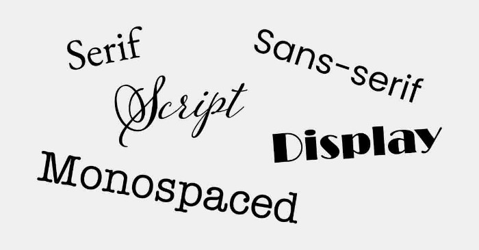
Type classifications are a way of organizing different typefaces.
They are types of lettering styles that can be divided into serif, sans-serif, script, monospaced, and display.
- Serif: Serif typefaces have very short strokes at the ends of their letters and are often used for longer bodies of text.
Examples include Times New Roman, Garamond, and Bodoni. - Sans-serif: Sans-serif typefaces do not have the little stroke at the ends of their letters and are often used for titles, headings, and short bits of text.
Examples include Helvetica, Arial, and Futura. - Script: Script typefaces are based on handwriting and have a more decorative look than serif or sans-serif.
Examples include Amatic, Pacifico, and Lobster. - Monospaced: Monospaced typefaces have all letters of equal width and are often used for coding or programming.
Examples include Courier, Monaco, and Lucida Console. - Display: Display typefaces have a more ornamental or decorative look and are often used for titles, headings, and short bits of text.
Examples include Impact and Playfair Display.
Each group has its distinctive look and feel, allowing designers to mix and match various types to effectively convey different messages in their designs.
As type classification plays such an important role in design work, it is essential for any designer to be well-versed in the different typefaces available and how to use them appropriately for their desired effect.
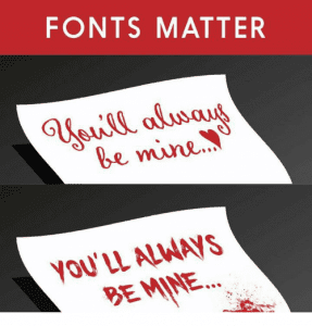
Here is a quick and funny example to better understand why fonts matter –
Why is it important to understand the anatomy of type?
Understanding the anatomy of type is incredibly important for anyone involved in graphic, web, and UX design, as it ensures that typefaces are used correctly and effectively.
In addition, knowing how each element of a typeface works together can help a designer select font combinations, find the ideal font for their project, and create aesthetically pleasing designs.
For example, understanding the x-height of a font family can help determine which fonts in that family will be the best fit for an intended aesthetic.
In contrast, understanding proportions can ensure that proper line length and spacing are applied throughout a project.
It’s also important to know how different weights and variants can be used together to create meaningful juxtapositions while staying within design conventions.
Ultimately, by studying typography and its anatomy, any designer working with text-based projects or using AI design tools can develop an eye for detail that leads to unique and effective work.
What is the anatomy of type?
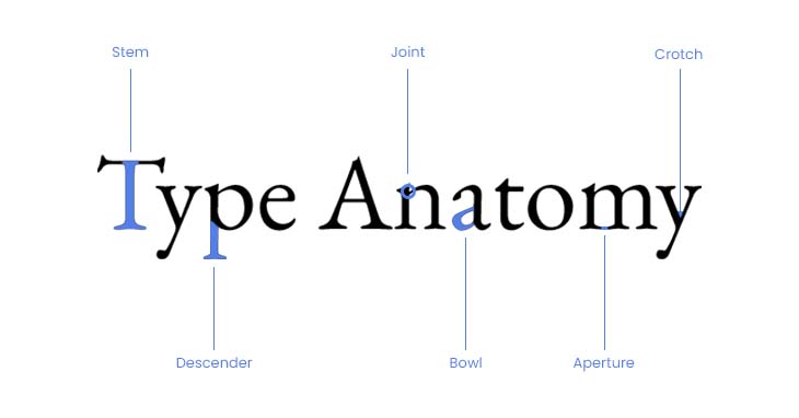
1. Stem
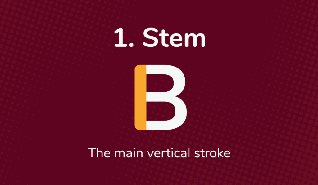
A stem, in type, is the main branch of a letterform. It typically starts from the baseline and goes up to the top of the letter, providing a sturdy structure.
Variations in stem width can create interesting looks and depth to different styles of typography while still maintaining legibility.
2. Descender
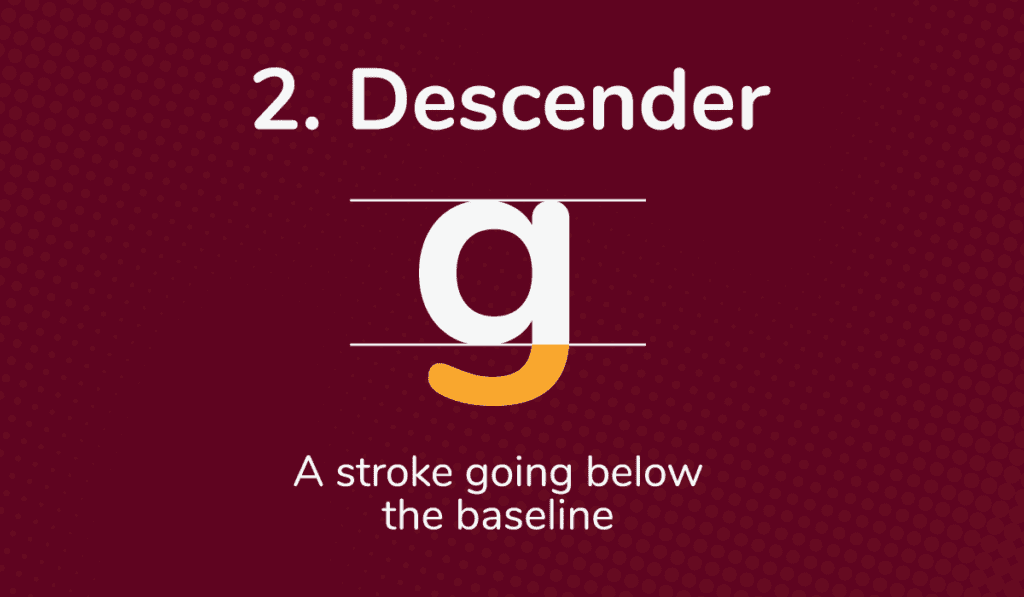
The descender in type is the part of a letter that descends below the baseline.
Descenders can make certain words stand out as they sink lower than the rest of the text.
3. Joint
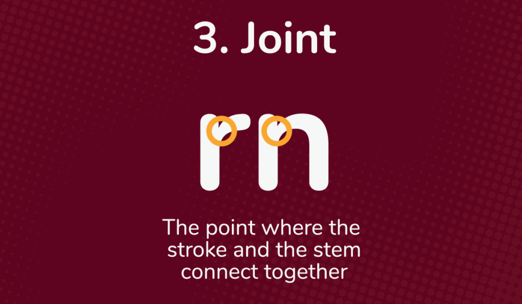
A joint in type is an essential element of design that connects two letters.
This joint creates more than just a visual connection; it helps create the shape and form of a specific font.
Joints in type are commonly associated with cursive fonts, which rely on connected strokes to produce fluidity, but they can also be found in modern designs like sans serifs.
Joining allows designers to bring their type concept to life by forming harmonious relationships between the connecting parts.
4. Shoulder
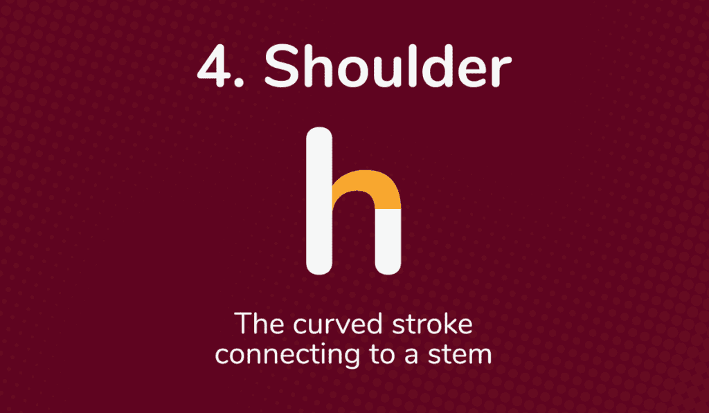
The shoulder in type is a term used to describe the main curved stroke connecting to the letter’s stem.
The shape of the shoulder contributes to the overall shape of the letter form and conveys subtle differences in style from font to font.
Understanding shoulder length and shoulder slope can help designers identify typefaces that match their desired aesthetic.
5. Bowl
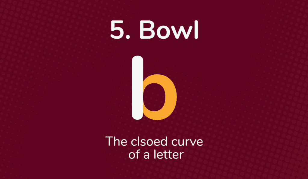
The bowl is the closed curved stroke of a letter that completes the basic form and gives it structure.
Bowls come in many forms and have varying margins depending on the typeface. Type designers sometimes adjust bowl widths and shapes to emphasize important words or add subtle dimensions to the text.
Understanding how bowl shapes and sizes play off one another is an essential aspect of creating great typefaces.
6. Counter
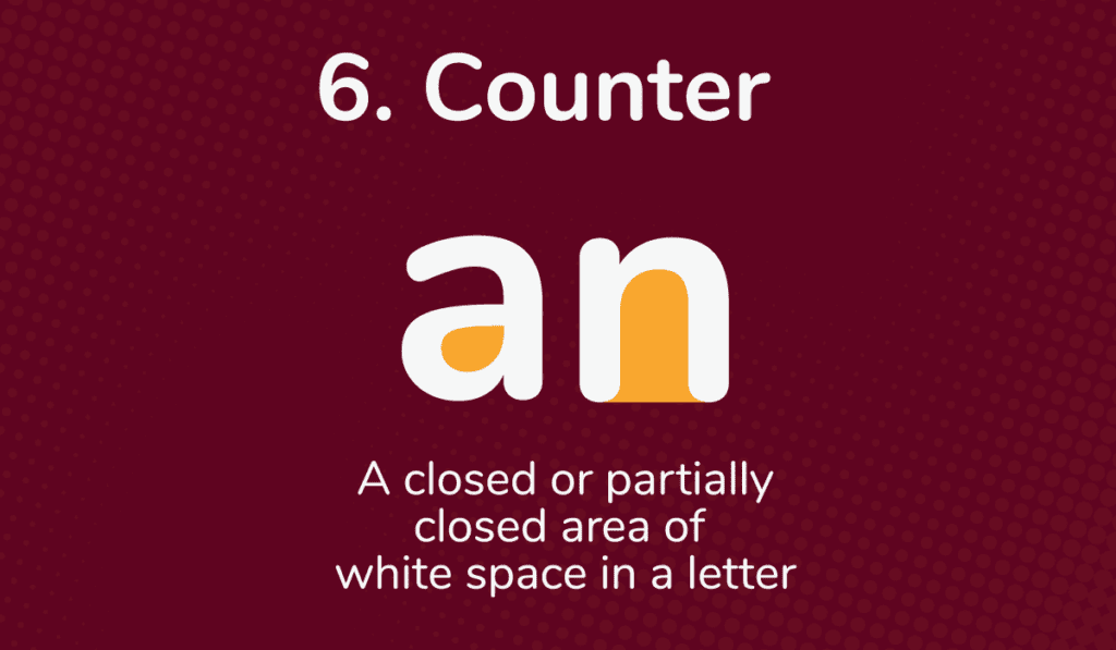
The counter in type refers to the space within a letter, usually presented as a partially or fully closed area. Counters lend shape to typesetting by creating much-needed white space that offers contrast and an inviting look.
By understanding how counters interact with other typography elements, typographers can create beautiful compositions that achieve beautiful form.
7. Ascender
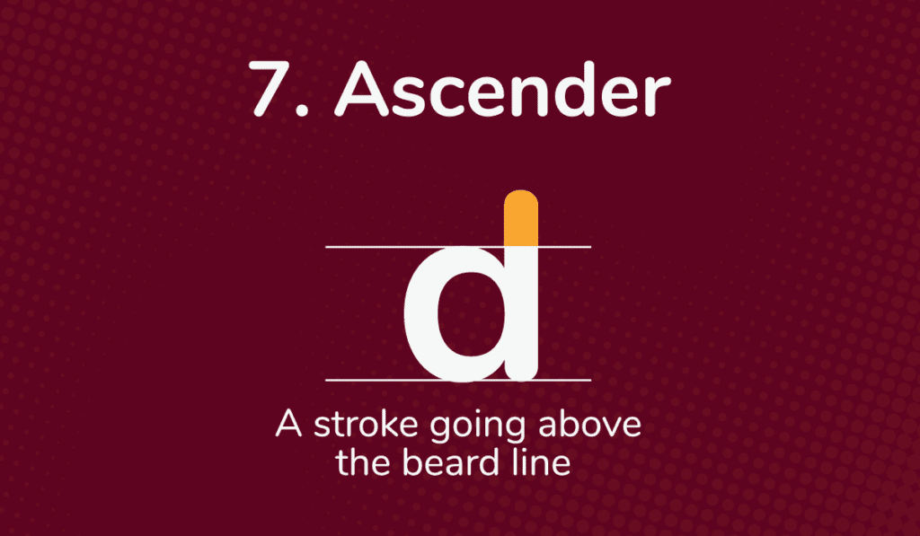
The ascender in type is one of the main measurements on each font character. It’s defined as the part of the stroke going above the mean line, which differs from font to font.
Ascenders can aid the legibility of a text by adding more height to characters like “b” or “d.” They can account for half of the characters’ overall height.
Ascenders are an interesting part of type to add interest and legibility to text. Some fonts have shorter or longer ascenders than usual which could help you achieve a unique look when setting type.
8. Aperture
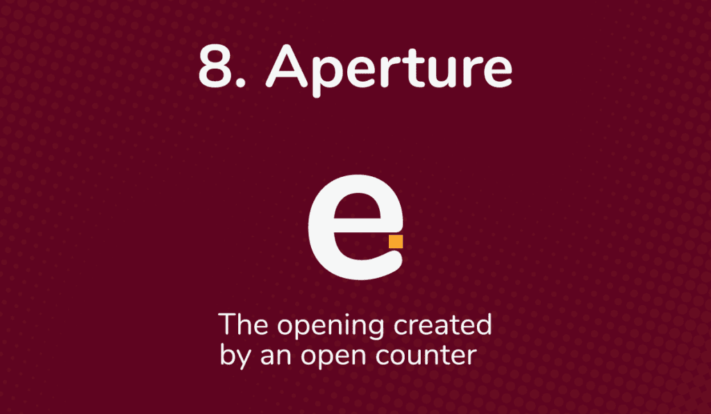
Aperture in type is the measurement that describes the size of the opening created by an open counter.
Aperture is a crucial aspect of typesetting because it influences the overall appearance of text and affects the readability of viewers.
Therefore, it’s important to be aware of how much space there is in the opening of a counter, not only for stylistic reasons but also for legibility.
9. Serif
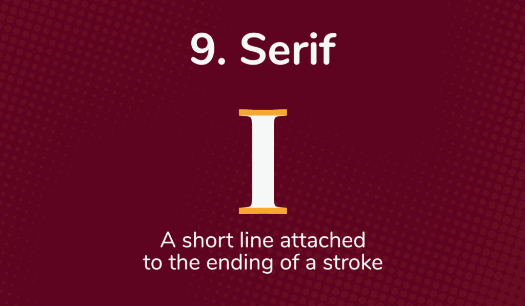
Serifs are thick and thin strokes attached to the end of a stem in a letter, number, or symbol. This can be seen in serif fonts such as Times New Roman and Garamond.
Serifs help guide the eye across rows of text, making them look more elegant and professional. Generally, serif fonts are considered better for a printed matters like books and newspapers, while sans-serif typefaces are preferred for screen viewing on digital platforms like computers and mobile devices.
All types of serif styles have a timeless quality about them that’s been used for centuries. Serif typefaces were used by Gutenberg during the 15th century when he invented printing from moveable type.
10. Crossbar
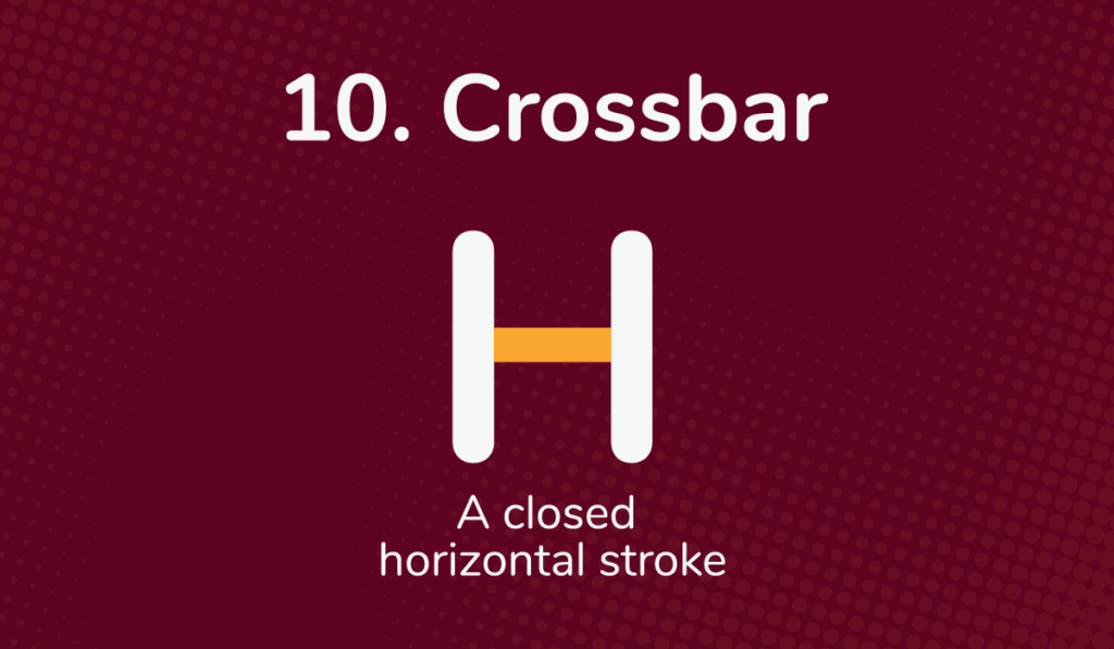
The crossbar in type is a closed horizontal middle stroke. Crossbars add stylistic complexity to text while helping with legibility and the ability to identify different characters quickly.
11. Arm
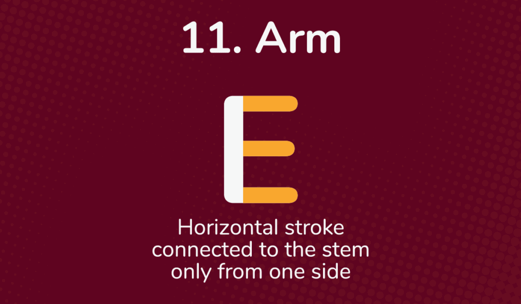
An arm is a long horizontal stroke connected to the stem of a character, usually the letter “E” or “F,” from only one side. This arm typically branches above the body and has no attachment on the other side.
Arms are used in typography to balance a font while also increasing readability. In addition, arms can give letters a unique look that suggests strength and confidence, thus making words stand out among text.
12. Terminal
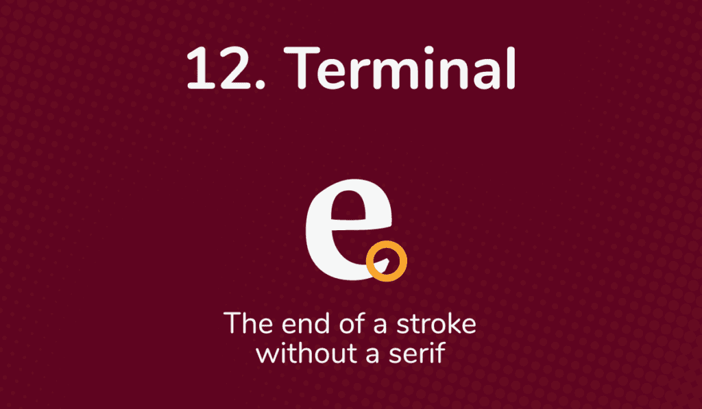
Terminal in type is characterized by the lack of serifs at the end of a letter’s strokes. A terminal is a final stroke without any flourishes.
13. Leg
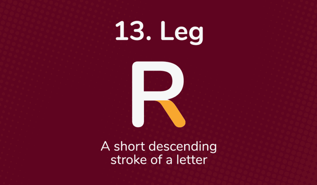
The leg is an important part of typography and refers to the descending stroke of a letter. By careful choice of leg shape, type designers draw attention to their letterforms and achieve aesthetic uniformity for the words written in certain typefaces.
Leg shape is also used to differentiate between different styles, such as italic or regular fonts.
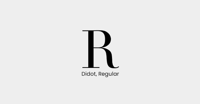
Some leg designs have become iconic over time; for example, the leg on “R” in Didot has become a classic leg design for sans serif typefaces.
The leg is crucial in typography and is essential for achieving beautiful letterforms.
14. Vertex
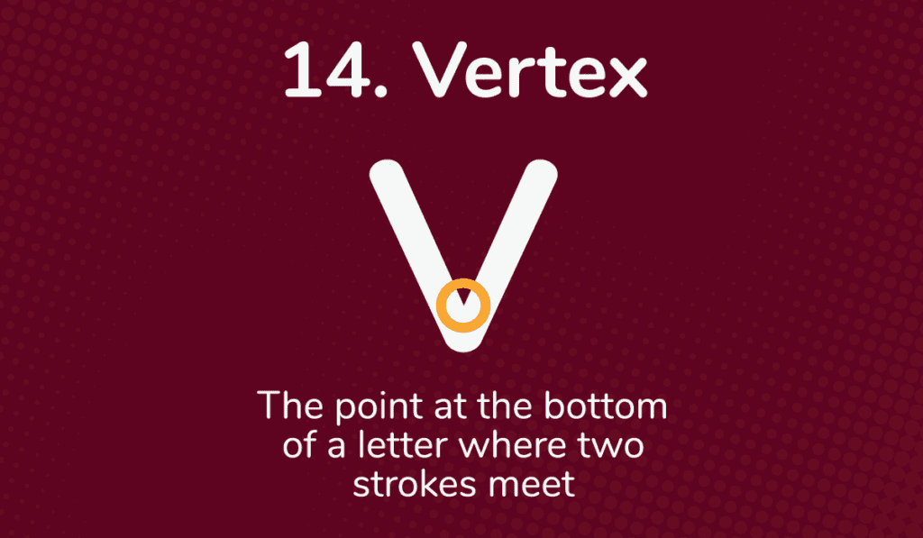
The vertex is an essential point in type design. The point at the bottom of a letter where two strokes meet.
The vertex is key to constructing a balanced, even font. It is an anchor to unify the letter and set the tone for readability and aesthetic balance.
15. Mean Line
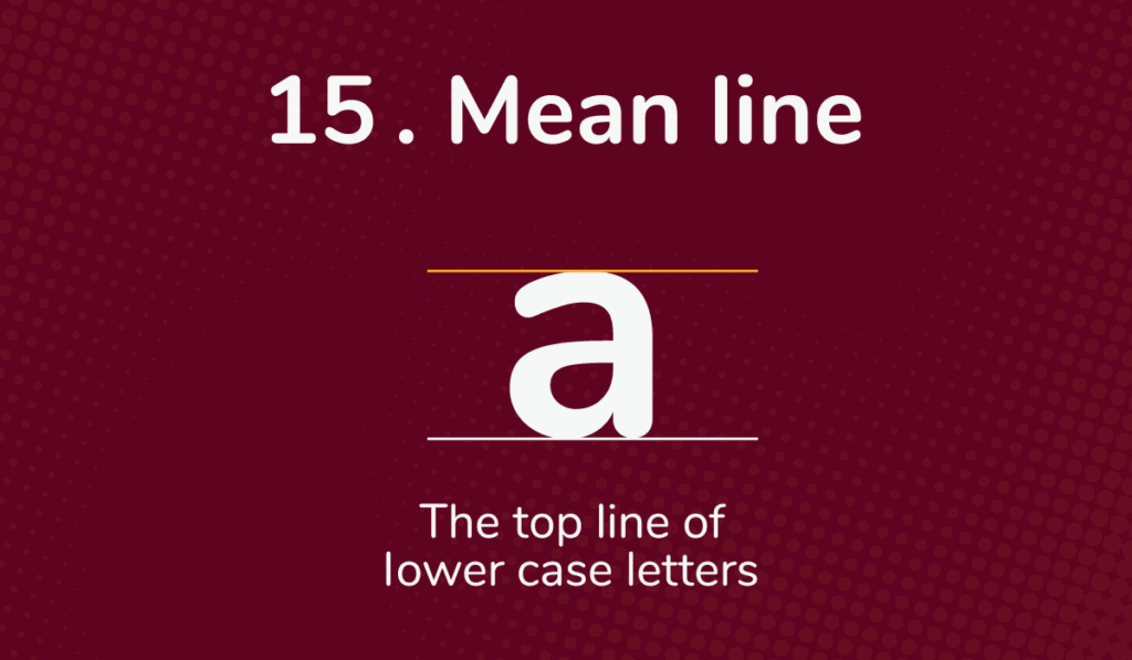
The mean line of type refers to the top line of lowercase letters in a font. It is considered crucial to the legibility of type, and its importance can’t be overstated.
An aligned mean line among these letters creates a rhythm that flows from one glyph to the next. The mean line should always remain consistent so viewers will recognize clear letterforms with an enjoyable read, regardless of font or size.
16. Spine
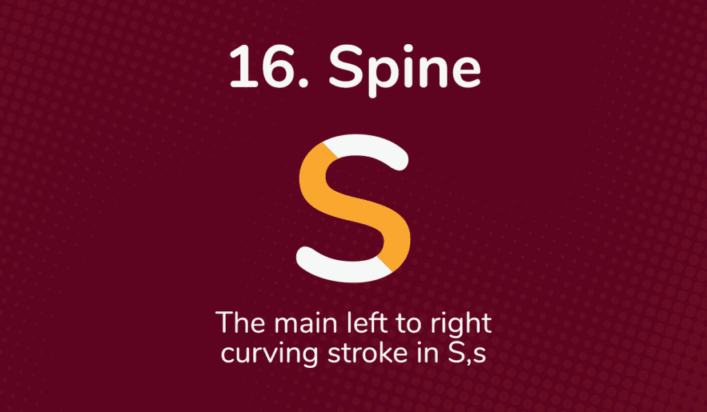
The spine is the main left-to-right curving stroke in capital and lowercase “S.” The spine is essential to creating a balanced and aesthetically pleasing type.
17. Bracket
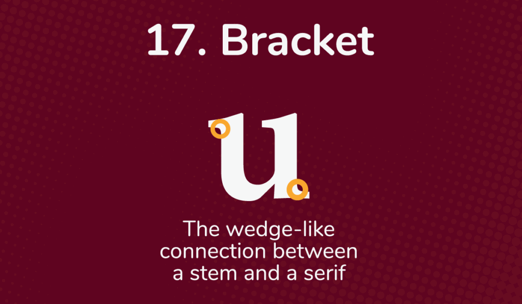
The bracket is a wedge-like connection between a typeface’s stem and serif, typically found in serif typefaces. This bracket seamlessly integrates the serif with the rest of the letterform: without it, the abrupt ends of a letter’s strokes may detract from its aesthetic qualities.
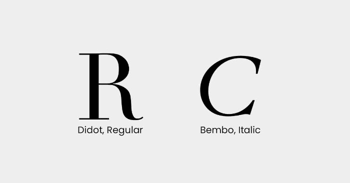
Brackets vary amongst typefaces, ranging from the thin bracket of Didot to the liberally bracketed italics in Bembo; some may even be missing entirely.
As a result, designers should understand bracket details when selecting a font – they could make all the difference in getting the desired results.
18. Apex
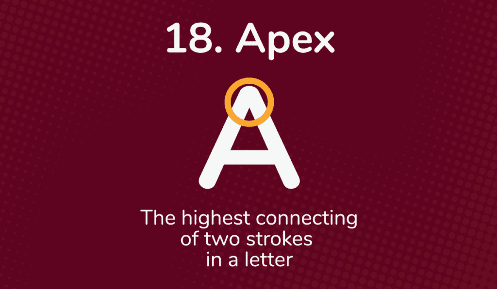
The apex in type is the highest connecting of two strokes in a letter. The most common apexes are points on letterforms such as “A” and “M.”
An apex can help to create visual harmony within the letterform and make words easier to read. When apexes are used on different font styles correctly, they can convey an intended emotion or a specific style.
19. X-height
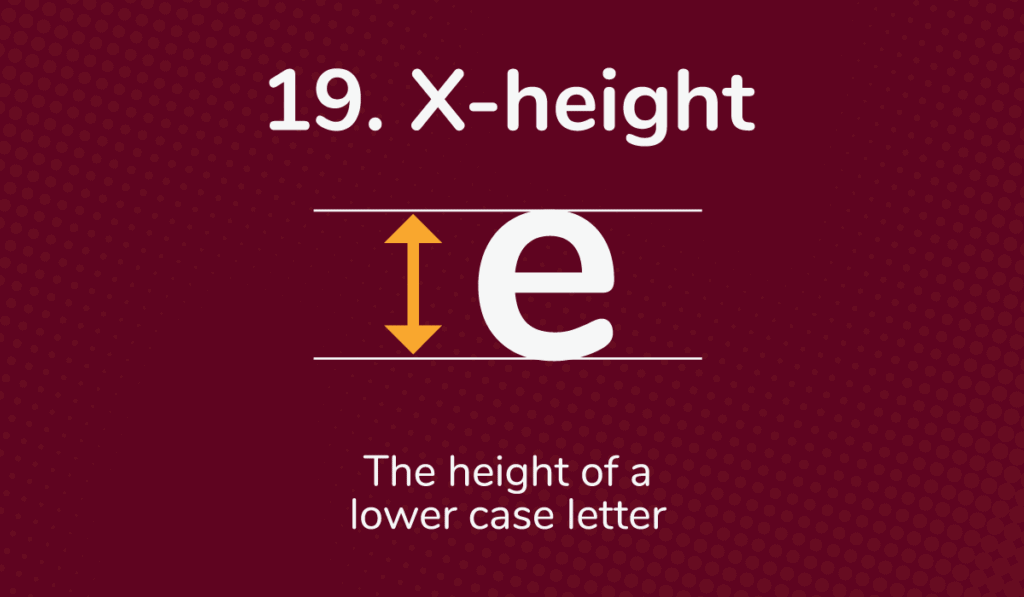
The X-height is an important type term to understand when discussing typography. It refers to the height of a lowercase letter in a particular typeface, not including ascenders or descenders.
The X-height is often used as a unit of measure when discussing proportions within different typefaces or adjusting font sizing.
By knowing x-height, designers can harmoniously adjust font sizes compared with headings and other design elements for optimized readability across digital projects.
20. Hairline
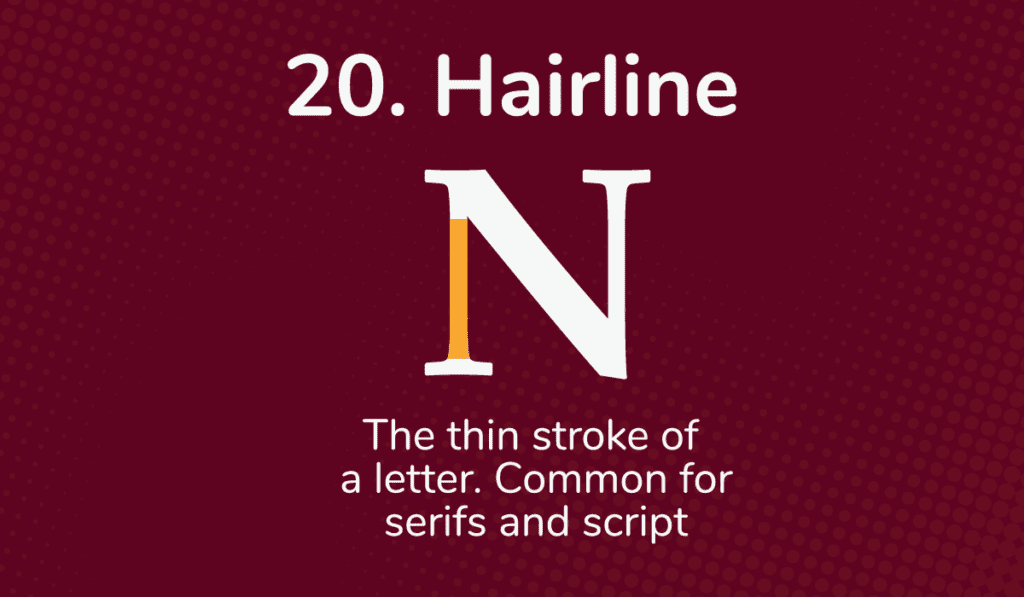
The hairline in type is one of the more subtle design elements of typography, yet it is something designers must consider carefully. It refers to the thin stroke of a letter.
Hairlines are especially common for serifs and scripts, where smaller details like hairline styles and thicknesses are essential for legibility and readability.
In calligraphy, the hairline is the thin upstroke created while writing the letters.
21. Spur
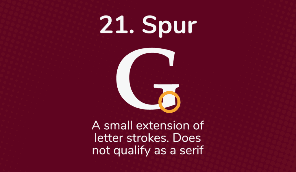
The spur is an interesting feature in some typefaces and does not qualify as a serif. It is a small extension of a letter stroke.
The spur can give the typeface additional elegance, making it popular among designers looking for unique designs.
Spurs are also common in various gothic and blackletter calligraphy styles and typefaces.
22. Crotch
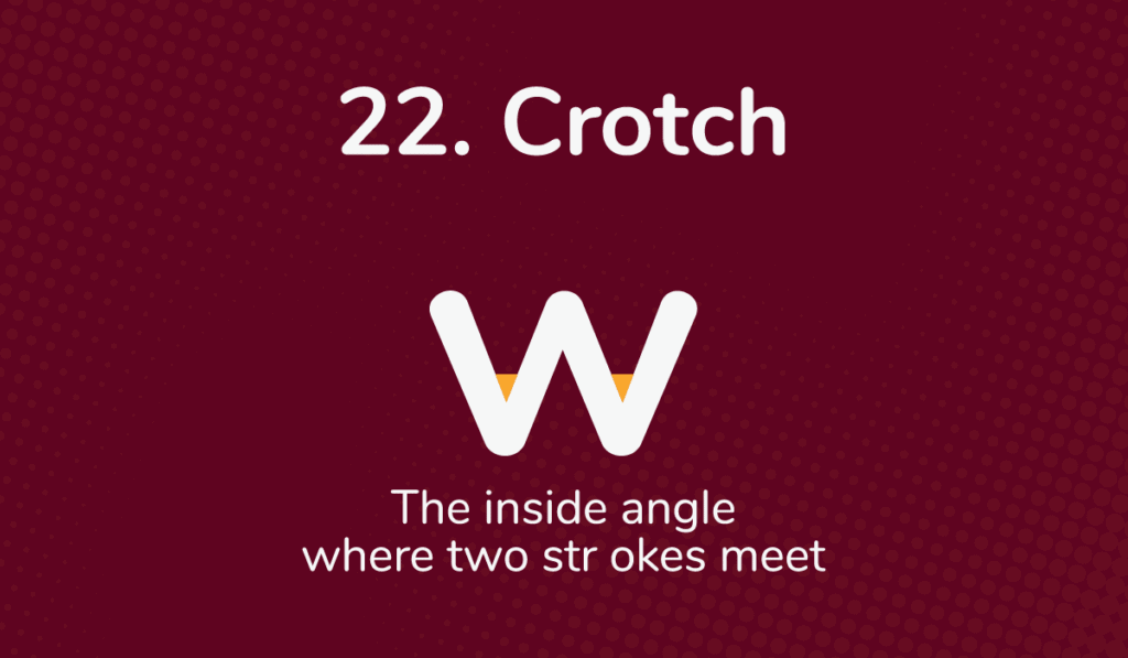
The crotch in type is where two strokes meet and form an interior angle, creating a more dynamic letterform and drawing attention.
Crotch points should be carefully considered when creating or selecting a typeface, as it can affect the look and feel.
23. Kerning
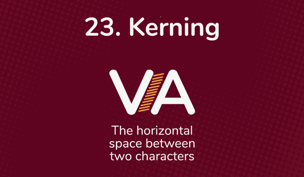
Kerning is adjusting the horizontal space between two characters in a typeface. Creating a well-balanced and visually appealing typeface is important, as kerning can drastically affect how words are understood and emotions conveyed.
With kerning, letters are spaced closer together or further apart depending on the context. For example, a designer may want to have letters closer together to convey a sense of unity.
In contrast, others may want to achieve the opposite effect by spacing letters further apart.
As a result, kerning must be considered carefully to ensure that any text looks its best for the appropriate context.
Kerning is always adjusted optically and never mechanically.
It’s a skill that improves with consistent practice, and for that, I highly recommend checking out the Kerning Game 🙂
24. Tail
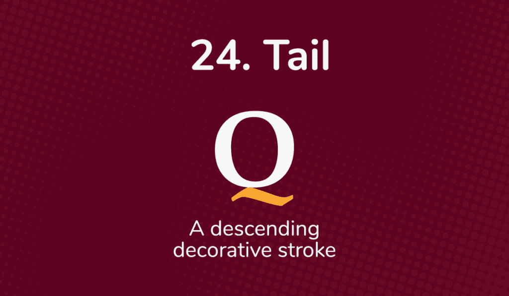
As a part of typography, the tail is the distinctive, tail-like descending stroke at the end of a letter. It is often changing in size and shape according to the font family.
Generally, the tail helps to add a decorative effect, but it also has practical functions to increase legibility. For example, a tail can distinguish “Q” from “O.”.
25. Diagonal
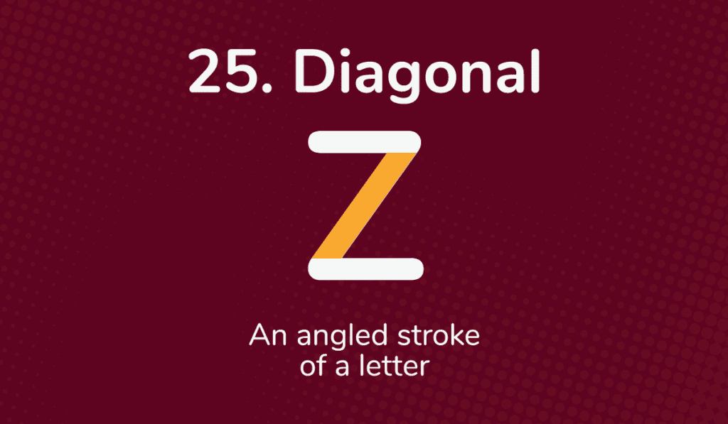
The diagonal stroke in type is angled, giving the letter movement and a dynamic feel. In addition, diagonal stroke lines in type help enhance readability by directing the reader’s eye.
26. Swash
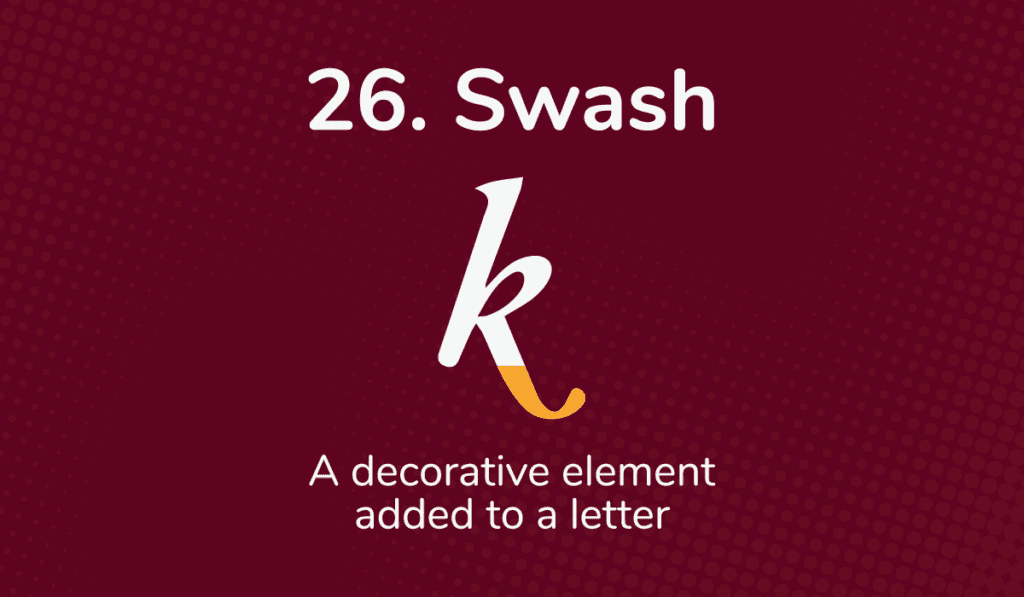
The swash in type refers to a decorative element added to certain letters, typically stylized versions. This swash adds a unique flair and sense of elegance to the letter, giving it a more personal touch than a font that does not have a swash.
Some swashes are so elaborate that they resemble calligraphy, while others are simple accents.
While this decorative element can make a font stand out, it’s important to use swashing sparingly – too many swashes can make the text difficult to read.
27. Baseline
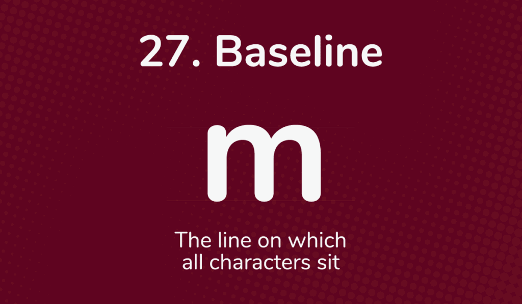
The baseline in type refers to the imaginary line on which all characters, numerals, and letters sit horizontally. It is important to create uniform line spacing to give the text a professional look.
The baseline is also used to ensure consistency when combining text elements like headings and body copy. Having a baseline set for type ensures that each sentence has a good rhythm and flow regardless of which font style or size is used.
Having baseline knowledge is beneficial to typographers when designing logos, branding materials, and website pages with beautiful typefaces. The baseline provides a structure on which to build to improve legibility.
28. Cross stroke
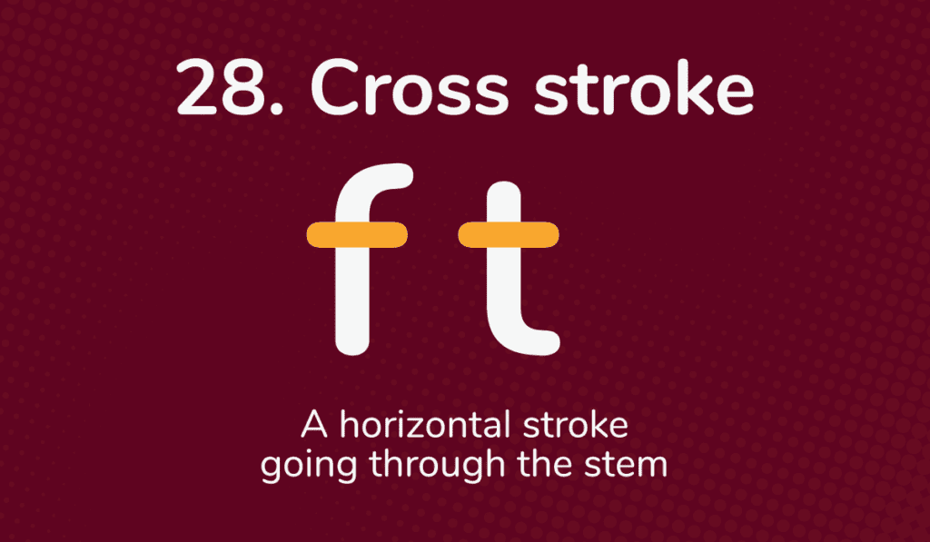
The cross stroke in type is a short horizontal stroke going through the stem section of a typographic character. It can distinguish specific characters from one another, such as “f” and “t.”
In addition, cross strokes are frequently used for aesthetic purposes. Their utilization allows type designers and font creators to produce more attractive fonts by adding these subtle dynamic elements.
29. Tracking
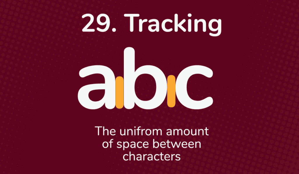
Tracking is an essential typographic adjustment that can make all the difference in any text. It refers to the uniform amount of space between characters.
Tracking helps create an overall visual appeal so that readers don’t have to work hard to read or comprehend text.
In essence, tracking contributes to the aesthetic quality of the type and ensures that it looks both inviting and comprehensible.
30. Ligature
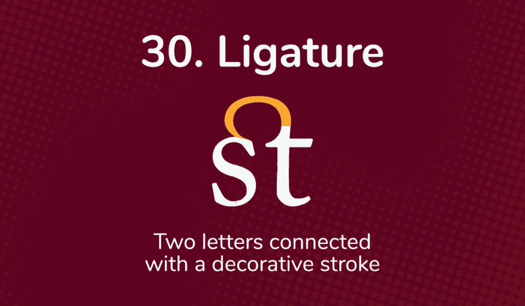
A ligature in type is a combination of two letters, often connected with a decorative stroke. It is often used where separate letters could pose spacing issues due to their shape. Otherwise, it is used for aesthetics.
Ligatures have grown increasingly popular and can now be found in digital fonts and handwriting. The designer draws potential letter combinations to create ligatures and decides how the ligature should look.
Ligatures are an important part of typography that allows for functional and aesthetic purposes.
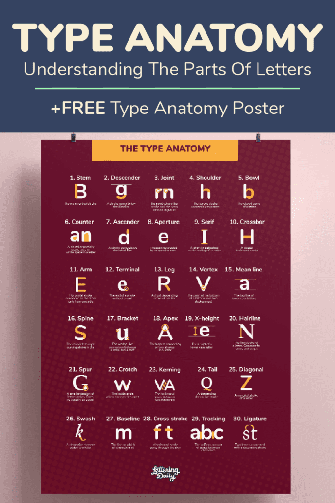
Get your FREE Type Anatomy poster!
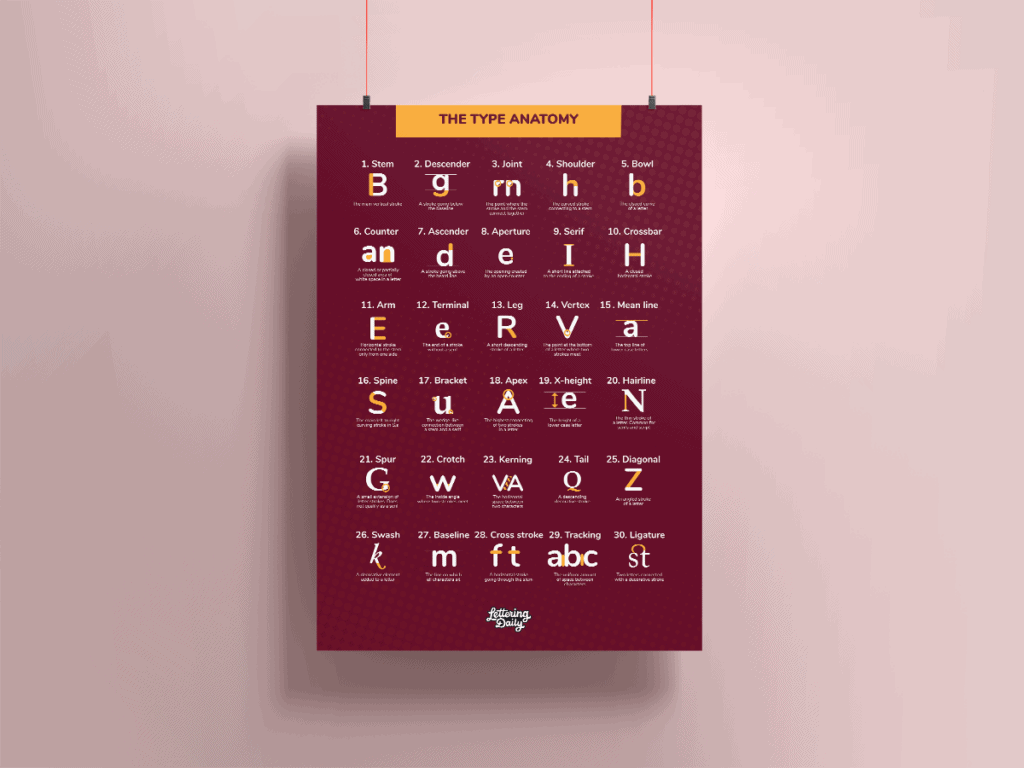
As mentioned earlier, here you can get this FREE Type Anatomy poster.
The poster is an A3 size or 11.7 by 16.5 inches big.
It can easily be scaled on smaller sizes if needed.
The poster can serve as decoration for your studio/home and a reminder of all the intricate typography terms.
The poster is located inside the Lettering Crate and all the other freebies.
Drop your email below to get instant access to the Lettering Crate.

Stay updated with my tutorials and get instant access to the Lettering Crate –
A growing library of free lettering & calligraphy resources that includes –
Final words about type anatomy
When it comes to typography, there’s more than meets the eye.
Each part of the letter must contribute to legibility while remaining pleasing to the eye and attention-grabbing. By understanding type anatomy, you can create headlines and body copy that are both easy to read and visually appealing.
In other words, as Pablo Picasso said – “Learn the rules like a pro so that you can break them like an artist.”
Now I would like to hear it from you –
What do you think is the most critical aspect of typography?
Pin Me!
About the author
Janine Heinrichs is a graphic designer who writes at Janine Designs Daily. After completing a 365-day design challenge, she shares everything she knows about design, technology, and more for digital artists. She also offers SEO & Content Marketing services to help skyrocket businesses. You can reach her at [email protected]

Just a heads up that the word “closed” is misspelled in the graphic for “5. Bowl”
Great job Marian, been in this field for many years, and easy to forget some of these terms in this “digital age”
This is great!
Came across this looking for the same thing for symbols. Do you know if such exists?
Thanks,
Henry
This is a great and in depth knowledge of typefaces. I have worked with many designers and they do not know the first thing about typography. Kerning is a foreign word to them as well as leading. I am also old school from the time of Letterpress (hot type). Everyone has a computer, BUT the lack of training and common sense is severely lacking.
An amazing sharing of knowledge for anyone with enthusiasm for the art of letters, calligraphy and the aesthetics of words.
Thank you for the nice words, Marian 🙂