This post and the photos within it may contain affiliate links. If you purchase something through the link, I may receive a commission at no extra charge to you.
Are you ready to learn the art of hand lettering?
In this tutorial, I will teach you the very basics you need to get started.
By the end of this post, you will know what and how to practice.
Let’s have a quick overview of what you’ll be learning in this tutorial –
- What is hand lettering
- How hand lettering differs from calligraphy
- The essential lettering tools + recommendations
- Laying down the foundation – terminology, core rules, basic styles, understanding letter construction.
- How to create a hand lettering piece – a 6 step process
- The 30-day lettering planner – a practical practice guide for beginners + FREE lettering alphabet worksheets
- Additional resources for further learning and studying
- Final words
Let’s dive right in!
What is hand lettering?
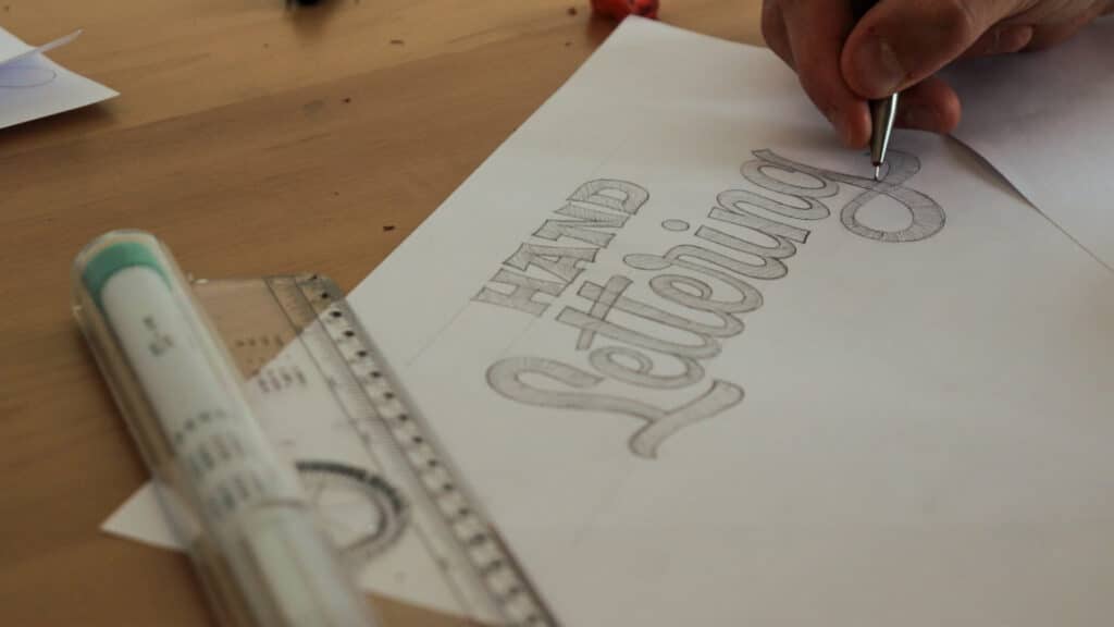
Hand lettering is a visual art form that primarily focuses on drawing and illustrating letters by hand (hence the name). Unlike calligraphy, where we write the letters, with hand lettering, we are drawing the individual letterforms.
How hand lettering differs from calligraphy?
As I just mentioned, hand lettering is the art of drawing (illustrating) letters. In contrast, calligraphy is the art of (beautiful) writing letters.
Once again –
Hand lettering – drawing
Calligraphy – writing
Here you can also see an example of it.
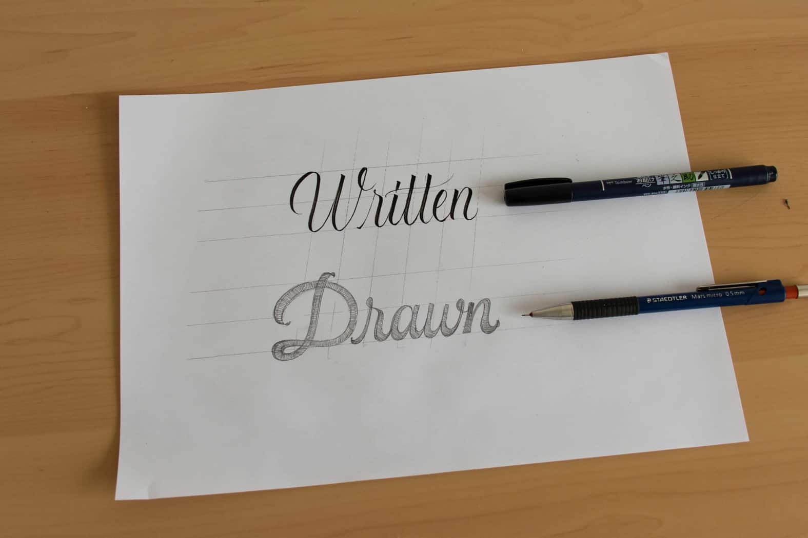
When doing hand lettering, the letters are most commonly drawn or sketched with a pencil and then outlined with various pens and markers.
In contrast to calligraphy, where certain styles require specific tools, for hand lettering, you don’t really need a specific tool.
In fact, you can do hand lettering with pretty much any writing tool that you have.
Hand lettering and calligraphy are often used interchangeably, but as you can see they are quite different from each other.
Remember – The key difference between hand lettering and calligraphy is in the process and not the end result.
If you want to better understand the difference, I wrote a separate in-depth article on that topic. Check it out here.
Did you land on this article, thinking you would be learning about calligraphy or brush lettering?
Don’t worry – I got you covered!
If you were misled by the terminology, you could check out this post. It’s a huge guide (like this one) that will teach you everything you need to know.
Hand lettering comes in all sorts of different styles, shapes, and forms, and in recent years it has been making a major comeback in the art/design industry.
Now that we know what hand lettering is, we can proceed to the next section of this guide.
The essential lettering tools needed + recommendations.
One of my favorite aspects of hand lettering is that you don’t really need any fancy and expensive tools to get started.
Of course, once you get more into it, you will want to invest in better tools, but for now, you will just need a handful of essential tools.
There are indeed better and higher-quality tools on the market, but please keep in mind –
No tool will improve your skills overnight!
It’s all about consistent and quality practice – but more on that later on.
Here are the essential tools for hand lettering that you need to get started (links to Amazon) –
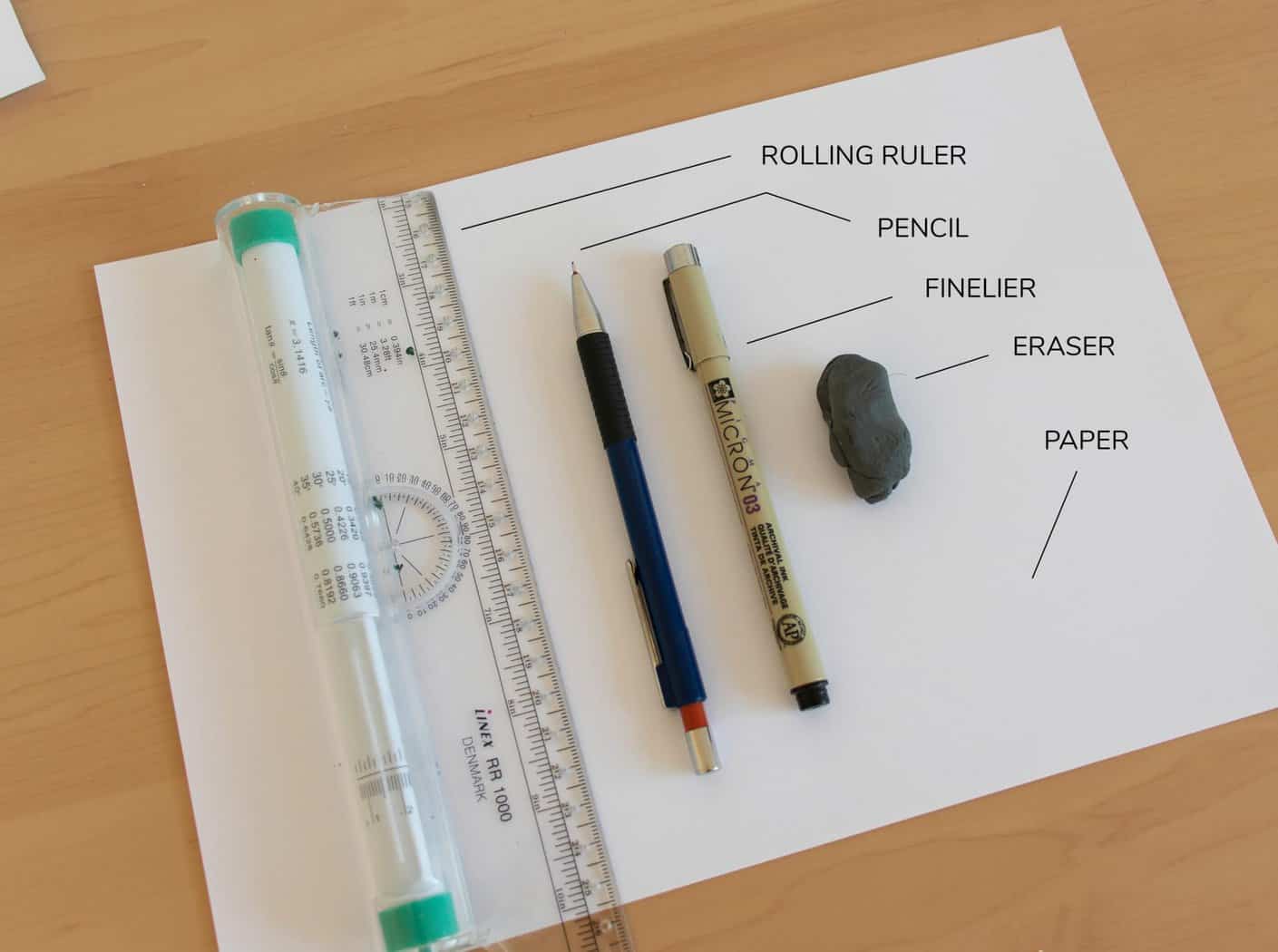
Let’s briefly go through each of the tools so I can explain what do we need them for.
The Pencil
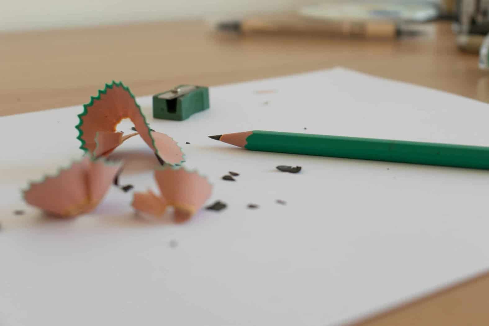
The pencil is probably the most underrated tool out there.
That goes for both hand lettering & calligraphy.
The pencil allows you to quickly lay down ideas, sketch, erase, fix, and much more.
You probably know already that there are different types of pencils out there.
HB, 2B, 6H, and so on.
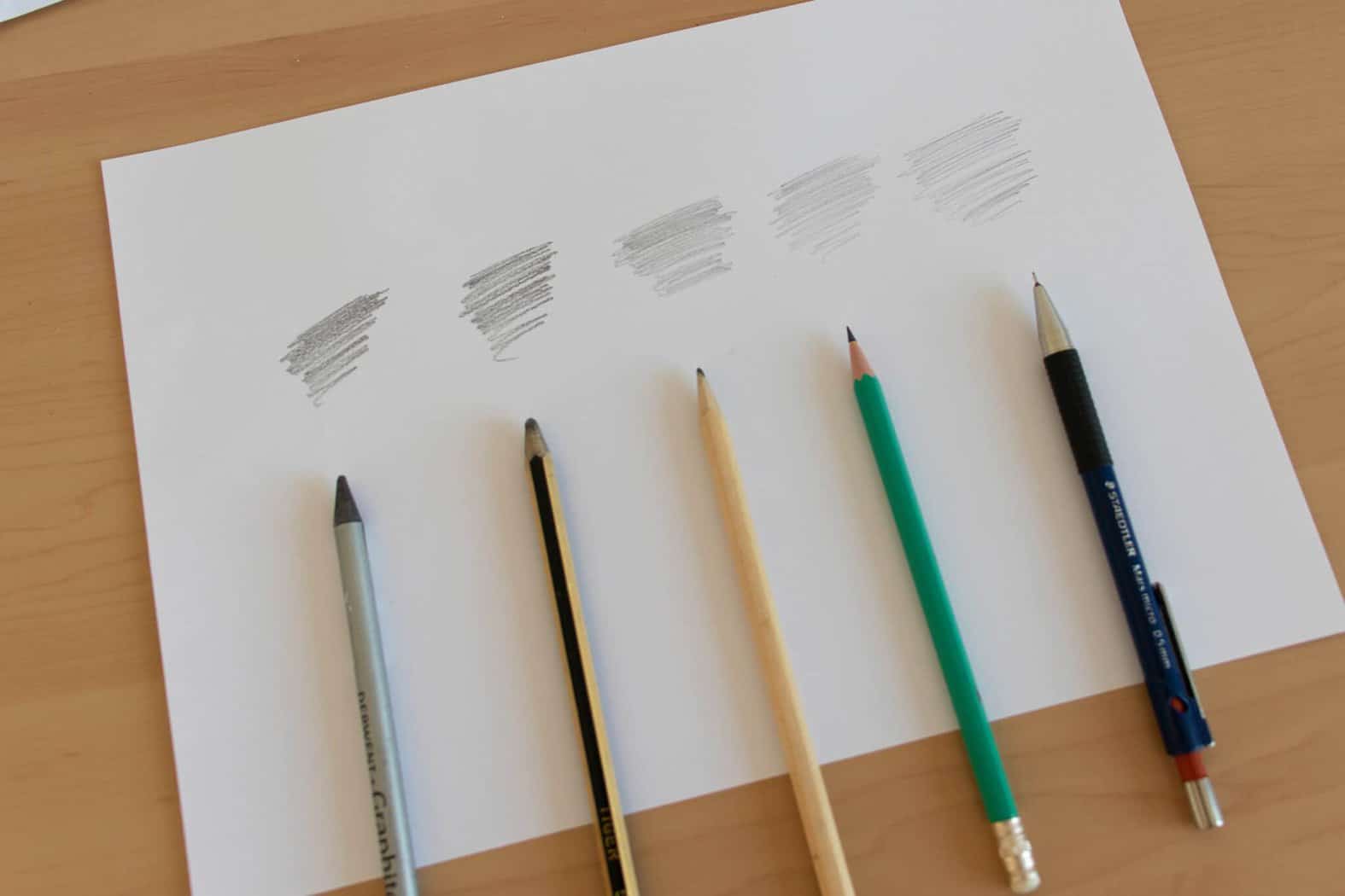
They all have their different purposes, and for hand lettering, I would personally recommend the following types of pencils (links to Amazon) –
For hand lettering sketching, we need a pencil that leaves light marks that can be easily removed.
However, if you really want to get the best of the best, then that’s without any doubt –
The mechanical pencil
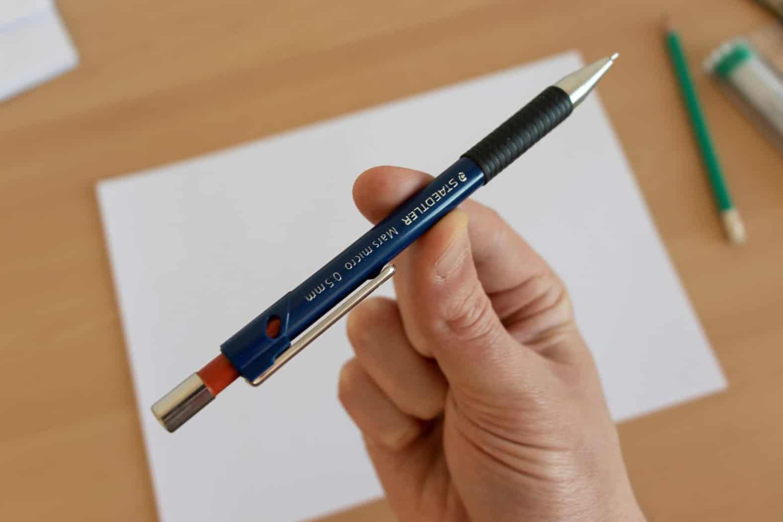
You will always get thin, light, and sharp lines, and on top of that, you will never have to sharp it and worry about any mess.
The mechanical pencil that I use and recommend is the Staedtler Mars (links to amazon).
Paper
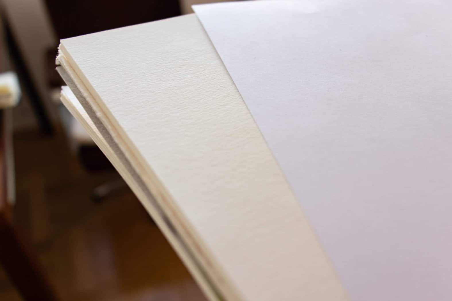
Unlike with calligraphy, hand lettering isn’t so tied up with specific types of papers.
You won’t have to worry too much about bleeding and feathering unless you work with certain types of color markers.
The main thing I want you to understand is that there are two main categories when it comes to paper choice –
- Practice paper – example – HP Premium
- Paper for final artworks – example – handmade paper
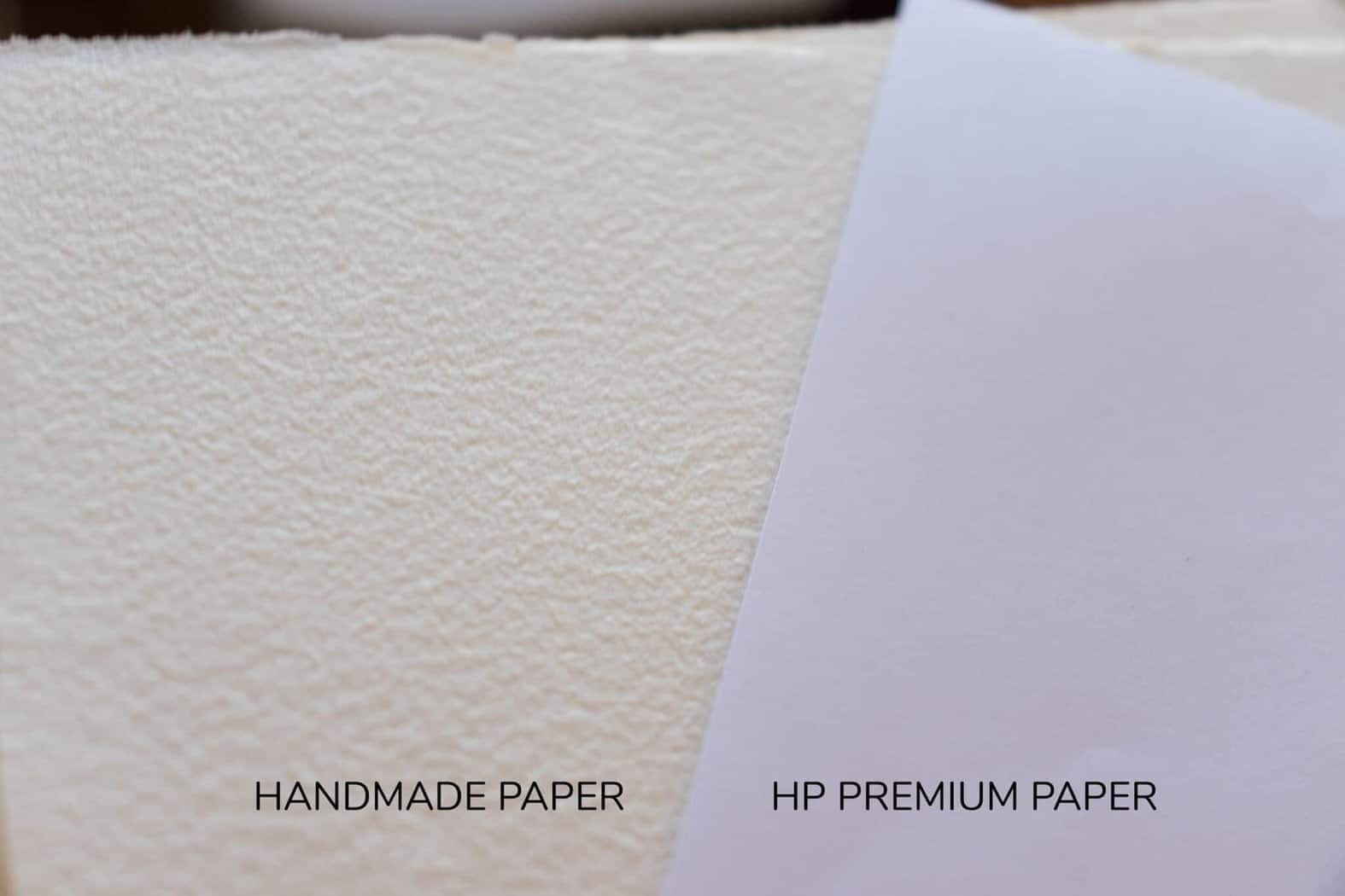
Practice paper is cheaper, and its purpose is for, well – practice!
For now, practice paper is your primary focus, but with time you will improve, and you will want to create a final piece on a nicer piece of paper.
For practice, you can basically use whatever print paper you have, however, my recommendations are the following (links to Amazon) –
- Rhodia dot pad – excellent for practice thanks to the dot grid that is laid out on each sheet. This is extremely helpful for guidelines, consistency, etc. – more on that later on.
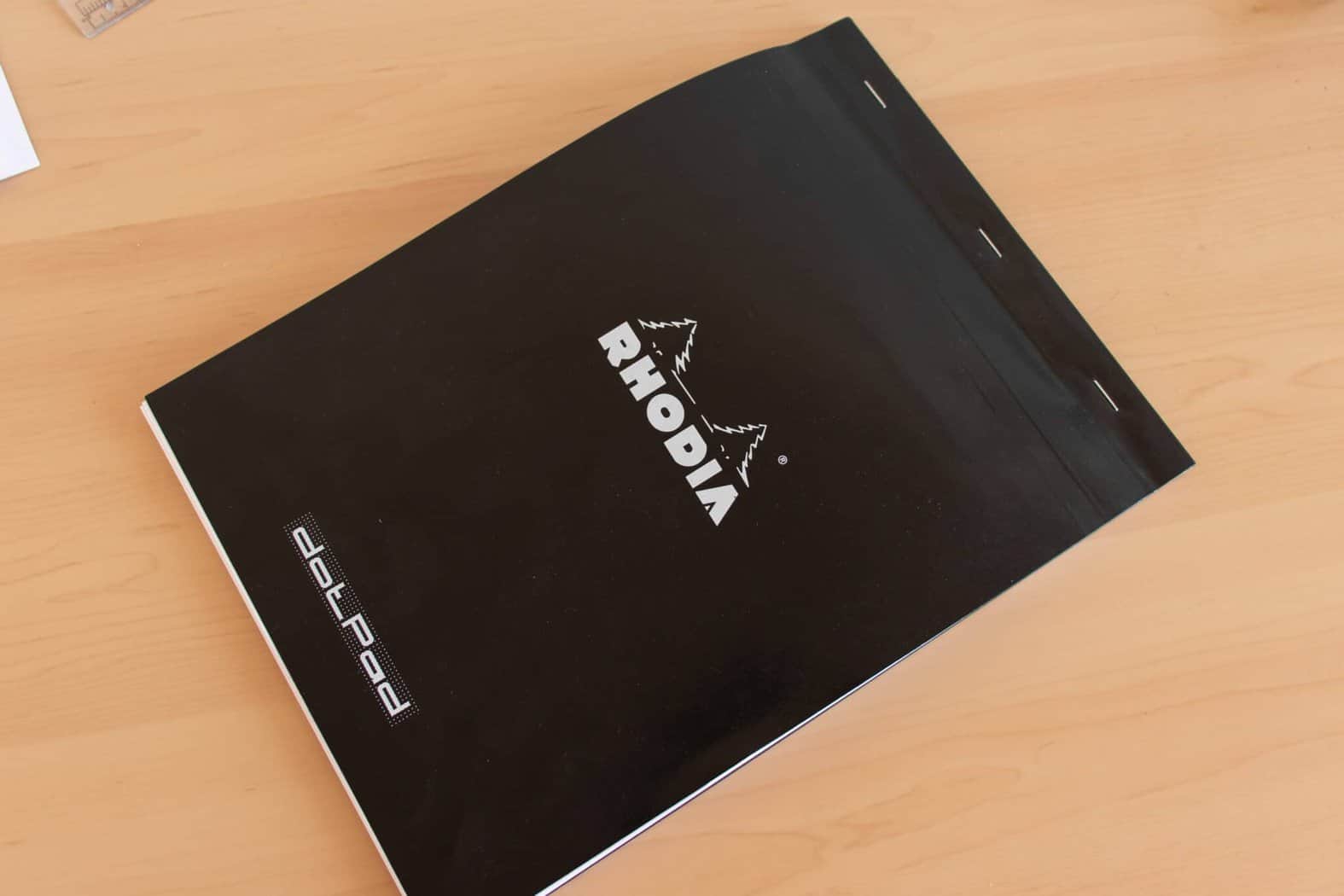
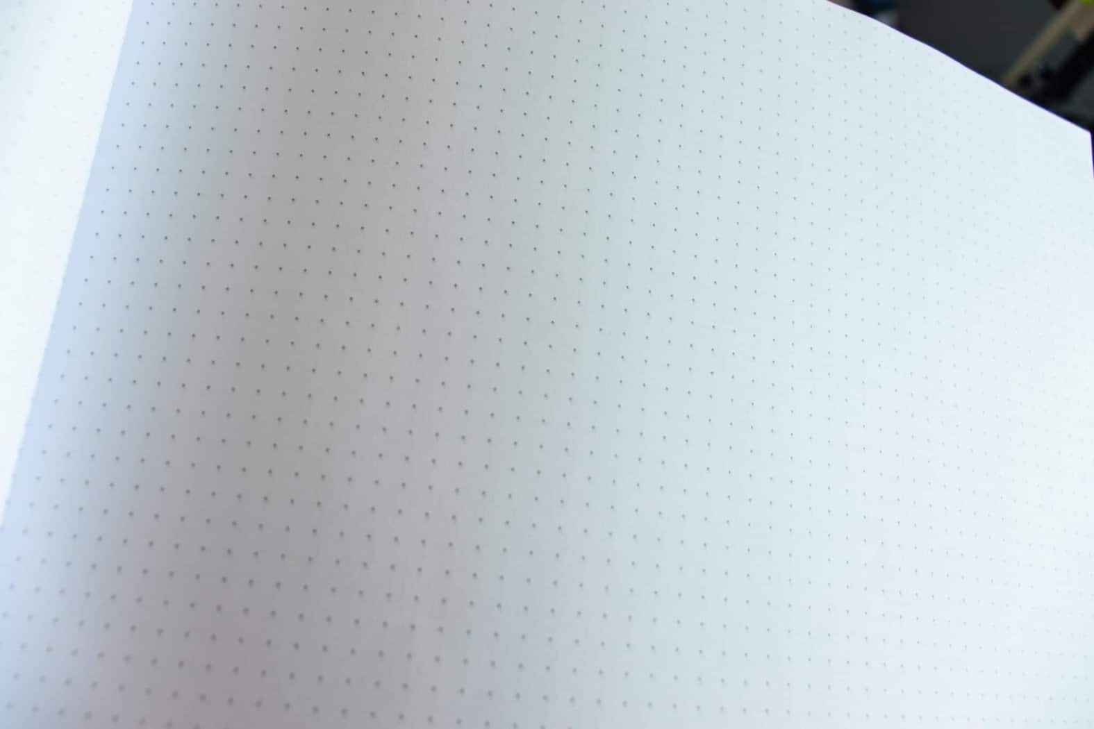
The quality of the paper itself is also outstanding, and you will never have to worry about bleeding and feathering – regardless of the tool you use.
In fact, the Rhodia pads are my top recommendations when it comes to calligraphy as well.
- HP premium 32 – very smooth and thicker type of paper, which is excellent for practice. Specific markers with heavy ink flows will bleed, but for the most part, you don’t need to worry about it. A huge selling point for the HP is the quality and quantity you get for the price.
Paper for final artworks –
I love working with watercolor papers when I create final artworks.
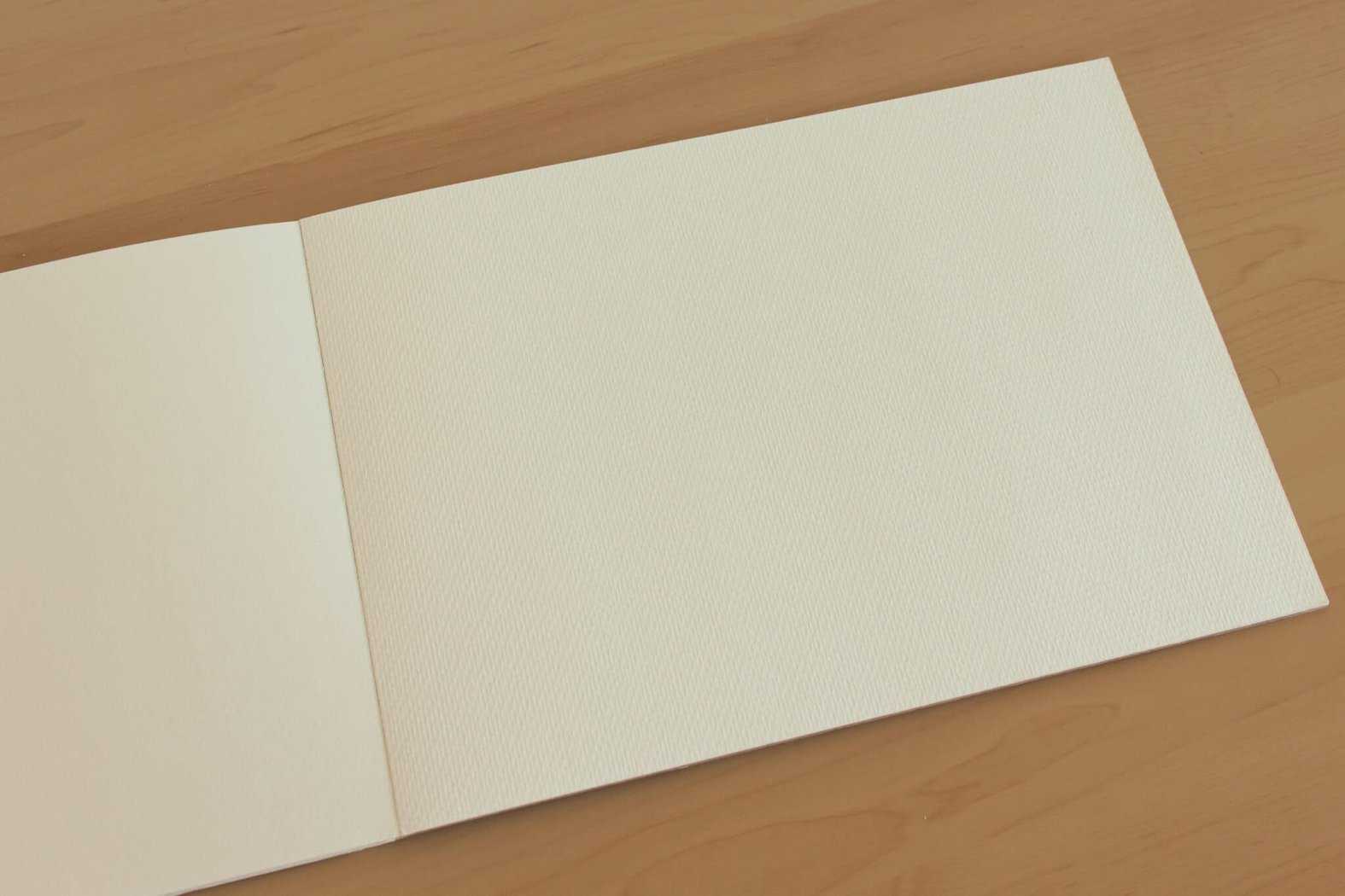
Here are some of my favorite types of watercolor papers for hand lettering (links to Amazon) –
As mentioned, these are more expensive types of papers, so I would recommend you avoid using them for practice.
Just for special occasions 🙂
Ruler
The ruler is another essential tool.
We use the ruler to keep our letters nice and consistent (more on that later on).
Honestly, you can use whatever ruler you wish, but my top recommendation has always been the rolling ruler.
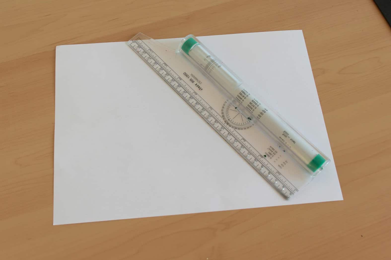
It’s like a regular ruler, but it has a small cylinder on the backside.
That allows him to roll up and down the page, and thus you can create parallel lines quickly and efficiently.
It’s a real time-saver, and it has definitely improved my workflow. You can check it out here (links to Amazon).
The eraser
We all make mistakes.
We use the eraser to remove the sketch marks and guidelines once we have finished the piece (more on that later on).
You can use whatever eraser you have, but nonetheless, I would like to make two quick suggestions (links to Amazon) –
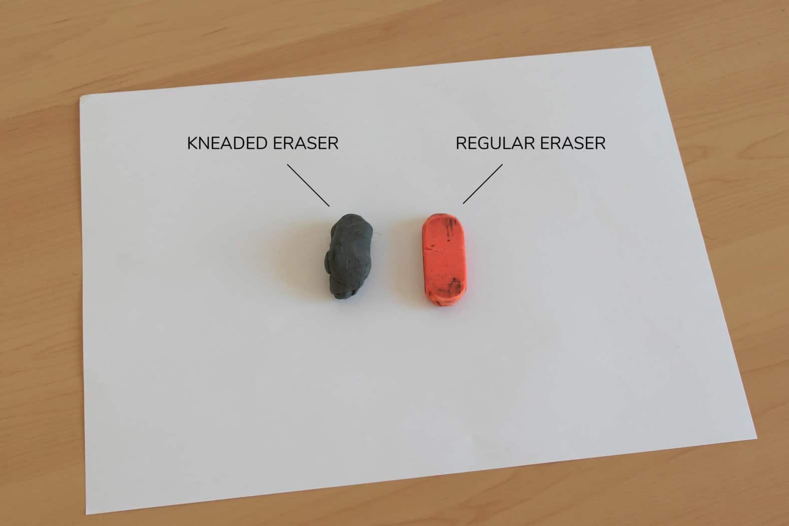
- The kneaded eraser – great for removing light pencil marks, and the best part is that it doesn’t crumb = no mess!
- The Tombow mono zero (or similar) – a pen-shaped eraser with a small tip – great for removing pencil marks in small areas without having to remove half of the sketch.
Black fineliners (makers)
I would say that this is the only tool on which you shouldn’t cheap out.
The difference between a good fineliner and a crappy one is quite noticeable, and the price difference is minuscule.
The fineliner plays one of the most critical roles in the whole lettering process, so I really recommend getting something decent.
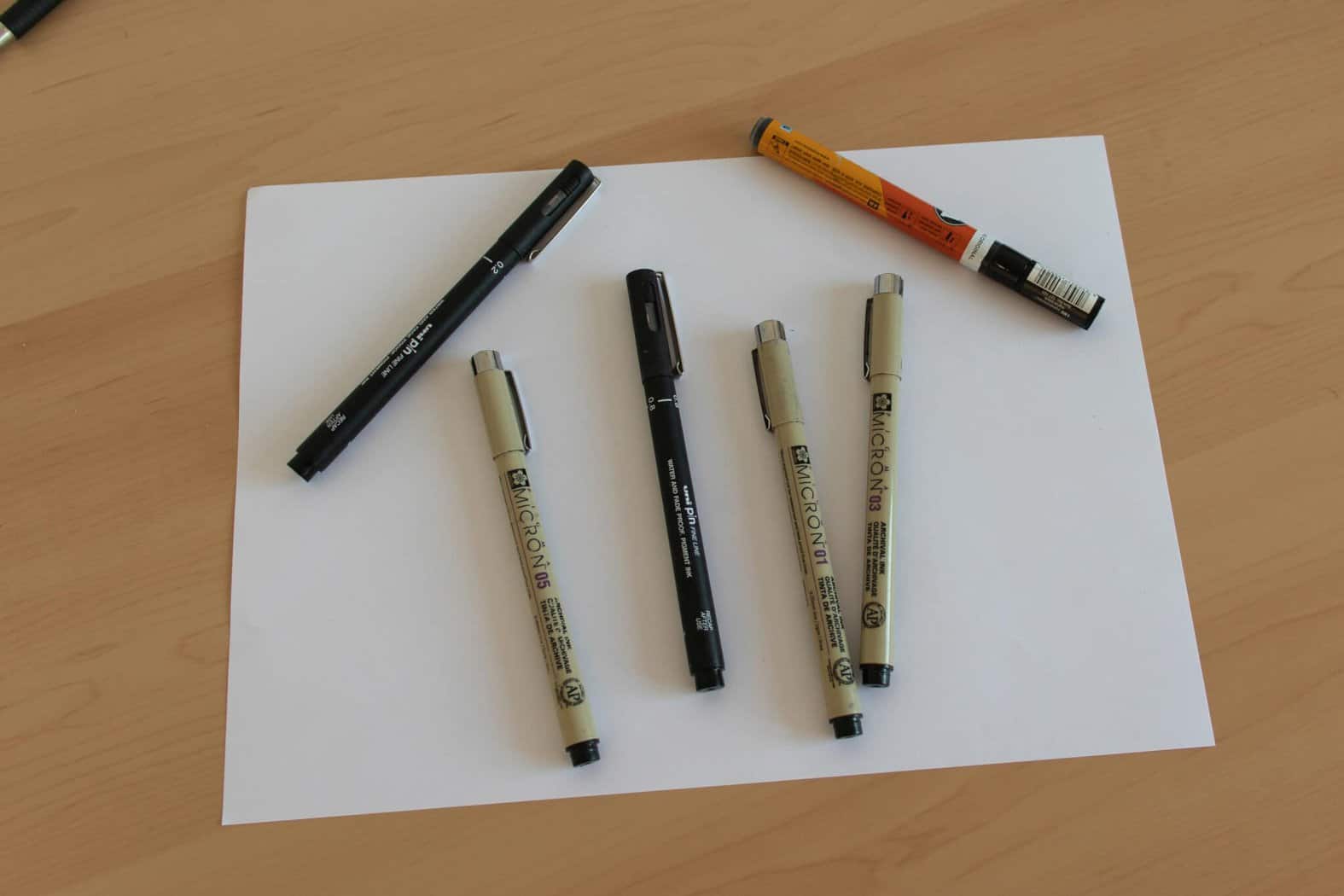
For fineliners, I recommend the following selection (links to amazon) –
- Sakura Pigma Micron – undisputable champion when it comes to inking your letters, drawings, and more. Durable, affordable, and most importantly, very comfortable to work with. If I could, I would rate it 11/10! The packs usually come with different sizes so you can cover a wide range of needs – from fine details to quickly filling shapes.
- Uni Pin fineliners – a great alternative to the Sakura Pigma Micron.
Color markers and pens (bonus) –
For now, I just want you to get comfortable with the idea of inking and outlining your letters.
It’s not an easy task, and it requires focus, patience, and consistent practice.
If we add color combinations and harmonies to the equation, we just complicate things for no reason.
Nonetheless, I realize that some of you might be more experienced and wish to add some spark to your work.
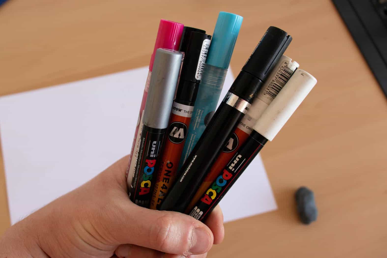
That been said, here is my recommendation for color markers (links to amazon) –
Ok, now that we’ve covered the tools section, we can proceed to the next one which is –
Laying down the foundation – terminology, core rules, basic styles, understanding letter construction.
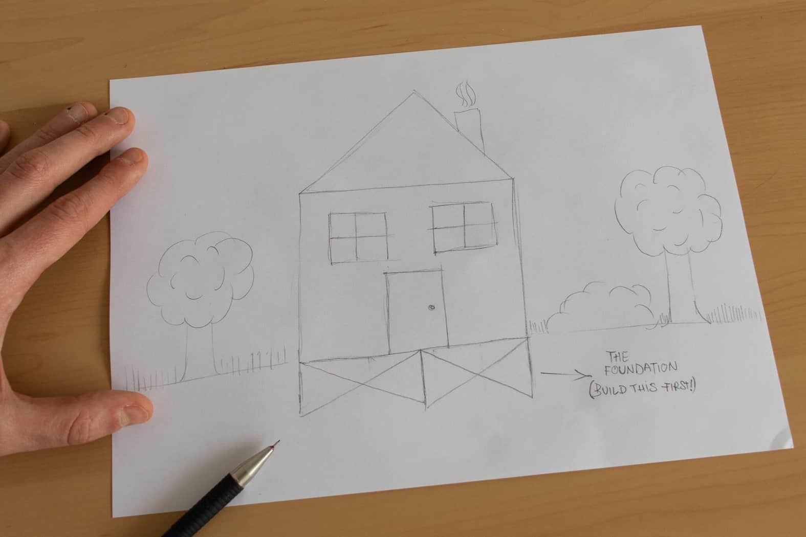
Having a proper understanding of the basics is crucial for your further practice and general progress.
There is a saying that I like to often use in my articles – ‘’A house is only as strong as its foundation’’.
Important!
Consistent practice is essential, however, the way you practice makes all the difference in how fast you can learn and improve your skills.
In my experience, the best way to practice is by starting with the very basics and gradually move towards more difficult elements.
Just ask yourself – how can you make any significant progress if you can’t distinct the good and the bad aspects?
In this section, that’s exactly what i want to do.
I want to introduce you to the basic concepts, but at the same time, I’ll do my best to keep things simple.
I realize that too much information can be overwhelming or even discouraging in some cases.
Here are the things I’ll cover –
- Basic terminology
- Core rules (consistency, spacing)
- Basic lettering styles (understanding letter construction)
With time and practice, you will most certainly expand your knowledge, but this will be enough to get you started.
Basic terminology
This part is quite straightforward.
The terminology goes really specific, right down to every single detail and part of the letter that exists in the alphabet.
For now, you don’t need to go that far deep and memorize all of the terms.
However, having a basic knowledge of type anatomy is definitely something I would recommend.
Check out this example below –
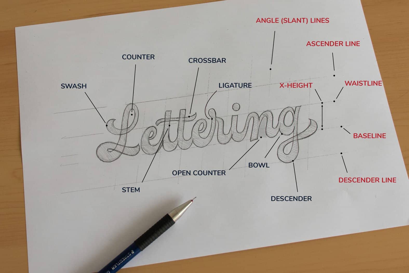
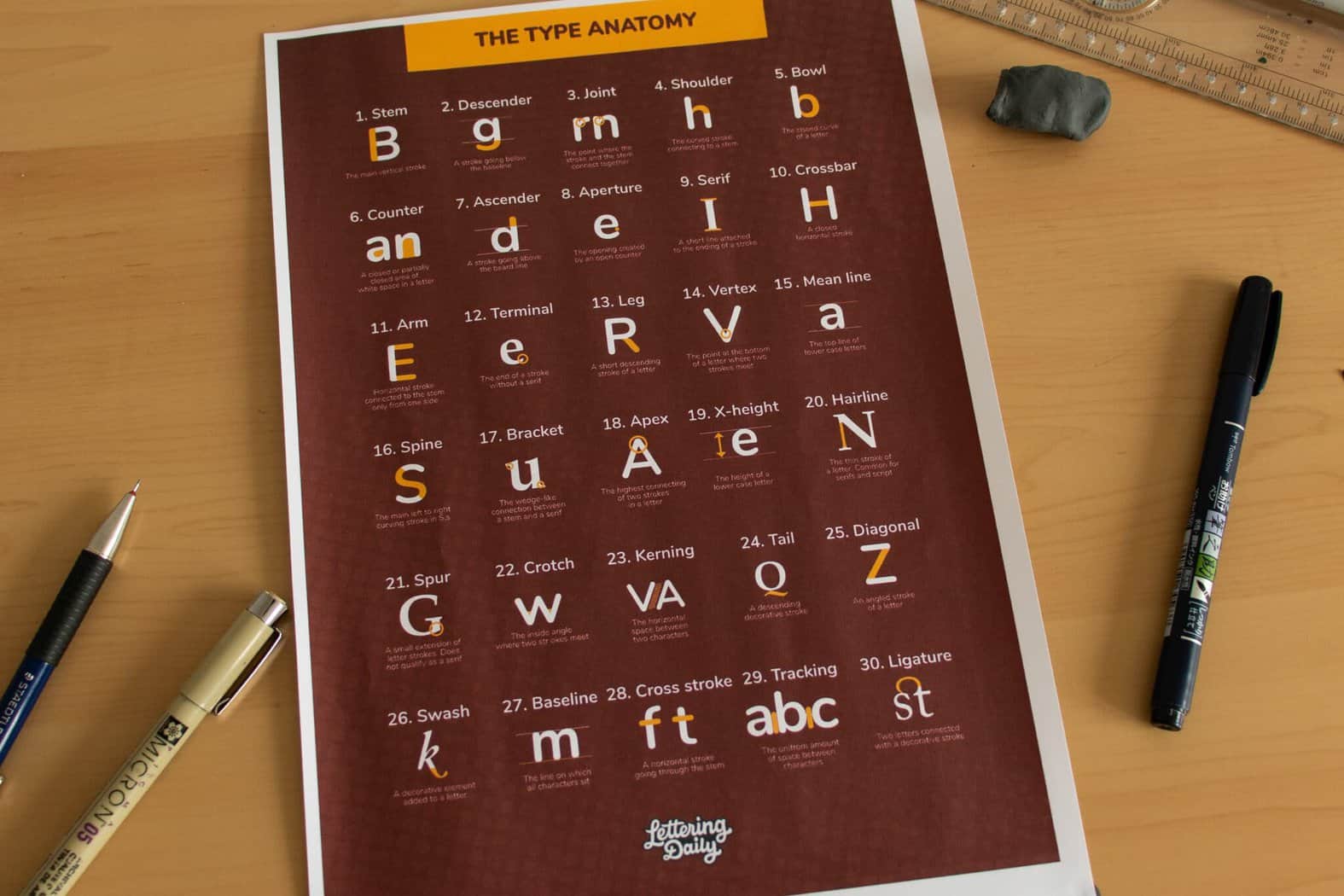
In the Lettering Crate (the resource library with freebies), I’ve included the anatomy poster that covers the terminology more in-depth.
You can then print it out and have it above your work desk to use it as a point of reference.
Core rules for hand lettering
There are a lot of different rules, however, as I mentioned, I don’t want to overwhelm you with too much information.
Instead, I will go over 2 rules that I believe to be the very foundation for every hand lettering beginner –
- Consistency
- Spacing
Let’s start with consistency.
Consistency
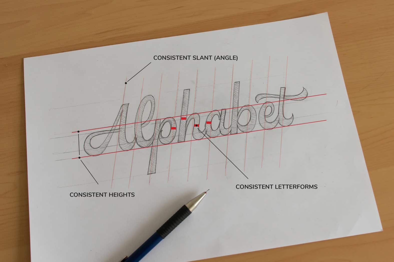
Consistency is the idea of having all letterforms follow the same visual pattern.
By keeping our letters consistent, we increase the visual harmony, and it just makes the whole thing look so much better.
Consistency spreads across different areas such as –
- Letter thickness
- Angles,
- Heights,
- Etc.
This is the art of drawing letters by hand, so of course, you don’t have to go crazy with mathematical precision here.
Nonetheless, the more consistent your letters are, the better.
The best way to improve your consistency is by using guidelines.
Laying out a proper grid with your layout is a crucial step.
Here is an example of consistent lettering –
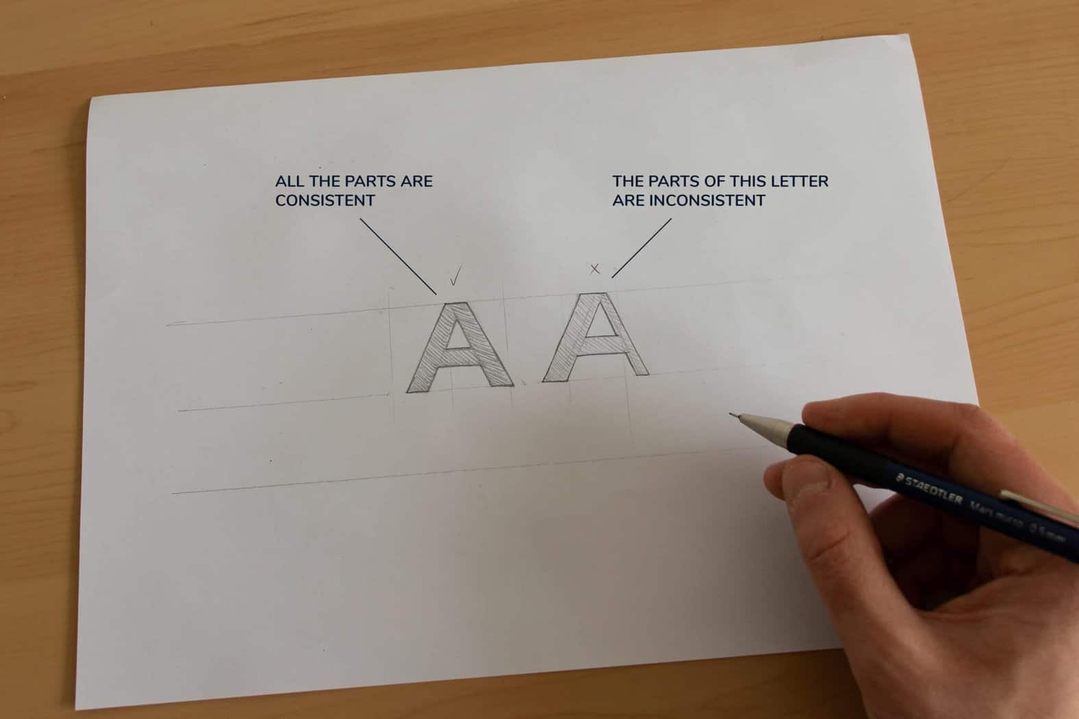
Here is another example.
However, here you can see the difference between a consistent and an inconsistent letter.
Another way that you will dramatically improve your consistency is by not rushing and spending more time sketching.
The second core rule I want you to keep an eye out for is –
Spacing
Spacing between letters may seem daunting at first, but trust me once you get into it – it’s really not that hard.
The key is practice, and with practice, you will start developing a so-called ‘’typographic eye’’ that will allow you to recognize good from bad spacing.
So, how do you properly space letters?
The very first thing you must understand about spacing is that not all letters are equally spaced from each other.
The idea is to arrange them, so they look like they are equally spaced.
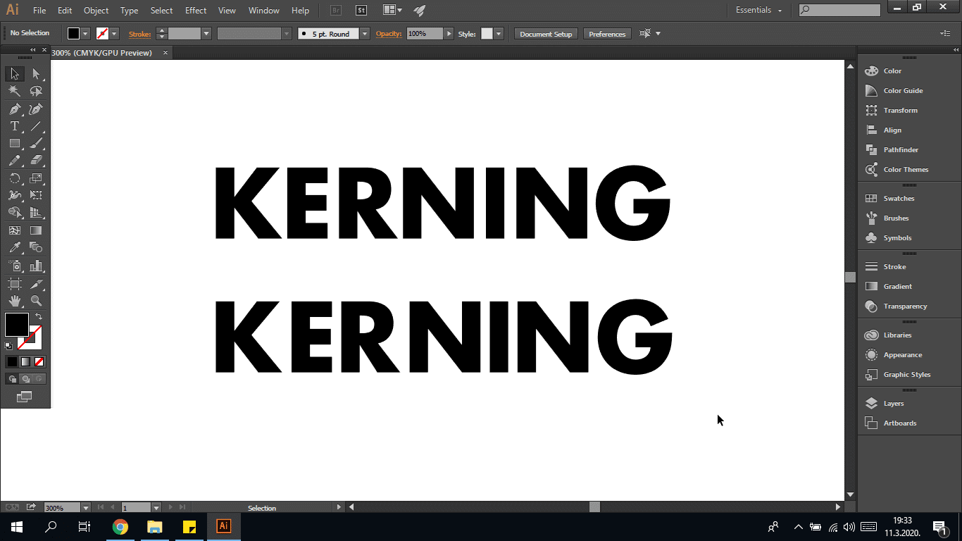
The example above is optically spaced, while the one below has the same exact amount of space between each letter.
I think we can all agree that the one above looks correct in comparison to the one below.
Different letters come into various shapes and depending on how they are placed next to each other.
The space between can be tighter or wider.
Feeling confused?
Yup, I remember that feeling.
Don’t worry, the following example should help clear the air.
Here are three of the most common letter shapes that interact with each other –
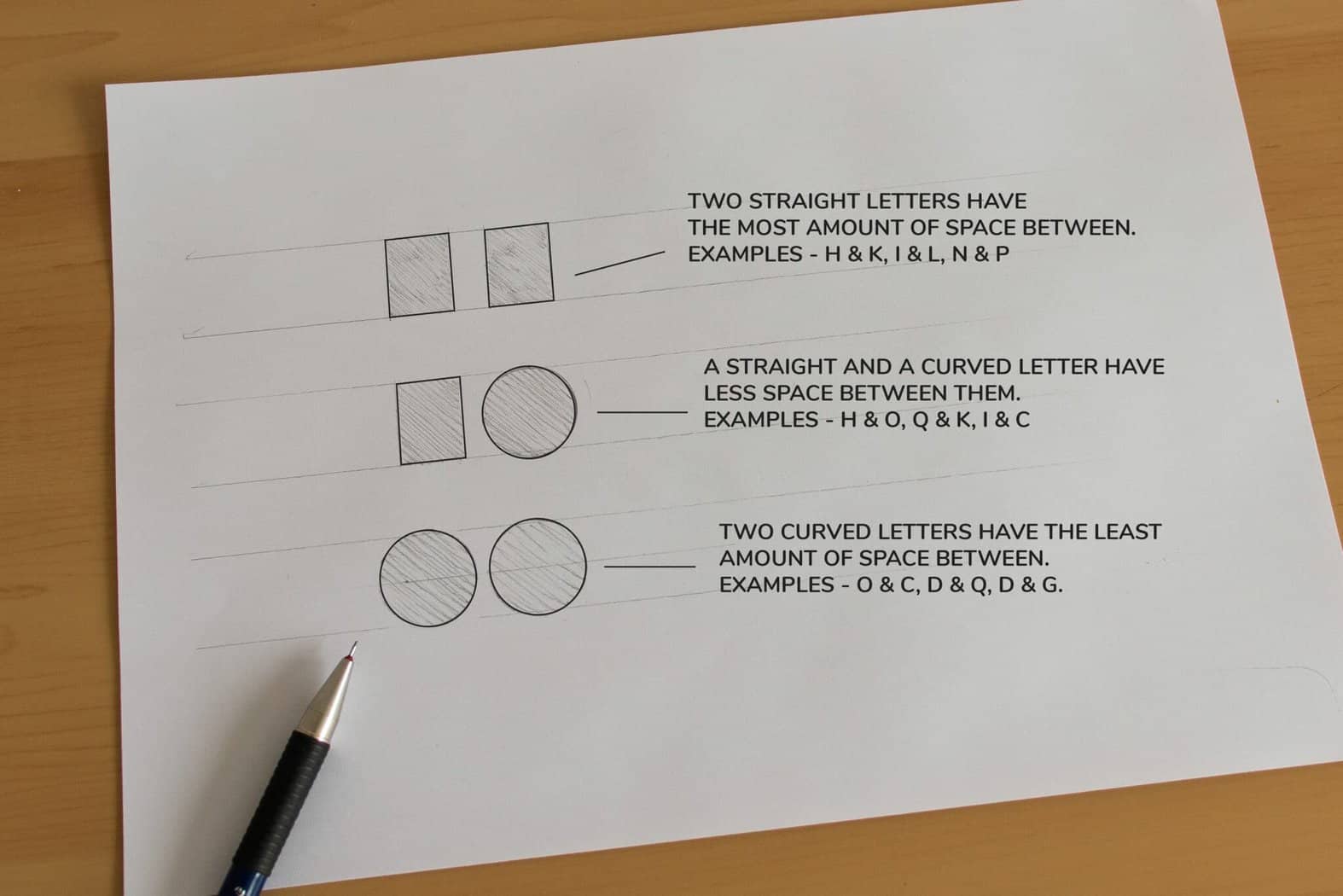
Additionally check out the video below.
It sums up the whole concept behind correct letter spacing.
What I would like you to do now (you can also do it later) is to take 5 minutes and play a quick kerning game.
It’s a free online game that gives you 10 prompts, and your task is to kern the letters using the mouse or the arrow keys for more precision.
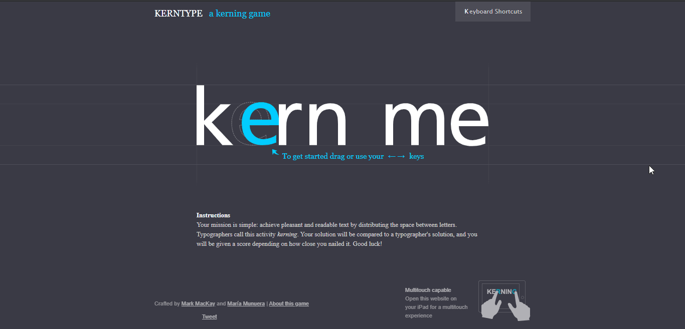
After each round, the game will automatically correct your selection (if any needed), and it will give you a score from 1 to 100 – depending on how accurate you were.
This is a fantastic way to train your ‘’typographic eye.’’ After a couple of rounds, you will already start to notice an improvement.
I played this game a lot when I was just learning about spacing, and it was super helpful!
You can play the kerning game here.

My ”typographic eye” is a bit rusty! 😀
To sum up once again –
- The goal is to optically arrange the letters – not equally.
- Follow the three combo rule (two ovals, straight and oval, two straights)
- Just be mindful of your spacing, and you will see progress!
That’s it folks!
For now just try to focus on keeping your letters consistent and properly spaced. If you just manage to take care of these two rules, you will already be so much ahead of the curve!
Now it’s time to learn about the basic lettering styles.
Basic lettering styles
In this section, I am going to show you three basic styles and how to do each one of them in their most basic form.
Once you’re comfortable with their basic forms, you can start tweaking them to create your unique lettering styles.
Remember what I’ve mentioned earlier – ‘’A house is only as strong as its foundation.’’
The three basic hand lettering styles I will show you are –
- Sans serif
- Serif
- Script
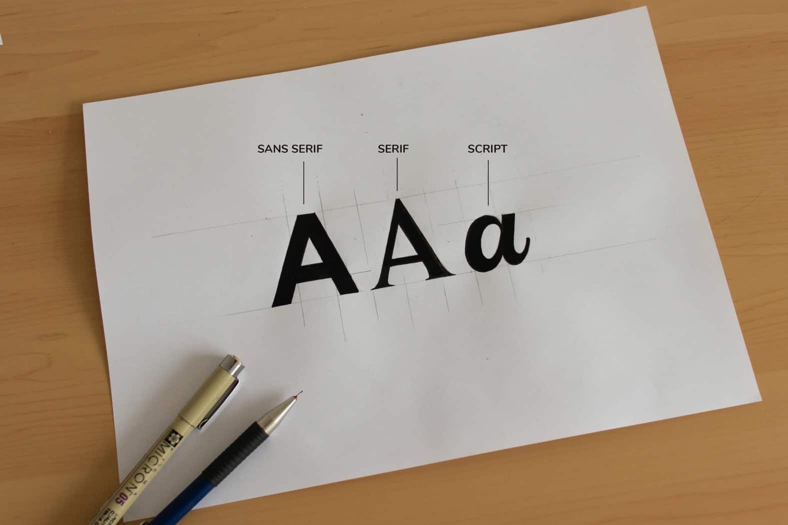
Let’s get to it!
Sans serif hand lettering style
This is the easiest and the best style to start with.
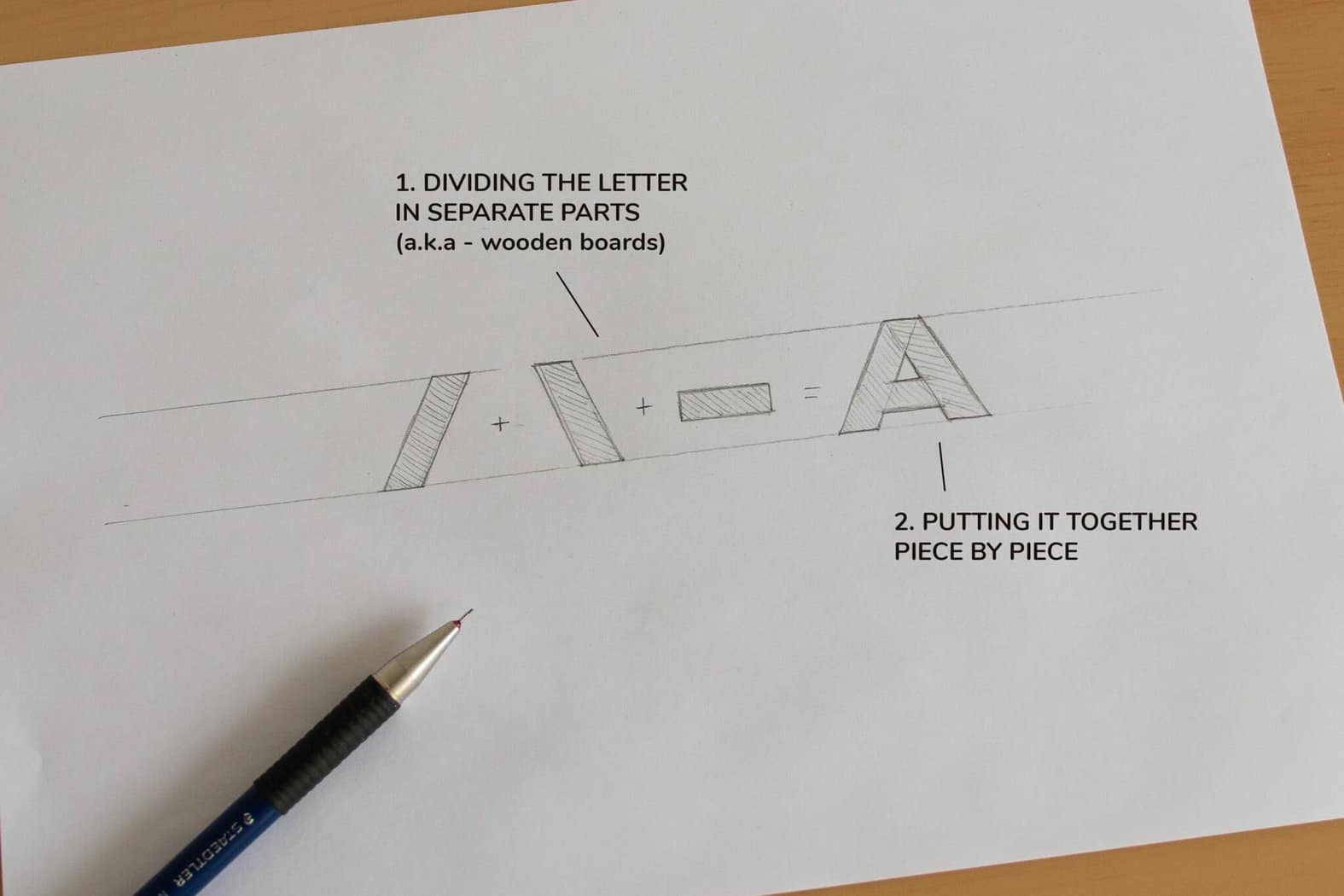
The proper way to practice hand lettering is to divide the letter into its individual shapes.
I call this – The wooden board technique.
Instead of trying to write the letter as a whole, we construct one shape at a time.
Kinda like stacking wood boards on each other – hence the name.
Here is an example of the letter A
Here are a few more examples –
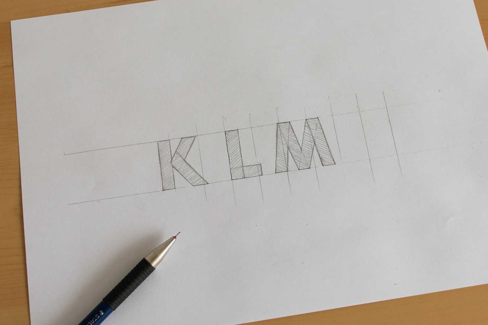
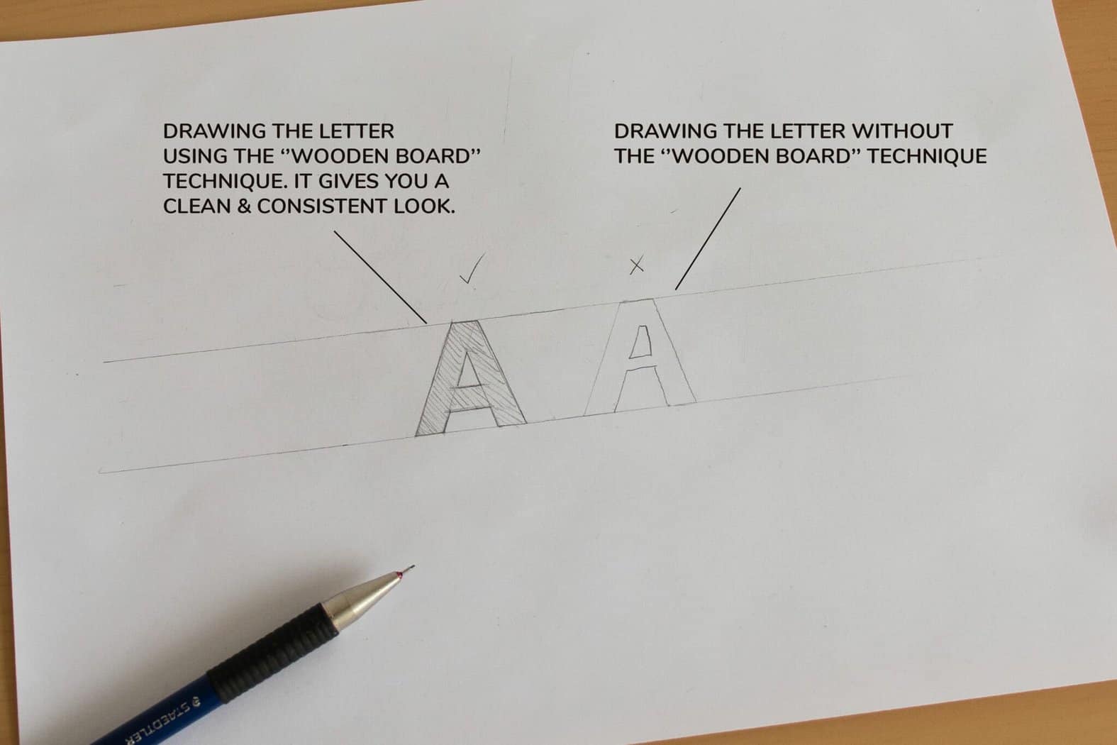
By using the wooden board technique, you will be able to maintain a high level of consistency in your letters.
And it also just makes so much more sense than trying to aim for the same thickness of shapes.
Below is an example of the wooden board technique vs. how most beginners try to draw letters –
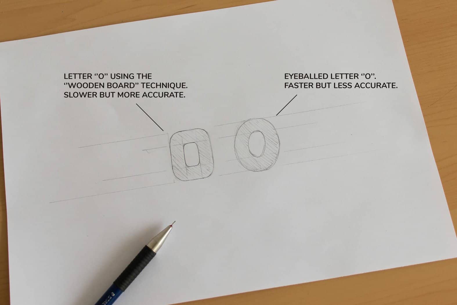
What about round letterforms?
Round shapes are indeed a bit trickier, but fear not!
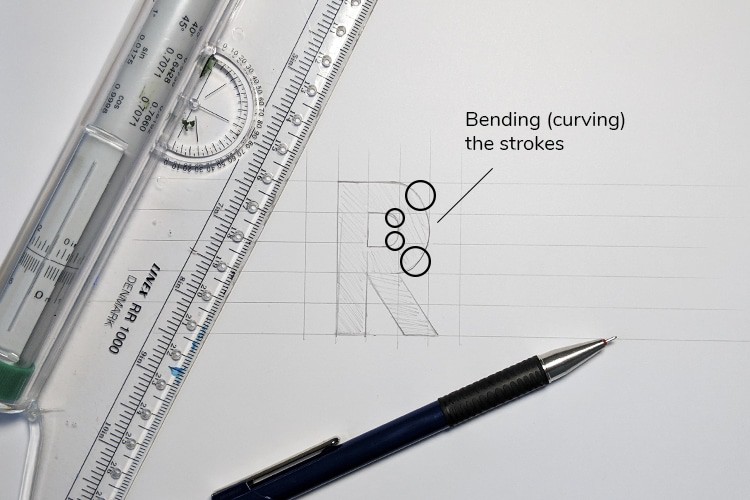
Sketch them lightly in square shapes, and then simply round up the corners to your liking.
Here is an example –
And here is one more example of drawing rounded letterforms using the ”wooden board” technique –
Start by tracing!
In the freebie section for this article, I included a sample sans serif alphabet (you will find it lower in the article).
All you need to do is print it out and trace it over.
You can do that either with tracing paper or a light tablet.
Quick tip – if you don’t have any tracing paper, baking paper works good as well!
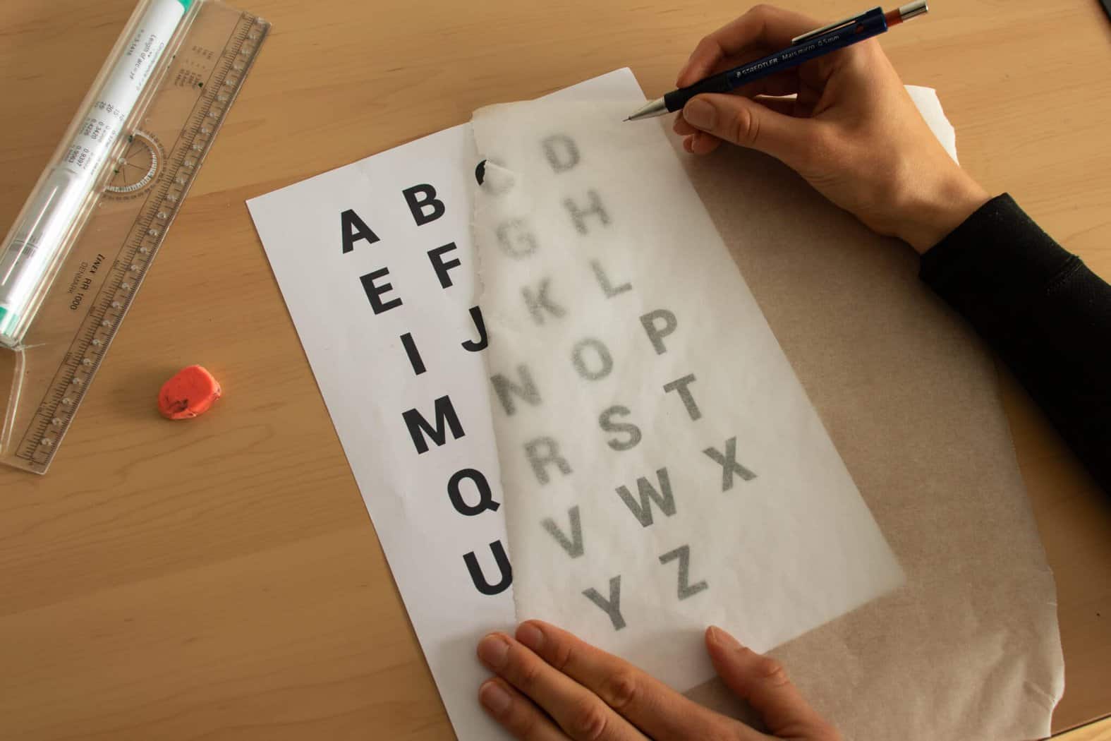
If you are a complete beginner with zero experience, I would highly recommend that you trace this alphabet at least 10 times.
By tracing (copying) this alphabet, you will start to understand how to construct letterforms correctly as well as all the small nuances that come with it.
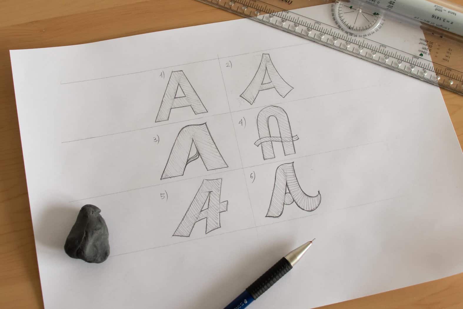
Once you become confident enough with the basic letterforms, you can use these core rules and start bending and tweaking the shapes of letters.
Here is an example –
Now we can proceed to our next lettering style, which is –
Serif hand lettering style
Serif letters are basically the same as sans serif with two key differences.
- They have serifs (duh) – small decorative elements at the endings
- They have a thick and thin dynamic (up thin, down thick)
So, how do you draw serif letters?
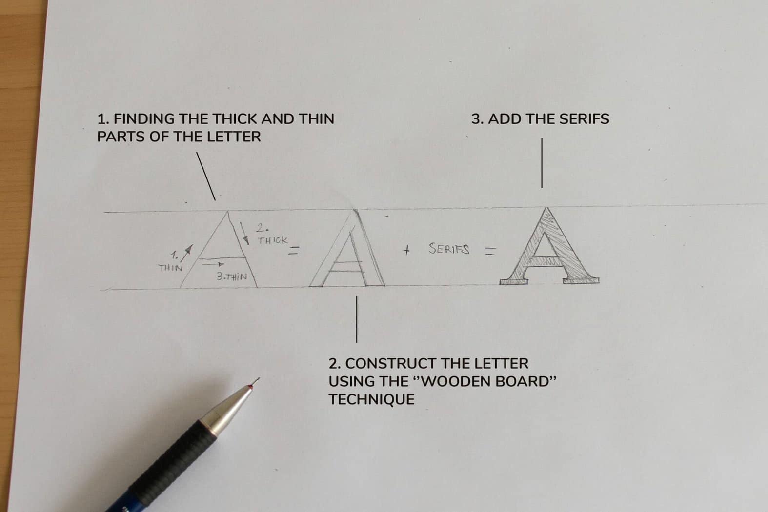
First of all, you need to know where to place the thick and thins.
The easiest way to know where is thick and where the thin is to follow this rule –
Upstrokes – thin
Downstrokes – thick
Just think about how you would typically write the letters.
If you are just starting out, I would recommend you keeping a reference alphabet while you are drawing the letters.
Believe me, it won’t take you long before you remember where the thick and thins should go.
The process of drawing a serif letter is very similar to the sans serif style.
- Construct the letter (with the thick & thin strokes)
- Add the serifs
- Connect the serifs smoothly with the stems.
Check out this example below –
To properly learn and understand serif lettering, we will follow the same process as we did with the sans serif style.
In the freebie section you will also find a reference alphabet for the serif style.
Grab some tracing (or baking) paper, and start practicing!
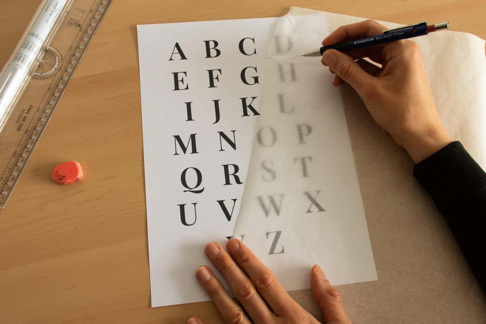
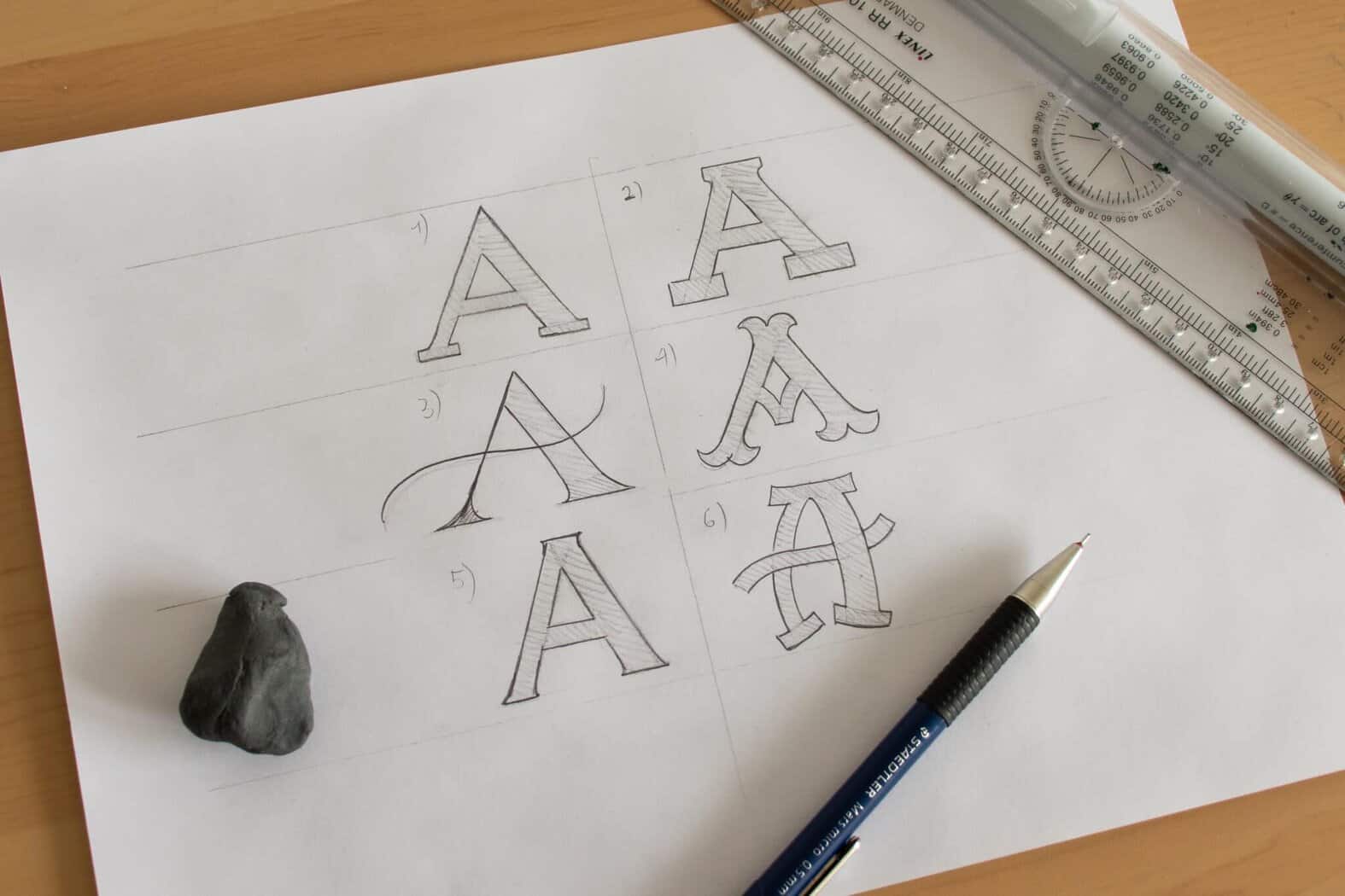
Once you’ve developed a solid foundation, you’ll be able to tweak the shapes of the letters to create many different styles.
Here is an example –
Script hand lettering style
Script lettering is definitely my favorite style of the three.
Beautiful and flowing, but also more challenging than the previous two lettering styles.
So, how do you draw the script lettering style?
Hopefully, the majority of you reading this tutorial had the luxury of learning cursive in elementary school.
Knowing cursive will make the learning process much easier since we will use it as a foundation.
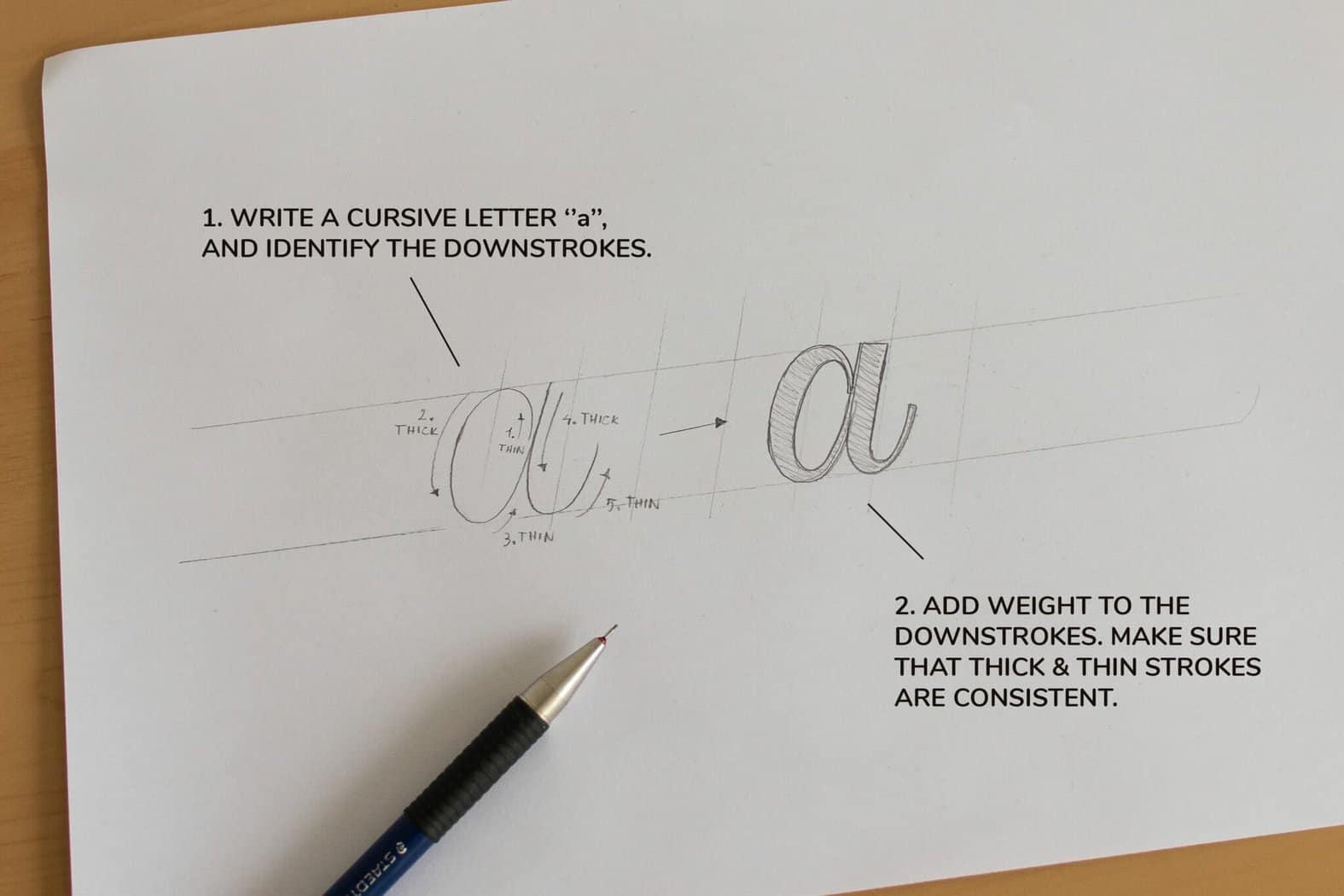
Similar to serif letters, the key to the script style lies in the thick and thin contrast.
Once again –
Upstrokes – thin
Downstrokes – thick
Check out the example below –
Now let’s do the whole alphabet!
Once again, tracing is the key.
As with the two previous styles, you’ll find a sample alphabet for the script lettering style as well.
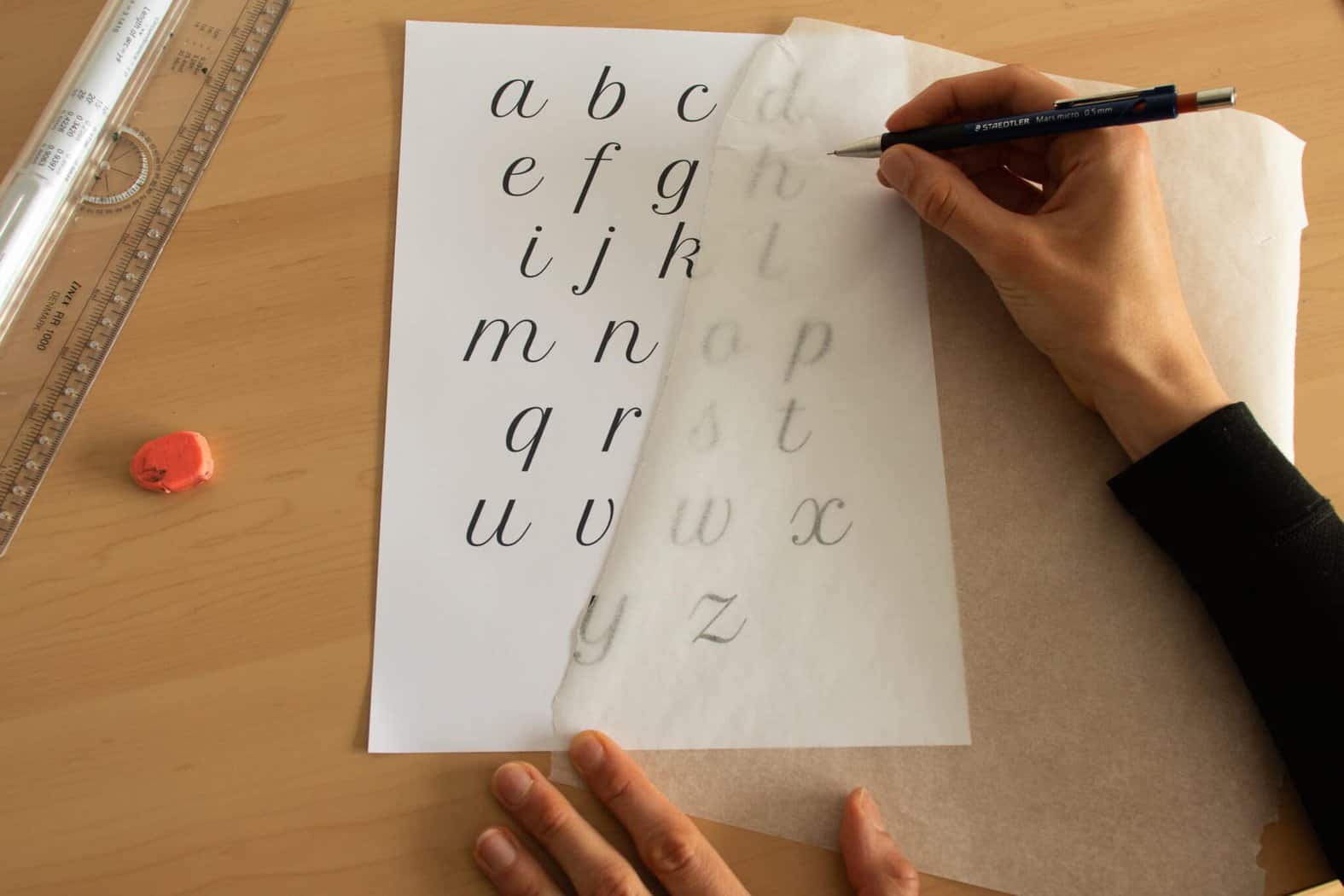
After you’ve developed a strong foundation for the basics, you’ll be able to start creating your own unique styles with confidence.
Here is a quick example –
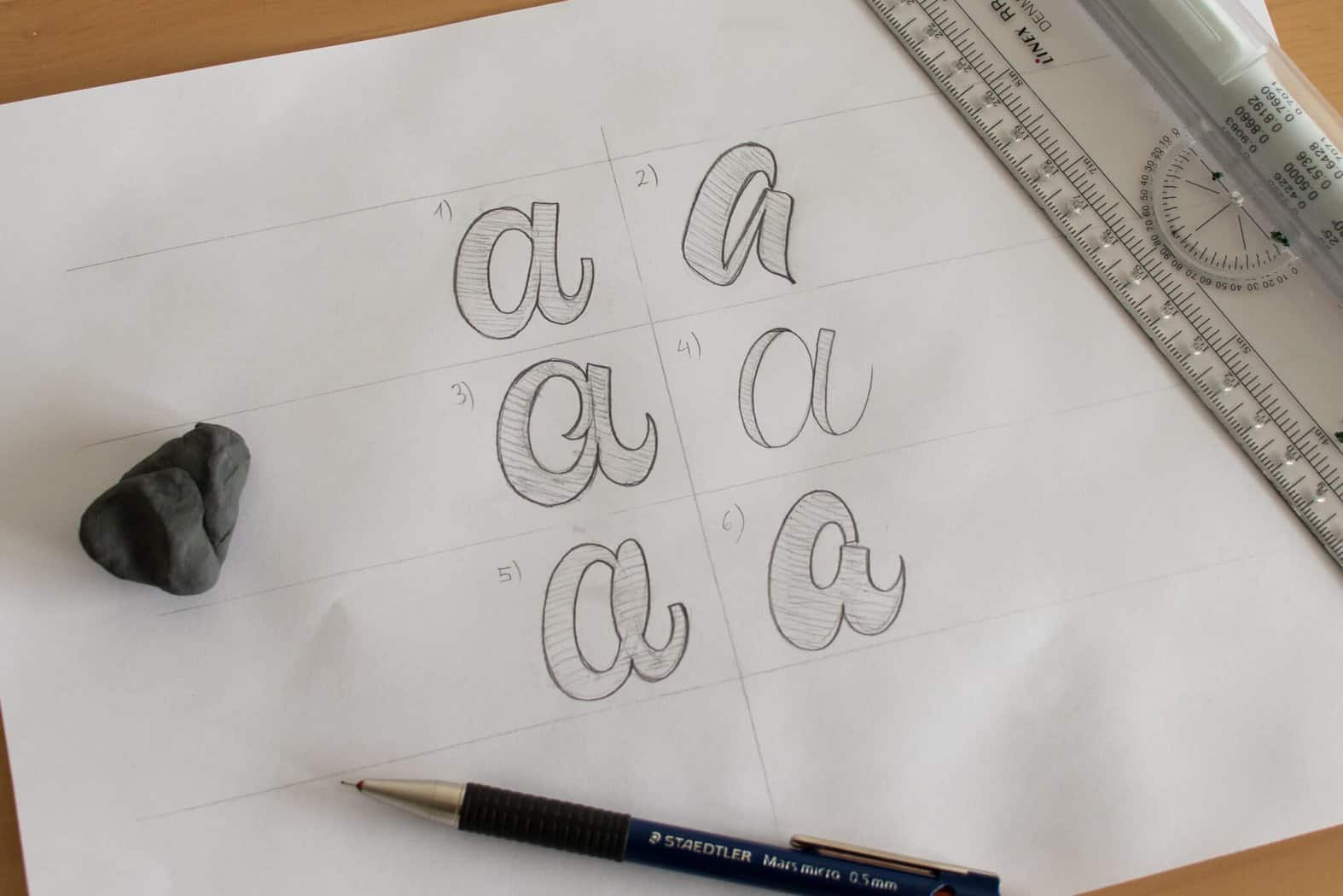
How to create a hand lettering piece – a 6 step process
As I mentioned earlier, it’s best to get started with short, single words and then gradually expand to more complicated designs.
Also – forget about details such as shadows, highlights, textures, flourishes, etc.
Right now, our focus is on practicing and learning the basic letterforms.
The idea for this section is to introduce you to a workflow that you can then use for any lettering projects you wish to create.
Without any further ado, let’s get started!
Step 1 – planning! What are you going to create?
Planning is the absolute foundation for any creative project.
You don’t just sit down and start to create the first thing that pops in your mind.
I said that we will practice single and shorter words for now.
I decided to hand letter the word – Style
And I also decided to do it in a script style – since it’s my favorite.
Step 2 – Gather inspiration.
Once, i’ve planned out what i want to create, it’s time to go online and gather some inspiration.
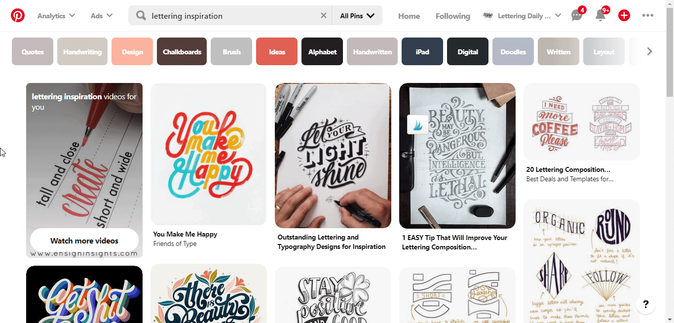
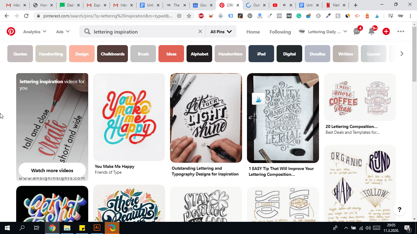
My best favorite place to gather inspiration is without a doubt – Pinterest.
We are not going to copy someone’s artwork, but instead trying to find a sense of direction for our project.
Look for 2-5 different styles that you like.
Going over 5 is a bit of an overkill, and it could actually achieve the opposite effect.
It would be good if you could make a moodboard out of your selection and use it as a point of reference while you sketch.
Which is in fact our next step.
Step 3 – thumbnail sketches
Thumbnail sketching is a super powerful technique for generating ideas.
The point here is to just let your ideas flow, instead of immediately going with the first one you get.
So don’t worry about making them all nice and tidy – you’ll do that once you pick one of them.
Believe me, you will be surprised to see how many dope ideas hide under the surface.
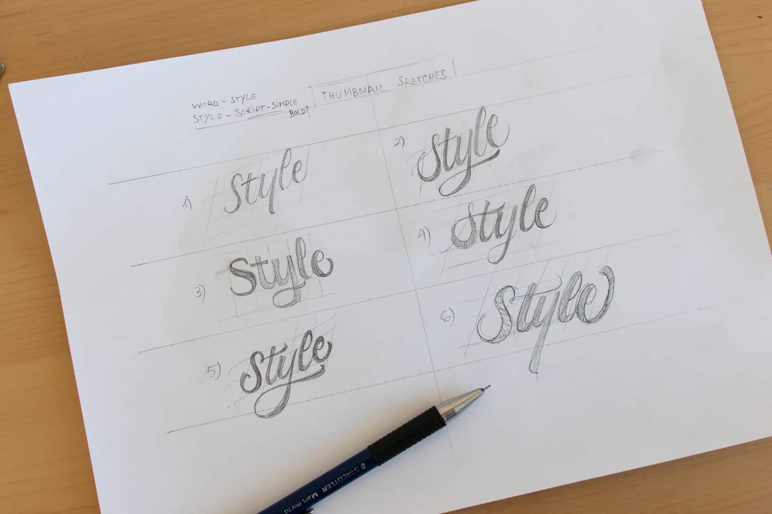
I would advise you to do a minimum of 3 thumbnail sketches before you pick one.
However, you could make as many as you want.
As you can see above, these are just quick rough sketches – just playing around to see what I can come up with.
Step 4 – Sketching time!
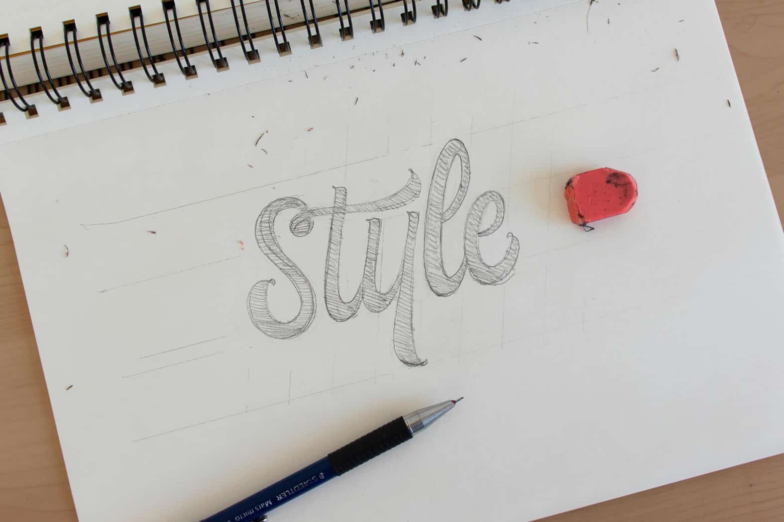
Once you’ve picked your favorite sketch, it’s time to create a bigger and more refined version of it.
First of all, we are going to draw our guidelines.
Remember what we talked about previously – guidelines will help us to keep up letters nice and consistent.
Do not, and I mean DO NOT skip this step.
Guidelines are essential, and both beginners and professionals use them.
It takes you a couple of seconds to draw a few lines, and it will make the whole process much easier.
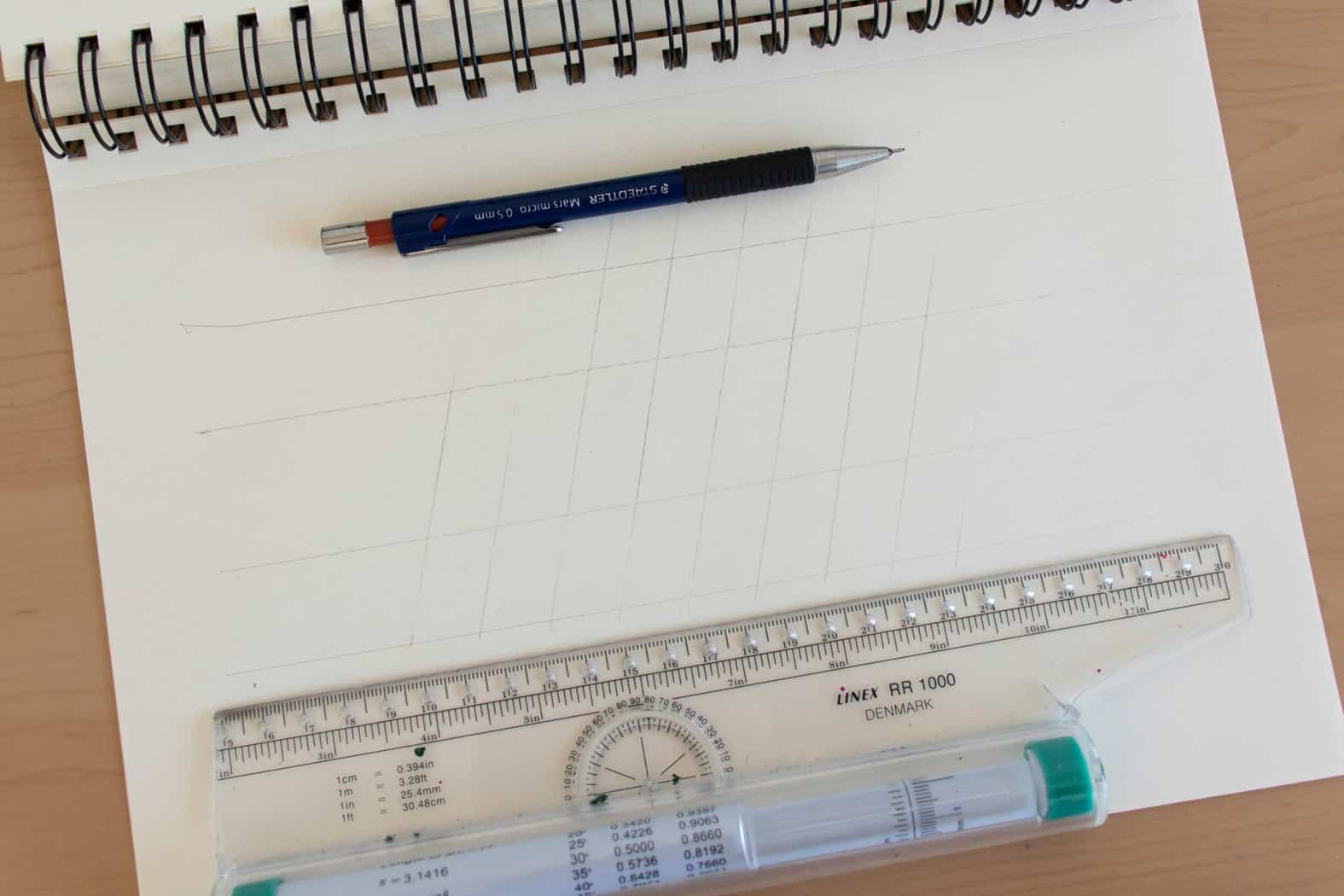
Take your time with the sketch.
This is not the same as a thumbnail sketch.
This one needs to be much cleaner, with well-defined lines.
While you’re sketching this, try to think about the two core rules we were talking about previously.
Are your letterforms consistent?
Are your letters spaced properly between each other?
If not, don’t be afraid to delete the pencil marks and fix things up.
This is precisely the reason we sketch – so we can fix and improve our work!
Another tip for sketching – keep your strokes light.
We need to delete our pencil marks later on, and it’s much easier to do that with light pencil marks.
Once your sketch is ready, we can move to the next step.
Step 5 – Inking the sketch!
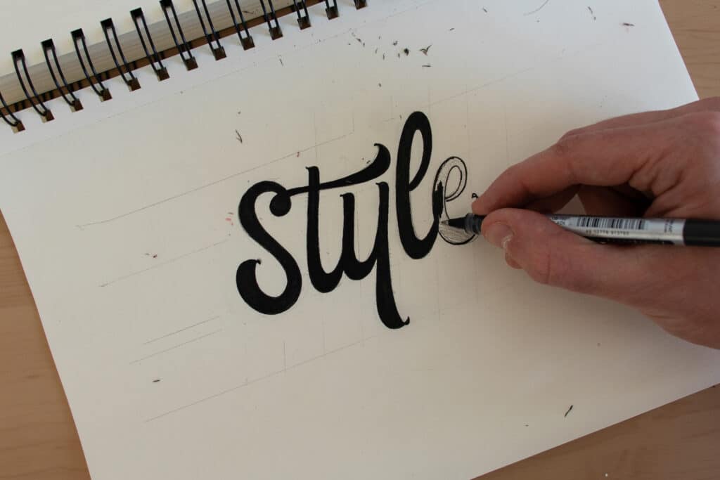
Grab your black fineliner and start outlining your letters.
Please keep in mind that outlining and inking your letters is no easy task.
It takes a lot of patience, focus, and consistent practice.
So don’t get discouraged if the end result doesn’t turn out as expected.
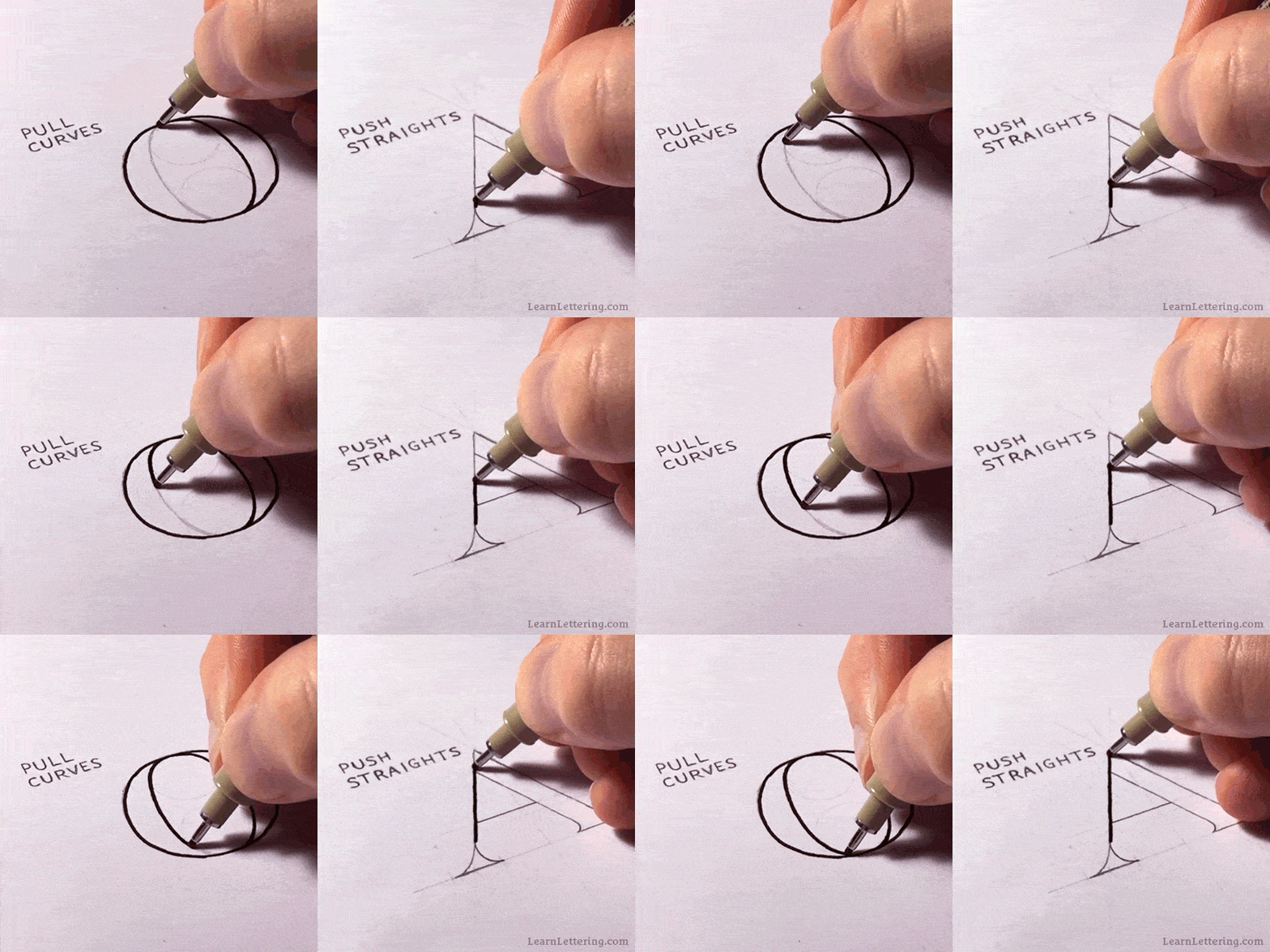
The general rule for inking is to push straights and pull curves.
Sean McCabe has this great gif image that demonstrates perfectly what I mean.
Just take your time and enjoy the process.
If you would like to learn and improve your inking skills even further, I wrote a whole separate article on how to do that.
Step 6 – Remove the pencil marks.
Before we finish our lettering process, we just need to do the final step, which is removing the pencil marks.
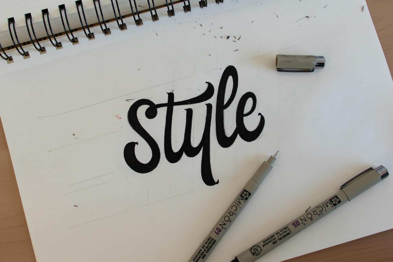
Make sure you leave the ink to dry off for at least half an hour.
Otherwise, the ink might smudge all over the place.
Again, it’s best if you use a light hand when you sketch because this makes the removing of the lines so much easier.
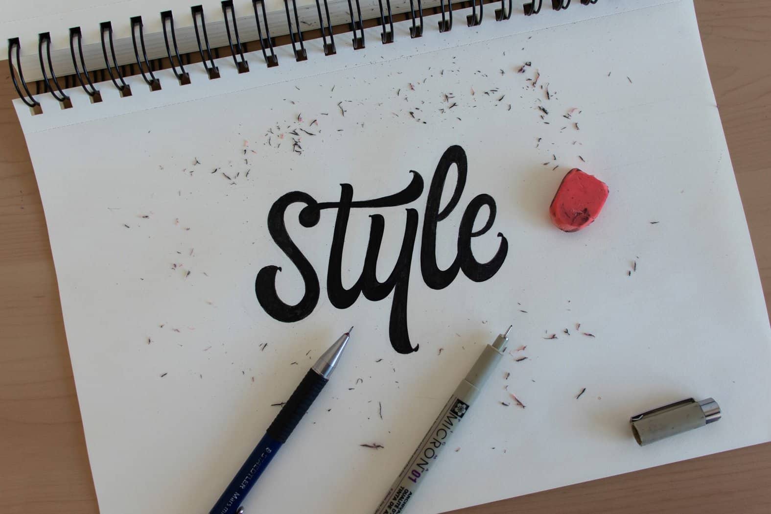
Et voila’!
This is it, folks!
If you managed to follow through the process, you’ve successfully created your first-hand lettering piece.
The 30-day lettering planner – a practical practice guide for beginners + FREE lettering alphabet worksheets

I created the 30-day lettering planner to guide you through your first days of hand lettering.
As i already mentioned it a couple of times so far, practice is very important, but the way you practice has a huge impact on your progress.
The 30-day lettering planner will guide you through exercises gradually.
From very basic tasks to more complex ones as you progressing.
So, how does the 30-day lettering planner work exactly?
The planner is divided into 4 sections – each for one week of the month.
Every day you will be introduced with a specific lettering exercise.
- Week 1 – is all about sans serif lettering
- Week 2 – is about serif lettering
- Week 3 – will focus on script lettering
- Week 4 – In the last week we are combining styles, learning basic layouts and simple effects (such as shading)

It would be great if you could complete one task per day as consistent practice will definitely give the best results.
However, if you miss a day or it takes you longer to complete a task – don’t worry!
That’s totally fine and just keep following the planner.
Along with the 30-day lettering planner you will also find the lettering alphabets for tracing –
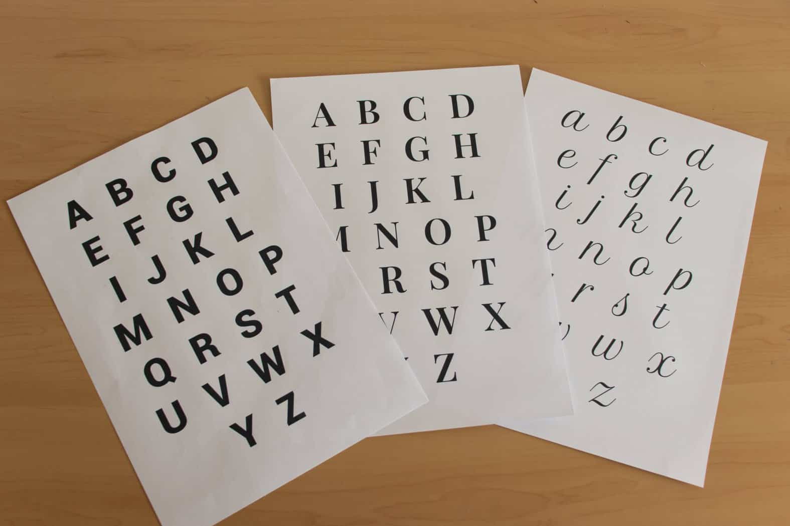
You can find all these freebies inside the Lettering Crate.
Simply drop your email below, follow the instructions and you will get instant access to it.

Stay updated with my tutorials and get instant access to the Lettering Crate –
A growing library of free lettering & calligraphy resources that includes –
Additional resources
What we just covered are the fundamental steps you need to get started.
Start small, lay down a solid foundation, and any new skill/technique will be so much easier to apply.
In this section, I would like to mention some additional resources that will help you along your lettering journey.
First of all, we have hand lettering books!
Online resources can provide a great starting point.
However, books really dive deep into specifics.
They manage to shed light in areas you never even knew existed before.
If you really want to step up your skills, books are the way to go!
In this article, I review some of the best hand lettering books for beginners.
Online courses (Skillshare)
If it wasn’t for Skillshare, you probably wouldn’t be reading this article right now.
Most likely, this entire website wouldn’t even exist.
With the help of Skillshare, I’ve managed to learn a whole variety of different skills that allow me to run this whole website, content creation and more.
For those who still haven’t head for Skillshare – it’s basically an online learning platform that hosts more than 20 + thousand online classes.
Classes that range from hand lettering & calligraphy all the way to – photography, business, design, writing, marketing – the list goes on and on.
These are classes that are taught by some of the top names in the industry.
The best part of all is that you can start for free!
As a Skillshare ambassador, I can offer a 2-month free premium membership.
If you change your mind at any point in these two months, you can cancel your subscription, and you won’t get charged a single dime.
If you sign up using my link I’ll be getting a small commission, meaning that you will also be supporting the whole Lettering Daily initiative 🙂
I wrote a separate article where I recommend my favorite lettering and calligraphy classes from Skillshare.
Check it out here –
Finally, you can also check out the other articles and tutorials on my website.
Just hit this link, and it will take you to all posts within the hand lettering category.
Wrapping it up
There you have it, folks, the beginners guide on how to get started with hand lettering.
Start slow, don’t rush, and gradually expand your skills as you go.
If you manage to do that, I guarantee that you will notice more progress in less time!
The world of hand lettering is so vast that the more you learn about it, the more you realize how much you still don’t know.
I know that this may sound like something negative, but I think it’s actually what makes lettering so fun and exciting!
Join our official Facebook group!
Are you looking for constructive feedback on your work?
A great way to improve in any sort of skill is having someone more experienced examining your work.
If you are interested in getting constructive feedback, then you should definitely check out our official Facebook group!
The Facebook group is a place where you can –
- Get feedback
- Ask questions
- Share your work
- Mingle with fellow artists
- And much more.
Our little (but growing) forum is a place for everyone – no matter your skill level!
Thank you for stopping by and until the next time,
Stay AWESOME!
Pin me!
How To Create A Hand Lettering Piece in 6 Easy Steps
Learn how to create a hand lettering piece by following these 6 easy steps.
Materials
Instructions
- Planning the project - before we start creating the piece, it's important to plan out the project so we know what we are working on.
- Gathering inspiration - head over to Pinterest (or Instagram) and look for some inspiration. We are trying to determine what sort of style we want our lettering piece to have. Anywhere between 2-5 images will be enough.
- Thumbnail sketches - Using the inspiration we gathered in the previous step, we are going to create a couple of thumbnail sketches. These are quick rough sketches just to get the creative juices flowing. I would advise a minimum of 3 thumbnail sketches but you can create as many as you wish. This step will help us choose the right style for our lettering piece.
- Sketching time! - Once you picked your favorite thumbnail sketch, it's time to create the final sketch. This one will be more detailed and refined. First of all we have to lay down the guidelines to keep our letterforms consistent -
Once we have the guidelines all set up, we can start sketching our letters. Try to keep a light hand as we will remove these pencil marks at the end of the process. - Inking the sketched piece - Now it's time to grab our fineliners and ink our sketched lettering piece. Don't rush this step because we can't really correct any mistakes like we could with a pencil.
- Remove the pencil marks - Once you are finished with carefully inking your letters, it's time to remove the pencil marks. Make sure to let the ink dry otherwise you will be left with a bunch of ink smudges all over it.
And that's the whole process behind creating a hand lettering piece! 🙂
Recommended Products
As an Amazon Associate and member of other affiliate programs, I earn from qualifying purchases.
About the author

Hey, I’m Max Juric, and I’m deeply passionate about calligraphy and hand lettering.
I’ve spent years honing my skills in the art of lettering, working with hundreds of clients from all over the world on design projects such as logotypes, branding, custom lettering, murals, and more.
But my journey doesn’t end there. I’ve also dedicated myself to sharing my knowledge and expertise with others, creating a wealth of resources including tutorials, articles, and podcasts.
It’s been incredibly rewarding to see thousands of people engaging with my content each month. Knowing that I’m helping fellow enthusiasts grow and develop their skills makes me really happy.
Welcome to Lettering Daily, your hub for all things lettering and calligraphy. Whether you’re a seasoned pro or just starting out, I’m here to inspire and guide you on your lettering journey. Stick around, and let’s explore the world of letters together!



Hi, just joined to group.
Yesterday I was at a calligraphy workshop and I still can’t decide whether I am for calligraphy or lettering. Can I do both? 🙂
It is an absolutely great article for beginners. Thanks a lot for sharing your skills for free. It is so helpful and greatly explained. I just print workshits and start to practice, and I can’t wait to start my 30-day planner.
Hey Ana, absolutely! I do both 🙂 They really complement each other and if you like both i would definitely encourage you to do them 🙂
Oh my god…this article is so amazing…it has explained hand lettering beautifully and I can say it is a blessing for an amateur like me…it has cleared all the doubts that I had relating to hand lettering ..I m going to read other related articles..for sure…all in all l loved it..thank u…😊😊
Thank you! Glad to hear that, if you need any help you can always reach out 🙂
Awesome advice and attention to detail! Thanks so much for the website, have been lettering for years but have learnt much new cool stuff! Like the rolling ruler, what a game changer 🙂
Hey Philippa! Thank you for the awesome comment. I am glad you liked the article 🙂
Hey man you made my day..
I was in search for tutorial like, it was feel like I lost In this search because no one gives this much detail and end up in “Anatomy of type”
But this website is so inspiring, thanks again man
Thank you bro! Im glad you liked it! To be honest, while writing up this post, I felt like I was going too much into detail, and that i would just end up confusing people. At the same time, it felt like something that is essential to the learning process. Thank you for the feedback! 🙂
This is such a fabulous site. Thank you so much. Inspiring!
Thank you, Giselle! 🙂
This website is the best resource for lettering that I have come across. I stumbled upon it when I was trying to get some copperplate calligraphy worksheets. This has opened up a whole new world for me!
It means so much, thank you! I’m just getting started to be honest 😀 Many more tutorials and articles are to be written 🙂
Thank you for making this website ,its excellent ! and I really appreciate your efforts,its really helpful for beginners and I love that kerning game . I have seen the lettering crate and I had a question – what’s a ‘ regular style ‘ hand lettering, its given in the 30 day lettering plan, I didn’t understand . thank you once again ?
Hey, thanks again 😀 Check out the previous response that I gave you 🙂
Hi! This is a pretty awesome post and I’m really looking forward to trying it out. Could you please explain how exactly we’re supposed to draw the guidelines and determine the angles?
Thank you, Emilie! You are free to determine both the size and angle of your guidelines. Let’s say you wanted an upright style of lettering, in that case draw only vertical lines. If you want a tiny slant to your letters then just add a bit of angle to the lines. You can also play with the size of the ascenders and descenders. It all depends on what you want to create and the placement of the letters. There are no strict rules (like with certain traditional calligraphy scripts). The important is that these lines are all consistent since their goal is to keep your letters consistent. Hope this helps, if not, be sure to join the Facebook group I run and I can have a better look at your work 🙂
Hope this helps!
I’m a total beginner and would love to learn the basics. Your information here is to the point and very helpful. Thanks!
Hey Cindy, thank you for the kind comment! 🙂 Glad to hear that.
Looking for a new hobby/skill to try during quarantine. Came across this website and I must say it is really helpful, informative and truly inspiring! Thank you for the sharing your knowledge and appreciate the gesture of the freebies. I am excited to start and have already signed up for the Lettering Crate, however I have yet to receive a confirmation email…
Thank you, Rosalyn! I really appreciate the kind words. Also thank you for reaching out via email, I am glad we were able to resolve the issue quickly! 🙂
This website is truly inspiring and helpful for does who are beginners . I really appreciate your efforts and your hard work . thank you for investing your precious time for us . I saw the 30 day planner and I had a small question : what’s regular style of hand lettering ? Thank you once again ????
Hey Anshika, thank you for the kind comment! When I mention the ”regular” style I mean the most basic form of that letter. Without any details, decorations, distortions, etc. I know it may seem boring, but as I mention in the article, it will help you form a very solid foundation for much faster skill development.
Wow! I’ve followed you on instagram for a long time but I never knew there was a website as nice as this! Thank you this was an amazing read.
I’ve been hobby-lettering every now and then but I truly wanna take it to the next level, do it right.
There is one very VERY consistent issue I always run in when sketching for my letters….
The Ratios… they drive me crazy honestly…. I just don’t know how tall should the ascender line be compared to the x line…. If we say the x line is for example 5 cms should the ascender and descender lines be a fixed ratio derived from that 5? I never got around to adjusting it….
And should those ratios and the sizes of your horizontal grids be related to your letter weights? For example if you’re doing it in a 2 cm x heights you can’t go around using 3 cm thick strokes?
Do these things have rules or am I overthinking it and should just eyeball it?
Sorry for writing this much…. And thank you again for this website ^^
Hey Assem,
Thank you for the kind words and it’s great to hear you want to get into lettering more.
Let me answer to your questions one by one –
1. About the ratios – you are free to determine the heights, angles and proportions of your letters. There isn’t a set rule around this. In fact, that’s what’s so awesome about lettering! You could have thick, bold and low letters or tall thin letters. Short ascenders and descenders or long ones. Straight or slanted – you choose. As i recommend in the article – move gradually! Start by learning the basic form and then with time it will be so much easier to expand towards more complex designs.
2. Should the size ratio correspond to the grid size? Not necessarily – as i mentioned about you are free to make that choice. However, if you decide to create a certain thickness of your strokes, then all of the letters should be consistent. That goes for proportions, angles, spacing, etc.
3. Should i just eyeball it? Definitely not. Use guidelines, guidelines are your friend and they will help you out in the process! No matter if you are a beginner or super experienced, guidelines are always helpful. Determine the sizes and proportions in advance and then make sure all letters follow the same elements.
The best thing now would be that you join our Facebook group and you share some of your work. This way I can give you direct constructive feedback to your work.
Hope this helps!
Cheers man! 🙂
Thank you for this ^^
I already found the facebook group and I can already tell this will be very constructive… Very talented community! <3
Thank you so much for the kind words, Assem! I am really happy you are finding this community to be valuable. If you need any help or if you have any questions, don’t hesitate to shoot 🙂 Always happy to help!
Hi!! from Thailand. I’ve been looking for things to do during quarantine and I found your articles! I’m a beginner and not good at English but somehow I understand all the things that you wrote. I’m really do interesting in calligraphy. I know it’s a bit too late but is it possible to download the 30 day planner too? Thank you so much.
take care. stay healthy 🙂
Hey Nont, the 30-day lettering planner is located in the Lettering Crate and it will stay there all the time. To access it, just sign up for the newsletter and you will gain instant access to it 🙂
Cheers!
I am intersting improve your hand writing
Welcome aboard 😀
Hey! Seems my verification email isn’t comming at all ? help
Hey Liza, sorry to hear that. Can you shoot me an email so I can have a look at it?
Thanks!
A-mazing, and really the ultimate hand lettering guide! So much value here – thank you for sharing your knowledge! <3
Thank you! <3
Hi! You’re site is exactly what I’m looking for to get me started on calligraphy and hand lettering. I’ve actually been gathering inspirations from the net, and copying them, but I would really love to learn how to create my own, not just copy.
I already signed for the Lettering Crate, and received an email for confirmation. But when I click the button, I am receiving an error page. Can you please help me?
Thank you!
Hey Felicity,
Thank you for the kind words and please accept my apologies for the late response here. Have you managed to fix the issue? Can you shoot me an email with your email address that you used to sign up? I will fix it right away for you 🙂
Cheers!
hi dear…
thanks a lot for this amazing information. I m a beginner and this information gives me so much support.
But I didn’t get from where I can have the files to download. please can I
have these?
I love your work.
my email is jiyapice15@hotmail.com
Thank you for the kind words! Please send me an email and I will be happy to sort this out 🙂
Hi there! I have signed up but I haven’t received the 30 day planner. I already checked my spam folder and it isn’t there. A little help please? Thank you!
Hey Emelyn, sorry to hear that. Can you shoot me an email at – letteringdaily@gmail.com
I would be happy to help you with this.
I need never did learn to write properly, and your pages look like the right place to fix this up. I hope you’ll forgive my mistakes.
Hey Valerie, thank you for the kind comment!
Nice piece of information would definitely join the 30 day planner
Thank you, Foram! If you need any help or if you have any question, don’t hesitate to ask 🙂
hi lettering daily Isent an email in order to get the link , And I’ve got it already But when you enter the password it does not work.
I hope get it , thanks.
Please send me an email in regards to this issue.
I don’t receive the email to confirm .
Please send me an email in regards to this issue.
I would like a copy of the 30 day planner if possible. I’m looking forward to making progress with my hand lettering skills 🙂
I can’t believe it! I’ve been trying to get into hand lettering for years and have simply given up for lack of explanation! This site is like the Holy Graal! Thank you sooooooooooooooo much for creating it and share it!
Hahaha! Thank you so much Mariana! Your comment brought me a lot of joy 🙂 I am so happy hearing that you found the content useful.
So glad I came across this article. So helpful and brilliantly explained. Definitely trying the 30-day planner to get started in lettering 🙂
Thank you!
I am truly happy to hear that! If you ever need help or feedback, feel free to join our official Facebook group! 🙂
Hi! I was actually planning to purchase the rolling ruler. However, I really don’t know which one works better and that will last longer. I saw some good reviews at Amazon about the MyLifeUnit rolling ruler likewise to Alvin’s. But it seems that there were more negative reviews too on how they perform. Like the roller isn’t functioning well, the material is cheap, too expensive considering its function, so hard to manipulate/control, etc. I am confused on what to choose though. Can you suggest as your personal preference which one would you choose? thanks!
Hey Melissa, sorry for replying so late to your comment. I use a rolling ruler from Amazon but considering that I’m based in Europe it’s a different brand. I honestly couldn’t be more happy with it! It works flawlessly and it saves me a ton of time for both lettering and calligraphy – definitely a most used tool along with my pencil and pens. Perhaps you can try to find one in your local art & craft shop and test it on the spot? Let me know if there is anything else I can help you with! 🙂
Hi , I have been doing calligraphy for 2 years and just moved on to hand lettering thanks for all these tips keep up the good work???.
Hey Jay, happy to hear that you are expanding your knowledge it will definitely help you on both ends! 🙂
Can I have a link for downloading the 30 day planner? I dropped my email and confirm with password on the website but can’t find the 30 day planner in all the tutorials.
Hello Emily, sorry to hear you are struggling with finding the planner. All of our freebies are located in our resource library which also known as The Lettering Vault. Once you sign up with your email and you confirm your registration, you will receive an automatic welcome email that contains a link and a password to that resource library. On that page, you will be able to find the 30 day planner along with ALL of the other freebies. In case you are not able to find this email, be sure to check your spam folder – sometimes they end up over there. If you are not able to find this email, please send us an email and i will personally make sure to give you a copy of the 30 day planner. 🙂
I can’t wait to start my 30 day planner. This particular blog not only boosted my confidence but excited me as well. It’s an absolute guide for beginners like me. Thank you !!
Hey Julee, this means so much to me! I’m happy to hear that you feel confident about your journey, be sure to find our Facebook group so we can provide you with constructive feedback and help you grow even faster! 🙂
Love this article & blog. It’s an amazing world we live in with blogs and so much information we can find, from blogs and *free* tutorials like this! 😉 Thanks for sharing your skills.
Thank you for the kind words! Im very glad you enjoyed this tutorial! Cheers 🙂
Thank you for the article,But I hope get the link.You have already sent the link but when I enter the password it does not work!I hope to get it as soon as possible.
Hi, just joined and I am an absolute beginner. Can I dowload the Ultimate Hand Lettering Guide? I can’t see a pdf link. I will certainly use your club. After searching the net for hours, you seem to be the best!!! I’ll soon start feebly attempting my Calligraphy efforts.
Regards to all
Mike
Hey Mike! thank you so much for the kind words! You can definitely download it 🙂
All you need to do is drop your email, and we will send you an invitation to our exclusive content area where you can find the 30 day planner along with our other free downloadable content.
Loved the article. It’s simple, concise and up to the point. Learnt a lot.
Thank you Deepak! Really appreciate your kind words 🙂