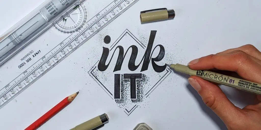
Inking and outlining your hand lettering sketches is probably one of the hardest thing to master.
In this article we are sharing 5 awesome tips that you can start implementing even today!
If you want to draw smooth curves, straight lines and sharp edges, these tips will definitely help you with that.
Before we jump right into it, let’s have a quick overview of what we are going to cover in this article –
- The importance of inking + the ideal mindset
- 5 EASY tips that you can start implementing right away
- A few bonus tips!
- Wrapping it up
Grab your tools and let’s begin!
The importance of outlining and inking + the ideal mindset
Outlining and inking your sketches is one of the final steps in the process of hand lettering.
It’s the moment when you bring your sketch to life, and honestly, it’s quite difficult to do it smoothly with no mistakes – sometimes even frustrating!
This is a very delicate step that require both focus and patience, and it can make a huge difference to the final outcome.
It’s understandable that not every single line, curve, edge or detail can be perfect.
However, even the untrained eye can notice when something is done in a hurry compared to something that was planned and done with patience.

So, why is it important to properly ink and outline your letters?
In my opinion there are two main perspective to consider –
- It makes your work look better and more appealing (obviously)
- As human beings we always seek to improve the way we do things, and i believe that we should always strive towards doing things better. I know that this might sound cliche for some people, but if you quickly get satisfied with your efforts, you growth will definitely be slower.

This is exactly why these following tips will be helpful when you start inking and outlining your next lettering piece!
Before we jump right on to the tips, i just wanted to point out another very important thing – and that is…
The ideal mindset.
As many other things in life, outlining your letters smoothly and precisely is a skill, and skills require time and lots of practice before we become good at it.
Think of it like – playing the guitar, learning a new language, riding a bicycle, dancing etc.
These things take time, so if you are just starting out with lettering and with outlining your sketches, don’t get discouraged if it looks like you were blindfolded while you were doing it.
By practicing consistently i mean – every single day for AT LEAST 15-20 minutes (the more the better)!
Without any further delays, let’s jump on the tips!
Tip 1 – Warming up!
Have you ever heard of the term muscle memory?
Some of you may be familiar with this term but for those who are not, here is a quick definition of what muscle memory is –
Muscle memory is a form of procedural memory that involves consolidating a specific motor task into memory through repetition, which has been used synonymously with motor learning. When a movement is repeated over time, a long-term muscle memory is created for that task, eventually allowing it to be performed without conscious effort.
Source – wikipedia.com
Basically this is the reason why practice is so important and it’s being constantly preached all around you.
Warming up is an essential step because it takes a bit of time and movement before that built up muscle memory kicks in.
The same thing goes when you practice calligraphy, you need to warm up your hand and arm muscles before your strokes reach their full (temporary) potential.
ACTION STEP
What should you do in order to warm up?
It’s simple.
Instead of jumping right on the letters, warm up by outlining some simple geometrical shapes such as – a square, circle, triangle or a combination of them (after all, letters are a combination of geometrical shapes)
Here is an example –

You don’t need to spend too much time on this, even just 5 minutes outlining a few basic shapes will definitely warm your hand and prepare you for your lettering pieces.
Tip 2 – Push and pull
There are certain more natural hand movements that can help us get straighter and smoother lines.
Technically speaking, these two hand movements will cover more than 90% of all the work you will ever do in hand lettering – exactly why this tip is one of my favorites on this list!
The two key strokes here are – pulling down the curves and pushing up your straight lines.
Check out this image below –

The reason you want to push down your curves is because the hand follows a natural motion of the wrist.
As for the straight lines, they should be pushed forward.
However, a key concept to remember when it comes to straight lines is, that the movement comes from the arm (the forearm) and not the wrist!
The wrist should be completely locked!
Imagine as if your hand was in an arm casket and you are simply unable to rotate your wrist – that’s the motion you are looking for here.
Another important thing to mention is – go slow!
I can’t stress this enough, really…
Way too many people (mostly beginners) tend to rush in this process which is probably the main reason why the lines look all funky and wobbly.

You are not racing with anyone here, and there is no need to finish a hand lettering piece in under an hour.
In order to master the art of inking your letters precisely, you need to learn how to do this process with patience.
ACTION STEP
1. Try to write a dozen of straight lines using a upward motion while keeping your wrist locked – remember – imagine your arm is in a casket!
2. Draw some oval shapes by pulling your strokes down and going slow. You can either trace some pencil sketched objects or simply do curves straight away.
For very beginners these 2 motions may feel weird and maybe even unnatural.
Don’t worry,
It’s completely normal and it will take a bit of time to get used to them.

Tip 3 – Twist the paper
You will notice that certain lines (especially horizontal ones) are quite difficult to be done smoothly.
As we just mentioned, you should pull curves and push straights, however some letters, such as the S have their curves in different positions.
A simple solution to this problem is to twist the paper! (duh)
It’s better to rotate a piece of paper than trying to position your arm in a unnatural position.
Basically by rotating the paper you can adjust every line to a pull curve and push straight motion.
ACTION STEP
Create a sketch of a word that contains both straights and curves – i took the letter R as an example.
As you start to ink it, rotate the piece of paper in a way that you pull all of the curves, and push all of the straights.
Ink the whole thing with just these two motions.

Tip 4 – Keep in mind the size of your pen!
The smaller the tip of the pen is, the more precise details you can achieve.
Some people prefer to work from the inside towards the outline, however, i think it’s better to work the other way around – outlining and then filling.
If you start tracing your sketch with a 1.0 mm thick fineliner (that’s quite big btw.) you have a higher chance of screwing the whole thing up.
In case you miss a line, your letter will already be thicker than the other, that means that now you need to accommodate the other elements towards your mistake – and that’s only one!

A better way of doing this is to start outlining with something significantly smaller, my choice is 0,3 or even 0,1 mm.
Doing it this way even if i make a mistake it won’t be so noticeable as with the 1.0 mm.
Once you outlined the letter with a fine tip, you can use the larger one to fill the space – because it’s pointless and it takes more time doing it with a smaller tip.
ACTION STEP
Start outlining a shape or a letter with a smaller tip and fill it with a larger sized tip.
Once that’s done you can go back to the smaller tip and use it to fix some (if any) details of the shape/letter.
Tip 5 – Don’t be afraid to use the ruler
This tip is very obvious, if you are working on a bigger piece with longer and straight lines, don’t be afraid to help yourself out with a ruler.
Several months ago, i suggested to one of our group members to help herself out with a ruler when inking long, straight lines.
Her response was – ‘’but if i use a ruler, it feels like I’m cheating’’
I could understand her point of view, and why she might think that but the ruler is just a tool that assists with straight lines, not a magical tool that will do the work for you.
ACTION STEP
Sketch out a word with only (or mostly) straight lines – without curves.
For this example, I will draw the word – THE
Use the ruler to outline the whole thing – remember to start with a smaller sized pen and fill it in with a larger one.
This is just for practice, you don’t need to use the ruler ALL the time.
Start off by drawing all the vertical lines, like this –

Now flip the ruler and finish the horizontal lines like this –

A few bonus tips
1. Watch out for alcohol based ink markers – they bleed through paper!
Be sure to test your pens on a separate piece of paper if you are not sure.
Popular markers like that are – Sharpies, Copics, Winsor & Newton etc. They are great markers, but you need bleedproof paper for them.
2. Avoid high textured paper – paper tooth or also known as the texture of the paper, can sometimes be problematic for precise outlining.
I’m not saying that it’s impossible, but as a beginner it’s maybe better to stick with a smoother type of paper.
3. Fix it once it’s done – this one is important! Start fixing the letters only once you’ve outlined and inked the whole word.
Once you have it done, it will be much easier for your eye to spot where its needed to thicken certain lines.
Wrapping things up
That’s about it folks, hopefully this handful of tips will help you on your future lettering projects.
Keep in mind that precise inking and control over your strokes is just a skill like many others that is based on time and consistent practice!
You can definitely do this!!
If you dedicate yourself to this you will improve, just practice consistently and most importantly remember to –
ENJOY THE PROCESS!
Is there an area of lettering/calligraphy that you are struggling with?
Are you maybe looking for some honest constructive feedback?
Do you have a specific lettering/calligraphy questions but you are unable to find the answer online? Do you feel like you are stuck in the same place?
We have an official Facebook group where our main goal is to create a fun and enjoyable learning experience for lettering and calligraphy artists – no matter the skill level.
It’s a place where you can share your work, get feedback, ask questions, network with fellow artists and much more!
Until the next time,
Stay AWESOME!

Stay updated with my tutorials and get instant access to the Lettering Crate –
A growing library of free lettering & calligraphy resources that includes –
Pin me!
About the author

Hey, I’m Max. I’ve been drawing and messing around with letters since 2011. I don’t have a formal art degree—my background is actually in the kitchen as a former chef and on the streets painting graffiti with my friends. Over the last decade, through a ton of trial and error, I somehow turned that obsession into a full-time gig. These days, I design custom logotypes for global brands and paint large-scale murals. I started Lettering Daily just to create the kind of honest, no-BS tutorials I wish I’d had when I was starting out. Stick around, and let’s draw some letters.


Hello Max,
I finally decided to do 30 Days! I am on week 3, script lettering! I have learned so much!! I love writing calligraphy with a broad nib for italic with dip pen, but knew I needed more to help with basic fundamentals! What a difference even the first few days! Been following you a while and I appreciate all you do! So Thank You!💛-Sue
Thank you, Sue. For your wonderful comment. Let me know if there is anything i can help you with! 🙂
I truly appreciate your tutorials. Thank you for all you guys do to help people. It’s also super great that you aren’t trying to sell us anything during the tutorials. Thanks for sharing your talents.
Hey Suzy, thank you so much for saying this! My main focus here is to provide helpful information and instruction. On some occasions, I will recommend the products that I use. In other articles, I might review certain products I believe to be helpful. However, I will never try to sell some crap just to make a quick buck. I am glad that people recognize this, thank you for your comment! 🙂
I’m completely supporting Suzi! Thank you Max and your team!!!🤗 Very grateful 💓☺️
Thank you so much, Mari! Im glad you like the post 🙂 If you have any suggestions and wishes for upcoming tutorials or generally things you struggle with, don’t hesitate to let me know in a comment below!
Thank you! Those are really great tips which I am going to employ. 🙂
Thank you for the kind words! Happy to help! 🙂