In this tutorial, Jake Rainis will teach you how to get started with Fraktur calligraphy.
By the end of this article, you will have a clear understanding of what you need and how you can get started with Fraktur calligraphy.
Want to explore more? Head to the Calligraphy Hub where I’ve organized tutorials, styles, and resources for all levels.
Before we jump right into this article, let’s have a quick overview of what you will be learning –
- The different styles of blackletter calligraphy and their differences
- What makes Fraktur different?
- The tools needed
- Understanding the line structure
- Basic stroke techniques
- Learning the alphabet (+ FREE downloadable practice sheets)
- Further learning and practicing
- Final words
Without any further delays,
Let’s begin!
Hey there!
My name is Jake Rainis, and I’m a calligraphy artist from Boston, Massachusetts (USA).
I’m extremely passionate about flat-pen calligraphy, particularly all the different styles of Blackletter calligraphy.
Today, I’d like to teach you everything you need to know to start with one of the most prominent styles of Blackletter; Fraktur.
Fraktur is one of the four core styles of blackletter.
Before jumping in, I’d like to address one of the most commonly-asked questions about Fraktur (and subsequently, every other style of Blackletter calligraphy).

What are the different styles of Blackletter calligraphy, and how can they be distinguished from each other?
If you’ve ever pondered this question, you’re in the right place!
Blackletter calligraphy has a rich history. While this history is beyond the scope of what can be packed into this article, it does help to have a high-level understanding of what Blackletter calligraphy is at its core.
This understanding will help to make your journey more purposeful and help you learn to differentiate one style of Blackletter from another.
Blackletter is a category of medieval-era calligraphy and typography.
It can distilled down to four styles;
- Textura
- Rotunda
- Bastarda
- Fraktur
Any other variation can be considered an offshoot that developed from one or more of these core styles (common examples include Cursiva or Schwabacher).
These styles developed between the 11th and 18th centuries in the order described below.
Over many centuries, their generational evolution was the result of regionality, education (or lack thereof), available materials of the time, religion, and politics.
Textura
Blackletter’s roots started with Textura, which came about in the 11th century as a response to Europe’s evolving literacy.
As more universities opened their doors, so did the need for educational textbooks.
Carolingian was the standard hand at this time.
However, despite its clear legibility, it was time-consuming to produce, and its wide letterforms occupied a considerable amount of space on the page.
For these reasons, scribes in Northern Europe began developing alternative forms of Carolingian that became the Textura style we know today.
The strokes in these letterforms were more uniform than Carolingian and carried a repetitive vertical rhythm.
This allowed scribes to work faster, and since the letterforms were much narrower, more text could fit on a single page.

Textura is the foundational basis of all Blackletter calligraphy.
Edgar Villa wrote a fantastic and comprehensive article about Textura.
Be sure to check that out for further learning!
Rotunda
Shortly after the emergence of Textura in the 11th and 12th centuries throughout Northern Europe, Rotunda emerged from Southern Europe.
Rotunda shares some of the same structural characteristics as its rigid cousin Textura, but as the name “Rotunda” might suggest, it also features far more rounded qualities.

As a result, the style is far less rhythmic and considerably more legible.
You’ll also notice that some of the vertical stems in Rotunda’s letters feature flat bottoms.
This quality is truly unique to Rotunda.
Bastarda
Jumping back up to Northern Europe, the 14th century saw the emergence of Bastarda.
Also true to its name, Bastarda scripts can be characterized as bastardized treatments of Textura.
The style is a hybrid mix of traditional Textura and the simplified Cursiva styles that came about in later centuries.
This evolution from the Textura script is likely because, in addition to the development of better materials during these times, Bastarda is quicker and easier to write.
Because of this, Bastarda is considerably more gestural and organic than rigid and uniform.

While there are no singular “textbook” forms of any style of Blackletter, Bastarda is perhaps the most nebulous since its execution is far less prescribed than its predecessors, Textura and Rotunda.
Fraktur
Fraktur, which didn’t debut until the 16th century, is Blackletter’s fourth and final core style.
To incite centralized typographic normality, it was developed under the orders of a German emperor who was frustrated with the difficult-to-read hands throughout Europe.
There are centuries of controversy-filled history behind Fraktur’s existence, but it finally fell out of popularity in the mid-1900s.
This was due largely in part to the rise of the Third Reich.
Most Nazi propaganda was printed in Fraktur throughout World War II, and the style eventually (and unfortunately) became synonymous with the Nazi Regime.

What Makes Fraktur Different?
Fraktur is arguably the most prominent and mature of the four core Blackletter styles.
Its heyday was far longer than its predecessors, and it existed during a time in which it could be printed and widely distributed.
The word Fraktur is derived from the Latin word “fractus,” which means broken.
This word translates to English as “fracture.”
The meaning is quite accurate as the Fraktur letterforms are broken apart into fractured strokes laid out at many angles.
This could certainly be said about other styles of Blackletter, but the stroke formations of Fraktur – particularly its uppercase letters – are considerably more complex and broken apart.

The angles and curves of Fraktur letterforms differ greatly from the Textura hand, which is comprised of shorter, straighter strokes that fall at just several different angles.
Earlier, Blackletter’s hands were straight, rigid, and narrow, which created a strong vertical rhythm, and because the letters were often tracked together tightly to conserve space on a page, they were difficult to read.
Fraktur does contain rounded strokes, but Rotunda is perhaps the easiest style to distinguish it from since Rotunda letterforms are not “fractured” much at all.
As previously mentioned, they also contain flattened vertical stems, which is not an aesthetic feature in Fraktur.
Bastarda is perhaps the most difficult style to differentiate from Fraktur since their letter structures share similar qualities.
Bastarda tends to be wider, simpler, and more gestural, so use these three visual features as clues when identifying differences.
Blackletter Calligraphy Tools
As you might already know, an overwhelming number of tools are designed to create calligraphy.
In this article, Max covers the essential calligraphy tools every beginner needs to get started.
However, when it comes to Blackletter or any other style of flat-pen calligraphy, traditional pointed nibs and brush pens that are used to create Copperplate or Spencerian scripts aren’t the best-suited utensils for the job.
Instead, you’ll want to use a broader tip.
Broad tips can come in the form of markers, fountain pens, brushes, and quills.
All are worth exploring in depth throughout your creative pursuits because each will yield different results based on the application.
Likewise, each one will require its own unique learning curve.
If you’re just starting, I’d encourage you to prioritize learning the calligraphy itself, rather than focusing too much effort on learning how to wield the tools effectively.
This will streamline your initial learning.
And once you’ve grown comfortable with the calligraphy, you can branch out on tools to your heart’s content.

The lowest barrier to entry is undoubtedly the Pilot Parallel fountain pen.
Parallels are a must-have if you’re serious about Blackletter or flat-pen calligraphy.
The broad-edge tip comprises two parallel slabs of metal that feed the ink.
They come in four sizes:
- 1.5mm
- 2.4mm
- 3.8mm
- 6mm
(get both the 3.8mm and 6mm – you won’t regret it).
These pens are extremely precise, robust, and easy to maintain.
You can also refill the cartridges with your own ink as well as mix other colors to create beautiful gradations.

Beyond the pen itself, you’ll want the following basic supplies:
- Paper (Mixed media paper, or anything suited for ink or wet media)
- Ruler (A T-square is most convenient, but any straight edge will do)
- Pencil (To draw the guidelines)
- Eraser (For erasing guidelines when your work is complete)
I have no explicit recommendations for brands or materials here.
I use what I have lying around.
If you’re looking for more specific recommendations, Edgar Villa explains the tools he uses in his article about Textura.
Understanding Line Structure
When preparing your composition, chances are you’ll want to use guidelines as a visual aid.
A typographic line structure comprises several horizontal lines marking the different spacial anatomies of a letterform.
You’ll want to draw these guidelines to ensure consistency throughout your work.
In this article, Max will teach you everything you need to know about calligraphy guidelines and how to use them.
Guideline Anatomy
Consider the following diagram:

All letters sit on the baseline; most lowercase letters are as tall as the x-height.
However, some letters (such a “b” or “l”) have a stem that rises beyond the x-height.
These extended portions of a letter are called ascenders, and they’ll reach up to the ascender guideline.
Likewise, some letters (such as “j” or “p”) have descenders or portions of the letter that reach below the baseline down to the descender guideline.
All uppercase letters also sit on the baseline, and a couple also has descenders.
However, unlike their lowercase counterparts, they’re all as tall as the ascender guideline.
Guideline Spacing
How far apart these guidelines are from each other is another important aspect of how your letters will appear aesthetically.
Traditionally, vertical spacing in Blackletter calligraphy is measured in units, where one unit represents one nib-width of your pen.
For example, if your nib is 6MM wide, your spacing unit is 6MM.
Most fraktur alphabets follow “2:4:2 ratio”.
This means:
- The space between the ascender and x-height guidelines is two units
- The space between the x-height guideline and baseline is four units
- The space between the baseline and descender guideline is two units

I would recommend you begin your studies with the classic 2:4:2 ratio.
Once you’re comfortable with this approach, experimenting with guideline spacing is something you can and should do in your calligraphy explorations.
Basic Stroke Techniques
Over the many centuries of Blackletter’s heyday, scribes began to write with more expression and gesture.
This was likely due to speed and the evolving quality of paper since their pens could glide without catching their nibs on rough edges and paper fibers.
This expression is visually apparent when comparing early 12th-century Textura samples to 17th-century Fraktur samples.
This expression, paired with its complex structure, makes Fraktur so nuanced and arguably the most difficult to learn.
But of course, that doesn’t mean it cannot be done!
When approaching Fraktur, you’ll want to keep a few aspects in mind.
First, and perhaps most important, the angles most Fraktur letterforms are comprised of vary drastically compared to Textura, in which the pen sits at just a couple rather steady angles.
Compare the same letters in Fraktur and notice the variety of different angles:

The horizontal strokes that connect vertical stems in Fraktur are noticeably more sporadic and varied than the rhythmic consistency found in Textura.
As you learn to write Fraktur, you’ll want to get comfortable with rotating the pen from stroke to stroke to achieve appropriate angles and varied widths.
While the Fraktur alphabet might follow less of a typographic system than Textura, you’ll begin to identify similarities between certain letters that will help you commit these stroke techniques to memory.

Another major characteristic of Fraktur (and one beginner often find confusing) is the construction of its vertical stems.
At first glance, a newcomer might wonder how such points can be achieved in one stroke.
The secret?
They can’t!
Instead, they’re done in several layered strokes.
The following diagram illustrates how:

These stems appear in most lowercase letters and are a major visual factor that distinguishes Fraktur from other styles of Blackletter calligraphy.
Practicing this layered stroke repeatedly is a great way to build a solid foundation for many different letters in the alphabet.
Learning the Fraktur Alphabet – FREE downloadable worksheets
If you’ve read this far, you should now be well-equipped to begin practicing the Fraktur alphabet.
And practicing (for hours and hours on end!) is all it takes to become proficient in any calligraphy style.
I’ve put together a printable guide for the lowercase and uppercase alphabets to aid your studies.
Drop your email below, follow the instructions, and you will receive instant access to the Lettering Crate.

Stay updated with my tutorials and get instant access to the Lettering Crate –
A growing library of free lettering & calligraphy resources that includes –
It’s a resource library that contains the Fraktur worksheets (among many others) and a ton of other freebies as well.
The guides are sized for pens with a 3.8MM nib-width (the exact size of the green Pilot Parallel for convenience) but any pen in the 3.5-4.5MM range will suffice for calligraphy practice.
Print out as many copies as you need and begin by tracing each letterform.

As you trace, pay close attention to the angles at which each stroke starts.
Also, note their size and how they sit in relation to each other, and the negative space around them.
Understanding these relationships will help reinforce the uniformity necessary to create consistent letters and words.
Once you’re comfortable with tracing, try recreating them from visual reference without tracing them.
And after enough practice, you’ll become intimate enough with these letterform structures to recreate them from memory without a visual reference.
This is where the fun begins! Memorizing an alphabet is only the beginning of your journey.
At this point, you can begin experimenting with different materials, creating complex compositions, working at different scales and guideline ratios, and even begin evolving the alphabet into your own signature style!
Further learning of Fraktur calligraphy
Hopefully this article was comprehensive enough to give you a robust background in what Fraktur calligraphy is in relation to other styles of Blackletter as well as how to distinguish it and recreate it for yourself.
It’s impossible to provide enough information within a single post for one to master a style of calligraphy.
However, if you’re interested in taking your learning to the next level, I’ve created a series of books to help you do so.
Each of these four books covers one of the four styles of Blackletter calligraphy in extensive detail (Textura, Rotunda, Bastarda, and Fraktur).

These books are available digitally on my website (and can be printed just like these free worksheets)
To learn more about other scripts, check out Max’s article on the 10 calligraphy styles for beginners.
Conclusion
Mastering a calligraphy style can be difficult and frustrating, but don’t let this discourage you.
It will probably not come naturally to you, but you’re not alone.
Keep in mind that even though it can be considered an art form by today’s standards, it originated as a utilitarian practice.
No one was born possessing an innate skill to write calligraphy.
It only came about with deliberate practice, just like learning to speak a language.
Take breaks often, particularly if your hand gets sore or if you find your focus and attention drifting away from your work.
Learning a style of calligraphy is like working out.
Going to the gym once for four hours is far less effective than regularly going in shorter intervals.
Dedicate time to practice regularly, and you’ll be impressed by your own work in no time!
Be sure to join our official Facebook group where you can share your work, ask questions about lettering & calligraphy, network with fellow artists and much much more!
Until the next time,
Stay AWESOME!
Pin me!
About the author
I’m Jake Rainis, a Calligraphy Artist from Boston.
My journey as an artist started when I was old enough to hold a pencil, but it wasn’t until high school that I committed to becoming a creative professional. When I graduated, I moved to Boston and earned my degree in Graphic Design at Northeastern University. I’ve been living in Boston ever since and have over decade of experience serving clients in a variety of fields.
I began specializing in typographic arts in 2013. Over the course of several years practicing lettering and calligraphy for myself and for my clients, I have found my niche in pushing the boundaries of blackletter calligraphy.
Calligraphy is a discipline that dates back centuries. While many may think it to be an obsolete utilitarian practice, it is actually an evolving subculture celebrated by artists around the world. Through my own work and teaching, my goal is to spread awareness of this culture and help aspiring artists find success in their creative endeavors.


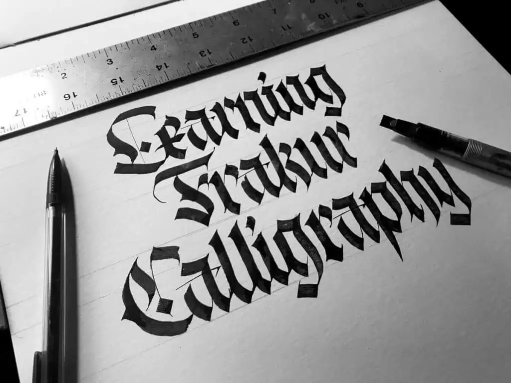
the first image reads: Learning “Frakur” Calligraphy
Muchas gracias por compartir esa sabiduría, que la vida los siga iluminando
Can I get practice sheets
Seems I’m not the only one to sign up for the free pages but not received the emails 🤔😬
I’d love to have the free printables❤️thank you
Actually, Fraktur was banned by the nazis themeselves, because Hitler thought this style to be “Jewish”…
Yes, that is true, but if im not mistaken, that happened later on. Also, if I’m not mistaken, that was only an excuse to remove the style, the actual reason was the difficult readability of fraktur for everyday text.
Both the above points are correct, however, I found that one of the other main drivers for the Nazis abandoning Fraktur style texts was simple economics. Apparently, it was prohibitively expensive to set up new printing blocks in newly conquered territory. It was far more effective to utilise the local printing infrastructure for the purposes of propaganda etc.
Personally, I am really enjoying some of the recent renewed interest in the Blackletter styles. My favourite is Fraktur for its combination of style as well as individual expressiveness.
I believe you’re correct, and the Drittes Reich ban on Fraktur was due to a desire to “modernize” with more readable typefaces—nothing to do with “Jewishness”.
But either way, the reality is directly contrary to what this article claims, which is that Fraktur fell out of favor /due to use *by* the Third Reich:/ i.e., the exact opposite of the truth.
You’d think Mr. Rainis would have done a little reading before submitting the article…!
Hello.
I subscirbed for the newsletter, but i did not recieve the practice sheets. Coud you send it to me? [email protected]
Send me an email with that address and I’ll fix it up right away.
Hi! Thanks for those great worksheets! I’m just wondering about that lower case f – how do you get that long symmetrical vertical taper with the 3.8mm nib? Is it done in a single downward stroke?
Hey Roy, yes, it’s a single stroke. You have to twist the pen as you go down. It takes a bit of practice since it’s a more complex motion. Also, the size of the nib has nothing to do with it. It would be the same thing even with a 6.0mm pen. Let me know if you have any other questions 🙂
Thank you for your helpful site. I’m studying Fraktur now and found a good deal of help here.. I’d love to have your guidelines.
Thank you, Mindy, for the kind words 🙂 If you are having issues accessing the Lettering Crate feel free to send me an email and I’ll take a look at it.
How can you do faux gothic?
Hmmm, not really sure to be honest. Haven’t tried that out yet. I think it’s more fun to do it with a broad-edged tool 😀
I love how the “t” in “Fraktur” is missing in the illustration at the very top. Spotting that in Google image search was what actually brought me here.
Hahaha, I think you are one of the first people who ever managed to figure it out. I guess it’s because of how quickly we read things. We only noticed the typo while we were uploading everything on the site 😀
Hello! This is amazing!
I´ll wait for more!
Thank you! 🙂
I already sent my email, but until now don’t get any practice sheet
Sorry to hear that :/ Can you shoot me an email so i can fix this mistake?
I subscribed for the lettering crate a week ago but i haven’t received any mail regarding the lettering crate.
Hey Manas, sorry about that. Please send me an email and I will fix it immediately.
Hello! I posted my email to get practice sheets, but didnt receive nothing, my email is [email protected], also where can I buy the books?
Hello Juan, for any technical issues on the site, it’s always best to send me an email directly. Can you please do that so I can take a closer look at it? Also, to which books are you referring? If you mean Jake’s books, there should be a link for them on Amazon.
Hey, actually I dropped my email but I did not get the free worksheets for fraktur! I hope you fix my problem soon! Also this was really helpful got to know a lot!?
Hey Deya,
Please send me an email with the email that you used, and I will help you solve this issue ASAP. 🙂
Hi guys! It’s a great tutorial! I’ve taken some classes, but always need more practice. I read there are free practice sheets, but I can’t find them. Would you send me them, please? Really apreciate it!
Thank you so much 🙂 Really appreciate your kind words. In order to get to the practice sheets, you just need to drop your email and you will get access to the resource library a.k.a. the Lettering Crate. Inside you will find all the practice sheets for all the different styles and tutorials that we have so far – along with other free downloadable content. You can find the sign-up form under the ”Learning the Alphabet – FREE downloadable practice sheets” subtitle, or at the very beginning on the sidebar. Let me know if you need any further assistance, I’ll be happy to help 🙂
Hi Guys ! i subscribe to the lettering crate librery but im putting password and dosen´t work, i dont have access to the work shite of gothic calligraphy
can you help me please to get access to the content
thanks for your time!
Hey Jose!
I think we already solved your issue via email. If there is anything else you need help with, do not hesitate to contact us 🙂
Awesome job guys and thanks particularly to the author. It is quite inspirational and clear instructed. I also dropped my email but didn’t receive anything. Could you send the practice sheets, please? Cheers!
Hey Criserna, im happy to hear that you enjoyed the article! Im sorry you didn’t receive the practice sheets.
We just did several tests with different emails and it worked fine for us. May i suggest to check both your all email and spam folder. Perhaps it went somewhere there. Don’t worry in case it really didn’t went through feel free to shoot us an email and we will send you the practice sheets 🙂
So good that I ended up buying two of the books, absolutely worth it!
Awesome! really happy to hear that. Im sure you will see that it was totally worth the investment 🙂
Very nice! I’ve been a long time practitioner of textura and I’ve always wanted to try other styles. I put my email down at the end but I never received the free practice sheets?
Hey Lisa! Thank you so much for the kind words. Im really sorry to hear you are having problems claiming the practice sheets.
Have you tried to check your spam folder? If you are unable to find it there, shoot us an email at – [email protected] and we will send you the practice sheets directly 🙂
I think this was an EXCELLENT guidethrough addressing the problems faced by beginners and helping them out. Very, very, VERY well written. Thank you so much for this
Happy to hear you liked it! Cheers!