Hello everyone, I’m Joanna from Quirky by Design, but all my friends call me Jo, so please, just Jo.
I’m so excited to share some beginner tips on starting dip pen calligraphy and hopefully infect you with an appetite and enthusiasm for this art form.
If you’re feeling overwhelmed or unsure where to begin, I recommend starting with the main calligraphy resource — it’s the main roadmap I’ve put together for beginners.
This calligraphy tutorial will cover the following :
- Materials to Start Dip Pen Calligraphy
- How to hold the pen
- Using Guidelines
- Basic Strokes and Constructing
- Letterforms
- FREE downloadable practice sheets
- Where to find more resources
First off, you’re probably wondering :
What tools and materials do I need for dip pen calligraphy?
You’ll need basic calligraphy tools.
Nonetheless, I made a recommendation for the tools here below.
Nibs
Whilst I always say that at the end of the day, a calligrapher’s favorite nibs are a subject of personal preference, there are quite a few that I’d recommend for beginners.
Here are some of my favorites, from a range of modern to vintage nibs :

Nikko / Zebra G – A popular nib for beginners, the G nibs are not too stiff or too soft / flexible, thus resulting in greater control when you’re just starting out.
Hunt 22 – A slightly softer nib in comparison to the G nibs, the Hunt 22 is a great choice if you’d like a little flex in your nibs without losing control.
Hunt 101 & Leonardt Principal – This is a very flexible nib, with a sharp point.
The flexibility of the nib results in thick, luscious down strokes (also known as shades), and the sharp point results in fine hairlines.
This creates a beautiful contrast between your thick and thin strokes.
I have a penchant for vintage nibs, mainly because it feels surreal to be using nibs that are no longer in production, like writing with a little part of history.
Some of my favorite vintage nibs are :
Blanzy 2552 – Beautiful sharp tip that doesn’t drag or snag on your paper, yet soft enough to create beautiful contrasts between your thin and thick strokes.
Henry 605 – This one has an odd shape, but I love that it holds a ton of ink, meaning you don’t have to keep dipping your nib in ink, freeing up more time for you to concentrate on your strokes and flourishes.

How to prepare new calligraphy nibs
Before you actually start using your nibs you need to prepare them by taking of the oil coating that is applied by the manufacturer.
You see, the nib manufacturers apply a protective layer on the nib in order to prevent them from rusting, and before you can start using them you need to remove this oily coating.
This step is essential because if you don’t do it, the ink wont stay on the nib and it will be very hard (if not impossible) to use them.
Luckily this process is quite simple, it only takes a few minutes and needs to be done only once.
Here are a few ways you can do this –
1. Tooth paste –
Apply a bit of tooth paste on your tooth brush and gently scrub the nib (both sides) for about 30 seconds.
Be sure to scrub it gently in order to not damage the nib.
Once you are done, rinse it well under water and dry it off completely with a paper towel (or a rag)
2. Rubbing alcohol/acetone
With the help of a cotton swab rub some alcohol/acetone on the nib. Once you have cleaned the whole nib you are ready to use it.
3. Stick it in a potato!
Yups! good old fashioned potato does the trick when it comes to nib preparation.
All you need to do is grab a fresh potato and slowly (very gently) slide the nib inside of it – don’t stick the whole thing in otherwise it will be hard to pull it out.
Don’t hold it more than 10-15 minutes otherwise your nib might start to rust.
Once you are done, simply dry it off and you are all set.
Pen holders
There are 2 main types of pen holders for calligraphy;
Whilst the oblique holder is admittedly more suited for right handers, there are now also oblique pen holders for left handers.

The oblique holder holds your nib at a set angle, making it easier on your neck and shoulders when you’re writing for long durations of time.
Trust me, you wouldn’t want to be racking up a bill with a chiropractor due to bad posture, which leads me to my next point –
make sure you have a comfortable chair and desk at the right height for writing.
I’d say, save those extra dollars for writing tools.
Paper
Although normal copy paper would work for practice (as long as it’s bleed proof), I would suggest getting some Rhodia paper if you can afford it. I love these Rhodia pads because :
⦁ The ink doesn’t bleed
⦁ The surface is extremely smooth so your nibs don’t snag as much on them
⦁ They come in blank sheets, lined and with dot grids. My favourite for beginners are the lined pads.
I also wrote an article about the best calligraphy papers depending on the tool that you use.
Ink
When it comes to ink, you really have a wide choice.
However, here are a few recommendations for beginners –
⦁ Sumi ink
⦁ Winsor & Newton calligraphy ink
⦁ Speedball India Ink
⦁ Gouache (mixed with water)
Not all ink are the same, some are too thick while others too liquid.
Luckily you can always thicken the ink with gum arabic and dilute it with water if needed.
This will require some trial and error before finding the right combination – as it also depends on the nib and the paper you use.
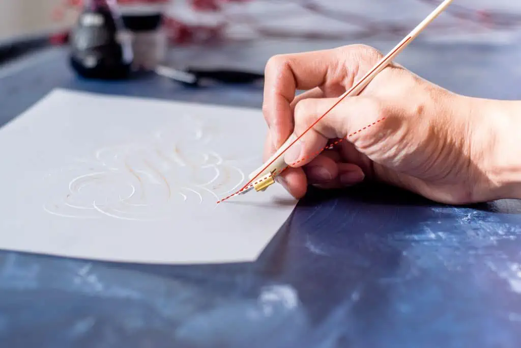
How do I hold an oblique pen holder ?
Probably one of the questions I get asked most, the oblique pen holder looks tricky, but you basically hold it like you would a regular pen or pencil.
One point to observe is that when observing the pen from its side, the nib should be at a less inclined angle as the body of the holder, as this prevents the nib from snagging on your paper on the upstrokes.


By aligning the point of your nib to the slant lines, you allow the nib tines (the two sides) to open up equally – thus giving you that nice thick down stroke.
In order to achieve this you will have to rotate the paper your are writing on – instead of bending your arm in a unnatural position.
How do I get started writing calligraphy ?
Learning how to use guidelines
It is always recommended that you use proper guidelines when starting out.
This ensures that you develop the right muscle memory.
The diagram below refers to both the anatomy of calligraphy type in accordance to the baseline, cap height, ascender and descender, as labelled.

Basic strokes
I like to think of calligraphy as a composite of different basic strokes.
Please refer to the attached guide sheet to practice some of these strokes on your own –
Underturn – start by applying pressure on your nib on the down stroke, slowly curving upstrokes and releasing pressure as you do that.
Overturn – the opposite of the underturn, start with an upstroke, curving downwards and applying pressure for a thicker down stroke.
")
Ovals – when drawing out oval strokes, I imagine the face of a clock, and start going counter clockwise from ‘1 o clock’ making sure that the stroke is balanced on both sides.
")
Compound Stroke – a combination of the overturn and underturn, start as if you’re writing an overturn, and connect that to the underturn after your down stroke.
")
Ascender – this stroke is used for tall letters like ‘l, b, k, h etc’. Start with a thin
upstroke, and cross over to end with a thicker down stroke.

Descender – this stroke is used for letters such as ‘ g, j, y, and z’. Start with a thick down stroke, crossing over to end with a thin delicate upstroke loop.
")
Letterforms
Now that you know the basic strokes, it’s time to combine them to form letterforms, or alphabets.
It’s easier to approach calligraphy when you break down each alphabet into the basic strokes that they’re composed of.
For instance, the letter ‘a’ is made up of an oval and an underturn.
Refer to the attached sample guide sheet for a quick example and rundown of how to write the letters ‘a, d, g’ and ‘n, and m’.


Examplars
Below are some examples of dip pen calligraphy letters.
Try and identify the basic strokes that make up each letter, and reconstruct the letters based on the basic strokes they’re composed of.
Lowercase letters :

Uppercase Letters :

FREE Downloadable practice sheets
Now it’s time to practice!
We’ve prepared some free downloadable practice sheets that will help you practice the basic calligraphy strokes as well as blank sheets with guidelines that will keep your letter forms nice and consistent.
Drop your email below, follow the instructions and gain instant access to all of the worksheets from the Lettering Crate.

Stay updated with my tutorials and get instant access to the Lettering Crate –
A growing library of free lettering & calligraphy resources that includes –
Other resources and where to get them
The internet is a rich resource for materials pertaining to calligraphy.
Here are a few of my favorite places for resources, ranging from tools to free articles dating back to the 18th century.
IAMPETH.com – the International Association for Master Penmen and Teachers of Handwriting is a wonderful site that is a treasure trove for free articles pertaining to traditional calligraphy.
Members also get to join their annual gathering where you get to
meet Master Penmen and other calligraphy enthusiasts.
The Postman Knocks – a pretty equipped website for modern calligraphy, covering tutorials and more.
John Neal booksellers – one of my favorite places to get tools, they stock everything from papers, inks , nibs to hand turned pen holders and calligraphy books.

Final words
Calligraphy is a process and a journey.
I’ve been doing it full time for almost four year now, but still find myself learning something new everyday, therefore I think that an essential ingredient in what makes a great calligrapher is the enthusiasm to keep learning and keep on practicing.
Here are some final tips on how to keep on improving :
Set aside 10-15 minutes each day for intentional practice.
Intentional practice means paying close attention to your letterforms, and studying each one intently before moving on to the next.
I like to practice with quotes and poems to practice long form writing, and I think writing out the lyrics of your favourite songs can be an interesting way to keep on practicing.
Refer to the classics.

Whilst calligraphy is just enjoying a resurgence in popular interest, the art form has been around for centuries.
Thus, one of the best resources to refer to is the work of the old masters of the craft.
Thankfully for us, there are tons of resources available, both in printed form and on the world wide web.
Whilst it is great to refer to these works for reference, it is imperative that you keep on honing your skills and learning the right letterforms before coming up with your own take on flourishes and variations to the alphabet.
Have fun. After all that has been said and done, remember to always have fun.
Personally, I find it very therapeutic and relaxing to unwind at the end of the day whilst practicing some letterform variations or referring to old journals and articles regarding penmanship.

I’m always amazed at the amount of creativity and dedication that was put into the simple art of translating thoughts into tangible letters, and presenting it in a way that is ageless.
These days, calligraphy is seen on everything from wedding invites, to branding and posters, to high-end ads on TV, so much so that it is easy to forget that it all started with the humble act
of putting pen on paper, and watching ink scribble out beautiful letterforms that have graced everything from official documents to intimate love letters.
Pin me!

About the author

Jo’s love for calligraphy stemmed from her grandfather who taught her cursive at the age of 7. Till this day Grandpa Chia is fondly remembered for his beautiful penmanship and penchant for sneaking chocolate treats to the grandkids. After working as an engineering researcher and obtaining her doctorate in 2015, Joanna took a plunge of faith and ventured into the world of art and calligraphy. Having honed her skills under the tutelage of international Master Penmen and renowned calligraphers, today her calligraphy has graced corporate branding, logos, events, weddings and has steadily built a client portfolio of international and local brands. In her spare time, she teaches calligraphy to both adults and children.
She has been featured in various publications, including Harper’s Bazaar, CLEO, Elle and is one of Malaysia’s Top 10 Calligraphers (Tallypress). Jo also appeared on NTV 7’s Bella, where she got to chatter excitedly about her passion for letters and mission in reviving this long forgotten art. She believes that even as we live in an ever exciting digital world, there is something magical and transcendental about transferring thoughts unto paper, of encapsulating personal messages in handwriting, something uniquely intimate to each individual. If you would like to get in touch for event and private session bookings, she’d love to hear from you at [email protected]

Thanks for the article! Hoping to receive a copy of the practice templates — can’t wait to try!
hey, loved it. thank you so much for this read.
Thank you for the kind words Nitya! 🙂
I am going into this for the first time and have been given a glass dip pen and fountain pen with different nibs. I had no idea one had to clean them prior to use so I thank you for this tip. I am older so this will be good practice to keep my hands steady and I am signing up for the free samples. I appreciate all the advice and how to obtain free samples.
Thank you so much for the kind words, Denise! 🙂
Hey….does lettering crate have a price? And is it necessary to pay for lettering crate,in case, to get free printables!?
Hey, thanks for the comment. Nope, the Lettering Crate is completely free. You just sign up with your email to get the password, and you can unsubscribe from the newsletter whenever you want. Let me know if you have any questions. You are also more than welcome to shoot me an email 🙂
What do you do when you are done writing? Do you just rise the ink off? This is a really nice article too.
Thank you for the kind words, Brenda. Yes, when you are done, you should always wash your nibs from the inks and it’s crucial that you dry them off properly to avoid and rust.
Hope this helps!
I’m using these as a part of a culminating activity for my high school classroom as we start our literature unit on old England. It’s always fun to see them try new things like this!
Thank you, Emily! 🙂
Very much helpful. I am get bored when it comes to reading but yours look super attractive and fruitful for me. It helped a lot. Thanks a lot. Hoping same helpful thing in future
Thank you, Ananya 🙂 I really appreciate the kind words. More is coming soon!
I’m starting to practice my penmanship and this article was a big help. I hope that I would be able to receive a copy of the free prectice sheet and basic strokes
I am glad to hear that Mari. Please send me an email if you need help accessing the Lettering Crate to get the free worksheets.
Hi,
Thanks a lot for your wonderful website you have and the amazing works samples and I’m a great admirer of your works which I have been seeing for long,…
I appreciate it if you could please send the exercising template sheets which will be start for me so I can start practicing.. thanks
Thank you.
Cheers!
Hi,
Thanks a lot for your amazing website.
I appreciate it if you could please send the exercising template sheets .
Thank you Vahid, the worksheets can be found in the Lettering Crate. Sign up for the newsletter and you will get instant access to all the freebies 🙂
Hello, can I please get the free practice sheets? 🙂 Thank you!
Absolutely, you just need to join the newsletter in order to get full access to the Lettering Crate.
Can I have the practice sheets please? e-mail: [email protected]
In order to get the practice sheets, you have to sign up to our newsletter. Once you do that you will get full access to the Lettering Crate, a place where we keep ALL of our freebies.
Flex nibs are one approach to calligraphy. Also know that italic nibs (not mentioned here) are the other major approach – a broad, non-flexy nib, where horizontal angle determines the line width, instead of pressure.
You are totally right, the title is a bit misleading. I will change it on the next update. Thank you for the mention 🙂
Could you please provide me basic tutorial for calligraphy??
Thank you
Hey Gauri, this is a basic tutorial for calligraphy 😀 What exactly are you struggling with? I would be happy to help
Hello,
Could you tell me the name of this book you show in this picture?:
https://www.lettering-daily.com/wp-content/uploads/2019/01/40409337_562992057454702_4708696581015350740_n.jpg
I am not sure, but i think that if you reach out to Joanna directly she will be more than happy to provide additional info.
This article you have written, was so informative, I absolutely loved it. I’m wondering if you have a online course?
Thank you
Asia
We are really happy to hear that you enjoyed the article! As for the online course, it’s best if you reach out to Joanna and ask her directly