
Hello!
I’m Tamer Ghoneim, and I am a calligraphy artist based in the US.
I love making calligraphic art and am really excited to teach you the tools and techniques you’ll need to create your own circular calligraphy masterpiece.
Today we’re going to be making a “Calligram.”
Here is a quick overview of this tutorial –
- What is a calligram?
- Tools for creating circular calligraphy
- Setting up your composition
- Writing inner and outer circles
- Optional effects and finishing up
- Video process + more examples (inspiration)
- FREE downloadable template
Let’s get started!
Looking for more calligraphy tutorials like this? I’ve collected them all in one place — visit the Calligraphy Hub to dive in.
1. What is a calligram?
The definition of a Calligram is –
“a word or piece of text in which the design and layout of the letters create a visual image related to the meaning of the words themselves.”
You can create a lot of exciting designs following this technique!
Keep in mind that this is an advanced calligraphy technique, and if you’re just getting started, I would recommend you check out the calligraphy beginner’s guide.
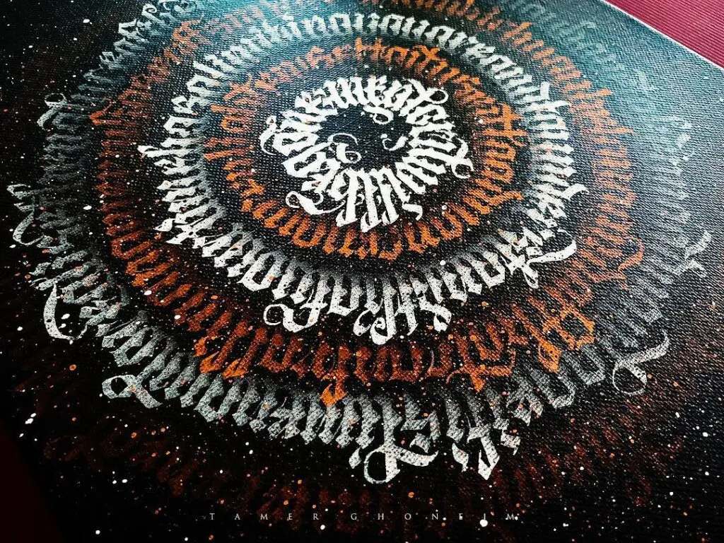
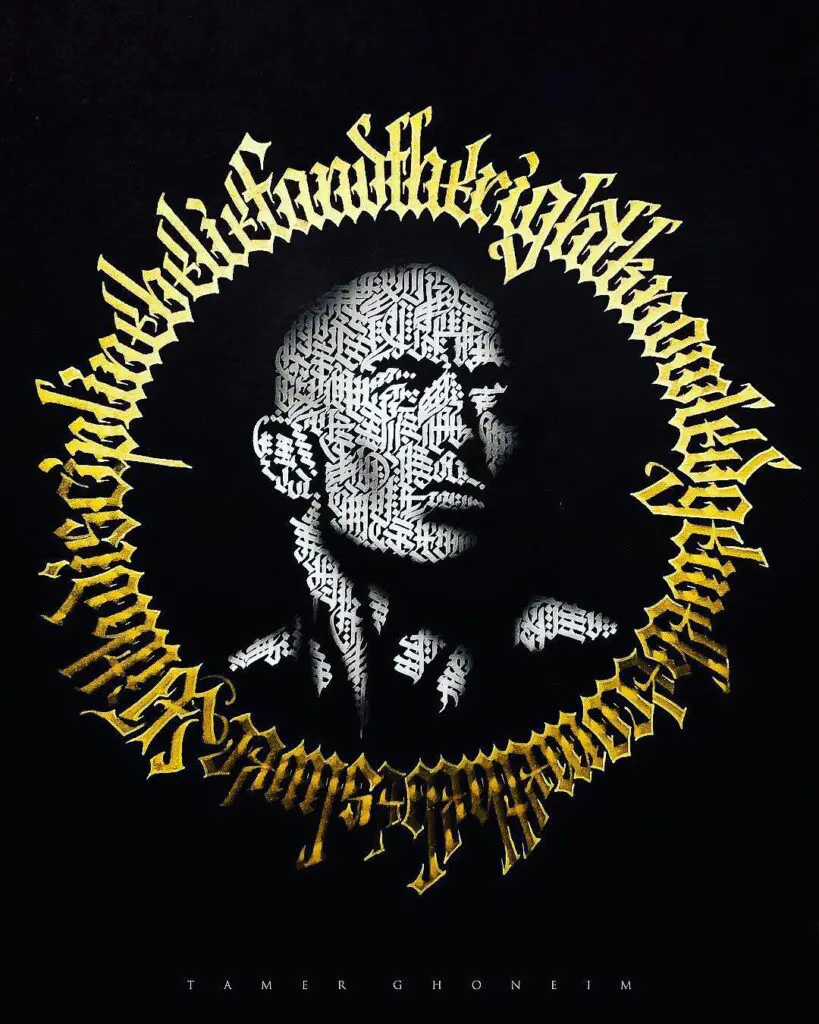
Here is an example that I recently created –

In this tutorial we won’t be creating a calligram per se but rather –
laying out the design of the characters into a circular shape instead of an image related to the meaning of the words.
Considering that this is a beginner’s tutorial, it will be much easier for you to start learning basic shapes and then gradually move towards more challenging and complex compositions.
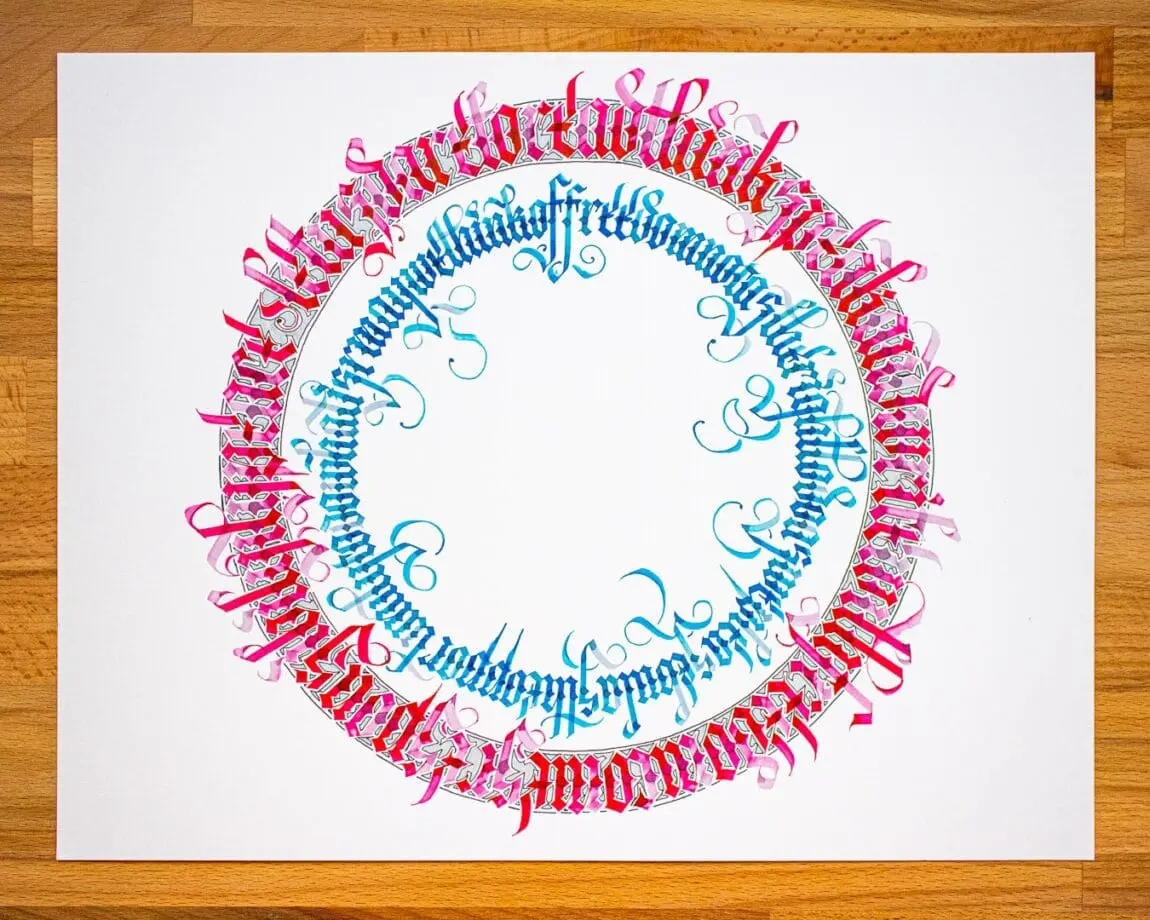
At the end of the tutorial I will add some of my work so you can see all the different things you can create using this technique.
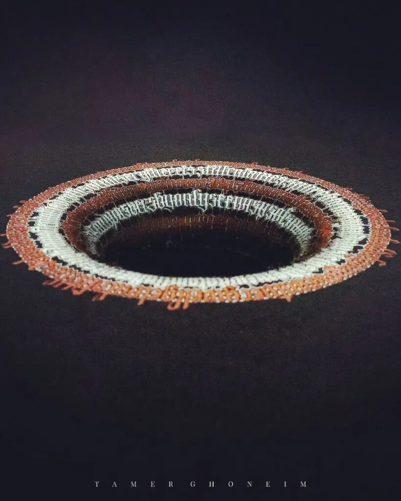
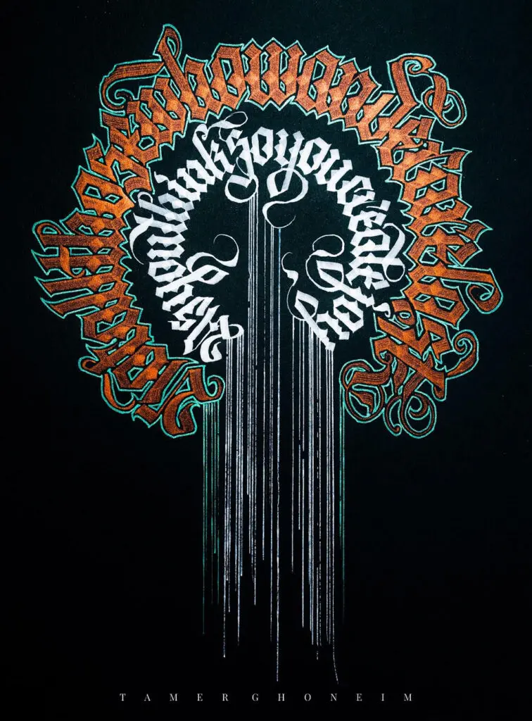
We’ll be going through the steps to make this piece:

For this tutorial, you’ll need to know how to write a basic Gothic script.
There are several variations that you can use for a calligram, and I’ve developed one that I think is really well suited for this style of art. In fact i just released my new workbook called –
The Complete Modern Gothic Calligraphy Toolbox
You can use whatever gothic style you’re comfortable with!
Let’s go ahead and jump in by going through the tools that we’ll need for this project.
2. Tools for Creating Circular Calligraphy
There are several tools you’ll need to make your own circular calligraphy art.

Here’s a list of each one with a product link:
2. Pilot Parallel Pen – 2.4mm
(Or you can get the whole Pilot Parallel Pen Set
[includes sizes 1.5mm, 2.4mm, 3.8mm, 6mm])
3. Pilot Parallel Red Ink Cartridge (FYI: comes with the standard pen)
3. Pilot Parallel Turquoise Ink Cartridge
4. Sakura Pigma Micron Fine Line Pen 01
4.Sakura Pigma Micron Fine Line Pen 02
(Or you can get the Sakura Pigma Micron Fine Line Pen Set
[includes sizes 005, 01, 02, 03, 04. 05])
5. Copic Sketch Markers (N0, N2)
(You can get these in the Copic Sketch Markers Set
[includes the following greys N0, N2, N4, N6, N8])
11. Small Plastic Container
3. Setting Up Your Circular Calligraphy Composition
The steps in the following sections show the general process that I follow when creating any of my circular calligraphy art.
Find the Center of the Page
You don’t have to do this step.
You can draw a circle wherever you want on the page!
But if you’d like your composition to be centered on the paper, this is the most straightforward approach.
Tool(s) used in this step:
- Paper (we’ll use this tool in all the steps 😉 )
- Clear Grid Ruler
- Mechanical Pencil
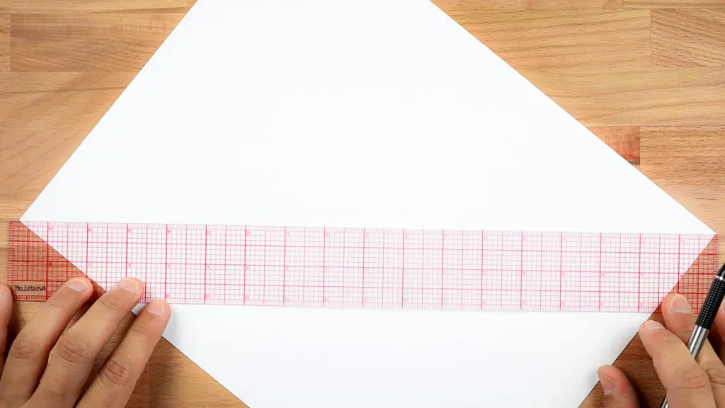
Using a ruler long enough for the page you’re working on draw lines connecting opposite corners of the page.
The point where they intersect is the center of your page (no measuring or math needed!).
This technique is shown in the image below.

Draw Circles
Tool(s) used in this step:
Sizing & proportions of the letters.
Now that we’ve found the center (or you decided where you plan to place your circles on the page), it’s time to draw the circles that will become the guides for your lettering.
I usually draw only 2 lines to mark the x-height. X-height indicates where the tops and bottoms of the lowercase letters will be – letters like “a” and “c” that don’t have ascenders or descenders (Letters like “b” and “g” are different, and I don’t draw guidelines for their ascenders or descenders).
I usually use an x-height of 5 times the width of the pen that I’m going to write with.
For this tutorial, I used two different sized pens (a larger green pen and a smaller orange pen).
So, I’m drawing four circles, total – two for each pen’s x-height.
So, the green Pilot Parallel Pen, which is 3.8mm wide, has an x-height of 19mm based on the calculation –
3.8mm x 5 = 19mm.
The orange Pilot Parallel pen that is 2.4mm wide has an x-height of 12mm because of –
2.4mm x 5 = 12mm.
Now I know that I need two lines with 12mm of space (what will eventually be the smaller, inner circle of text) and two lines with 19mm of space (for the more massive, outer ring of writing).
*Note that if you want more guidelines for ascenders or descenders, you can measure these out as well.
As far as the spacing between the circles of calligraphy text, I usually leave between 1-2cm of space.
The following image shows me measuring out the sizes for each of the circles that we’ll be using.
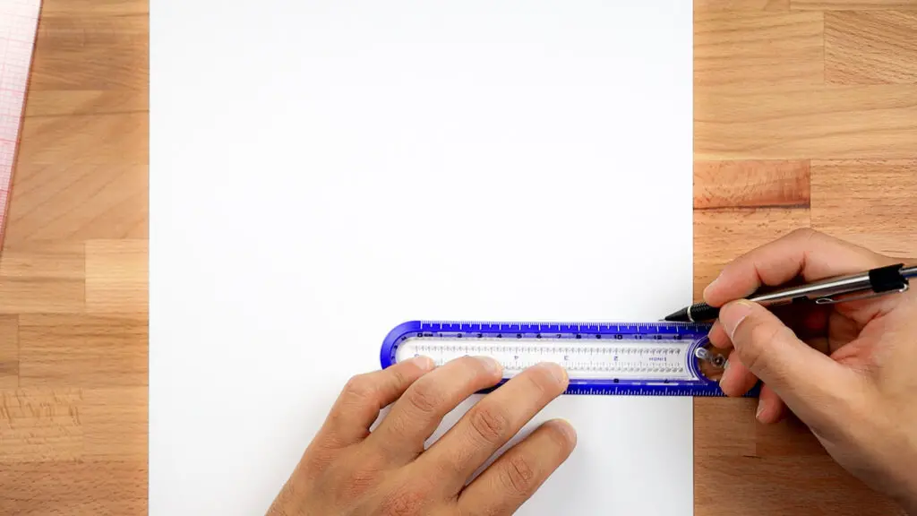
Sizing the circles is mostly a trial-and-error thing.
If you have a decent idea of the text you’ll put in the circles, you can do some rough math with circumference ratios to get an idea of how large your circles should be.
Otherwise, plan on sketching out a few different sizes to see what works.
(There is a much more precise process for this that requires its own tutorial. You can shoot me questions about that if you’re dying to know how I do it. But eyeballing and some trial-and-error will work just fine for this tutorial).

Once I’ve drawn the points that indicate the x-heights (bottoms and tops) for both small and large circles, it’s time to draw the circles themselves.
My favorite tool to draw circles is the Helix Circle Ruler for two reasons:
1. No Holes in Your Page – because of the way this tool works, you don’t end up poking a hole in the center of your page as you would with a compass.
Instead, you align the center hole of the ruler with the center of your circle, hold down the circular piece in the center of the ruler, insert the pencil into the small hole that best aligns with the marks you made.
At that point you simply rotate the pencil on the page.
2. Variety of Circle Sizes – The tool is long enough that you can draw both small and large circles, and there are so many increments that you can draw a wide variety of sizes.

Draw Radial Lines
Tools used in this step:
- Mechanical Pencil
- Ruler (Helix or Grid)
This step is what will help you most in lining up your lettering while writing, so when you’re writing in this style, feel free to draw as many of these radial lines as you want.
Later, when you get more comfortable, you won’t need to draw as many.

Draw these by lining up the ruler with the center of the circles (Step 1), and drawing lines through the circles we made in Step 2.

Once you’re finished drawing as many of these radial lines as you want, your page should look similar to the image above.
Remember, as long as you don’t erase the center point of your circle(s), you can always draw more radial lines if you need to!)
4. Write inner and outer calligraphy circles of your calligram
Tools used in this step:
- Pilot Parallel 3.8mm, 2.4mm
- Pilot parallel ink
- Ecoline grey ink
- Small plastic container
Using the guides that you’ve drawn, you can now start your lettering!
I start with the outer circle and then create the inner circle – you do what feels most comfortable.
Shaping Letters in Radial Text
Keep in mind – the top of each letter should be a little wider than the bottom because of the circular path of your text.
To illustrate how this actually works, I’ve provided a comparison of the character “o.”
It will change based on the size of the circle and pen that you’re using.
For each of the following three images, I wrote the character with a 3.8mm Pilot Parallel Pen.
This first image shows the letter “o” written normally in a straight line. Nothing unique or exciting here. It’s our basis for comparison.

Now things are going to get a little more fun – but not too much more challenging.
This second image shows the same letter “o” written along the path of a larger circle (one with a huge radius).
You’ll notice that the letter shape barely changes because the arc is so mild that it’s almost like writing in a straight line.

With smaller circles the radial lines you drew become particularly helpful in sizing the letters.
They help you to exaggerate the tops of letters and compress the bottoms of letters so that the letters meet neatly within the words and phrases of your text.

Adding color gradients to your calligram
It’s easy to create stunning color gradient effects by merely having a few different inks and a spare plastic container on hand.
After you choose your pen’s ink cartridge, choose a second complementary color for contrast, and put a small amount in the plastic container for easy dipping.
As you write, regularly dip your pen into the contrasting color.
This will create a gradient effect as the dipping color transitions with the cartridge color in the pen.
To get the color gradient effect you see in the outer circle of my example, use the Red Pilot Parallel Pen ink cartridge (the one that comes with the pen when you buy it) and regularly dip it into Ecoline Grey ink.

To achieve the color gradient effect in the inner circle, use the Turquoise Pilot Parallel ink cartridge and dip it in the Ecoline Grey ink.

It’s good practice to use some kind of barrier between your hand and the page where you’re creating your radial calligraphy.
This kind of composition isn’t your standard left-to-right linear writing, so the odds of smudging are significantly increased!
Prevent that kind of accident with a blank sheet of paper like the one I use in the image above.
5. Optional effects and finishing up your calligram
Your circular calligraphy piece is technically finished! The only thing you have left to do is erase outlines (detailed below).
The calligraphy i create is sometimes considered done at this point.
However, I will often add outlines, shadows/shading, or both.
It’s totally up to you whether you want to add these optional effects!
Note that it’s good practice to draw outlines before erasing pencil guides, and to add shading after deleting.
Draw Outlines (Optional)
Tool(s) used in this step:
Drawing the lettering outlines is a detailed and time-consuming process.
There is no shortcut for doing these, it’s a lot of detailed work.
But outlines add a fascinating dimensional effect to the overall work.
I personally really enjoy the process of adding outlines.
I find that time flies by while drawing all of these little lines, and the final effect is super satisfying.
So I strongly encourage you to try it at least once!
Start with the outlines between characters (versus the outlines above and below letters).
Basically, you want to start in the middle and work your way out in a kind of radial pattern.
After you’ve finished the interior outlines, draw the outlines on the upper parts of the letters, then the lower regions.
The upper and lower outlines tend to be a series of repeating triangles, so it’s easy to get into a rhythm of drawing these consistently if you draw them all together.
(You can go lower than upper if you want to – just do a whole line first, then switch to the other one to take advantage of that flow state.)
You can also incorporate the circular lines you drew as x-height guides, as I did in this tutorial.
Or, you can choose to ignore (and erase) those circular lines. It’s up to you.

Erase Pencil Lines
Tool(s) used in this step:
I highly, highly (very highly) recommend waiting a while before you begin to erase the pencil guidelines.
You want to make sure that the ink is totally dry before you start using your eraser.
Otherwise, you’ll be in for a lot of smudging.
I have learned this the hard way.
Learn from my mistakes!
Leave your art to dry overnight and then erase the pencil lines the following day.
Start slowly without applying much pressure to make sure the ink isn’t smudging.
If you do run into problems with smudging, you can leave your work to dry longer or use a smaller eraser that will give you more control over the area you are erasing.

Add Shading (Optional)
Tool(s) used in this step:
Shading, like outlines, creates a beautiful dimensional effect, especially if you’re working with white paper.
It can also be an effective way to fill in white space without making the art seem too crowded or busy.
To add the shading, use the brush tip of a Copic sketch marker.
The brush tip is sensitive to pressure, so it allows you quickly to fill in larger or smaller spaces without switching pens.

Finished!
Congratulations! After shading, your circular calligraphy art piece is as finished as it can possibly be.
Now you’ve got to find a great square (or even circular) frame to display that gorgeous work. And don’t forget to share on social media and tag me in your finished creation!
6. Video process of creating a calligram
I’ve also recorded the whole process and you can watch here –
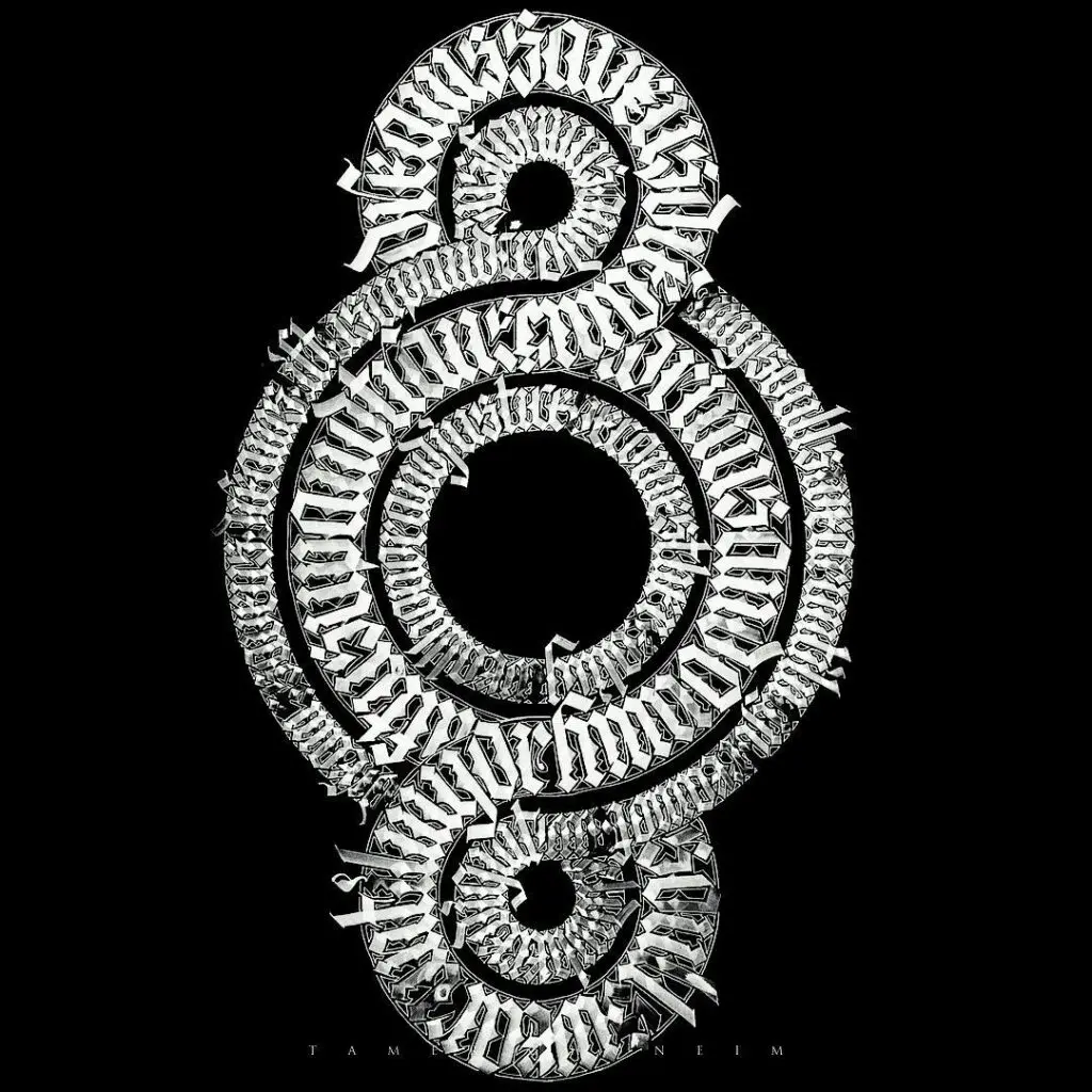
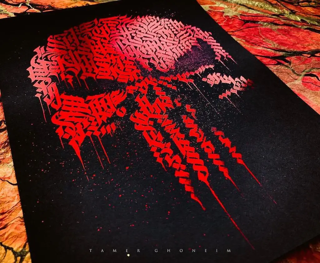
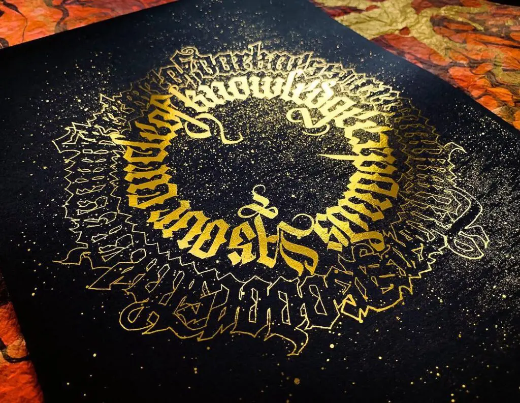
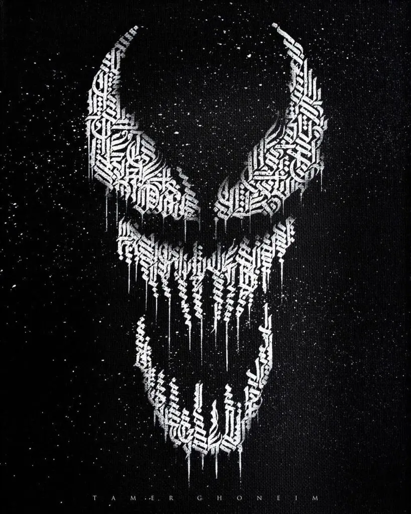
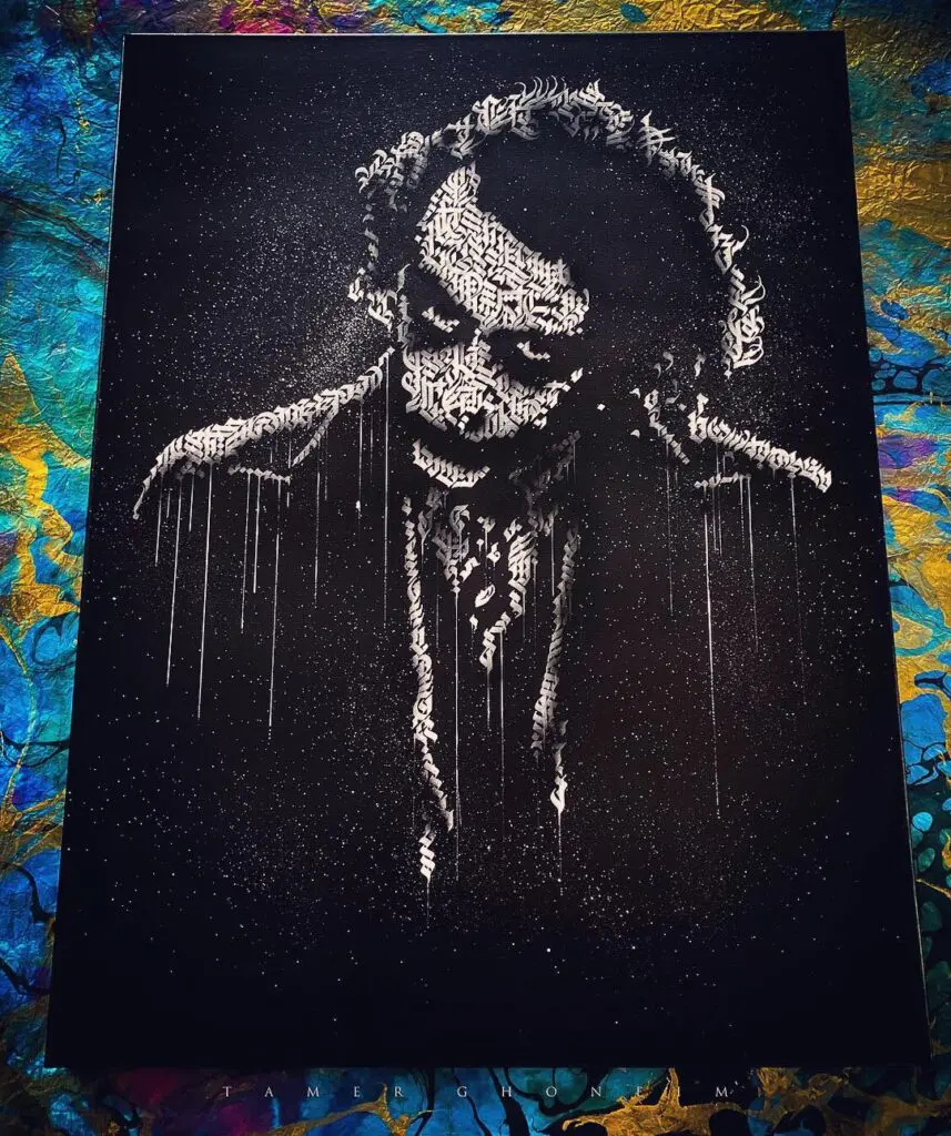
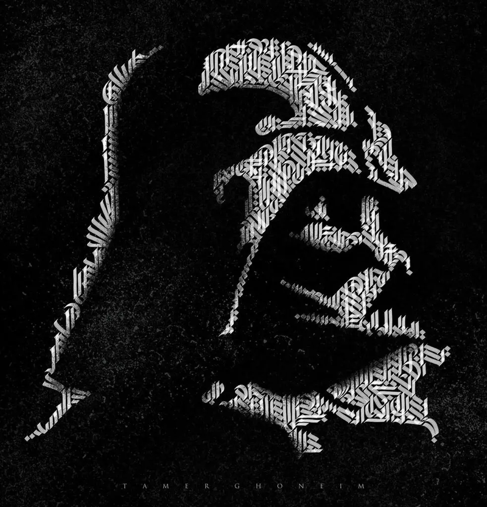
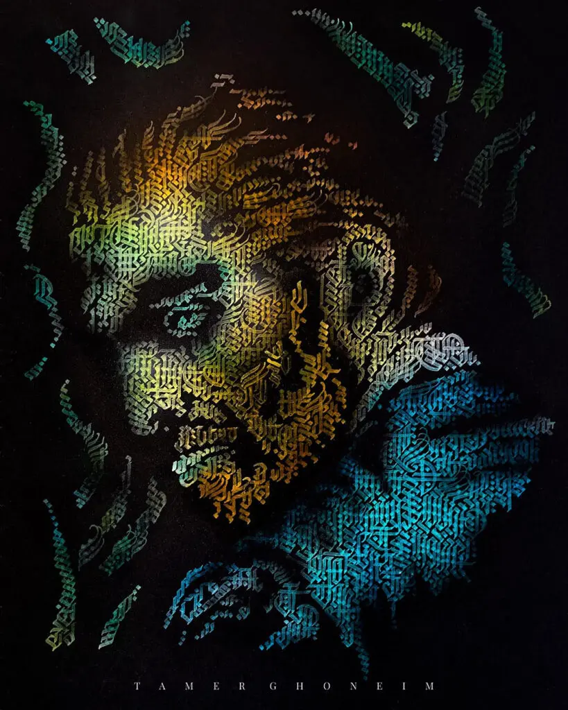
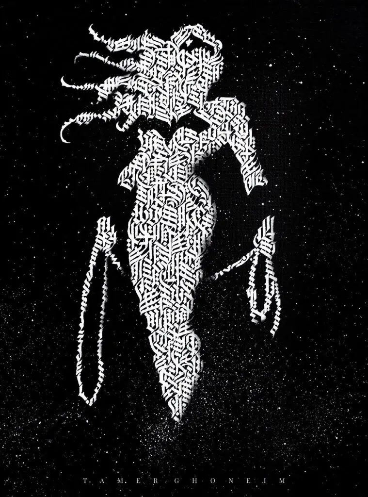
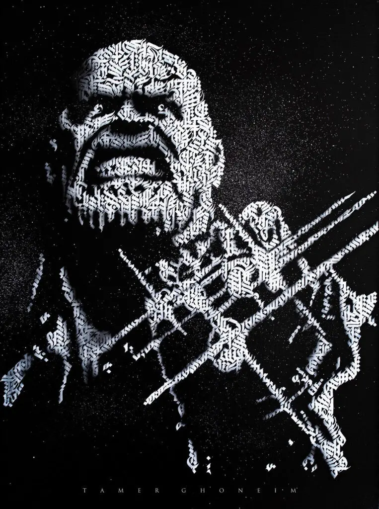
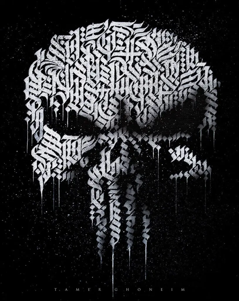
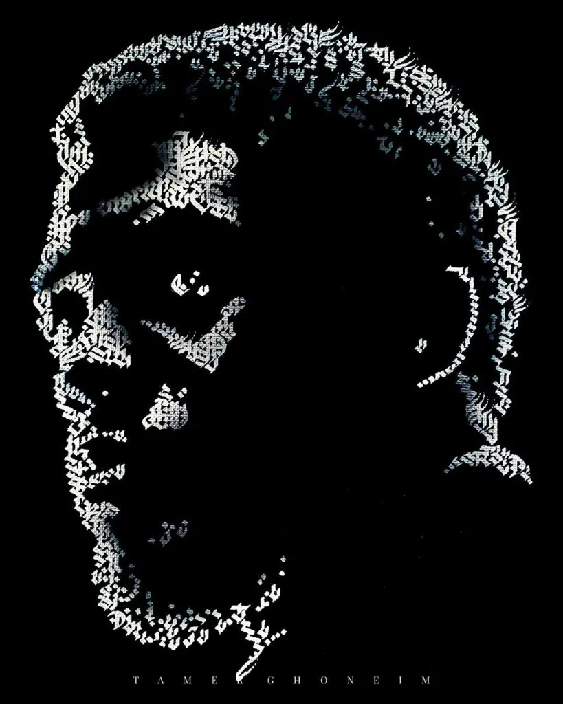
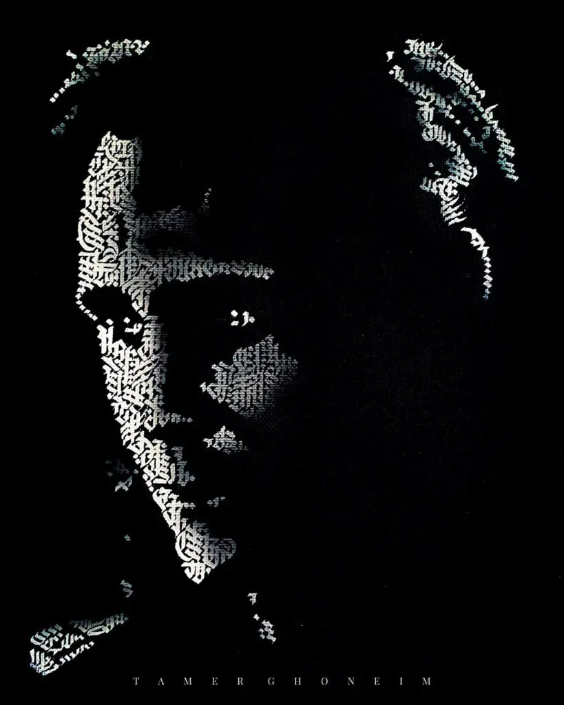
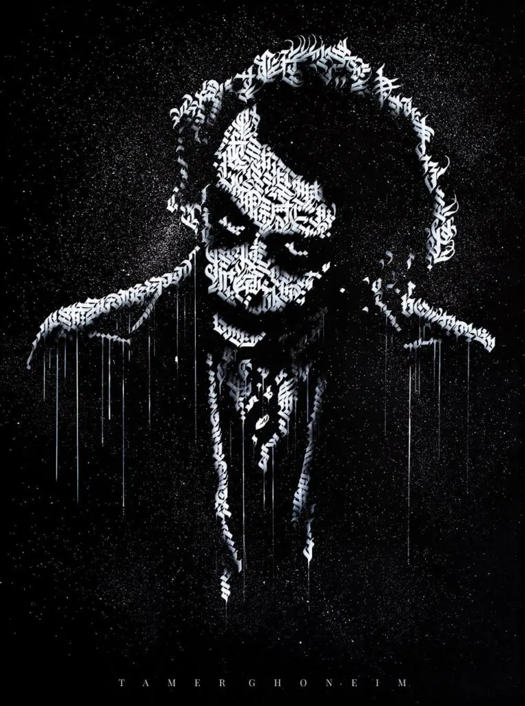
A few additional examples of my calligrams
Like mentioned in the beginning of the post, the circular shape is the most basic form you can start with.
Once you feel comfortable enough with the circular shape you can gradually move towards more challenging designs.
Here is a few of my previous works that you check out for inspiration (and you can find more on my Instagram page).
7. FREE downloadable template

Before you go –
don’t forget to grab your free downloadable template that i created for you.
If you are struggling with creating the circles or perhaps you don’t have all the needed tools to create one –
Simply download this template, print it out and start writing!
Drop your email below and get instant access to the calligram template as well as all the other freebies in the Lettering Crate.

Stay updated with my tutorials and get instant access to the Lettering Crate –
A growing library of free lettering & calligraphy resources that includes –
Final words
Thank you so much for working through my tutorial.
And a huge thanks to Lettering Daily for this fantastic opportunity. It’s a great honor and a pleasure to work with this awesome site and to connect with you.
I would love to hear from you as I absolutely love calligraphy and helping others learn this fun art style. Please get in touch with questions, comments, thoughts, or just to say hi.
Here are the platforms you can find me on –
Mega personal thanks to Lettering Daily for inviting me to share this tutorial, Rachel Hollert for helping me with putting it all together, and Tom Ross for incredibly effective business advice and mentoring. You are all wonderful!
Pin me!
About the author

Hi, my name’s Tamer and I’m an artist, instructor, and entrepreneur. Thanks for stopping by to learn a little more about me.
The short version of why I made the journey into art is quite simply because I love it. I love the entire process – the experimentation, planning, creating, and sharing each piece. I also love helping others discover the joy that they can experience from bringing more creativity into their lives.
My calligraphic work is an exploration of language as visual art. I love working with simple, traditional tools to reimagine inspiring words and passages as visual art. I also explore abstract ideas by creating works composed of flourishes and the calligraphic strokes of deconstructed letterforms. I love this journey – the countless hours of detailed practice, repetition, exploration, and creativity. Reality fades and I find stillness, peace, and focus while working. I became, and continue to be, fascinated by this art form and consumed by the perpetual pursuit of continuous improvement and mastery.

Hi there, downloaded the template, and I’m a little confused as to why there’s a dotted (1 nib width) line at the bottom of each ring? Also I am wondering if the radial lines are spaced for one letter or if they’re just general guidelines to keep everything evenly spaced. Thanks again for making this tutorial!
The quick answer to this one is that the bottom dotted line is there to help indicate where to begin to change writing angle if they use a style like the one I often write with. And the radial lines are just general guidelines and are not intended to be spaced for single letters (because the letters vary in width (like “I” vs “m”) and individuals may write different letter widths depending on pen angle, script, or their personal style. So the radial guidelines are just general guides intended to help them with the angle changes and letter compression as they work around the circle.
I m calligraphyer. So I liked ur writting.I wanna teach my art students in this style.plz send me ur paper. Thanxs for anticipatation
Thank you for your comment, but im not sure i understand you want me to send you… If you want to access the freebie, just sign up for the newsletter and you will get instant access to all the freebies currently available.