Hello, allow me to introduce myself.
I am Nick, better known as @snooze.one, and I am a lettering artist based in Berlin, Germany.
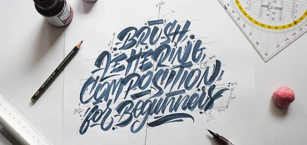
I’ve been practicing brush lettering for two years now, and in this post, I will share my experiences when it comes to working with composition/layout and balance.
The balance is the most crucial part of any work.
Without a good composition, the meaning and the legibility of the phrase gets lost.

Let’s have a quick overview of the things I’ll be sharing with you in this tutorial –
- Tools needed for this project (my personal recommendations)
- Understanding the basics of concepts like – Layout, composition and balance
- My step-by-step process when creating a brush lettered quote
- A few extra tips to keep in mind
- Introducing Matchphrase
Let’s get started!
This is one of the many topics I cover in the central calligraphy hub I created to help beginners get started confidently.
1. The tools you need to create brush lettering compositions
In order to follow along this tutorial, you will just need a couple of basic tools for brush lettering.
Here is a list of the tools I commonly use in my brush lettering projects –
Writing tools
A pencil – for the sketch
A brush pen – any brush pen that you like.
The brush pens i like to use the most are –

Paper –
I recommend that you don’t pick a too light/thin paper that bleeds.
When we work with brush pens, we usually work with quite some ink coming out of the brush.
I use some regular smooth 120g/m² paper with no texture.
In this post you can learn more about the different types of paper when it comes to brush lettering.
I found out when you work with such type of paper, the brush flows better, and it allows you to control the brush pen even more.
The best type of paper for brush pens are always bleed-proof marker pads.
They are extremely smooth and gentle on the brush tips and they don’t absorb a lot of your ink – allowing your brush pens to last longer.
Here are a few recommendations when it comes to paper –

Other needed tools –
Eraser –
Have an eraser to your site to correct and to clean up the piece after you finished it.
Ruler –
Essential!
I recommend a larger triangle ruler.
You can use a rolling ruler as well.
You will need this for sketching out the layout and to keep it consistent.
Optional an iPad – If you prefer to work digital, feel free to work with an iPad!
These rules can be applied digitally, as well.

You can also check out this article on the essential calligraphy tools.
2. The basics for brush lettering compositions – understanding layout, balance, and composition
The foundation of the lettering is the layout.
When you work with multiple words, you have to think about how to arrange them and consider how they relate to each other.
If the layout doesn’t work the meaning of the quote gets lost.
A good layout should emphasize the essential words of the quote and stand out!
Here are some examples of great layouts in a similar style.
Before we start, I want to explain some fundamentals and terms that are important to know to create a successful composition.
What is the composition?
Composition is the overall arrangement of visual elements in a work of art.
That would include things (for example) such as word hierarchy, flourishes, colors, details, and all the other things that make up the design.
Composition deals with the broader image, the whole artwork.

The layout
is the arrangement of visual elements on a page.

The balance
is a visual effect that makes the work equally weighted in each direction from the center.
Symmetry is the easiest way to achieve balance.
You can’t go wrong with the same structure on both sides, it will always look balanced.

To make your work look more attractive, you might want to step away from the simple symmetry and search for the asymmetrical balance.
There are many achieve this, for example, A large box can we balanced with several smaller boxes on the other side.

In school, we used to do an exercise for balance:
We had to draw a square, and in this square we drew 4-5 points anywhere we like.
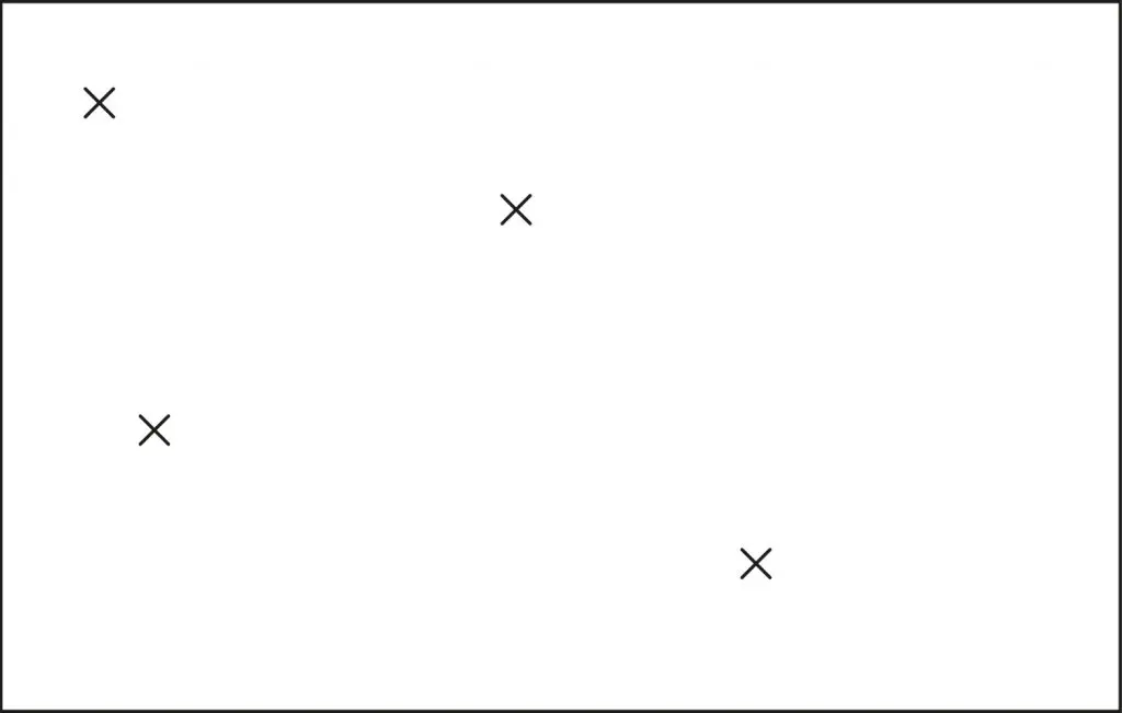
After that, we connected the points, so it built a shape.
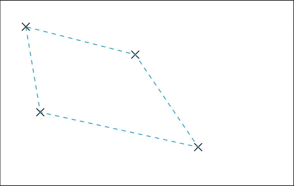
This exercise gives you a good insight into how balance works.
Our task now was it to balance this construct, using lines, circles – anything that could help to balance it.

Now it’s time to show how we can implement these concepts while we try to brush letter multiple words together in a single, good-looking piece.
A year ago, I found this post by @nabruone.
He explains the basic principles about balance in such an easy way:

In this piece, the red lines create the height as well as the main structure of the piece. The blue lines are the floor and roof that sandwiches and levels the lettering. The purple lines are the walls that close out the whole thing on both ends. The green lines are accents that accentuate each end. This is the blueprint to a piece.
He used the symmetrical balance for this one.
This applies to multiple words as well.
I am going to show you this on an example in a bit.
3. Creating a brush lettered layout/composition using multiple words – Step by step process
After we clarified the basics, I hope you understood the Idea behind balance and layout.
I will know to explain my process step by step.
My compositions are not that complicated, sometimes a more straightforward form does the job very well.
I think the main problem is that people don’t think that much about the compositions and neglect this topic completely.
So how you do a basic composition?
The most basic composition might be the cantered composition.
A common way is to write the words out and draw a box around the words and see how you can arrange them.
Now you just have to center them underneath, and that’s basically it for this composition.
Another technique, I discovered for myself recently, is to use the text tool in illustrator.
Center the text and to tweak the text box until you think it looks good.

Think about which words should be grouped together, in a line, in the same style or the same weight.
I will now show you my process on a simple example.
For this I choose the phrase: “This is the life I choose”
Let’s start!
First, we need some guidelines.
Important – Decide upfront what your layout is going to look like.
Guides are essential for a good composition; this is also the one thing I always see people don’t do.
I remember, once I started using guidelines, my work instantly had a much better composition, and my letters didn’t jump around anymore.
I am using a simple triangle ruler and a pencil.
For the composition, I make different rows.
Each row has a little bit of space between the other row.

After that, I draw a line through the middle of my grid.
This helps me to locate the center to position the words later.

The last step, before we finish the grid, is to add a third layer of lines.
This one is for the angle of the letters.
It’s not necessary, but it’s helpful and keeps your work even and clean.

That is basically it for the grid.
Before I start writing, I like to roughly sketch the words into the grid, to see where I have to place them and to get a feeling of the letters (How much space their need, etc.)

After that, I grab my brush pen and write the whole phrase down!

You can see I failed a little bit at the balance and centering the words.
Those smaller mistakes do not mean you have to write the whole phrase over again.
There are some tricks to make it still work!
To be honest, I do this more instinctively, but there are some tricks how can locate these spots.
Draw a box around the lettering, and you will see that there is some white space left.
I don’t want you to fill out the whole box, just to keep some balance.
You can see how the “IS,” and the “LIFE” has a more significant gap between them, than the “E” of the “THE” and the “E” of the “LIFE.”

I added a little swash to the L in life and another one to the E in “The” to balance it out.
You can see the “IS,” and the “L” in the word “LIFE” has a similar gap like the “E” on “THE” and the “E” on “LIFE.”
I also added a stroke to the bottom and a “crown” to the top… and all a sudden it looks more balanced, doesn’t it?
However, there is still some space, that needs to be filled.

An excellent trick to fill up left space are circles/paint drops.
Make you sure you don’t make them all the same size and try to add a little bit of contrast between them.

Just be careful with these tips for filling up space, I might overload this work already.
I added some drips and other details to the lettering.
This is the final work:

Keep in mind a good composition shouldn’t rely on these extras and details!
An excellent composition should be emphasized through the lettering itself.
I will now go deeper into the topic balance and explain it by showing some of my work.
Here is a phrase I wrote a couple of days ago.
I did it freehand, and I didn’t really think about the composition, but there is still a lot going on.

As you can see, I kind of centered the words.
The two “you” s, the two “do” are centered.
The two “gotta”s and the “what” are slight off.
I balanced this out with the swashes.
It makes the piece more interesting, so try to play a little bit with the position, you don’t always have to stick to the centered composition.
To analyze this piece with the words of @nabruone

You can also see how I used the first and last letters of each line to finish up the composition.
Sometimes I used a swash on both sites, and I mirrored the descender of the “g” with a higher ascender of the “t.”
If you still struggle with calligraphy letters, check out this tutorial where you learn how to write the whole alphabet in calligraphy.

4. A few extra tips to keep in mind
- Start with the layout first and then focus on the style.
- Start with roughly sketching the composition and allow mistakes to happen.
- Don’t rush it.
- It might take some time and start simple centering the words.
- Get a feeling for the balance and just pay attention to the layout, it doesn’t have to be a super complex one.

5. Introducing Matchphrase
Inspiration on the fly
After you got an insight into how the layout and balance work, all you need to get started is a phrase to write, right?
I just recently launched a new website, with a growing collection of phrases.
You can filter them by topic, length, length per word, and language.
All you need to find a matching sentence.
We all have these lists with lots of phrases we like and that we save to write later, why don’t just put all the list in one massive, sorted collection, for everybody to use?

Find more about that here matchphrase.org or check the Instagram account @matchphrase.
Thanks for your attention and I hope I could bring this topic a little bit closer to you.
6. Final words
Thank you for joining us for yet another tutorial.
As you can see, these concepts are not that difficult or too complicated to understand.
The key behind them is good ol’ consistent practice!
The more you do it, the easier it will be for you to create different well-balanced layouts.
If you want to get constructive feedback to your lettering and calligraphy, be sure to join our Facebook group!
The official Lettering Daily Facebook group is a place where you can –
- Share your work
- Get constructive feedback
- Network with fellow lettering & calligraphy artists
- Ask specific questions about lettering & calligraphy
- Much more!
Thank you for joining for another tutorial, and until the next time –
Stay AWESOME!!
Pin me!

Stay updated with my tutorials and get instant access to the Lettering Crate –
A growing library of free lettering & calligraphy resources that includes –
About the author
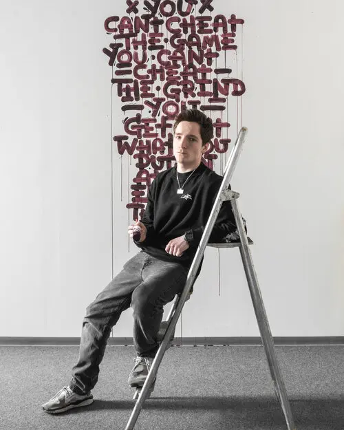
I am Snooze one, a lettering artist from Berlin, Germany.
The first time I worked with letters was at the age of 13 when I started with graffiti.
After my godfather gave me a parallel pen, I started to practice calligraphy and lettering.
I love to try out new things and comparing different techniques.
For three years now I am also interested in different printing techniques.
I have a small screen-printing shop in my attic and I really enjoy
printing my letters on t-shirts and posters!


simplemente y como lo he dicho hace ya algún tiempo, snooze es un gran referente, tiene toda la dedicación para responderte alguna duda que tengas, aunque no hablamos el mismo idioma no hay problema para comunicarnos, muchas gracias por estos tips que nos ayudan bastante a quienes estamos partiendo en esto ya mas enfocado. Sólo como pregunta, ¿cómo ocupas la Regla paralela con gobernante?
Saludos y nos estamos leyendo, tengo unas frases que quiero me revises 🙂
Hola Jonathan, lo siento pero no estoy seguro de entender completamente lo que quieres decir. ¿Puedes tratar de explicarlo de una manera diferente? Lamento la mala traducción, estoy usando el traductor de Google: D
Thank you for teaching me yet another lesson
Lovely
I am glad you liked it and you could learn something!
Although this article gave some really great advice regarding composition (thank you!), it was SO poorly written that it was difficult to read. Please be sure to include some editing next time ?
I especially appreciated the idea that just because your first attempt isn’t quite balanced, you don’t have to re-letter it. That sure takes away some of the stress!
Hey Abbott, thank you for your feedback. What exactly is difficult to read? Would love to know so we can improve our content the next time.
Thank you!
I agree with Abbott. I appreciate the tutorial but I find the lettering too cramped and therefore difficult for me to decipher. Too much going on there for me, however, you clearly explain how to balance the text out. Following your tutorial I would simply increase the spacing and possibly skip all upper case. Matchphrase sounds fun. I’m heading on over…
Thank you.
I understand what you mean, I tried to cover all the ideas with one lettering, might overload it because of that.
Thanks for checking out Matchphrase!
I am just starting and feel a bit overwhelmed,
I have an idea for Christmas and I could not figure out how to arrange it!
This tutorial was awesome!
Thank you very much!
I am so glad this article could help you!