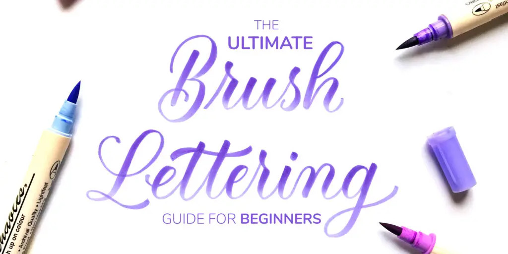
Hello!
It’s Jillian and Jordan from Loveleigh Loops, and we’re excited to bring you an article that’s all about brush lettering.
We’re twin sisters who have taught tens of thousands of students how to master calligraphy tools and letter styles, ranging from pointed pen to flourishing to iPad lettering.
But brush lettering was our first real love, and we have a lot to share with you today.
Here are the contents of this guide –
1. What is brush lettering?
2. What supplies do you need?
- Supply #1: Paper
- Supply #2: Brush Pens
3. Why are brush pens great for lettering?
4. How do you use a brush for calligraphy?
5. What’s the right way to hold a brush pen?
6. How to overcome the most common brush pen struggles
7. Brush Pen Warm-Up Drills
- Warm-Up #1: Downstrokes
- Warm-Up #2: Upstrokes
- Warm-Up #3: Curved Strokes
- The 7 fundamental strokes
8. FREE downloadable worksheets
9. Summary
10. Bonus 1 –
- Brush pen characteristics (ink type, color selection, size, flexibility, duality, etc.)
11. Bonus 2 –
- Brush pen storage tips
Let’s get started with the tutorial!
Pin me!

1. What is brush lettering?
Let’s define “brush lettering” by breaking it apart into the two words: “brush” and “lettering.”
- The Brush can be a brush pen, which is a felt-tip marker with a flexible tip, or an actual paintbrush with bristles.
- Lettering can be broken down into hand lettering and calligraphy. The main difference is that in hand lettering, you “draw” the letters, but in calligraphy you “write” the letters and follow specific rules (learn more about the difference here).
In this article, we’ll focus on using brush pens to do calligraphy.

2. What supplies do you need?
You only need two things to get started: a brush pen and paper.
But you can’t just use any old paper you have sitting around.
Why not?
Most brush pens are felt-tipped, and they’re more fragile than they look.
Dragging them across rough surfaces, even paper that’s just slightly textured can lead to fraying.
This breaks down the tip and makes it harder to get crisp, thin lines, and can damage the pen.
So what can we do to avoid this?
It’s simple–use smooth paper!
Supply #1: Paper
Here are some of our favorites:
- High-quality printer paper, such as HP Premium 32lb
- Marker or tracing paper, such as Canson Marker Paper
- A pad of very smooth paper, such as Rhodia pads
If you want to learn more about calligraphy papers, check out this article.

However, you’ll also want to keep in mind the absorbency.
The highly absorbent paper will drain the ink from the pen.
Choosing a smooth, low-absorbent paper will make your brush pens last the longest!
When choosing paper, you’ll also want to think about using guidelines.
You can use a pencil and ruler to draw out straight lines, or you can print guide sheets directly on the paper.
Another option is to print a sheet of guides to use with a light pad, or underneath transparent marker paper.
If you keep reading, you’ll see a worksheet with different guide sheet options later on.
Let’s talk about the next supply you need – brush pens.

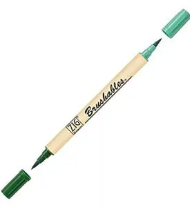
Supply #2: Brush Pens
When it comes to brush pens, there are hundreds of options. It can be intimidating, but we’ll break it down for you now.
We at Loveleigh Loops surveyed over 2,000 letterers about their favorite brush pens, and the top two results were the Pentel Sign Touch and Tombow Dual Brush pen.


Both options are easy to use, easy to find, and reasonably priced.
The Pentel is smaller and has a firmer nib than the Tombow Dual.
A few of our other favorite brush pens include:
They’re dual-sided with TWO brushes, one light and one dark of the same hue. They’re also pigment ink, so they’re long-lasting and fade-resistant. The nibs seem to resist fraying more than other similar-sized brush pens.
Faber-Castell Pitt Artist brush pen.
These pens are pigmented and fade-resistant. They come in a variety of lovely colors and are a medium-sized nib. The nibs are reversible, which makes them long-lasting.

Sakura Koi Coloring brush pen.
The Kois come in a variety of really unique colors. The barrel of the pen is short, making them perfect for portability, and they can create a nice contrast in line thickness.

An excellent choice for medium-sized lettering. The nib is firm and creates delicate hairlines.
This small-nib brush pen is a staple in the lettering world. It comes in a hard and soft option, perfect for different levels of flexibility and ink flow. They’re durable and create beautiful hairlines.

Probably the juiciest brush pens ever! The Ecolines create stunning natural gradients and have reversible nibs to make them long-lasting. They come in both bright and pastel colors.

If you want to learn more about tools, check out this article on the essential calligraphy tools.
3. Why are brush pens great for lettering?
Brush pens are great for lettering because they are much easier to get started compared with a dip pen and ink.
The learning curve is much lower as well as the maintenance aspect – more on that later on.
Besides the fact that they are very beginner friendly, here are a couple of more reasons why we love brush pens.
First off, they come in a variety of colors and ink types.
You can create some beautiful color schemes and neat visual effects!
Here’s an example of blending, which can be done with water-based pens:

But that’s not all… you can also get a range of sizes for the brush tip.
Depending on how big you want to write, you can get fine-tipped pens (like the Pentel Sign Touch) and larger ones (like the Tombow Dual Brush).

Also, some pens are more flexible than others.
If you’re very heavy-handed, you might have more success with a firm tip.
Very flexible tips are typically harder control and take lots of practice to feel comfortable with.
By the way, practicing pressure control with brush pens can translate to other tools, such as paintbrushes or dip pens.

The variety of colors, sizes, and flexibility makes it easy to find a pen that fits your needs.
Whether you’re just practicing, or working on a project, or creating something to share on Instagram, there’s a pen for you.
More about that later!
Oh, and one last reason we love brush pens:
they are SO much more portable (and mess-free) than inks or paints.
You can just throw a few in your bag, and you’re good to go 🙂
Now let’s talk about how to actually *use* them.
In case you don’t have a brush pen and you cannot get one, you can always try to do calligraphy with a pencil.
4. How do you use a brush for calligraphy?
The thing that makes script lettering look like calligraphy is the variety of stroke weights.
In other words, some parts of the letters are thicker than others.
So how do you do that with a brush?
The key is to change the amount of pressure you’re writing with.
By using lighter pressure (just touch the tip of the brush to the paper), you can create a thin line. Pressing down harder on the brush will create a thicker stroke.
Sounds easy enough!
But when you go to try it yourself, you might be unsure of which parts you’re supposed to make thicker.
Here’s the secret: Thick down, thin up.
On the word “strength,” you can see that the areas where the pen moves downward have a thicker line than the other parts of the letters:

The way to achieve this is to use more pressure on the downstrokes, and less on the upstrokes.
This creates a contrast between the strokes and gives it the look of calligraphy.
So what does the pen look like on thick versus thin strokes?
Let’s take a side-view look.
The first picture below shows light pressure, with just the tip of the pen touching the page.
In the second picture, more pressure is applied so that more of the nib comes in contact with the paper.


Don’t be nervous about pressing down on the flexible tip.
As long as you’re holding your pen at about 45-degrees to the page (and not too upright), you won’t damage it by pressing down.
In practice, using different amounts of pressure on the letters will create a calligraphy effect.
Let’s look at another example in the word “extraordinary” below.
You can see that anywhere the pen would travel in a downward direction, the stroke is thicker.
Everywhere else, it’s thin.
On curves, such as the top and bottom of the oval in the letter ‘a,’ there are smooth transitions:
the stroke gradually gets thicker or thinner.
On these transitions, the pen gradually changes from light to heavy pressure, or vice-versa.

Another characteristic of calligraphy is slant and proportions.
Using guide sheets helps with both of those! See how:

While traditional calligraphy scripts have strict rules on the slant angle and how tall the ascender/descender line is versus the x-height, there’s a lot more flexibility in modern brush lettering.
Whatever proportion and slant look best to you works for us, as long as you maintain consistency!
We’ll talk more about how to practice consistency later in this article.
Okay, now that we know more about what brush lettering looks like, let’s talk about how to hold the brush pen.
5. What’s the right way to hold a brush pen?
Watch any brush lettering artist on Instagram, and you’ll start to see that there are lots of different ways to hold the pen.
So the answer is: there isn’t just one “correct” way to do it.
What’s important is that you have a grip that is comfortable and allows you to make contrasting thick and thin strokes.
Start by holding the pen the same way you write with any regular pencil.
Then, make three adjustments:
- Relax your grip. Holding too tightly can cause pain in your hand.
- Move back. Make sure you’re not holding too closely to the tip. Your fingers should be an inch or so away from the tip of the pen.
- Angle your pen. Pay attention to the angle of the pen compared to the paper. Many people tend to hold it too upright, which makes it harder to get contrasting stroke weights, and can damage the pen. Shoot for about 45-degrees to the surface of the table (but you don’t need to get out a protractor!)

This is what your grip might look like from a side view:

It takes some time getting used to using a brush pen for lettering, but keeping those three tips in mind will help.
Just getting started with brush calligraphy?
Check out my workbook From Strokes to Style — it’s a step-by-step guide built for beginners, no experience needed.
Master Brush Calligraphy
One Stroke at a Time
This 100+ page workbook walks
you step-by-step through brush
calligraphy basics to full style
development – no experience needed.

6. How to overcome the most common brush pen struggles
Now, brush lettering can look really easy when you follow tons of talented artists who have been doing this for years.
But, it can actually be quite challenging to get started.
Based on our survey of hundreds of beginner brush letterers, here are the most common struggles:
- Knowing which supplies to use
- Pressure control (shaky upstrokes)
- Transitioning from thick to thin strokes
- Consistency
- Knowing what to practice

Hopefully, our section about supplies earlier in this article (and the bonus at the end!) help you with Struggle #1.
Now for the hard part: pressure control, thick-to-thin transitions, and consistency.
The key to solving Struggles #2-5 is practice…
…but you have to do the right kind of calligraphy practice.
Luckily, we made a resource to help.
It’s our brush pen warm-up worksheet, and you can get it for free.
But first, we’ll go over some warm-up drills as well as the 7 basic calligraphy strokes.
Once we explain you how to do these drills, you’ll be able to download our brush pen warm-up worksheet – for both big and small brush pens!
It’s time to get your tools out and get to work.
7. Brush Pen Warm-Up Drills
As you do these strokes, we’d like to remind you of these 3 things:
- Hold your pen at a 45-degree angle to the paper (i.e., not too upright)
- Make your downstrokes thick by applying more pressure. The upstrokes will be thin, requiring less pressure on the pen
- Practice on smooth paper
And we also have a BONUS tip for you:
- Go slowly! Really focus on the pressure you’re applying
Let’s get into the drills. We’ll start with downstrokes.
Warm-Up #1: Downstrokes
Place your pen at the top guideline and press the tip of the pen into the page. As you draw the stroke, apply an even amount of pressure to produce a thick line. Create these at a slight angle to the baseline rather than straight upright.

Practice a full row of these and work on keeping them consistent.
Depending on the pen, you might hear a squeaky sound when you make the downstrokes—that’s fine!
As long as you’re keeping the pen angled at 45-degrees and using smooth paper, you won’t ruin the pen.
Warm-Up #2: Upstrokes
This drill is the complete opposite of the downstrokes!

We’ll start at the bottom and move upwards, following a slight slant.
Instead of applying pressure, you’ll need to use a lighter touch.
Don’t worry if the thin strokes look or feel shaky—that’s totally normal and will improve with practice.
After practicing thick and thin strokes separately, it’s time to combine them with curves.
Warm-Up #3: Curved Strokes
For the first drill, you’ll start from the baseline and go up, then curve around at the top.
As you start going back down, add pressure to create a thick line, then let off the pressure once you hit the baseline again.
Continue back up with a thin stroke.

The second curved drill is the opposite.
Starting with a thick downstroke, curving around to a thin upstroke, and then up and over to a thick downstroke.

Lastly, try creating ovals.
Start at the top and move counter-clockwise.
The left part will be thick and the right, thin.

This video demonstrates these drills in real time:
Next? Practice, practice, practice!
Getting your hand used to create strokes with varying amounts of pressure is so important.
It’s best if you can get consistent strokes within these drills before you even move into letters.
Once you have them down, it will make writing with a brush pen much easier.

Fundamental Strokes
When you’re more comfortable using your pen after practicing the warm-up drills, we at Loveleigh Loops encourage you to try out the fundamental strokes of the lowercase alphabet.
You’ll see that these strokes are simply a combination of the warm-up drills you just learned.

The 7 fundamental strokes, sometimes called basic strokes, are:
- entrance stroke
- underturn
- overturn
- oval
- compound curve
- ascending loop
- descending loop
It’s important to practice these shapes because they make up the lowercase letters of the alphabet.
For example, you’ll find the oval in lowercase “a” and “o”, and the ascending loop in letters like “h” and “k.”
Max has created a whole in-depth tutorial on the basic calligraphy strokes that you can check out here.
And once you’ve learned the basic calligraphy strokes, you can check out this tutorial that will teach you how to write the whole lowercase alphabet in brush calligraphy.
8. FREE downloadable worksheets

This worksheet gives you drills to help combat the struggles of pressure control, thick-to-thin transitions, and consistency.
You’ll practice your thick downstrokes, thin upstrokes, and curves/transitions.
We included scans of our actual brush strokes so that you can compare yours to ours.
You can do these drills with any size brush pen!
Simply sign up to the newsletter below and you will get full access to the Lettering Crate – an exclusive member area with all the freebies available on Lettering Daily.

Stay updated with my tutorials and get instant access to the Lettering Crate –
A growing library of free lettering & calligraphy resources that includes –
9. Summary
In this article, we’ve answered these questions:
- What is brush lettering?
- What supplies do you need?
- Why are brush pens great for lettering?
- How do you use a brush for calligraphy?
- What’s the right way to hold a brush pen?
- How do you make the basic strokes?
We’ve barely scratched the surface of what’s possible with brush lettering.
Just take a look at the #brushlettering hashtag on Instagram to see how many amazing works are being created each day!
Don’t forget to grab your free worksheet for Brush Pen Warm-Up Drills that will help you overcome the most common struggles beginners face with brush lettering.
Simply sign up to the Lettering Daily newsletter and get full access to the Lettering Crate and all the available freebies.

Want to learn even more?
We’ve created a beginner-friendly, comprehensive online course called Brush Lettering Bootcamp that will take you from complete beginner to being able to create lettering with a brush pen.
It includes over 6 hours of video lessons plus worksheets that walk you through every step—including details that you never even thought you needed to know!
You’ll learn –
- brush pen control
- thick and thin transitions
- how to analyze and critique your work to improve
- the complete alphabet
- letter connections
- numbers and symbols
- and much more
We break everything down, and our students continuously tell us about the “lightbulb” moments they have throughout the lessons.

Interested in more info about brush pens?
You’re in luck!
We wrote a whole section for you about brush pen characteristics and storage tips.
Read more:
10. BONUS: Brush pen characteristics (ink type, color selection, size, flexibility, duality, etc.)
While you can get started with just a single brush pen and some smooth paper, if you’re anything like us, you want to try out ALL the pens.
And there are so many to choose from!
It can be overwhelming, so we’ll break down all the characteristics for you.
Once you understand these, you’ll be able to choose which one will work best for your project.
Here are the brush pen characteristics:
Nib type: Felt versus Bristle
Felt-tip brush pens are a solid tip made of fibers that look like a sponge.
These are our favorites for beginners because they’re easier to control.
Bristle-tip brushes have individual strands that come together to form the brush.
They’re usually more challenging to control, but you can get unique brushy textures with them.
You can also use bristle-tip brushes on textured surfaces, whereas felt-tip pens should be used only on smooth paper.
The majority of popular brush pens are felt-tip, and those are also the kind that we prefer.

Flexibility: Soft to Firm
One of the hardest parts about starting with brush pens is learning how to control them.
Using a firm, stiff nib allows for more natural control on the thin strokes because the tip returns to its original shape after applying pressure.
Firmer tips require that you press harder on the pen to create a thick stroke.
Flexible nibs are softer and react more quickly to changes in pressure.
This can make it harder to control the thin upstrokes, but also allows for beautiful, juicy thick strokes.
Ink type: Dye or Pigment
Now we’re getting into some chemistry!
Dye-based means that the colorant is dissolved into the ink solution (usually water), which pigment inks have tiny, insoluble particles that don’t dissolve completely.
What you actually need to know about this difference is that dye-based inks are generally easier to blend, but are more prone to fading.
Pigment-based inks resist water and light, so they’re longer lasting.
However, they’re typically harder to blend.
This video demonstrates the difference.
The top two brush pens are water-based and blend easily, even after drying.
The third is a pigmented ink and doesn’t blend at all:
Size
Brush pens come in a variety of sizes, from extra-fine to extra-large.
Note: we’re referring to the actual nib, not the size of the barrel of the brush pen.
Smaller nibs are great for detail work and smaller scale lettering, such as envelopes, and are typically firmer.
Larger tip pens are generally juicier because more ink can flow out, and they can range from firm to soft.
Even though smaller pens can seem easier to learn with, we personally believe that it’s best to start with a larger nib so that you can see all of the strokes and connections and get used to pressure control.
It’s easier to cover up your mistakes with a small nib, or not notice them at all, which makes it more challenging to transition to a larger size later.

Colors
We’re lucky to live in a world where so many brush pen colors exist!
While some brands only offer black, many provide at least a few color options.
Some have over 50 (!), and you can also find sets, such as pastels or jewel-tones, that go well together.

Other characteristics
Some brush pens are double-sided, with a bullet tip on the other end, or even another brush tip in a lighter shade.
You can also find metallic inks, which show up beautifully on dark paper.
11. Bonus – Brush pen storage tips
In general, the best way to store your brush pens is laying down flat, NOT standing upright.
This is so that the brush tip doesn’t dry out (if you stored them brush side up) or get over-saturated (if brush side down).
To keep them laying flat, you can store your brush pens inside of drawers or on shelves.
For a more organized solution, you can search for marker storage shelves or create your own DIY storage.
Two notable exceptions to this rule are the Karin Brushmarker Pro pens, which must be stored upright, and Tombow Dual Brush Pens, which can be stored upright.
You can store either of these options standing up with the cap at the top in the stand that comes with the full set or in cups.
Thank you for joining us for another tutorial.
We hope the contents of his tutorial were useful and that they will help you improve your brush lettering skills.
If you’re interested in learning other styles, check out Max’s article on the 10 calligraphy styles.
Until the next time,
Stay AWESOME!
About the author
Loveleigh Loops is an online educational resource for aspiring letterers, co-founded by twin sisters Jillian Reece and Jordan Truster. Jillian Reece is an analyst-turned-entrepreneur. She gravitates towards a modern brush calligraphy style and loves figuring out step-by-step ways to teach. Her love of art and lettering has turned into a full-time passion and there’s nothing she enjoys more than helping her students achieve their goals. Jordan Truster is an engineer-turned-creative business owner. She specializes in pointed pen, the Copperplate style, and flourishing. Her engineering background influences her approach to teaching calligraphy. She loves to break down complicated concepts into logical steps and teach students how to analyze their work. Jillian and Jordan grow up near Cleveland, Ohio and now live a few houses apart in Dayton, Ohio. They’ve built a highly engaged and supportive online community.


Hi🥰. I came here looking for a beginner’s guide to lettering with brush pens. Very helpful, thank you so much.
You are welcome 🙂
Where can i buy zig brushables from Sacramento , USA?
I think the best way to go about that is to search for it online 🙂
You can get the online at Marker Supply! https://www.markersupply.com/zigbrse.html
Here’s a sample pack that has them, along with some other brush pens to try: https://www.markersupply.com/jilolobrpenc.html
I have been following on Instagram for years! Please sign me up for your newsletter
Hey Robin, do you still need help with that subscription?
Hi. I came looking for a beginner’s guide to lettering with brush pens, and stumbled upon this. Very helpful, thanks.
You mention that brush pens should be used on smooth paper. My intention was to build a relationship with brush pens, and then also use them for homemade cards. I would assume then, that’s not a good idea to use on regular blank cards/ cardpaper?
Thank you, Maheen! Yes you can still use them on regular blank cards/cardpaper. You just need to be aware that rougher and less absorbent paper can consume your brush pens faster than proper paper.
While brush pen lettering can be lovely, I wish people would *call* it brush pen lettering… brush lettering uses……a brush, not a pen. and is a whole different skill… and a much harder skill to master.
Thanks for your comment, Tisha. I agree with you and I think that you are technically correct. However, there are a few other things that I took into consideration for the title of this guide. The main one being that brush lettering has become a popular term for this particular style, and it’s recognizable in the community. I wouldn’t even call it lettering but rather calligraphy – I believe that hand lettering is a totally different form of art than calligraphy. Most popular brush pens today are made with felt tips and i think it’s their ease of use that makes it so popular – especially among beginners. We also have bristle brush pens with the long synthetic hairs – like the fude Pentel brush. I completely agree with you that it’s a much harder skill to master – it requires a different hold, more concentration and a well-developed foundation. I am not a professional and i might be talking nonsense here, but i believe it would be easier to start learning the basics using a felt tip brush pen and then move towards a bristle brush and learn how to operate that tool. What do you think? Thanks again for your comment, im really happy to see that there are people out there who are keen on correct terminology and who understand the nuances of this beautiful artform 🙂