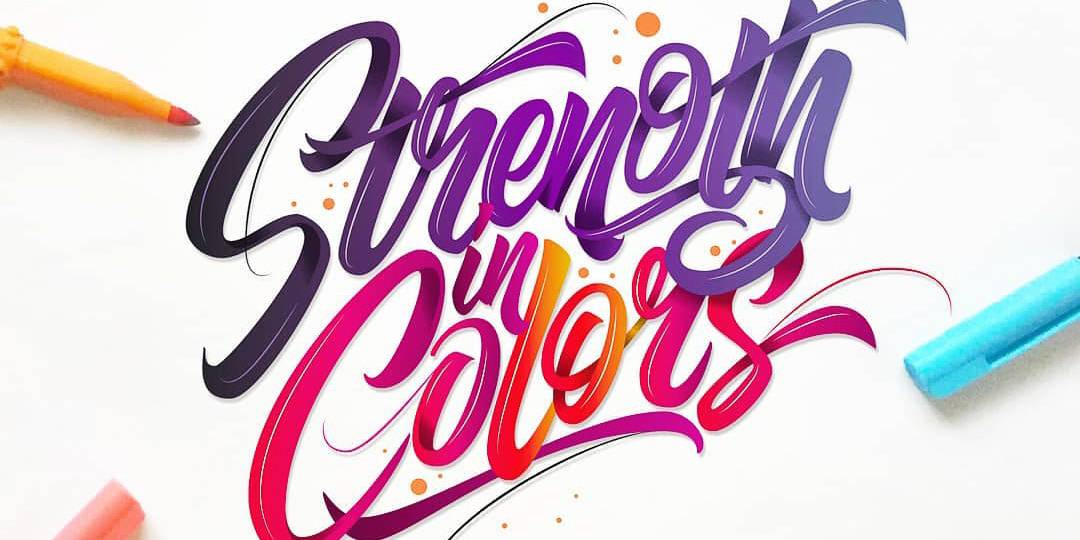
Working with colors can sometimes be overwhelming, and not understanding the fundamentals is like walking into a dark room with no lights on. Today we will be going over some of the very basic principles of colors in order to start creating colorful masterpieces with confidence.
Here are some of the things we will cover today:
- Why are colors important
- Value and saturation
- The types of color harmonies
This may seem a bit complicated at first, but i guarantee you that understanding these 3 concepts will open up your eyes completely towards the world of colors 🙂
1. WHY ARE COLORS SO IMPORTANT?
Let me start right off by saying that color can either ‘’make or break’’ your artwork. Color is equally important as your layout composition, stroke consistency, balance, etc.
Colors are a great way to reinforce the message that you are trying to convey with your lettering, and colors are also a great way for setting up a mood or evoke a certain emotion.
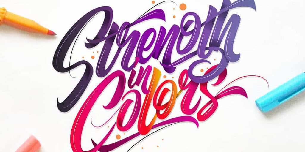
This has a lot to do with the psychology of colors, such as the basic division of warm and cold colors as shown in the image below.
A quick example so you can understand better what im exactly talking about is: the red color (warm) can signify dominance, passion, anger etc. – strong emotions. Here is a great example by the talented @skribsinner

2. VALUE AND SATURATION
Let’s start with saturation here. In the most basic definition,
SATURATION is the intensity of color.
While on the other hand,
VALUE is the level of brightness or darkness of a certain color.
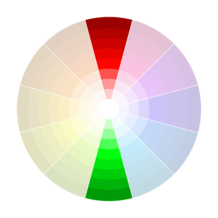
By only taking one color i.e. Blue, and adjusting its saturation and value we can already get wide range of different colors. Check out this scheme that illustrates perfectly the different tones created from the color Red simply by modifying these two things –

Even with this simple few basic tweaks you can create some beautiful looking letter blends, backgrounds, shadows etc. But we will get back to this later on in this article.
As mentioned earlier, colors are a great way to evoke certain emotions and setting up a mood, conveying a certain message etc.
By using brighter, more saturated colors you can set up a cheerful mood and evoke different positive emotions, while on the other hand, by using darker tones you can create an opposite reaction.
This naturally, depends on the message your are trying to share with your lettering.
AVOID HEAVY SATURATION
You definitely want to avoid using heavy saturated colors throughout your whole artwork. This is something i see many beginners are struggling with.
Remember that your eyes need to rest, and that bright and saturated colors are best combined with low saturated colors.
Here is a good photo example,
if you try to look at it for a longer period of time you will start noticing your eyes struggling with it.
Here is what you DO NOT want to do

While this is a much better and soothing look

These 2 photos, which perfectly illustrate the negative effects of heavy saturation are taken from www.digitalphotomentor.com
It is very common to use a higher level of saturation on ‘’objects’’ you would like to point the attention to (a.k.a the main focal point), and this is due to the increased contrast between the highly saturated object and the low saturated background.
We recently shared on our Instagram page this awesome inspirational piece by @joey_bearbower
and although it doesn’t have any colors per see (black is still a color) you can see how he used more saturation on the ”GET IT” in order to draw your attention to it. In other words we can say that ”GET IT” is the focal point in this piece.

Try to start pay more attention to the colors on TV, music videos, movies etc. You will quickly start to understand how professionals are using colors to their advantage.
Before we start talking about the different color harmonies i would like you to check out this awesome info graphic made by Studio Binder, which perfectly illustrates how professionals are using the psychology of colors in TV shows and movies to their advantage.
The Psychology of Color in Film
3. THE TYPES OF COLOR HARMONIES
Ok now that we have learned why colors are so important, and what value and saturation are, we can move on the the final step of this tutorial and break down the color harmonies, or in other words, color combinations.
Before we start counting down the different combinations i would like to present you the color wheel! (most of you have probably had the chance to see this before)
We will be using the color wheel to show you the different combinations.

Remember – you will find the color wheel being turned in different positions, in this example the color yellow sits on the left side but there are other examples where it sits in different positions. Don’t let that confuse you since, the color harmonies are always the same.
NOTE – In order for you to get the most out of this, is to test each color harmony. Preferably multiple times, nothing will give you more insight as first hand experience!
1. Monochromatic-
As mentioned previously, just by adjusting the value and saturation of 1 color you can create a wide variety of tones of the same color.
This is great for those just starting out !
This is the most simple color combination since you are just using one single color.

Here is another awesome example of a monochromatic color harmony by @skribsinner
You can see that using only one color, and adjusting the value and saturation across the artwork, you can already achieve some stunning results!

2. Complementary-
You have probably heard this many times before. It’s a very simple yet very popular color combination.
Complementary colors are 2 colors sitting opposite to each other on the color wheel.
The best way to use this color harmony is to AVOID using the equally across your artwork (50 – 50) but rather using one as the main one and the other as a supporting color.
An awesome example by Arturo from @argoos.letters
You can notice the slight dominance of the blue color over the orange. If you still haven’t check out this awesome tutorial on how to present your lettering, where Arturo will guide you through a step by step process 🙂

3. Split Complementary
Very similar to the complementary color harmony, the split complementary is achieved by splitting one of the colors to the 2 surrounding on of the colors.
The split complementary simply gives you more creative freedom, where instead of only 2 colors (complementary) now you can add a third one into the game, and still create something very beautiful!
I would dare to say that this color harmony could be a bit challenging for those just starting out, and therefore i would recommend to practice the previously mentioned combinations 🙂
Here is another example by @skribsinner

4. Analogous –
This is probably one of my favorites !
The rule for this combination is 3 different colors sitting next to each other on the color wheel.
The reason i like this one so much is that it feels very natural, its easy to make and it gives you the opportunity to explore a certain color on a much wider scale.

This lettering piece by @Jimbobernaus demonstrates perfectly this color harmony!

5. Triadic-
The triadic color combination is 3 colors equally distant on the color wheel.
This one is a bit harder to pull off but it can definitely brings some stunning results. Once again, like with the complementary combo; do not use them equally throughout your artwork!

6. Tetratic ( double complementary)
To achieve a tetratic color harmony, you need to pick 4 different colors – 2 pairs of opposing colors.
Remember once again, do not distribute them evenly! Since you have a wider choice of colors here, the best way to use this color combination is for backgrounds or larger scale lettering pieces.

These last two color harmonies being more complex than others, are harder to find online, and if you have some suggestions you are more than welcome to reach out to us.
Here is an example of the tetratic color harmony by the skillful hand of @tolgagirgin99 , and although it’s google’s logo (and colors) it’s still a good example to illustrate this color harmony.

There you go awesome creative people!
These are the fundamental rules of colors 😀
Remember, colors are an equally important element such as the composition, balance, contrast etc.
Don’t be afraid to try it out and fail ! Failing at something new is the most absolute normal thing in this world, and it’s necessary for you to learn and grow 🙂
And if you want to find the perfect brush pen for your lettering, be sure to check out this article.
Until the next time,
Stay AWESOME!

Stay updated with my tutorials and get instant access to the Lettering Crate –
A growing library of free lettering & calligraphy resources that includes –
Pin me!
About the author

Hey, I’m Max. I’ve been drawing and messing around with letters since 2011. I don’t have a formal art degree—my background is actually in the kitchen as a former chef and on the streets painting graffiti with my friends. Over the last decade, through a ton of trial and error, I somehow turned that obsession into a full-time gig. These days, I design custom logotypes for global brands and paint large-scale murals. I started Lettering Daily just to create the kind of honest, no-BS tutorials I wish I’d had when I was starting out. Stick around, and let’s draw some letters.

Are brown and gold not tertiary colour , why is it not in the colour wheel? or are they other tertiary colours to be learnt.
Make split complementary color explanations easier?
They are and they are on the wheel. What exactly confuses you?
What it is to do with lettering?
Calligraphy.
Please send us the post.
Thank you.
I love doing it.
So please send us as many as you can
Helps a lot, thanks!
Glad to hear that! 🙂