Hello!
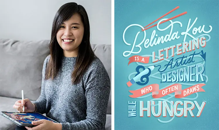
I’m Belinda Kou, a lettering artist and illustrator from Chicago, Illinois.
I love combining digital illustration with lettering to create tasteful and vibrant graphics for businesses — especially for the food and beverage industry!
When sharing work online, especially on platforms like Instagram, colors can make or break your piece.
How can you use colors to create something that stops someone from scrolling through their feed?
Bold and bright colors sometimes help, but what really matters is locking down how well they work together.
If this is something you struggle with, don’t worry!
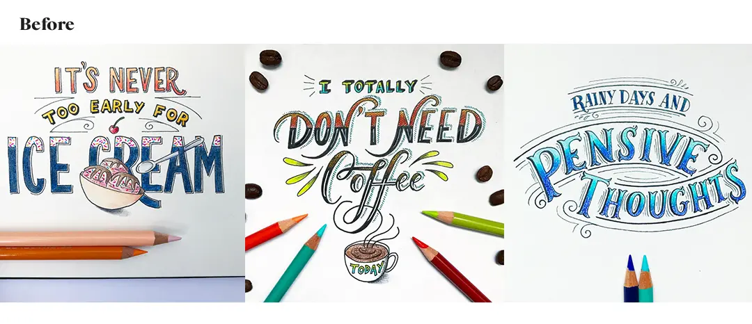
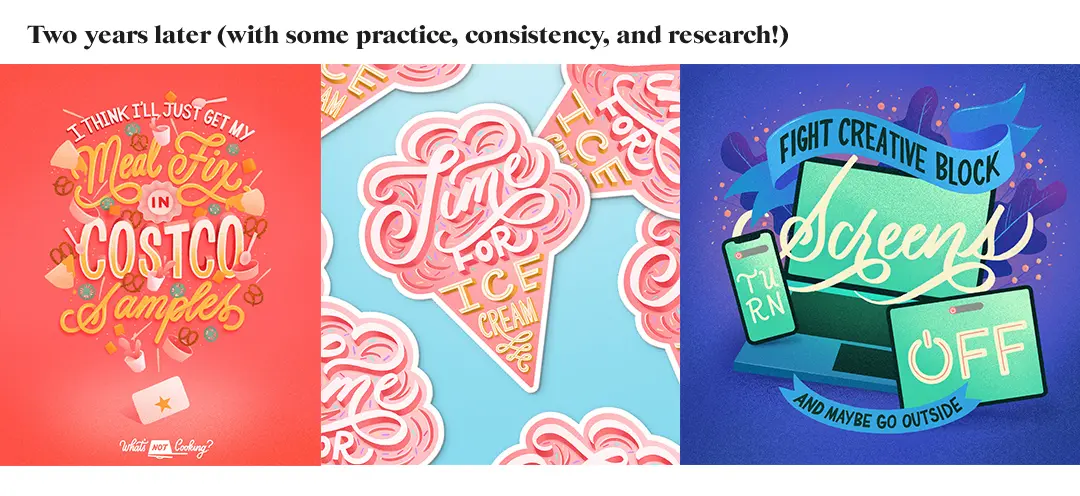
It takes time, but with consistent practice, planning and research, you WILL see your work improve!
Stay tuned for a challenge at the end of this article to help you do that!
Having developed an appetite for bold and vibrant color combos, I’ll be sharing with you some of the strategies I’ve learned along the way that helped me make better decisions about color including:
- When to introduce color into your lettering process
- Set the tone
- How to choose colors for your palette
- Where to find color palette inspiration
- Quick tips/tricks
Let’s get started!
1. When to introduce color into your lettering process
Ever waste minutes or even hours of your creative process with color indecision, and nothing seems to work?
I’ve been there!
One solution that I’ve found to help prevent some of this is to work in grayscale first.
This helps me make solid decisions about the work outside the influence of colors: things like –
- contrast
- scale
- proximity
- and focal points.
Once that’s nailed down, I add color to emphasize the decision making.
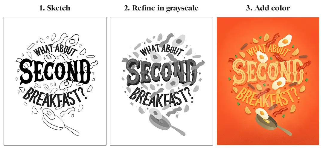
Working in grayscale also helps later on to determine the value and saturation of the colors (check out the color fundamentals article for more information on this and other color terms).
Grayscale will show you where the contrast needs to be.
For example, if your background is practically black in your initial composition, and you decided to go with blue as the background color, then you know you’re going to pick a heavily saturated blue or a dark shade of blue and your letters will be a much lighter color to stand out.
If it’s a white background in grayscale with black letters, then you’re going to choose a light color for the background with a more heavily saturated color for your letters, and so on.
2. Set the tone (pun intended?)
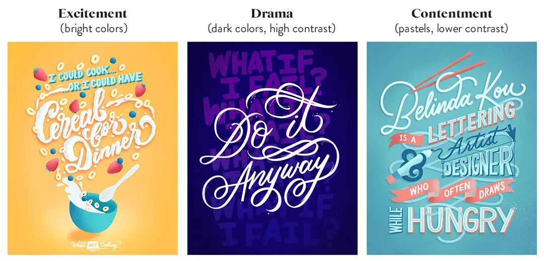
You could turn the same message in your art from exciting to dramatic with a simple switch of colors.
What kind of mood do you want to communicate?
Is it excitement?
Try a bright color scheme.
Is it drama?
Try something darker with cooler tones and pops of warm colors, or even black and white.
Is it contentment?
Pastels work well for that.
If you need a reference, the color fundamentals post has a helpful breakdown of colors used in film.
You can also do a quick search on color psychology to find tons of diagrams that break down meanings and emotions often associated with each color.
Once you figure out the mood you want to convey and choose a color that feels appropriate, that will be your main color and be used the most in your piece.
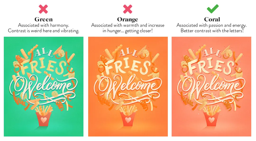
See the progression of color choices in the example below.
In the end, I chose to go with a coral background than green.
Orange was a close option, since it is associated with food and hunger, but I adjusted it to a coral shade for two reasons:
1) The message was about love and acceptance of fries, so red made sense and
2) red helped create more contrast between the background and the fries.
If you ever have a hard time choosing between two colors that communicate a similar mood, you can also look at the contrast of your lettering with the background and pick the color that helps that stand out better.
3. How to choose colors for your palette
Once you set the mood with a main color, you can start to decide what additional colors to add.
It is helpful to figure out which type of color harmony you want to use: monochromatic, complementary, split complementary, analogous, triadic, and tetradic (see the color fundamentals article for more info on color harmony).
I personally tend to use complementary or analogous color schemes.
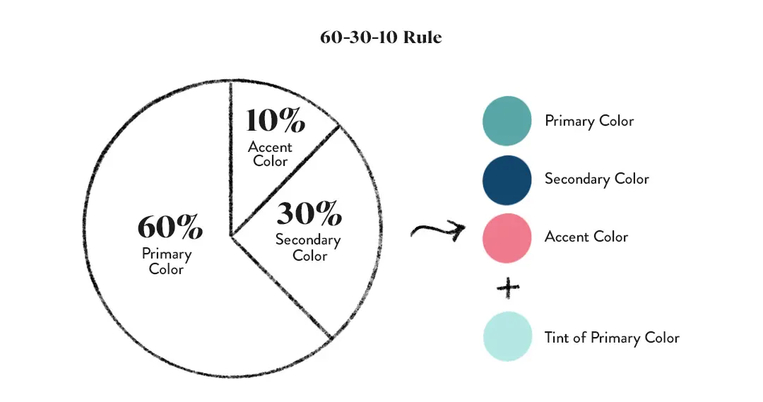
If you don’t know where to begin, restrict your color palette to 2-3 colors.
Begin by picking your main color, a second color, and one accent color to use sparingly.
The 60-30-10 rule is helpful to follow, where 60% of the piece is your main color, 30% your secondary and 10% your accent.
Then, if needed, add 1–2 more colors from there.
Choosing colors that have the same hues but are different tints and shades will also keep your palette more consistent.
You can create contrast this way without introducing a new hue (such as using a light blue for your lettering and a darker blue for your background).
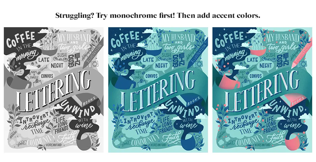
If you’re having a hard time deciding what colors go where and to what degree of value or saturation to add, try taking your grayscale image and apply a monochromatic color scheme first.
Then, pick a different color to add for an accent.
If you want more colors, do it one at a time so you can be intentional about how you are distributing each color (aim for an even distribution of accent colors) and aren’t using too many.
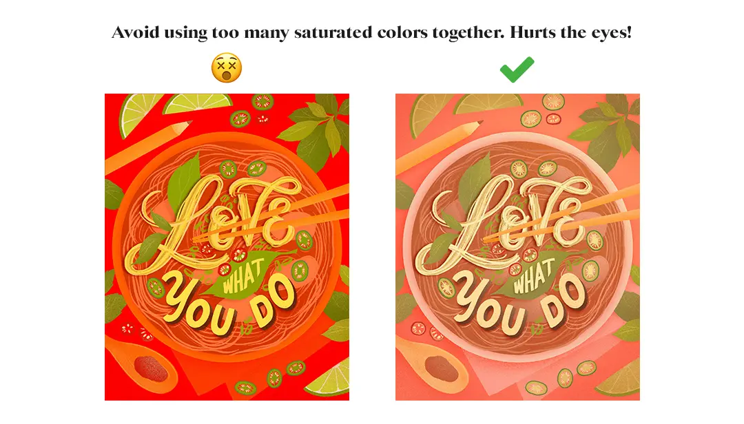
Also, try to avoid picking colors in your palette at the highest saturation levels.
It may end up overwhelming the eyes.
Generally, your color palette will look more cohesive if you choose different hues that contain similar levels of saturation and value.
4. Where to find color palette inspiration
You can find lots of color palette inspiration online!
Here’s where I like to go:
A quick color palette search will pull up tons of images and samples
Browse for inspiration, or search with color or mood keywords to see what images come up with color palettes in action
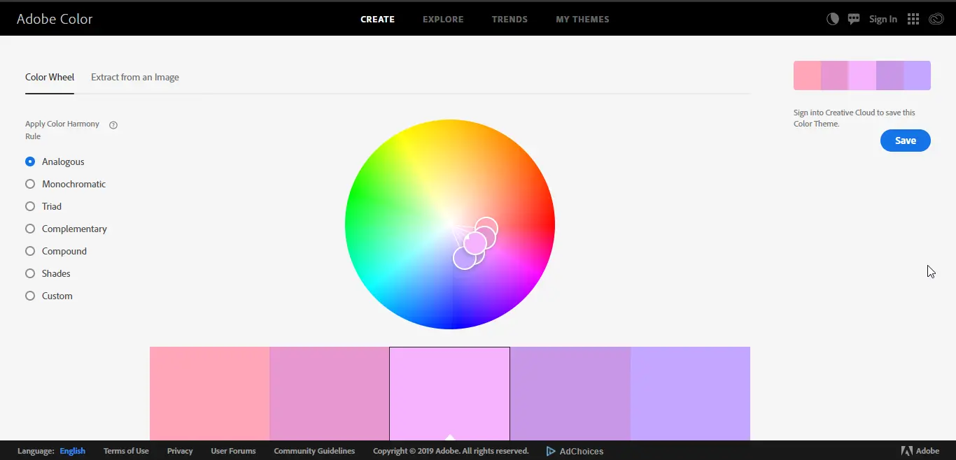
Create your own or explore color palettes on this website
This website is dedicated to images and color palettes pulled from those images
Instagram accounts dedicated to palettes such as
Artists who are rocking it with color
You can also find tons of inspiration from real life!
There’s a lot of cool color combos that you might see every day, if you look for it!
Take a photo and try eye dropping from that to create your own color palette.
5. Quick tips/tricks for coloring your lettering
The color struggle is real!
Here are some things that have worked for me through the years:
Duplicate your files –
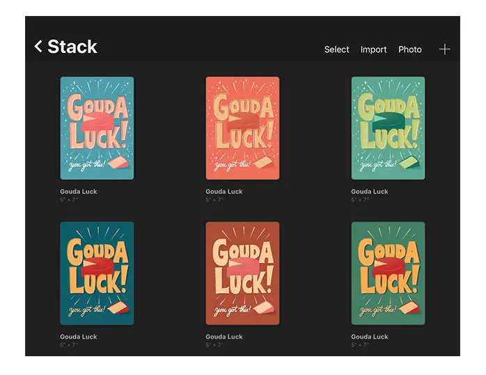
If you’re working digitally, such as in Procreate, it helps to duplicate your files if you’re not positive what color scheme you want to use.
In Procreate, you can see all your thumbnails at once which can help you compare quickly and make a decision on what works best.
Gut check with friends –
It doesn’t hurt to ask!
Especially if you’ve been too close to your artwork to notice any differences anymore.
Take a break!
Return to it a few hours later or the next day to see it with fresh eyes.
Squint test –
Squint your eyes to blur what you see.
This makes it easier to find where your focal points are and if your color placement and choices are working.
When you squint, look for even distribution of colors, especially where your color accents are.

Flip to grayscale –
Export your image (or take a photo) and convert it to grayscale via Photoshop or an app.
This is a different way to see if you’re creating enough contrast with your color choices.
Stick to 2-3 colors at first –
When in doubt, minimize!
If something’s not working in your color scheme, try taking out a few colors.
It’s always easier to start with a small amount of colors and expand as you get more comfortable.
Apply your knowledge! (#colormylettering)
I hope you were able to learn something new today!
In fact,
the best way to apply your freshly acquired knowledge is to put it into practice!
This is exactly why we’ve decided to create a small fun challenge in order for you to implement the things we’ve talked about in this article.
So, how does the #colormylettering challenge work?
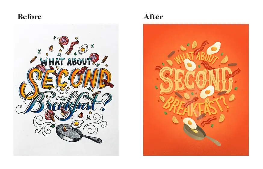
It’s quite simple!
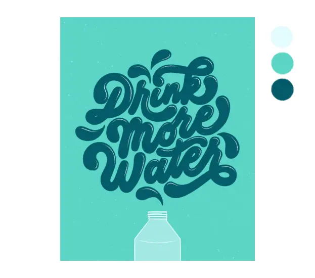
Take an old piece that you’d like to rework with new colors.
You could either be improving the existing color choices you made OR apply a completely new color scheme!
Then, simply share your work on Instagram and don’t forget to tag us! (@lettering_daily and @belindaskou) We’d love to see your improvement!
Some of our favorites will also be featured on the official Lettering Daily Instagram page!
But wait!
There is more.
If you want to get more constructive feedback not only on this challenge but generally your lettering and calligraphy, be sure to join our Facebook group!
The official Lettering Daily Facebook group is a place where you can –
- Share your work
- Get constructive feedback
- Network with fellow lettering & calligraphy artists
- Ask specific questions about lettering & calligraphy
- Much more!
Thank you for joining for another tutorial, and until the next time –
Stay AWESOME!!

Stay updated with my tutorials and get instant access to the Lettering Crate –
A growing library of free lettering & calligraphy resources that includes –
Pin me!
About the author

I’m a Chicago-based lettering artist and designer who often draws while hungry. ;) I have a penchant for drawing food, foliage and flowing lines, combining illustrations with hand lettering to create tasteful and vibrant graphics for digital and print. My background in the creative field has been a bit circular, with a brief stint teaching middle school science after getting my degree in biopsychology that eventually led me back to school to pursue design. After six years working in the agency setting as a graphic designer and associate art director, I made the transition to full time freelance with a focus in lettering and illustration.

Thank You so much for the content! It’s excelent and I’m learning so much.
Thanks! I am really glad to hear that 🙂