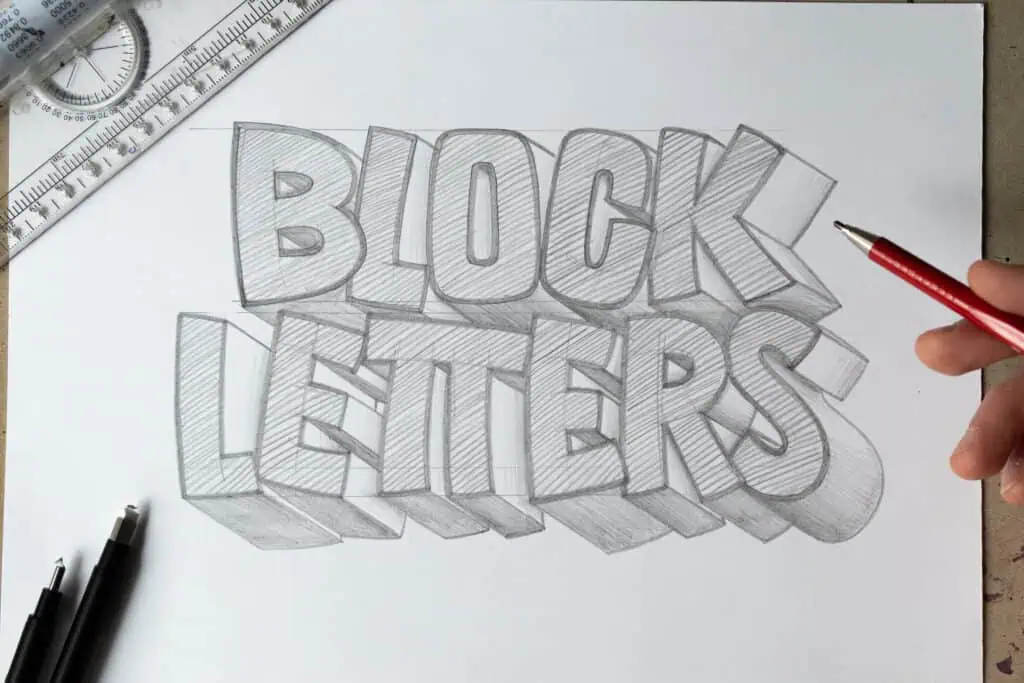
Block lettering, also known as sans serif lettering, is one of the most versatile lettering styles you can learn. It’s bold, readable, and built on structure rather than decoration.
In this guide, we’ll focus on how block letters are constructed and how small decisions around spacing and proportions can dramatically change their look. The goal isn’t to copy styles, but to understand a system you can adapt to your own work.
In this article you’ll learn:
- What block letters (sans serif letters) are
- Skeleton and wooden board construction methods
- How to space and kern block letters
- How to modify letter proportions for different styles
- Creative practice project ideas
In case you prefer to watch, I also made a YouTube video on this topic-

What Are Block Letters (Sans Serif Explained)
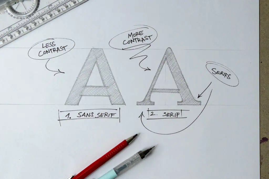
Block letters are often used as a substitute term for sans serif letters. The term comes from French and literally means “without serif”, referring to the small decorative stroke endings found in serif typefaces.
Another key difference is stroke contrast, which is often more pronounced in serif typefaces than in sans serif.
Block letters are one of the essential lettering styles you should learn as a beginner.
Tools Needed to Draw Block Letters
No fancy tools required. Just pencil, paper, and a bit of intention.
A ruler can help, but it’s not a must-have.
If you’d like to explore lettering tools in more depth, check out my extended guide.
How to Draw Block Letters Step By Step
Before worrying about outlines, shadows, or effects, the most important thing to learn is how block letters are constructed. Strong structure makes everything easier. Weak structure makes everything feel like a struggle.
The goal is to build letters from the inside out.
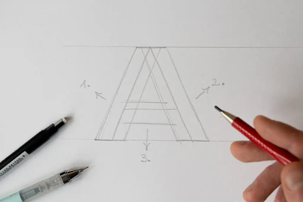
Step 1 – The Skeleton method
The first step is to reduce each letter to its simplest form. Think of this as the skeleton of the letter.
Draw the letter using single lines that define:
- its height
- its proportions
- its posture and rhythm
At this stage, you’re not drawing thickness or decoration. You’re simply deciding how the letter stands and how it relates to the other letters around it. If the skeleton looks balanced, the final letter will almost always work.
Here’s an example using the letter A.
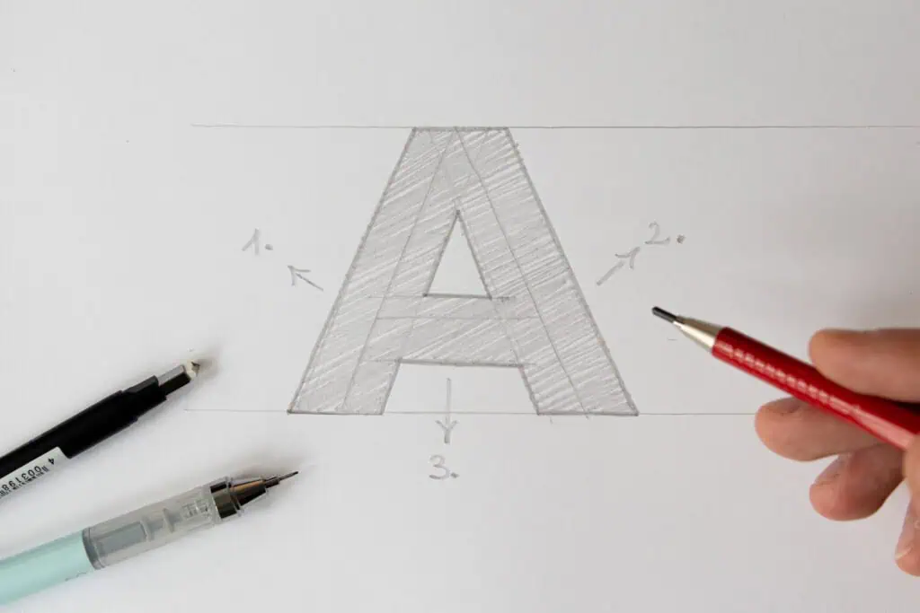
Step 2 – The Wooden Board technique
Once the skeleton is in place, you can begin adding thickness using what I call the wooden board technique. Imagine dividing the letter into simple shapes and stacking wooden planks on top of each stroke. The goal is to build volume evenly and intentionally.
Focus on:
- consistent stroke width
- clean corners
- smooth transitions
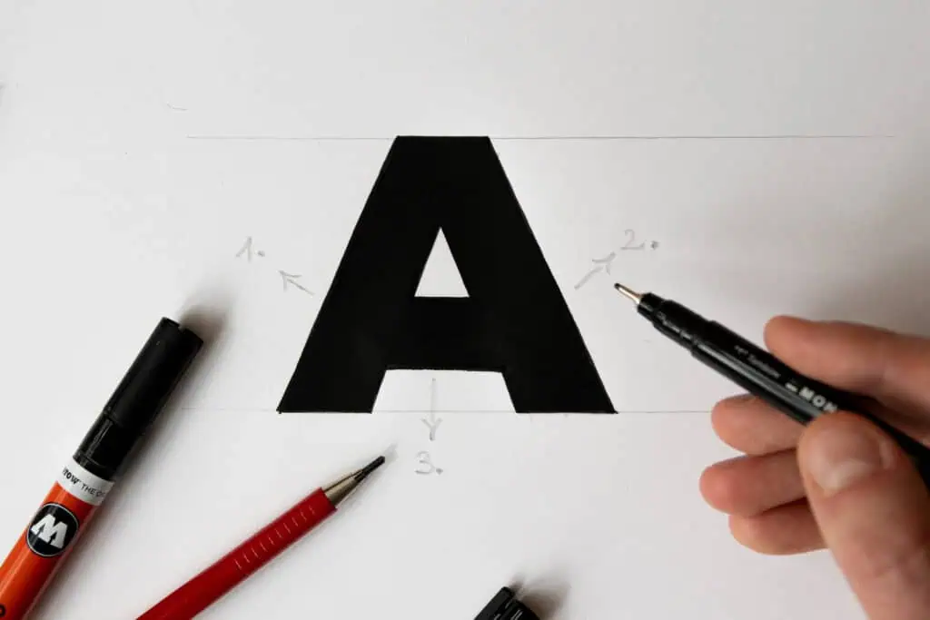
Step 3 – Fill in the letter
This method keeps your letters controlled and prevents them from becoming uneven. Once the structure is complete, you can fill in the shapes to create a solid letter. You can also do a second pass on the outer edges of the letter to create a light outline.
Step 4 – Ink the letter (optional)
To completely finalize the letter you can grab a fineliner or a marker and ink it. I marked this as an optional step since our goal is focusing on foundations and structure. In case you want to improve your inking check out this guide.
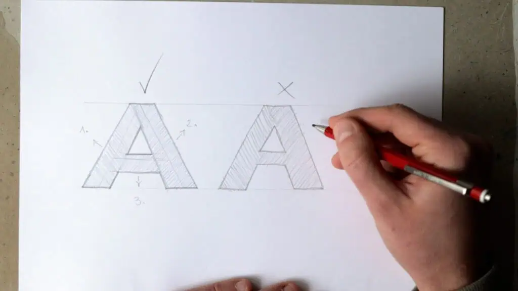
What Not to Do: Drawing From the Outside In
A very common beginner mistake is drawing block letters by outlining their outer shape first and filling them in afterward.
This often leads to:
- inconsistent stroke widths
- awkward spacing
- stiff or distorted letterforms
When you build from the outside in, you lose control of structure. Building from the skeleton outward keeps your letters flexible and accurate.
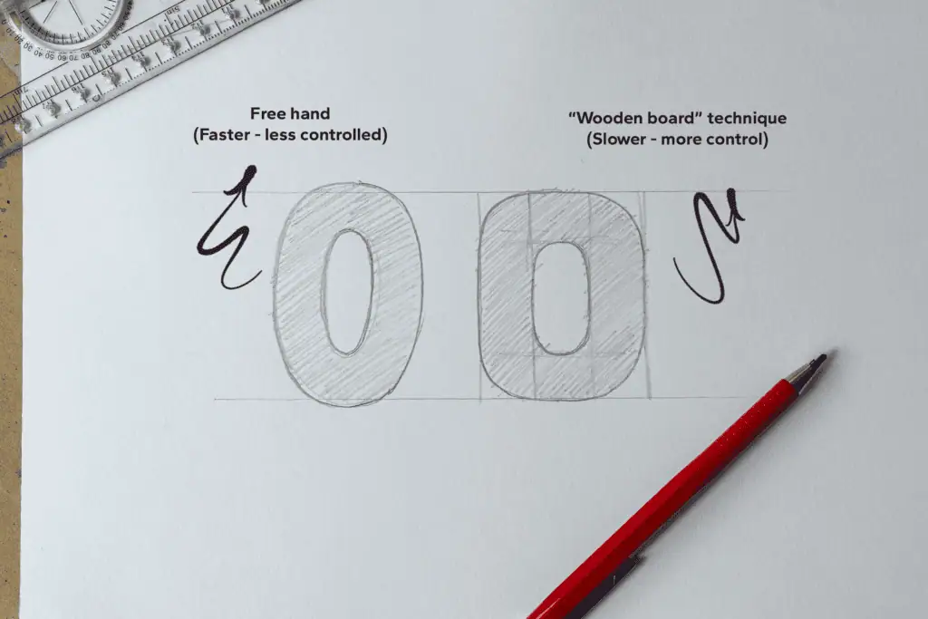
How to Draw Rounded Block Letters
The wooden board technique is very straightforward when working with straight and diagonal strokes, but rounded letters require a slightly different mindset.
Let’s take the letter O as an example.
You can either:
- eyeball it, which is faster but less controlled
- or construct it using the wooden board approach for better accuracy
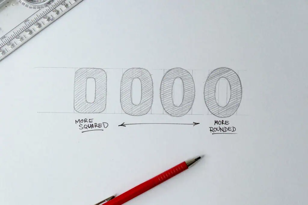
If you break the letter O down, it becomes four main strokes: up, down, left, and right, essentially forming a square. From there, you draw the boards and then round the inner and outer corners.
Depending on the style you’re going for, these letters can feel more squared or more rounded. Both are valid design choices.
Understanding Letter Groups
Most block letters fall into three broad categories:
- Straight letters (E, H, T, L)
- Diagonal letters (A, V, W, Y)
- Rounded letters (O, B, C, D)
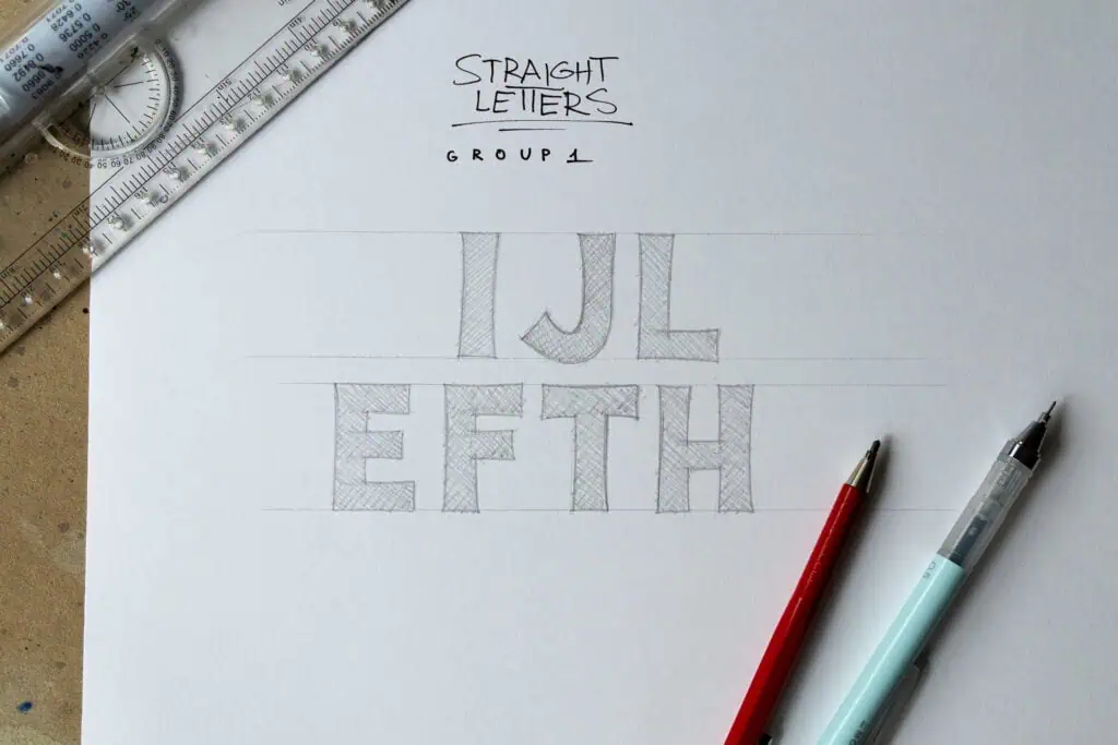
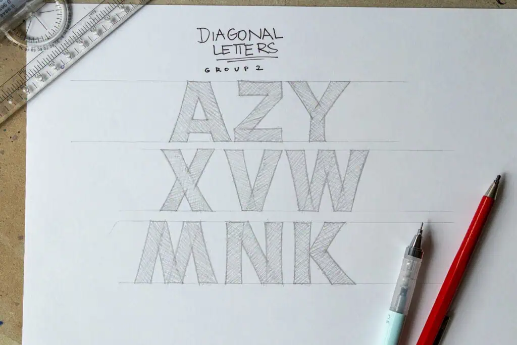
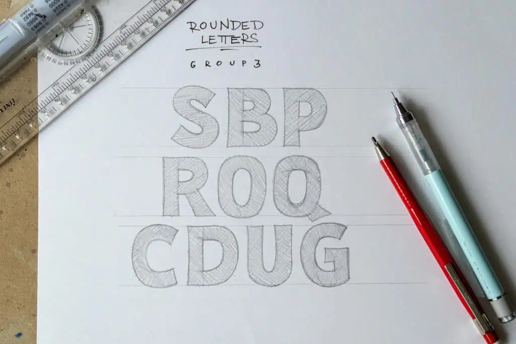
Straight letters are usually the easiest to control. Diagonal letters introduce angle management. Rounded letters tend to be the most challenging because maintaining consistent thickness through curves requires careful observation.
If you understand how the construction principles apply to each group, you can approach any letter with confidence.
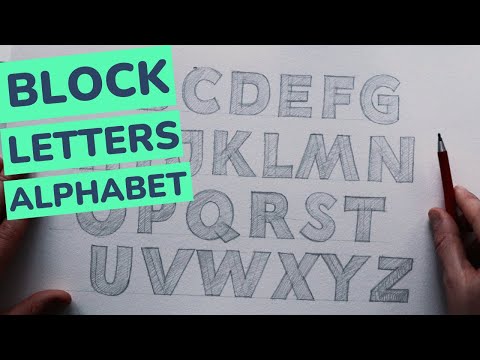
Block Letters Alphabet
Here’s a process video showing how I use the wooden board technique to draw the entire block letter alphabet.
How to Properly Space Block Letters
Spacing Is Optical, Not Mechanical
Good spacing isn’t about equal measurements. It’s about visual balance.
If this sounds like the introduction to a meditation seminar, don’t worry. A quick visual comparison usually makes the point clear.
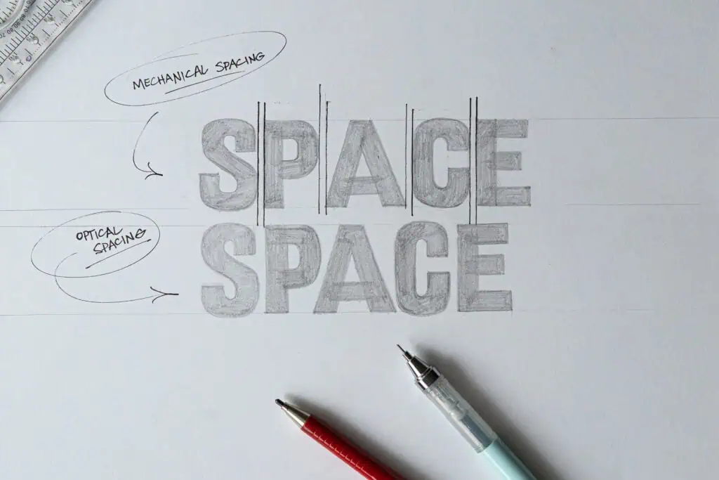
Two spaces can measure the same and still look very different depending on the shapes of the surrounding letters. Rounded letters, diagonals, and straight edges all create different optical gaps.
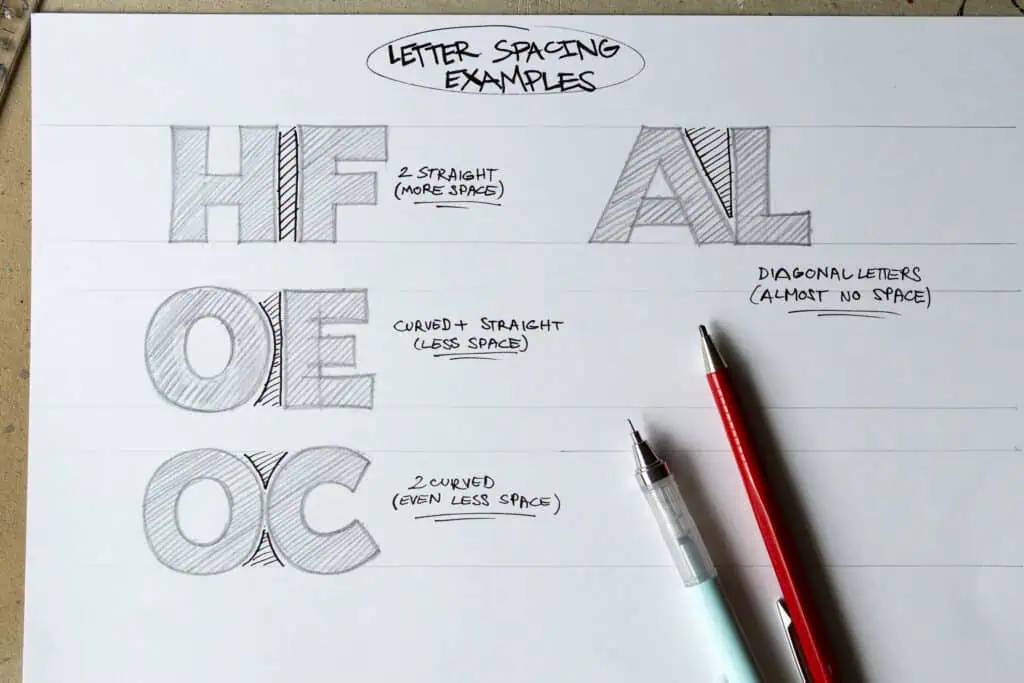
Rule of thumb (optical, not mechanical):
- Straight letters usually tolerate slightly more breathing room.
- Curved letters visually close space and often need to sit closer.
- Diagonal letter pairs often create large triangular gaps and usually need extra tightening.
- Always judge spacing by eye, not by measurement.
Try not to get overwhelmed by this. It doesn’t need to be perfect. The goal is simply that it looks good.
Spacing individual letter pairs is also known as kerning.
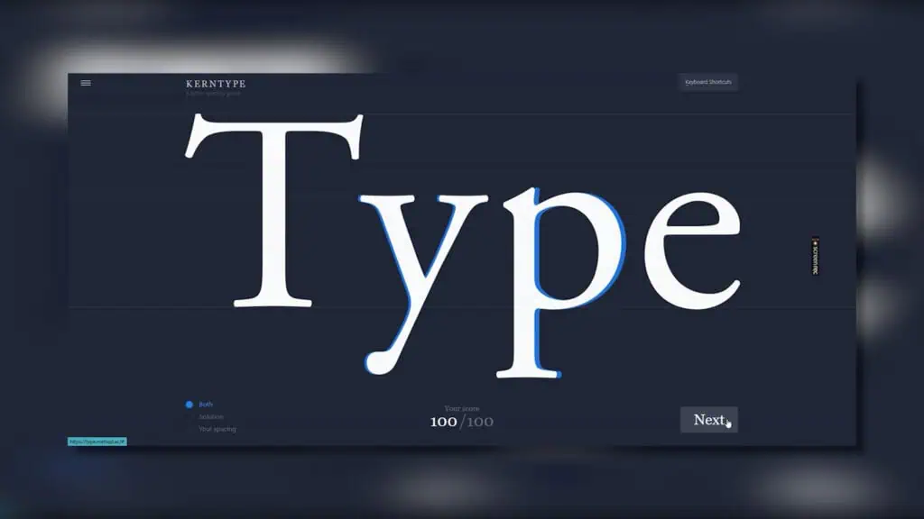
If you want to train your eye quickly, there’s a fantastic free spacing game at type.method.ac that makes kerning practice surprisingly fun.
Changing the Look With Proportions
Once the structure works, you can dramatically change the personality of block letters simply by adjusting proportions.
Try experimenting with:
- wider or narrower letters
- taller or shorter proportions
- heavier or lighter stroke weight
- sharp or rounded endings
- upright or slightly slanted axes
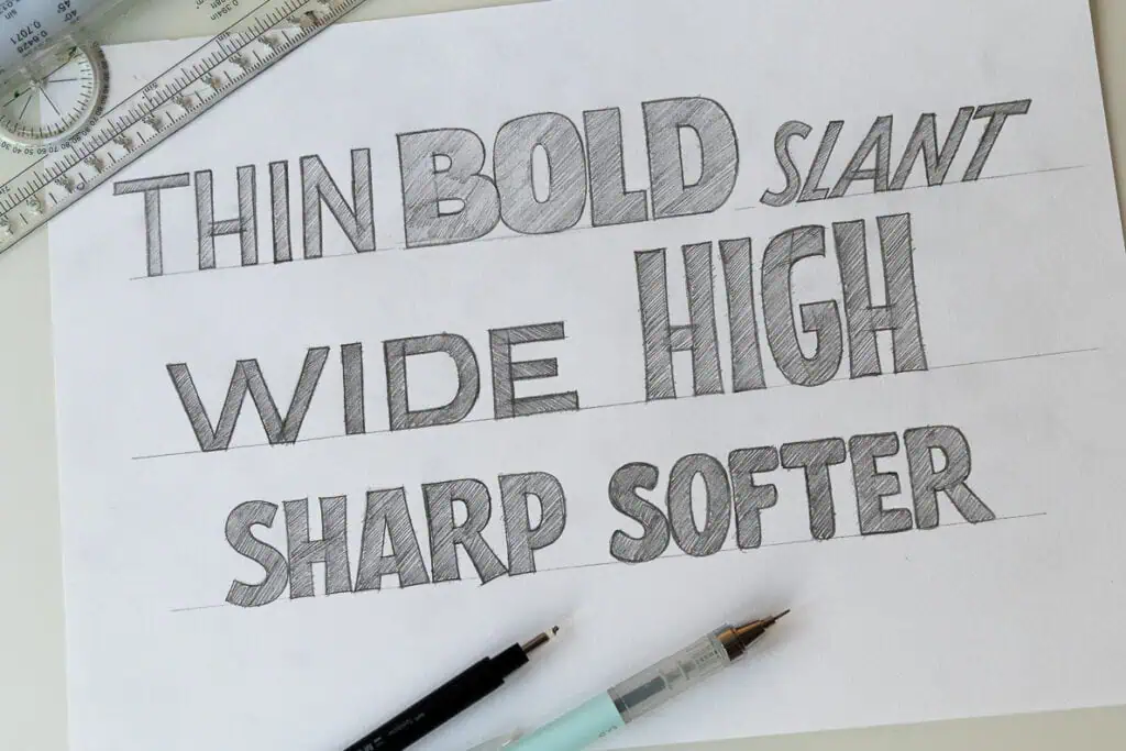
The underlying construction stays the same. Only the decisions change. This allows you to create a wide range of styles from a single system.
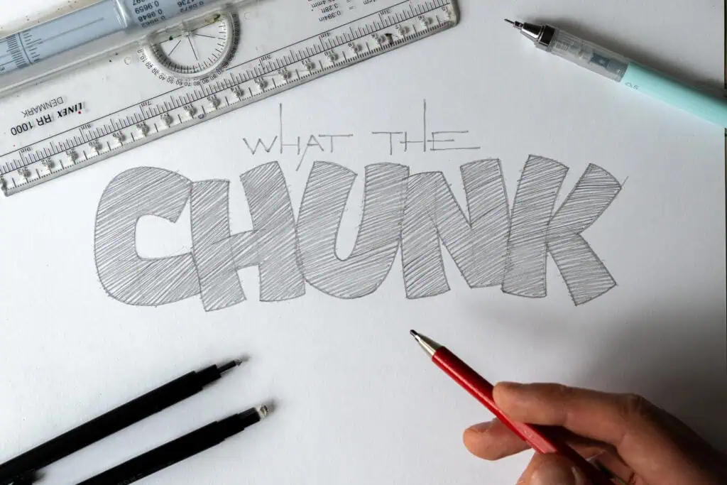
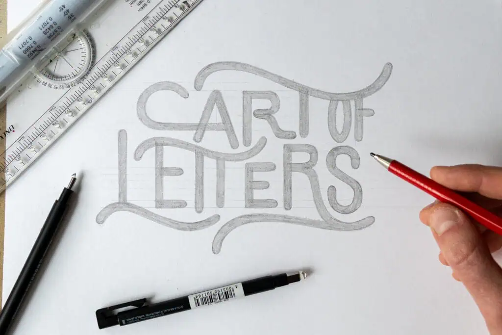
Block Lettering Examples and Practice Ideas
To turn theory into skill, here are several creative exercises you can try:
1. Playing With the Baseline and Angle
Let letters bounce slightly above and below the baseline to create rhythm and movement.
2. Interlocking Letters
Overlap or connect letters so they share space. This improves spacing awareness and composition skills.
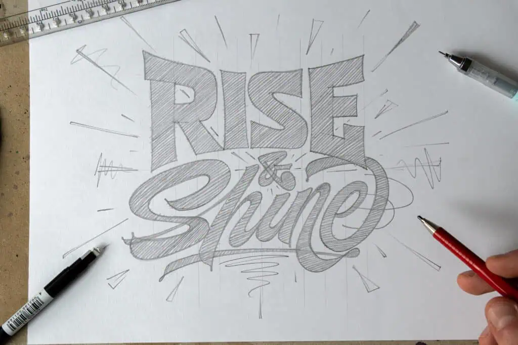
3. Pair Block Letters With Script
Combining rigid block letters with flowing script creates contrast and visual interest.
4. Place Letters Along a Path
Arrange letters along arcs, waves, or curves to introduce motion and layout control.
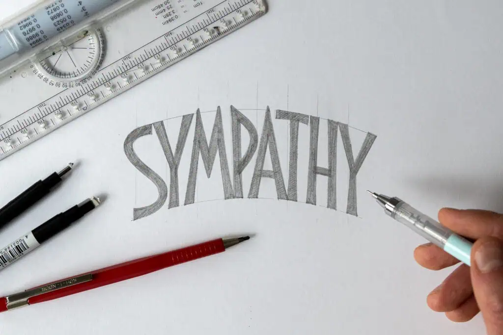
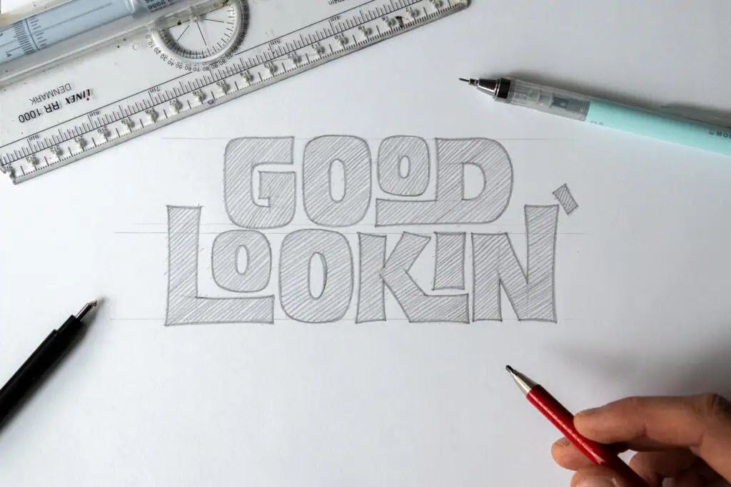
5. Fit Letters Into Shapes
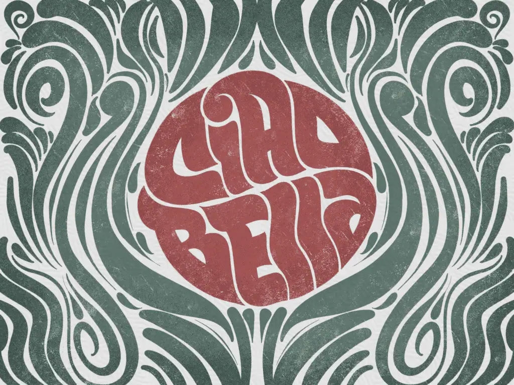
Design words inside circles, badges, or containers to practice proportion and hierarchy.
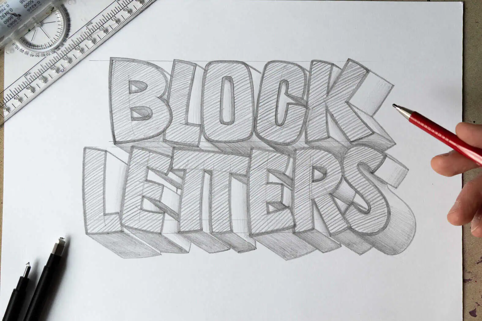
6. Add Simple Effects
Outlines, shadows, and basic 3D effects can add depth and polish once the base letters are solid.
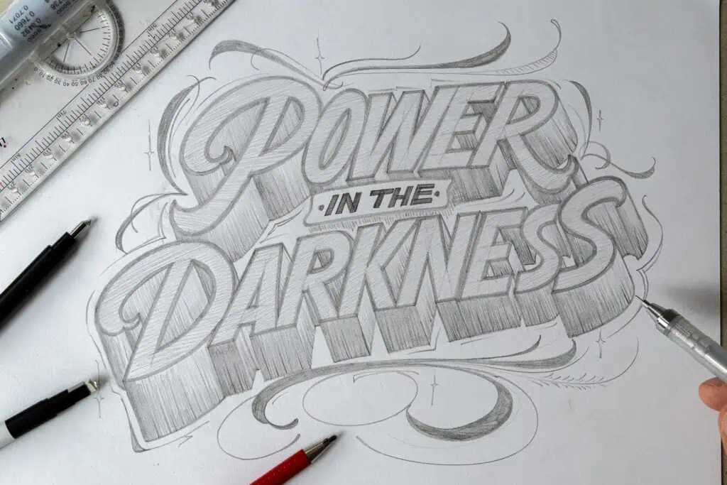
7. Subtle Flourishes
Add minimal flourishes as extensions of the letters rather than separate ornaments. These should support the composition, not overpower it.
Final Thoughts
Block lettering isn’t about memorizing styles. It’s about understanding structure so you can adapt freely.
Start with the skeleton.
Build thickness intentionally.
Space optically.
Then explore proportions and layout. Once those fundamentals are in place, creativity becomes easier and more enjoyable.
Pick one exercise and try it today. Small experiments compound quickly.
If you’d like more inspiration and lettering styles to explore, check out the hand lettering resources linked below.
👉 Explore the Hand Lettering Style Database
👉 Style Your Alphabet Workbook (10% OFF with code: STYLE10)

Stay updated with my tutorials and get instant access to the Lettering Crate –
A growing library of free lettering & calligraphy resources that includes –
About the author

Hey, I’m Max. I’ve been drawing and messing around with letters since 2011. I don’t have a formal art degree—my background is actually in the kitchen as a former chef and on the streets painting graffiti with my friends. Over the last decade, through a ton of trial and error, I somehow turned that obsession into a full-time gig. These days, I design custom logotypes for global brands and paint large-scale murals. I started Lettering Daily just to create the kind of honest, no-BS tutorials I wish I’d had when I was starting out. Stick around, and let’s draw some letters.

do you guys do things more like chaligraphy