The letter C might seem simple, but that open form is a blank canvas for serious creativity. With no stem or crossbar to “lock in” the shape, you’ve got room to experiment with width, contrast, and how tight or loose the curve feels.
It can feel delicate and calligraphic, bold and geometric, or anything in between. C is one of those letters where a small stylistic tweak can change the whole vibe.
🎁 Free Lettering Worksheet Download!
Get one full tracing page straight from the Style Your Alphabet Workbook — absolutely free.
Practice, trace, and start styling your letters today!

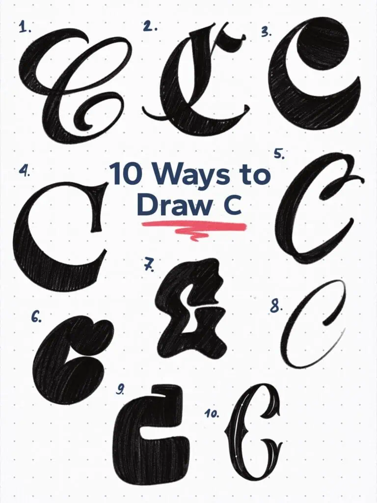
🔤 10 Ways to Draw the Letter C – Style Descriptions (With Personality)
1. Copperplate Script Style
Inspired by the timeless calligraphic script—but with a little extra weight. Think formal, but make it bold. Perfect for when you want elegance that still stands out.
2. Fraktur-Inspired
Sharp angles, strong verticals, and tight curves. Definitely pulling from blackletter, especially Fraktur. It’s rigid, but not stiff—just dramatic in the best way.
3. Retro High Contrast
This one just screams retro signage. Over-the-top curves and bold stress shifts—like it time-traveled from a 1970s album cover.
4. Old Style Ionic Serif
Simple, sturdy, and full of presence. Low contrast and those classic bracketed serifs keep it grounded—proof that “plain” can still hit hard.
5. Business Penmanship Brush
Started with business handwriting as the base, then flipped it into a brush pen vibe. Feels intentional but loose—like someone wrote it fast, but beautifully.
6. Bubble Graffiti Style
This one’s got that classic “throw-up” graffiti flavor. Rounded shape with a playful serif jabbed on for character. Funky and totally street.
7. Experimental Wavy
I just wanted it to move. No grid, no rules—just playing with motion and seeing what came out. It’s weird. And I kinda love it.
8. Calligraphic
Minimal construction, but with clear pen stroke logic. Like it was drawn with a dry brush or a fine-liner pen—super chill, but deliberate.
9. Square Slab Display
Big, boxy, and loud. That squared counter makes it feel almost mechanical, like it belongs on a retro arcade cabinet or a sports logo.
10. Narrow Tuscan Serif
Vertically squeezed with those classic split terminals. A little Victorian, a little circus-y, and definitely here to put on a show.
Explore the full Hand Lettering Style Database →

Master Every Letter A–Z With 260 Creative Styles
The Style Your Alphabet Workbook is your hands-on guide to building confidence, creativity, and control in your lettering.
Inside, you’ll find:
✅ 260 hand-drawn letters to trace and remix
✅ 26 word examples to practice real-world design
✅ Beginner-friendly insights that teach you how to think like a lettering artist
About the author

Hey, I’m Max. I’ve been drawing and messing around with letters since 2011. I don’t have a formal art degree—my background is actually in the kitchen as a former chef and on the streets painting graffiti with my friends. Over the last decade, through a ton of trial and error, I somehow turned that obsession into a full-time gig. These days, I design custom logotypes for global brands and paint large-scale murals. I started Lettering Daily just to create the kind of honest, no-BS tutorials I wish I’d had when I was starting out. Stick around, and let’s draw some letters.
