The letter B is all about rhythm and flow. With its vertical spine and stacked bowls, it naturally invites experimentation—do you keep the bowls symmetrical? Do you let one stretch or shrink? That vertical stem keeps things grounded, but the curves let you play.
It’s a great letter to explore contrast, bounce, and proportion—especially when you want to inject some style into a classic structure.
🎁 Free Lettering Worksheet Download!
Get one full tracing page straight from the Style Your Alphabet Workbook — absolutely free.
Practice, trace, and start styling your letters today!

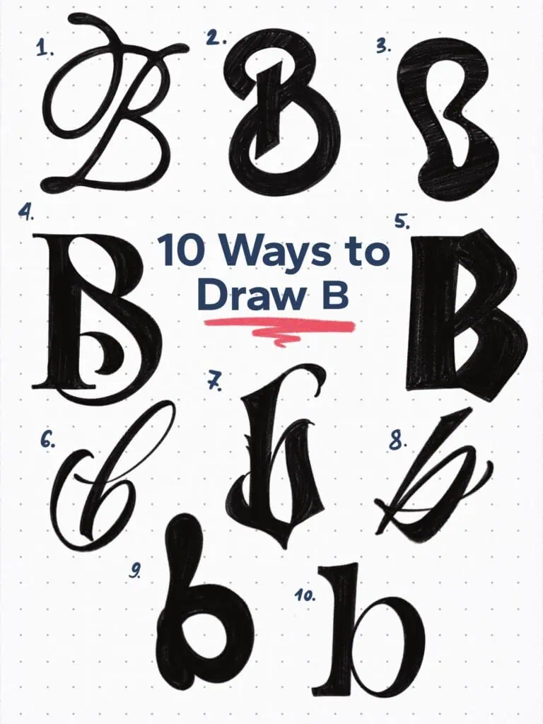
🔤 10 Ways to Draw the Letter B – Style Descriptions
1. Ink-Loaded Script
Inspired by italic caps and a round nib loaded with ink. You can really see the build-up where the strokes intersect—like the nib was a little too enthusiastic. That messiness? That’s the magic.
2. Geometric Cut
Bold, monospaced, and sliced across the top like it’s been precision-cut. Minimalist and modern, but still has that punch.
3. Blob Serif
Chunky, soft, and super friendly. The kind of B that would give you a hug. Retro vibes with a gentle attitude.
4. Experimental Old Style Serif
I wanted to push both bowls—so the bottom has this twisted little swash, and the top continues right out of it in one fluid move that loops back over itself. Kinda complicated, but looks cool, right?
5. Neuland-Inspired
Calligraphy meets chiseling. Big angles, dramatic rhythm, and a lot of presence. This one doesn’t whisper.
6. Flourished Loop
A lowercase B with a dramatic exit flourish. Handwritten luxury at its finest—definitely showing off a little.
7. Blackletter
Upright, dense, and unapologetically dramatic. If this B could talk, it’d speak in medieval Latin and drop the mic.
8. Dynamic Brush
Quick, loose, and confident. You can feel the motion in this one—like it was drawn in one breath.
9. Rounded Pop
Bubbly and bold, with just the right amount of weird. High contrast but low tension. A B that doesn’t take itself too seriously.
10. Modernist Minimal
Super clean, no fuss. A lowercase B with nothing added or taken away—just straight-up letterform honesty.
Explore the full Hand Lettering Style Database →

Master Every Letter A–Z With 260 Creative Styles
The Style Your Alphabet Workbook is your hands-on guide to building confidence, creativity, and control in your lettering.
Inside, you’ll find:
✅ 260 hand-drawn letters to trace and remix
✅ 26 word examples to practice real-world design
✅ Beginner-friendly insights that teach you how to think like a lettering artist
About the author

Hey, I’m Max. I’ve been drawing and messing around with letters since 2011. I don’t have a formal art degree—my background is actually in the kitchen as a former chef and on the streets painting graffiti with my friends. Over the last decade, through a ton of trial and error, I somehow turned that obsession into a full-time gig. These days, I design custom logotypes for global brands and paint large-scale murals. I started Lettering Daily just to create the kind of honest, no-BS tutorials I wish I’d had when I was starting out. Stick around, and let’s draw some letters.
