The letter D is like a mashup of strength and softness. One side is a solid vertical line—no-nonsense, straight-up structure. The other side? A giant curve begging to be stylized. That tension between straight and round gives D a ton of personality potential.
It’s also a great test of balance—how far can you push the curve without losing the core form? Turns out… pretty far.
🎁 Free Lettering Worksheet Download!
Get one full tracing page straight from the Style Your Alphabet Workbook — absolutely free.
Practice, trace, and start styling your letters today!

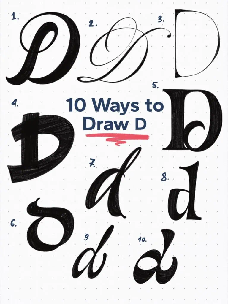
🔤 10 Ways to Draw the Letter D – Style Descriptions
1. Bold Script
High contrast, bold strokes, and just enough flair to feel confident without being flashy. Feels assertive, but still has that graceful, handwritten ease.
2. Flourished Copperplate
A classic capital dialed up to eleven. Sharp contrast, long ascenders, and swooping loops. Basically yelling “look at me” in the most elegant way possible.
3. Hairline Modern Roman Capital
Inspired by Roman capitals but stripped to the bone—razor-thin weight, almost no contrast, and super vertical. It’s sharp, disciplined, and kind of quietly powerful.
4. Playful Bold Sans
Sometimes you’ve just gotta let loose. This one’s chunky, bouncy, and hand-drawn with zero stress about getting it perfect. It’s bold and chill at the same time.
5. Victorian-Inspired Display Serif
All about contrast and interior detailing. Definitely borrowing from vintage letterpress styles. Feels ornamental but still holds structure.
6. Uncial-Inspired
A rounded two-stroke lowercase “d” with early calligraphy DNA. Pulled from uncial letterforms but stylized in a looser, more modern way.
7. Dynamic Brush Lettering
This is the kind of “d” I love doing with a brush pen. The two downstrokes have different angles, which makes it feel powerful and dominant—even a bit aggressive (in a good way).
8. Tall Wedge Serif
Big x-height, tight counter, and those wedge-shaped terminals give it an editorial feel. It’s giving high-end magazine title energy.
9. Round Nib Script
Almost monoline with a gentle slant. Nothing showy—just rhythm, clarity, and the influence of the tool itself. Less about a style, more about the pen behind it.
10. Reverse-Contrast Display
Flips the usual logic on its head—thick on the bottom, thin on the top. Super bold and intentionally weird. Definitely made to grab attention in a headline.
Explore the full Hand Lettering Style Database →

Master Every Letter A–Z With 260 Creative Styles
The Style Your Alphabet Workbook is your hands-on guide to building confidence, creativity, and control in your lettering.
Inside, you’ll find:
✅ 260 hand-drawn letters to trace and remix
✅ 26 word examples to practice real-world design
✅ Beginner-friendly insights that teach you how to think like a lettering artist
About the author

Hey, I’m Max. I’ve been drawing and messing around with letters since 2011. I don’t have a formal art degree—my background is actually in the kitchen as a former chef and on the streets painting graffiti with my friends. Over the last decade, through a ton of trial and error, I somehow turned that obsession into a full-time gig. These days, I design custom logotypes for global brands and paint large-scale murals. I started Lettering Daily just to create the kind of honest, no-BS tutorials I wish I’d had when I was starting out. Stick around, and let’s draw some letters.
