The letter E is all about balance and structure. With its strong vertical stem and trio of horizontal arms, it’s one of the most recognizable shapes in the Latin alphabet—but also one of the most fun to mess with.
Whether you stretch the crossbars, flip the contrast, or swing the loop into a spiral, E can take on tons of personality without losing its core identity. That makes it a perfect playground for exploring rhythm, weight, and form variation—especially when you’re trying to sneak some creativity into a “safe” letter.
🎁 Free Lettering Worksheet Download!
Get one full tracing page straight from the Style Your Alphabet Workbook — absolutely free.
Practice, trace, and start styling your letters today!

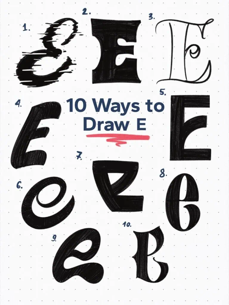
🔤 10 Ways to Draw the Letter E – Style Descriptions
1. Distressed Glitch Brush
Tried something looser and more experimental here—a distressed effect that almost reads like a digital glitch. It’s messy in all the right ways.
2. Reverse Contrast Slab Serif
Notice how the vertical spine is the thinnest part while the horizontal bars are heavy—classic reverse contrast. Bold, a little rebellious, and definitely not playing by the rules.
3. Ornamental/Vintage Hybrid Skeletal
At its core, this follows Roman capital construction, but I took a sharp left. It’s skeletal—just outlined with clean single-stroke crossbars—and full of vintage ornamentation. Yeah, it’s a weird combo, but it works.
4. Brush Casual
You’ve seen this before—it’s got that loose, confident feel inspired by sign painter brushwork. Relaxed, bold, and super readable.
5. Squared Art Deco Serif
Tall, condensed, and full of that 1930s deco charm. Flat terminals and a lower crossbar that swings upward toward the middle give it a stylish, architectural feel.
6. Heavy Slanted Loop
Drawn in a single stroke with a wide spiral-like form. Feels casual and hand-lettered, but that slant gives it energy—like it’s leaning into the page.
7. Stylized Modular Display
Not gonna lie, this one’s a little out there. A flipped, abstract take built on modular forms—barely recognizable as an “e” but still totally letterform. Just wanted to mess around with structure.
8. Condensed Modern Victorian Hybrid
Strong verticals, thin joints, and that tight proportion give it a modern feel. But the little swash tail on the bottom? That’s pure Victorian drama. A nice mashup.
9. Blob Grotesque
It’s a chunky, cartooned-out “e” with huge curves and closed aperture. Definitely leaning toward pop grotesque display territory—friendly but not soft.
10. Victorian-Blackletter Hybrid
Sharp contrast, heavy downstrokes, and that aggressive hook in the bowl. Feels like blackletter and Victorian serif had a dramatic, stylish baby.
Explore the full Hand Lettering Style Database →

Master Every Letter A–Z With 260 Creative Styles
The Style Your Alphabet Workbook is your hands-on guide to building confidence, creativity, and control in your lettering.
Inside, you’ll find:
✅ 260 hand-drawn letters to trace and remix
✅ 26 word examples to practice real-world design
✅ Beginner-friendly insights that teach you how to think like a lettering artist
About the author

Hey, I’m Max. I’ve been drawing and messing around with letters since 2011. I don’t have a formal art degree—my background is actually in the kitchen as a former chef and on the streets painting graffiti with my friends. Over the last decade, through a ton of trial and error, I somehow turned that obsession into a full-time gig. These days, I design custom logotypes for global brands and paint large-scale murals. I started Lettering Daily just to create the kind of honest, no-BS tutorials I wish I’d had when I was starting out. Stick around, and let’s draw some letters.
