The letter F is bold, lean, and all angles. It’s got the vertical backbone of an E, but with less structure to hold it in—no bottom arm, no curves—just straight lines and attitude.
That simplicity gives it room to be wildly stylized. You can stack, slice, loop, or flare and it still reads instantly. F walks the line between rigid and rebellious, which makes it a surprisingly fun shape to push and play with.
🎁 Free Lettering Worksheet Download!
Get one full tracing page straight from the Style Your Alphabet Workbook — absolutely free.
Practice, trace, and start styling your letters today!

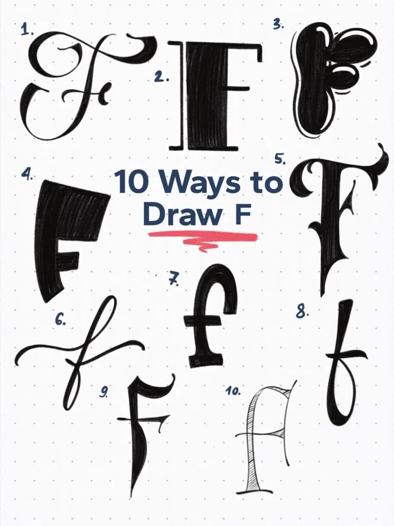
🔤 10 Ways to Draw the Letter F – Style Descriptions
1. Angular Semi-Flourished Script
A formal capital script with sharp turns and abrupt terminals. It’s got structure, but it’s not stiff—like it dressed up, but still brought some edge.
2. Typewriter Serif Didone
This one’s rocking that dramatic contrast between thick and thin. And the lone vertical stroke on the left? Totally unnecessary but totally perfect. Adds just the right amount of weird.
3. Blobby Display
Oversized, rounded, and unapologetically loud. Like bubble letters that got a little too ambitious. Honestly, it’s kinda goofy—and that’s the charm.
4. Bold Graffiti-Style Sans
Heavy, tilted, and made to be seen. This one’s got street energy—like it was scribbled on a wall in thick paint with zero hesitation.
5. Victorian/Gothic Hybrid
The detail here is everything. Stylizing every part of the F is a challenge, but the goal was to keep the two crossbars readable while pushing the rest as far as I could. Fancy and dramatic, without losing structure.
6. Wide-Spaced Modern Script
Imagine drawing with a brush pen and just… slowing down. The wide spacing and soft rhythm give this one a calm, elegant feel—like it’s not in a rush to impress you.
7. Low-Contrast Ionic Serif
Lowercase F, bold and grounded. Ionic serifs blend right into the stem, and the low contrast keeps it sturdy. Think friendly but still serious.
8. Looping Monoline Script
One smooth stroke, clean loop, relaxed posture. It’s casual—but not careless. Nailed the balance between flow and legibility.
9. Fraktur-Inspired
You know that belly on the stem? Total Fraktur move. Pointed end, tight structure, and just enough chaos to make it feel historical and hand-drawn.
10. Lombardic Minuscule
Usually, Lombardic is reserved for fancy, decorated capitals—but here I pulled that vibe into a lowercase F. Super stylized, a little strange, and definitely not shy.
Explore the full Hand Lettering Style Database →

Master Every Letter A–Z With 260 Creative Styles
The Style Your Alphabet Workbook is your hands-on guide to building confidence, creativity, and control in your lettering.
Inside, you’ll find:
✅ 260 hand-drawn letters to trace and remix
✅ 26 word examples to practice real-world design
✅ Beginner-friendly insights that teach you how to think like a lettering artist
About the author

Hey, I’m Max. I’ve been drawing and messing around with letters since 2011. I don’t have a formal art degree—my background is actually in the kitchen as a former chef and on the streets painting graffiti with my friends. Over the last decade, through a ton of trial and error, I somehow turned that obsession into a full-time gig. These days, I design custom logotypes for global brands and paint large-scale murals. I started Lettering Daily just to create the kind of honest, no-BS tutorials I wish I’d had when I was starting out. Stick around, and let’s draw some letters.
