G is one of those letters that has a lot going on. It’s got structure, it’s got style, and depending on how you tackle it, it can feel super refined or totally wild. Uppercase Gs offer that satisfying roundness and unexpected crossbar moments, while lowercase G’s are basically playgrounds for experimentation. Honestly, once you start playing with G, it’s hard to stop.
🎁 Free Lettering Worksheet Download!
Get one full tracing page straight from the Style Your Alphabet Workbook — absolutely free.
Practice, trace, and start styling your letters today!

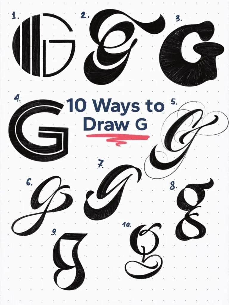
🔤 10 Ways to Draw the Letter G – Style Descriptions
1. Art Deco-Inspired Sans
Think The Great Gatsby—an era when slick geometry and confident symmetry shaped the way letters dressed up. This one’s clean, stylish, and ready for a black-tie poster.
2. Inverted Heavy Script
Take a bold, weighted script and flip its weight logic. Flourishing becomes trickier but way more fun. Sometimes, bending the rules is exactly the point.
3. Blobby Retro Style Sans
Round everything, but keep the sans-serif structure intact. This one’s a callback to the groovy energy of the ’60s and ’70s. Quirky, soft, and totally unapologetic.
4. Grotesque Split Sans Serif
A no-nonsense sans—until you notice the horizontal breaks. Suddenly, this minimal G looks like it’s sliced in half. Simple trick, cool payoff.
5. Flourished Brush Script
Start with a basic brush-script G. Now flick the pen a little further, curve that exit, and suddenly it’s dancing. A couple of subtle flourishes go a long way here.
6. Spiced-Up Copperplate
The bones follow traditional Copperplate, but each stroke is subtly twisted for tension and attitude. Like a classic letterform caught mid-sway.
7. Ribbon Style Terminals
The structure’s clean, but the magic lives in the endings—literally. The stroke twists into ribbon-like flourishes that add elegance without overcomplicating.
8. Humanist/Modern Hybrid
A lowercase G that lives between past and present. Loosely structured, lightly calligraphic, and not trying too hard. Just has that natural rhythm.
9. Rotunda-Inspired
Borrowed from one of the more rounded blackletter styles, this form pulls curves in and pushes them out in unexpected places. That spine is doing a lot—and it works.
10. Experimental Whatever
I’ll be honest—I ran out of gas and just drew what felt right. And then I looked at it and thought, yep… that’s my G.
Explore the full Hand Lettering Style Database →

Master Every Letter A–Z With 260 Creative Styles
The Style Your Alphabet Workbook is your hands-on guide to building confidence, creativity, and control in your lettering.
Inside, you’ll find:
✅ 260 hand-drawn letters to trace and remix
✅ 26 word examples to practice real-world design
✅ Beginner-friendly insights that teach you how to think like a lettering artist
About the author

Hey, I’m Max. I’ve been drawing and messing around with letters since 2011. I don’t have a formal art degree—my background is actually in the kitchen as a former chef and on the streets painting graffiti with my friends. Over the last decade, through a ton of trial and error, I somehow turned that obsession into a full-time gig. These days, I design custom logotypes for global brands and paint large-scale murals. I started Lettering Daily just to create the kind of honest, no-BS tutorials I wish I’d had when I was starting out. Stick around, and let’s draw some letters.
