H might seem straightforward—it’s just two verticals and a bridge, right? But the real fun comes in how you connect those parts. Is the crossbar soft and curved, or sharp and angled? Does it float, stretch, loop, or disappear entirely? This letter is all about balance and rhythm, and the 10 takes here are proof that even the most basic structures have endless personality.
🎁 Free Lettering Worksheet Download!
Get one full tracing page straight from the Style Your Alphabet Workbook — absolutely free.
Practice, trace, and start styling your letters today!

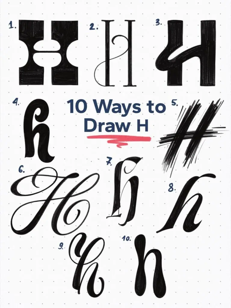
🔤 10 Ways to Draw the Letter H – Style Descriptions
1. High Contrast Display Slab
Bold and dominant, this H features extreme contrast and chunky rectangular serifs. It feels structured yet powerful—great for imposing headlines.
2. Ornamental Hairline Serif
A delicate high-contrast construction with a vertical spine and swirling decorative flourish. Feels like something from a formal invitation or fashion editorial.
3. Playful Rounded Sans
This one bends the rules—literally. A soft, bold sans-serif with a connected crossbar adds a fun and modern twist.
4. Chunky and Funky
Thick strokes, low contrast, and curved terminals make this H unapologetically playful. It’s lively and confident without being too polished.
5. Dry Brush Gesture
Rough, bold, and full of energy. It captures the essence of motion like a quick gesture from a flat brush—spontaneous but intentional.
6. Flourished Copperplate
A classic copperplate form made dramatic by exaggerated loops and terminal swashes. High contrast and elegance all around.
7. Upright Gothicized Italic Inspired
This one bridges roughness and refinement—pointed terminals paired with smooth curves create a dynamic lowercase h with serious flair.
8. Contemporary Calligraphic Sans
Clean and fluid, with slanted axis and tapered curves. This lowercase h blends traditional calligraphic rhythm with modern sans structure.
9. Modern Brush Script
Balanced weight and expressive strokes. With a slight bounce in its shape, it walks the line between casual and elegant.
10. Blob Script
Rounded forms and teardrop terminals create a soft, almost cartoon-like vibe. This one feels relaxed, even a bit whimsical.
Explore the full Hand Lettering Style Database →

Master Every Letter A–Z With 260 Creative Styles
The Style Your Alphabet Workbook is your hands-on guide to building confidence, creativity, and control in your lettering.
Inside, you’ll find:
✅ 260 hand-drawn letters to trace and remix
✅ 26 word examples to practice real-world design
✅ Beginner-friendly insights that teach you how to think like a lettering artist
About the author

Hey, I’m Max. I’ve been drawing and messing around with letters since 2011. I don’t have a formal art degree—my background is actually in the kitchen as a former chef and on the streets painting graffiti with my friends. Over the last decade, through a ton of trial and error, I somehow turned that obsession into a full-time gig. These days, I design custom logotypes for global brands and paint large-scale murals. I started Lettering Daily just to create the kind of honest, no-BS tutorials I wish I’d had when I was starting out. Stick around, and let’s draw some letters.
