Let’s be honest, the letter I isn’t exactly winning any popularity contests when it comes to personality. But that’s the challenge, right? Its simplicity leaves so much room to explore structure, terminals, and even tools. Whether it’s a bold slab, a ribbon-style lowercase, or a quirky experimental sans, this one’s all about proving that even the most “boring” letter can turn heads.
🎁 Free Lettering Worksheet Download!
Get one full tracing page straight from the Style Your Alphabet Workbook — absolutely free.
Practice, trace, and start styling your letters today!

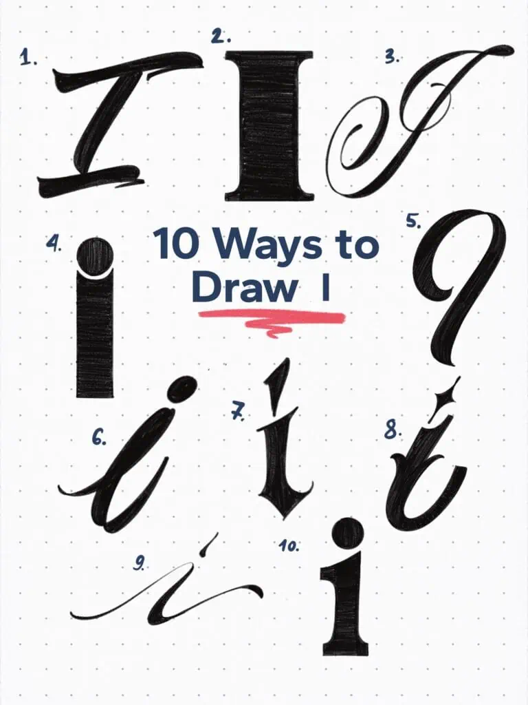
🔤 10 Ways to Draw the Letter I – Style Descriptions
1. Brush-Inspired Sans
Structured like a capital sans serif, but drawn with the rhythm of an ink-loaded brush. The dynamic slant gives it a hand-done edge that’s anything but stiff.
2. Bold Ionic Serif
A heavyweight letterform featuring subtle bracketing on its serifs. Dominant and grounded, it feels like it belongs in a bold editorial headline.
3. Teardrop Terminal Copperplate
Often confused with ball terminals, teardrops tell a different story. The softness in this flourish gives it a warm elegance rooted in classic copperplate forms.
4. Experimental Sans
Let’s be honest—the sans serif capital “I” doesn’t exactly scream personality. So here, the tittle (yes, the dot has a name) drops right into the stem, creating an unusual and playful dent.
5. Sign Painter’s Stroke
Inspired by traditional sign painting tools, this form reflects the heavy pressure and organic tapering of a loaded brush. A good reminder that tools often shape style.
6. Ribbon Script Style
Imagine shaping letters from a shoelace or satin ribbon—this script captures that same flat, curling flow. It’s delicate, but with direction and presence.
7. Angular Condensed Blackletter
With sharp inward bends and tight spacing, this one feels intense. Like it’s standing guard. It channels gothic energy with a pointed warning: approach with respect.
8. Mid-Stem Tuscan Experiment
Tuscan serifs usually sit proudly at the terminals—but here, they interrupt the stem itself. Unexpected, decorative, and undeniably different.
9. Modern Casual Script
Soft, flowing, and elegantly tilted. This lowercase i feels like it’s taking its time, adding movement and charm with every curve.
10. Typewriter Ionic
A close cousin of the bold serif at number 2, but with less muscle and more finesse. The slightly larger serifs make it feel retro and friendly, like it came off a vintage typewriter.
Explore the full Hand Lettering Style Database →

Master Every Letter A–Z With 260 Creative Styles
The Style Your Alphabet Workbook is your hands-on guide to building confidence, creativity, and control in your lettering.
Inside, you’ll find:
✅ 260 hand-drawn letters to trace and remix
✅ 26 word examples to practice real-world design
✅ Beginner-friendly insights that teach you how to think like a lettering artist
About the author

Hey, I’m Max. I’ve been drawing and messing around with letters since 2011. I don’t have a formal art degree—my background is actually in the kitchen as a former chef and on the streets painting graffiti with my friends. Over the last decade, through a ton of trial and error, I somehow turned that obsession into a full-time gig. These days, I design custom logotypes for global brands and paint large-scale murals. I started Lettering Daily just to create the kind of honest, no-BS tutorials I wish I’d had when I was starting out. Stick around, and let’s draw some letters.
