Drawing a J is like playing with rhythm—it’s got flow, curves, and a surprising amount of swagger. Between its looping descenders and clean verticals, there’s room for a lot of expression. These 10 styles show just how much movement and style you can inject into one simple hook. Some are sharp, some are soft, and a few feel like they belong in a signature or a street sign.
🎁 Free Lettering Worksheet Download!
Get one full tracing page straight from the Style Your Alphabet Workbook — absolutely free.
Practice, trace, and start styling your letters today!

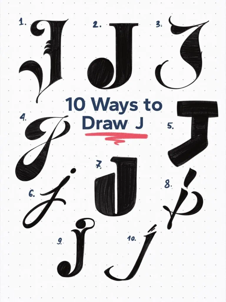
🔤 10 Ways to Draw the Letter J – Style Descriptions
1. Gothic Display Serif
Sharp, stylized, and ornamental—this J blends blackletter inspiration with pointed terminals. The decorative spine flares add a medieval touch without sacrificing clarity.
2. High-Contrast Old Style Serif
Classic and elegant with a bold vertical stroke and a dramatic teardrop terminal. There’s a nice weight to this one—it wouldn’t look out of place in a fashion masthead.
3. High-Contrast Lombardic Capital
Inspired by Lombardic capitals, but pushed even further with exaggerated contrast. All the drama, all the detail.
4. Funky High-Contrast Script
Heavily influenced by 70s script lettering. The bold weight lands mostly at the bottom of the stems, giving this one serious groove.
5. Slab Serif Block
Chunky and industrial. Feels like it was carved from wood or forged in metal—rigid proportions, squared top serifs, and full-on slab energy.
6. Modern Calligraphy Loop
This lowercase J moves like a dancer. The looped descender and expressive entry stroke feel handwritten and full of rhythm.
7. Mid-Cut Display
Imagine a geometric J that gets sliced mid-stroke with a clean knife. That’s the vibe—bold, simple, and slightly unexpected.
8. Graffiti-Inspired Script
This one’s all about motion. You can practically feel the speed in the strokes—casual, loose, and totally expressive.
9. Bowl-Terminal Serif
A lowercase J that finishes with some flair. The heavy bowl terminal anchors the letter, while the tittle connects like a ligature to the stem—playful but intentional.
10. Angular Italic
This J means business. Calligraphy meets velocity—angled strokes, upright energy, and just the right amount of tension to carry a signature or logo.
Explore the full Hand Lettering Style Database →

Master Every Letter A–Z With 260 Creative Styles
The Style Your Alphabet Workbook is your hands-on guide to building confidence, creativity, and control in your lettering.
Inside, you’ll find:
✅ 260 hand-drawn letters to trace and remix
✅ 26 word examples to practice real-world design
✅ Beginner-friendly insights that teach you how to think like a lettering artist
About the author

Hey, I’m Max. I’ve been drawing and messing around with letters since 2011. I don’t have a formal art degree—my background is actually in the kitchen as a former chef and on the streets painting graffiti with my friends. Over the last decade, through a ton of trial and error, I somehow turned that obsession into a full-time gig. These days, I design custom logotypes for global brands and paint large-scale murals. I started Lettering Daily just to create the kind of honest, no-BS tutorials I wish I’d had when I was starting out. Stick around, and let’s draw some letters.
