K might be one of the most dynamic letters to draw. It’s got a tall vertical stroke and two diagonals that can bend, break, or swirl in any direction you want. Uppercase Ks tend to be more rigid and structural—like they were built out of beams—while lowercase versions open the door to expressive loops and calligraphic flair.
The angles can be sharp and aggressive, or smooth and graceful depending on the vibe you’re chasing. It’s one of those letters where a single decision—like the shape of the leg or arm—can totally change its personality.
🎁 Free Lettering Worksheet Download!
Get one full tracing page straight from the Style Your Alphabet Workbook — absolutely free.
Practice, trace, and start styling your letters today!

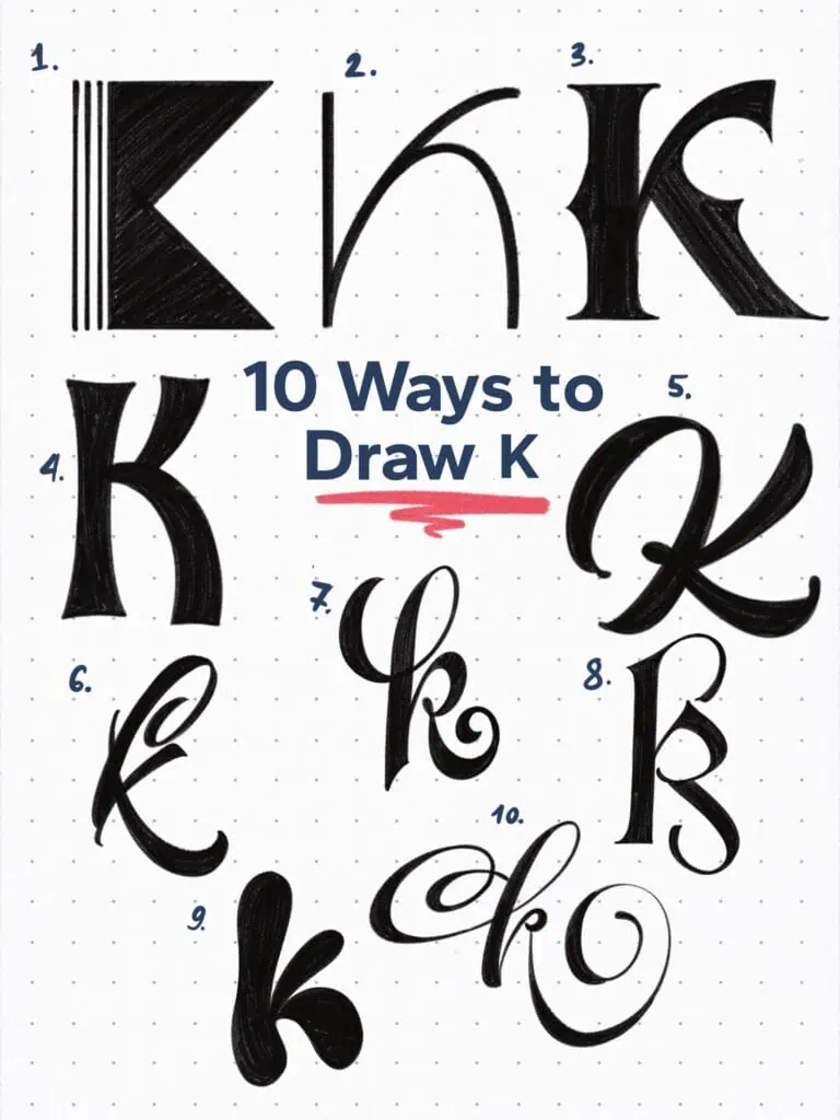
🔤 10 Ways to Draw the Letter K – Style Descriptions
1. Geometric Block Serif – Art Deco Inspired
Constructed from rectangles and lines, this K leans hard into shape and contrast. The triple-stroke spine gives it a sense of rhythm and repetition. In case it’s not obvious, this one’s heavily inspired by the Art Deco movement.
2. Minimalist Hairline
Elegant and restrained. The lowercase form is reduced to two simple curves with lots of negative space—great for fashion branding or editorial headlines. Notice how the lower leg extends from the same stroke as the top arm.
3. Vintage Inspired
A classic Roman capital with added sharpness. Angled stress, bracketed serifs, and deep interior notches give it a timeless yet punchy appearance.
4. Bold Grotesque Sans
Sturdy and utilitarian. This uppercase K takes cues from grotesque sans styles—low contrast, even proportions, and full authority.
5. Dynamic Brush Script
Uppercase and expressive, this K takes a casual brushstroke and turns it into a flourish. The second leg loops out in a fluid exit stroke—full of motion and charm.
6. Modern Calligraphy Loop
The lowercase form swirls like a ribbon. A tight counter in the loop keeps things playful, while the extended terminal adds a graceful rhythm.
7. Copperplate–Brush Hybrid
A lowercase k that blends calligraphic influences—structured like copperplate but softened with a brush-style exit stroke.
8. Art Nouveau Inspired Serif
A vertical axis and long, swooping arm give this K its stylized charm. The subtle weight shifts and curves evoke early 1900s hand-lettered display fonts.
9. Bubble Style Display
Rounded and juicy, this K feels like it belongs on a comic book title or sticker pack. The balloon-like terminals give it bounce and fun energy.
10. High-Contrast Flourished Script
Loopy, lavish, and full of drama. This lowercase K takes swashes to the next level, with razor-thin hairlines and oversized curves. It’d be tough to make this work in a word without adjustments—but it shows just how playful the K can get.
Explore the full Hand Lettering Style Database →

Master Every Letter A–Z With 260 Creative Styles
The Style Your Alphabet Workbook is your hands-on guide to building confidence, creativity, and control in your lettering.
Inside, you’ll find:
✅ 260 hand-drawn letters to trace and remix
✅ 26 word examples to practice real-world design
✅ Beginner-friendly insights that teach you how to think like a lettering artist
About the author

Hey, I’m Max. I’ve been drawing and messing around with letters since 2011. I don’t have a formal art degree—my background is actually in the kitchen as a former chef and on the streets painting graffiti with my friends. Over the last decade, through a ton of trial and error, I somehow turned that obsession into a full-time gig. These days, I design custom logotypes for global brands and paint large-scale murals. I started Lettering Daily just to create the kind of honest, no-BS tutorials I wish I’d had when I was starting out. Stick around, and let’s draw some letters.
