The letter L is one of those forms that can either be wildly expressive or quietly supportive. Because of its simple structure, it gives you a lot of freedom to stylize without sacrificing legibility. From sharp-angled blackletter versions to soft, swashy scripts, L can flex hard or stay chill—it all depends on how you want it to flow. And yes, sometimes that tail is just begging for a little drama.
🎁 Free Lettering Worksheet Download!
Get one full tracing page straight from the Style Your Alphabet Workbook — absolutely free.
Practice, trace, and start styling your letters today!

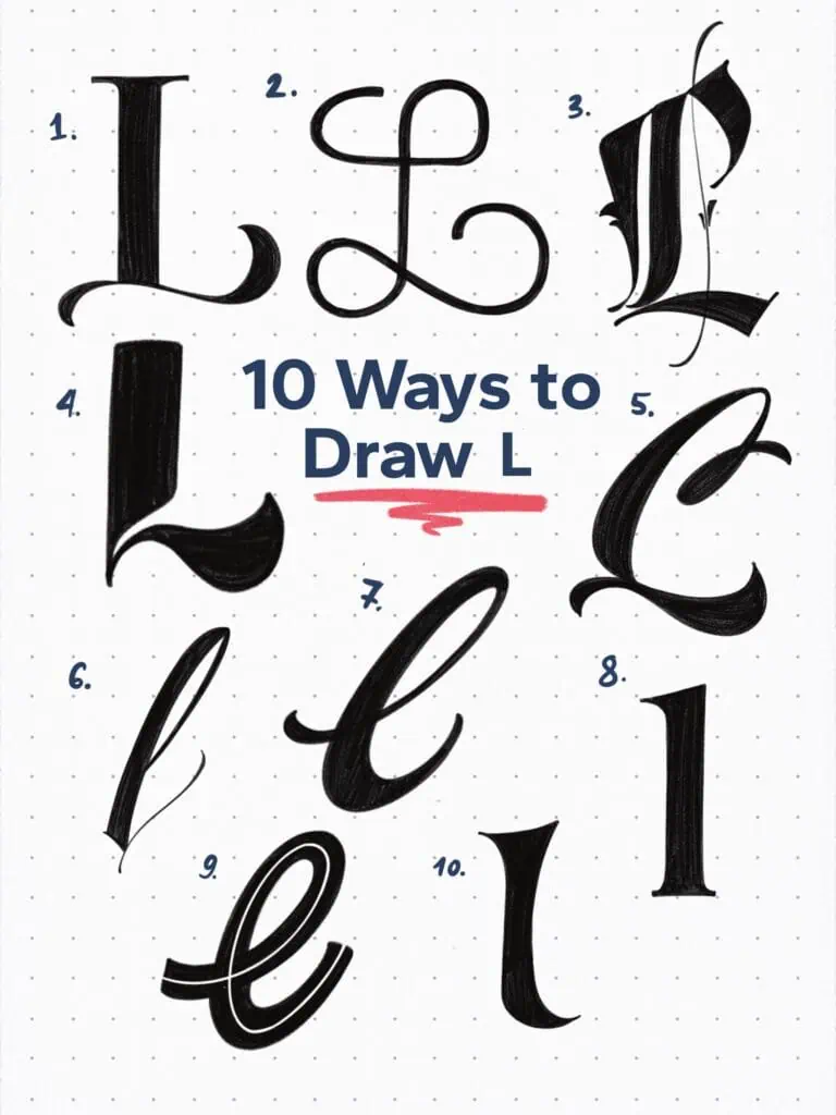
🔤 10 Ways to Draw the Letter L – Style Descriptions
1. Old Style Swashed
A high-contrast capital L with a horizontal foot serif that feels a bit like it’s sliding into the room. Elegant but grounded.
2. Monoline Swash Script
Built with even weight and a double flourish—this L is all about movement and fluidity. Looks mechanical yet smooth at the same time. When working in monoline, it’s a good idea to exaggerate certain features.
3. Textura-Inspired Blackletter
Sharp angles, tight spacing, and those decorative thorns along the stroke—this one screams tradition and gothic flair. The middle flourish gives it a sophisticated look, but also cleverly fills the open counter space.
4. Bold Sans Serif
A lowercase L with thick, blocky construction and a curved tail that gives it momentum. Think signage or loud branding.
5. Brush Script with Terminal Curl
That top stroke extends into a nice, dramatic loop that gives the whole letter its rhythm. Still readable—but definitely has an attitude.
6. Pointed Hair Brush Inspired
Almost like writing with a pointed pen—thin upstrokes, thick downstrokes, and a terminal that softens everything up. Don’t mistake this for a felt-tip brush; this one’s got long, individual hairs and requires a whole different skillset to master.
7. Rounded Brush Lettering
Looks like it came straight out of a lettering warm-up session. Confident curves and a casual handwritten rhythm keep this one feeling fresh.
8. Humanist Inspired
Simple in its structure, yet rooted in the tradition of calligraphic scripts that convey seriousness and elegance.
9. Split Stroke
I’ve created multiple letters in this style. The split stroke through the middle is a simple, effective way to add character—even to the most basic letterforms.
10. High Contrast Wedge Serif
This one balances a tall form with curved weight at the base. It feels like a serif L with editorial ambitions—definitely at home in a high-end magazine layout.
Explore the full Hand Lettering Style Database →

Master Every Letter A–Z With 260 Creative Styles
The Style Your Alphabet Workbook is your hands-on guide to building confidence, creativity, and control in your lettering.
Inside, you’ll find:
✅ 260 hand-drawn letters to trace and remix
✅ 26 word examples to practice real-world design
✅ Beginner-friendly insights that teach you how to think like a lettering artist
About the author

Hey, I’m Max. I’ve been drawing and messing around with letters since 2011. I don’t have a formal art degree—my background is actually in the kitchen as a former chef and on the streets painting graffiti with my friends. Over the last decade, through a ton of trial and error, I somehow turned that obsession into a full-time gig. These days, I design custom logotypes for global brands and paint large-scale murals. I started Lettering Daily just to create the kind of honest, no-BS tutorials I wish I’d had when I was starting out. Stick around, and let’s draw some letters.
