The letter M is all about structure and rhythm. With its multiple strokes and symmetrical potential, it offers a perfect playground for both upright forms and flowing scripts. Whether you’re tightening it up for condensed elegance or letting it bounce across the baseline with loops and swashes, the M gives you space to experiment with balance, contrast, and motion.
Let’s dive into ten ways you can stretch, stylize, and spice it up.
🎁 Free Lettering Worksheet Download!
Get one full tracing page straight from the Style Your Alphabet Workbook — absolutely free.
Practice, trace, and start styling your letters today!

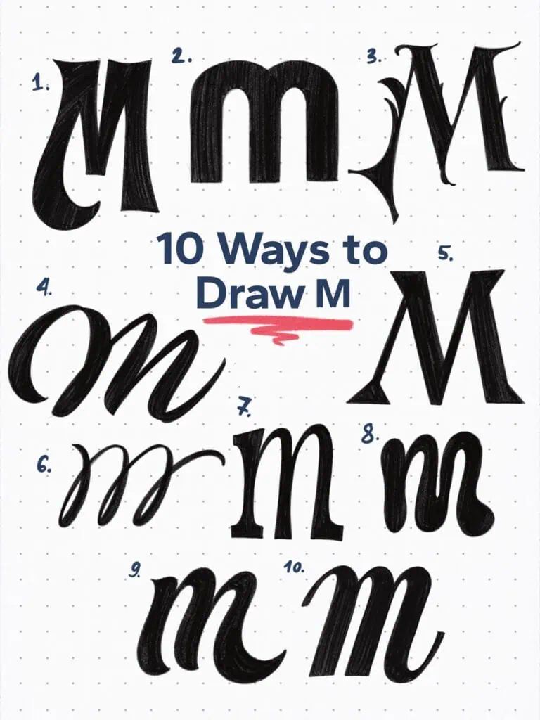
🔤 10 Ways to Draw the Letter M – Style Descriptions
1. Swashed Grotesque Sans
The pointy ends might read as serifs at first glance, but make no mistake—this is a sans serif letter. The swashed leg adds flair and could shift sides depending on the M’s position in a word or pair.
2. Rounded Modular Sans
Two arches, one stem. Built from geometric shapes with even weight throughout, this uppercase M feels modern, balanced, and super friendly.
3. Victorian Display Serif
High contrast, sharp points, and ornamental thorns—this one’s all about showmanship. A perfect fit for vintage labels, signage, or theatrical designs.
4. Loose Script Connection
This M flows with ease, designed to sit mid-word like it’s always been there. The rhythm and slant make it ideal for hand-lettered logos or casual scripts.
5. High Contrast Latin Serif
A stately uppercase M with distinct tapering and vertical elegance. You can feel the historical influence—think classical print with refined posture.
6. Modern Looped Script
The repetitive strokes in this lowercase m set up a steady rhythm. A great way to build flow while exploring consistency in style and movement.
7. Slab-Serif
Chunky, grounded, and just a little wild. The tapered strokes and quirky construction give it a playful, cartoon-adjacent vibe that still carries visual weight.
8. Blobby Grotesque Lowercase
Bubble letters are making a comeback! This one’s soft, round, and heavy, but doesn’t feel clumsy—it bounces with retro charm and confidence.
9. Bold and Funky Script
Honestly, every letter looks great in this style. The long swash on the second overturn makes this one especially fun at the end of a word.
10. Condensed Italic
A tall and narrow form with slanted energy. The entry and exit strokes are ideal for seamless word connections—great for tight compositions or fast-paced lettering.
Explore the full Hand Lettering Style Database →

Master Every Letter A–Z With 260 Creative Styles
The Style Your Alphabet Workbook is your hands-on guide to building confidence, creativity, and control in your lettering.
Inside, you’ll find:
✅ 260 hand-drawn letters to trace and remix
✅ 26 word examples to practice real-world design
✅ Beginner-friendly insights that teach you how to think like a lettering artist
About the author

Hey, I’m Max. I’ve been drawing and messing around with letters since 2011. I don’t have a formal art degree—my background is actually in the kitchen as a former chef and on the streets painting graffiti with my friends. Over the last decade, through a ton of trial and error, I somehow turned that obsession into a full-time gig. These days, I design custom logotypes for global brands and paint large-scale murals. I started Lettering Daily just to create the kind of honest, no-BS tutorials I wish I’d had when I was starting out. Stick around, and let’s draw some letters.
