The letter N has this great natural movement—it can go rigid and vertical like an old Roman column or bend with soft curves like a script flowing mid-word. Whether it’s uppercase or lowercase, the N gives you a chance to play with rhythm, weight transitions, and clever diagonals. It works great for contrast-heavy styles or looped flourishes that guide the eye forward.
🎁 Free Lettering Worksheet Download!
Get one full tracing page straight from the Style Your Alphabet Workbook — absolutely free.
Practice, trace, and start styling your letters today!

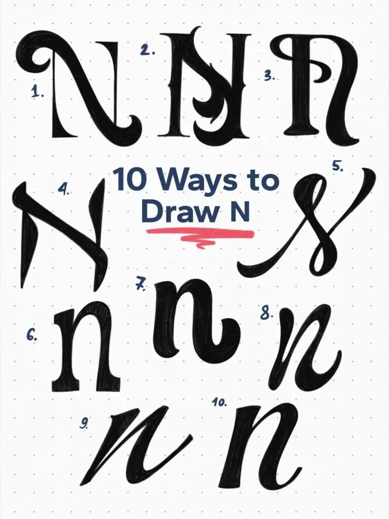
🔤 10 Ways to Draw the Letter N – Style Descriptions
1. Flourished Serif Capital
What I really like here is the modesty of the vertical serifs contrasted with the thick, swashed diagonal that connects them. It’s like formal wear with a twist.
2. Vintage-Inspired Serif
This one’s a throwback to classic sign painting. Inspired by the elaborate details of vintage lettering, this N brings in ornamental spurs and flourishes for that old-school power punch.
3. Art Nouveau Inspired
Clean and commanding. High contrast paired with a sweeping bowl-like shoulder creates something bold yet soft. The rounded serifs add balance, while that looped tail steals the show.
4. Uncial Inspired
Borrowing from the Uncial calligraphic script, this N has broad, Roman-cap-style proportions. A strong, grounded look—kind of like it’s carved in stone.
5. Looped Single-Stroke Script
Designed to feel like a single fluid motion, this style is thin, airy, and rhythm-driven. Feels like it was drawn with a super soft brush—elegant and effortless.
6. Slab Serif Lowercase
Chunky, grounded, and confident. Straight lines and bold slabs give it retro vibes, like something pulled off an old newspaper headline.
7. Casual Upright Brush Script
This one’s got attitude. With bold contrast and a slight slant, it’s the kind of letter that’s not afraid to stand tall and shout, “Hey, look at me!”
8. Ink-Loaded Italic
Here’s a playful one. The idea was to imagine using a pen that was a little too full of ink—extra juicy strokes, heavier where the pen sits, and an informal charm that makes it feel handwritten in the best way.
9. Compressed Signature Stroke
A lowercase N at its most essential. Slanted, tight, and quick—like something you’d scribble into a logo or a personal signature.
10. Casual Exit Stroke
I tapered the vertical stem to add tension (narrower in the middle), and the exit stroke? That’s just me imagining how this could link up in a hand-lettered word. Gotta love a letter that leaves a trail behind.
Explore the full Hand Lettering Style Database →

Master Every Letter A–Z With 260 Creative Styles
The Style Your Alphabet Workbook is your hands-on guide to building confidence, creativity, and control in your lettering.
Inside, you’ll find:
✅ 260 hand-drawn letters to trace and remix
✅ 26 word examples to practice real-world design
✅ Beginner-friendly insights that teach you how to think like a lettering artist
About the author

Hey, I’m Max. I’ve been drawing and messing around with letters since 2011. I don’t have a formal art degree—my background is actually in the kitchen as a former chef and on the streets painting graffiti with my friends. Over the last decade, through a ton of trial and error, I somehow turned that obsession into a full-time gig. These days, I design custom logotypes for global brands and paint large-scale murals. I started Lettering Daily just to create the kind of honest, no-BS tutorials I wish I’d had when I was starting out. Stick around, and let’s draw some letters.
