You’d think drawing an “O” would be simple—it’s just a circle, right? But that simplicity is what makes it such a great playground for experimenting with stress, counter space, proportion, and contrast. From refined editorial elegance to bold geometric abstractions, the letter O offers endless opportunities to bend the rules while still staying instantly recognizable.
🎁 Free Lettering Worksheet Download!
Get one full tracing page straight from the Style Your Alphabet Workbook — absolutely free.
Practice, trace, and start styling your letters today!

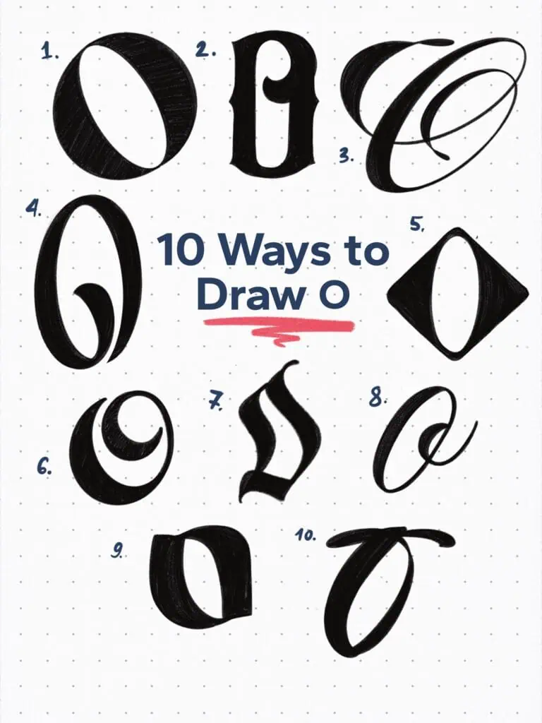
🔤 10 Ways to Draw the Letter O – Style Descriptions
1. High-Contrast Display Serif
A classic “Didone-style” O—tight, refined, and confident. Angled axis with razor-thin hairlines creates a bold, fashionable presence. Think editorial headlines or luxury branding.
2. Ornamental Blackletter-Inspired
Not your average O. Tall and narrow, this one’s shaped by sharp interior angles and thick, curved serifs. The vertical tension and inner notch make it feel like a Gothic twist on the Roman capital.
3. Flourished Tear Drop Terminal Script
What starts as a traditional oval quickly takes off. Extended teardrop terminals loop around the letter like ribbon—elegant, calligraphic, and full of motion.
4. Single Stroke Condensed
This O doesn’t connect, and even though a regular O has a closed counter, here I made an exception and left a narrow opening. The inner swash is just a stylistic choice to give it some flair.
5. Diamond Grotesque
A typographic curveball. This O flips convention and leans into geometric abstraction. Wide at the center and pinched at the poles—modern and eye-catching.
6. Spiral-Shaped
Similar to number 4. The proportion is rather squared off and the loop falls on the top side of the letter.
7. Fraktur-Inspired
It’s a rather strange-looking form when it stands on its own. However, properly paired with other letters of the same family, it simply works.
8. Copperplate-Inspired O
Handwritten with style. Try to maintain the connecting stroke (aka the comma dot) on the top side—just above the x-height.
9. Reversed Stress Serif
Here’s an O that puts its weight where you least expect it. With heavy horizontal strokes and light verticals, it plays on the idea of reverse contrast—perfect for quirky display use.
10. Calligraphic Swash O
This one has energy. The heavy main stroke paired with a swooping entry creates drama. It looks like a letter caught mid-dance.
Explore the full Hand Lettering Style Database →

Master Every Letter A–Z With 260 Creative Styles
The Style Your Alphabet Workbook is your hands-on guide to building confidence, creativity, and control in your lettering.
Inside, you’ll find:
✅ 260 hand-drawn letters to trace and remix
✅ 26 word examples to practice real-world design
✅ Beginner-friendly insights that teach you how to think like a lettering artist
About the author

Hey, I’m Max. I’ve been drawing and messing around with letters since 2011. I don’t have a formal art degree—my background is actually in the kitchen as a former chef and on the streets painting graffiti with my friends. Over the last decade, through a ton of trial and error, I somehow turned that obsession into a full-time gig. These days, I design custom logotypes for global brands and paint large-scale murals. I started Lettering Daily just to create the kind of honest, no-BS tutorials I wish I’d had when I was starting out. Stick around, and let’s draw some letters.
