The letter P may be top-heavy by design, but it still gives you plenty of room to balance structure and flourish. Whether you’re experimenting with expressive swashes, rigid slab serifs, or compact geometric builds, the P offers a satisfying combination of vertical tension and round counterplay. It’s also a great letter for trying out ligatures and stylistic curves without losing its essence.
🎁 Free Lettering Worksheet Download!
Get one full tracing page straight from the Style Your Alphabet Workbook — absolutely free.
Practice, trace, and start styling your letters today!

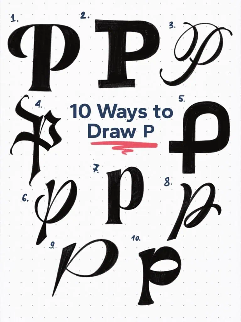
🔤 10 Ways to Draw the Letter P – Style Descriptions
1. High-Contrast Display Serif
Thick-and-thin elegance with a dramatic bowl shape. The vertical stem stays sharp and formal, while the exaggerated curve adds a sense of flair—very editorial, very timeless.
2. Slab Serif Block
Bold, sturdy, and grounded. This one’s all about weight and presence, with flat terminals and a no-nonsense silhouette. Great for display type that demands attention.
3. Swashed Copperplate Script
This version loops and swirls like it’s dancing across the page. A refined contrast, a well-balanced flourish, and that long outstroke gives it strong personality.
4. Fraktur Inspired
Sharp, angular, and rooted in calligraphic tradition. It’s a letter with bite—pointed terminals and dense structure create a gothic, medieval vibe.
5. Geometric Sans
Stripped down to basics: one circle, one stem. Perfectly modern and super friendly in tone—this is a “P” that thrives in logo systems and minimalist design.
6. Looped Brush Script
Casual but elegant. The brushstroke is continuous and rhythmic, forming a letter that feels handwritten, fluid, and full of motion.
7. Transitional Serif
Bridging the old and new. This one holds onto a bit of humanist contrast while still staying crisp. The roundness of the bowl softens the overall stiffness of the stem.
8. Flourished Ligature Style
Almost a double letter, this P suggests movement through its double-stem and looped exit. Think custom logotype or expressive monogram work.
9. Modern Script with Overturn
A lowercase P built for speed—thin upstroke, thick overturn, and a sharp terminal. Dynamic and confident, with a signature-style vibe.
10. Compressed Display Serif
The weight leans low and left, creating a compact, stylized form. The narrow bowl and tapered terminals make it feel both vintage and bold.
Explore the full Hand Lettering Style Database →

Master Every Letter A–Z With 260 Creative Styles
The Style Your Alphabet Workbook is your hands-on guide to building confidence, creativity, and control in your lettering.
Inside, you’ll find:
✅ 260 hand-drawn letters to trace and remix
✅ 26 word examples to practice real-world design
✅ Beginner-friendly insights that teach you how to think like a lettering artist
About the author

Hey, I’m Max. I’ve been drawing and messing around with letters since 2011. I don’t have a formal art degree—my background is actually in the kitchen as a former chef and on the streets painting graffiti with my friends. Over the last decade, through a ton of trial and error, I somehow turned that obsession into a full-time gig. These days, I design custom logotypes for global brands and paint large-scale murals. I started Lettering Daily just to create the kind of honest, no-BS tutorials I wish I’d had when I was starting out. Stick around, and let’s draw some letters.
