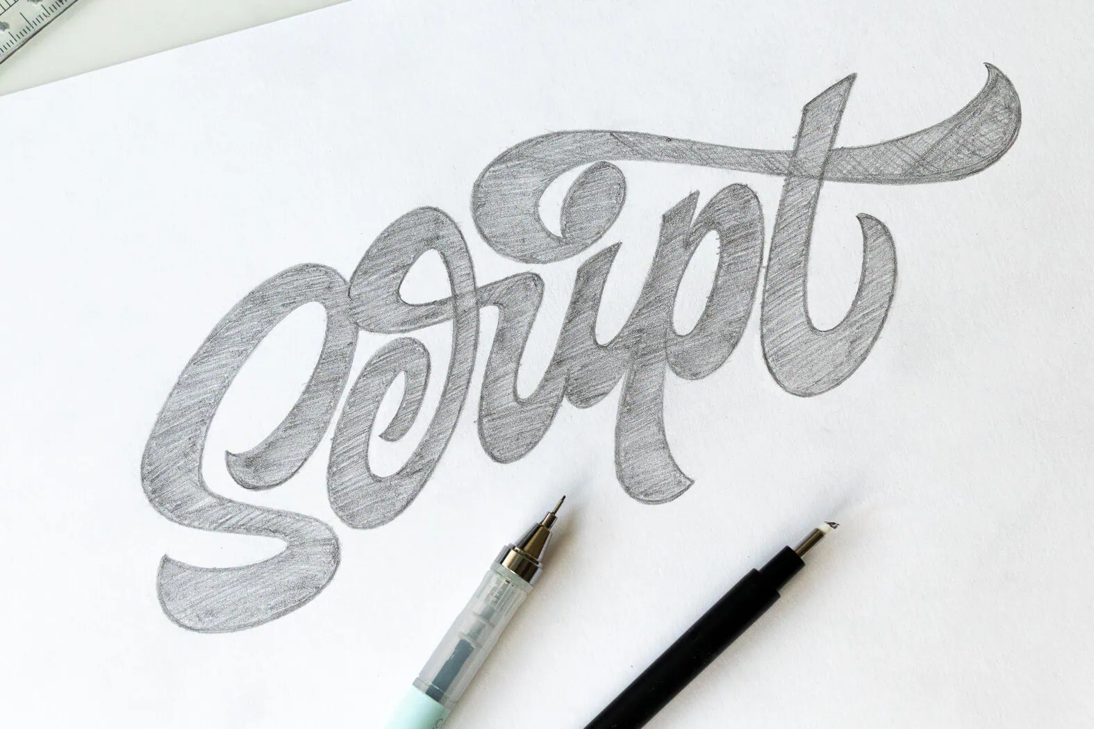
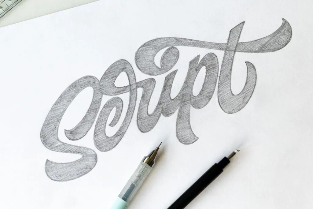
If you’ve ever tried your hand at script lettering, you’ve probably hit a wall where your letters look rigid, stiff, and completely lifeless. Most generic tutorials tell you to just “practice more,” but after 15 years in the game, I’ll tell you the truth: Practice matters, but how you practice makes all the difference.
To transition from rigid lines to beautiful, dynamic flow, you have to stop blindly drawing lines and start understanding how calligraphy mechanics dictate a layout. If you are brand new to this world, it helps to understand the foundational differences—check out my guide on Lettering vs. Typography vs. Calligraphy to see how these worlds intersect.
In case you prefer to watch, I also made a YouTube video –

1. What is Script Lettering?
Before we pick up a pen, let’s establish a clear definition. Script lettering is the art of drawing interconnected letterforms that mimic cursive handwriting or traditional calligraphy. Unlike actual handwriting, which is reactive and continuous, lettering is illustrative—meaning you are carefully building, drawing, and modifying the shapes.
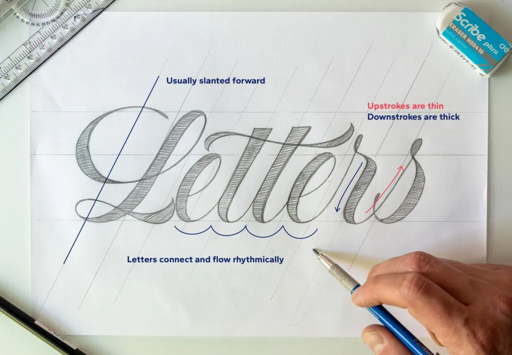
Key Characteristics of Script Lettering:
- Fluidity & Connections: Letters naturally flow or explicitly link into one another via entry and exit strokes.
- Slant (Axis): Most script styles lean forward, giving the word a sense of speed and elegance.
- Rhythmic Contrasts: It relies heavily on the classic rule of calligraphy: thin lines on the upstrokes, thick lines on the downstrokes.
To master this craft, you need to develop your lettering eye, embrace analytical practice, and commit to a philosophy of Try, Fail & Try Again.
2. The Breakthrough: The bridge with calligraphy
As both a hand lettering and calligraphy artist, I managed to become aware of the power you can carry from one art form into another.
The single biggest shift in my lettering journey was realizing that smooth script lettering mimics the rhythm, movements and physics done with a flexible brush (as well as other calligraphy tools).
It used to bother me so much that when doing brush calligraphy, my strokes always looked so nice and clean, whereas my script lettering looked like I tried drawing it with my left foot…
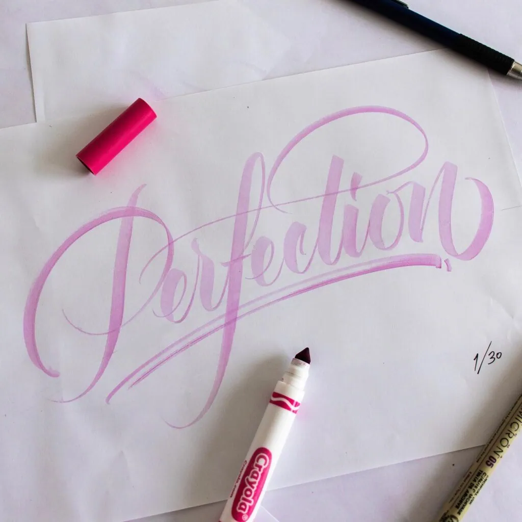
If you try to draw a long, sweeping swash using only your fingers or your wrist, your line will be jagged, uneven, and forced.
If you want to understand how a brush naturally behaves so you can replicate it in your drawings, I highly recommend diving into my modern calligraphy guide for beginners, to learn the core rules of thick and thin strokes.
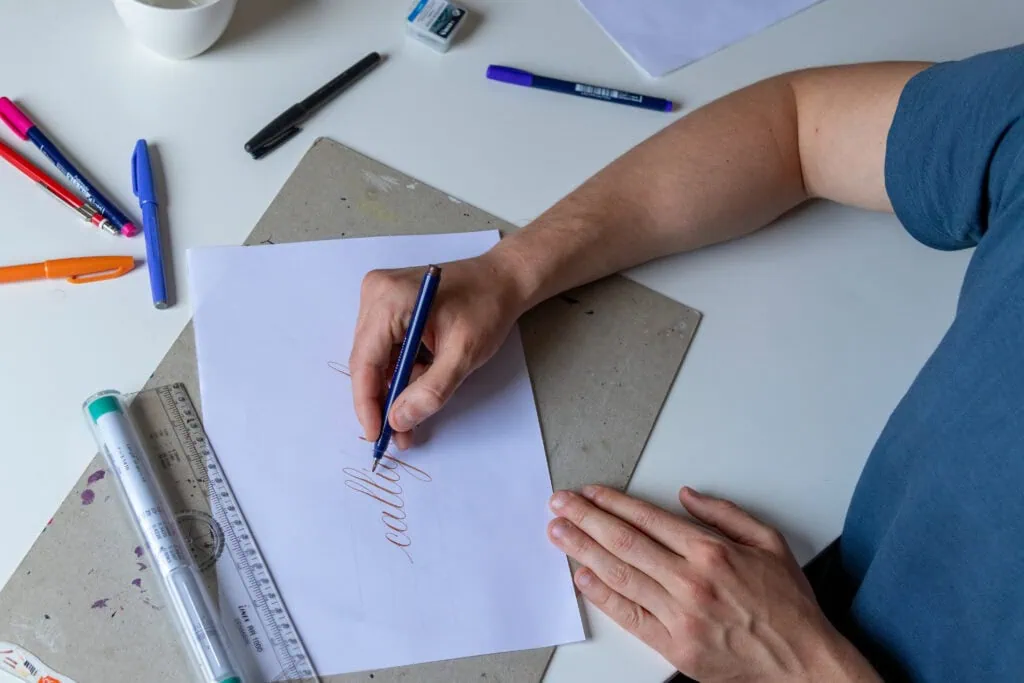
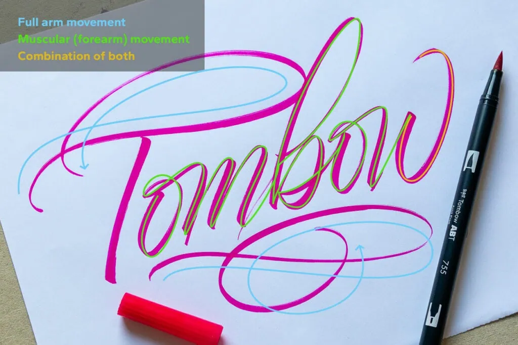
To create truly beautiful lines, you have to learn how to engage different muscle groups depending on the stroke:
- Finger/Wrist Movement: Perfect for small, highly controlled details or short entry/exit strokes.
- Muscular/Forearm Movement: Used for standard letterforms and extended strokes.
- Full Arm Movement: Pivoting from the elbow or shoulder. This is the secret weapon for creating dominant, sweeping lines that dictate the motion of an entire word.
The Letter “t” Rule
Think of the lowercase “t”. The main downward stem is basically an extended underturn stroke (an extended letter “i”). You execute this with controlled muscular movement.
However, the crossbar is the perfect playground for a dominant swash line. By throwing your full arm into that crossbar stroke, you give the entire word its energetic momentum.
Looking at the example below, are you able to spot what strokes where made with muscular and which were made with full arm movement?
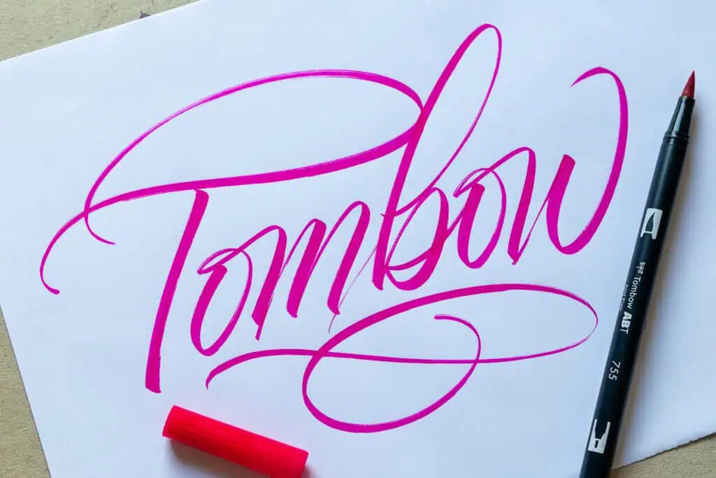
I just want to emphasize that I am not actively thinking of the different muscles that I use while I write. It’s a very intuitive and automated process. I talk about the different types of movements in my calligraphy drills video as well as in my brush calligraphy workbook.
3. Case Study: The “Bonkers!” Refinement Process
To see this in action, let’s pull back the curtain on a piece I designed as an educational handout for a workshop at Lettering Days in Munich.
The final piece looks crisp and deliberate, but it started as an absolute mess. That is completely by design. By building your sketches from rough drafts to final inks using tracing paper or a light tablet, you give yourself the freedom to make mistakes.
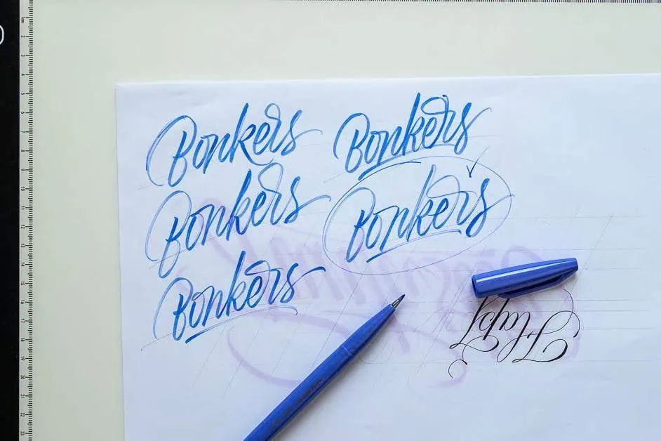
Step 1: The Raw Energy (Thumbnails & Rough Layouts)
You don’t start with perfection; you start with rhythm. In the image below, you can see quick, small thumbnail sketches using a blue pen. This phase is purely about testing compositions, slants, and how the letters interact.
From there, I moved to a larger purple Tombow dual brush pen to establish a bold, overarching rhythm and capture the character of the word.
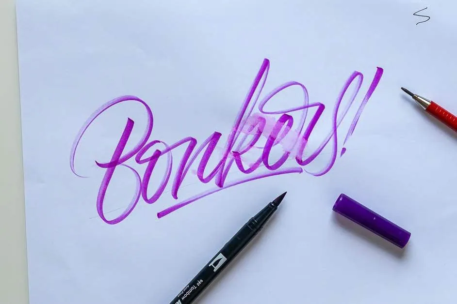
I actually liked the B from a previous attempt so i decided to combine that with the letters from the example above.
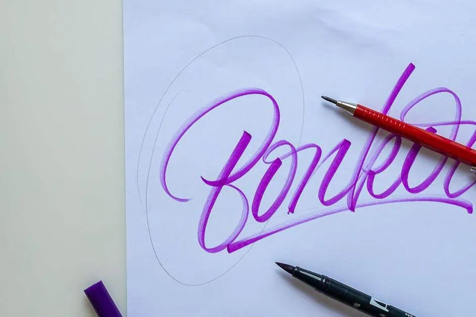
Step 2: Analytical Practice (The Self-Critique)
Once you have a rough sketch you like, grab your light tablet (or tracing paper) and trace the sketch for the first draft.
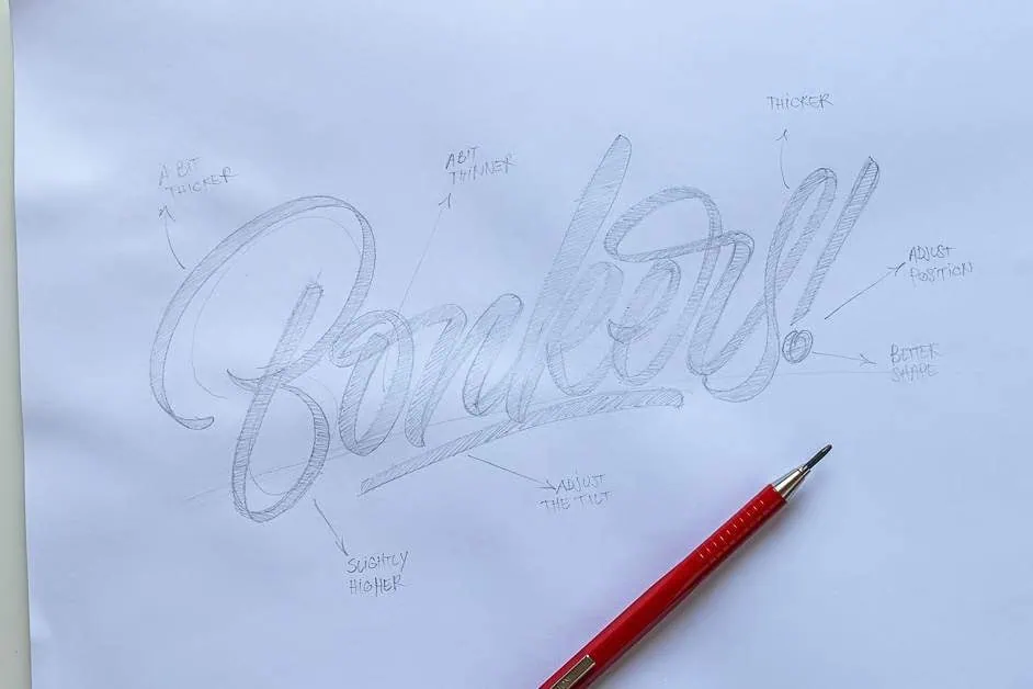
Once you have that rough draft you can begin with the analytical practice which helps you train your lettering eye.
I’ve added little notes on the side of the sketch so you can see some of the things i pay attention to when doing the analytical practice.
- “A BIT THICKER” on the left loop of the B.
- “ADJUST THE TILT” on the baseline.
- “SLIGHTLY HIGHER” on the bottom loop.
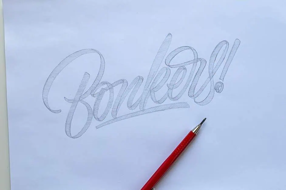
Step 3: Tightening the Pencil Draft
Using those critiques, I grab a fresh sheet of paper, turn on my light tablet and implement the notes in the following sketch.
Step 4: Final Inking
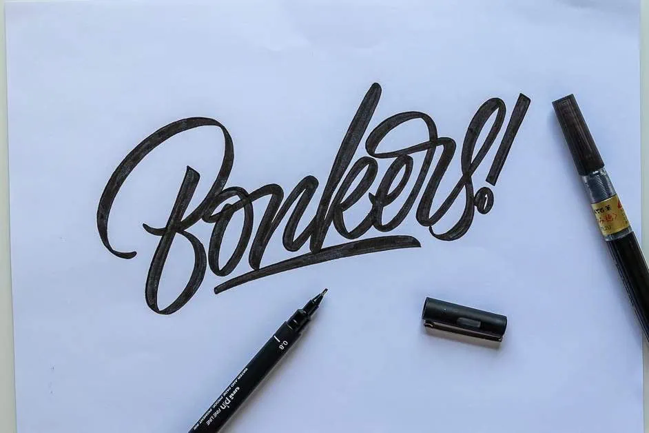
Essentially you can follow the same process as many times as you want. I was satisfied with the second pass and in most cases it takes me two to three sketches to polish a lettering piece before inking.
Once you’re satisfied with the final sketch you can proceed to ink it and adding effects.
4. Training Your “Lettering Eye”
Developing the muscle memory to draw a smooth stroke is a special skill, but learning how to see inconsistencies is a completely different challenge. When you are in the “Analytical Practice” phase of a sketch, look past the surface and judge these key elements:
- Spacing & Balance: Look at the negative space inside the letters, not just between them. As for balance, make sure that there’s “equal” weight distributed on each side (up, down, left, right).
- Consistency Over Perfection: It is far more important to have a consistent slant angle and uniform letter heights than it is to have perfectly matching stroke endings. To a viewer, a wavy, inconsistent slant stands out like a sore thumb.
Two Tricks to See Inconsistencies Instantly
- Flip the Page: Turn your sketch upside down or look at it in a mirror. This tricks your brain into seeing abstract shapes rather than reading a word, making structural errors instantly obvious.
- Take a Smartphone Photo: Shrinking the image down to a small screen forces you to see the piece as a whole composition rather than getting lost in a single letter.
5. The “Mix & Match” Style Formula: Designing Your Own Custom Script
A common misconception among beginners is that “script is just script.” But as you can see in the example below script lettering can take on an infinite variety of shapes, weights, and personalities. If you want to expand your horizons past script, be sure to look at my massive breakdown on How to Learn Different Lettering Styles.
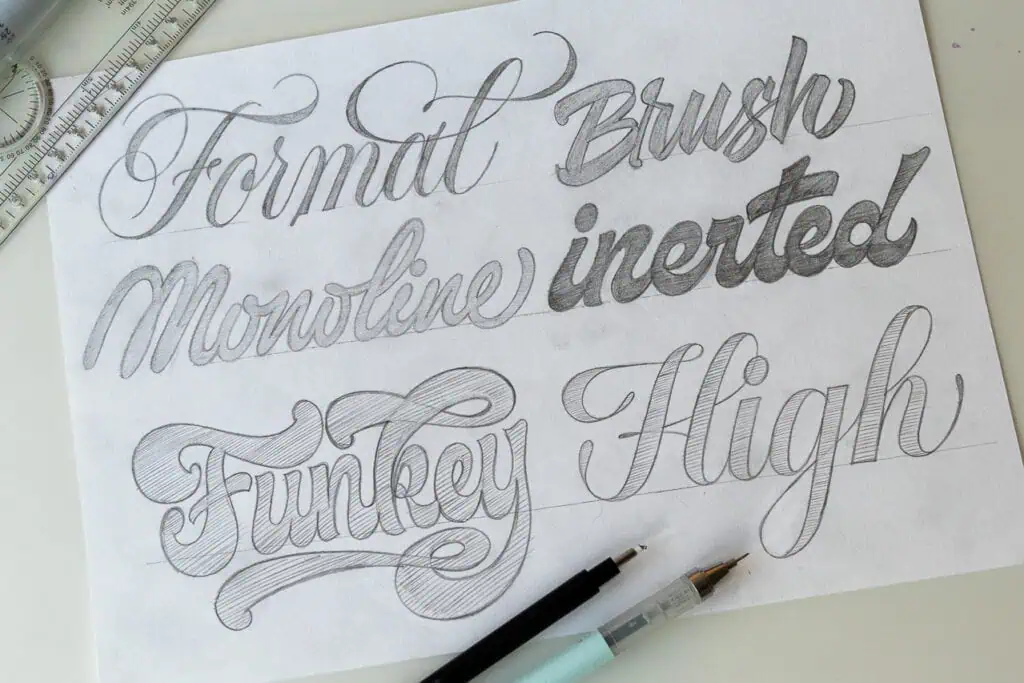
Every single structural choice you make—from the sharpness of a corner to the slant of a baseline—might feel small on its own. However, these minor choices stack up quickly to create an entirely different visual vibe.
Furthermore, the look of your letters can evoke specific emotions or communicate distinct attitudes. A razor-sharp, high-contrast script feels formal and luxurious, while a thick, low-branching bounce script feels playful, nostalgic, or energetic. It is incredibly important to keep these emotional cues in mind when picking your lettering style, especially if you are designing for a specific brand or project.
Instead of trying to blindly copy someone else’s aesthetic, you can use a simple design formula to build the exact attitude you want to convey. Think of script lettering like a soundboard with different sliders. By pushing these variables up or down, you can invent completely new styles from scratch.
Here are five variables you can tweak to design your own custom script style, as illustrated in the sample sheet:
1. Weight Contrast (High, Low, or None)
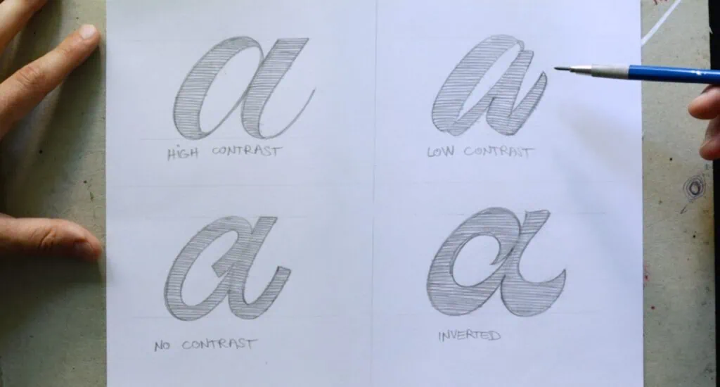
- High Contrast: Think of the Formal style in the top left. The difference between the ultra-thin hairlines and the heavy downstrokes is extreme, creating an elegant, traditional, and high-end look.
- Low Contrast: Look at the Brush or High style examples—the strokes feel more uniform, giving it a modern, casual, or retro feel.
- No Contrast (Monoline): The Monoline style in the middle left keeps the exact same line weight throughout the entire word. It’s clean, friendly, modern, and highly versatile.
- Inverted Contrast: Notice the inverted sample. By flipping the rules and making the horizontal or unexpected strokes thicker, you get an edgy, eye-catching, and unconventional look.
2. Angle (Slant)
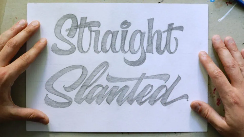
The angle of your vertical axes dictates the overall energy and movement of the piece.
- Deep Right Slant: Creates a sense of speed, elegance, and classic calligraphy (seen in Formal).
- Upright (Vertical): Keeping your letters perfectly straight up and down makes the script feel stable, clean, and friendly.
3. Height & Proportions (x-Height vs. Ascenders/Descenders)
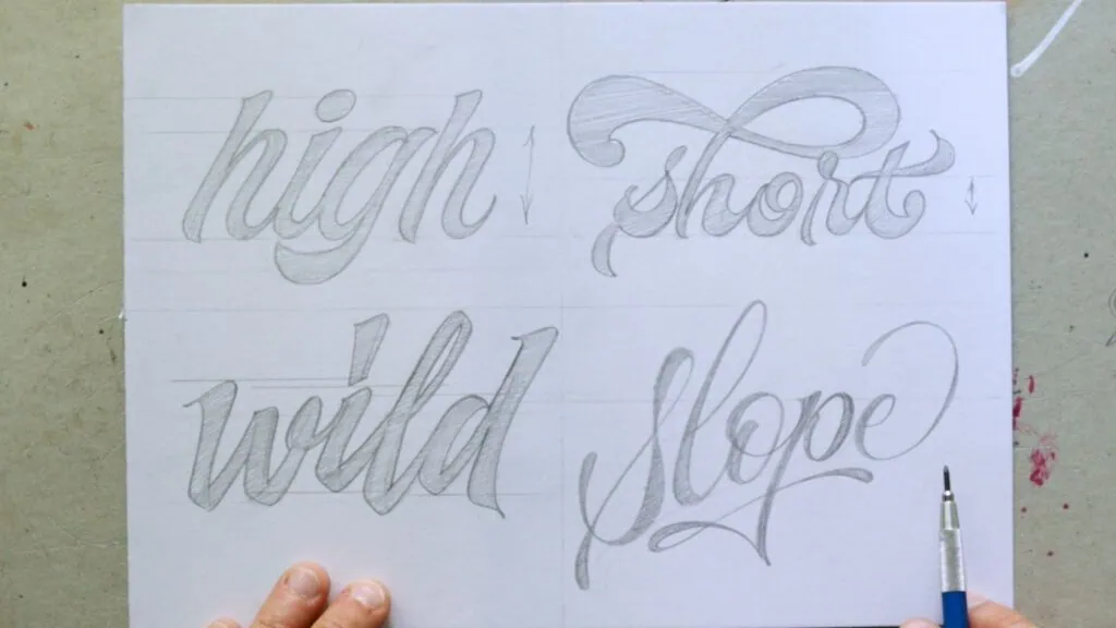
- High x-Height: Look at the word High on the bottom right. The bodies of the lowercase letters are stretched tall, while the loops (ascenders and descenders) remain compact. This feels bold and contemporary.
- Low x-Height: The lowercase bodies are tiny, while the loops on letters like b,d,f,g (ascenders & descenders) stretch out dramatically. This maximizes elegance, drama, and classical beauty.
- Variable x-Height: Some letters can go up while others can go down. This creates a more dynamic feeling for your lettering.
- Sloped x-Height: Letters can also be drawn on a sloped baseline creating another interesting look.
5. Stroke Endings & Terminals
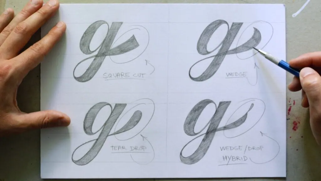
How you end your lines completely changes the texture and mood of the word.
- Blunt/Square Cuts: Blocky, hard angles that give a strong, rugged, or athletic feel.
- Wedge: Probably the most popular and the one I use the most.
- Tear drop: Bulbous or circular dots at the ends of strokes that feel soft and approachable.
- Wedge/drop hybrid: For those letterers ready to spice up their stroke endings a bit more.
6. Spacing & Kerning
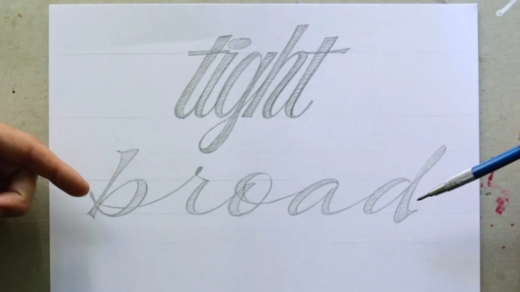
- Tight Spacing: Pushing letters so close together that they overlap or share walls . This gives the word massive impact, structural weight, and a loud personality. Just keep in mind the legibility impact the tight spacing can have.
- Loose Spacing: Giving the letters breathing room with long, sweeping connection strokes, which feels airy, luxurious, and light.
6. Making It Pop: Adding 3D, Shadows, and Dimensional Effects
Once you have used the mix-and-match formula to design a custom script layout, you can take your work to a whole new level by adding dimension. Effects like 3D blocks and drop shadows turn flat typography into an eye-catching piece of art.
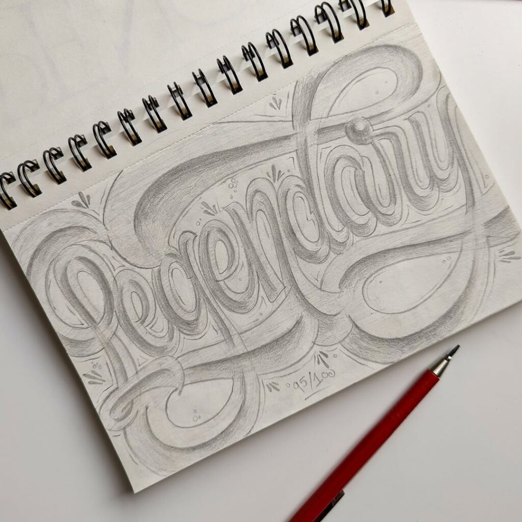
When you’re ready to start experimenting with these effects, keep these three foundational techniques in mind:
The Basic 3D Extrusion
To turn your 2D script into a 3D powerhouse, you need to project the corners and edges of your letters outward. As a rule of thumb for script lettering, your dimensional thickness looks best pointing downwards and to the right.
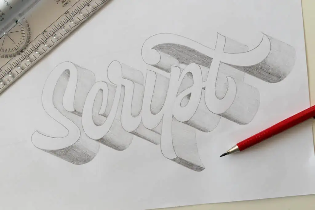
- How to practice it: You can use tracing paper to copy your original sketch, shift the paper slightly down and to the right, and trace it again. By connecting the matching edges and closing the shapes, you instantly create a 3D block.
- Want a complete, beginner-friendly blueprint for this? Check out my ultimate guide on How to Draw 3D Letters Step-by-Step.
Shadows and Cast Shadows
Adding a cast shadow underneath your lettering adds dramatic realism. Shadows always fall in the exact opposite direction of your imaginary light source. If your light is coming from the top-left, your letters will cast a shadow toward the bottom-right. I wrote a full tutorial on adding shadows to your lettering.

- Pro Tip: A common beginner mistake is connecting the shadow to the top surface of the letter instead of connecting it to the bottom layer of your 3D block.
- If you are working digitally, you can master this quickly by checking out these 3 Easy Lettering Shadow Effects in Procreate.
Advanced Perspective and Gradients
If you want to move past flat 3D and create cinematic, movie-poster-style lettering, you need to step into perspective drawing. This involves using vanishing points on a horizon line so that your letters appear to realistically recede into the distance. You can then use a soft pencil or cotton swab to smudge the graphite and create smooth, realistic gradient shading on the sides.
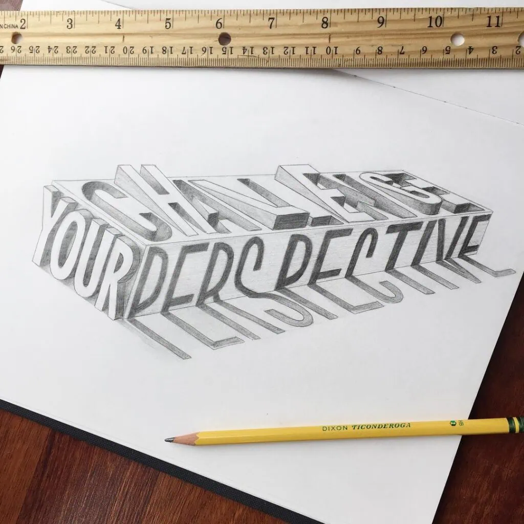
- Ready to tackle the big leagues? Learn the exact rules of depth in my step-by-step masterclass on How to Draw Letters in a 2-Point Perspective.
- And if you want to apply these classic vintage effects using physical paint, dive into the Ultimate Guide to Sign Painting 3D Letters.
7. Analog vs. Digital Tools
I love both analog tools and digital setups (like Procreate on the iPad), and I use both constantly. If you want to work professionally or take on client work, you will inevitably need digital tools for vectorizing and handling revisions efficiently.
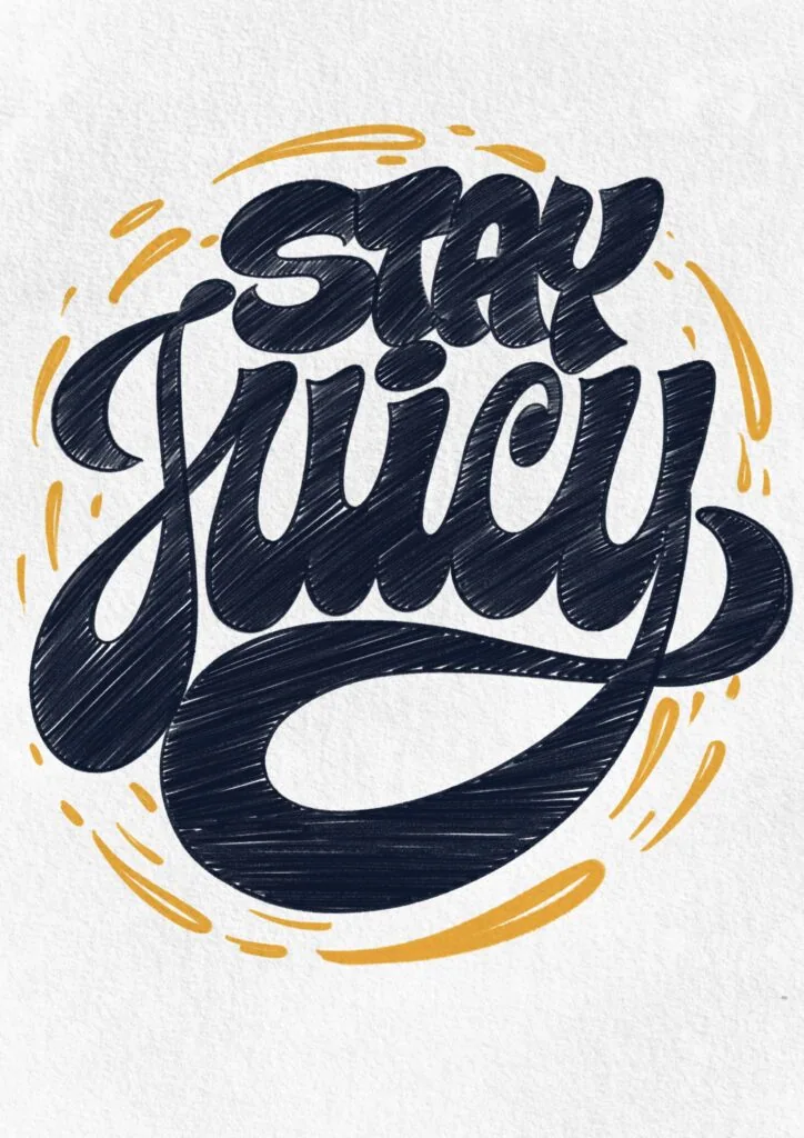
However, they both offer distinct benefits for learning:
- Analog is highly challenging because mistakes take a long time to fix. It forces you to think three steps ahead and treats your paper with respect.
- Digital has a steep learning curve because you have to navigate an entirely new software environment, but its “undo” button allows for rapid experimentation.
My Advice: Don’t limit yourself. Try both to understand how each side functions.
My Philosophy: Try, Fail & Try Again
If there is one thing I want you to take away from my 15 years in this industry, it’s this: You will fail, and that is inevitable.
But failure isn’t a dead end; it’s data. Every messy sketch and warped letter gives you a benchmark of your current skill level and shows you exactly what needs to be improved on your next attempt.
- Less is More: Stop trying to create massive, complex layouts with crazy flourishes, swashes, and ligatures right out of the gate. It stifles your progress. Master simple letterforms first, then add complexity over time.
- The Power of 15 Minutes: One quick, focused pencil sketch a day using strict guidelines will bring you insane results. I have seen students make more progress in 6 months by sketching 15 minutes a day than others do in 5 years of grueling, 2-hour cram sessions on the weekends.
Be patient with your hands, be brutal with your analytical practice, and don’t fear the messy drafts.
Now, grab a pencil, set up some guidelines, and go make some beautiful mistakes.
About the author
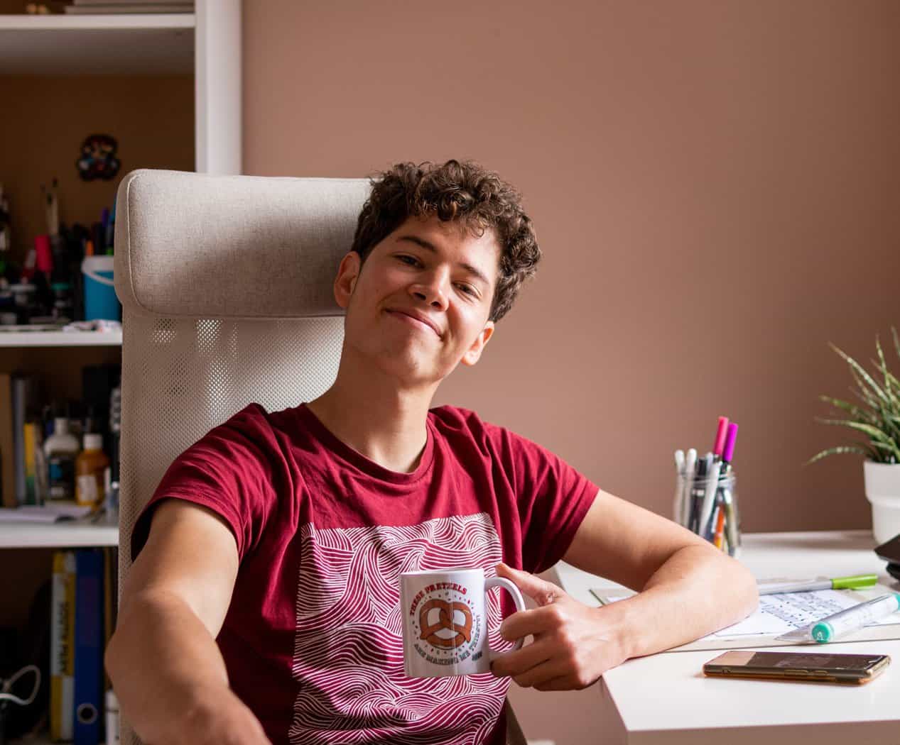
Hey, I’m Max. I’ve been drawing and messing around with letters since 2011. I don’t have a formal art degree—my background is actually in the kitchen as a former chef and on the streets painting graffiti with my friends. Over the last decade, through a ton of trial and error, I somehow turned that obsession into a full-time gig. These days, I design custom logotypes for global brands and paint large-scale murals. I started Lettering Daily just to create the kind of honest, no-BS tutorials I wish I’d had when I was starting out. Stick around, and let’s draw some letters.