Do you want to learn how to add shadows to your lettering using the Procreate app?
Well, you’ve come to the right place.
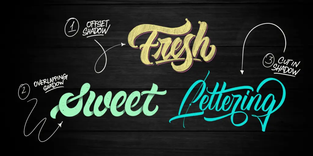
In this tutorial, I will teach you three different shading techniques step by step.
These methods are relatively simple and suited even for beginners, and on top of that, they can work for both hand lettering and calligraphy.
Before we get started, here is a quick overview of the contents of this tutorial –
- Tools needed
- Method one – Offset shadow
- Method two – Overlapping shadow
- Method three – Cut in shadow
- Bonus method
- Final words
Without any further delays, let’s get straight to it.
If you prefer watching over reading, I’ve also made a YouTube video you can check out instead –
1. Tools needed for this tutorial
Since this is an iPad lettering tutorial, you will, of course, need an iPad and an Apple pen.
If you are interested in learning the analog method (on paper), I also have a separate tutorial. You can check it out here.
Aside from the iPad and the Apple pen, you will also need the Procreate app.

In this tutorial, I am using the Procreate 5.0 version.
It might be different depending on when you are reading this.
Finally, I’ll use various Procreate brushes that I’ll mention later on in the tutorial.
As I will guide you through each method, I’ll mention exactly the brushes that I use, and I’ll provide a link for you to check them out.
A quick note – If you are working with shadows for the first time, try to be patient. Working with light and shadows can seem a bit confusing at first. It’s not difficult, and you need a bit of practice to figure out how it works.
Let’s get started with our shading methods!
Method 1 – The offset shadow.

I chose this as the first method since it also demonstrates clearly how light casts a shadow on an object.
In our case, the object will be the letters.
I already have my letters created, as I mentioned in the beginning, you can apply these techniques to both hand lettering and calligraphy.
Step 1 – Create your letters.
You can pick whatever style or technique you prefer.
I went for a rougher and texture script lettering.
For the lettering, I used the Rough & Raw brushes.

Step 2 – Duplicate your layer.
Head over to your layer panel, swipe the layer to the left and duplicate it.

Step 3 – Pick your color.
Select the layer underneath, click on the thumbnail image, and select the “Alpha Lock” feature.

Pick a complementary color to your lettering.
My letters are yellow, so I’ll go for a purple shade.
Keep in mind that since I am working on a dark (black) background, I should pick brighter colors, so they contrast well enough.
If you are working on a lighter background, do the opposite.
Once you’ve selected your color, click on the thumbnail once again, and select “Fill Layer.”
It will automatically color your layer in the currently selected color.
After that, remember to turn off the “Alpha Lock” mode.

Step 4 – offset your lettering.
Once you’ve colored your layer, select it by hitting the arrow on the top left corner.
It will select your whole layer.

The direction of where you will move your layer (aka shadow) depends on where your light source comes from.
Essentially the choice is yours.
Generally, the rule is that the shadow is cast on the opposite side of the light source.
Here is a helpful diagram –

In my example, I will imagine the light source coming from the top left corner, meaning that the shadow will be cast on the bottom right.
Once again, the opposite of the top left is bottom right.
So, coming back to the example.
Select your lower layer, and move it down on the right by tapping on the bottom right corner.
You see, by tapping, you are moving the lettering in small increments, which allows you to be more precise.

Very important! – We want to keep our letters connected with the second layer, so avoid any gaps. Otherwise, this won’t work.

Step 5 – Duplicate the top layer.
Open the layer panel, select the top layer, and duplicate it.

Step 6 – Move the middle layer.
Select the layer in the middle, and move it halfway between the pink and top yellow lettering.
You do that by simply tapping a few times in the same spot – the bottom right corner.

You can reduce the middle layer’s opacity so you can see better where you are moving it.

Step 7 – It’s showtime, baby!
Perfect!
You have your layer where it should be, and now it’s time to finalize it.
Select the middle layer, touch on the thumbnail image, and click on “Select.”

While it’s selected, turn off the visibility.
Go on the bottom layer, select the eraser brush, and make sure to choose the big hard airbrush.

With the airbrush as an eraser, go over the whole piece.
It will delete the mid-layer and leave you with a perfect offset shadow.

When you are done, feel free to delete the middle layer.
And that’s it! A very simple yet fantastic looking shadow effect.
When you are done, feel free to delete the middle layer.
And that’s it! A very simple yet fantastic looking shadow effect.
Method 2 – The overlapping shadow.

This shading method is called overlapping (well, at least I call it like that) because that’s precisely what it does.
The shadow adds depth, making it seem as the strokes are overlapping each other.
It’s one of my favorite techniques, and it’s enjoyable to create.
A quick note – this shading style best fits with a bit thicker strokes. You can still use it even if you’re working with thinner letterforms. I just think it looks better with thicker strokes.
So let’s get started!
Step 1 – Create your lettering.
I already created some sweet lettering for this! 😀

Step 2 – Create a new layer.
Create a new (empty) layer above your lettering.
Click on the thumbnail icon and select the “Clipping Mask” feature.
This will create a mask on the lettering layer underneath so we can work without making a mess.

Step 3 – Pick the right color.
Before we add our shadows, we need to pick the right color.
Since my letters are in mint green, bright color, I will go with a darker shade.
I do that by going in the “classic” color selection and just lowering the brightness bar (the one on the bottom).
You can also try to play with different color combos.
I prefer a more subtle variation.

Step 4 – Create the shadows.
We have our clipping mask and color set up, and now we can start adding the shadows.
I will use the “Powdery” brush from the Rough & Raw brush pack for the shades.
I enjoy the effect I can create with this brush, but you feel free to use any other brush.

If you are not sure which one to pick, I can suggest the soft airbrush.
Start applying the darker shade on every spot where the strokes overlap and letters connect.
Underneath, you can see an example where I marked all the spots where overlaps and connections occur.

A helpful trick is to imagine how you write the letters, from start to finish.
Think of it as following a trail. It will help you visualize these overlaps.
Apply more pressure on the beginning of the overlaps, and as you go further, be more gentle.
Try to create a sort of gradient effect.
I am going from darker to lighter.
It will add more depth, and it will just look so much better.

Do this for all the letter connections and overlapping areas.

Step 5 – Delete the scraps.
OK, once you are done, grab the eraser tool and pick yourself a nice outlining brush.
I will pick the ‘Wet Inker” from the Kick-Off Lettering Toolbox brush pack, but you feel free to select whichever you like.
Just make sure it leaves a solid mark, and it allows you to do precise line-work.

While still being on the masked layer, zoom in closely and start deleting the unnecessary shading parts.

Take your time to do it nicely and precisely.
Do that on all the parts with shadows of your lettering piece.
Congrats!
You’ve successfully created the overlapped shading technique 🙂

Method 3 – The cut in shadow.

In my opinion, this shading technique is the easiest one.
You don’t have to worry about working with multiple layers or anything similar.
It’s also the most subtle effect compared with the other ones.
Step 1 – Create your lettering.
I went for some brush calligraphy for this one.
I used the “Crayola Texture Pro” brush from the Lettering Brushes pack by Daniel Hosoya.
However, feel free to use any brush and style you prefer.

Step 2 – Identify the cuts.
The idea here is quite similar to the overlapping shadow technique we previously created.
The cut in shadow will go on all the places where the letters either overlap or connect.
We are cutting certain parts out to create the “illusion” of shadows.
It will look as certain parts go on top of each other.
In the image below, I marked all the areas where the letters connect and overlap.

Step 3 – Create the cuts.
Once we know where the cuts should go, we can start creating them.
First, duplicate your layer, so you have a copy if you mess it up, or you want to do some other effect (you can duplicate it and turn it off).
Start cutting the parts that we marked in the previous step.
Like this –

In most cases, these cuts will have a triangle looking shape.
Keep doing this for all the marked spots.

And that’s it! Give yourself a nice high-five!
You’ve successfully created the cut in shading technique.
If you struggle to remember where the cuts should go, you can always use this image as a reference.

Bonus method – the long casted shadow.

To top things off, I’ve decided to share an extra shading technique.
This one is called the long casted shadow, and it’s becuase it’s projecting a very long shadow of your lettering.
Let’s get started!
Step 1 – Create your lettering.
Again, whether you prefer hand lettering or calligraphy, it’s going to work either way.
I already have my lettering piece prepared.
I used the “Beautiful” brush from my Brush Calligraphy pack (links to Design Cuts), but you can use any brush you want.

Step 3 – Adjust the black box.
Click on the arrow in the top left corner.
That will select the whole box.
While you are in the selection mode, you can adjust the size and position of the box.
Once again, we imagine the light source coming from the top left corner, meaning that the shadow will be cast on the bottom right side.
Adjust the black box in that direction.
Make sure that the edges of the box are reaching the furthest points of your lettering.
Those will be your first and last letters.
Also, make sure that it covers the whole lower area.
You should have something that looks like this –

Step 4 – Remove the top parts.
Now we need to delete certain parts from the top.
How do we know which parts to remove exactly?
It’s easy. You need to think about which parts are above others.
Here I marked (with white x’s) the top areas, check it out –

Before I start erasing the unnecessary parts, I will mark these areas using straight lines.
Open up a new layer and draw a straight line along the edge using a contrasting color.

Now duplicate that layer and place the next line on the next marked point.

Repeat the same thing for all the marked spots.
Ok, now you should have something that looks like this –

Delete all the black areas above each of the straight white lines.
Here is an example –

Feel free to remove the white guidelines and marks that we had in place.
As you can see, I still need to clean it up a bit on the edges.

Step 5 – The secret is in the details!
Open up a new layer above the shadows (below the lettering).

If you are wondering why is the shadow black, I just brought back the opacity of that layer to 100%.
Go on your shadow layer and tap on the thumbnail image.
Hit the “Select” feature, and hide the layer.

Go back to your empty middle layer.

Select a darker shade of your background.
In my example, it’s going to be some sort of Bordeaux (one of my favorite colors :).
Use the soft airbrush, and start applying the darker shade from top to bottom to create a gradient effect.
It helps if you make the brush really big and if you reduce the opacity of the brush to about half.
You should have something like this –
And there you have it, friends!
That’s how you create the long drop shadow effect 🙂
I know it seems a bit intimidating the first time you do it, but it’s not that difficult, and it gives a nice touch to your lettering.
Final Words
I hope you found this tutorial to be helpful.
Which of these shading techniques do you like the most?
Let me know by dropping a comment below!
If you decide to create one of these effects, be sure to send me DM on Instagram so I can give you a story shoutout.
If you would like to get constructive feedback on your work and additional tips and resources on how to improve, check out my Facebook group.
Thank you for reading and until the next time,
Stay AWESOME!
Pin me!


Stay updated with my tutorials and get instant access to the Lettering Crate –
A growing library of free lettering & calligraphy resources that includes –
About the author

Hey, I’m Max. I’ve been drawing and messing around with letters since 2011. I don’t have a formal art degree—my background is actually in the kitchen as a former chef and on the streets painting graffiti with my friends. Over the last decade, through a ton of trial and error, I somehow turned that obsession into a full-time gig. These days, I design custom logotypes for global brands and paint large-scale murals. I started Lettering Daily just to create the kind of honest, no-BS tutorials I wish I’d had when I was starting out. Stick around, and let’s draw some letters.


Great article! The step-by-step guidance on creating different shadow effects in Procreate was very helpful. The methods were clear and easy to follow. I do have one question: For the “cut in shadow” technique, what are some tips for ensuring the cuts look natural and not too harsh? Thanks for the awesome tutorial!