Are you trying to outline your lettering using the Procreate app?
If so, you’ve come to the right place, and I will guide you throughout the whole process – step-by-step!
And don’t worry, this method is super quick and easy and doesn’t require you to work with many layers.
This method can also work for calligraphy, illustrations, or basically any sort of object you wish to outline.
Here is a quick overview of this tutorial –
- What do you need for this tutorial?
- The step-by-step outlining process
- A few extra tips
- Final words
Without any further delays, let’s get started!
If you prefer watching over reading, I’ve also made a YouTube video you can check out instead –

What do you need for this tutorial?
You will, of course, need an iPad Pro, an Apple pen as well as the Procreate app.
I am using the Procreate 5x version at the time of writing this tutorial.
Aside from these tools, you’ll also need your lettering/calligraphy piece to be ready.
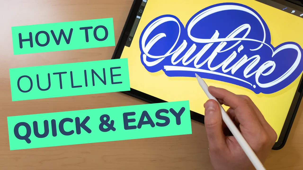
For this tutorial, I’ve created a quick calligraphy piece that says ‘’Outline’’.

For it, I used the ‘’Beautiful’’ brush from my Calligraphy brush pack (links to DesignCuts.com), but feel free to use any brush you have at hand.
Quick Note – If you are trying to create an outline on a lettering piece with texture, especially on the edges, the outline won’t be super smooth.

Outlining your lettering in Procreate in 6 EASY steps
As mentioned, I think this is the quickest, and easiest method Procreate currently has to offer.
So let’s jump right into it.
Step 1 –
Plan out your colors.
Here we are working with 3 different elements –
- Background
- Lettering
- Outline
My advice is that you select colors that have good contrast between each other.
My background will be yellow, my lettering will be white, and the outline will be blue.
If you are struggling with your colors, I’ve written a beginner guide on color theory and how to use them in your lettering.
You can check it out here.
Step 2 –
Duplicate your lettering layer two times.

I will color them both in my selected outline color, which is a nice contrasting dark blue.
To color them quickly, open up the layer panel, tap on the thumbnail icon, and select the ‘’Alpha Lock’’ mode.

Once they are on the ‘’Alpha Lock’’ mode, tap the thumbnail once again and choose ‘’Fill Layer’’.

That will color everything in your layer, and since the lettering is in Alpha Lock, it will only color the lettering.
Once you are done, make sure to turn off the Alpha Lock mode.
Step 3 –
Select the middle layer, open up the transformation panel from the top left corner and select ‘’Gaussian Blur’’.
Slide the top bar to about 7-8%.


Quick note – The amount of gaussian blur might be different depending on the size of your canvas. For reference, I’ve selected ‘’Screen Size’’. For you, it might be a bit more or a bit less. The important is that you create a small outlined blur around your lettering piece. Just make sure you don’t overdo it.
Step 4 –
Merge the blurred layer with the one below.
This will help us get a smoother outline in the next step.

Step 5 –
Hit the select tool from the top left corner, and make sure it’s under the automatic selection.

Now THE MOST IMPORTANT PART! –
Touch with your pen on the lettering, not under, above, left, or right.
It has to be on the lettering.

Once you’ve touched, slide with the pen on the right, as you did with the Gaussian Blur.
You will see a bright blue color on the screen, and you should keep sliding until it’s outlining your lettering to your desired thickness.
I will leave mine to about 98%, and again in your case, that could be more or less.
What matters is that you see the blue line going all around your lettering.
Like this –

Step 6 –
While still being in the selection mode, open up a new layer, and pick a big hard brush.


With the color you selected for your outline, go all over your lettering piece.
This will cover the selection AKA the lettering outline.

And boooom!
There you have it, folks!
You’ve successfully outlined your lettering piece.
Super quick, super easy, and without having to duplicate a whole bunch of layers.
A few extra tips to improve your outlined lettering
Ok here are a few extra tips that you can further implement on your piece.
Tip 1# – Fill in the gaps!
If you outlined your lettering, chances are you will still have some gaps in your piece.
Grab the brush tool and fill in the gaps.
It will look much cleaner and less distracting.
After all, it’s a lettering piece, not a piece of swiss cheese 😛

Tip 2# – Add some shadows!
We can further pimp out our outlined lettering piece by adding some shadows.
Duplicate your outline layer (the bottom one) and move it slightly down and to the right.
You can also do it on the left, imagining that your light source comes from the top right.
This will create an offset shadow effect. Like this –

Additionally, you can take it a step further by duplicating the offset shadow layer, moving it a bit more in the same direction, and reducing the opacity to about 10% more or less.
This will give it the look of a drop shadow.


Tip 3# – Add some more shadows!
My last tutorial was all about how to add shadows to your lettering in Procreate.
One of the techniques was the cut in shadow effect.
I think the cut in shadow is a perfect fit when you are outlining your letters.
Here you can see an example of it.

If you want to learn how to add the cut in shadow effect, check out my other tutorial by clicking here.
I also made a YouTube video showing how to achieve that effect.
It’s the third effect in the video below –
Final Words
And there you have it, folks!
A relatively simple and quick way to outline your lettering, illustrations, or any other object for that matter.
So far, this is the best method (in my opinion) that Procreate has to offer.
However, Procreate has been regularly releasing updates with new features, and I wouldn’t be surprised at all to see an outlining feature coming out soon.
If you now a better and easier method for outlining your lettering, don’t hesitate to drop a comment below.
The same goes for ideas and suggestions for future and upcoming tutorials.
Until the next one,
Stay AWESOME!
Pin me!
 Pin – Lettering Daily-01-01")

Stay updated with my tutorials and get instant access to the Lettering Crate –
A growing library of free lettering & calligraphy resources that includes –
About the author

Hey, I’m Max. I’ve been drawing and messing around with letters since 2011. I don’t have a formal art degree—my background is actually in the kitchen as a former chef and on the streets painting graffiti with my friends. Over the last decade, through a ton of trial and error, I somehow turned that obsession into a full-time gig. These days, I design custom logotypes for global brands and paint large-scale murals. I started Lettering Daily just to create the kind of honest, no-BS tutorials I wish I’d had when I was starting out. Stick around, and let’s draw some letters.

Thanks for the tutorial! I was having the same issues as other posts have noted. I managed to accidentally fix it by goofing around. I was touching my apple pencil to the center of the font body, but when I touched the pencil to the center of the text box I got your result albeit reversed. I went along with it and got the thickness I wanted and ended up having to delete a layer and then I had the exact outline as you. I know, not a lot of help, but it worked. Frustrating coming from PS / AI to procreate for some things.
Glad to hear that you managed to find the solution 🙂 Yeah, some things are quite different, but I still like Procreate for what it is 🙂
Same problem. I use an IPad Pro, so that’s not the problem. Maybe it’s a Procreate update thing? When I put my pen in the middle of the lettering and try to slide, the screen automatically goes all blue, there is no going to 98%. Even if I back it off to almost 1%, it is still at max coloration. So, no way can I get past step 5. I bought your brushes too! Sad that I can’t duplicate what you’ve shown with the outline.😕
Hey Tiffany, Im not sure why is that. It still works for me on the latest version of Procreate. Perhaps you can shoot me an email with a video of you trying to follow the process? I think that would be helpful for me to see what could be the problem.
Hey! I’m having the same problem as Sharon. I am placing my pencil on the lettering (which is one word, my name) and in the middle. I have tried several times with different amounts of Gaussian Blur. I’m not using an iPad Pro. I have an iPad 8. I usually just use the templets I have from Loveleigh Loops which are 2048px x 20848px with a DPI of 132. Would any of this be the reason I cannot get beyond step number 5?
Hey Renee, in step 5 you have to hit the selection tool and on the toolbar on the bottom select the automatic feature instead of the freehand which is on by default. It is the automatic selection that creates the outline. Have you watched the YouTube video as well? Perhaps that could be helpful? Please let me know, I’m happy to help if i can.
After watching the video and reading the step by step i can get to step 5 and as soon as i attempt to move the white lettering to the right to 97% the lettering suddenly turns to black? What might be the problem that is happening, i have tried to do this several times and it always goes to the black.
I would appreciate any help or advise that you could give me.
I love the articles and videos and try each one.
Thanks you for your time and stay safe.
Sharon
Hey Sharon, that seems to be the maximum amount the current selection can go. It’s completely normal it happens to me too. It just means that right before 97% is the maximum amount you can add to it. As mentioned, that number could be slightly higher or lower depending on how much gaussian blur you have added in the previous step. It could also vary depending on your canvas size. What matters the most is that you place the pen on the middle of your lettering piece and make sure it touches a letter (or a part of it). As mentioned earlier you can join the Facebook group and share your work for further assistance and feedback. Let me know if there is anything else i can do to help 🙂
Thank you for reading and trying out these tutorials! 🙂
Can you help me, as i get confused as to when you have duplicated layers which one is the original layer?
I’ve tried renaming the layers but when I follow the directions i must be on the wrong layer.
Is there a way to tell which is which.
Thanks for your help and love the lessons
Hello Sharon, thank you for your comment. When you say duplicating the layer do you mean initially or when i talk about the extra effects you can add?
Initially you duplicate the layers, you apply the gaussian blur and you merge them together right afterwards. At that point the top layer is the lettering layer and the bottom one becomes the outline. The outline layer serves only as a selection layer that later you just need to color once you’ve done the automatic selection. I hope this helps. You can also join the Facebook group and share your work there for further assistance and feedback. Let me know 🙂