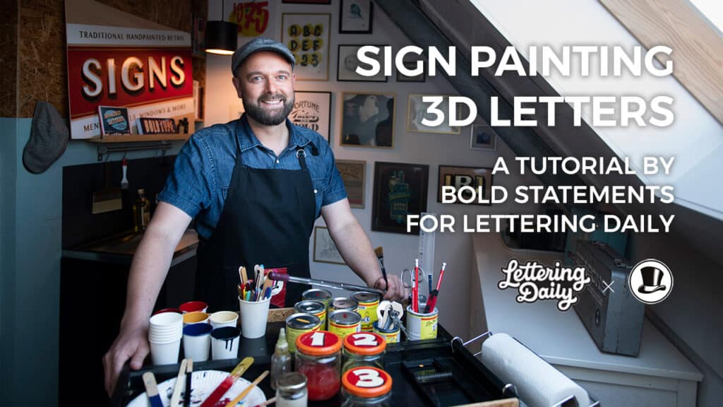
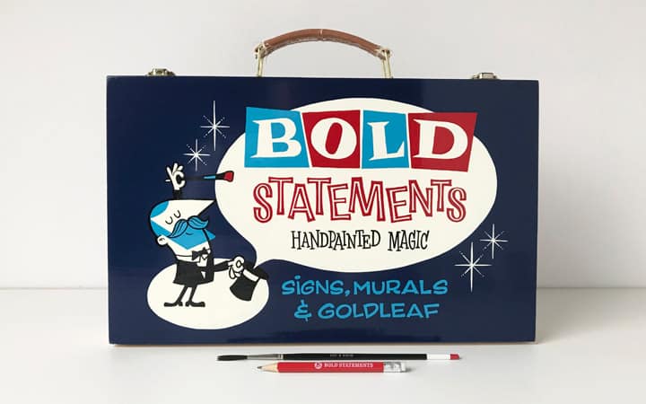
Hi there!
My name is Pieter Snijders, and I am a passionate designer and the lettering artist behind the label Bold Statements. I am 45 years old and based in Arnhem, The Netherlands.

Today I will teach you three tutorials in one:
- How to draw 3D letters,
- How to transfer your design onto your canvas,
- And how to paint a stunning lettering piece using sign painting techniques.
About sign painting
Back in the day, before computer prints and vinyl stickers dominated the street scene, shopfronts, advertising posters, signs, and billboards were all designed and painted by hand.
There was a whole industry of well-trained men and women who made a full-time living with this craft we call sign painting.

Most sign painting veterans were not just skilled with a brush. They were also able to design new signs and logos for their clients on the spot.
Their main objective was to make their client stand out in the crowd on Main Street. That is why they had a whole arsenal of bold effects to pull out of their hat to make the sign of their client pop.
Back then, trade schools where you could learn this craft were very common. Before students even learned how to handle a brush, they had to learn many other skills as well.
Skills such as –
- Which materials do you need for which job?
- How do you construct correct basic letterforms by hand?
- How do you create a good layout or a striking logo?
- How do you create a balanced color scheme?
- How do you sell your added value to your client?
- And so on …

When these students were finally allowed to pick up a brush, they were told to practice only basic brush strokes for weeks in a row before they were even allowed to paint letterforms.
Suppose you want to become a professional sign painter. You need to build up muscle memory and efficiency through practice.
Today, unfortunately, the possibilities to get that kind of thorough education are limited.
But! … You do not need to become a professional sign painter to enjoy the fun that painting letters can bring. And that is precisely where this tutorial comes in! It might not make you a skilled professional overnight, but if you have to start somewhere, this article could just spark the fire in your belly to get you started.
And if you happen to discover your inner sign painter (and I bet you do!) I can definitely recommend following a few live workshops to help you further.
Let’s try it out and get this party started!
Get your tools!
As mentioned earlier, this tutorial covers three different stages –
- drawing
- transferring
- and painting.
Each stage can be done with basic and affordable tools or with fancy, more expensive tools.
Remember kids: if you are resourceful, the fancy tools do not necessarily give you better results than the basic stuff does! It all depends on what you are aiming for.

I will sum up the needed tools at the start of each step, along with the pros and cons of the different solutions. Then, adjust them to your own needs and possibilities.
Part 1 – Drawing the 3D letters
Although drawing three-dimensional letters can be tricky, the needed tools are very obvious. All you need is:
- a pencil
- an eraser
- a triangle ruler
- a compass
- some tracing paper
- tape
The next steps are also suited for drawing 3D letters with a computer or tablet. Some die-hard sign painters might say that it is not done to use a computer to create your designs.
I totally agree that there is no better way to learn proper letter construction than to start drawing and painting letters by hand. However, that is not the objective of this tutorial.
I think there is no shame in drawing your lettering piece digitally if you consider a computer or a tablet as just another tool. However, it is more likely that your result will have that authentic, handmade look if you draw your artwork by hand.
The two methods for drawing 3D letters.
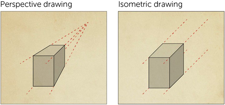
There are several ways to draw three-dimensional letters. Two of the easiest ways result in a so-called isometric image (without a realistic perspective). This is because all lines that give thickness to your letters are parallel and the same length.
The picture below shows the difference between perspective and isometric drawing. Today, we will focus on isometric drawing.
Method A:
- Determine in which direction you want to show the thickness.
- Draw diagonal lines from the corners of your letters.
- Put them all at the same angle and give them all the same length.
- Connect all the endpoints of the diagonal lines.

Method B:
- Trace your letters with tracing paper.
- Then, move your paper a bit upwards and to the right and trace again.
- After that, you can connect all matching corners of the letters.

Today we are going to use method B to create our 3D lettering design. In the next section, I will guide you through this process step by step.
Fun fact –
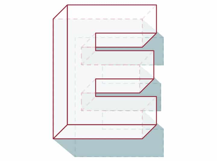
Of course, you are free to choose in which direction you draw the thickness of your letters. Printers and digital designers tend to draw a thickness that points downwards to the right. However, sign painters found it easier to point it downwards to the left when you want to paint your letters. Here is why …
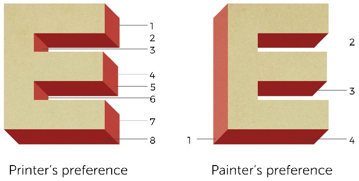
Take a look at these samples of the letter E, the most used letter in the alphabet. When the shading points to the left, you have to draw four extra shapes. If you point it to the right, you have to draw eight extra shapes.
The choice is up to you, and there is no right or wrong.
As always, there is an exception to the rule. Script lettering and numbers look better, with a thickness pointing downwards to the right.
This is because both have a lot of diagonals that point from the right top to the left bottom. If your shading is facing the same direction as the diagonals of your numbers, the effect will have less impact.
If you have to combine regular letters with numbers or script lettering, then pointing your shading to the right bottom is preferred.
OK, enough talking… Let’s get started!
How to draw 3D letters step by step.
If you have decided in which direction you want to draw the thickness of your letters, we can start.
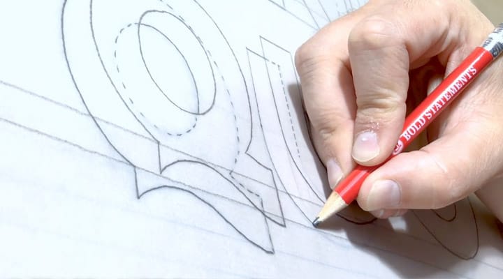
Step 1.1
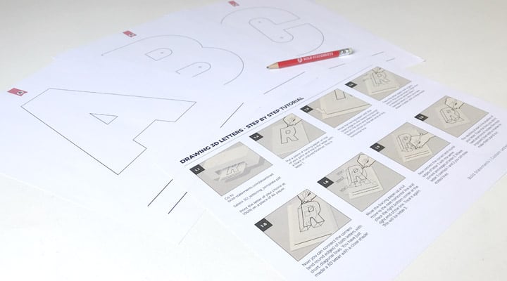
Create a lettering piece in 2D. You can use any lettering piece that you have designed yourself. But if you want some easy samples to work with, you can go to www.bold-statements.com/download and select ‘3D lettering template’. This pdf contains a simplified, geometrical alphabet with a few handy guidelines. Print the letters you need at 100% on A4 paper.
You can also find a pdf with the short version of the tutorial ‘Drawing 3D letters’ on that same download page. This must be your lucky day!
Step 1.2
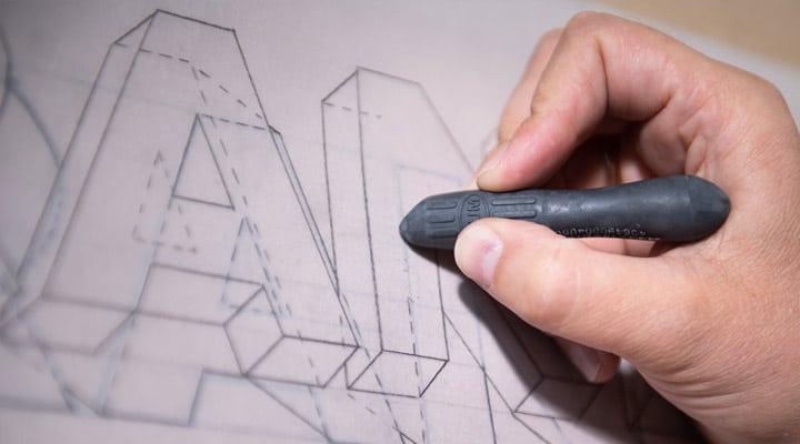
Take a piece of tracing paper and place it on top of your design. Use a little piece of tape to keep it in place. Now trace the letters of your design. This will become the top surface of your letters.
I will refer to this result as ‘Layer 1’. For a better understanding later in the process, it can help to trace this step with a colored pencil or maybe even fill in the letters of layer 1 with some color.

Step 1.3
Move the tracing paper a little upward and a little to the right if you want the thickness of your letters to point to the left bottom.

Step 1.4
Trace your design again on the same piece of tracing paper. This will become layer 2 (the bottom side of your 3D letters). Draw thin or dotted lines where layer 2 overlaps layer 1.
Step 1.5
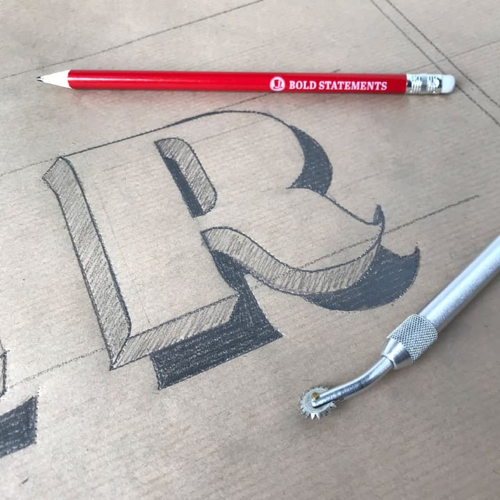
Connect the corners (and round edges) of both layers with short diagonal lines.

You have just made a 3D lettering piece!
Adding a cast shadow
In the next few steps, we are going to draw a cast shadow beneath your lettering piece. Shadows are drawn in the opposite direction of where the light is coming from.
If your light source is placed at the left top of your design, your letters will cast a shadow to the right bottom. This also means that the left and top sections of your 3D letters will be lighter than the right and bottom sides.
A point light will cast hard shadows, and a diffuse light source will cast soft shadows and gradients.

Step 1.6
Let’s say that your light source is placed at the top left of your lettering piece. In that case, you move the tracing paper up and to the left to achieve a shadow that will point to the right bottom.
Trace it again. All lines that overlap with layers 1 and 2 can be thin or dotted. So this will be layer 3.

Step 1.7
Now connect the corners and round edges of layer 3 with the same corners and edges of layer 2 (NOT LAYER 1!). Where layer 3 overlaps 1 and 2, you can draw dotted lines.
If you do this correctly, you notice that shadows connect to the BOTTOM side of your 3D letter (layer 2) instead of connecting it to the top surface of the letter (layer 1), which is a common mistake.
Step 1.8
The resulting shape is the shadow of your lettering piece. Erase the dotted and thin lines and/or redraw the most important lines with a marker to make them stand out.
Your three-dimensional design is ready for the next stage!
Sidenote: My booklet Papercut 3D letters also describes this process with additional steps on creating that nice bevel effect and steps on how to create a beveled letter out of different layers of colored sheets of paper.
Advanced Shading
Don’t let yourself be confused by the terms’ shadow’ and ‘shade.’ Both terms can be used to describe the non-illuminated side of an object or the non-illuminated shape which an illuminated object casts onto a surface.
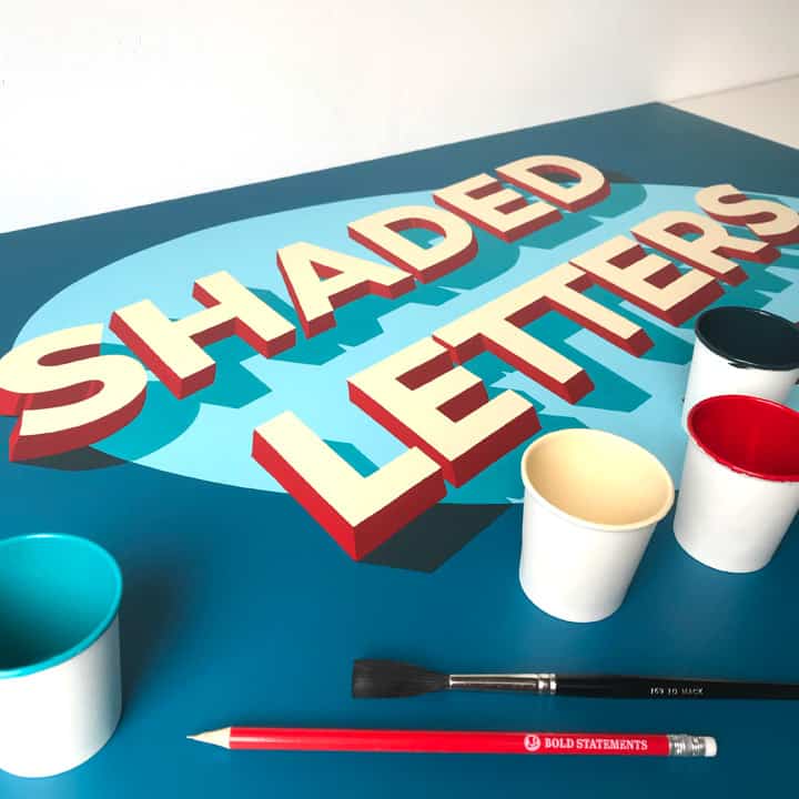
However, sign painters use the term ‘shade’ in a broader perspective. In sign painting, ‘shade’ is used as a collective term for various effects concerning light, shadow, and dimensional depth of letters and graphics.
In my research of sign painting techniques, I have never found a complete overview of all those different shading effects (the correct collective name for these effects).
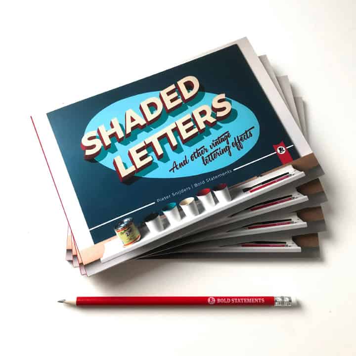
So, I decided to create my samples of each effect and bundle them in a self-published book called ‘Shaded Letters & other vintage lettering effects.’ In this tutorial, I will only describe the basics. Check out my book to learn all about the different types of shading. The possibilities to combine these different effects are endless!
Part 2 – Transferring the 3D letters
When you are satisfied with your lettering piece, you might want to transfer your design onto another canvas, like a fresh piece of paper, a wooden panel, or even a wall. I remember having major headaches trying to wrap my head around doing this before I learned a few very simple but effective methods. But, looking back, it couldn’t be more obvious …
Of course, you can use a projector if you have access to one. A projector makes it easy to adjust the scale of your design to the desired size of your final artwork. However, if you do not have to scale your design, there are ways that are much cheaper and, above all, more accurate. If you need to trace your design multiple times in between painting different layers, it can be very hard to reposition your projector and its lens the same way as before.
If you follow the next steps, you also do not need a dark environment, and you will have to dodge your own shadow.
That is why I prefer to work with paper patterns: I prepare a sample of my design on paper at the actual desired size. With this pattern, I create temporary guidelines on my canvas. You can create a pattern in two different ways:
Method 1 for transferring –
The cheapest and most easy method is to create your own carbon copy paper. All you need is just a piece of (colored) blackboard chalk and a pencil. Then, you can simply cover the backside of your paper with the long edge of your chalk stick.

Roughen up the side of a fresh piece of chalk by scraping a knife alongside the edge for an easy start.

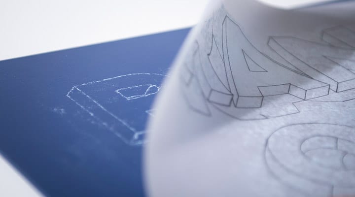
Next, you position your paper pattern into place and tape it to your canvas. If you need to trace your pattern multiple times between different layers of paint, it might be wise to mark the pattern corner positions on your canvas with small chalk or thin pencil lines. This way, you can easily reposition your pattern again at the same location later on.
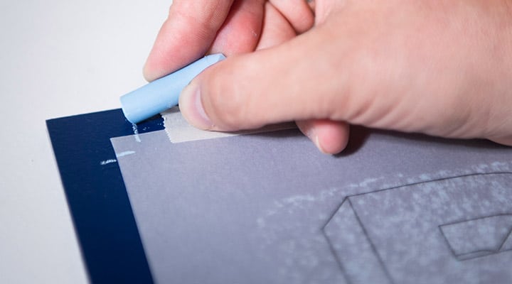
Finally, trace your design with a pencil. The chalk on the back of your pattern will transfer to the canvas, where you put the pressure with your pencil.
Tip: If you are working on a delicate surface, such as a car, for example, you can use a fine-liner instead of a pencil to prevent scratching the car.
Bonus tip: Use different colored pencils or fine-liners for different layers, so you can see more easily which parts you have already traced and which parts you haven’t.
Method 2 for transferring –
Some sign painters prefer to create a so-called pounce pattern. With a pounce wheel, you can cut little holes in the paper pattern along the lines of your design.
This works best if you put a soft rubber mat or a piece of styrofoam underneath your paper. For optimum results, it is best to open up the holes by sanding down the back of your paper pattern with a piece of sandpaper.

If you place your pattern onto your canvas, you can pounce it with a pounce pad (or an old sock) filled with chalk powder or charcoal dust. The powder will pounce through the little holes and leave dotted lines on your canvas.

Creating a pounce pattern takes a little more time to prepare, but it will cost you less time and effort to create your guidelines on the location of the job.
Look online for your nearest sign painting supplier for pounce wheels, pads, and powder.
Preparations needed before we start painting
Before we start painting the piece we’ve drawn on paper and then transferred to our final surface, it’s important to cover two additional sections –
- The sign painting tools needed
- Sign painting practice – covering the basic strokes
OK, we’re almost there. Please stay tuned for a few more minutes. After that, we will paint our lettering design the sign painters’ way, I promise!
The importance of sign painting tools
Of course, you are free to create a lettering piece any way you like. For example, suppose you want to paint your letters with cheap finger paint and a single-hair brush that is totally fine. But professional sign painters need to move on to the next job in time to make a living.
That is why sign painting as a profession is all about efficiency –
- How can you paint letters using the smallest number of brush strokes possible?
- Which tools work best for which job?
- What materials give the smoothest results?

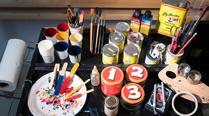
Sign painting tools needed.
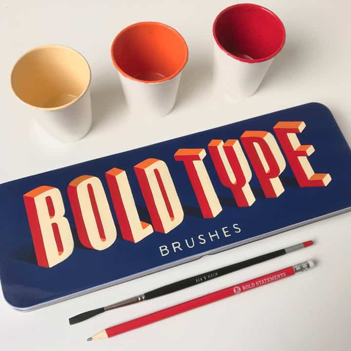
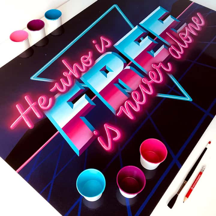
- Brushes
- Paper cups (espresso-size dipper cups are most convenient)
- Icicle sticks
- Enamel paint
- Palette (optional)
- White spirit (and optional a flow enhancer or paint reducer medium)
- Tissue paper or cloth
- Natural oil (or acid-free Vaseline)
- Mahlstick
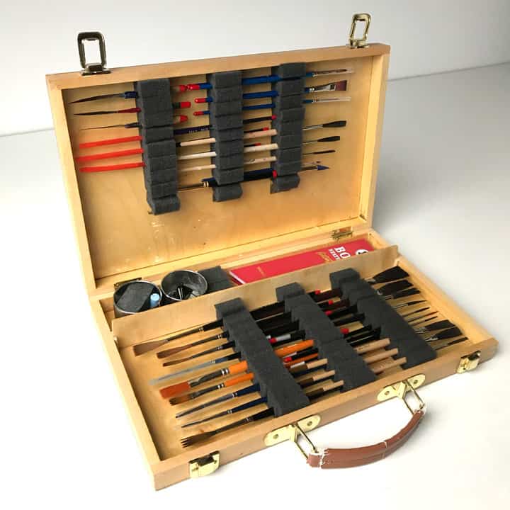
1. Sign Painting brushes
Sign painting brushes can be quite expensive, but usually, they are well worth the investment. When it comes to brushes, fancy is better most of the time. Your brush can make or break your sign painting experience. That is why it is important to find the brush that works best for you. If you get the chance to experiment, I advise you to try out different brushes to find out which brushes work best for you.
There are different types of brushes: in different shapes and sizes with different types of brush hairs. So, where to start?

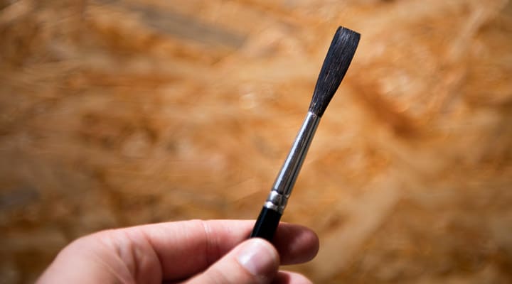
The best brushes for this tutorial (filling in block letters) have a so-called chisel tip. If palleted well, the ending of the hairs of these brushes form a nice straight edge with sharp corners. So-called flat brushes have shorter hair, but they are also suited for block letters because of their sharp edge.
You might have noticed that most sign painting brushes have longer hairs than those you can buy at your local artist supplies store. Longer hairs can hold more paint so that you can pull nice, long lines instead of having to dip your brush after every inch (efficiency!).
The width of a brush can be indicated by a number or in inches. Numbers usually range from 0 (thin) up to 12 (wide) or higher. So a size 3, 5, and 8 should get you started. If you are dealing with an indication in inches, you can try ⅛”, ¼”, and ⅜” for a start.
Apart from the shape, length, and width, there are also various types of hair to choose from:
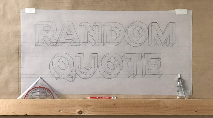
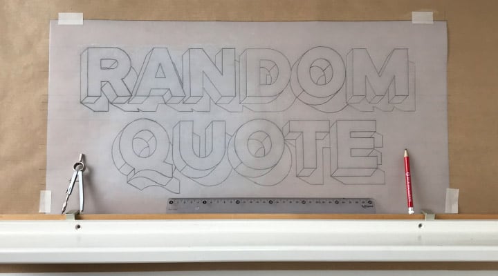
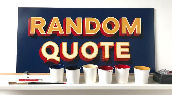
Pure sable hair brushes are very soft and can hold a lot of paint, but they can be quite expensive. The set of sable hair brushes that I have are my go-to brushes for most projects. I have also used them to paint the Random Quote panel for this tutorial.
Squirrel and ox hair is slightly less soft, but they work very well with enamel paint. Over the past decades, synthetic hair has developed increasingly as a good alternative for natural hair in many cases, especially when working with acrylic paint.
If you are eager to try out this tutorial without wanting to spend too much money before you have even started, try to find a flat brush with a nice, straight chisel edge that fits your budget, for example, the flat brushes from this set.
New brushes can have a bit of wax at the tip of the hairs to keep them in shape until they reach their new owner. Don’t forget to give your brush a gentle massage with a drop of dishwashing soap in some lukewarm water to remove the wax. Make sure the water is not too hot to prevent the hairs from curling.
2. Paint
If you are just starting and you do not want to spend too much money while trying out this tutorial, acrylic paint (water-based) is fine to use. It is water-based, doesn’t smell strong, and is usually quite affordable. Different brands have different prices, which usually results in greater opacity if you spend a little more. I think this brand has a nice price-quality balance. You can use plain water to dilute acrylic paint to a consistency that makes your brush flow nicely over your canvas.
However, I prefer to work with enamel paint whenever I can. This is because enamel paint has great opacity and is known for its glossy finish and durable hardness (like an enamel coating on certain metal products).
Alphanamel and 1Shot are two enamel brands available in most countries worldwide, but there are other brands as well, like Ronan in the U.S. and the home brand of London-based supplier A.S. Handover. Look online for a local supplier in your country since international shipping regulations can be strict for paint and other chemicals.
Most well-known enamel brands have additional products to mix with the paint for different purposes. Especially the flow enhancers (also called reducers) are essential for an optimal painting experience. I will explain more about this later on in this tutorial.
3. Mahlstick
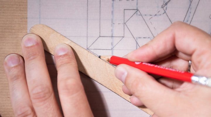
A mahl-what? A Mahlstick. Many sign painters use a mahlstick for better brush control. There are ready-made mahlsticks available, but you can easily make one yourself from a simple wooden stick and a soft ball of cotton wrapped in a rubbery cloth or a finger of a rubber glove.
The stick will keep your hands out of the fresh paint, and by moving it, it will guide your painting hand. You can also use it as a ruler or a compass when you are painting.

Some painters prefer to use the hand over hand method; you place one wrist on the canvas and the wrist of your painting hand on top.
Others work with the little finger of their painting hand on the canvas, the pinky down method.

Try all methods for a while and find out what works best for you.
Sign painting practice – the basic sign painting strokes.
Roughly speaking, there are three different disciplines in sign painting:
- Block
- Casual
- and Script.
Each discipline uses slightly different techniques and different brushes.

The biggest challenge is to develop the skill to paint these different styles’ single stroke’. That demands a lot of training, and I can’t stress enough: not everyone has to become a professional sign painter overnight to enjoy painting letters. So, don’t be too hard on yourself. If you feel the need to touch up your letters with a few extra brush strokes in the beginning, just do so.
Casual and Script are beautiful lettering techniques that leave room for every painter to develop their signature.
However, almost every other lettering style constructed out of straight edges, sharp corners, and geometric curves can be painted with the basic techniques used for painting block lettering. So that is what we will be focussing on today.

As you might have guessed by now, painting every day is a romanticized view of sign painting. Most of the time, it is 10% painting and 90% something else! But for me, every step of the process has its charm.
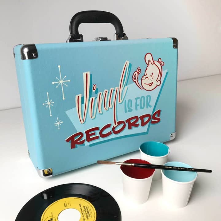
Now that you’ve got your tools organized, it is time to open up a can of fresh paint. You can use icicle sticks to stir the paint and to move the paint from the can into a dipper cup. You do not need a lot of paint for a little practice or a small panel. A little layer of about 5 mm in your cup will be more than enough most of the time.
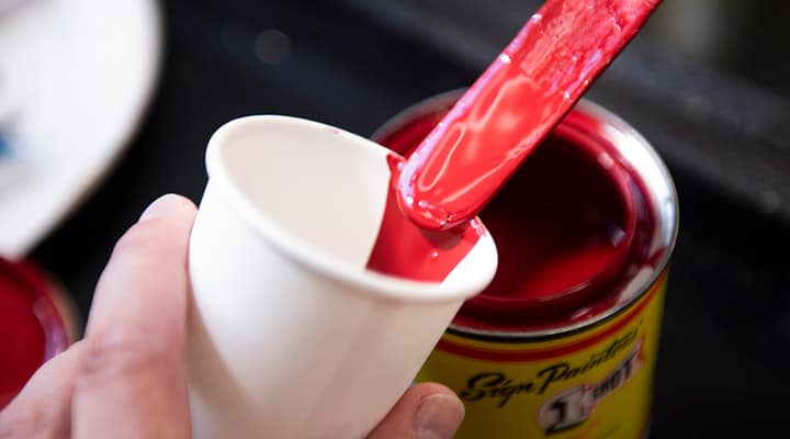
If you hold the cup tilted above your can while you transfer the paint, you keep the edges of your can clean. In addition, clean cans close better, which will extend the storage life of your paint.
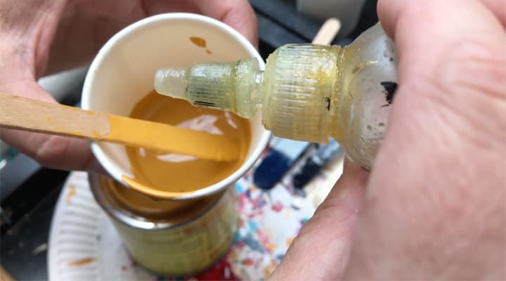
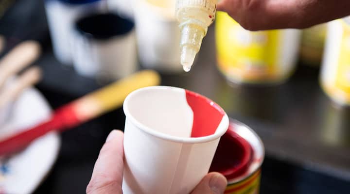
Put a few drops of flow enhancer into your cup and stir it well. This simple step is one of the most crucial steps for a good painting experience. You want to mix your paint thin enough so that your brush will run as smooth as possible across your canvas. This will take some experimenting before you get the hang of it.
If the paint in your cup starts to thicken while painting, you just add a few extra drops of a flow enhancer, and you are ready to go again. White spirit will give the same effect, but flow enhancers are developed to maintain the opacity and durability of the paint.
Of course, this also goes for acrylic paint; experiment with adding drops of water until you find the desired consistency. Then, try it out on a piece of scrap board or paper to see if you can paint as smooth as possible without the risk of paint running down your artwork.
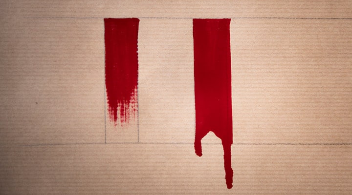
Soon enough, you will notice when you have found the right consistency: if your paint is too thick, your brush will drag along your canvas with too much friction, and you will see dry brush marks before you can finish your stroke. If you mix too much reducer into your paint, it will start running down your brush and across your canvas.
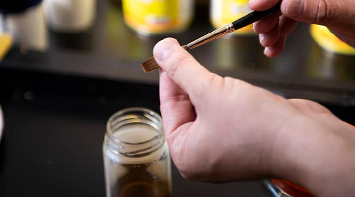
Another important step is loading your brush with paint: first, dip the tip of your brush in the paint and paint a few strokes on the inside of your cup to let the paint creep up the brush’s hairs. Repeat several times until the paint has spread across the full length of the hairs, all the way up to the heel of the brush.
Your brush now contains too much paint, so we need to remove the excess paint and get the brush hairs into their sharp chisel-tip shape again. This is called paletting. Some sign painters prefer a palette (a small piece of cardboard can do the trick), where they can test their brush and paint by moving it back and forth across the palette. I was taught to use the edge of the cup to get the brush into shape:
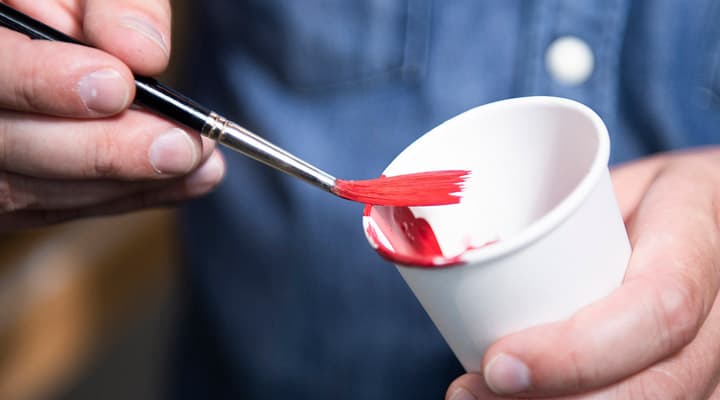
Wipe the excess paint off of both sides of the brush on the edge of the cup while you wriggle the hairs a little back and forth. This will cause the hairs to spread out and form the desired chisel shape.
Repeat the loading and paletting of your brush after each stroke!
OK. You’re all set now to start painting.
Posture
Make sure you are working in a comfortable position with enough space to move your arms freely. Painting works best if your canvas is in an upright or at least a diagonal position. Painting with a mahlstick while standing gives you the most freedom to move.
But if you are just starting on this path, it might give you more control to sit down and work on a sloped surface with the hand-over-hand method. Working on a horizontal surface is possible. It is not recommended if you plan to paint long hours in a row due to back pain.

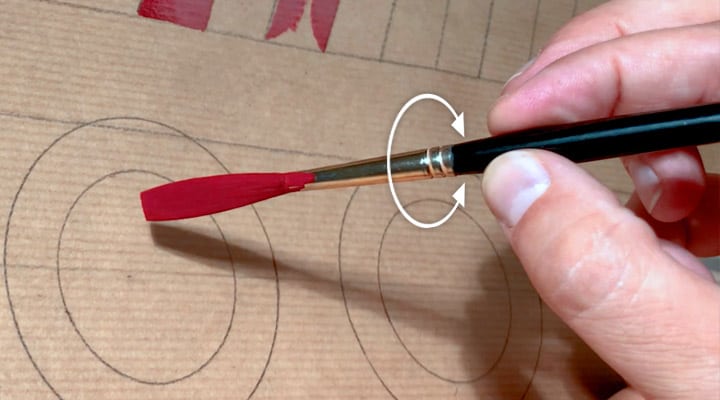
Now, pick up your brush and hold it gently between your thumb and your index and middle finger, just a little above the ferrule (that little iron tube that holds the brush’s hairs).
This way, you can easily roll the brush between your fingers. Try it a few times first! In THIS little exercise, you need to train a lot to develop your muscle memory. But, it is the magic trick to most of the work that we will be doing!
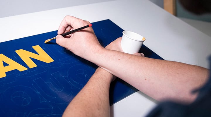
When I paint 3D letters with straight edges, sharp corners, and geometrical shapes, I use sign painters’ techniques for block lettering. Below you can find the basic strokes. To prevent you from messing up your final artwork, I recommend you practice these basic strokes on a piece of scrap paper before you start to work on your panel.
Rectangular strokes
To achieve crispy corners and razor-sharp edges on rectangular shapes, you build up the shape in different steps:
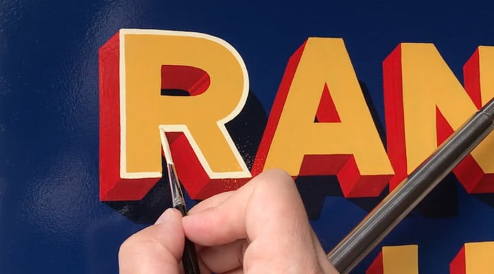
First, we start with the left edge of the shape. Twist your brush just a little bit counterclockwise so you can place the left corner of the chisel tip into the left top corner of the rectangle. (Try to paint downward as much as possible! This gives you the most control)
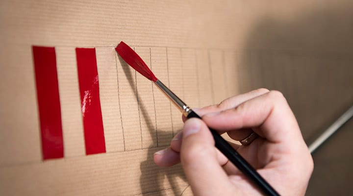
Now, pull the brush down. While pulling down, you twist the brush back clockwise until all the hairs touch the surface of your canvas. Next, push the hairs halfway down onto the canvas (not just the tip of your brush or the full length of the hairs).
You only need to keep your eye on the left edge of your brush and try to keep this side inside the rectangle. If your brush is not too big, what happens on the right side is not important if it stays inside the rectangle.
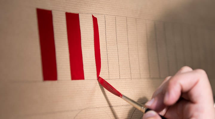
When you approach the left bottom of your rectangle, start to twist your brush back counterclockwise to end your stroke with just the left tip of the brush in the corner of your rectangle.
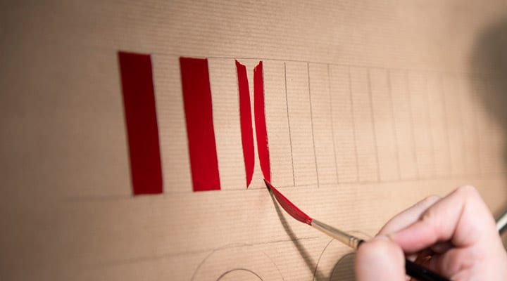
Next, we repeat these steps mirrored along the right edge. Then you rotate the brush to a horizontal position and repeat it for the top and bottom edge. Finish off by filling in the empty spaces.
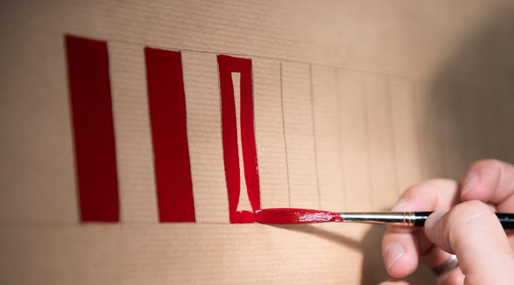
Tip: If you want to do it like a true sign painter (efficiency is key!), you pick the largest brush that fits the shapes you are painting to finish it in as few strokes as possible.
Diagonal strokes
For diagonals, you follow the same procedure as for rectangles. The challenge is a bit bigger, though, because of the extra sharp corners and the awkward diagonal position of your brush.

Circular strokes
Painting circles can be very challenging, but it is the most rewarding when you can nail them.
When painting block letters, you can build up the ‘O’ out of two sections. First, you paint the top half of the circle. Then, start at ‘9 o’clock’ and follow the circle’s lines upwards and to the right while you twirl the brush slowly clockwise until you reach ‘4 o’clock’.
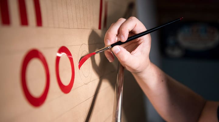
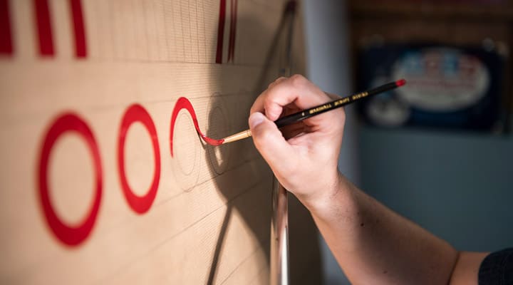
Next, paint the bottom half of the circle. Start at ’10 o’clock’, overlapping your first stroke a little. Twirl the brush counterclockwise while you move your brush along the shape of your circle until you reach ‘3 o’clock’.
Once you have developed enough muscle memory to control your brush’s inner and outer edge simultaneously, you should be able to paint a perfect ‘O’ in two single strokes.
Until then (practice, practice, practice), you can use an extra step to paint circular shapes. Pick a brush that is slightly thinner than the width of your letters. Use the same technique to paint the outer edge of your shape first and paint the inner edge afterward.
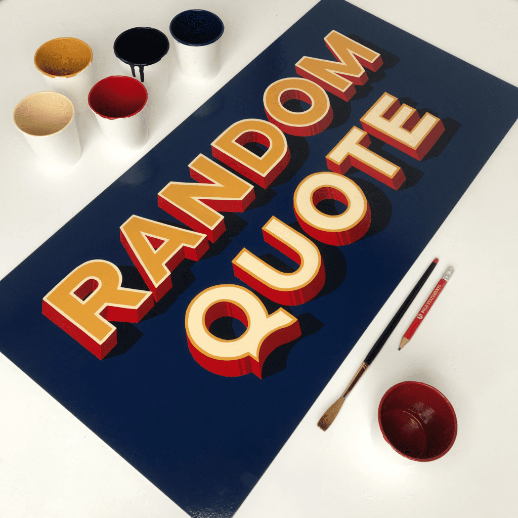
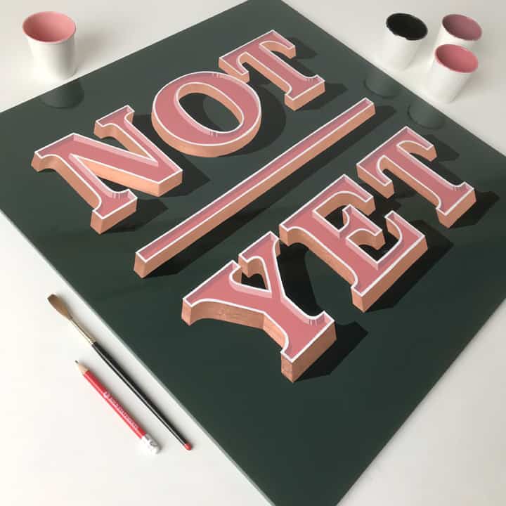
Part 3 – Painting the letters, applying the techniques to the artwork.
These tips should help you paint the 3D lettering artwork you designed and transfer it onto your canvas.

Plan in which order you want to paint the different layers of your artwork.
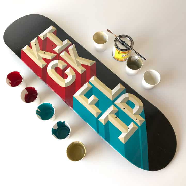
For this project, I have painted the yellow letters first.
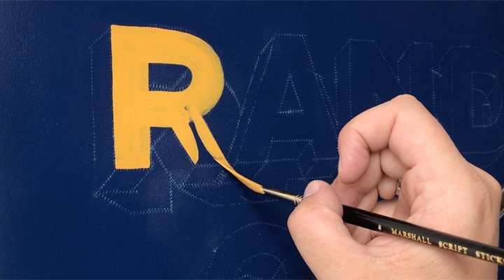
After that, I painted the bright red highlights and the dark red shaded parts.

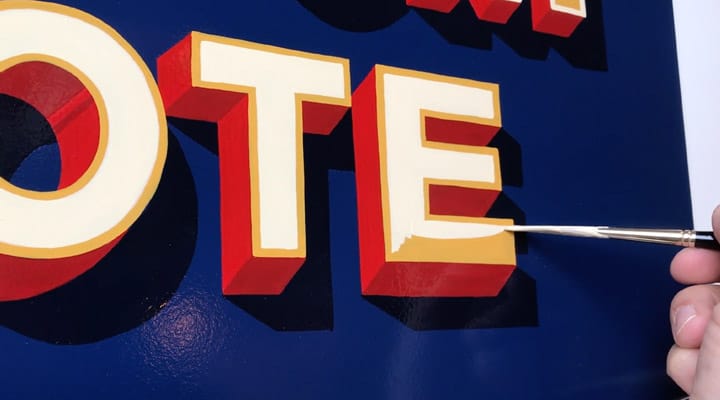
Then I painted the dark blue cast shadow, and finally, I gave the word ‘Random’ an ivory outline.
I have reversed the color scheme for the word’ Quote’ by filling the letters with ivory, leaving a yellow outline around them.
There is no right or wrong in determining the order in which you want to paint. In some cases, it can be helpful to start from back to front; drop shadows can have very sharp corners, which are hard to paint. If you paint those first, you can cover up the little mistakes with the next layer.
On non-porous surfaces, you can fix most small mistakes with your thumb, a q-tip, or the tip of a rag. Bigger mistakes or stains can be wiped away with a rag dipped in white spirits.
Take your time and make sure that each layer is dry enough to paint the next layer. Under average circumstances (temperature, humidity, ventilation), you can continue after 1 or 2 hours working with enamel paint. However, drying times can differ between colors. Also, thick layers of paint need more time to dry.
As a bonus, I have created a video compilation of all the steps described above to shed some more light on the process. You can watch it here –
Brush care
Once you have spent your precious money on some quality brushes, you might want to use them for more than just one painting. If you take good care of quality brushes, they can last a lifetime.
Rule number one in brush care is to keep oil and water-based brushes apart. Don’t mix them up!
After working with water-based paint like acrylics, you should rinse your brush hairs thoroughly but gently with lukewarm water. Ensure to wash away all paint, especially at the base of the hairs (this is called the heel of the brush). Do not dab your brush too roughly, or the hairs will break. After washing, extract most of the water with a cloth and store your brushes dry and horizontally.
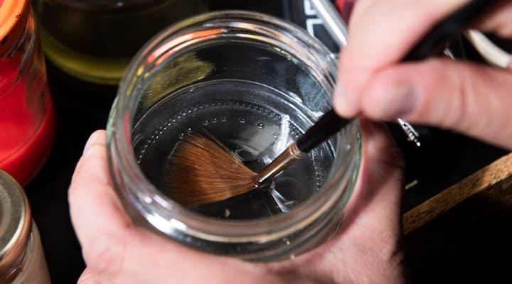
Brushes for oil-based paint like enamel paint need more care. Never leave your brushes in enamel paint unused for more than a few minutes. Take away the excess paint of your brush gently with a piece of cloth or tissue paper. Then wash out as much paint as you can in three different washings. Put some white spirit in three jars:
- Wash out most paint in the first one.
- Stir it in a second jar once it is almost clean.
- Use the third one to make sure all paint is removed.
After that, spin the brush’s handle between your both hands firmly to shake the white spirit out of the brush hairs.

Finally, you give your brushes the spa treatment; soak the hairs of your brushes in natural oil (look for neat’s-foot oil) or rub them gently into their natural shape with acid-free Vaseline.
This way, you prevent any paint that might have stayed behind in the heel of the brush from drying and form a hard lump at the base of the brush. That would ruin your experience of painting smoothly ever again with that brush. Store your brushes horizontally.
Tip: White spirit and enamel paint have strong fumes, so work in a well-ventilated room or work outside. White spirit is flammable, and there are known cases of used cleaning rags causing spontaneous combustion after being put away in a closed bin. So always let your rags dry before disposing of them.
Bonus tip: white spirit can be used over and over again. If you keep it in a jar for a few days, the paint residue will sink to the bottom. This way, you can use the white spirit repeatedly or pour it in a clean jar if you like.
Also, wash your hands thoroughly when you are finished. Enamel paint and white spirit are toxic substances. Finally, never eat or drink while you are painting!
Tip: paint stains on your hands can also be cleaned with olive or sunflower oil which is not harmful to your skin, unlike white spirit.
Fun times ahead!
There is a lot more to learn, but for now, I think there is enough input for you to practice and to create stunning, hand-painted, 3D lettering artwork. I can’t wait to see your progress! Tag @boldstatements.nl when you post your work to keep me updated.

As a final word, I can only say: Don’t forget to have fun!
Remember that no one expects you to paint perfect letters immediately. Making mistakes and discovering how to avoid and solve them is the essence of learning.
Of course, you can feel stuck now and then, especially when you are learning something new on your own. When you notice that you are missing the fun of painting letters, you probably need to change.
First, make sure you have the right stuff. Investing in professional tools can prevent a lot of frustration. Check the tools listed earlier once more.
If that doesn’t help, I can advise you to follow a live course or workshop if you get the chance. Things like thinning paint to the optimum consistency and handling the brush can be tricky to learn by reading or watching a video.
Attending a workshop or talking to someone with experience has added value. And as a bonus, you will get to know a lot of new, like-minded letter nerds as well. Lettering workshops make the best friends!
Additional resources for learning sign painting
If you would like to learn more about different shading types for your 3D letters, check out my self-published book called ‘Shaded Letters & other vintage lettering effects.’

For more live workshops, follow betterletters.co
Excellent online workshops are given by Liane Barker from Brush and Pen Studio.
Liane teaches in small groups with a lot of personal attention and feedback.
There is a lot of other reading material available. More tips and tricks about the craft of sign painting can be found here:
‘Sign Painting, a practical guide to tools, materials, and techniques’ by Mike Meyer & Friends, published by Better Letters
‘Signwriting tips, tricks, and inspiration’ by Joby Carter & Scarlett Rickard
Final words
Thank you very much for following this tutorial. I hope I have lit a spark or two for the amazing craft of sign painting. But, again, even if it is not your ambition to become a professional sign painter, you can still enjoy the fun that painting letters can bring. So go ahead, try it and remember to have fun!
You can check out my work and other related activities on www.boldstatements.nl or Instagram @boldstatements.nl

Pin me!


Stay updated with my tutorials and get instant access to the Lettering Crate –
A growing library of free lettering & calligraphy resources that includes –
About the author

Bold Statements is the label of Pieter Snijders, a passionate designer and sign painter based in Arnhem, The Netherlands. He uses hand lettering, sign painting, and gilding to make unique designs with a touch of vintage; this varies from retro logos and prints for clothing to murals, hand-painted shop fronts, food trucks, menu boards, and more.
He likes to share his love for typography and creative skills in his books and by giving workshops and demos at all kinds of events.
“When I graduated at The Design Academy in Eindhoven, hand-painted signs were not a thing. I learned how to design 3D products using mainly digital tools. Typography was not my forte back then. The highbrow design teachers taught us to use Helvetica in black and white. At all times we should avoid sugarcoating shit like Willy Wonka. However, or maybe that is why, I have developed a guilty pleasure for sugar-coated letters with drop shadows, bevels, and other ‘shady’ effects. So, now you know how the Bold Statements logo was born.
A few years ago, I found my passion for lettering, and ever since I like to combine my 3D design background with hand-drawn typographic design. Over the past years, I have researched a lot of original sign painting resources. That’s how I discovered that a lot of foundations in contemporary graphic design have their origin in the craft of sign painting.”


This is a great tutorial, thank you for sharing ! I’ve just got one question regarding the brushes. In the article you mention that depending on the style of letters you are painting you use different type of brushes. Could you please clarify what brushes should be used for Block – Casual -and Script ?
Thanks a lot !
I think he did, only my opinion but hope this helps,the longer flat brush for bold as you need it to hold lots of paint for bold, casual was the shorter but still flat as it’s casual it’s bit quicker so I would imagine it was shorter flat like a sho card brush, and the script was with a fine, I think there are many names for this type liner, fine, script, coach, scroll, etc.
What a great, comprehensive tutorial! I’ve always wanted to try sign painting. It may be time to actually do it.
Thank you for breaking it down.
Thank you James! Im glad you enjoyed the article! 🙂
Wow! Wow! Wow!
Pieter, this is an amazing tutorial. Your love for your craft shows in all the beautiful details you have included here. Thank you!
Thank you, Evelyn. You’re welcome.
This is so well done, Pieter! I love how you do everything you do with so much love and care.
Thank you Lucy for the kind comment!
Thank you for your kind words and your contribution to this tutorial, Lucy. Couldn’t have done this without you!