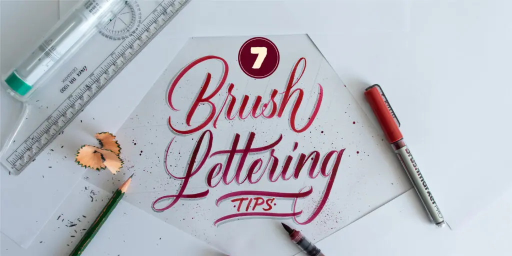
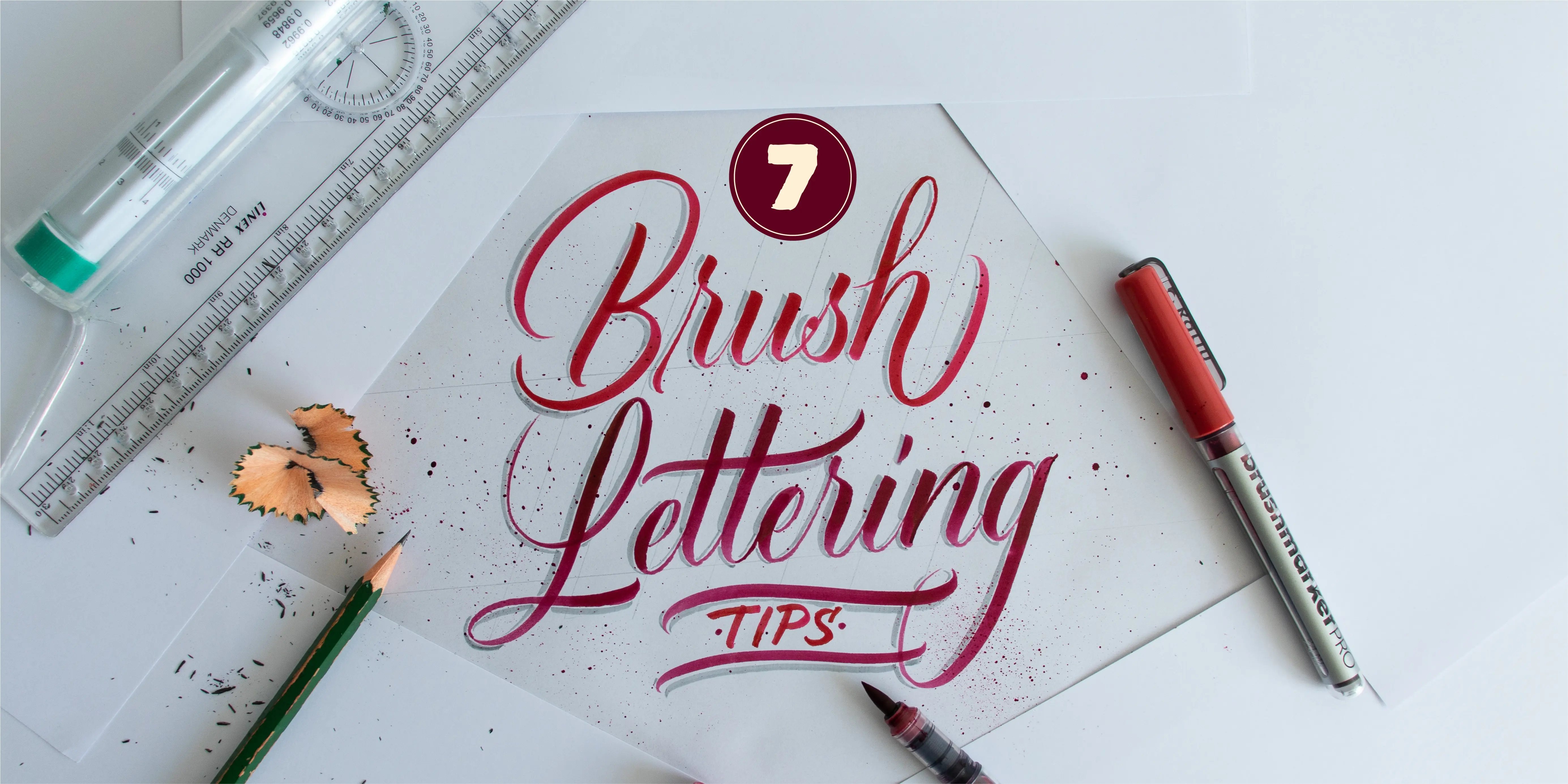
Are you looking for ways to improve your brush lettering skills?
In this article, I’ll share 7 EASY tips that will help you boost your brush lettering.
The same tips I used over the years to improve my daily practice.


These tips are fairly simple, and you can implement them even if you are a beginner.
So grab your brush pens,
And let’s dive right in!
Quick note – if you are just getting started, then perhaps this beginner’s guide will be better suited. Check it out, and then come back to this article.
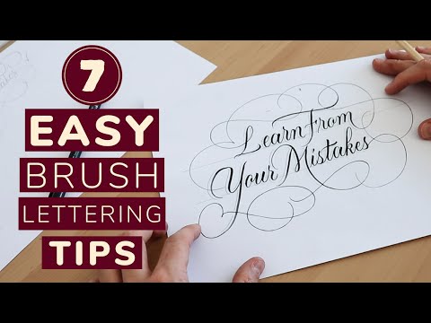
I also made a YouTube video in case you prefer to watch –
1. Use the basic calligraphy strokes.
Learning and using the basic strokes for your brush lettering is the best way to learn, period.
By basic strokes, I don’t just mean that you should do your upstrokes thin and downstrokes thick.
Instead, by basic strokes, I mean to use the 8 shapes we use to construct the whole lowercase alphabet.
I created a whole in-depth guide on how to use the basic calligraphy strokes.
This is also something I covered in the brush lettering guide for beginners and the modern calligraphy guide.
However, I’ll repeat it here as well.
So it’s actually quite straightforward.
We have basic 8 shapes –
In order of appearance –
- Entry stroke
- Downstroke
- Underturn
- Overturn
- Compound curve
- Oval
- Ascending loop
- Descending loop
Here I am using the Tombow Fudenosuke soft tip (links to Amazon).
In different combinations, they create (nearly) the whole lowercase alphabet.
Here’s an example where I’m using 8 different colors.
This way you can see all the basic strokes being used.
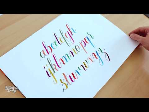
In the video,, I use the Karin Brushmarkers Pro (links to Amazon).
As you can see, A LOT of the letters share these strokes.
This makes it easier to practice for several reasons –
- You don’t have to guess the form and shape or a letter
- Increases the consistency of your work
- It’s just easier to learn
Once you have a good understanding of the basic strokes and execute them with confidence, you can start to tweak them and create your own unique style.
In this tutorial, I teach you how to create the whole lowercase alphabet using a brush pen.
BTW. You can also practice calligraphy using just a pencil. Check out this tutorial.
2. Use guidelines for your brush lettering
Working with guidelines is easy, and there is no reason you shouldn’t use them.
I wrote a more in-depth article about what calligraphy guidelines are and how to use them.
Guidelines are super helpful in keeping your letters nice and consistent.
We use guidelines to keep our height consistent,
And, more importantly, the angle (slant) of our letters.
Here is an example of using guidelines vs. not using guidelines –


*On the right image I added the guideliens after the letters – to demonstrate the inconsistencies.
One of the most common questions I get about guidelines is – how do I draw guidelines? What are the sizes I should use?
The answer is – you decide!
Let me explain.
With traditional calligraphy scripts, there are well-defined rules when we talk about letter sizing and proportions.
For example, the Italic script should have an x-height of 5 nib widths and an angle between 5 and 7 degrees.
")
We can see another example with the Copperplate script.
The Copperplate script uses a 1.5x: x: 1.5x letter ratio and a quite steep angle of 55 degrees.

And so on.
When doing brush lettering, you are not tied down to these specific rules, and you are free to determine the look of your letters.
The height and the slant of the letters.
If you prefer an upright over a slanted letter style – go for it.
")
You want larger ascenders and descenders to incorporate more prominent flourishing?
")
Be my guest.
What matters here is – consistency!
Consistency (in all its forms) is what will give a that desirable and attractive look to your calligraphy.
All you need is a –
- Descending line
- Baseline
- Waistline to close the x-height
- Ascending line
- And finally the angle lines
")
What I use to create my guidelines, and what I always and HIGHLY recommend is the – Rolling ruler (links to Amazon).
It has a cylinder on the backside that allows it to roll on any flat surface.
The rolling ruler allows you to draw straight, parallel lines quickly and without any hustle.
I love it, and I use it daily.
3. Holding your pen correctly.
The pen holder is super important, and it deserves an article (even a series) of its own.
However, I’ll try to keep this simple and actionable.
It’s important to understand that while you write, you shouldn’t feel any discomfort in your hand.
If you do, it’s highly likely that it’s caused due to your hold.
The pen hold should be firm but not too tight (commonly known as the death grip).
The pen should almost feel like an extension of your arm.
Avoid any sort of wrist bending, as it tightens the muscles and decreases control.
")
")
It’s much better if you turn the paper instead (based on the slant you’ve chosen).
The brush pen should be held at a roughly 45-degree angle.
Avoid steeper angles as it will cause fraying of your brush pens.

")
Another essential note is that your brush tip should always be almost if not completely perpendicular to the paper.
Otherwise you won’t be able to get any thick strokes.
Lastly, I just wanted to address something important.
I continuously see people holding their pens in a fist-like position.
")
I’m not saying you can’t hold the pen in that way, but it’s important to understand that this hold can decrease the range of your movements.
Don’t be afraid to change and modify your hold.
I’ve done it multiple times, and believe me, it’s not as hard as it seems.
The beginning is weird, but you can get used to it very quickly.
So to recap the whole pen hold tip –
- Hold your pen firmly (but avoid death grip)
- You shouldn’t feel any pain or discomfort as you write
- Don’t bend your wrist (turn the page instead)
- Hold the pen on a 45-degree angle (from the surface)
- Keep the pen perpendicular to the page
- Changing and modifying your hold is not as hard as it seems
4. Sketch your letters
Sketching your letters before you execute them with a brush pen is a potent trick that will help you improve the final look of your work.
It’s quite challenging to expect you to lay down a brush lettered masterpiece immediately in your first attempt.
Instead, grab a pencil and some paper where you can quickly lay down different ideas and variations.
Let me demonstrate this through an example.
I will letter the following quote – “Learn from your mistakes.”
Here is how it looks on my first attempt without any prior planning or sketching –
")
It looks a bit sketchy, right? (pun totally intended)
Now I’ll make a second attempt.
Before that, I’ll do a quick round of sketching to see a couple of different variations I can come up with.
")
The pencil allows me to do quick thumbnail sketches, where I can visually explore different combinations with layouts, flourishes, positions, etc.
You can also lay down a pencil skeleton and then go over with a brush pen.
Here is what I’ve come up with, and you can see the comparison with and without sketching –
")
")
To sum this up, take 10 extra minutes to plan your work, and it will look better.
5. Take it slow and lift your pen often
This is a very common issue I see with beginners.
You are not racing with anyone, and you are for sure, not doing yourself a favor by doing your lettering quickly.
The first tip was to use the basic calligraphy strokes.
What I recommend is that you split your movements according to those strokes.
By that, I mean that you should lift your pen after each stroke instead of doing everything in a single motion.
Here is an example –
If you go slower, you will increase the control of your movements, and you will be able to pay more attention to your letter spacing and consistency.
6. Proper posture
Posture is another crucial element for calligraphy and brush lettering.
I’ve seen people practicing while lying on the couch and while watching Netflix or even on the floor.
Unfortunately that isn’t’ really helpful.
You need a proper writing environment to facilitate the maximum capacity of your movements.
You can’t do that if you are laying on the couch.
So, what’s a proper posture you should have?
Lucky for you,
My friend Paul created this YouTube video that explains how to get started.
For a more extensive & comprehensive understanding of posture, placement, and position – I highly recommend Paul’s latest online course.
7. Relax, take a chill pill
As mentioned earlier, any sort of tension in your writing hand is just going to diminish the control of your movements.
I’ve also noticed that I can’t really practice if I am nervous, hungry, upset, etc. Brush lettering and calligraphy, in general, require you to be focused.
If you are not relaxed, it’s going to be very difficult to achieve a highly focused state of mind.
It’s completely normal, and it happens to me regularly.
Take a break, eat something, go for a walk, and simply come back to it later.
Forcing out a calligraphy practice session won’t yield any good results.
-3")
For this example, I used the Ecoline bruh pen (links to Amazon).
BONUS 1 – Structure your practice sessions
I strongly recommend that you take a deliberate approach when you practice.
With a structured practice routine, you will make more progress than if you just scribble around with no goal.
Here is what I suggest –
Step 1 – Begin your practice sessions by warming up.
I like to do a whole page of the basic strokes, and it takes me between 10 to 15 minutes max.
")
Here I am using the Penel Fude Touch brush pen (links to Amazon).
Step 2 – Pick a word or a phrase you will brush letter.
Creating final pieces will help you push yourself to your limits – much better than randomly filling the paper.
Step 3 – Remember tip 4, sketch your letters.
")
Try to come up with 3-5 different quick (and rough) thumbnail sketches.
Pick your favorite layout.
Step 4 – Grab a clean sheet, draw the guidelines, and start writing.
")
If you don’t like the final result, try again.
However, be careful not to fall into the perfection loop (I have an abundance of experience in that area).
Done is better than perfect, and progress will arrive along with consistent practice.
Step 5 – Finally, examine your work.
")
What are the good and the bad elements?
Make some notes for yourself, and be mindful of them in tomorrow’s practice session.
The above practice session is just an example – that’s how I choose to practice.
Feel free to structure you practice sessions in a way it suits you best.
The point is to practice with intent.
Making more progress in less time, as opposed to random practice without a clear goal.
BONUS 2 – Ask for feedback!
Sometimes you don’t know that you are doing something wrong until someone points it out to you.
I love constructive feedback, and it has helped me tremendously.
Lucky for you,
I’ve created a Facebook group, especially for that purpose!
It’s a place where you can –
- Share your work
- Get constructive feedback
- Ask questions
- Meet and network with fellow artists
- And much more.
Besides me, there are many great (and experienced) calligraphers & letterers ready to share helpful and constructive feedback.
Feedback that will help you improve your work even further!
Hit the button below to join in!
Check out the Facebook group!
Final words
And there you have it, friends!
Hopefully, this article gave you plenty of insights on where and how you can further improve your skills.
I would love to hear it from you!
Which one of these tips do you want to try out first?
Be sure to drop a comment below 🙂
Until the next time,
Stay AWESOME!

Stay updated with my tutorials and get instant access to the Lettering Crate –
A growing library of free lettering & calligraphy resources that includes –
Pin me!

About the author

Hey, I’m Max. I’ve been drawing and messing around with letters since 2011. I don’t have a formal art degree—my background is actually in the kitchen as a former chef and on the streets painting graffiti with my friends. Over the last decade, through a ton of trial and error, I somehow turned that obsession into a full-time gig. These days, I design custom logotypes for global brands and paint large-scale murals. I started Lettering Daily just to create the kind of honest, no-BS tutorials I wish I’d had when I was starting out. Stick around, and let’s draw some letters.

I’m glad I’m doing this and I look forward to learning how to write in calligraphy.
This is awesome! Thank you for sharing all this in a simple and understandable way 😀 I don’t like being criticized for my work but as you say at the end of your article that you like constructive criticism then, I think I need to learn to accept them starting now 🙂
Thank you so much for this comment. Im glad to hear that you’ve changed your mind about receiving feedback. I know it’s kinda demotivating when you hear someone taking a part the work that you created but sometimes it can be really helpful. I don’t like it if someone is being mean or rude, because that’s really being constructive. Constructive feedback has the purpose of helping someone to learn and improve, and if that’s your goal then feel free to let me know 🙂
OH IT WAS SO USEFUL AS I WAS ABOUT TO GIVE UP BRUSH LETTERING BUT YOUR TIP N GUIDE SAVE ME
THANK U SO MUCH
No no, never give up! 🙂 You’re always free to shoot me an email if you are really struggling with something! And thank you, I appreciate your kind words!
Very useful tips to start with calligraphy
Thanks
Thank you, Nidhi! 🙂
Thanks very much Max really useful … I’m a beginner and fall into all the traps! Great to have the pointers and reminders. I find your Posts so helpful. Thank you.
Thank you so much, Victoria! I am really glad that you liked this article 🙂
This was a fantastic help to me as I’m just getting started with lettering. Loved the tips and feel very encouraged now.
Woop-woop 🙂 Awesome! Really happy to hear that!