
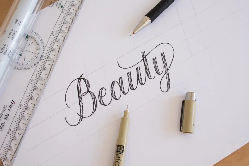
In this tutorial, I’m going to show you how to do calligraphy with any writing tool that you have. This technique is also known as Faux Calligraphy.
This is a fun and easy way to get started with calligraphy, and to help you out, I even created free downloadable PDF practice sheets.
You’ll find this tutorial—and many more like it—inside the Calligraphy Hub, where I’ve organized everything to support your calligraphy journey.
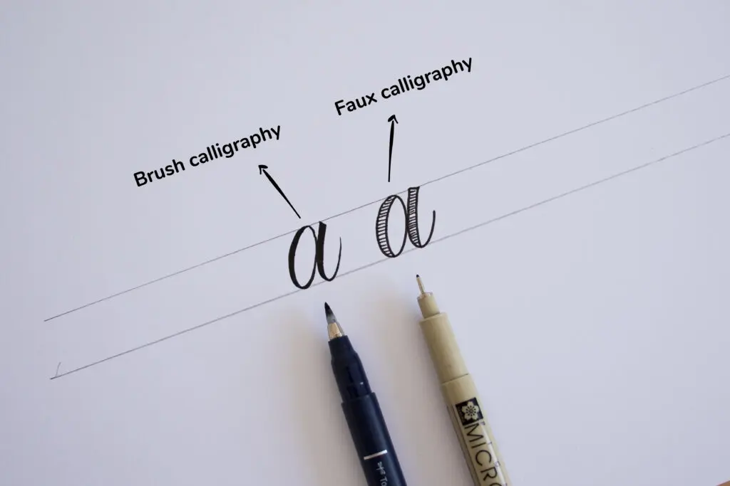
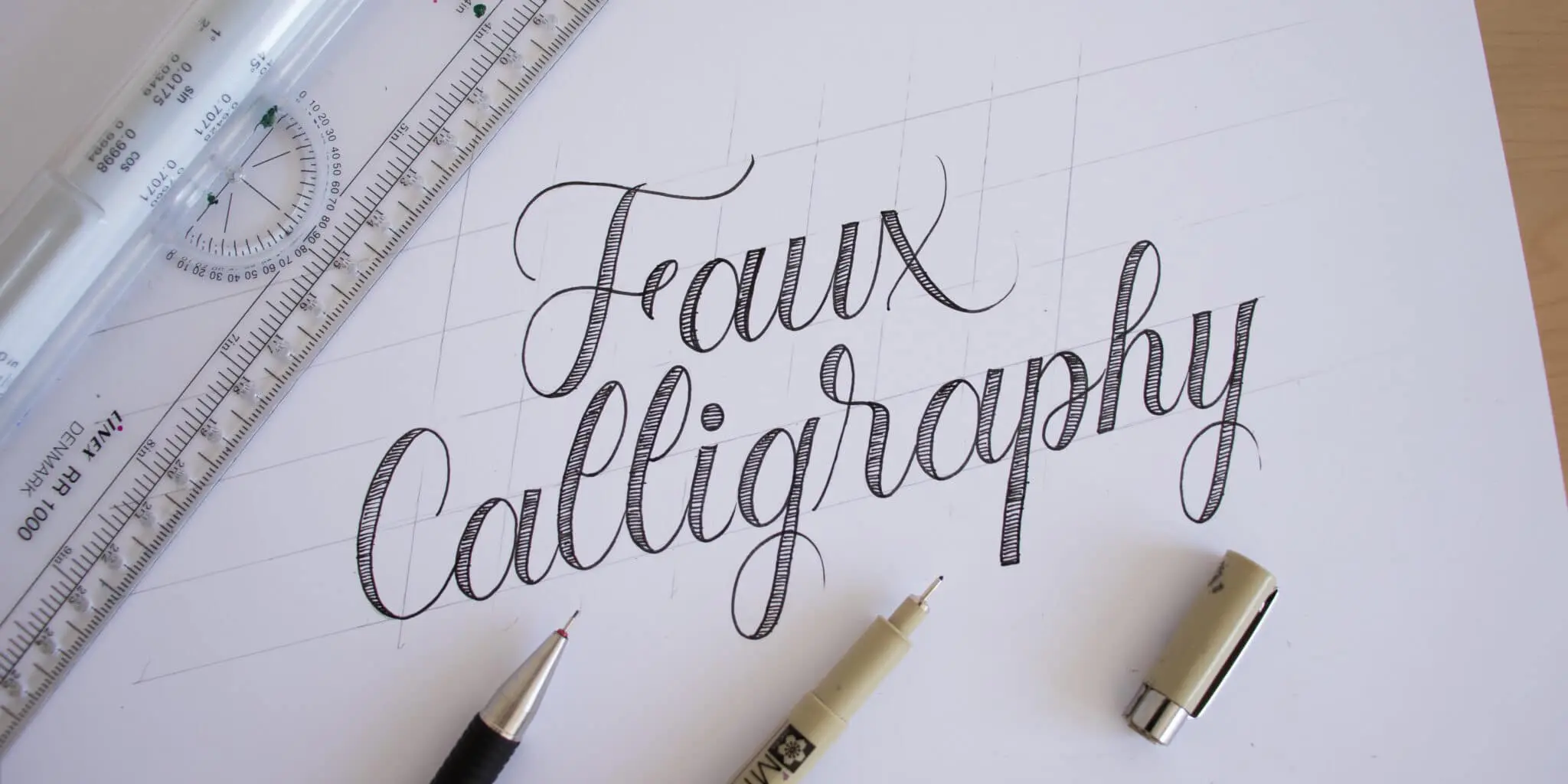
What is faux (fake) calligraphy?
Faux calligraphy, also known as fake calligraphy, is a technique used to imitate the look of calligraphy by using any kind of writing tool—hence the name. The effect is created by adding an additional stroke to the downstrokes.
Essentially we’re trying to imitate the look of letters written with a brush pen. In case you’re not familiar, with brush pens we apply pressure on the downstrokes to get thicker lines and we release pressure to get thinner lines
The 3 Core Rules for Faux Calligraphy
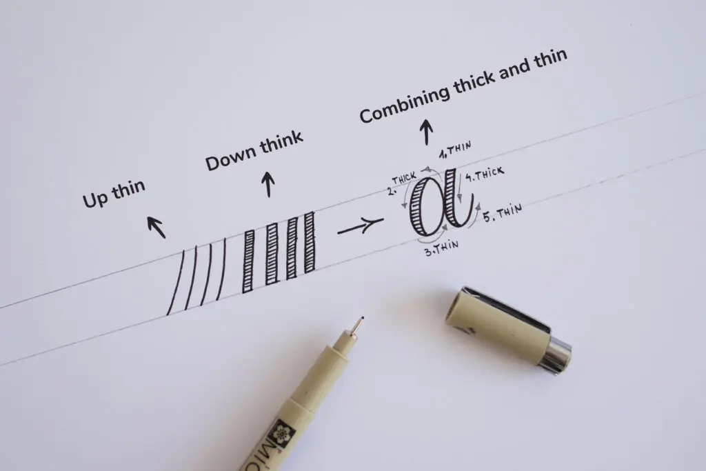
Rule #1: Work with basic strokes
Writing calligraphy is essentially a combination of upstroke and downstroke motions. The most important rule to remember is:
- Upstrokes are thin
- Downstrokes are thick
Like so:
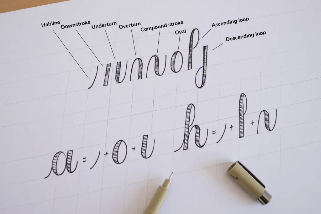
The best way to learn and practice is by mastering the basic calligraphy strokes. There are eight fundamental strokes that you can combine to form nearly every letter of the lowercase (minuscule) alphabet. By using these basic strokes, you will achieve a much cleaner and more consistent look in your lettering.
Below is an example of the basic strokes and how to combine them to create different letterforms.
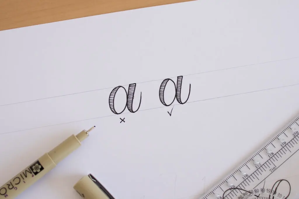
Rule #2: Where to add the thick downstrokes
One of the biggest struggles with faux calligraphy is knowing exactly where to add the thick downstroke. While you can add it to either side, being inconsistent will quickly lead to spacing issues—especially when you start connecting letters into words.
My recommendation is to always add the thickness to the inside of your letterforms.
On certain letters, you may want to leave a slight gap (like the letter “p” in the example below), but this is a personal preference rather than a strict rule.
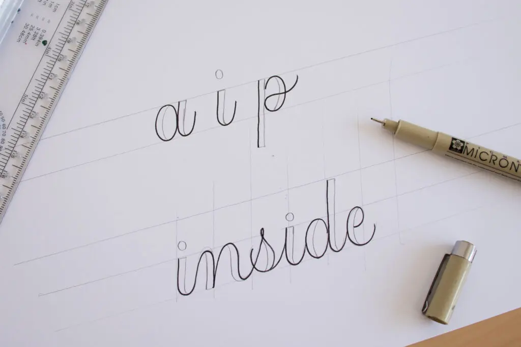
By consistently adding the thick stroke to the inside of the letters, you ensure that the spacing between your letters remains uniform.
- Note: If you prefer to add them to the outside, that is perfectly fine as well. The most important thing is that you remain aware of your spacing and maintain consistency throughout your work.
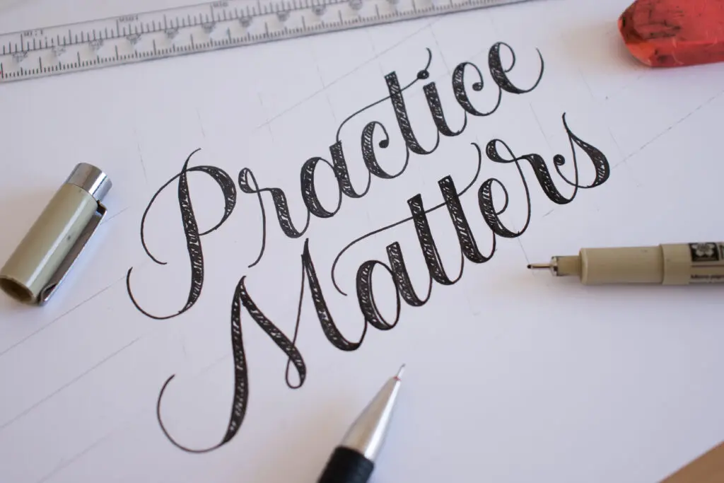
Rule #3: Consistency in your letterforms
Consistency is a crucial element of calligraphy. In short, it is what makes the difference between professional-looking letters and beginner work.
The first thing to focus on is the consistency of your downstrokes. You want to maintain the same thickness across all downstrokes; otherwise, you will end up with wonky, uneven letterforms. While you don’t need to aim for mathematical precision, you should try to get them as close as possible.
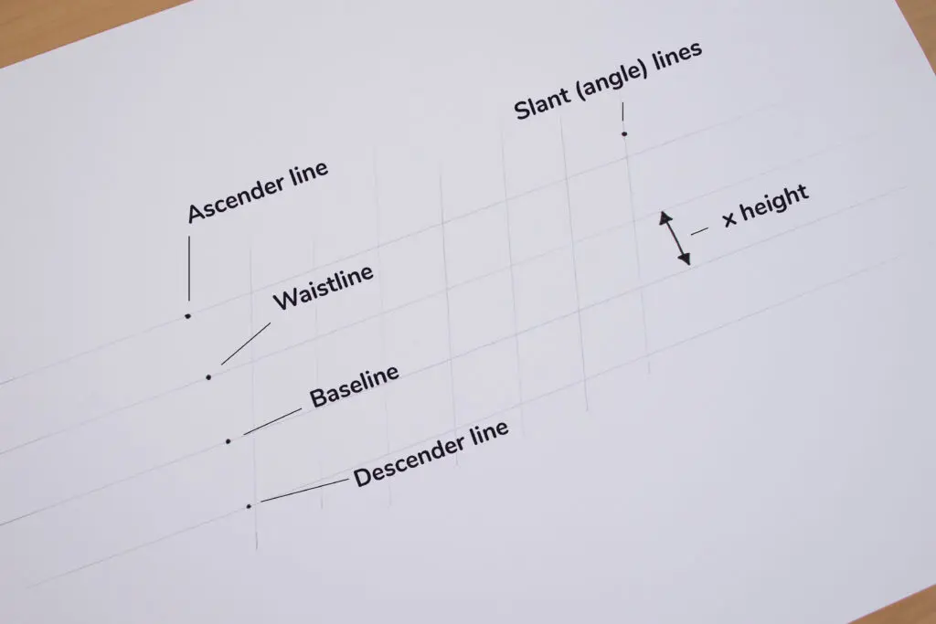
The second factor is consistency in your proportions, particularly regarding height and angle. The best way to achieve this is by practicing with guidelines.
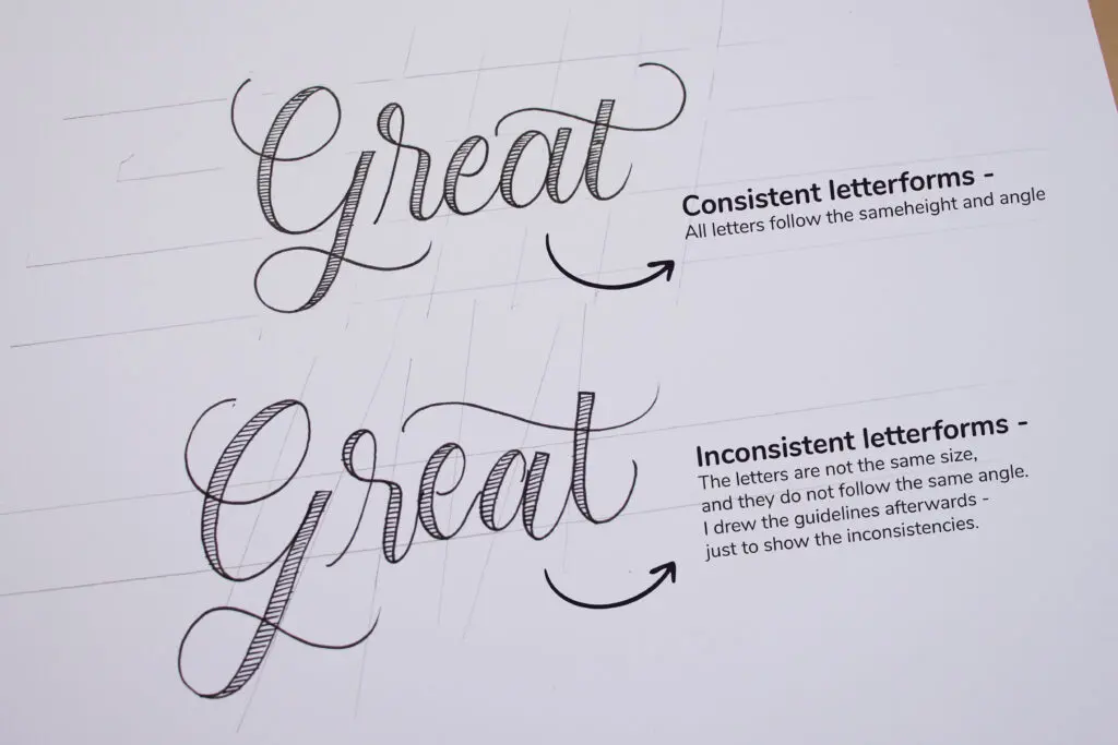
You can draw your own guidelines with a ruler. If you aren’t sure how to set them up, check out my tutorial on how to use calligraphy guidelines.
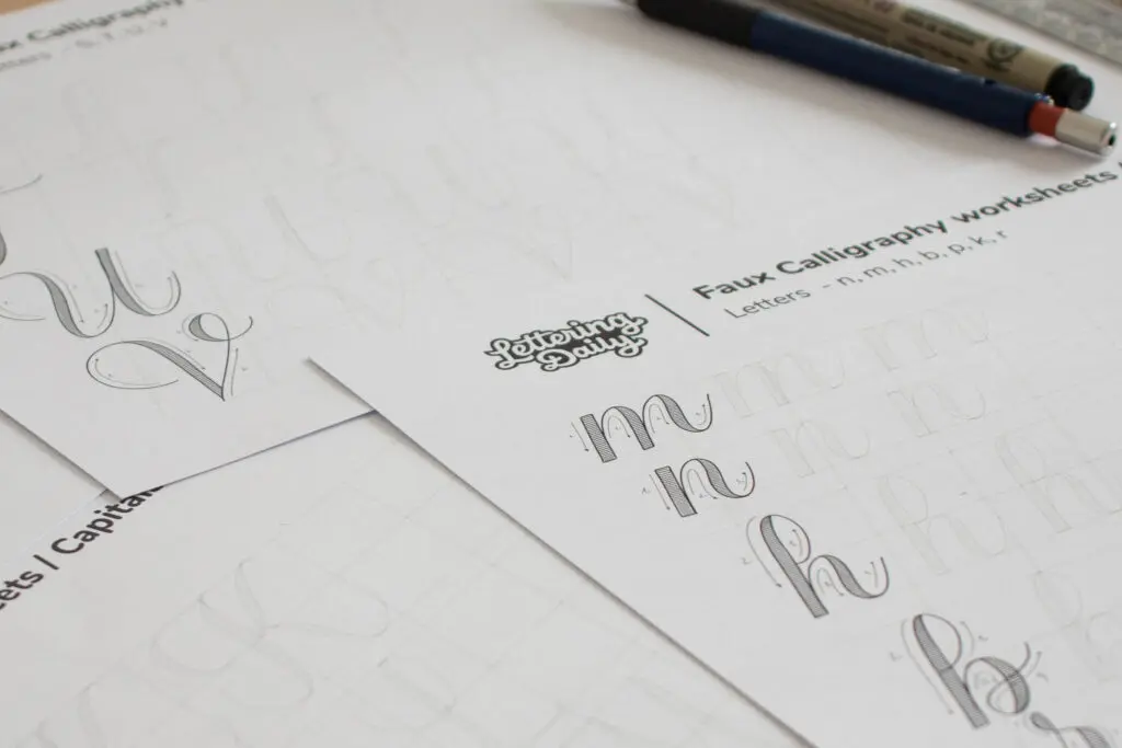
Free Faux Calligraphy Alphabet Worksheets
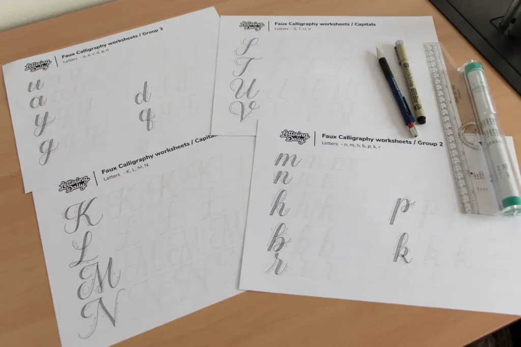
I created free printable worksheets so you can practice faux calligraphy on your own. These sheets include:
- Faux calligraphy capitals
- Faux calligraphy minuscules (lowercase)
- A blank practice sheet with guidelines for writing words
Drop your email below to get instant access to the Lettering Crate, where you’ll find these free worksheets and many other resources to help you improve your lettering.

Stay updated with my tutorials and get instant access to the Lettering Crate –
A growing library of free lettering & calligraphy resources that includes –
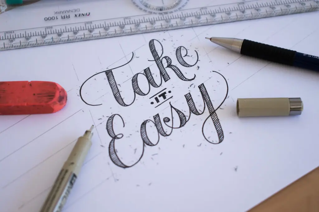
Write out your first word in 5 simple steps
Now it’s time to put everything together and write your first word. I’ll guide you through the entire process, step by step.
Step 1: Draw your guidelines
Grab a ruler and draw your guidelines to keep your letters nice and consistent. If you’re feeling lazy, even a simple straight baseline is better than nothing at all.
Step 2: Write your word
Using a pencil, write out your word. Focus on using the basic calligraphy strokes we mentioned earlier. If you’re feeling confident, you can go straight in with a pen or fineliner.
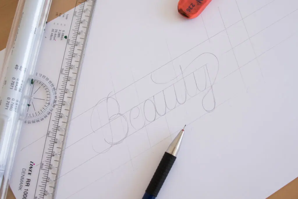
Step 3: Identify your downstrokes
Remember to keep your downstroke placement consistent—either on the inside or the outside of your letterforms. Also, ensure your downstrokes maintain the same weight.
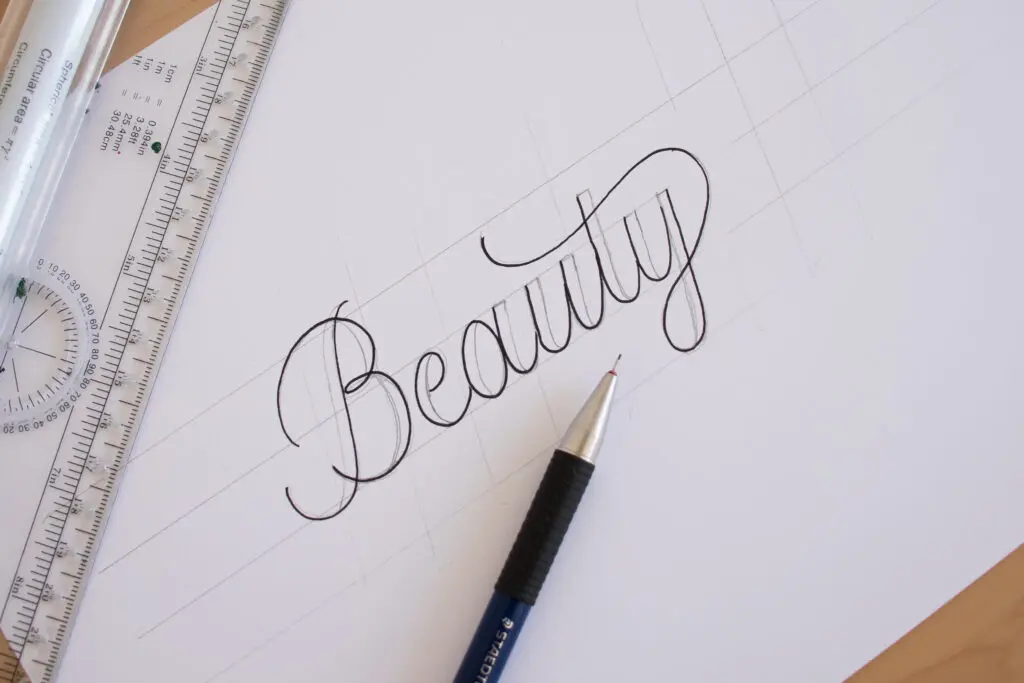
Step 4: Outline and fill it in
The way I usually do it is by outlining the entire shape first and then filling it in.
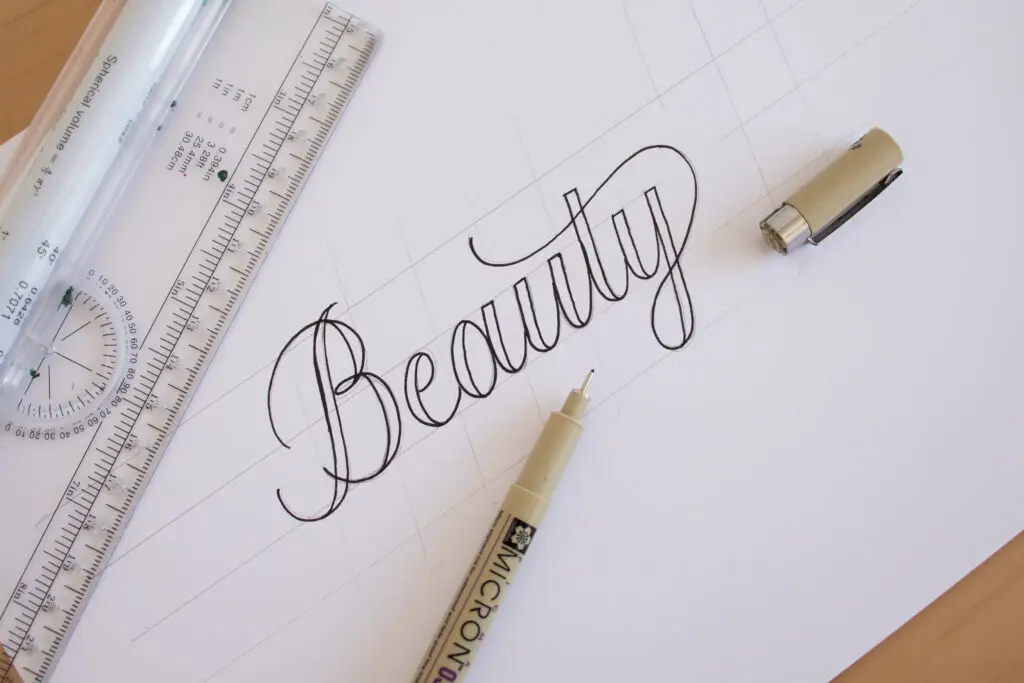
Step 5: Erase the pencil marks
Give the ink plenty of time to dry completely, then erase your pencil marks to reveal your finished piece!
Bonus tip – You can have some fun with the fill: try a solid black color, lines, or a circular “messy” fill for a nice texture. You can even try using different colors!
Next Steps
Are you ready to move on to real brush calligraphy? Check out my tutorial for Modern Calligraphy.
Or, if you want a complete breakdown with no guesswork, check out my in-depth workbook: From Strokes to Style. It includes over 50 pages of theory along with 50+ pages of practice worksheets.
Master Brush Calligraphy
One Stroke at a Time
This 100+ page workbook walks
you step-by-step through brush
calligraphy basics to full style
development – no experience needed.

About the author

Hey, I’m Max. I’ve been drawing and messing around with letters since 2011. I don’t have a formal art degree—my background is actually in the kitchen as a former chef and on the streets painting graffiti with my friends. Over the last decade, through a ton of trial and error, I somehow turned that obsession into a full-time gig. These days, I design custom logotypes for global brands and paint large-scale murals. I started Lettering Daily just to create the kind of honest, no-BS tutorials I wish I’d had when I was starting out. Stick around, and let’s draw some letters.

Can I get your Faux Calligraphy Worksheets? Its so beautiful!
Thank you, Max. (Love your picture, BTW. Calligraphy is, should be a lot of fun.)
I have done faux calligraphy with my fine point and 1.1 mm nib fountain pens (same color). It worked very well, much like what you’ve taught here.
This was very helpful, I thought it was going to be a lot harder, but you made it look so easy. Thank You! 🙂
Super happy to hear that 🙂
Thank u for sharing such an amazing art
Thank you for the kind words.
Thank u
You’re welcome! 🙂
Awesome…
Thank you!
There’s noticeably a bundle to learn about this. I assume you made sure nice factors in features also.
Thank you 🙂
It is very helpful❤
Thanks! Glad to hear that 🙂
I’ve subscribed…but I didn’t find link and password!
Thank you for this awesome guide! I already sign-up but still didn’t received the confirmation email and where to download the practice sheets.
Hey Malou, I just checked your email subscription and i can see you’ve received the welcome email and everything else. In case there are still some issues, it’s best to shoot me an email 😀
Wow!
Amazing Calligraphy Love It <3
Thank youuu! 😀
Hi there, I am so much interested on learning about this. However, I cant find the link where I should sign in to have an access for the worksheets.
There is a box under the worksheet section where you can drop your email. Once you are subscribed to the newsletter you will receive a welcome email that contains the link and the password for the Lettering Crate. Inside you will be able to find these worksheets as well as all the other freebies i currently offer 🙂 If you are encountering any issues, please shoot me an email and I’ll be happy to help you out!
Hi there! I signed up for the newsletter but did not get the practice sheets. Any ideas how I can get it? Thank you!!
Hey Jasmine, have you received the welcome email? Please shoot me an email if you need any further assistance.
Hi
Can’t seem to subscribe to your newsletter. I have checked my junk and spam folders multiple times but nothing. Please help me out here.
Thanks
Hey there, please shoot me an email and i’ll try to fix it as soon as possible 🙂
Thank you so much for the fantastic information! I’ve tried to sign up for the newsletter, but am not getting the confirmation email (I’ve checked the junk/spam folder and it’s not there either). Is there another way to subscribe? Thank you!
Hey Jenn, thank you for the kind words! Can you please shoot me an email, and I would be happy to help you sort this out ASAP!
Hey Daly lettering l was fully appreciate with your sport to us
Sure thing Shamal 🙂
I volunteer at a adult handicapped complex , where I teach, drawing, Zentangles and now Lettering.
My group is very teachable, and they love new things. Thank you for making this so easy to learn.
I can not wait to show everyone and hand out practice sheets…..
Regards Carole Bent
Hey Carole! Thank you for your kind words. I am actually planning a major update on this tutorial as we speak! Hopefully you will like the updated version even more 🙂
Can I Have A Practice Sheet?
Hey Jeric, absolutely! Just sign up for the newsletter and you’ll get instant access to all of them! 🙂
Love this guide, thank you !
I’ve downloaded the “Faux (fake) calligraphy practice sheets”, but I can’t see the capital letters there. Where can I find them?
Hey Joanna! I appreciate your kind words it truly means a lot 🙂 I am currently working on updating this tutorial and i promise i will include capitals as well 🙂
Great tips! I love it! I subscribed and confirmed my email but I still haven’t got the access to the sheets!
Hey Elisabetta, are you still facing issues with the subscription?
i love to learn about this. very good information makes it easy to learn.
I am glad to hear that Jackie. Soon im updating this whole tutorial and making it even better than before 🙂
thank you. Love this.
Thank you, Sara! Means, a lot 🙂
I am very interested learning how to do faux calligraphy. My problem is my letters are not smooth or straight on the line.
It takes time to build up that skill, don’t get discouraged. Keep practicing and you will get there. If you need some help, be sure to join our Facebook group in order to get some constructive feedback on your work.
I can’t wait to get started practicing with these sheets. Thanks so much.
Sherry
Thank you for your comment Sherry, hope you will enjoy the practice sheets!
HOLA… hace tiempo tome la desicion de hacer caligrafía como mi pasatiempo exclusivo y hasta hoy encontré todo para hacerlo bien y de manera organizada.
Es comenzar con pasos seguros.
cuando me jubile me invitaron a participar en terapias de grupo y respondí que ya tenia un proyecto, ENTENDER Y APRENDER CALIRAFIA.
GRACIAS.
I would love some practice sheets 🙂
Hey April, all you need to do is sign up to the Lettering Crate and you will get instant access to all the freebies that we offer 🙂
Thank you!
You are welcome, Rochelle 🙂
Hi. I’m Silvina from Argentina. I came across this web page because iI was searching for some advice and techniques for Lettering. I’m a complete beginner on this, and I’ve found you really helpul!! I’ve made my own notes based on what I read from you.
I’d like to receive the practice worksheets so that I can start with this lovevly hobby!
Thanks a lot!
Silvina
Hey Silvina!
Thank you so much for your comment. Im really happy to hear that you found this tutorial helpful 🙂
Great techniques!
Thank you! 🙂
Hello! I just started learning calligraphy so your website was really helpful! Thank you ?
Thank you, Priya! Means a lot! 🙂
Hi,I’m a beginner at calligraphy,and I find your instructions very helpful,thank you!
Thank you very much!
Hello and thanks!
The content it’s amazing, It’ll be very helpful to keep me in the Calligraphy-Lettering world.
My question is, I’m registered already but I can’t find the way to download the practice sheets, where can I find them?
Thanks
Hey Olivia! Thank you for the kind words, it means a lot 🙂 Once you’ve signed up for the Lettering Vault you should receive a welcome email that contains the link and the password to the member area page. Often times (i honestly dont know why) it ends up in the spam or all mail folder – so please be sure to check those. In case you still don’t see it please feel free to reach out via email and i will personally make sure you get direct access to the Lettering Vault! 🙂
Hi, I’m very new at calligraphy, I’m wanting to write my own place cards and invitations for my wedding later this year.
Definitely doable! Let me know if you have some specific questions or you need help with something! Cheers 🙂
I don’t quite understand how to draw the guidelines. Is there a starting rule on how far apart the lines should be or the angle or any of it?
Hey Sandee! Traditional calligraphy scripts such as italic, copperplate, blackletter etc. have determined heights, angles etc. depending on the size of the tool that you use. However, modern calligraphy and faux calligraphy as well, has more freedom to it. That been said, you can determine the height and the angle that you want, so if you want to have straight and tall letters that’s totally fine, if you want them short and really slanted that can work as well. If you are still in doubt i would highly suggest that you do some work and that you share it in our Facebook group so we can closely monitor your progress, and provide you with further tips and suggestions on how to improve 🙂 For any other questions, feel free to reach out at any time!
I am a beginner and find your tips and instructions very helpful. Thank you!
Glad to hear that!
Thank you so much for this & very helpful! Especially adding the space/weights inside your strokes. I’ve been struggling trying to keep consistent thickness for some letters & struggle to get that thicker downstroke in a tight spot. Your way is brilliant & I tried as I was reading. Problem solved! brilliant! Thank you, thank you!
Hey Jan, thank you so much for your comment! im really glad you found this helpful 🙂 Perhaps if you want to increase your precision even more, you could drop a pencil sketch before going straight with a pen. Be sure to join the Facebook group, would love to see your work and give you additional feedback 🙂
Hi! I just started to learn hand lettering and your website is very helpful for beginners like me. Already subsribed and download my first practice sheet. Thanks!
Thank you Melissa! Happy to hear that 🙂 Don’t forget to join the Facebook group so we can network and you can get some feedback on your work 🙂
Love it! Thanks <3
Thank you for reading it 🙂 <3