Hey, letterfriends!
Becca here from The Happy Ever Crafter, and today I am super excited to bring you the 5 things I wish I’d known when I got started with modern calligraphy.
Before I “formally” took a real calligraphy workshop in 2015, I had been trying to teach myself calligraphy for years. Truly.
I was that kid in high school who used to spend more time emulating the fonts in the textbooks than actually reading them.
And in university, I was always the go-to person when there needed to be nice writing on a project.
BUT…
Although I had an eye for pretty letters, I could only produce them by copying. I’d find a font I liked, look at the letters, and copy them onto a page.
I never truly understood how to do them on my own without looking at a reference.
Finally, I decided to take a real, in-person workshop and get the low-down.
And it changed the game.
I had so many A-HA moments when I decided to stop copying and start purposefully learning the basics.
So I thought I’d share the top 5 game-changers I discovered.
(OH, and if you’re interested in learning too, come and join my free course!)
1. Understand where the “thicknesses” go.
This is embarrassing, now that I know what’s what, but when I used to attempt (what I thought was) calligraphy, I thought that the thicker parts were shadows.
Like, I’d write my word out in cursive, and then think about where the light would hit, and then draw in shadows.
It would have looked something like this.

Looks totally wonky, right?
And it’s cause those thicker parts are not supposed to be “shadows”.
I was putting the thick parts in totally the wrong place.
Turns out, those “thicker parts” are actually, uhh, like, THE most important part to understanding how calligraphy works.
The “thicker” parts are actually the downstrokes.
Essentially, as you write your word, anywhere that your pen is moving in a downwards direction is going to be thicker- aka a DOWNSTROKE.
(And vice versa, moving in an upwards direction would be thinner- aka an upstroke).
Here’s an example with the letter “a”.
If you mimic the way you would have written this “a”, and think about where your pen was moving in a downwards direction, you’ll see that those lines are thicker.

Now let’s do the same thing with that original word, “hello”, but this time using downstrokes instead of “shadows”.

Notice that the thick parts are in almost the complete opposite places on the letters from the earlier “hello” example?!
Looks better, right?
It’s still not perfect, because I didn’t build this letter properly.
But we’re getting to that (see point #3!).
2. Don’t look for “calligraphy pens”.
This is improving, as the big art stores recognize that modern calligraphy is catching on, but it’s still something I have to clarify for my students all. the. time.
When you head into an art store looking for supplies to get started, DON’T look for the “calligraphy pens”.
Counterintuitive, right?
But generally, if you look for “calligraphy pens”, what you’ll find are chisel-tipped or broadedged tools.
This not what you’re looking for if you want to do modern calligraphy.
These tools are used for older, more traditional forms of calligraphy, and they’re totally different.
The tips on those pens/nibs are rigid, so in order to create thin/thick lines, you manoeuvre your pen position to get different angles on the pen.

In modern calligraphy, though, which is our focus here, the way you achieve those thin upstrokes and thick downstrokes (see point #1) is by applying more or less pressure to the tool.
You don’t move your hand position, you just press harder or lighter.
This means that what you need are flexible-tipped tools, so that they flex when you push on them.
So when you go on the hunt for your writing tools, make sure you avoid “calligraphy pens”.
Instead, look for things like:
- brush pens (these look like normal markers/pens, but they’re flexible!)
- pointed pens (these are steel nibs that you dip into ink, similar to the old-school calligraphy tools you’ll see, but they’re pointed at the tip and flex when you press on them!)
- paintbrushes (these are a little harder to use as a beginner, but since they’re flexible, you can totally use them for calligraphy!)
- pencils – yup good old regular pencils are great tools for practicing calligraphy.

Need help understanding what tools to choose?
I have a 50-page guide all about supplies.
You can find it here!
3. Know that calligraphy ≠ cursive.
This is a big one.
In my free basics course (www.showmeyourdrills.com), this is hands-down the biggest mistake I see most beginners making.
But it’s also where I see the most rapid improvement once it’s corrected!
If you grew up sometime before the 2000’s, you probably learned how to write in cursive, right?
(If you didn’t, you’re actually in a GREAT position for learning calligraphy. No bad habits to break!)
And most people learning calligraphy for the first time (myself included, way back when!) assume that calligraphy is just cursive, but with the added thicknesses.
But remember at the end of point #1, when I mentioned that the word “hello” still looked a little off?
It’s because calligraphy is NOT the same as cursive.
Here’s an image of the word cat in cursive with added thicknesses (top), versus calligraphy (bottom).

So what’s the difference?
Cursive is written in a continuous movement, without lifting your pen off the page.
Calligraphy, though, is broken down into strokes.

These strokes are the first step you should be doing when you decide to learn calligraphy.
Without learning these, you’ll struggle to be satisfied with the look of your calligraphy.
Why?
Because all of your letters are made up of those strokes.
Here’s an example.
See how this letter “h” is built of 3 of the different strokes from the image above?
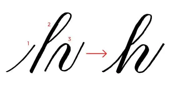
This is how calligraphy looks so much more consistent and neat than cursive with added thicknesses.
As soon as you learn these strokes and understand how to assemble them, the entire alphabet will seem far less daunting.
Building your alphabet just turns into simple math!
Stroke + stroke = letter.
Trust me- learning these strokes first will make you SO happy when you start making letters since they’ll look so darn perfect!
Wanna try the strokes for yourself?
I have a free basic strokes course you can join, with free workbooks, videos & a beginners community. Find it here!
4. Lift your pen.
I remember seeing videos on Instagram when I first started learning, and noticing this subtle little thing that I wondered about.
Why is this artist lifting their hand off the page so many times during 1 word?
Well, now that you understand the concept of breaking your letters into strokes, the reason should make a lot more sense (as it did for me, too, once I learned!).
When you’re writing in calligraphy, you’re writing in individual strokes, and you should be lifting your pen in between each one.
Here’s that word “cat” again, but this time, showing a red dot where you would lift your pen in between strokes.

So really, you’d be writing it in 6 pieces, like this.

This reinforces consistency since you’re no longer thinking about the letters as wholes, but rather as their own individual strokes.
Here’s what the alphabet would look like if each stroke were a different color.

Now, the lift in between strokes doesn’t have to be anything crazy.
Sometimes it’s just a subtle start/stop motion, where you’re lifting your pen off the page about a millimeter.
But the fact that you’re stopping in between strokes is the important part.
Note: if you’re using a pointed pen (dipping the nib in ink), this is even more crucial! Not stopping in between strokes will cause you to drag ink all over the place!
5. Slow the heck down.
This one is a game changer for some people. And I think a lot of the original problem comes from Instagram videos.
On Instagram, you have to speed up the video because it only allows videos of a certain length.
So beginners see those, and think they should be writing suuuuper quickly!
Don’t!
Trust me. Go slowly. It’ll make a huge difference for you.
I specifically remember in the first workshop I took, the instructor (the lovely Joanne of @indetailcreative) told us that calligraphy should be like yoga for your hands.
Breathe IN on your upstrokes, and OUT on your downstrokes.
THAT’S how slow you should really be going.
Going slow is the key to using flexible tools.
There are three main places you’ll notice issues if you’re going too fast.
Let’s take a look at each.
a) transitions
If you’re going too fast, you’ll probably have trouble switching from a hard downstroke to light upstroke, or the other way around.
If that’s the case, you’ll experience what I like to call “the soggy bottom” (LOL!)….

In this case, moving too quickly means that there isn’t enough time to gradually transition from thick to thin, so the bottom of the stroke is too heavy
b) consistency
If you’re going too quickly, you will probably notice a lack of consistency in your strokes.
And like we talked about earlier, consistency is key with calligraphy.
Here’s what I like to call “the eyelash” example- showing some simple upstrokes.
In the top example, I moved my pen nice and slowly.
In the bottom, I moved far too fast, causing the upstrokes to all be different lengths, and look more like eyelashes.

c) ink flow
Moving your pen too quickly can also affect the ink flow of your tool.
With pointed pens (nib & ink), moving too quickly will drag and splatter ink.
With brush pens or even paintbrushes, it will leave your downstroke looking streaky, or like the pen is running out of ink.

The good news, though?
All three of those issues can be solved by just slowing the heck down!
6. BONUS TIPS!
K, I know I said I’d give you 5 things I wish I’d known, but there are more. So without making this blog post 8,000 words long, let’s do a little speed round, shall we?
Here are a few more things I wish I’d known.
- Use high-quality paper. This’ll help you not ruin your pens, and it’ll make your work look cleaner. My favorite is Rhodia.
- Smaller brush pens are easier than bigger brush pens. Generally, the smaller the tip, the easier it’ll be for beginners. My favorite is the Zebra Funwari or the Tombow Fudenosuke.
- Try to relax your “death grip” on the pen. It’ll help your strokes look more natural.
- It will take a LOT of practice. You won’t get good at this overnight. You need to dedicate time!

Conclusion
I hope you found this helpful, and that you can save some time by knowing these tidbits that I didn’t have when I started!
If you’re interested in learning calligraphy from the ground up, come and join my free course called ShowMeYourDrills!
This course runs twice a year and is my signature program for helping beginners get started on the right foot.
You get access to a free course platform including full printable worksheets, step-by-step videos and a friendly & supportive Facebook community for extra help and accountability.
Check it out here!


Stay updated with my tutorials and get instant access to the Lettering Crate –
A growing library of free lettering & calligraphy resources that includes –
Pin me!
About the author

Becca is a Canadian calligrapher, artist and instructor. In just a few years, she has grown a huge community of 165k+ aspiring calligraphers, by teaching the basics of calligraphy in a simple and fun step-by-step process. She has even been able to take her business on world tour, meeting her students in over 20 different countries, and traveling the world while continuing to grow her business. But beware! If Dad jokes and puns aren’t your jam, you might want to find somewhere else to learn!


“ I hope you found this helpful, and that you can save some time”
Yes, I found it amazingly helpful, but the time I thought I might save has been swallowed up by going slower! That said, a great post that should improve my calligraphy.
Thank you.
I’M enrolled in the Jan 6th 2020 course. Supper excited! Just completed my “homework”
Great news! 🙂
Becca, in my humble opinion this is one of the most critical posts for “Show Me Your Drills” and key to learning how to letter, I really like the breathing tips and the part on the speed of your lettering. One other modern calligraphy tip you didn’t mention is how addictive lettering is. I now have a collection of calligraphy books, some rare and a collection of pointed pens, not that I anticipate using them all. Thank you for running this course again, I always learn new skills and welcome your feedback and the mentor’s feedback.
Brenda
Cheers Brenda, thank you for the comment!
I can not wait till Monday and keep sending helpful hints. I copy everyone.
I had an AH-ha moment reading #3 & 5
I go way too fast and i totally get it now about how often i need to lift my pen.
My favs:
♡Yoga for the hands
♡Breathe in on the upstroke and out on the down stroke
Seriously, major AH-ha moment for the second point.
Love it!
I cant wait to practice right now.
Thanks for being so generous with your knowledge and btw i really love how un-complicated you teach/instruct.
Thanks so much Becca
Love,!
@elena_b_art_and_stuff
Simple instructions–made a difference. Sat down and tried another practise alphabet. Thought it looked better than any I have produced so far. Amazing what understanding a few basics can do! thank you for thinking out the needs of beginners, Becca!
I’m really enjoying your course and loved the article! Thanks so much for teaching us all 🙂
You are most welcome 🙂
I came across your site on Pinterest. I am fairly new to calligraphy and just enjoy the art of writing. Your tips are very informative. I look forward to participating in some of your classes. Keep up the good work!
Thank you! Happy to hear that you found it useful 🙂
Becca, I feel so encouraged and inspired whenever I see, hear and watch your work. I’m all signed up for SMYD and even though you probably feel like a broken record with this type of information, it truly helps in solidifying the basics and establishing that foundation. I think you’re awesome and am hopeful to be 1/2 as talented as you. Keep up the awesome work.
Ahh thanks so much Tami, that’s such nice feedback to hear!!!
You are spot on, Becca, especially about construction and the SLOW DOWN.
(And when in doubt, go SLOWER!)
Love your videos and looking forward to Show Me Your Drills!
So excited to have you, Jan!
Wonderful article. I had many soggy bottoms, and other mistakes. Thank you for explaining why. It all makes so much sense now.
Im so glad it helped fix that, Debra! Nobody wants a soggy bottom! 😛
Becca, this is a wonderful article. I’m copying it for my book of your instructions. You’re the best! You’ve got this Internet stuff down, I’ll never get that! I’m still working on basics.
Keep up the good work you do.
Terry, the old guy, lol
Thanks so much, Terry!!
As reiterated by so many, TAKE BECCA’S CLASSES. They really help ingrain the strokes into your muscle memory. I took all of them, and it has truly improved my lettering. Plus I am just a big fan of her website, interviews, and dad jokes ?.
Thanks, Becca, for this article!
Aww thanks Adrienne!! <3
Becca, I have started with your first SMYD, then went on to all your books. I learned a lot from you, and still learning. Thanks!
So glad you’ve enjoyed everything, Mercedes!
I took Becca’s course last year and am gearing up to start again on Monday. It is by far the easiest and most fun way I’ve seen to learn modern calligraphy. Becca is so fun and the community is super supportive. You could simply take the drills course and be on your way, but I suggest you take her other classes as well if you can. The ‘slow and steady’ approach will provide a great foundation for your calligraphy skills. Seriously can’t say enough good things about Becca and her course.
Thank you so much Connie!!!!
Becca, you are awesome! You’ve been such a huge help throughout my lettering journey and I’m thankful for all the useful tips and tricks you share with us all!
Thank you so much, Lou!!!!
Try her free class, you’ll be so glad you did! Not only is she a great instructor, she’s a dynamite person! Cares about all her students, gives us her very best.
Ahhhh thanks Susan! Always so supportive!
Can’t wait to take your course. I’m so excited!!
Can’t wait for you to try, Heather!
This was a great article and really explains what the difference is between old and modern calligraphy.
So glad you found it helpful Betty!
Absolutely the best calligraphy instructor I have encountered. She is thorough, her instructions are very clear and she is totally approachable. I would definitely recommend her courses. Brenda
Wow thank you Brenda that’s such a wonderful compliment!
Perfect hints, Becca! You’re the best!
It’s my pleasure Vicky glad you enjoyed it!
Great info. Looking forward to learning the basics
Looking forward to seeing you in the program Cherie!
Absolutely love THE Happy Ever Crafter and the drills and tips she’s provides.
Thank you so much Sherry!
I took part in the first session of #showmeyourdrills and #showmeyourletters in 2017 it was super rewarding. I learned all the basics of modern calligraphy. The contents of the booklets are easy to use. We progress step by step.
It’s really cool. It helped me a lot in the practice of lettering.
Thank you Becca for your services. You are a fresh and sparkling girl I take pleasure to follow you again on social networks. It’s a source of inspiration.
I’m soooo glad you enjoyed it!