In today’s tutorial, I will be showing you how you can add a color effect to your lettering/calligraphy in 5 different ways – step by step!
Colors are a great way to enhance your work, and the gradient effect will take that to the next level.
Perhaps there are even more ways of adding a color gradient to your artwork, but these are the techniques i know about and i just want to give you a larger choice.
Let’s have a quick overview of what you will be learning today –
- What is a color gradient?
- Why should you add it? (examples)
- Analog (pen and paper) – 3 Techniques
- Digital – 2 Techniques
- Final words
Get your learning socks on, and let’s begin with the tutorial!
WHAT IS A COLOR GRADIENT
Before jumping right on to the practical part of this tutorial, i just wanted to cover a bit of theory.
Even if you don’t know what’s a color gradient you most likely already saw it somewhere.
Here is a quick definition of what a color gradient actually is –
A color gradient is a graphical effect that gradually blends one color with another (on a certain surface)
There are many ways you can create this effect but there are 2 ways that are generally the most used ones –
Axial – from one side to the other
Radial – transitions in circle
Here is a quick example –
AXIAL –

RADIAL-

The other thing i would like to mention is that the colors you want to use in a gradient effect matter!
Colors are a powerful element, not just in lettering but in art and design in general. Some color go really well together while other don’t.
From a beginner’s perspective, the color theory might seem like something advanced and complicated, which is exactly the reason I decided to craft this comprehensive guide that will easily help you understand the fundamentals of colors and how to use them properly (without making your eyes bleed).
WHY SHOULD I ADD A GRADIENT EFFECT TO MY LETTERING?
Because it looks freaking dope!
And i mean, why not?
It’s always good to push your creative boundaries and try new things.
If you don’t want to try new techniques and methods because you are afraid to fail – that’s a really poor excuse!
In order to grow you need to fail, it’s an essential part of the process.
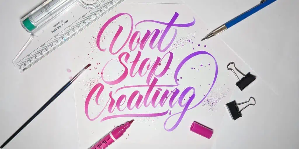
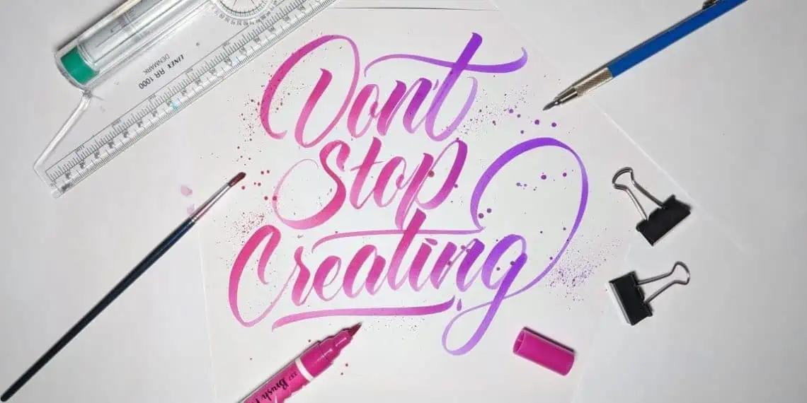
Check out a few examples of some awesome lettering gradient effects –
HOW TO ADD A GRADIENT EFFECT TO YOUR LETTERING (pen and paper)
Ok by now you understand what’s a gradient effect and hopefully you are motivated enough to give it a try for yourself.
If it doesn’t come out as you expected on your first attempt, DO NOT get discouraged!
Keep on practicing and you will get there – PROMISE 🙂
We will start with the techniques that are performed with pen and paper, and i have to say that these techniques are a bit more challenging simply because of the fact that once you mess up you have to start from the beginning – unlike with the digital methods where you can undo and go back until you are satisfied with it.
ADDING A GRADIENT EFFECT WITH BRUSH PENS (2 techniques)
Ok so, the first two techniques that i will be showing you today are created with brush pens.
I would argue that these are the easiest methods on the list since they take the least amount of time.
What do you need for these techniques?
- Blendable brush pens (water based ink) like –
Tombow dual brush pens, Lyra brush pens
- Blending pen or a water brush or a regular brush and clean water
- Bleedproof paper – this is to keep your brush tips from fraying.
Keep in mind – go easy with the water to avoid wrinkles or even holes, bleedproof paper is quite thin. This is exactly why i would recommend you using the blending pen for these techniques.

Let’s dive in!
GRADIENT TECHNIQUE 1
The first technique is super simple and easy to do, so let’s start by picking two colors that go well together.
For this technique i would advise to take one brighter and one darker color in order to get the best result.
In this example i picked a pink (brighter) and a purple Tombow (darker)

Step 1 – With your brighter color write your word. I’ll go with the word ‘’Simple’’
*Don’t forget to create your guidelines to keep your lettering consistent!

Step 2- Start applying your darker tone either on top or bottom of the word.
Don’t exaggerate because it will be harder to blend them

Step 3 – With your blending pen start gently blending the two colors.

Awesome! This is the first method of creating a gradient effect, easy right?

GRADIENT TECHNIQUE 2
The second technique is even easier since it takes less time, and you actually don’t even need the blending pen.
The only downside of this technique is that it doesn’t create a perfect gradient effect, but i still find it pretty cool – especially considering the simplicity of it!
Like with the previous technique, i would recommend to go with a brighter and darker color for best results.
Step 1 – take the darker color and flip it vertically so it touches the tip of the brighter color.
What will happen here is that the darker color will transfer on the tip of the brighter one and thus creating a gradient effect as you write.

Note – the time holding the markers in this position really depends on the length of your word.
So if it’s a shorter word you don’t want to hold it more than 2-3 seconds and if it’s a longer one you can keep it for about 6-7 seconds.
This will require a few attempts in order to get it right.
Don’t worry about ruining your pens, water-based ink pens are self cleaning and after a couple of strokes your tips will be as good as new!
Step 2 – write your word!

GRADIENT TECHNIQUE 3 – hand lettering
In case you fancy more hand lettering over calligraphy, and you don’t have the possibility to add the gradient effect digitally,
don’t worry we got you covered!
For this example i used again the Tombow brush pens, but you can also use watercolors.
What will you need for this method?
- Pencil – for sketching out
- Watercolor paper or mixed media paper – I would advise using thicker paper here.
- Blendable brush pens or Watercolors
- Blending pen or Water brush or a regular brush with clean water on the side
In case you are a total beginner, you should check out my beginners guide for hand lettering.
Step 1 – Doing some rough sketching + thumbnails.
Sketching is the key for a good hand lettered piece, and for this example i decided to choose the word Fun
I’ll start with some rough sketches and thumbnail in order to explore the possibilities of this word.
If you lack inspiration, head over to Instagram or Pinterest and try to find 3-5 pieces that you really like for inspiration.

Step 2 – After you found the right version, it’s time to create some guidelines and start sketching our letters.
Note – be gentle with your pencil strokes, otherwise it will be very hard to delete the marks afterwards.

Step 3 – Start applying your first color from the left (or the right, doesn’t really matter)
In this example i will be creating an axial gradient ( remember what we said, axial is from one side to the other – top to bottom) but more of a diagonal one instead of a straight one.
When you are close to the middle of your piece you should stop.

Step 4 – Start applying the second color from the other side.
With watercolors it’s always best to start with a brighter, less saturated tone and gradually apply more pigment, instead of going straight with a more saturated tone.

Step 5 – Blend the colors together with gentle strokes, like so –

HOW TO ADD A GRADIENT EFFECT TO YOUR LETTERING (Digital)
Ok now that we saw how to create a gradient effect on paper, it’s time to dive into the digital world!
The really cool thing about this method is that you have much more control with the look of your gradient effect, and on top of that you can undo and repeat the process as many times as you want to.
Let’s get to it!
ADDING A GRADIENT EFFECT USING PHOTOSHOP
The first digital method from creating a gradient effect will be done with Adobe Photoshop.
This method is a bit lengthy (there are more steps compared with the other methods) and it might see a bit overwhelming, but trust me – it’s not that hard!
Aside from that i think that this is definitely one of the best methods on this list, meaning that it gives the best effect – so the hustle is totally worth it!
If you are not that experienced with the software,
Don’t worry,
I’ll give you step by step instructions!
Step 1 – Create your artwork, you can do either calligraphy or lettering doesn’t really matter (just keep a solid color)

Step 2 – Take a photo of your work, one that will be ready to be shared on your Instagram (or other social media)
Note – Taking the time to create a proper presentation and taking a good picture with your work, will SERIOUSLY impact the engagement you get from social media.
I personally always appreciate when artists take the extra step to present an awesome photo!
In case you are not sure how to snap a proper photo,
Fear not!
I have a step-by-step tutorial that covers exactly this topic!
Step 3 – Send your photo to your computer – either with a cable or gmail/google drive (or similar). Avoid using Facebook since it has the bad habit of compressing the images and reducing their quality
Step 4 – Open up Photoshop and open the photo with your artwork.
If you are planning to post your work to Instagram, remember that they use a square format (1000×1000) You can crop it in Photoshop using the crop tool.

Step 5 – Duplicate your layer by clicking the right click on the layer and click on duplicate layer

Step 6 – From the adjustments panel, hit the hue/saturation

Step 7 – Once you’ve done that, hit the right click on the hue/saturation layer (on the layer panel) and create a clipping mask

Step 8 – Once you have your clipping mask, open the properties of the hue/saturation layer (double click from the layer panel)
Click on the hand icon (like showed in the screenshot) this will allow you to select a specific color to be modified.

Step 9 – Once you’ve clicked on that hand icon, a eye-dropper icon will appear on your mouse cursor, and then simply click on your letters – so we can change the colors of the letters (check the image below)

Step 10 – Now we can find our second color by sliding the hue slider.
Don’t just pick any color, take your time and try to find a good fit.
I picked this purple color.

Step 12 – By holding the shift key select the hue/saturation layer and the copy of the first layer and hit the control + E key in order to merge them together

Step 13 – We are almost there!
Im not sure if you noticed, but when i picked this purple color from a few steps ago, my marker color (and the lid) was also changed.
This is because they were the same color as the lettering.
If you want you can keep it like that, but here is what you do in case you don’t want it.
Simply pick your eraser tool from the tool panel on the left and go over the marker and the lid (and other affected elements)

Step 14- It’s time to create the gradient!
Once again, pick your eraser tool, increase the brush size to approximately the size of your lettering (like in the screenshot below) and put the hardness of the brush to 0!

Step 15- Now you just need to figure out and click from where you want your gradient to come-
From left to right, top to bottom, this is totally up to you to decide.
I went from right to left as my final pick.

Once you are done, simply export your work in a high quality format and send it to yourself so you can share it on Instagram.
Remember- avoid using Facebook messenger!

ADDING A GRADIENT EFFECT USING PROCREATE (iPAD LETTERING)
Procreate is the best sketching and drawing app there is – and the increase in popularity in the recent years, definitely reflects that!
If you are a Procreate user, then you know that they recently released a new update with a bunch of new features, one of them being the clipping mask.
There were also different ways of creating gradients before this update, i just think that the clipping mask feature makes it much more easier and customizable.
Let’s get down to the step-by-step process!
Step 1 – open up a new art board/canvas (again, if you want it for Instagram, remember the square format)

Step 2 – Create your lettering/calligraphy it doesn’t really matter – just keep it in a solid color.
I went on and hand lettered the word ”Legend”

Step 3 – The next step is to create our gradient layer. You can either do it by yourself or download an already made one.
Im going to show you how you can make your own gradient but in case you want to use pre-made one you should definitely check out this page.
Create a new layer on top of your lettering.

Step 4 – From the brush menu select the medium hard brush (or any other larger brush)

Step 5 – Select the colors you want to use for your gradient. In my example i decided to use the analogous color harmony – 3 colors sitting next to each other on the color wheel.
Once you got that covered, hit the adjustment button on the top left corner and choose the Gaussian blur effect

Step 6 – By sliding right you increase the blur and by sliding it left you decrease it.
Add a bit of blur in order for the color to blend together.

Step 7 – We are almost there!
Now simply open your layer panel and on the color layer select clipping mask

Step 8- BOOM!
You got it! Simple as that. The best part is that you can move, flip, increase, decrease your color layer as much as you want and create your own unique design
FINAL WORDS
Thank you for reading this tutorial, and i really hope that you found some of these techniques useful.
Keep trying new tools and new techniques and keep pushing your creative boundaries.
Be sure to join the official Lettering Daily Facebook group where you can share your work, ask questions, get feedback, network with other lettering artists and much more!
Until the next time,
Stay AWESOME!

Stay updated with my tutorials and get instant access to the Lettering Crate –
A growing library of free lettering & calligraphy resources that includes –
Pin me!

About the author

Hey, I’m Max. I’ve been drawing and messing around with letters since 2011. I don’t have a formal art degree—my background is actually in the kitchen as a former chef and on the streets painting graffiti with my friends. Over the last decade, through a ton of trial and error, I somehow turned that obsession into a full-time gig. These days, I design custom logotypes for global brands and paint large-scale murals. I started Lettering Daily just to create the kind of honest, no-BS tutorials I wish I’d had when I was starting out. Stick around, and let’s draw some letters.

Awesome. All in one place. Cheers for you!
cheers bro!
Thanks for that tutorial. Kudos <3
Hey Aldrin, you are very welcome! 🙂