
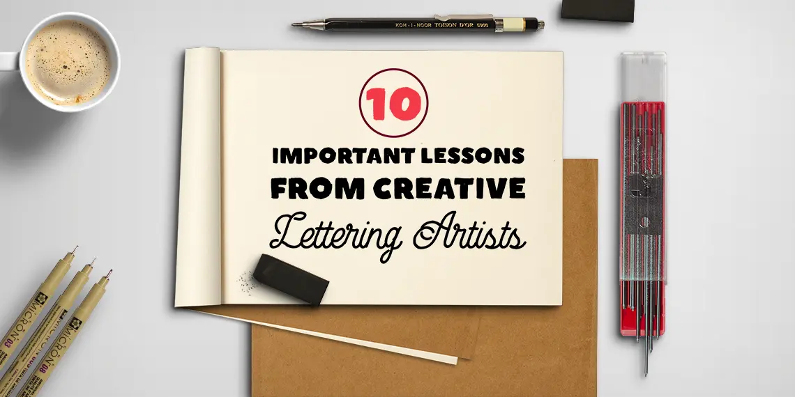
Hand-lettering is very intimate, personal, and soulful art.
Unlike digital fonts that are available to all, a hand-lettering designer labors to birth something new every time.
With a hand-lettering artist working for your project, you can be sure of the originality and freshness of the imagination.
These are the very reason for which we see a rise in demand for hand-lettered logos, shop fronts, book covers, and other marketing material.
The exclusivity and personalization that goes into modern calligraphy or hand-lettered design are very hard to duplicate with projects that have been decorated using digital font types.
For hand-lettering enthusiasts, the process of becoming an accomplished designer, be it a mural art or hand-lettering logo design, can sometimes span decades.
To make this journey more manageable (and more informative) for you, I have gathered here 10 design tips and lessons from successful and established hand-lettering artists. Tips that may help you skate over a lot of potholes in your journey as a newbie.
If you’re just getting into calligraphy, you might find my complete learning hub helpful — it covers everything from styles to practice tips.
1. Master The Rules Before Breaking Them.
As you start your hand-lettering learning, you will discover that the field is more technical than artistic.
Unless you know what the basics of hand lettering are, you won’t be able to go much farther.
Like most amateur artists, you may deride the following rules.
Still, as you start on this journey, you’ll soon realize that this professional (like many others) is unkind to those who don’t respect its foundational architecture.
To truly understand the art behind the science of hand-lettering, it is crucial to learn and master the basics. That is unless you want to get stuck, adding a lot of bells and tendrils to your letters in an attempt to seem ‘artsy.’
Jen Mussari, an established commercial hand-lettering designer, echoes her agreement about this point.
“Learn the rules before daring to break them! I feel a strong desire to obsess over the fundamentals of each style so that I can work with confidence when trying to meet any concept most effectively. I have spent the last four years obsessing over sign painting techniques and feel almost ready to get into pinstriping. Each technique deserves abundant time and respect.”
Jen lives in Brooklyn, where she spends her days painting, drawing, and designing in collaboration with brands big and small.
Her best advice in her own words, “I had a professor who once told me to “find a way to stay a student.” He stressed that being in a community of learning is valuable beyond the actual skills you learn, and that artists are lucky to be able to continuously pursue knowledge in our work. I have found permission to stay curious within that advice, and that desire to learn hasn’t left since.”
2. Have Guidelines, Not Rules.
As important as it is to learn and master rules, it is also essential to know when the rules are restricting you.
A true artist considers basic rules a foundation to build upon, instead of boundaries that you have to stay in.
Once you become familiar with the architecture of the foundation, it is crucial to discover what works for you and what your personal style is.
Laura Worthington, an established and published hand-lettering artist, advocates following guidelines, not rules.
“Everyone has their own process. For myself, I usually start with the lowercase alphabet, as that is what is used most often. Also, a few unique lowercase letters are great. Still, if every letter is unique and unrelated in style to each other, then the overall design becomes chaotic. It’s like using every crayon in the box and adding feathers and glitter just because you can.”
Laura’s approach to lettering is very organic. According to Laura, she simply takes a pen or brush to paper. She begins drawing until something sparks a memory or idea. The most important thing for her is to experiment and keep the pen moving.
Her best advice is, “Don’t be afraid to fail. Sometimes you get part of the way through the design and realize that it just isn’t working, then you have to make the choice of trying to fix it or scrapping it entirely and starting fresh. Don’t get discouraged, every failure is a stepping stone to later success. Go back to your original inspiration and ask yourself what drew you to it. If you hit a creative block, sometimes trying something that is a complete contrast to your original inspiration can lead to a breakthrough. You can find inspiration in the oddest of places if you keep your eyes and mind open.”
3. Aim For Progress And Not Perfection.
As you start designing or practicing your letters, you’ll probably come across people who’ll either claim to be perfectionists or seem as they are.
When that happens, don’t let them deter you from your own journey.
Perfection is an illusion – even if it were something real, it’d have emptiness ahead of it. What’s better than perfect? Nothing. Do you really want to work with nothing?
Hand-lettering artist Maricar C. Ramos explains it perfectly:
“Every time that I want to learn a new technique, I will study the basic rules first and get inspiration from the many lettering/calligraphy artists, then I will create my own version based on how I understand it and how I want my lettering to look like. I want my lettering to be freestyle, and I think the only rule that I need to consider is that I want my works to inspire others to aim for progress and not perfection.”
Maricar is also a watercolor enthusiast and believes practice makes a man perfect.
She often advocates newbies about the importance of regular practice, “Since the day I have started my lettering journey, I’ve always heard about “Practice makes progress.” It’s a piece of advice that every beginner might be tired of hearing of. Still, it really helped me to grow confidently with my works. It’s something that encouraged me to just enjoy the process of learning and creating.”
4. “Don’t Stop Until You’re Proud.”
Something that ties perfectly with ‘progress, not perfection’ is a quote from a brilliant hand-lettering designer Lisa Quine who’s personal style is so filled with personality that you can see a sense of pride in each piece.
“Don’t stop until you’re proud’ is my personal mantra. I try to get the sketch of whatever I’m working on as close to complete as possible before I go to ink it in or work on the final version. If the foundation of the piece is solid, the rest should fall into place.”
When you make yourself your most honest critic, the results of what you can produce and create can be truly fulfilling.
Lisa is also a true Beyoncé fan. She says, “I’ve gotten a ton of inspiration from Beyoncé. “Always stay gracious, the best revenge is your paper” is something I try to keep in mind. I genuinely believe that being a kind and helpful person who takes the high road gets you far in life. It’s worked so far for me! Sometimes artists don’t get the best client reactions or maybe a post doesn’t perform as well as they would have hoped, but I’ve learned that staying positive and cheering on fellow artists is rewarded with great karma. Also, I get down sometimes when I see other artists that won business I was also in the running for, but there are 1000000000 more projects out there so you just have to look ahead instead of behind! Above all else, try to make each and every opportunity you have PHENOMENAL! Not everything you create will be a show-stopper, but if that’s the goal, it’ll be harder to do bad work!”
5. Pay Attention To Legibility, Not Looks.
It is possible and understandable to get lost in the art of the whole process.
But keep reminding yourself of the bigger picture. Unlike personal art, what you’re looking for when working with client projects is more than art is functionality as the piece is going to be used for a specific purpose: a brand logo, a shop front, a banner design, or similar.
So make sure what you create is functional, legible, and adds value to the business. In words of Mhelanie Hernandez –
“Always make sure your lettering is legible. It doesn’t matter how beautiful your lettering looks; if no one can read it, it defeats the purpose.”
Mhelaine is a lettering artist based in Phoenix, AZ.
Her excellent advice is, “Just start! Lettering can be intimidating, but if you start now, you’ll be better today than you were yesterday.”
6. Inject Some Emotions.
When creating brand identities or logotypes for businesses, it is crucial to add emotions through designs.
Structuring letters a different way or adding few tinsels and bells can change the meaning behind the words quite emphatically.
If you are working with a graphic designer who’ll be creating the logo and you’re in charge of only the lettering, it is essential to create work that shows a united front and effective meaning.
As Olga Zakharova, an illustrator and letterer, says –
“I think the most important thing is if your lettering transfers emotions to the viewer. It’s not enough to just draw perfect shapes (like it’s not enough to be on ideal notes in music all the time), it’s at least as important to have some meaning behind the drawing.”o one can read it, it defeats the purpose.”
The advice Olga will pass on to fresh lettering artists is, “Everybody started from zero – there is no man who was born with the knowledge on how to draw letters. Everybody who is successful now were at point zero. If they could do it – you can too.”
7. Don’t Be Discouraged By Other People’s Work.
People will tell you that comparisons are harmful, and they’ll be right. But it’d be denial to say that all of us don’t indulge in it every now and then. Especially when we see an art piece that is painfully beautiful and demands us to look at it with reverence.
But before you feel discouraged and start to wonder if you’ll ever create something as beautiful, ask yourself to remember that you don’t know what their journey has been.
Everyone struggles differently, and no one lives a life that hasn’t seen some downtime.
Bob Ewing, a successful graphic designer, and letterer have the ideal recipe to brew when somebody else’s brilliant work pushes you towards self-doubt.
“Anytime you are learning something new, it just takes time and practice. It’s easy to scroll endlessly through social media and see all these beautiful things and glance right over the fact that behind each one of those pieces is a messy process with a great deal of effort. So, don’t be discouraged by other people’s work. You have to learn to appreciate what you can offer to the world through your own work. So practice and practice a lot. And don’t be afraid to try new things.”
Here’s Bob’s best advice, “Draw a lot, it really is that simple and that hard. Anytime you are learning something new, it just takes time and practice. It’s easy to scroll endlessly through social media and see all these beautiful things and glance right over the fact that behind each one of those pieces is a messy process with a great deal of effort. So, don’t be discouraged by other people’s work. You have to learn to appreciate what you can offer to the world through your own work. So practice and practice a lot. And don’t be afraid to try new things. When you are first learning something new it is far easier to let yourself explore more because you don’t have that experience to pull from. At times I have to force myself to try new things or different techniques. It’s that cli·ché of getting out of your comfort zone, and it really is true.”
8. Inspiration. Dissection. Creation. Make Something New.
Your approach to design should be as different as you are.
It should be an accurate representation of you as a person and an artist and must follow a path that you have forged for yourself.
Learn from your mentors, but don’t forget to venture out and see what else is out there.
Hand-lettering guru Stefan Kunz explains his four-step method of letter-creation that he has developed all on his own, after years of studying, teaching, and learning.
“The first step is inspiration, opening your eyes to new things. Kind of like, storing it, saving it, and savoring it. Then comes the dissection. In this step, I try to understand and picture how each of the letters works individually. I start by copying or recreating the same letter and dissecting it into pieces. Kind of like how a watch-maker finds individual pieces. The next thing is creating. Here I use what I have learned in dissection as to how each part works and creating something unique, either by using the same letters to create new words or by using different elements that I like and joining them together to create a cohesive whole.
The last step is making something new every time and not repeating earlier versions. This step may involve a lot of fails before you can come up with something spectacular. But that’s okay. The failings help you move forward and take the next step.”
9. Envision It Before You Can Execute It.
Artists do not create work out of nowhere; there’s always something that inspires the imagination and gets the creative juices running.
And envisioning is a large part of imagination and creation.
Perhaps that is where the stereotype of artists staring off into the air comes from.
But here is at least one place where you’d like to prove the stereotype right. Stare off into the air. See what no one else can see.
Envision it.
Look at it in your mind’s eye before you can draw it on paper.
Annica Lydenberg puts it simply.
“Looking and envisioning comes first, execution is just a small part. Something has to exist in my brain before I sit down to create.”
Annica is an accomplished lettering artist, mural painter, art director, and illustrator.
She expresses her style and inspiration through her website, Dirty Bandits.
Her advice, “Don’t worry that every job is everything; some will be good for your portfolio, some will be good for your bank account, some will be good for your soul.”
10. A Piece Of Advice For Hand-Lettering Newbies.
Apart from ‘practice makes perfect,’ what advice would these hand-lettering masters give to the new artists in this field? Something that has a more practical and concrete application that leaves little room for confusion.
“Personally, I’m always trying to keep things as authentic and analog as possible. I think it’s vital to understand calligraphy and how the tools define the forms of the letters. It’s important to know how to write letterforms before trying to draw them or paint them. With signwriting and gilding, I would say that first and foremost it’s all about good letterforms and layout, all the bells and whistles and fancy effects are a waste of time otherwise!”
Ged Palmer, a brilliant hand-lettering designer from London, has the best advice:
“I think the best place to start is by buying the @Speedball textbook, some chiseled and pointed nibs and work your way through that patiently, learning styles. Buy a small desktop drawing table so when you are sketching you can sit upright. Focus on breathing and posture with your work. Don’t add unnecessary fancy bits and ligatures everywhere, good lettering should look elegant and natural without the bells and whistles.”
Wrapping things up.
Learning the art of hand-lettering is a labor of love.
It may evolve from a love of graphic design or just starts more organically and directly as a love for hand-lettered words.
No matter its origin, at the heart of it, it’s a need to add something very personal to the design and make it that much more valuable to everyone who uses it or looks at it.
Hopefully, with these lettering geniuses sharing their tips with you, this labor will become much less intense and much more productive.
What are your current lettering struggles? Were any of these tips helpful to you? Let me know by dropping a comment below!
Pin me!


Stay updated with my tutorials and get instant access to the Lettering Crate –
A growing library of free lettering & calligraphy resources that includes –
About the author

Hi! My name is Ayesha Ambreen and I am a content strategist, graphic designer, and calligraphy artist. I am best known for my creative content ideas. My work has been featured on blogs such as Smashing Magazine, Entrepreneur.com, CreativePro, Lifehacker, and more. When I’m not writing, I love spending my time drawing and reading books.

It can help them learn how the industry works, without worrying about the technical aspects of setting up the business.
This is such an inspiring post. I can relate to most of the advices here and I am very inspired to be doing the small steps everyday, to do better today compared to “me” from yesterday. So glad to know that the struggles I am having are so common even to the lettering gurus here in this journey. So glad that I am not alone. So glad to be assured that I am on the right direction. Thanks for this post!!
Xoxo
@Jane.Artscape
Thank you for your comment Jane 🙂 We all deal with different struggles and what matters is that we manage to recognize them and learn how to deal with them. Hearing the same from others can be very encouraging to start making a change. Glad to hear you liked the article! 🙂
Wonderful, encouraging post. I find one of my biggest challenges is coming up with unique ideas. For fonts. Of course, going down the Pinterest rabbit hole, doesn’t really help either. I also seem to have a problem with holding the pen too tight that I have a permanent callus on my right ring finger. I also worry that I’m not holding the pen correctly. I guess currently I have lots of problems lol and yet I keep coming back to it. That has to mean something, right?
Hey Suzy, thank you for your comment. Finding inspiration is difficult without having a solid grasp of the foundations. This is why I always recommend starting with the basic form of the script (whatever it is that you studying) and with time and practice you will become better. Once you do that, you’ll be able to tweak and bend these rules into something completely new – that will be your very own unique style. As for the hold, you are right. You shouldn’t be holding it that strong. You want to hold the pen gently but firmly, think of it as an extension of your arm. To help you more with these specifics, it would be best if you joined our Facebook group. I hope this helps! 🙂
Thankyou for this inspiring list! Gives me a focus, which can be realistic 🙂
Perfect! Super glad to hear that 🙂
I’m a lettering newbie.. All artist advices are good and it’s really useful.. I believe that lettering is so good for your soul and fun fulfilling…
Thank you so much for the kind words 🙂
I love: “Inspiration. Dissection. Creation.” That’s good advice! I never really consciously tried that before…… it will help me fell less intimidated by gorgeous pieces and see them as educational opportunities. ???
Thank you, Jessica! I really like how you summed it up and I hope it will help you with your progress! 🙂